William B. Hoyt (update)

William B. Hoyt
I was looking through the website of the Maine Art Gallery (in Kennebunkport), when I was struck by this image. On looking up the artist’s website, I realized I had written a brief post about him a couple of years ago.

William B. Hoyt’s clear, precise, realistic approach is most often applied to landscapes and seascapes. In the latter you can see the influence of realist giants like Thomas Eakins, a point he makes clear by including a pinned-up print of Eakins’ Max Schmitt in a single scull over the sink in one of his combination interior/landscape paintings, Flat Water.

Likewise, he has painted a small print of Vermeer’s The Milkmaid into a painting of his kitchen he has titled King Arthur and the Milkmaid (the King Arthur reference is to the brand of the bag of flour), Andrew Wyeth’s Christina’s World in his Lobsters and Champagne; and has Caravaggio’s Baccus tucked in the window in Kitchen in Tuscany.

There are other references to influences tucked into the interiors in his new work at the Maine Art Gallery. Unfortunately, the images posted there are too lo-res to see in detail.

In fact, it is Hoyt’s interiors that I find most interesting. Though his landscapes have an obvious appeal and are the major focus of his work, the interiors have a stillness and “moment in time” quality that are wonderfully evocative, and I was glad to see that his new works include a number of interiors. The large windows in his kitchen, in particular, invite his repeated theme of interior/landscape combinations, and the porcelain and unpainted wood make for a rich setting to tie the objects together.

Hoyt doesn’t shy away from complex compositions and seems to challenge himself in his interior paintings with numerous objects that vary in color, texture, degree of sheen and sensitivity to reflected light and color. His landscapes are often panoramic in proportion and complex in subject matter.

Hoyt has revised his website since I last visited, but I’m a little disappointed that the new one still doesn’t show his work to best advantage. Instead of elegantly introducing you to the artist and his work, and quietly letting you know that there are prints available, the site starts right in trying hard to sell the Giclées, giving it an air of commercialism. You almost feel that the primary focus of the paintings is to sell the prints. I’m sure this isn’t the case, but it’s an unfortunate effect of the emphasis on the prints rather than on the paintings.

It’s also still way too easy to miss the link at the bottom right of the image pages that brings up the “high-res version”, without which you wouldn’t be able get a much feeling for subtlety and strength of his work.

Drew Struzan

Drew Struzan
Drew Struzan is another of those artists, like Michael Deas, whose work you have undoubtedly seen, whether you realize it or not. Struzan is responsible for some of the most famous and recognizable movie posters in recent memory. He has also done art for advertising, book and comic covers, music CD covers and other product illustration.

Struzan is best known for his movie posters. He has obviously absorbed influences from illustration greats like J.C. Leyendecker, Coles Phillips, Norman Rockwell and others, and brings his knowledge of illustration techniques to bear in clear, powerful and striking representation of the likenesses of actors and the succinct representation of the promised excitement in a movie.

In his online portfolio you can see some of the famous poster and advertising art he has created for Star Wars, Indiana Jones, Harry Potter, Blade Runner, Back to the Future, Pan’s Labyrinth, Hellboy and others.

Struzan works in airbrushed acrylics on board with details and textures added in colored pencil. There is a drawings section in his portfolio in which you can see some freely realized, but remarkably precise, drawing in colored pencil on toned paper.

The portfolio is arranged so that the initial click gives you a brief description and a detail image, which is linked to the full size images. the detail images occasionally give a hint at the wonderful surface and texture characteristics of his work and make you wish they were reproduced larger.

Fortunately, there are three (as far as I know) collections of his work: The Movie Posters Of Drew Struzan, The Art of Drew Struzan – Star Wars Portfolio and Drew Struzan: Oeuvre.

[Link courtesy of Michael Hirsh of Articles and Texticles]

Peter Sylvada

Peter Sylvada
California painter and illustrator Peter Sylvada paints in a way that makes “painterly” too weak a descriptor.

Ranging from muted earth tones to brilliant, impressionist strength colors, his oil paintings are composed of wonderfully bold chunks of color and a wealth of tactile brush texture.

From portraits that show the obvious influence of Sargent, to Homer-inspired sea images, to city images that carry echoes of Robert Henri, Sylvada draws on a wealth of affection for great artists and imbues his paintings with rich contrasts of color and tone. His compositions experiment with unorthodox variations in proportion and balance in which backgrounds and occasionally parts of objects are turned into color fields shimmering with the textures of brush strokes.

Unfortunately, his portfolio site, though nicely designed graphically, is hampered by agonizingly slow image transitions that make it an exercise in patience to go through more than a few images. It’s worth the trouble, though; perseverance will be rewarded by an array of wonderful paintings.

Similarly frustrating is his “Bio” page, which also keeps you waiting for over-long “page” turns, and then brushes off his professional accomplishments as though they were inconsequential.

His illustration clients include Toyota, Nissan, United Airlines, The Atlantic Monthly, The Philadelphia Inquirer, and others.

Sylvada is working on a children’s book he has written and he is currently preparing for his initial gallery exhibition.

Jacques-Louis David on
The Power of Art

Jacques-Louis David
The subject of Simon Schama’s The Power of Art, the BBC/PBS program being broadcast on most PBS stations tonight in the US, is French neo-classical painter Jacques-Louis David.

It’s difficult to separate David’s life and work from the political turmoil of his times, in which he was intricately involved; as I pointed out in my previous post about David, and as I’m sure Schama will go into in detail in the program.

It might be nice, however, to simply stop and look at David as a painter, seeing him directly as in this Portrait of Anne-Marie-Louise Thélusson, Comtesse de Sorcy, a larger version of which can be seen on the Art Renewal site.

As I pointed out in the post I wrote just before my post on David, a painting that I though for years was my favorite painting by David (and one of my favorite paintings in the Metropolitan Museum of Art, which is saying something) turned out not to be by David, but by Marie-Denise Villers, a student of one of his students.

Perhaps Schama will have some surprises up his sleeve in his look as David as well.

Sundays with Walt and Skeezix (Gasoline Alley by Frank King)

Sundays with Walt and Skeezix - Gasoline alley by Frank King
In 2005 Sunday Press Books published a remarkable collection of Little Nemo in Slumberland, Winsor McCay’s astonishing early 20th Century comic strip, printed at the size of the original full page newspaper comics. (See my post on both McCay and the book.)

Thanks to the risky but brilliant choice of format, So Many Splendid Sundays is a revelation. It is the comics equivalent of the cleaning of the Sistine Chapel, a great masterwork revealed in the way it was meant to be seen.

How do you follow up an act like that?

Well, you could start with another masterful comics creation, particularly one that has been under-appreciated, even by those of us who treasure the great classic newspaper comics, and give it the same eye-opening full-size newspaper page treatment.

Sunday Press Books editor/publisher Peter Maresca has done just that with the release of Sundays with Walt and Skeezix, featuring the innovative and beautiful work of Frank King on his landmark strip Gasoline Alley.

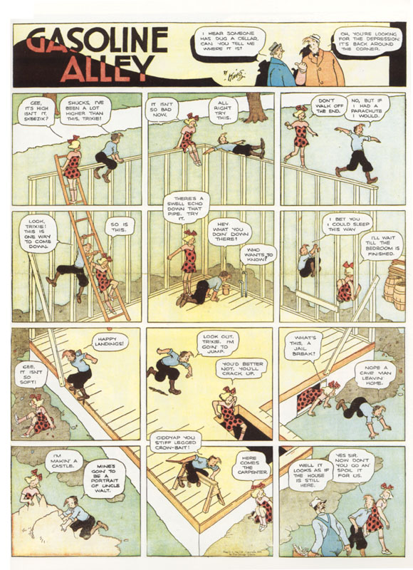
Gasoline Alley was a deceptively quiet slice of life comic started by King in 1918. Like George Herriman’s Krazy Kat, Gasoline Alley was a secondary feature that rose to be the artist’s main opus. Originally a single black and white panel in the Chicago Tribune’s catch-all Sunday page called “The Rectangle”, the original premise was simply characters talking about automobiles, which were something of a newfangled contraption at the time and the object of much tinkering and discussion. The panel and its characters gained popularity and the title went to a full strip with a full Sunday Page.

Over time, instead of featuring the normal comic strip conventions of gags or adventures, Gasoline Alley developed into a series of gentle, subtle slices of american life. Several years into the successful run of the strip, the Tribune asked King to broaden the appeal to women, so King brought a family to his main character Walt Wallet, a confirmed bachelor at the time, by having a baby left on his doorstep. Little Skeezix (according to Wikipedia, slang for motherless calf), called his adopted father “Uncle Walt” and became the second star character.

Skeezix also started one of the more remarkable attributes of Gasoline Alley. Most authors of continuing stories, in comics or other mediums, are reluctant to let their characters change and age, not wanting to lose a good thing, so they suspend them in a kind of no-time, in which events happen, but the characters remain roughly the same age. In Gasoline Alley, Skeezix and the other characters began to age, in more or less real time, growing older, going through the phases of their lives like real people and passing the torch new young members of the family. Remarkable.

Don Markstein in his Toonpedia article on Gasoline Alley, contends that the strip was not only the first soap opera style comic, but the first soap opera style continuing story of any kind, predating the actual “soap operas” by many years.

The strip is still going today, carried on by “descendents” in a way. When he retired, King handed the Sunday strip to Bill Perry, who he had found in the Tribune’s mail room and made his assistant, and the daily to Dick Moores, who had been Chester Gould’s assistant on Dick Tracy and put his own unique stamp on the strip, in some ways reinventing it and making it his own. Moores took over the Sunday too when Perry retired and he, in turn, passed the strip on to his assistant Jim Scancarelli, who writes and draws it today.

Though each has their own approach, they, and many other cartoonists and comics artists, were influenced by King’s clear, spare but richly imaginative drawing style.

King’s drawings, in fact, were influential on the European comics artists like Hergé who would refine the ligne claire style, the influence of which would come full circle to contemporary American comics artists like Chris Ware, who contributed to the Drawn & Quarterly collections of Gasoline Alley a few years ago and has done the book design on the new Sundays with Walt and Skeezix volume.

King was obviously influenced and impressed by McCay’s sublime fantasy in Little Nemo (and who wouldn’t be), and his stories of family life were peppered with dream sequences and flights of fancy in which he let his pen and imagination roam freely.

The Sunday Press book, though I haven’t yet had the pleasure of seeing it in person, focuses in particular on some of King’s more imaginative and innovative strips and promises to be an absolute treat.

At $95 it may seem pricey for a comics collection, even a great one, but keep in mind that this is the wide screen, high definition, Imax version of comic strips. Until you see one of these volumes, you don’t realize what a difference size makes.

The book can be pre-ordered now and ships in August. I don’t know if the publisher is better prepared to meet demand this time, but the first printing of the Little Nemo book sold out quickly and the second printing wasn’t available for months.

Ironically, the sample strips displayed on the Sunday Press Books site are too small to read and get a real feeling for the beauty of the art. Here’s an (unfortunately watermarked) image of an original Sunday from Library of Congress exhibit of comic strips, another image of a printed Sunday page from the FamilyLosAngeles blog, one from MarkStaffBrandl.com; and you may find more through an image search.

Here’s the page shown above posted larger, and another, on the site of the Tate Museum from their online magazine’s excellent essay on The Real Comic Book Heroes.

DC Comics Announces Zudacomics.com

Zudacomics.com
In the 12 years or so that I’ve been drawing webcomics, I’ve continued to be stupefied by the monumental cluelessness of the major comics companies (with the possible exception of Dark Horse) in regard to online comics.

It took Marvel and DC four or five years to even acknowledge their existence, they never seemed to get that this was a whole new branch of the comics medium, if not a new medium in itself; and, since they couldn’t figure out how to make money off of web comics directly, merely used their half-hearted and unimaginative forays into the field as shills for their regular print stuff.

When I heard that DC Comics was starting a new “web comics imprint” called Zudacomics.com, I assumed that this was more of the same. It turns out though, that it’s a bit different and, thankfully, at last, a bit less clueless.

Modeled on the notion of a webcomics portal, an idea that numerous independent sites have been exploring for eight or nine years, Zudacomics.com is touted as a home to multiple online comics that will be culled from work submitted, and voted on, by the site’s visitors.

The key and clueful difference here is that the chosen creators will then actually be paid, receiving commissions for a year’s worth of work (though what that actually means isn’t stated), and have their creations published in print as well.

Another hopeful sign of cluefulness is the format. DC is asking that the submissions be in 4:3 aspect ratio, not quite modern computer screen dimensions, but close enough, and something that the “big two”, and even a large number of current webcomics artists, haven’t quite gotten, instead forcing readers to scroll through vertical print-comics format on the horizontal screen.

The real sign of cluefulness, however, is their statement that the content will remain creator-owned; but before we get too warm and fuzzy, read Todd Allen’s thoughtful analysis on Comic Book Resources. You can also read the New York Times’ more rosy announcement.

DC is evidently throwing some money at the project, hiring IBM to build a dynamic, back-end driven site, though how they intend to make money on the venture is still unclear.

The Zudacomics.com “teaser site” doesn’t include much detail yet, just the press release, a brief overview of “the deal“, some logos and a “stay notified” sign-up. They will be rolling out information over time, with the scheduled launch for the content site slated for October.

[Link courtesy of Bob Hires]