Marcin Jakubowski

Marcin Jakubowski
Marcin Jakubowski is a freelance concept artist and illustrator who works digitally, painting his atmospheric images primarily in Photoshop.

Based in Gdansk, Poland, Jakubowski works with a variety of clients in CG animation, TV shows and commercials.

His website has examples of his illustrations, character and creature design and environments, as well as a section of concepts and sketches.

The thumbnail images in the galleries are linked to larger images, which in turn are often linked to larger versions that open in a pop-up. These are of particular interest in viewing Jakubowski’s work, in that many of his images involve both textural aspects and elements of scale that are best appreciated in larger image sizes.

Marcia Burtt

Marcia Burtt
Marcia Burtt is a plein air painter who has chosen to work in acrylic, a medium more often associated with studio painting, photographic realism and illustration than the immediacy of plein air.

Her approach, however, makes it seem a natural choice; with fresh, bright colors and a distinctly painterly feeling, she captures scenes of waterways and shorelines, lush gardens and rocky deserts, roads and towns.

Her website is somewhat confusingly arranged. The home page looks like thumbnails of images from her archive of older work, and if you wait a moment, it fades into an image of her and mention of her workshops. The apparent thumbnails, however, are actually a single image, and attempting to click on any individual one simply drops you on the real first page of the archive, where you are presented with an array of slightly larger actual thumbnail images.

From there, you must click on the thumbnails to open the larger versions; then you are apparently expected to use your browser’s “Back” button to return to the thumbnail page. There is no provision to step through them in sequence or return with a link. I found it easiest to Command-click (Mac), or right-click (Windows) and open several in new browser tabs, simply closing them when I’ve finished looking.

If you work your way back through her archives, however, you’ll be rewarded with a variety of subjects, compositional approaches and color palettes.

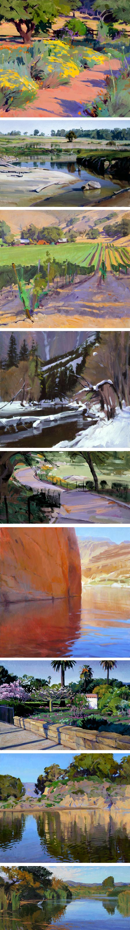
Acrylic shares with gouache the ability to quickly and easily make flat areas of color; in Burtt’s hands these become patches of color, similar in some ways to the approach of the Italian painters known as the Macchiaioli. In some paintings she uses acrylic more like gouache or oil, sometimes with rough textural chunks of paint, in others she works with delicate watercolor-like effects. Some of her smaller works have a quick pochade-like quality, others a more refined degree of finish.

As you look through the nicely extensive selection of her work she has made available on her site, you’ll see her experimenting with composition as well, moving the horizon up and down, focusing on skies, playfully pushing elements to the edges of the composition, searching for balance and harmony within variety.

All of her compositions are marked by a strong geometric underpinning and a sharp awareness of negative space. This is particularly evident in paintings that follow one of her favorite themes, bodies of water in which part of the scene is reflected. Here you can see her compositions create, in effect, two separate arrangements of the same shapes, for example with more or less sky, repeated and flipped, within an overall composition in which they must also form a whole.

She has explored the possibilities of her chosen medium in other ways, at times utilizing the preternaturally intense colors that acrylics permit, at other times working with a restrained palette.

Burtt is also a teacher, she conducts workshops and demonstrates her approach in an American Artist instructional DVD, Mastering Plein Air Acrylic Painting with Marcia Burtt for which there is a promo on YouTube. There is also a brief section on Painting with Acrylics on her website. There are also downloadable PDFs of articles in which she is featured from American Artist and Southwest Art on her bio page.

Her work, along with the work of other artists, can bee seen at the Marcia Burtt Gallery in Santa Barbara, CA.

Scott Gustafson

Scott Gustafson
Scott Gustafson’s richly textured and intricately detailed illustrations are steeped in his admiration for great illustrators of the Golden Age like N.C. Wyeth, Normal Rockwell, Maxfield Parrish and Arthur Rackham.

Though he has had numerous commercial clients in his 25 year career, his fondness for those great classic illustrations, and the classic stories they often accompanied, has carried over into seeking out the opportunity to illustrate books of classic stories, fairy tales and Mother Goose as well as fantasy stories and other subjects.

His website is a bit awkwardly arranged, in that you often have to return to the home page to jump to other sections, and it’s easy to miss things by casual browsing. Be sure to check out the books and gallery sections in addition to the portfolio and what’s new sections.

Many of the images are supplemented with roll-over detail image, but they are still frustratingly small given the level of detail and degree of finish in his work.

Gustafson works in layers of oil and oil glazes. On the website there is a step by step walk through of his methods for The Man in the Moon (images above, 7th down).

He often tackles complex compositions, and controls how your eye moves through them with adroit manipulation of color and value in key areas of the painting. He also manages to unify a multitude of elements and colors into a harmonious whole.

In addition to the numerous books he has illustrated or contributed to, Gustafson has recently written his first novel, Eddie, the Lost Youth of Edgar Allen Poe (Amazon link here), aimed at children ages 8-12, and illustrated with over 90 black and white illustrations (image above, bottom).

Adoration of the Shepherds, Gerrit van Honthorst

Adoration of the Shepherds, Gerrit van Honthorst
I love nativity scenes like the one at top (with details below it), Adoration of the Shepherds by 17th century painter Gerrit van Honthorst, in which the infant is not just bathed in light, but seems to be a source of light, as if incandescent with the Holy Spirit.

In this case the child appears to be the only source of light in the scene. Scenes illuminated by a single light source, usually a candle, were a recurring theme for Van Honthorst, as in his painting Childhood of Christ (above, second from bottom). In this he was similar in some ways to the French painter Georges de la Tour, though without the latter artist’s masterful sense of mystery and stillness.

Van Honthorst also used the theme of a nativity illuminated from the direction of the child in his painting of two years earlier, Adoration of the Child (above, bottom), but the effect is not the same.

Even though he has taken pains with the light source in Adoration of the Shepherds, you can tell his real interest as an artist was not with the mother and child, but in the faces of the shepherds, wonderfully defined and enlivened by the direct light and the sharp chiaroscuro it invites.

Leyendecker’s Santas


Even though it was Thomas Nast who fleshed out the old fellow, pipe and toys in hand, Reginald Birch who gave his suit its colors and Haddon Sundblom who often incorrectly gets the credit (much as I like him), I still maintain that our modern concept and image of Santa Claus owes more to J. C. Leyendecker than to any other single artist.

I think it was Leyendecker’s covers for The Saturday Evening Post, along with his advertising illustrations, that gave the Jolly One the form followed by Rockwell, Sundblom and subsequent other artists, and is basically the Santa figure we know and love today.

The image at top is from the December 22, 1923 issue of the Saturday Evening Post. I tried to trace out a bit of the history in my 2006 post on Illustrator’s Visions of Santa Claus.

Even though the general look and feel of long white beard, red outfit trimmed in white fur and Big-Sack-O-Toys® was set by Birch’s St. Nicholas illustrations, I still think that Leyendecker refined and perfected the image beyond Birch’s slightly wan version, and I think Lyeyendecker was much more influential in both the reach of his work and its influence on other illustrators.

Rockwell, when painting Santa covers for the Post shortly after Leyencecker (who he considered his artistic hero), was essentially painting Leyendecker’s version of the character. Sundblom, who the Coca Cola company claimed for years was the originator of the modern Santa Claus, came later and was essentially painting Leyendecker/Rockwell Santas (and a very good ones, I admire Sundblom’s Santa illustrations second only to Leyendeckers), as was N.C. Wyeth in his interpretation of Old Kris.

Plus, Leyendecker’s Santa Claus illustrations are filled with such wonderful visual flourishes and thoughtful touches that they feel like presents from the artist to us (I love the army boots in the top painting).

Dutch Winters at Schiphol

Dutch Winters at Schiphol, Rijksmuseum: Charles Lickert, Willem Witsen, Louis Apol, Anton Mauve
Also in keeping with the Winter Solstice (see my previous post), the Rijksmuseum in Amsterdam has mounted an exhibition of 19th Century Dutch paintings of winter that will be on exhibit at the Amsterdam Airport Schiphol from 21 December 2011 to 26 March 2012.

The museum’s page for the exhibition doesn’t directly link to the 8 works in the show, but it does link to pages in the museum’s collection for artists whose work will be featured, including (images above, pairs from top): Charles Lickert, Willem Witsen, Louis Apol and Anton Mauve.

I have no idea which paintings are in the actual exhibition, so I’ve just selected some winter themed paintings from the mentioned artists as examples.

Even though it’s a little awkward to click through to the image detail page and then click again on the magnify (plus sign) button under the preview image, it’s worth it for the wonderfully high resolution images.

[Via Art Knowledge News]