
When I point you to web based resources for images from the artists I feature on lines and colors, I don’t emphasize nearly enough how limited those images are when compared to images in print.
I’m second to none in my appreciation for how well images can display on screen. I was one one of the first to create comics specifically to be distributed on the web, so I’m no Luddite, but there are still some things that print simply does better.
The main factor in this is resolution. You get used to looking images on screen and you can easily forget that even modern hi-resolution monitors are still very limited in this regard. The standard for Macs is 72 pixels per inch (96ppi for Windows), somewhat comparable to dots per inch in printing. When you increase your monitor resolution, you might double that or even triple it, but the standard for printing is 300dpi, sometimes higher in fine art books.
Even if your monitor resolution went that high your chances of encountering images of illustrations or other artwork in a large enough file size to display large on your screen at that resolution is slim. So what you’re missing in viewing images on screen, my friends, is detail.
Beyond that there are issues of color fidelity, which varies from monitor to monitor, but detail alone is enough to make all the difference. This is why you will often hear me exhort you to find print versions of the works I point out, and why I’m constantly trying to encourage artists to post images large enough to allow people to get a better feeling for what the original looks like.
This disparity was snapped into clear relief for me when I picked up my copy of r/evolution: The Art of Jon Foster yesterday.
I wrote a brief post about Jon Foster’s remarkable work back in January of 2006. At the time I mentioned that the previous collection of his work, Progressions: The Art of Jon Foster was unfortunately out of print, and a new one was planned but had not even been titled.
Well the new book is here and it is extraordinary, both because Foster’s work is extraordinary, and because editors Cathy Fenner, Arnie Fenner and Irene Gallo have done a superb job of demonstrating just how well print is suited to the vibrant, detailed display of paintings. Cathy Fenner and Arnie Fenner are the editors of the Spectrum collections of fantastic art (the latest edition of which, Spectrum 13, was recently released). Gallo, who also wrote the book’s Afterword, has a post about the book and it’s inception on her blog, The Art Department.
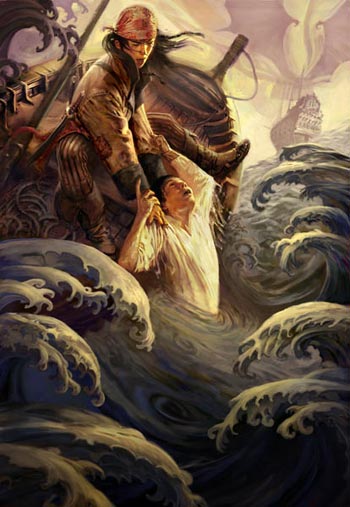
Foster is an illustrator who has done science fiction and fantasy book covers and interior illustration, as well as comic book covers and graphic stories.
Foster works primarily digitally, but often combines digital and traditional techniques. The book describes some of his process. He will often start with traditional pencil sketches, working and reworking ideas until satisfied he has arrived at the best composition, take the final sketch into the computer, paint the image digitally in Painter and Photoshop, and then print it out at a large scale, glue it to hardboard and finish the work with oil paint.
One of the delights of the new book is that you can see the flow and texture of the brushstrokes, both digital and physical, the patterns they make as they both follow and define the forms, in a way that is simply impossible to see in the low resolution images (as nice as they are) available online. Incidentally, Foster has added new images to his site since my last post.
Foster has a bold, painterly style, rich with the textures of brushstrokes and the feeling of a physical surface to the image. He usually employes a dark palette, punctuated with accent colors that seem not so much bright as intense. In fact, intensity is at the core of his art, intensity of color, of drama and of emotion.
Despite the reputation for intensity that film, video and multimedia has given to images onscreen, it is the time honored medium of print that reveals the true intensity of Jon Foster’s fantastic art.