
Rian Hughes is a British comics artist, illustrator, graphic designer and type designer.
As a comics artist he became known for his work on Dare,, an updated version of Dan Dare, written by Grant Morrison and serialized in Revolver; as well as Robo-Hunter and number of other features for 2000AD and other titles.
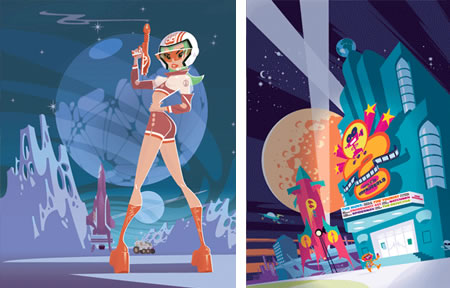
At a time when highly rendered or fully painted comics were a big trend, Hughes forged a highly graphic, flat color approach in which design played almost as important a role as drawing. If not exactly in a direct lineage to the ligne claire school of illustration and comic art (see my post on Hergé), notably because of the frequent absence of lines, he was nonetheless a defender of the principles at the root of that style.
Hughes was one of the early adopters of computer graphics for illustration and comic art, using Adobe Illustrator to create images in vector shapes. His style was very influential on illustrators in the 90’s and he continues to be widely noted for his distinctive approach. He was one of the earliest and most notable proponents of the “retro-60’s” style that has become prominent in illustration and animation (see my post on Ghostbot, creators of the familiar animated eSurance commercials).
Hughes is also notable a graphic designer and typeface designer and is one of the most influential designers in comics industry. If you’ve ever noticed the high level of graphic design in DC Comics, for example, particularly as compared to the more pedestrian and cluttered design in Marvel’s books; a good bit of that influence is from Hughes. He was also instrumental in the design overhaul of a number of British publications lass familiar to American audiences. Hughes created many logos that comics fans will instantly recognize, as well logos for a variety of other clients.
Hughes has been noted as a font designer and has designed numerous inventive and stylish display fonts, many created specifically for illustration, comics or design projects he was working on. (Must be nice to be that facile. Need a font? Design one!) You can see an overview of his fonts on Identifont as well as on his own site.
Hughes’ website is called Device, (formerly Device Fonts), and features his illustration, comics work, logos, design and fonts, as well as an impressive client list and some short animations.
Hughes’ site doesn’t include much of his comic book work as many would like, (comics fans may find much recognizable material in the Logos and Design sections, though).
A new collection has just been published under the title of Yesterday’s Tomorrows (not to be confused with the book of retro-futrism titled Yesterday’s Tomorrows: Past Visions of the American Future by Joseph Corn and Brian Horrigon).
There is an illustrated article about the book on the FirstPost site, and a more detailed review on Jog – The Blog.
[Suggestion courtesy of Jack Harris]