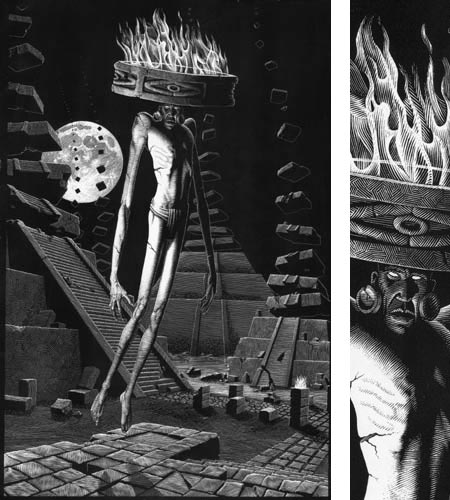
There is something particularly appealing about images created by an artist who is strongly skilled in the medium of scratchboard. This slightly arcane and quite demanding medium is the through-the-looking-glass version of pen and ink; in which black ink is taken away from the coating on a clay-surfaced board, and the image is built from lights rather than from darks.
It may be the texture, the balance of dark to light, or the characteristic line work, but I often find scratchboard images particularly compelling.
Patrick Arrasmith is an accomplished illustrator who works primarily in scratchboard, and his work is an excellent case in point.
Arrasmith’s clients include The New York Times, The Wall Street Journal, The Village Voice, Entertainment Weekly, Reader’s Digest, Outside, The Weekly Standard and numerous other periodicals and book publishers.
As you look through the work on his site, you are likely to see stylistic similarities to other practitioners of the art of scratchboard that I’ve featured in the past, like Mark Summers, Scott McKowen and Elizabeth Traynor; but on further inspection you’ll see farther reaching comparisons like the amazing scratchboard/pen and ink master Virgil Finlay, and even the lithographs of M.C. Escher.
Even though you might often wish for larger images of Arrasmith’s work, the images on his site are large enough to get some idea of the total piece, and there are often detail crops that show a bit of the texture of the scratchboard technique (image above, with slice of detail image, right).
Arrasmith seems to be restlessly exploring some of the possibilities of the medium, and his portfolio includes a series of figure studies, portraits of dogs and various experiments and personal pieces. At first I assumed that, like Finlay, he was combining “pure scratchboard” with pen and ink, but my impression is the most, if not all, of the pieces are completely brought out of the blackness of the ink coating with the finely scratched white lines.
There are some color pieces, in which the scratchboard drawing has had color applied over it, presumably digitally in Photoshop. A number of these have a nice balance of black and white to color in that the color has only been applied to selected areas of the image, leaving an appealing blend between the two approaches.
In all of them, though, there is that ineffable visual magic inherent in the scratching of white lines out of the dark mysteries of a flat black page.

