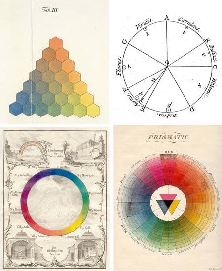
It’s been the subject of much discussion, some suggesting that it is misleading enough that it should be rethought entirely, but the color wheel remains the most common and convenient method for visually understanding and comparing the relationships of different hues.
As part of the Gutenberg-e project by the American Historical Association and Columbia University Press, Sarah Lowengard has written a scholarly treatise on The Creation of Color in Eighteenth-Century Europe, the third chapter of which, Number Order, Form, delves into the history of color wheels and other visual systems of ordering and visualizing the relationships of colors.
The link going around the web currently (I found it on Digg) is to a post on the Color Lovers blog, which has extracted selections from her paper into an article on the History of the Color Wheel.
Color circles have been used to describe associations of colors from medieval times, but the first known example of the representation of hue in the form of a wheel, or circle, commonly suggested as the original color wheel, is traced to Sir Isaac Newton; whose keen mind was for some time focused on the nature of light and color.
Other systematic visual arrangements of colors precede it, like Tobias Mayer’s Trhchromatic Graph [correction – see below], which he first described in 1758 (interpreted by Georg Christoph Lichtenberg, image above, top left), but Newton’s circle is recognizable as the predecessor of the one in modern art texts. (For a couple of color wheels that I find particularly useful, see my links to Bruce MacEvoy’s artist pigment color wheels on handprint at the end of this article.)
Newton’s experimentation splitting sunlight with a prism is relatively well-known. (It’s still a fun and instructive practice is you haven’t indulged in it, I got mine from Edmund Scientific.)
Less well known is Newton’s original color circle, or hue circle, which was actually a kind of pie-chart (image above, top right), in which the bands of color he observed were distributed in wedges corresponding to their width in the observed spectrum, and arranged around the circle in the order of their wavelength. Newton emphasized that his circle represented the properties of the color of light (additive color), not artists’ pigments (subtractive color).
It was Newton who accomplished something that I have long been fascinated with, and confused by — the “closing of the circle”.
Physical wavelengths of light, which our eyes and brains interpret as different hues, can be thought of a part of a linear arrangement, segments of the electromagnetic spectrum; a continuous band of wavelengths of energy from the very short (X-rays and Gamma rays), with wavelengths measured in the distances equivalent to atomic nuclei, to the very long (radio waves) with wavelengths measured in distances on a human scale (meters or 10’s of meters).
The spectrum of visible light sits somewhere in between, at wavelengths the size of protozoa (micrometers, or millionths of a meter, also known as microns), ranging from red on the short end at 700nm, to violet on the long end at 400nm.
But how, my fevered little brain would like to know, does this linear relationship bend back on itself, like the optical equivalent of a Möebius strip, and connect in a continuous band; and how does it fit into that neat and oh-so-convenient system of primary, secondary and tertiary colors, triads; and in particular, the dramatic, and apparently biologically founded, relationship of color wheel opposites, or complementary colors?
This seems to have something to do with a “gap” in the color wheel, between the physical wavelengths of red and violet, in which the purples fill in with colors that are not discrete frequencies on the spectrum, but combinations of others.
I have to admit that I’m still basically unclear about this, but let’s face it, we always knew purple was weird.
Correction and addendum: Divid Briggs, author of The Dimensions of Color, was kind enough to write a comment and point out that though many systems of color charts precede Newton, Mayer’s was not one of them.
He also appears to have an answer to my question about the “closing of the circle”, which comes from the opponent model of vision. He explains if briefly in his comment on this post, and in more detail on The Dimensions of Color.
It turns out that I’m obliquely familiar with this model of human vision, which is based on two “channels” or scales of color, redness vs greenness and yellowness vs blueness, and a lightness scale or channel, in that this is the color model on which the LAB (CIELAB) color space is modeled.
CIELAB (“LAB color”) is a color space used in Photoshop, and is the fundamental color space on which Photoshop bases its interpretations of other color spaces. If you convert between CMYK and RGB, for example, Photoshop converts to the first color space to LAB and then from LAB to the other. (Here’s Adobe’s Technote.)
The CIELAB color space, based in part on Munsell but founded on the biological way in which the cones in the eye react to color, was codified in 1931 by the Commission Internationale d’Eclairage (International Commission on Illumination) to describe all colors visible to the human eye.
The closed circle of the color wheel is a product of the related opponent model of vision in which the interaction of the redness to greenness and blueness to yellowness scales forms a circle, and the oppositions produce the famous complementary color effects with which artists are so familiar.
So there’s my answer. It’s in the eye of the beholder.

