Lines and Colors art blog

FM 100 Hue Test

FM 100 Hue Test
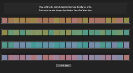
The FM 100 Hue Test is a seemingly simple test of your ability to discern close hue relationships, a sort of “color IQ test”.

The interactive is provided by x-rite, a company that makes Munsell-based color measurement products.

It consists of four bands of small squares of varying colors. Each band represents a scale of colors between two specific hues, represented by fixed squares at either end.

The task is to rearrange the drag-and-drop squares within each row to set them in the appropriate order of hue.

When you get down to the fine discrimination between hues that are very close, it becomes harder than it seems at first.

You get a score at the end, “0” being perfect, and the opportunity to compare your score to others of your gender and age group. There is also a feature, that I was unable to take advantage of because I came up with a perfect score, that allows you to see the color ranges within which you had the most difficulty discerning the close hue relationships.

Scorekeeping and the game-like element aside, this is an enlightening exercise in comparing closely related hues, something of concern to anyone working in color, particularly painters looking to match the colors they see when mixing paint.

One of the keys that helped me with the exercise was not being shy about moving closely related colors side to side after they were in position, making it a bit easier to compare them briefly in a different context. Many of the color squares, arranged in their correct relationship, can appear identical until you shift them one position to the right or left. That in itself is an interesting phenomenon.

As always when viewing or judging color, whether in isolation, on a palette, in a digital color picker or in a painting, the important factor is the relationship of a color to its adjacent colors.

Have fun.

[Via Art School at Home, via Making a Mark]

FM 100 Hue Test on xrite.com

Comments

14 responses to “FM 100 Hue Test”

  1. Nietzsche's Tears Avatar
    Nietzsche’s Tears

    Cool, but completely ignores the variable of monitor calibration/quality.

  2. True, the test isn’t set up for accurate representation of specific colors on screen, but it should work within the relative conditions of most monitors, as it’s self-contained, not referring to external colors.

  3. Very cool test. I scored a zero (perfect), too. I don’t know what I would have done if I hadn’t. Daggers to the eyes? Salt? Leap off the roof? Stare at the sun? Thanks for sharing it with us! http://www.matthewweld.com http://www.matthewweld.blogspot.com

  4. Actually, I think the exercise would be of most use to someone who scored less than perfect, in the form of its ability to highlight the color range in which the most confusion occurred, allowing one to study that color range in particular.

  5. Well, I did not score zero. I found it takes some getting used to. I’ve now taken it four times in two days and each time my score was twice as good as the previous. Maybe I was tired when I did it the first time. Or maybe I should stick to etching and drawing rather than painting…

    Like you Charley, I don’t think it matters what kind of calibration one’s monitor has or hasn’t. It’s an abstract test wherein the colors are relative only to each other. I do think there may be something to the idea that colors emitted in the virtual world of a backlit cathode ray tube or LCD screen may be rather different (easier to compare? harder to compare?) than comparing hues in the normal world of reflective surfaces around us.

  6. I do believe the quality of the monitor, and perhaps its settings (as opposed to calibration for matching printed color) can make a difference.

    If the monitor is not good at displaying subtle variations in hue, or is not operating a a high enough level of contrast, it could reduce the observer’s ability to detect subtle hue variations.

    If I get chance, I may try the test on my much cheaper HP Windows monitor and compare the results to the experience on my Apple Cinema Display.

  7. Argh! I’ve tried twice and I just cannot reach less than seven… I’ll be optimistic and say it’s probably because of my screen settings ;-p
    My daughter (6 in 20 days) scored an impressive 19!
    Thanks for the advice. I loved the test (as well as all the gems you find for us over the net.)
    Thanks for everything

    Czek

  8. I loved this! I got a 4, and what was interesting is I had errors in one little section of the green/yellow hue range. Very interesting exercise. Thank you for sharing!

  9. M. Belloulid Avatar
    M. Belloulid

    That was a fun and interesting test. I was concerned lately that my ability to discern color was diminishing– I guess not! I was able to get a perfect score…

  10. Damián Avatar

    I scored 14 the first time, then 4 the second time right away after the first try. According to it I have issues in the yellow-green area or something.

  11. The monitor calibration thing isn’t necessary because the important thing is the relation of each colour to each other not to some external printing source.

    I have scored 0 on a few different computers in different light conditions – tungsten/fluoro/day-light. Just because I was curious to see if it was possible in all conditions, all variations etc.

  12. Jeez, I got 35. It was blue/purple that killed me. It all started to look like periwinkle after awhile.

  13. michele Avatar

    What?! How do you guys get 0? I got 75!!! The whole third line thing was pretty much the same color all the way through! how can you distinguish differences in the same color?

    Are you sure you don’t mean you had 0 on SOME of the color things?

    1. Try my suggestion of moving adjacent tiles from one slot to the other frequently.

      Also, if your monitor is too dark or light, or is color-shifted, it would affect your ability to discern fine color differences.

      Try viewing a color calibration chart like this one: http://tomyeah.com/images/Monitor%20calibration%20chart.jpg (from here), and make sure you can see all of the distinctions of gray.