
Categories
- 3d CGI
- Amusements
- Animation
- Anime & Manga
- Art Materials
- Art Videos
- Blogroll
- Cartoons
- Color
- Comics
- Concept & Visual Dev.
- Creativity
- Digital Art
- Digital Painting
- Displaying Art on the Web
- Drawing
- Eye Candy for Today
- Gallery and Museum Art
- High-res Art Images
- Illustration
- Motion Graphics & Flash
- Museums
- Online Museums
- Outsider Art
- Painting
- Painting a Day
- Paleo Art
- Pastel, Conté & Chalk
- Pen & Ink
- Prints and Printmaking
- Reviews
- Sc-fi and Fantasy
- Sculpture & Dimensional
- Site Comments
- Sketching
- Storyboards
- Tools and Techniques
- Uncategorized
- Vector Art
- Videos & Podcasts
- Vision and Optics
- Watercolor and Gouache
- Webcomics
Archives
- May 2026
- April 2026
- March 2026
- February 2026
- January 2026
- December 2025
- November 2025
- October 2025
- September 2025
- August 2025
- July 2025
- June 2025
- May 2025
- January 2025
- December 2024
- November 2024
- October 2024
- September 2024
- August 2024
- June 2024
- April 2024
- March 2024
- February 2024
- January 2024
- December 2023
- November 2023
- October 2023
- September 2023
- August 2023
- July 2023
- May 2023
- April 2023
- March 2023
- February 2023
- January 2023
- December 2022
- November 2022
- September 2022
- August 2022
- July 2022
- June 2022
- May 2022
- April 2022
- March 2022
- February 2022
- January 2022
- December 2021
- November 2021
- October 2021
- September 2021
- August 2021
- July 2021
- June 2021
- May 2021
- April 2021
- March 2021
- February 2021
- January 2021
- December 2020
- November 2020
- October 2020
- September 2020
- August 2020
- July 2020
- June 2020
- May 2020
- April 2020
- March 2020
- February 2020
- January 2020
- December 2019
- November 2019
- October 2019
- September 2019
- August 2019
- July 2019
- June 2019
- May 2019
- April 2019
- March 2019
- February 2019
- January 2019
- December 2018
- November 2018
- October 2018
- September 2018
- August 2018
- July 2018
- June 2018
- May 2018
- April 2018
- March 2018
- February 2018
- January 2018
- December 2017
- November 2017
- October 2017
- September 2017
- August 2017
- July 2017
- June 2017
- May 2017
- April 2017
- March 2017
- February 2017
- January 2017
- December 2016
- November 2016
- October 2016
- September 2016
- August 2016
- July 2016
- June 2016
- May 2016
- April 2016
- March 2016
- February 2016
- January 2016
- December 2015
- November 2015
- October 2015
- September 2015
- August 2015
- July 2015
- June 2015
- May 2015
- April 2015
- March 2015
- February 2015
- January 2015
- December 2014
- November 2014
- October 2014
- September 2014
- August 2014
- July 2014
- June 2014
- May 2014
- April 2014
- March 2014
- February 2014
- January 2014
- December 2013
- November 2013
- October 2013
- September 2013
- August 2013
- July 2013
- June 2013
- May 2013
- April 2013
- March 2013
- February 2013
- January 2013
- December 2012
- November 2012
- October 2012
- September 2012
- August 2012
- July 2012
- June 2012
- May 2012
- April 2012
- March 2012
- February 2012
- January 2012
- December 2011
- November 2011
- October 2011
- September 2011
- August 2011
- July 2011
- June 2011
- May 2011
- April 2011
- March 2011
- February 2011
- January 2011
- December 2010
- November 2010
- October 2010
- September 2010
- August 2010
- July 2010
- June 2010
- May 2010
- April 2010
- March 2010
- February 2010
- January 2010
- December 2009
- November 2009
- October 2009
- September 2009
- August 2009
- July 2009
- June 2009
- May 2009
- April 2009
- March 2009
- February 2009
- January 2009
- December 2008
- November 2008
- October 2008
- September 2008
- August 2008
- July 2008
- June 2008
- May 2008
- April 2008
- March 2008
- February 2008
- January 2008
- December 2007
- November 2007
- October 2007
- September 2007
- August 2007
- July 2007
- June 2007
- May 2007
- April 2007
- March 2007
- February 2007
- January 2007
- December 2006
- November 2006
- October 2006
- September 2006
- August 2006
- July 2006
- June 2006
- May 2006
- April 2006
- March 2006
- February 2006
- January 2006
- December 2005
- November 2005
- October 2005
- September 2005
- August 2005
Relevant Blogs
Art, Painting & Sketch
- Gurney Journey
- Underpaintings
- Art and Influence
- Painting Perceptions
- Oil Painters of America
- Vasari Paint POV
- Flying Fox
- Urban Sketchers
- Bento (Smithsonian)
- Art Inconnu
- The Hidden Place
- Still Life
- Making a Mark
- The Art of the Landscape
- Exploring Color & Creativity
- Art Contrarian
- Artist A Day
- beinArt Surreal Art Collective
- Eye Level
- David Dunlop
- p.i.g.m.e.n.t.i.u.m
- CultureGrrl
- Joaquín Sorolla blog
- Artists in Pastel
“Painting a Day”
- A Painting a Day (Keiser)
- On Painting (Keiser)
- Julian Merrow-Smith
- Karen Jurick
- Jeffrey Hayes
- Carol Marine
- Abbey Ryan
- Daily Paintworks
Other Painting Blogs
- Virtual Gouache Land
- Neil Hollingsworth
- Marc Hanson
- Kevin Menck
- Marc Dalessio
- Larry Seiler
- Stapleton Kearns
- Colin Page
- Roos Schuring
- Hans Versfelt
- Titus Meeuws
- Régis Pettinari
- René Plein Air
- Belinda Del Pesco
- Robin Weiss
- Nathan Fowkes (Land Sketch)
- William Wray
- Frank Serrano
- Stephen Magsig
- Michael Chesley Johnson
- Twice a Week
- Sarah Wimperis
- Rob Adams
- Michael Cole Manley
- The Dirty Palette Club
- Mike Manley’s Draw!
Gallery Art & Illustration mix
Illustration
- Howard Pyle
- 100 Years of Illustration
- BibliOdyssey
- Illustration Art
- Today’s Inspiration
- Illustration Mundo
- Little Chimp Society
- Danny Gregory
- R D (John Martz
- Illustration Friday blog
- Monster Brains
- Illustrators & Illustrations (RU)
- Elwood H. Smith
- DaniDraws.com
- Designers Who Blog
- iSpot Blog
Sci-Fi & Fantasy
Illustration & Comics
Comics & Cartoons
- Comics Beat
- Robot 6
- Newsarama Blog
- Comic Vine
- Comics Alliance
- Forbidden Planet Int.
- Paolo Rivera
- Bolt City
- Flight
- Scott McCloud
- The Comics Journal
- Comixpedia
- Funnybook Babylon
- James Baker
- Middleton’s Sketchbook
- Boneville
- The Hotel Fred
- Paul Rivoche
- Daily Cartoonist
- Mad About Cartoons (William Wray)
- Digital Strips
Illustration & Concept
Animation & Concept
- Cartoon Brew
- Animation Blog
- Cold Hard Flash
- Concept Art World
- The CAB
- FY Concept Art
- Concept Ships
- Concept Robots
- John Nevarez
- Armand Serrano
- Marcos Mateu-Mestre
- all kinds of stuff (Kricfalusi)
- Yacin the faun (Man Arenas)
- Kelsey Mann
- Cre8tivemarks Blog
- Ice-Cream Monster Toon Cafe
- AAU Character & Creature Design
- AAU Animation Notes
- Articles and Texticles
Paleo & Scientific
Tools & Techniques
Other
Lists of Art Blogs
Art Image Resource Links
Historic Art Images
- Wikimedia Commons: Paintings
- Wikimedia Commons: Drawings
- The Athenaeum
- WikiArt (WikiPaintings)
- Google Art Project: Artists
- Google Art Project: Collections (Museums)
- ArtCyclopedia
- Web Gallery of Art
- Art Renewal Center
- Web Gallery of Impressionism
Auction Consolidation sites
Auction sites
- Sotheby’s
- Bonham’s
- Christies
- Heritage Auctions: Fine Art
- Heritage Auctions: Illustration
- Freeman’s Auctions
- Bukowskis
- Shannon’s
Image Search
Reverse Image Search (search by image)
- Tin Eye
- RevImg
- Google Image Search (camera icon)
- Bing Image Search (camera icon)
Promoting some friends and some clients of my website design business
- Twin Willows T’ai Chi studio in Wilmington DE. Taiji classes with Bryan Davis.
- Ray Hayward, Inspired Teacher of T’ai Chi ( Taiji ) in Minneapolis, Founder of Mindful Motion Tai Chi Academy
- OldHead Tattoo studio and Art Gallery in Wilmington DE. Tattoos and paintings by Bruce Gulick
- Sharon Domenico Art, pet portrait oil paintings
- Platinum Paperhanging, wallpaper hanging, Main Line and Philadelphia, PA
- Lisa Stone Design, interior designer, Main Line and Philadelphia, PA
- Studio12KPT, original art, prints, calendars and other custom printed items by Van Sickle & Rolleri
-
Eye Candy for Today: Correggio’s Ganymede
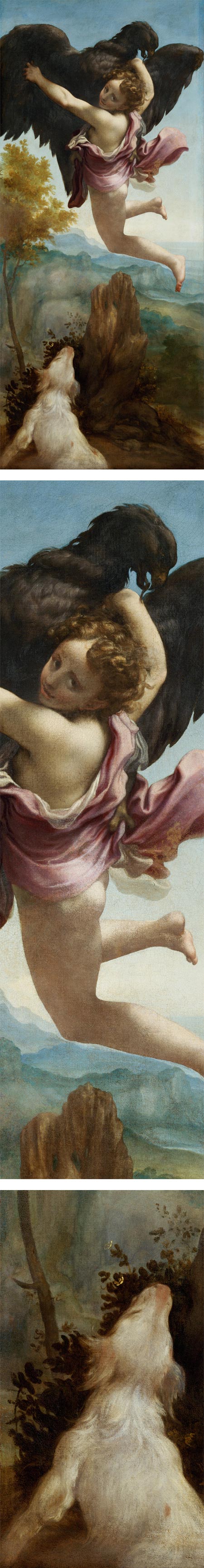 The Abduction of Ganymede, Antonio Allegri, called Correggio.
On Google Cultural Institute: Art Project. Large version also available on Wikimedia Commons (7.7mb).
Original is in the Kunsthistorisches Museum Vienna
Categories:
-
Michael Sowa (update)

When I first wrote about the delightfully whimsical and decidedly off-kilter paintings of German artist Michael Sowa back in 2006, I had to refer readers to poster sites to view examples of his work.I still can’t find a dedicated web presence for Sowa — though there is a portfolio on the site of artists’ rep, Margarethe Hubauer — but a number of his paintings have been posted to WikiPaintings, and there are a few other sources for images in the form of articles and blog posts.
There is a collection of his work, Sowa’s Ark, that is of of print but available used. There is also now a video clip showing how some of his art was used in the 2001 film Le fabuleux destin d’Amélie Poulain (released in the US. as Amelie).
For more information and background, see my previous post on Michael Sowa.
[Via MonsterBrains]
Categories:
-
More on Sargent watercolors at the Brooklyn Museum

As I reported back in May (don’t say I didn’t give you advance notice on this one), there is a once-in-a-lifetime show of ninety-three of John Singer Sargent’s dazzling watercolors, supplemented with nine beautiful oils, at the Brooklyn Museum until July 28, 2013.The show then moves to the Museum of Fine Arts, Boston, where it will be on display from October 13, 2013 to January 20, 2014. The exhibition draws on the strong collections of Sargent’s work in both museums.
As I had hoped, I was able to get to the show in Brooklyn, and… wow. Just wow.
I’ve insisted for years that Sargent should receive greater credit as a painter — credit he is finally receiving, along with increased recognition and popularity — but my already high assessment of his skills was raised even further by this show.
One thing that struck me in particular about Sargent’s approach to watercolor as revealed in the exhibition, was the way he pushed his medium in the service of his attention to the image. While I have no doubt that Sargent’s refined oil portraits were crafted with superb attention to their archival qualities, his watercolors were primarily done for himself, likely with less thought to their value as paintings. This was Sargent traveling, enjoying life, escaping from the demands of his society portraits and indulging in painting for the pleasure of painting.
In his use of watercolor, Sargent was anything but a purest, mixing transparent and opaque watercolor (gouache), using drybrush, wax resist, scratching out, and laying on the paint from the tube — both transparent and opaque paints — so thickly as to pass the limits of the paint to dry properly, leaving a few images, notably from the Bedouin series, cracking from their overly thick application.
The show, which is superbly curated, arranged and annotated, points this out, devotes considerable attention to his technique, and even displays of some of Sargent’s own materials, including still wet tubes of his paints from which conservators in Boston made test swatches of some of his colors.
The exhibition also includes nine superb oils (that in themselves would make a terrific exhibition), and gives an unusually opportunity to compare his approach to similar subjects in the different mediums (images above, bottom four).
If you can seen the exhibition, I recommend it highly. If not, I’ve listed some of my previous posts below with links to some online resources.
Having seen the exhibition catalog, which is certainly nice enough, I will still recommend The Watercolors of John Singer Singer Sargent by Carl Little as much as (if not more than) the catalog.
Though there are other artists whose command of watercolor is on a level with Sargent, notably Winslow Homer and some of the 19th century British watercolorists, I doubt that any could be considered conclusively his better.
Categories:
-
David Parkins

Illustrator and cartoonist David Parkins, originally from the UK and now based in Canada, has had a long career creating editorial illustrations, political cartoons and satirical comics for some of Britain and Canada’s top publications. In addition he has illustrated a number of children’s books.In the introduction to his website, Parkins points out that he is about to break the advice often given to illustrators when presenting their work (online or otherwise) to focus on a particular style, lest art directors become confused by their inability to compartmentalize an artist with multiple styles.
Much to our delight, Parkins proceeds to display a wonderful variety of rendering styles — from cartoony to realistic to retro — and editorial approaches, from charmingly innocent to bitingly acid.
Choose from his portfolio sections and drill down through the categories into individual publications or types of illustration.
In all of them, Parkins displays an obvious enthusiasm for drawing and graphically communicating a strong point of view, whirling his pen and watercolor through layers of politics and society, on out into the unfettered whimsey of children’s books.
Categories:
-
Eye Candy for Today: Ingres portrait of Princesse de Broglie
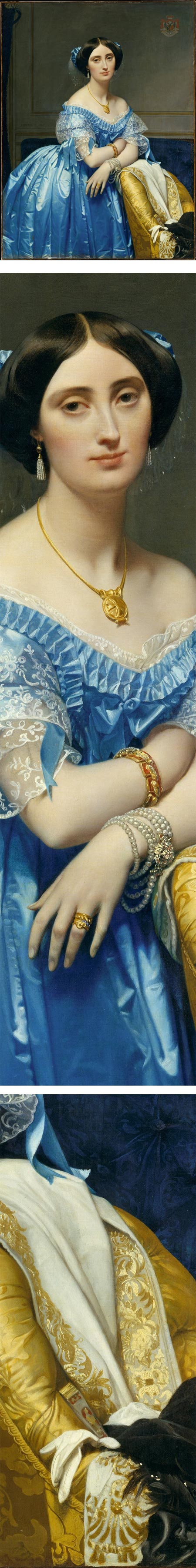
Joséphine-Éléonore-Marie-Pauline de Galard de Brassac de Béarn (1825–1860), Princesse de Broglie, Jean-Auguste-Dominique IngresIn addition to dazzling the eye with his handling of face, figure, fabric and jewelry, Ingres leaves no doubt that he has nailed the sitter’s likeness.
In the Metropolitan Museum of Art. Use “Fullscreen” link and download arrow.
Categories:
-
James Peale

Today is July 4, or “Indepenence Day” here in the U.S., a holiday on which we celebrate our freedom from having to pay undue deference to rich people with certain family bloodlines, and instead can devote our worshipful attention to talentless entertainment celebrities — as is just and right.It’s also a day in which attention is paid to happenings in the mid to late eighteenth century, when the “Founding Fathers” who pushed the British colonies on this continent to independence were doing their thing. At the same time, American artists were coming into their own, painting American subjects and establishing their own styles.
James Peale was a notable American painter of the time, though he is often overshadowed by his more famous and influential brother, Charles Wilson Peale, from who he learned to paint.
Though he had begun to establish a reputation on his own as a still life and portrait painter, when his brother offered him his already thriving practice in painting miniature portraits, James Peale largely set aside his other work and took up painting miniatures, usually in watercolor on ivory.
Later in his career, as his eyesight grew less acute, he moved away from miniatures and back into still life and full size portraiture (see his self-portrait, images above, bottom), as well as some landscapes and history painting. It was as a still life painter that he really came into his own, effectively creating a distinctive and influential style that can be called the Philadelphia school of still life.
I “came across” James Peale recently, as I was plein air painting in the graveyard of Gloria Dei (“Old Swedes”) Church here in Philadelphia, about 30 feet from his grave marker.
Categories:


Charley’s Picks
Bookshop.org
(Bookshop.org affilliate links; sales benefit independent bookshop owners; I get a small percentage to help support my work on Lines and Colors)

John Singer Sargent: Watercolors


Urban Sketching: Understanding Perspective


Charley’s Picks
Amazon
(Amazon.com affiliate links; sales go to a larger yacht for Jeff Bezos; but I get a small percentage to help support my work on Lines and Colors)
John Singer Sargent: Watercolors
Urban Sketching: Understanding Perspective