
Categories
- 3d CGI
- Amusements
- Animation
- Anime & Manga
- Art Materials
- Art Videos
- Blogroll
- Cartoons
- Color
- Comics
- Concept & Visual Dev.
- Creativity
- Digital Art
- Digital Painting
- Displaying Art on the Web
- Drawing
- Eye Candy for Today
- Gallery and Museum Art
- High-res Art Images
- Illustration
- Motion Graphics & Flash
- Museums
- Online Museums
- Outsider Art
- Painting
- Painting a Day
- Paleo Art
- Pastel, Conté & Chalk
- Pen & Ink
- Prints and Printmaking
- Reviews
- Sc-fi and Fantasy
- Sculpture & Dimensional
- Site Comments
- Sketching
- Storyboards
- Tools and Techniques
- Uncategorized
- Vector Art
- Videos & Podcasts
- Vision and Optics
- Watercolor and Gouache
- Webcomics
Archives
- May 2026
- April 2026
- March 2026
- February 2026
- January 2026
- December 2025
- November 2025
- October 2025
- September 2025
- August 2025
- July 2025
- June 2025
- May 2025
- January 2025
- December 2024
- November 2024
- October 2024
- September 2024
- August 2024
- June 2024
- April 2024
- March 2024
- February 2024
- January 2024
- December 2023
- November 2023
- October 2023
- September 2023
- August 2023
- July 2023
- May 2023
- April 2023
- March 2023
- February 2023
- January 2023
- December 2022
- November 2022
- September 2022
- August 2022
- July 2022
- June 2022
- May 2022
- April 2022
- March 2022
- February 2022
- January 2022
- December 2021
- November 2021
- October 2021
- September 2021
- August 2021
- July 2021
- June 2021
- May 2021
- April 2021
- March 2021
- February 2021
- January 2021
- December 2020
- November 2020
- October 2020
- September 2020
- August 2020
- July 2020
- June 2020
- May 2020
- April 2020
- March 2020
- February 2020
- January 2020
- December 2019
- November 2019
- October 2019
- September 2019
- August 2019
- July 2019
- June 2019
- May 2019
- April 2019
- March 2019
- February 2019
- January 2019
- December 2018
- November 2018
- October 2018
- September 2018
- August 2018
- July 2018
- June 2018
- May 2018
- April 2018
- March 2018
- February 2018
- January 2018
- December 2017
- November 2017
- October 2017
- September 2017
- August 2017
- July 2017
- June 2017
- May 2017
- April 2017
- March 2017
- February 2017
- January 2017
- December 2016
- November 2016
- October 2016
- September 2016
- August 2016
- July 2016
- June 2016
- May 2016
- April 2016
- March 2016
- February 2016
- January 2016
- December 2015
- November 2015
- October 2015
- September 2015
- August 2015
- July 2015
- June 2015
- May 2015
- April 2015
- March 2015
- February 2015
- January 2015
- December 2014
- November 2014
- October 2014
- September 2014
- August 2014
- July 2014
- June 2014
- May 2014
- April 2014
- March 2014
- February 2014
- January 2014
- December 2013
- November 2013
- October 2013
- September 2013
- August 2013
- July 2013
- June 2013
- May 2013
- April 2013
- March 2013
- February 2013
- January 2013
- December 2012
- November 2012
- October 2012
- September 2012
- August 2012
- July 2012
- June 2012
- May 2012
- April 2012
- March 2012
- February 2012
- January 2012
- December 2011
- November 2011
- October 2011
- September 2011
- August 2011
- July 2011
- June 2011
- May 2011
- April 2011
- March 2011
- February 2011
- January 2011
- December 2010
- November 2010
- October 2010
- September 2010
- August 2010
- July 2010
- June 2010
- May 2010
- April 2010
- March 2010
- February 2010
- January 2010
- December 2009
- November 2009
- October 2009
- September 2009
- August 2009
- July 2009
- June 2009
- May 2009
- April 2009
- March 2009
- February 2009
- January 2009
- December 2008
- November 2008
- October 2008
- September 2008
- August 2008
- July 2008
- June 2008
- May 2008
- April 2008
- March 2008
- February 2008
- January 2008
- December 2007
- November 2007
- October 2007
- September 2007
- August 2007
- July 2007
- June 2007
- May 2007
- April 2007
- March 2007
- February 2007
- January 2007
- December 2006
- November 2006
- October 2006
- September 2006
- August 2006
- July 2006
- June 2006
- May 2006
- April 2006
- March 2006
- February 2006
- January 2006
- December 2005
- November 2005
- October 2005
- September 2005
- August 2005
Relevant Blogs
Art, Painting & Sketch
- Gurney Journey
- Underpaintings
- Art and Influence
- Painting Perceptions
- Oil Painters of America
- Vasari Paint POV
- Flying Fox
- Urban Sketchers
- Bento (Smithsonian)
- Art Inconnu
- The Hidden Place
- Still Life
- Making a Mark
- The Art of the Landscape
- Exploring Color & Creativity
- Art Contrarian
- Artist A Day
- beinArt Surreal Art Collective
- Eye Level
- David Dunlop
- p.i.g.m.e.n.t.i.u.m
- CultureGrrl
- Joaquín Sorolla blog
- Artists in Pastel
“Painting a Day”
- A Painting a Day (Keiser)
- On Painting (Keiser)
- Julian Merrow-Smith
- Karen Jurick
- Jeffrey Hayes
- Carol Marine
- Abbey Ryan
- Daily Paintworks
Other Painting Blogs
- Virtual Gouache Land
- Neil Hollingsworth
- Marc Hanson
- Kevin Menck
- Marc Dalessio
- Larry Seiler
- Stapleton Kearns
- Colin Page
- Roos Schuring
- Hans Versfelt
- Titus Meeuws
- Régis Pettinari
- René Plein Air
- Belinda Del Pesco
- Robin Weiss
- Nathan Fowkes (Land Sketch)
- William Wray
- Frank Serrano
- Stephen Magsig
- Michael Chesley Johnson
- Twice a Week
- Sarah Wimperis
- Rob Adams
- Michael Cole Manley
- The Dirty Palette Club
- Mike Manley’s Draw!
Gallery Art & Illustration mix
Illustration
- Howard Pyle
- 100 Years of Illustration
- BibliOdyssey
- Illustration Art
- Today’s Inspiration
- Illustration Mundo
- Little Chimp Society
- Danny Gregory
- R D (John Martz
- Illustration Friday blog
- Monster Brains
- Illustrators & Illustrations (RU)
- Elwood H. Smith
- DaniDraws.com
- Designers Who Blog
- iSpot Blog
Sci-Fi & Fantasy
Illustration & Comics
Comics & Cartoons
- Comics Beat
- Robot 6
- Newsarama Blog
- Comic Vine
- Comics Alliance
- Forbidden Planet Int.
- Paolo Rivera
- Bolt City
- Flight
- Scott McCloud
- The Comics Journal
- Comixpedia
- Funnybook Babylon
- James Baker
- Middleton’s Sketchbook
- Boneville
- The Hotel Fred
- Paul Rivoche
- Daily Cartoonist
- Mad About Cartoons (William Wray)
- Digital Strips
Illustration & Concept
Animation & Concept
- Cartoon Brew
- Animation Blog
- Cold Hard Flash
- Concept Art World
- The CAB
- FY Concept Art
- Concept Ships
- Concept Robots
- John Nevarez
- Armand Serrano
- Marcos Mateu-Mestre
- all kinds of stuff (Kricfalusi)
- Yacin the faun (Man Arenas)
- Kelsey Mann
- Cre8tivemarks Blog
- Ice-Cream Monster Toon Cafe
- AAU Character & Creature Design
- AAU Animation Notes
- Articles and Texticles
Paleo & Scientific
Tools & Techniques
Other
Lists of Art Blogs
Art Image Resource Links
Historic Art Images
- Wikimedia Commons: Paintings
- Wikimedia Commons: Drawings
- The Athenaeum
- WikiArt (WikiPaintings)
- Google Art Project: Artists
- Google Art Project: Collections (Museums)
- ArtCyclopedia
- Web Gallery of Art
- Art Renewal Center
- Web Gallery of Impressionism
Auction Consolidation sites
Auction sites
- Sotheby’s
- Bonham’s
- Christies
- Heritage Auctions: Fine Art
- Heritage Auctions: Illustration
- Freeman’s Auctions
- Bukowskis
- Shannon’s
Image Search
Reverse Image Search (search by image)
- Tin Eye
- RevImg
- Google Image Search (camera icon)
- Bing Image Search (camera icon)
Promoting some friends and some clients of my website design business
- Twin Willows T’ai Chi studio in Wilmington DE. Taiji classes with Bryan Davis.
- Ray Hayward, Inspired Teacher of T’ai Chi ( Taiji ) in Minneapolis, Founder of Mindful Motion Tai Chi Academy
- OldHead Tattoo studio and Art Gallery in Wilmington DE. Tattoos and paintings by Bruce Gulick
- Sharon Domenico Art, pet portrait oil paintings
- Platinum Paperhanging, wallpaper hanging, Main Line and Philadelphia, PA
- Lisa Stone Design, interior designer, Main Line and Philadelphia, PA
- Studio12KPT, original art, prints, calendars and other custom printed items by Van Sickle & Rolleri
-
Tiago Hoisel

Tiago Hoisel is an illustrator and digital painter from Brazil. Hoisel works primarily in Photoshop to create his wildly exaggerated portrayals of people, famous and otherwise, as well as animals and other characters.His caricatures, as stretched and loopy as they may be, are grounded in the tactile realism of detailed textures and firm control of light and shadow.
Though his own blog has not been updated recently, you can find galleries of his work on CGHub and CGSociety.
[Via Metafilter]
Categories:
-
Eye Candy for Today: Corot landscape “sketch”
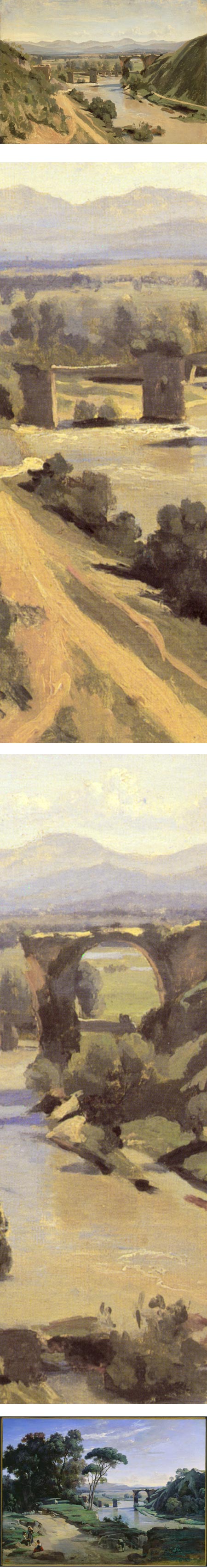
The Bridge at Narni, Jean-Baptiste Camille Corot.One of my favorite landscapes by Corot (or by anyone for that matter) — a shining example of why Corot and his compatriots in the Forest of Fontainebleau, along with Boudin, Courbet, Constable, Jongkind and a few others, were considered the precursors of French Impressionism, and by extension, most of the subsequent practitioners of painterly realism.
This was a plein air study for this painting, in the National Gallery of Canada (image above, bottom).
The study is in the Louvre; unfortunately not reproduced very large on their site. There is a larger version on Wikipaintings; but the color seems a bit off. I trust the Louvre’s reproduction better.
The top image is from the Louvre’s site; my close up crops are from an attempt to color correct the large version to look more like the Louvre’s reproduction (not quite true).
Categories:
-
Katie O’Hagan

Originally from Scotland, Katie O’Hagan moved to the U.S. after receiving a degree in silversmithing at Edinburgh College of Art.It was almost 10 years later that she began working in oils. She is now known for her incisive portraits, many of which are set in unusual compositions or settings, and some of which have a narrative element.
She has also done a series of “portrait groupings”, in which she portrays several individuals, usually members of a family, in stylistically related individual paintings rather than a more traditional group composition (images above, bottom three).
O’Hagan’s website includes a gallery of these as well as a gallery of her more varied portrait approaches.
I was particularly struck by her impressive use of low-light, or overcast day illumination in portraiture. This is very evident in her portrait of her oldest daughter (above, top with detail), set at twilight in Death Valley. The soft value contrasts in the modeling of the face are handled in a way that accentuates the dimensionality and physical presence of her subject rather than diminishing them.
There is an interview with the artist on The Artist’s Network.
O’Hagan received a Portrait Society of America Certificate of Excellence in 2012.
[Via Underpaintings]
Categories:
-
Thomas Paquette: Souvenir
I’ve written before (here and here) about the unique and wonderful visual character of Thomas Paquette’s landscape paintings, both large and small.Paquette is painter based in Western Pennsylvania. I’ve had the pleasure of seeing two shows of his work here in Philadelphia, and I’ve been looking forward to a third, new show that is currently at the Gross McCleaf Gallery titled “Souvenir”.
I was hoping to see the show before writing my post, but I don’t want my difficult schedule keep me from letting those in the area know about the show while there is still plenty of time to see it. (I’m determined to see it before it leaves, but it may come down to the last weekend).
Paquette’s work, while at first glance of relatively common landscape subjects of trees, rivers and fields, is on closer examination a marvel of edges and subtleties of color. He uses a carefully chosen range of colors, at once muted and vibrant, arranged within a delicate laticework of edges — a freeform geometry of suggested, but not actually drawn, lines.
I’ve surmised in the past that some of this may have come out of Paquette’s work with gouache — in which he paints absolutely fascinating miniatures — and the tendency of that paint to lay flat in areas, and form more defined edges where colors meet than other media like oil. Whether that’s the case or not, the effect has taken on a life of its own in his large oils, giving them a wonderful textural feeling from across the room, and a quality of freeform abstractions in their close up surface.
Though he paints reference sketches and studies in the field, Paquette’s final paintings are finished in the studio, often refined over a period of months in which the surface is worked and reworked until he arrives at the state of balance he is trying to achieve.
There are galleries of his work in Paquette’s website in several categories. There is also a page, not in the regular drop-down navigation, of works from the South of France.
As appealing as his paintings are in reproduction, they are much more so in person. If you get a chance to see the show here in Philadelphia, of one of his other shows in various locations, I recommend it.
Thomas Paquette: Souvenir is on view at the Gross McCleaf Gallery in Philadelphia until February 23, 2013.
(Note that the link to the show will only be relevant until the show is over, and will then point to the gallery’s next show. Their online pages for the artist, however, should remain current.)
Categories:
-
Eye Candy for Today: Brueghel still life

A Basket of Flowers, Jan Brueghel the Younger.Though not as accomplished as his father, Jan Brueghel the Younger turns in a 17th century tour de force of clear observation and fidelity to nature.
In the Metropolitan Museum of Art. Use “Fullscreen” link.
Categories:
-
Japanese Manhole Covers
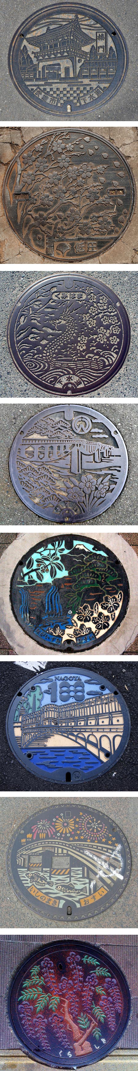
Here in the U.S, manhole covers are treated as simple utilitarian access to underground systems, and their design generally reflects that — just a utility hatch.In Japan, however, a large number of municipalities use the same kind of utility opening covers to express their local identity, with decorative covers that portray local landmarks, plants, animals, festivals and other elements of cultural or civic import.
There is an extensive Flickr group devoted to them and a book on the appreciation of them called Drainspotting.
[Via Salon]
Categories:


Charley’s Picks
Bookshop.org
(Bookshop.org affilliate links; sales benefit independent bookshop owners; I get a small percentage to help support my work on Lines and Colors)

John Singer Sargent: Watercolors


Urban Sketching: Understanding Perspective


)
Charley’s Picks
Amazon
(Amazon.com affiliate links; sales go to a larger yacht for Jeff Bezos; but I get a small percentage to help support my work on Lines and Colors)
John Singer Sargent: Watercolors
Urban Sketching: Understanding Perspective