
Categories
- 3d CGI
- Amusements
- Animation
- Anime & Manga
- Art Materials
- Art Videos
- Blogroll
- Cartoons
- Color
- Comics
- Concept & Visual Dev.
- Creativity
- Digital Art
- Digital Painting
- Displaying Art on the Web
- Drawing
- Eye Candy for Today
- Gallery and Museum Art
- High-res Art Images
- Illustration
- Motion Graphics & Flash
- Museums
- Online Museums
- Outsider Art
- Painting
- Painting a Day
- Paleo Art
- Pastel, Conté & Chalk
- Pen & Ink
- Prints and Printmaking
- Reviews
- Sc-fi and Fantasy
- Sculpture & Dimensional
- Site Comments
- Sketching
- Storyboards
- Tools and Techniques
- Uncategorized
- Vector Art
- Videos & Podcasts
- Vision and Optics
- Watercolor and Gouache
- Webcomics
Archives
- May 2026
- April 2026
- March 2026
- February 2026
- January 2026
- December 2025
- November 2025
- October 2025
- September 2025
- August 2025
- July 2025
- June 2025
- May 2025
- January 2025
- December 2024
- November 2024
- October 2024
- September 2024
- August 2024
- June 2024
- April 2024
- March 2024
- February 2024
- January 2024
- December 2023
- November 2023
- October 2023
- September 2023
- August 2023
- July 2023
- May 2023
- April 2023
- March 2023
- February 2023
- January 2023
- December 2022
- November 2022
- September 2022
- August 2022
- July 2022
- June 2022
- May 2022
- April 2022
- March 2022
- February 2022
- January 2022
- December 2021
- November 2021
- October 2021
- September 2021
- August 2021
- July 2021
- June 2021
- May 2021
- April 2021
- March 2021
- February 2021
- January 2021
- December 2020
- November 2020
- October 2020
- September 2020
- August 2020
- July 2020
- June 2020
- May 2020
- April 2020
- March 2020
- February 2020
- January 2020
- December 2019
- November 2019
- October 2019
- September 2019
- August 2019
- July 2019
- June 2019
- May 2019
- April 2019
- March 2019
- February 2019
- January 2019
- December 2018
- November 2018
- October 2018
- September 2018
- August 2018
- July 2018
- June 2018
- May 2018
- April 2018
- March 2018
- February 2018
- January 2018
- December 2017
- November 2017
- October 2017
- September 2017
- August 2017
- July 2017
- June 2017
- May 2017
- April 2017
- March 2017
- February 2017
- January 2017
- December 2016
- November 2016
- October 2016
- September 2016
- August 2016
- July 2016
- June 2016
- May 2016
- April 2016
- March 2016
- February 2016
- January 2016
- December 2015
- November 2015
- October 2015
- September 2015
- August 2015
- July 2015
- June 2015
- May 2015
- April 2015
- March 2015
- February 2015
- January 2015
- December 2014
- November 2014
- October 2014
- September 2014
- August 2014
- July 2014
- June 2014
- May 2014
- April 2014
- March 2014
- February 2014
- January 2014
- December 2013
- November 2013
- October 2013
- September 2013
- August 2013
- July 2013
- June 2013
- May 2013
- April 2013
- March 2013
- February 2013
- January 2013
- December 2012
- November 2012
- October 2012
- September 2012
- August 2012
- July 2012
- June 2012
- May 2012
- April 2012
- March 2012
- February 2012
- January 2012
- December 2011
- November 2011
- October 2011
- September 2011
- August 2011
- July 2011
- June 2011
- May 2011
- April 2011
- March 2011
- February 2011
- January 2011
- December 2010
- November 2010
- October 2010
- September 2010
- August 2010
- July 2010
- June 2010
- May 2010
- April 2010
- March 2010
- February 2010
- January 2010
- December 2009
- November 2009
- October 2009
- September 2009
- August 2009
- July 2009
- June 2009
- May 2009
- April 2009
- March 2009
- February 2009
- January 2009
- December 2008
- November 2008
- October 2008
- September 2008
- August 2008
- July 2008
- June 2008
- May 2008
- April 2008
- March 2008
- February 2008
- January 2008
- December 2007
- November 2007
- October 2007
- September 2007
- August 2007
- July 2007
- June 2007
- May 2007
- April 2007
- March 2007
- February 2007
- January 2007
- December 2006
- November 2006
- October 2006
- September 2006
- August 2006
- July 2006
- June 2006
- May 2006
- April 2006
- March 2006
- February 2006
- January 2006
- December 2005
- November 2005
- October 2005
- September 2005
- August 2005
Relevant Blogs
Art, Painting & Sketch
- Gurney Journey
- Underpaintings
- Art and Influence
- Painting Perceptions
- Oil Painters of America
- Vasari Paint POV
- Flying Fox
- Urban Sketchers
- Bento (Smithsonian)
- Art Inconnu
- The Hidden Place
- Still Life
- Making a Mark
- The Art of the Landscape
- Exploring Color & Creativity
- Art Contrarian
- Artist A Day
- beinArt Surreal Art Collective
- Eye Level
- David Dunlop
- p.i.g.m.e.n.t.i.u.m
- CultureGrrl
- Joaquín Sorolla blog
- Artists in Pastel
“Painting a Day”
- A Painting a Day (Keiser)
- On Painting (Keiser)
- Julian Merrow-Smith
- Karen Jurick
- Jeffrey Hayes
- Carol Marine
- Abbey Ryan
- Daily Paintworks
Other Painting Blogs
- Virtual Gouache Land
- Neil Hollingsworth
- Marc Hanson
- Kevin Menck
- Marc Dalessio
- Larry Seiler
- Stapleton Kearns
- Colin Page
- Roos Schuring
- Hans Versfelt
- Titus Meeuws
- Régis Pettinari
- René Plein Air
- Belinda Del Pesco
- Robin Weiss
- Nathan Fowkes (Land Sketch)
- William Wray
- Frank Serrano
- Stephen Magsig
- Michael Chesley Johnson
- Twice a Week
- Sarah Wimperis
- Rob Adams
- Michael Cole Manley
- The Dirty Palette Club
- Mike Manley’s Draw!
Gallery Art & Illustration mix
Illustration
- Howard Pyle
- 100 Years of Illustration
- BibliOdyssey
- Illustration Art
- Today’s Inspiration
- Illustration Mundo
- Little Chimp Society
- Danny Gregory
- R D (John Martz
- Illustration Friday blog
- Monster Brains
- Illustrators & Illustrations (RU)
- Elwood H. Smith
- DaniDraws.com
- Designers Who Blog
- iSpot Blog
Sci-Fi & Fantasy
Illustration & Comics
Comics & Cartoons
- Comics Beat
- Robot 6
- Newsarama Blog
- Comic Vine
- Comics Alliance
- Forbidden Planet Int.
- Paolo Rivera
- Bolt City
- Flight
- Scott McCloud
- The Comics Journal
- Comixpedia
- Funnybook Babylon
- James Baker
- Middleton’s Sketchbook
- Boneville
- The Hotel Fred
- Paul Rivoche
- Daily Cartoonist
- Mad About Cartoons (William Wray)
- Digital Strips
Illustration & Concept
Animation & Concept
- Cartoon Brew
- Animation Blog
- Cold Hard Flash
- Concept Art World
- The CAB
- FY Concept Art
- Concept Ships
- Concept Robots
- John Nevarez
- Armand Serrano
- Marcos Mateu-Mestre
- all kinds of stuff (Kricfalusi)
- Yacin the faun (Man Arenas)
- Kelsey Mann
- Cre8tivemarks Blog
- Ice-Cream Monster Toon Cafe
- AAU Character & Creature Design
- AAU Animation Notes
- Articles and Texticles
Paleo & Scientific
Tools & Techniques
Other
Lists of Art Blogs
Art Image Resource Links
Historic Art Images
- Wikimedia Commons: Paintings
- Wikimedia Commons: Drawings
- The Athenaeum
- WikiArt (WikiPaintings)
- Google Art Project: Artists
- Google Art Project: Collections (Museums)
- ArtCyclopedia
- Web Gallery of Art
- Art Renewal Center
- Web Gallery of Impressionism
Auction Consolidation sites
Auction sites
- Sotheby’s
- Bonham’s
- Christies
- Heritage Auctions: Fine Art
- Heritage Auctions: Illustration
- Freeman’s Auctions
- Bukowskis
- Shannon’s
Image Search
Reverse Image Search (search by image)
- Tin Eye
- RevImg
- Google Image Search (camera icon)
- Bing Image Search (camera icon)
Promoting some friends and some clients of my website design business
- Twin Willows T’ai Chi studio in Wilmington DE. Taiji classes with Bryan Davis.
- Ray Hayward, Inspired Teacher of T’ai Chi ( Taiji ) in Minneapolis, Founder of Mindful Motion Tai Chi Academy
- OldHead Tattoo studio and Art Gallery in Wilmington DE. Tattoos and paintings by Bruce Gulick
- Sharon Domenico Art, pet portrait oil paintings
- Platinum Paperhanging, wallpaper hanging, Main Line and Philadelphia, PA
- Lisa Stone Design, interior designer, Main Line and Philadelphia, PA
- Studio12KPT, original art, prints, calendars and other custom printed items by Van Sickle & Rolleri
-
John Atkinson Grimshaw

If, like me, you have had access to the same art museum for several years, you have likely developed favorites — works you look forward to seeing again and again as you return to the museum.For me one of these has been a painting in the Philadelphia Museum of Art titled Liverpool from Wapping (images above, top, with detail, second down) by Victorian painter John Atkinson Grimshaw.
The wonderfully atmospheric portrayal of misty twilight along the docks and the warm glow of gaslit windows reflected in wet sidewalks and the grimy slick of the streets captures my attention whenever I walk into the gallery where is hangs. (For some reason, this painting seems to be missing from the museum’s online collection database, though it has been in the museum for as long as I can remember. There are versions here and here, but the color is off in these and most reproductions I’ve seen of this painting. The photos at top are my own, and there is a bit of reflected light in the first one.)
Early on my fascination with this painting encouraged me to look up Grimshaw and find, to my delight, that it was not an anomaly but representative of much of his work. Though he also painted figures, room interiors, other landscape subjects and even fairy pictures, his most frequent themes were docks, towns, streets and rural lanes in misty, rainy, nighttime and low-light conditions.
In these compositions, he utilized a controlled, muted palette and low range of values over most of the image, with a highlighted area of brighter intensity, often the moon or a fog-bound sun, along with the reflected light it projected on wet surfaces. He frequently included a lone, often sihlouetted figure.
Grimshaw’s earliest works showed the distinct influence of landscapes by Pre-Raphaelite painters like William Holman Hunt, Ford Maddox Brown and Sir John Everett Millais, but even early on, he evidenced a fascination with moonlight, mist and fog.
At the end of his career, Grimshaw was experimenting with seascapes in a manner influenced by the French Impressionists, but his own style and subject matter made up the mainstay of his work.
He did not exhibit often, preferring to paint for private patrons, but his work was in demand, and was forged as well as imitated by other artists during his lifetime. He would eventually use just “Atkinson Grimshaw” as his working name, and you will find him commonly referenced that way.
There is an exhibition of Grimshaw’s work, Atkinson Grimshaw, Painter of Moonlight, which is the first major retrospective in 60 years, at the Guild Hall Art Gallery in London, UK, that runs until 15 January, 2012.
Unfortunately it doesn’t appear a catalog has been published to accompany the exhibit, and the only major print collection I’m aware of, Atkinson Grimshaw by Alexander Robertson, is out of print though it may be found used. [Addendum: Readers have been kind enough to inform us that there is a catalog, please see this post’s comments.}
Grimshaw’s studio in the Chelsea section of London was near that of James Abbott McNeill Whistler, who reportedly said of Grimshaw, “I considered myself the inventor of Nocturnes until I saw [his] moonlit pictures”.
Categories:
-
Pigments through the Ages
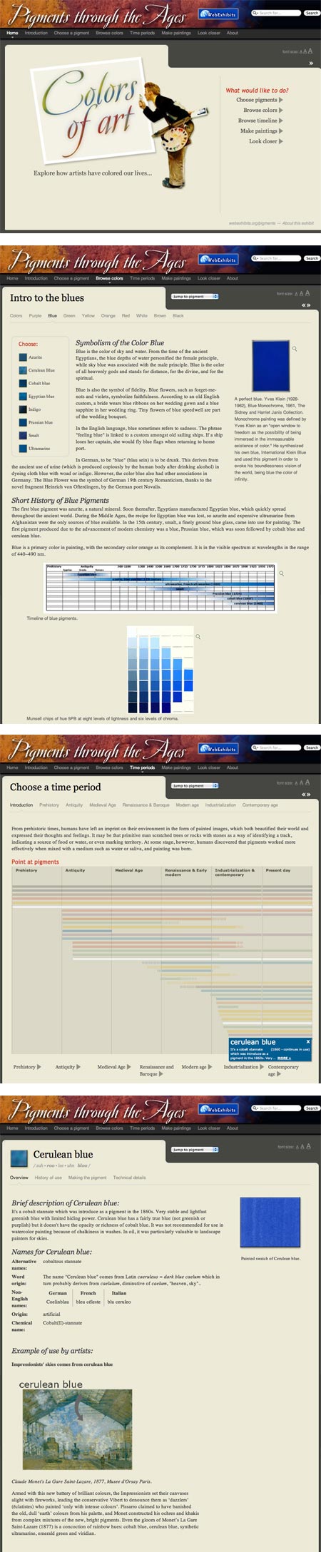
Pigments through the Ages is a web feature that explores artists’ pigments and their history in a series of brief, interconnected articles.From the navigation at page top you can Choose a Pigment, though I found it more informative to Browse Colors, as that gives you an overview of the limited list of pigments included in the feature within that range.
From either page you can arrive at a detail page about an individual pigment and get some information about the pigment’s history, composition and method of production, as well as short glimpses of the pigment’s use by an artist or two.
There is also a timeline that marks time periods in which various pigments became available. I wish this feature were more complete and easier to use (you have to roll over a line in the chart to see the pigment name) as I think it’s a particularly interesting aspect of the way artists through history have worked with the color ranges available to them.
Though not the most in-depth resource, it’s nonetheless interesting and may pique your curiosity and prompt you to go looking for additional information.
Pigments through the Ages is part of the larger WebExhibits website, that also includes features on Color Vision and Art, an analysis of the investigation of Bellini’s Feast of the Gods, and a fairly extensive feature on Van Gogh’s Letters.
Categories:
-
Happy Leyendecker Baby New Year 2012!

As I’ve done every New Year’s Eve for the past six years, I’ll wish all Lines and Colors readers a Happy Leyendecker Baby New Year!In addition to crystalizing our popular image of Santa Claus (see my recent post), the great American illustrator J.C. Leyendecker originated the contemporary concept of representing the new year as a baby, starting with his New Year’s cherub that welcomed in 1907 on a December, 1906 issue of The Saturday Evening Post.
He followed up in December of 1907 with an actual baby (sans wings) to represent the new year of 1908, and continued to represent the new year as a baby, usually portrayed as a personification of political or economic trends expected to be prevalent in the coming year, on into the 1940’s.
The beautiful high-quality image at top is from Scribble Junkies, where you can find a somewhat larger version, also with other smaller images.
Curtis Publishing continues to maintain (and is improving) its archive of Saturday Evening Post covers, including a section for J.C. Leyendecker covers in general and a new one specifically for New Years Babies.
You can find some larger Leyendecker cover images on My-Mags.com and a large selection on Cover Browser.
I wish everyone a beautiful new year filled with lots of wonderful art, both old and new!
Categories:
-
Virgil Finlay (update)

A recent comment from a reader on a post I did back in 2006 reminded me that I haven’t written for some time about the great science fiction, fantasy and horror illustrator Virgil Finlay.Though he worked in a variety of media, both in color and in black and white, Finlay is noted primarily for his astonishing ink illustrations, which were combinations of the meticulous and difficult techniques of scratchboard, crosshatch and stipple (the application of a myriad of tiny dots to make a tone).
His proficiency in the medium was matched only by his outrageous imagination, and the combination made him one of the most popular and in-demand science fiction and fantasy illustrators of his time.
Though his career spanned a longer period, Finlay was most active in the 1940’s in 1950’s when his illustrations appeared in numerous “pulp” magazines (so named because for the cheap grade of paper on which they were printed), and many of his images have a deliciously lurid pulp sensibility.
Since I last wrote about him, some new sources for images of his work have become available on the web, though the links I pointed to in my original article are no longer valid (the internet giveth and the internet taketh away).
Also unfortunately, the collections of his work printed in the 1970’s (like The Book of Virgil Finlay) and 1990’s (Virgil Finlay’s Women of the Ages, Virgil Finlay’s Phantasms, Virgil Finlay’s Strange Science and Virgil Finlay’s Far Beyond) are long out of print and have not been reprinted or compiled into a larger compendium as they deserve. However, you can still find used copies of some of them for reasonable prices.
Finlay’s extraordinarily detailed work in particular shines in the high-resolution medium of print, especially in those collections, which were printed on much higher quality paper than the original magazines. There are, however, a few resources on the web with reasonably good images.
One of the best is Golden Age Comic Book Stories (a blog with a much wider reach than its title implies, and for which I’ll issue a Major Time Sink Warning). My link is to a search which lists numerous posts in which Finlay is mentioned. If you’re inclined, keep clicking through “Older Posts” at page bottom, though they can be more or less relevant, the listed posts go on for several pages, and most images are linked to much larger versions.
Another good, and probably quicker, glimpse at Finlay’s work is a post on Monster Brains. There are also several pages of images on Collector’s Showcase (note links to 5 pages at bottom).
Finlay often brought scratchboard, hatching, stipple and deep chiaroscuro to bear in a single image, with masterful control of each technique. Though he was obviously influenced by pen and ink greats like Joseph Clement Coll, Franklin Booth and Howard Pyle, among others, Finlay created a style the was uniquely his own.
For more on Virgil Finlay, see Jim Vedeboncoeur’s article on BPIB, the Wikipedia entry and my previous post.
[Addendum: nice Flickr set from MonsterBrains]
Categories:
-
Kawase Hasui (update)

Like his contemporary, Hiroshi Yoshida, Kawase Hasui was a renowned woodblock print artist of the Shin hanga, or “new prints” movement in early 20th Century Japan.Also like Yoshida, Hasui traveled extensively and produced images of a variety of locations, though not as much outside of Japan as Yoshida. Instead, Hasui sought out remote landscapes within an increasingly industrialized and populated Japan.
His prints are often of scenes in snow, rain, twilight or darkness, though bright sunlight can also play its part, and he can be wonderfully evocative of different atmospheric and light conditions.
Many of his earliest prints, which are considered by some to be his best work, were lost in an earthquake in 1923. They must have been stunning because those that remain are extraordinarily beautiful.
Since my previous post on Kawase Hsui, some new sources for images have become available on the web. In addition to the web resources listed below, there is a currently in print collection of his work Visions of Japan (Kawase Hasui). You can also find his work in broader collections of Japanese woodblock prints.
Categories:
-
Rembrandt in America

While most of the best European art has remained in Europe, which is as it should be, a good deal has made its way into museums and collections in the U.S. and elsewhere, much to the delight of those who have access to it.An exhibition currently at the North Carolina Museum of Art, Rembrandt in America, looks at the the history of collecting Rembrandt paintings in the U.S.
In what looks to be a remarkable show, 27 Rembrandt paintings have been assembled from numerous collections, along with another 23 works by his workshop, assistants and contemporaries that were at one time attributed to the master.
Those who live in New York City with easy access to the Rembrandts in the Metropolitan Museum of art and the Frick collection may be jaded, but in the rest of the country the ability to see Rembrant’s work is much more rare, and a large grouping of his work such as this is unusual by any standard. The show includes works from private collections that are rarely seen by the public (images above, bottom two).
Rembrandt in America is at the North Carolina Museum of Art from now until January 22, 2012. It then moves to the Cleveland Museum of Art where it will be on view from February 19 to May 28, 2012 (and will be accompanied by an exhibition of Rembrandt Prints from the Morgan Library and Museum), and ends its run at the Minneapolis Institute of Arts from June 24 to September 16, 2012.
For those who can’t get to one of the venues in person, there is a rather disjointed image feature on the NCMA website. Clicking on any of the images opens them in a popup within which you can move back and forth, but the series is not always complete. I suggest starting with the eyes of the portrait at the upper right. Be sure to click on the easy to miss “MORE” link below the images for an additional series that contains some of the more interesting images in the exhibition.
As with most museum exhibition previews, I recommend supplementing your viewing with the use of other resources.
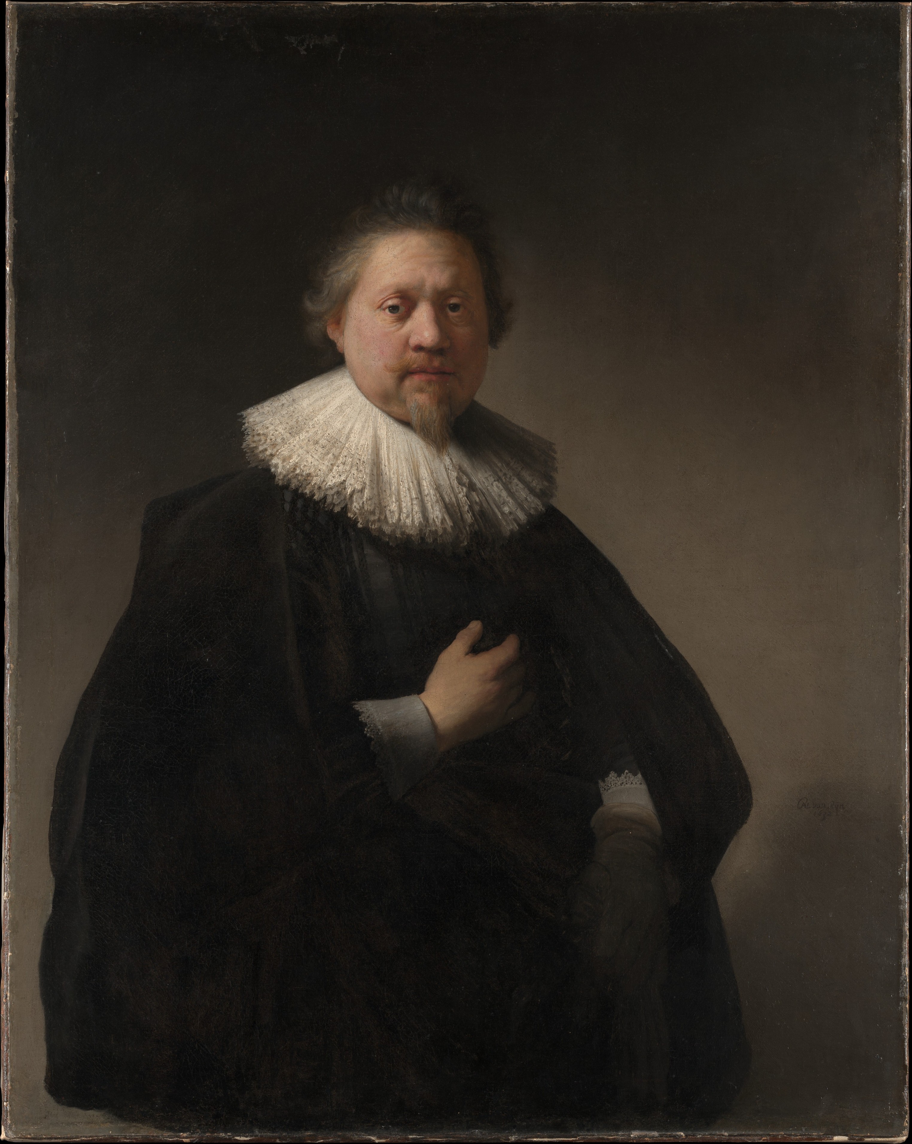
You can start by taking note of the sources for works on loan, and looking up the museums and collections to see if a better image is available there. For example, the Indianapolis Museum of Art has a better image of the wonderful self-portrait of Rembrandt as a young man that is part of the show. However, you can sometimes find even better images from other sources, such as an image of that same portrait as seen on the wonderful resource, Rembrandt Life and Work, which, though lighter, reveals more detail (image above, top). Another great resource for Rembrandt images is the Web Gallery of Art. You will find differences in color correction in the same image from different sources as well (including reproductions in books).
Rembrandt’s work, to my mind, is best appreciated up close, and small images often fail to demonstrate his enormous visual power and remarkable brushwork and use of texture. One of the best sources for detailed images of Rembrandt paintings is the beautiful new website of the Metropolitan Museum of Art (see my recent post), on which several images on loan for the exhibition can be viewed in detail, such as Portrait of a Man, probably a Member of the Van Beresteyn Family (above, second down, with detail, third down, high res version here).
You can easily search the collections for Rembrandt paintings or for an individual title. From the image detail page, choose “Fullscreen”under the image.
There is also a catalog accompanying the exhibition (Amazon link here).
It’s easy to be misled by small images into thinking that Rembrandt’s work consists largely of a bunch of dark, earth colored portraits of stuffy burghers and Biblical scenes, but if you have the chance to see his work in person, to look into the depths of his multi layered glazes and astonishingly textural surfaces, you may discover why he is often at the top of the list of the best painters in the history of Western Art.
Categories:


Charley’s Picks
Bookshop.org
(Bookshop.org affilliate links; sales benefit independent bookshop owners; I get a small percentage to help support my work on Lines and Colors)

John Singer Sargent: Watercolors


Urban Sketching: Understanding Perspective


Charley’s Picks
Amazon
(Amazon.com affiliate links; sales go to a larger yacht for Jeff Bezos; but I get a small percentage to help support my work on Lines and Colors)
John Singer Sargent: Watercolors
Urban Sketching: Understanding Perspective