
Categories
- 3d CGI
- Amusements
- Animation
- Anime & Manga
- Art Materials
- Art Videos
- Blogroll
- Cartoons
- Color
- Comics
- Concept & Visual Dev.
- Creativity
- Digital Art
- Digital Painting
- Displaying Art on the Web
- Drawing
- Eye Candy for Today
- Gallery and Museum Art
- High-res Art Images
- Illustration
- Motion Graphics & Flash
- Museums
- Online Museums
- Outsider Art
- Painting
- Painting a Day
- Paleo Art
- Pastel, Conté & Chalk
- Pen & Ink
- Prints and Printmaking
- Reviews
- Sc-fi and Fantasy
- Sculpture & Dimensional
- Site Comments
- Sketching
- Storyboards
- Tools and Techniques
- Uncategorized
- Vector Art
- Videos & Podcasts
- Vision and Optics
- Watercolor and Gouache
- Webcomics
Archives
- April 2026
- March 2026
- February 2026
- January 2026
- December 2025
- November 2025
- October 2025
- September 2025
- August 2025
- July 2025
- June 2025
- May 2025
- January 2025
- December 2024
- November 2024
- October 2024
- September 2024
- August 2024
- June 2024
- April 2024
- March 2024
- February 2024
- January 2024
- December 2023
- November 2023
- October 2023
- September 2023
- August 2023
- July 2023
- May 2023
- April 2023
- March 2023
- February 2023
- January 2023
- December 2022
- November 2022
- September 2022
- August 2022
- July 2022
- June 2022
- May 2022
- April 2022
- March 2022
- February 2022
- January 2022
- December 2021
- November 2021
- October 2021
- September 2021
- August 2021
- July 2021
- June 2021
- May 2021
- April 2021
- March 2021
- February 2021
- January 2021
- December 2020
- November 2020
- October 2020
- September 2020
- August 2020
- July 2020
- June 2020
- May 2020
- April 2020
- March 2020
- February 2020
- January 2020
- December 2019
- November 2019
- October 2019
- September 2019
- August 2019
- July 2019
- June 2019
- May 2019
- April 2019
- March 2019
- February 2019
- January 2019
- December 2018
- November 2018
- October 2018
- September 2018
- August 2018
- July 2018
- June 2018
- May 2018
- April 2018
- March 2018
- February 2018
- January 2018
- December 2017
- November 2017
- October 2017
- September 2017
- August 2017
- July 2017
- June 2017
- May 2017
- April 2017
- March 2017
- February 2017
- January 2017
- December 2016
- November 2016
- October 2016
- September 2016
- August 2016
- July 2016
- June 2016
- May 2016
- April 2016
- March 2016
- February 2016
- January 2016
- December 2015
- November 2015
- October 2015
- September 2015
- August 2015
- July 2015
- June 2015
- May 2015
- April 2015
- March 2015
- February 2015
- January 2015
- December 2014
- November 2014
- October 2014
- September 2014
- August 2014
- July 2014
- June 2014
- May 2014
- April 2014
- March 2014
- February 2014
- January 2014
- December 2013
- November 2013
- October 2013
- September 2013
- August 2013
- July 2013
- June 2013
- May 2013
- April 2013
- March 2013
- February 2013
- January 2013
- December 2012
- November 2012
- October 2012
- September 2012
- August 2012
- July 2012
- June 2012
- May 2012
- April 2012
- March 2012
- February 2012
- January 2012
- December 2011
- November 2011
- October 2011
- September 2011
- August 2011
- July 2011
- June 2011
- May 2011
- April 2011
- March 2011
- February 2011
- January 2011
- December 2010
- November 2010
- October 2010
- September 2010
- August 2010
- July 2010
- June 2010
- May 2010
- April 2010
- March 2010
- February 2010
- January 2010
- December 2009
- November 2009
- October 2009
- September 2009
- August 2009
- July 2009
- June 2009
- May 2009
- April 2009
- March 2009
- February 2009
- January 2009
- December 2008
- November 2008
- October 2008
- September 2008
- August 2008
- July 2008
- June 2008
- May 2008
- April 2008
- March 2008
- February 2008
- January 2008
- December 2007
- November 2007
- October 2007
- September 2007
- August 2007
- July 2007
- June 2007
- May 2007
- April 2007
- March 2007
- February 2007
- January 2007
- December 2006
- November 2006
- October 2006
- September 2006
- August 2006
- July 2006
- June 2006
- May 2006
- April 2006
- March 2006
- February 2006
- January 2006
- December 2005
- November 2005
- October 2005
- September 2005
- August 2005
Relevant Blogs
Art, Painting & Sketch
- Gurney Journey
- Underpaintings
- Art and Influence
- Painting Perceptions
- Oil Painters of America
- Vasari Paint POV
- Flying Fox
- Urban Sketchers
- Bento (Smithsonian)
- Art Inconnu
- The Hidden Place
- Still Life
- Making a Mark
- The Art of the Landscape
- Exploring Color & Creativity
- Art Contrarian
- Artist A Day
- beinArt Surreal Art Collective
- Eye Level
- David Dunlop
- p.i.g.m.e.n.t.i.u.m
- CultureGrrl
- Joaquín Sorolla blog
- Artists in Pastel
“Painting a Day”
- A Painting a Day (Keiser)
- On Painting (Keiser)
- Julian Merrow-Smith
- Karen Jurick
- Jeffrey Hayes
- Carol Marine
- Abbey Ryan
- Daily Paintworks
Other Painting Blogs
- Virtual Gouache Land
- Neil Hollingsworth
- Marc Hanson
- Kevin Menck
- Marc Dalessio
- Larry Seiler
- Stapleton Kearns
- Colin Page
- Roos Schuring
- Hans Versfelt
- Titus Meeuws
- Régis Pettinari
- René Plein Air
- Belinda Del Pesco
- Robin Weiss
- Nathan Fowkes (Land Sketch)
- William Wray
- Frank Serrano
- Stephen Magsig
- Michael Chesley Johnson
- Twice a Week
- Sarah Wimperis
- Rob Adams
- Michael Cole Manley
- The Dirty Palette Club
- Mike Manley’s Draw!
Gallery Art & Illustration mix
Illustration
- Howard Pyle
- 100 Years of Illustration
- BibliOdyssey
- Illustration Art
- Today’s Inspiration
- Illustration Mundo
- Little Chimp Society
- Danny Gregory
- R D (John Martz
- Illustration Friday blog
- Monster Brains
- Illustrators & Illustrations (RU)
- Elwood H. Smith
- DaniDraws.com
- Designers Who Blog
- iSpot Blog
Sci-Fi & Fantasy
Illustration & Comics
Comics & Cartoons
- Comics Beat
- Robot 6
- Newsarama Blog
- Comic Vine
- Comics Alliance
- Forbidden Planet Int.
- Paolo Rivera
- Bolt City
- Flight
- Scott McCloud
- The Comics Journal
- Comixpedia
- Funnybook Babylon
- James Baker
- Middleton’s Sketchbook
- Boneville
- The Hotel Fred
- Paul Rivoche
- Daily Cartoonist
- Mad About Cartoons (William Wray)
- Digital Strips
Illustration & Concept
Animation & Concept
- Cartoon Brew
- Animation Blog
- Cold Hard Flash
- Concept Art World
- The CAB
- FY Concept Art
- Concept Ships
- Concept Robots
- John Nevarez
- Armand Serrano
- Marcos Mateu-Mestre
- all kinds of stuff (Kricfalusi)
- Yacin the faun (Man Arenas)
- Kelsey Mann
- Cre8tivemarks Blog
- Ice-Cream Monster Toon Cafe
- AAU Character & Creature Design
- AAU Animation Notes
- Articles and Texticles
Paleo & Scientific
Tools & Techniques
Other
Lists of Art Blogs
Art Image Resource Links
Historic Art Images
- Wikimedia Commons: Paintings
- Wikimedia Commons: Drawings
- The Athenaeum
- WikiArt (WikiPaintings)
- Google Art Project: Artists
- Google Art Project: Collections (Museums)
- ArtCyclopedia
- Web Gallery of Art
- Art Renewal Center
- Web Gallery of Impressionism
Auction Consolidation sites
Auction sites
- Sotheby’s
- Bonham’s
- Christies
- Heritage Auctions: Fine Art
- Heritage Auctions: Illustration
- Freeman’s Auctions
- Bukowskis
- Shannon’s
Image Search
Reverse Image Search (search by image)
- Tin Eye
- RevImg
- Google Image Search (camera icon)
- Bing Image Search (camera icon)
Promoting some friends and some clients of my website design business
- Twin Willows T’ai Chi studio in Wilmington DE. Taiji classes with Bryan Davis.
- Ray Hayward, Inspired Teacher of T’ai Chi ( Taiji ) in Minneapolis, Founder of Mindful Motion Tai Chi Academy
- OldHead Tattoo studio and Art Gallery in Wilmington DE. Tattoos and paintings by Bruce Gulick
- Sharon Domenico Art, pet portrait oil paintings
- Platinum Paperhanging, wallpaper hanging, Main Line and Philadelphia, PA
- Lisa Stone Design, interior designer, Main Line and Philadelphia, PA
- Studio12KPT, original art, prints, calendars and other custom printed items by Van Sickle & Rolleri
-
Michael Brown
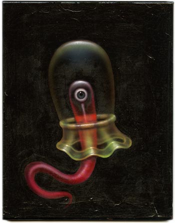
Michael Brown is an artist about whom I can find little information. I came across his work on the web site for Gallery Nucleus.He indulges in some delightful weirdness involving vaguely bunny-like things holding matches, sinister looking rabbits and birds with human eyes, and, in particular, beautifully colored translucent imaginary undersea invertebrates, floating languidly somewhere in the dark oceans of Brown’s mind.
The gallery offers prints as well as originals and a book of Brown’s recent works.
Categories:
-
Eric Bowman
 Eric Bowman is a painter and illustrator originally from Southern California and now based in the Pacific Northwest.
After years as a successful illustrator, Bowman is apparently focusing on his passion for plein air painting and figure work. His painting site has galleries of recent work, an archive of older work, and figure studies.
He is apparently still active as an illustrator, judging by his portfolio on the Shannon Associates site, in which you can see the influence of some of the great illustrators of the past, like Dean Cornwell, N.C. Wyeth, Haddon Sundblom, and even some of the pulp illustrators.
Bowman’s commercial clients include Time-Life, GTE, Nike, Harper Collins, Simon & Schuster, Kellogs and Hallmark; and his work has been showcased in the Spectrum annuals and has received Gold Medals from the Society of Illustrators.
His gallery paintings are frequently of landscape subjects that include built objects and environments, like houses, towns, boats and roads. Their small size (often 9×12 in; 22x30cm) and the painterly immediacy of their execution leads me to assume that they are largely painted en plein air.
Bowman has a nice flair for the creation of forms with succinct impasto brushstrokes, a refreshing brevity of notation and controlled but vibrant use of color.
Categories:
-
Karen O’Neil
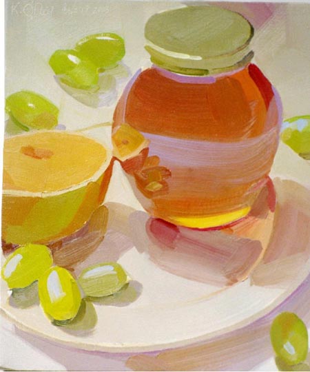
Karen O’Neil’s oil paintings of glassware, china and fruit have some of the characteristics of watercolor and some of the feeling of pastels.I’m pretty sure O’Neil is working in opaque impasto, but she somehow achieves a bright, airy quality to her paintings that is often seen in transparent watercolor, in which the surface white is transmitted through the paint.
She uses a lot of white objects and background surfaces in her compositions, and her subtle coloring of those surfaces, and the high chroma and high value of her color choices in general, give a feeling sometimes found in pastel, in which pigments are often mixed with white.
O’Neil seems fascinated by transparency and reflection, though by reflection I don’t so much mean mirror-like surfaces as reflected color. Colors bounce from one object or surface to another and back again.
She seems to utilize triadic color schemes and her paintings have an overall color theme to them, within which she is playful in her balance of color areas.
She is forceful and direct in her application of paint, with broad strokes defining forms with deceptive simplicity.
O’Neil is also a teacher and leads workshops and classes at the WailKill River School, The Woodctock School of Art and the Art Students League of New York Vytlacil Campus.
[Suggestion courtesy of James Gurney]
Categories:
-
Tekkon Kinkreet background art

Tekkon Kinkreet (or Tekkonkinkreet, a pun on the Japanese phrase for reinforced concrete) is a feature length anime (Japanese animated film) that has attracted a good bit of attention since its release in Japan in 2006. I haven’t seen the film yet, though I’m looking forward to it, but I came across a trove of wonderful background images from the film and wanted to share them with you in case they disappear.Adapted from a manga (Japanese comic story) by Taiyõ Matsumoto, the film is a combination of 3-D CGI and hand drawn animation. The backgrounds are stunningly rendered, filled with lavish detail in an evocation of the fictional city of Treasure Town, a thinly veiled alternate Tokyo.
The streets and buildings are presented with an uncanny eye to the minute details and textures of the city, carried over into equally detailed portrayal of imaginary structures.
Audrey Kawasaki has posted some images from the film on her blog i_seldom_do, evidently taken from a Japanese book of art from the movie that is not available in the US (as far as I can tell).
Worth a look both for the imagination, scope and visual splendor of the images; and for the direct observation and beautiful renderings of buildings and streets in sunshine and artificial light.
[Link via MetaFliter]
Categories:
-
Joe Vaux

Joe Vaux is a New York born artist now living and working in California. He studied at Syracuse University and has exhibited in group and solo exhibitions in various galleries in California.Outside of that, I know little about him. His work is a wonderful combination of grotesque imagery and punchy, almost storybook-like rendering, with a nicely graphic sense of design and a refreshing use of color. He often has a base of muted colors and deep darks, against which he pops passages of brighter colors and lighter values.
His subject matter encompasses all manner of demented creatures, fantastical environments and weird structures, and has some of the characteristics of the so-called “pop surrealists” but without the self-important seriousness often evident in many of those artists.
Vaux stands out in that his images exhibit a sense of humor, inventiveness and a visual playfulness that make them a treat. Sort of Bosch meets Miro by way of Charles Adams. I particularly like the way he juxtaposes bright colors against deep blacks, giving them a kind of electric glow.
His site is has two galleries plus an archive with many images, though the too clever for its own good navigation can be a bit tiresome after a while.
There is also a news section with mention of shows and galleries.
Categories:
-
Anna Richards Brewster
 When looking at the history of art, which in may ways reflects social history, I can’t help but think about how many potentially terrific artists we’ve been denied because women were discouraged or actively prohibited from being artists.
Anna Richards Brewster was active at the turn of the 20th Century, a time when it was acceptable for women to study art, particularly upper-class women who were becoming “cultured”; but that cultural training was meant to make them better wives, not prepare them for an active career. Women artists often had difficulty being accepted in exhibitions, were frequently left out of consideration for prizes or reviews and generally treated as “not serious” as contributors to the art world.
There were notable exceptions, like Cecilia Beaux, but even they were often not given the same appraisal they would have met had they been male. Despite the advances in this area in the last century, I think this is still the case to a degree, and women artists are often pushed down a bit in the regard of art historians and the art establishment in general (a “varnish ceiling”?).
Anna Richards Brewster was an accomplished painter who, among her several stylistic variations, is primarily thought of as an American Impressionist, though she is seldom mentioned in the books and articles you encounter on the subject. She was successful in her time, however, and received recognition during her career, winning the noted Dodge Prize from the National Academy of Design at the age of 20 (for best picture by a woman artist), and showing her work throughout her life, up until the 1930’s.
Brewster started early. She was the daughter of renowned landscape and seascape painter William Trost Richards, and began painting at the age of 10. In addition to the influence of her father, she studied with William Merritt Chase and John Lefarge, and was trained at the Académie Juilan in Paris.
Brewster experimented with many styles, from the influence of her father’s friends among the Pre-Raphaelite painters, flashes of Turner, bits of Barbizon, even traces of Hopper, to the interesting series of Alice in Wonderland illustrations she did in the style of John Tenniel.
But it is indeed her impressionist style paintings that stand out, lumionus, rich with atmosphere and texture, in which you can see the influence of Childe Hassam, and, of course, William Merritt Chase.
Online resources about Brewster are somewhat slim, but there is now a dedicated site about Anna Richards Brewster, in conjunction with a traveling exhibit called Anna Richards Brewster: American Impressionist, organized by the Fresno Metropolitan Museum of Art and Science.
There is a beautiful book accompanying the exhibit, Anna Richards Brewster: American Impressionist (more detail here).
The exhibition site is arranged a bit awkwardly, and you have to poke around a bit to find all of the 57 images on view, some in “Artwork“, most in the several pages of the “Checklist” section.
The exhibition is currently at the Hudson River Museum, in Yonkers, NY, until September 7, 2008. It then travels to the Butler Institute of American Art in Youngstown, Ohio from September 27 – December 28, 2008, and finally to the Fresno Metropolitan Museum from March 28 – June 14, 2009.
One of the stated goals of the exhibition’s organizers is to re-establish Brewster’s place in the history of American art, something that should well be done for a number of women artists.
[Link via Art Knowledge News]
Categories:


Charley’s Picks
Bookshop.org
(Bookshop.org affilliate links; sales benefit independent bookshop owners; I get a small percentage to help support my work on Lines and Colors)

John Singer Sargent: Watercolors


Urban Sketching: Understanding Perspective


Charley’s Picks
Amazon
(Amazon.com affiliate links; sales go to a larger yacht for Jeff Bezos; but I get a small percentage to help support my work on Lines and Colors)
John Singer Sargent: Watercolors
Urban Sketching: Understanding Perspective