
Categories
- 3d CGI
- Amusements
- Animation
- Anime & Manga
- Art Materials
- Art Videos
- Blogroll
- Cartoons
- Color
- Comics
- Concept & Visual Dev.
- Creativity
- Digital Art
- Digital Painting
- Displaying Art on the Web
- Drawing
- Eye Candy for Today
- Gallery and Museum Art
- High-res Art Images
- Illustration
- Motion Graphics & Flash
- Museums
- Online Museums
- Outsider Art
- Painting
- Painting a Day
- Paleo Art
- Pastel, Conté & Chalk
- Pen & Ink
- Prints and Printmaking
- Reviews
- Sc-fi and Fantasy
- Sculpture & Dimensional
- Site Comments
- Sketching
- Storyboards
- Tools and Techniques
- Uncategorized
- Vector Art
- Videos & Podcasts
- Vision and Optics
- Watercolor and Gouache
- Webcomics
Archives
- April 2026
- March 2026
- February 2026
- January 2026
- December 2025
- November 2025
- October 2025
- September 2025
- August 2025
- July 2025
- June 2025
- May 2025
- January 2025
- December 2024
- November 2024
- October 2024
- September 2024
- August 2024
- June 2024
- April 2024
- March 2024
- February 2024
- January 2024
- December 2023
- November 2023
- October 2023
- September 2023
- August 2023
- July 2023
- May 2023
- April 2023
- March 2023
- February 2023
- January 2023
- December 2022
- November 2022
- September 2022
- August 2022
- July 2022
- June 2022
- May 2022
- April 2022
- March 2022
- February 2022
- January 2022
- December 2021
- November 2021
- October 2021
- September 2021
- August 2021
- July 2021
- June 2021
- May 2021
- April 2021
- March 2021
- February 2021
- January 2021
- December 2020
- November 2020
- October 2020
- September 2020
- August 2020
- July 2020
- June 2020
- May 2020
- April 2020
- March 2020
- February 2020
- January 2020
- December 2019
- November 2019
- October 2019
- September 2019
- August 2019
- July 2019
- June 2019
- May 2019
- April 2019
- March 2019
- February 2019
- January 2019
- December 2018
- November 2018
- October 2018
- September 2018
- August 2018
- July 2018
- June 2018
- May 2018
- April 2018
- March 2018
- February 2018
- January 2018
- December 2017
- November 2017
- October 2017
- September 2017
- August 2017
- July 2017
- June 2017
- May 2017
- April 2017
- March 2017
- February 2017
- January 2017
- December 2016
- November 2016
- October 2016
- September 2016
- August 2016
- July 2016
- June 2016
- May 2016
- April 2016
- March 2016
- February 2016
- January 2016
- December 2015
- November 2015
- October 2015
- September 2015
- August 2015
- July 2015
- June 2015
- May 2015
- April 2015
- March 2015
- February 2015
- January 2015
- December 2014
- November 2014
- October 2014
- September 2014
- August 2014
- July 2014
- June 2014
- May 2014
- April 2014
- March 2014
- February 2014
- January 2014
- December 2013
- November 2013
- October 2013
- September 2013
- August 2013
- July 2013
- June 2013
- May 2013
- April 2013
- March 2013
- February 2013
- January 2013
- December 2012
- November 2012
- October 2012
- September 2012
- August 2012
- July 2012
- June 2012
- May 2012
- April 2012
- March 2012
- February 2012
- January 2012
- December 2011
- November 2011
- October 2011
- September 2011
- August 2011
- July 2011
- June 2011
- May 2011
- April 2011
- March 2011
- February 2011
- January 2011
- December 2010
- November 2010
- October 2010
- September 2010
- August 2010
- July 2010
- June 2010
- May 2010
- April 2010
- March 2010
- February 2010
- January 2010
- December 2009
- November 2009
- October 2009
- September 2009
- August 2009
- July 2009
- June 2009
- May 2009
- April 2009
- March 2009
- February 2009
- January 2009
- December 2008
- November 2008
- October 2008
- September 2008
- August 2008
- July 2008
- June 2008
- May 2008
- April 2008
- March 2008
- February 2008
- January 2008
- December 2007
- November 2007
- October 2007
- September 2007
- August 2007
- July 2007
- June 2007
- May 2007
- April 2007
- March 2007
- February 2007
- January 2007
- December 2006
- November 2006
- October 2006
- September 2006
- August 2006
- July 2006
- June 2006
- May 2006
- April 2006
- March 2006
- February 2006
- January 2006
- December 2005
- November 2005
- October 2005
- September 2005
- August 2005
Relevant Blogs
Art, Painting & Sketch
- Gurney Journey
- Underpaintings
- Art and Influence
- Painting Perceptions
- Oil Painters of America
- Vasari Paint POV
- Flying Fox
- Urban Sketchers
- Bento (Smithsonian)
- Art Inconnu
- The Hidden Place
- Still Life
- Making a Mark
- The Art of the Landscape
- Exploring Color & Creativity
- Art Contrarian
- Artist A Day
- beinArt Surreal Art Collective
- Eye Level
- David Dunlop
- p.i.g.m.e.n.t.i.u.m
- CultureGrrl
- Joaquín Sorolla blog
- Artists in Pastel
“Painting a Day”
- A Painting a Day (Keiser)
- On Painting (Keiser)
- Julian Merrow-Smith
- Karen Jurick
- Jeffrey Hayes
- Carol Marine
- Abbey Ryan
- Daily Paintworks
Other Painting Blogs
- Virtual Gouache Land
- Neil Hollingsworth
- Marc Hanson
- Kevin Menck
- Marc Dalessio
- Larry Seiler
- Stapleton Kearns
- Colin Page
- Roos Schuring
- Hans Versfelt
- Titus Meeuws
- Régis Pettinari
- René Plein Air
- Belinda Del Pesco
- Robin Weiss
- Nathan Fowkes (Land Sketch)
- William Wray
- Frank Serrano
- Stephen Magsig
- Michael Chesley Johnson
- Twice a Week
- Sarah Wimperis
- Rob Adams
- Michael Cole Manley
- The Dirty Palette Club
- Mike Manley’s Draw!
Gallery Art & Illustration mix
Illustration
- Howard Pyle
- 100 Years of Illustration
- BibliOdyssey
- Illustration Art
- Today’s Inspiration
- Illustration Mundo
- Little Chimp Society
- Danny Gregory
- R D (John Martz
- Illustration Friday blog
- Monster Brains
- Illustrators & Illustrations (RU)
- Elwood H. Smith
- DaniDraws.com
- Designers Who Blog
- iSpot Blog
Sci-Fi & Fantasy
Illustration & Comics
Comics & Cartoons
- Comics Beat
- Robot 6
- Newsarama Blog
- Comic Vine
- Comics Alliance
- Forbidden Planet Int.
- Paolo Rivera
- Bolt City
- Flight
- Scott McCloud
- The Comics Journal
- Comixpedia
- Funnybook Babylon
- James Baker
- Middleton’s Sketchbook
- Boneville
- The Hotel Fred
- Paul Rivoche
- Daily Cartoonist
- Mad About Cartoons (William Wray)
- Digital Strips
Illustration & Concept
Animation & Concept
- Cartoon Brew
- Animation Blog
- Cold Hard Flash
- Concept Art World
- The CAB
- FY Concept Art
- Concept Ships
- Concept Robots
- John Nevarez
- Armand Serrano
- Marcos Mateu-Mestre
- all kinds of stuff (Kricfalusi)
- Yacin the faun (Man Arenas)
- Kelsey Mann
- Cre8tivemarks Blog
- Ice-Cream Monster Toon Cafe
- AAU Character & Creature Design
- AAU Animation Notes
- Articles and Texticles
Paleo & Scientific
Tools & Techniques
Other
Lists of Art Blogs
Art Image Resource Links
Historic Art Images
- Wikimedia Commons: Paintings
- Wikimedia Commons: Drawings
- The Athenaeum
- WikiArt (WikiPaintings)
- Google Art Project: Artists
- Google Art Project: Collections (Museums)
- ArtCyclopedia
- Web Gallery of Art
- Art Renewal Center
- Web Gallery of Impressionism
Auction Consolidation sites
Auction sites
- Sotheby’s
- Bonham’s
- Christies
- Heritage Auctions: Fine Art
- Heritage Auctions: Illustration
- Freeman’s Auctions
- Bukowskis
- Shannon’s
Image Search
Reverse Image Search (search by image)
- Tin Eye
- RevImg
- Google Image Search (camera icon)
- Bing Image Search (camera icon)
Promoting some friends and some clients of my website design business
- Twin Willows T’ai Chi studio in Wilmington DE. Taiji classes with Bryan Davis.
- Ray Hayward, Inspired Teacher of T’ai Chi ( Taiji ) in Minneapolis, Founder of Mindful Motion Tai Chi Academy
- OldHead Tattoo studio and Art Gallery in Wilmington DE. Tattoos and paintings by Bruce Gulick
- Sharon Domenico Art, pet portrait oil paintings
- Platinum Paperhanging, wallpaper hanging, Main Line and Philadelphia, PA
- Lisa Stone Design, interior designer, Main Line and Philadelphia, PA
- Studio12KPT, original art, prints, calendars and other custom printed items by Van Sickle & Rolleri
-
Robert Carter
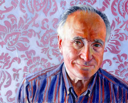
English born Canadian illustrator Robert Carter’s clients include numerous periodicals and publishers as well as commercial accounts. He has been the recipient of awards from the Society of Illustrators, The Artist’s Magazine and Communication Arts.His illustration portfolio contains many of his highly textural, strongly designed and fascinatingly realized illustrations. What really sparks my interest, tough, are his portraits. These are strikingly rendered. often with sharply defined textures, both in the backgrounds and in the faces of his subjects.
Carter experiments and plays with color both for its emotional impact and as a design element. His colors and textures are often expressionistic, capturing an impression of the person’s presence, history or temperament as much as their physical likeness.
Sometimes he will turn down his palette to a quiet monochrome, with just accented colors to anchor your eye; at other times he will throw a wide range of color into a single face, as though it were a microcosm of the subject’s world. His portrait faces jump out at you. He puts his faces in your face.
The piece I’ve chosen here is actually one of his more sedate portrait images, but I was just struck by the balance he achieved in the intensity of his colors and the fascinating use of pattern, against which the face exerts an immediate physical presence.
Categories:
-
Goro Fujita

Goro Fujita was born in Japan, grew up in Germany and studied there at the German Film School, where he concentrated on 3-D character animation. He is now a freelance character animator and visual development artist.The gallery on his site focuses mainly on his personal work. The section of finished work only contains 15 images. There are also sections for personal 3-D work and a nice sketchbook section with life drawings and quick sketches from life and imagination.
The real treasure on Fujita’s site, however, is the section of speedpaintings, meaning quickly done digital paintings. These are whimsical, imaginative and wonderfully realized in the spare, unfussed-with style inherent in speedpainting. They range across a wide variety of scenes and subjects and are sometimes hilarious (he has this thing for rabbits). In them he plays with color, composition, lighting and visual texture in ways that only free-ranging casual exploration is likely to bring out.
I have no idea how much relation any of them have to his professional work, and some are obviously playful interpretations of existing films, but a number of them are suggestive of intriguing ideas for stories.
There is a section of his short animations and a demo reel, as well as a section for tutorials, that includes tips and tricks for speedpainting, a painting screen capture and a “making of”s article about the most elaborate of the images in the Finished section, which was a Challenge entry for the CGSociety.
Fujita also has a blog, Chapter 56, in which he discusses his animation, paintings and various other topics.
[Link via Fossfor’s Laboratory]
Categories:
-
Antonio Mancini

John Singer Sargent is said to have called Antonio Mancini “the world’s greatest living artist”. Jean-Léon Gérôme called him “a phenomenon”.Mancini was an Italian painter who was so gifted at drawing as a child that he was admitted to the Naples Academy of Fine Art at the age of 12. He was producing accomplished large scale paintings four years later.
His career, though, would be troubled, marred by bouts of mental illness, poverty and emotional instability. The following description of his manic painting methods is quoted from the collateral prepared for a show currently on view at the Philadelphia Museum of Art:
There at the back, before a little table on which I see scattered an infinity of bric a brac, cloth flowers, embalmed stuffed birds, an inexpensive doll, there is the model Aurelia, an insignificant type of woman with olive complexion and an aquiline nose. She was posing as a vendor. Mancini, in shirt sleeves, extremely nervous, bustled about delivering brush strokes, that resembled blows of a whip, onto a canvas supported on the back of a chair. He snorted, he muttered to himself, he cursed at the model who wasn’t able to remain still, then he quickly distanced himself from the subject and bent down on his knees. Plump and not too flexible as he was, he stooped down and withdrew from his pocket binoculars which he used to view her in reverse. All of this while panting out of breath, and raving like someone obsessed.
The account goes on to add that Mancini’s elderly father added to the scene by standing off to one side, badgering him the whole time to put down his brushes and go to dinner.
Mancini was also so poor at times that he didn’t have proper clothing and reused his art materials. One of the pieces in the Philadelphia Museum show, which is the first major retrospective of his work in the U.S., is mounted so that you can see his painting on both sides of the same piece of canvas (one side of which is unfortunately upside-down from our point of view).
He was in a way rescued from his poverty, which was to some extent caused by naivety, by Sargent, who introduced him to English society patrons who paid to have his extraordinary style applied to their portraits. Sargent also painted a portrait of Mancini.
Mancini’s paintings are wonderful and eccentric, with thin veils of paint that barely mask the canvas in one area and huge gobs of impasto, looking like they have been chunked onto the canvas with a spatula, let alone a palette knife, in others. “Painterly” is an inadequate word to describe the way paint is scooped, mounded, troweled and scraped across the canvas in places, yet the same image will have passages of sublime modeling and blending.
One of the other remarkable characteristics of his paintings is his use of what he called a “graticola”, a grid method; in which a mesh of rectangular areas produced by threads strung across a frame were used to interpret a scene by using a similar grid against the surface of the canvas.
This was not an unusual method in painting and has been known for hundreds of years, you will often see preliminary sketches in which the gridlines show and lay the groundwork for transferring a sketch to a larger canvas. What is unusual is that the gridlines that are usually only in the drawing stage of the larger works, and are gone when paint is applied, have left their marks embedded in the thick layers of paint in Mancini’s final paintings, along with bits of glass, stone and other items he worked into his canvasses for texture and effect.
Mancini’s wild, intense and ultimately beautiful canvasses are striking on a number of levels, the application of paint, the use of texture, and the sometimes unusual surroundings for his subjects. He also often used street urchins for his models, in some ways mirroring his own economic circumstances, both as a child and as an adult.
The exhibit at the Philadelphia Museum of Art only runs to January 20th, and includes wonderful loans from some of the great museums in Europe, but it was assembled in honor of a gift of 15 Mancini oils and pastels to the museum’s permanent collection.
There is a book accompanying the exhibition (more details here).
[Suggestion courtesy of Harry Saffren]
Categories:
-
The illustrators of La Domenica del Corriere

La Domenica del Corriere (“Sunday Courier”) was Sunday insert for Corriere della Sera, an Italian newspaper that ran for 90 years, from 1899 to 1989. For most of that time the section featured a full-page illustration on its cover each week.These were often dramatic gouache or watercolor illustrations, almost in a pulp-illustration vein, but they presumably illustrated actual news stories (think of all of the notable and dramatic events that occurred during that period of time).
There is a site devoted to them at www.illustrated-history.org/, containing an archive of the illustrations and a bit of the history. The site is in Italian, and I’m afraid my Italian is even weaker then my French, so I relied on Google Translate to find my way around.
There is a search function on the home page that allows you to search by region (Per luoghi), by artist (Per autore) or event (Ricerca avanzata), with attendant drop-down menus.
It appears that there is a concentration on two artists in particular, Walter Molino (above left) and Achillies Beltrame (above right), whose work is sought after by collectors. Searching for these two may be a good place to start. Once you are on a page with a featured illustration, clicking on that image provides a pop-up with a wonderfully large reproduction of the painting. (I’ve included a full-size crop from a small section of each illustration above.) You can also informally browse from an illustration page to other pages by incrementing or decrementing the database number at the end of the URL in your browser’s address field.
Some of the illustrations are less interesting than others and there is some repetition of subject as they looked for sensational topics to illustrate (lots of train wrecks and other disasters), but some of these images are just wonderful and make the trouble of searching and browsing worth your while.
This is intended to be more of an illustrated history than an appreciation of the artists, but it serves as both. You can take a fascinating stroll through the early to mid 20th Century and view some wonderful pulp-style illustrations in the process.
I also found a blog on a site devoted to the paper, Blog del Club Domenica del Corriere, also in Italian, that features the illustrations, but doesn’t dwell on them exclusively.
[Link and suggestion courtesy of Jared Shear – see my post on Jared Shear]
Categories:
-
Blurb and Lulu

Suppose you’re meeting an art director and you want to leave behind printed samples of your work.You could print out some pages on your home printer and try to assemble them in an office store report cover, or you could go down to Kinkos and have them print and bind it in some kind of corporate report package; you could give them a disk and hope they take the trouble to view it, or you could just give up and beg them to bookmark your web site.
Imagine the difference, though, if instead of a printed pamphlet, you leave a full-color, glossy, hardbound book of your work, complete with dust jacket.
Or…
Suppose you’ve been asked to present a gallery with some photographs of your work as a form of initial contact. Some galleries still ask specifically for slides, but if it’s up to you would you rather give them a pile of photos, computer print-outs, bound or not, or… a book of your paintings that looks like you just picked it up off the shelf at Barnes and Noble?
Or…
Perhaps you’d like to collect your work in a book and offer it for sale on your web site, something I know many artists would love to do, but consider out of reach. (I can see all of the “painting a day” artists sitting up and taking notice.)
Or…
Maybe you’d just like to have your paintings, or even a collection of your travel photos, arranged as a book that you can give to friends and family as gifts.
“But, Charley,” you say, looking at your computer screen with a quizzical and/or bemused expression, “this all sounds great, but I don’t recall inheriting a fortune lately, I can’t afford to pay thousands of dollars to have a book printed. Have you gone daft?”
“Why, no,” I say, “well, maybe…, but that doesn’t alter the fact that one-off printing of individual books has become practical and, in fact, is now remarkably affordable and easy.”
It used to be that printing a full-color book required and outlay of thousands for an extensive print run, making such things impractical unless you could attract the attention of a publisher willing to invest in publishing your book to a wide audience. In printing the general rule has always been that the more copies you printed, the cheaper each copy became, and you had to print a relatively high number to get the price point per copy to be remotely viable, particularly in color. The idea of printing a single copy of a full-color book was absurd.
Printing technology, though still slow to change by the standards of digital media, has made some amazing progress while we were busy being dazzled by the internet. New on-demand printing techniques, utilizing sophisticated ink-jet technology, have finally made the low print run and one-off printing of full color books, even hard-bound books, practical.
You can now put together an 8″x10″ (20×25 cm) 40 page full-color hard-bound book and print one copy for as little as $30, soft-cover for $20!
There are several companies now that offer inexpensive short-run or one-off on-demand printing using this new technology; the one I have experience with, and can recommend almost without reservation, is Blurb.
In the case of Blurb, the technology is the HP Indigo 5000 digital press. Some of you may be familiar with Apple’s iPhoto books, which use the same principle but are much more expensive.
You don’t have to be a graphic designer, or know how to use Quark or InDesign, to put a book together for printing by Blurb. You download Booksmart, their book template software for Mac or Windows (I used the Mac version) into which you load your digital images and arrange them in a choice of book sizes and page template variations. The software is well thought out and very easy for someone with no design experience to use. Graphics professionals will actually find it a bit restrictive, but it’s not aimed at us, and as a work-around you can use your own typography and layout in the form of full-page images. The process even allows you to do full bleeds (images that extend to the edges of the page) at no additional cost.
It’s suggested you do a test print from your home printer, and then upload the book to your Blurb account through the Booksmart software. In 7-10 working days (1-2 weeks) the UPS driver will plop your shiny new securely packaged book into your eager hands.
You can print in several sizes, from 7×7 inches (18x18cm), starting at $13 for up to 40 pages paperback, to their “coffee-table book” at 13×11 inches (33x28cm), which is hardcover only starting at $55.
Most importantly you will blown away by the quality of the results (providing, of course that you are careful in the preparation of the book on your end). The books look fantastic, the printing and color are absolutely beautiful and look remarkably professional. They may be printed on-demand, but these are bookstore quality books that you would be proud to offer for sale on your web site.
For more information, I’ll refer you to a more extensive review by Kevin Kelly, a reviewer whose opinion I trust and from whom I learned about Blurb, who also reviews another on-demand printing service, Lulu.
I don’t have direct experience with Lulu, but I mention it because Kelly does and because Blurb is about printing in color, it’s not the ideal solution for black and white printing, which should be much cheaper than even the remarkably inexpensive color of Blurb books. Lulu may be of particular interest to those printing black and white comics.
When preparing a book for Blurb printing, be sure to heed Kelly’s advice about blurred images, take care to photograph your work sharply and as professionally as possible. (I list a few resources about photographing artwork at the end of this post.)
Once your book is complete (and you’re seen at least one copy of the finished article to make sure that it’s the way you want it), you can order more, at a discount if it’s over 10 copies. You can also offer the book for sale through the Blurb bookstore.
When I was investigating Blurb, I didn’t have enough artwork in a state that I wanted to print in a book yet, so as a test I put together a book of photographs I took in Venice and published a 20 page Blurb book. You can see it here in the Blurb bookstore. Below the image of the book cover is a link where you can download a PDF preview of the first 15 pages that will give you some idea of the Booksmart template layouts, at least as I have used them.
The image above shows that book in the Booksmart software on screen, the actual delivered book open to the same page and the book cover (inset).
If you’re at all curious about Blurb, you can create a small Blurb book for as little as $13 (plus shipping) just to check out the process. A friend of mine just did that and was delighted and amazed with the results.
So what are you waiting for? You’re only a couple of weeks away from being a published!
Categories:
-
Steve Rude: Artist in Motion

I received a copy of Steve Rude: Artist in Motion from Flesk Publications.Flesk is a small specialty art book publisher that was the subject of one of my first posts on lines and colors in which I praised their terrific collections of the work of pen and ink greats Joseph Clement Coll and Franklin Booth.
Since then, much to my delight, they have continued to expand and produce terrific books on illustrators like James Bama and contemporary comics artists like Mark Schultz and Steve Rude; and I wrote a follow up post on Flesk last Summer.
Over that time I’ve come to expect high standards in the production of their books, which are simply excellent, but I have to admit I was actually surprised at what a beautiful book they have produced in this latest volume. Not only is it a larger and more extensive book than I had expected, it covers a range of Rude’s work that was eye-opening.
Steve Rude is best known as a comic book artist. He is the co-creator, with writer Mike Baron, of Nexus, one of the most unique takes on the science fiction/super-hero genre ever produced. Rude has also applied his superb draftsmanship and story-telling skills to several other comics projects, including his own character The Moth, and mainstream characters like Superman, and even Space Ghost.
There is, of course, plenty of art from Nexus and Rude’s other comics work here, including preliminary sketches, model sheets, penciled and inked pages (often of the same page or panel, which I particularly enjoy). There are also many of his painted comics covers. In addition, however, are a large number of his other paintings, which is where the book really shines.
Rude is an artist who isn’t afraid to wear his influences on his sleeve. He has taken as his favorites some of the best, Alex Raymond, Jack Kirby and Russ Manning in the comics field, and for painting some of the terrific and under-appreciated illustrators of the mid-20th century like Harry Anderson, John Gannam, Haddon Sundblom, and in particular, Andrew Loomis.
Rude was instrumental in the production of the book, and in fact shares writing credit with publisher John Fleskes; and he is not only quick to acknowledge his admiration for these artists, but goes into some detail about them and also discusses his process of learning and discovering techniques form the study of their work.
That’s another remarkable thing about the book, in the process of creating a dazzling art book of Rude’s work, there are enough studies, preliminaries, and step-throughs that the book is also instructional. In several cases it includes original reference photos and preliminary sketches next to the finished work. There are also sections of Rude’s life drawing and animation work.
If you’re not familiar with Rude’s work, you can browse through the small gallery on the Flesk site and also click on the right two images on the book’s page. Unfortunately, the images are small and the ones chosen fall way short of giving a feeling for the real nature of the book.
You can also see some of Rude’s work on his own site, including a clip of one of the painting demos he has been giving in various locations.
All in all, this is a beautiful book notable to those interested in both comic book art and illustration in the classic tradition.
Steve Rude: Artist in Motion can be ordered directly from Flesk Publications, from Amazon, or from your local bookstore or comic book store.
Categories:


Charley’s Picks
Bookshop.org
(Bookshop.org affilliate links; sales benefit independent bookshop owners; I get a small percentage to help support my work on Lines and Colors)

John Singer Sargent: Watercolors


Urban Sketching: Understanding Perspective


Charley’s Picks
Amazon
(Amazon.com affiliate links; sales go to a larger yacht for Jeff Bezos; but I get a small percentage to help support my work on Lines and Colors)
John Singer Sargent: Watercolors
Urban Sketching: Understanding Perspective