
Categories
- 3d CGI
- Amusements
- Animation
- Anime & Manga
- Art Materials
- Art Videos
- Blogroll
- Cartoons
- Color
- Comics
- Concept & Visual Dev.
- Creativity
- Digital Art
- Digital Painting
- Displaying Art on the Web
- Drawing
- Eye Candy for Today
- Gallery and Museum Art
- High-res Art Images
- Illustration
- Motion Graphics & Flash
- Museums
- Online Museums
- Outsider Art
- Painting
- Painting a Day
- Paleo Art
- Pastel, Conté & Chalk
- Pen & Ink
- Prints and Printmaking
- Reviews
- Sc-fi and Fantasy
- Sculpture & Dimensional
- Site Comments
- Sketching
- Storyboards
- Tools and Techniques
- Uncategorized
- Vector Art
- Videos & Podcasts
- Vision and Optics
- Watercolor and Gouache
- Webcomics
Archives
- April 2026
- March 2026
- February 2026
- January 2026
- December 2025
- November 2025
- October 2025
- September 2025
- August 2025
- July 2025
- June 2025
- May 2025
- January 2025
- December 2024
- November 2024
- October 2024
- September 2024
- August 2024
- June 2024
- April 2024
- March 2024
- February 2024
- January 2024
- December 2023
- November 2023
- October 2023
- September 2023
- August 2023
- July 2023
- May 2023
- April 2023
- March 2023
- February 2023
- January 2023
- December 2022
- November 2022
- September 2022
- August 2022
- July 2022
- June 2022
- May 2022
- April 2022
- March 2022
- February 2022
- January 2022
- December 2021
- November 2021
- October 2021
- September 2021
- August 2021
- July 2021
- June 2021
- May 2021
- April 2021
- March 2021
- February 2021
- January 2021
- December 2020
- November 2020
- October 2020
- September 2020
- August 2020
- July 2020
- June 2020
- May 2020
- April 2020
- March 2020
- February 2020
- January 2020
- December 2019
- November 2019
- October 2019
- September 2019
- August 2019
- July 2019
- June 2019
- May 2019
- April 2019
- March 2019
- February 2019
- January 2019
- December 2018
- November 2018
- October 2018
- September 2018
- August 2018
- July 2018
- June 2018
- May 2018
- April 2018
- March 2018
- February 2018
- January 2018
- December 2017
- November 2017
- October 2017
- September 2017
- August 2017
- July 2017
- June 2017
- May 2017
- April 2017
- March 2017
- February 2017
- January 2017
- December 2016
- November 2016
- October 2016
- September 2016
- August 2016
- July 2016
- June 2016
- May 2016
- April 2016
- March 2016
- February 2016
- January 2016
- December 2015
- November 2015
- October 2015
- September 2015
- August 2015
- July 2015
- June 2015
- May 2015
- April 2015
- March 2015
- February 2015
- January 2015
- December 2014
- November 2014
- October 2014
- September 2014
- August 2014
- July 2014
- June 2014
- May 2014
- April 2014
- March 2014
- February 2014
- January 2014
- December 2013
- November 2013
- October 2013
- September 2013
- August 2013
- July 2013
- June 2013
- May 2013
- April 2013
- March 2013
- February 2013
- January 2013
- December 2012
- November 2012
- October 2012
- September 2012
- August 2012
- July 2012
- June 2012
- May 2012
- April 2012
- March 2012
- February 2012
- January 2012
- December 2011
- November 2011
- October 2011
- September 2011
- August 2011
- July 2011
- June 2011
- May 2011
- April 2011
- March 2011
- February 2011
- January 2011
- December 2010
- November 2010
- October 2010
- September 2010
- August 2010
- July 2010
- June 2010
- May 2010
- April 2010
- March 2010
- February 2010
- January 2010
- December 2009
- November 2009
- October 2009
- September 2009
- August 2009
- July 2009
- June 2009
- May 2009
- April 2009
- March 2009
- February 2009
- January 2009
- December 2008
- November 2008
- October 2008
- September 2008
- August 2008
- July 2008
- June 2008
- May 2008
- April 2008
- March 2008
- February 2008
- January 2008
- December 2007
- November 2007
- October 2007
- September 2007
- August 2007
- July 2007
- June 2007
- May 2007
- April 2007
- March 2007
- February 2007
- January 2007
- December 2006
- November 2006
- October 2006
- September 2006
- August 2006
- July 2006
- June 2006
- May 2006
- April 2006
- March 2006
- February 2006
- January 2006
- December 2005
- November 2005
- October 2005
- September 2005
- August 2005
Relevant Blogs
Art, Painting & Sketch
- Gurney Journey
- Underpaintings
- Art and Influence
- Painting Perceptions
- Oil Painters of America
- Vasari Paint POV
- Flying Fox
- Urban Sketchers
- Bento (Smithsonian)
- Art Inconnu
- The Hidden Place
- Still Life
- Making a Mark
- The Art of the Landscape
- Exploring Color & Creativity
- Art Contrarian
- Artist A Day
- beinArt Surreal Art Collective
- Eye Level
- David Dunlop
- p.i.g.m.e.n.t.i.u.m
- CultureGrrl
- Joaquín Sorolla blog
- Artists in Pastel
“Painting a Day”
- A Painting a Day (Keiser)
- On Painting (Keiser)
- Julian Merrow-Smith
- Karen Jurick
- Jeffrey Hayes
- Carol Marine
- Abbey Ryan
- Daily Paintworks
Other Painting Blogs
- Virtual Gouache Land
- Neil Hollingsworth
- Marc Hanson
- Kevin Menck
- Marc Dalessio
- Larry Seiler
- Stapleton Kearns
- Colin Page
- Roos Schuring
- Hans Versfelt
- Titus Meeuws
- Régis Pettinari
- René Plein Air
- Belinda Del Pesco
- Robin Weiss
- Nathan Fowkes (Land Sketch)
- William Wray
- Frank Serrano
- Stephen Magsig
- Michael Chesley Johnson
- Twice a Week
- Sarah Wimperis
- Rob Adams
- Michael Cole Manley
- The Dirty Palette Club
- Mike Manley’s Draw!
Gallery Art & Illustration mix
Illustration
- Howard Pyle
- 100 Years of Illustration
- BibliOdyssey
- Illustration Art
- Today’s Inspiration
- Illustration Mundo
- Little Chimp Society
- Danny Gregory
- R D (John Martz
- Illustration Friday blog
- Monster Brains
- Illustrators & Illustrations (RU)
- Elwood H. Smith
- DaniDraws.com
- Designers Who Blog
- iSpot Blog
Sci-Fi & Fantasy
Illustration & Comics
Comics & Cartoons
- Comics Beat
- Robot 6
- Newsarama Blog
- Comic Vine
- Comics Alliance
- Forbidden Planet Int.
- Paolo Rivera
- Bolt City
- Flight
- Scott McCloud
- The Comics Journal
- Comixpedia
- Funnybook Babylon
- James Baker
- Middleton’s Sketchbook
- Boneville
- The Hotel Fred
- Paul Rivoche
- Daily Cartoonist
- Mad About Cartoons (William Wray)
- Digital Strips
Illustration & Concept
Animation & Concept
- Cartoon Brew
- Animation Blog
- Cold Hard Flash
- Concept Art World
- The CAB
- FY Concept Art
- Concept Ships
- Concept Robots
- John Nevarez
- Armand Serrano
- Marcos Mateu-Mestre
- all kinds of stuff (Kricfalusi)
- Yacin the faun (Man Arenas)
- Kelsey Mann
- Cre8tivemarks Blog
- Ice-Cream Monster Toon Cafe
- AAU Character & Creature Design
- AAU Animation Notes
- Articles and Texticles
Paleo & Scientific
Tools & Techniques
Other
Lists of Art Blogs
Art Image Resource Links
Historic Art Images
- Wikimedia Commons: Paintings
- Wikimedia Commons: Drawings
- The Athenaeum
- WikiArt (WikiPaintings)
- Google Art Project: Artists
- Google Art Project: Collections (Museums)
- ArtCyclopedia
- Web Gallery of Art
- Art Renewal Center
- Web Gallery of Impressionism
Auction Consolidation sites
Auction sites
- Sotheby’s
- Bonham’s
- Christies
- Heritage Auctions: Fine Art
- Heritage Auctions: Illustration
- Freeman’s Auctions
- Bukowskis
- Shannon’s
Image Search
Reverse Image Search (search by image)
- Tin Eye
- RevImg
- Google Image Search (camera icon)
- Bing Image Search (camera icon)
Promoting some friends and some clients of my website design business
- Twin Willows T’ai Chi studio in Wilmington DE. Taiji classes with Bryan Davis.
- Ray Hayward, Inspired Teacher of T’ai Chi ( Taiji ) in Minneapolis, Founder of Mindful Motion Tai Chi Academy
- OldHead Tattoo studio and Art Gallery in Wilmington DE. Tattoos and paintings by Bruce Gulick
- Sharon Domenico Art, pet portrait oil paintings
- Platinum Paperhanging, wallpaper hanging, Main Line and Philadelphia, PA
- Lisa Stone Design, interior designer, Main Line and Philadelphia, PA
- Studio12KPT, original art, prints, calendars and other custom printed items by Van Sickle & Rolleri
-
Armand Serrano

Armand Serrano is a visual development artist for Sony Pictures Animation. He started out with FilCartoons, a subsidiary of Hanna-Barbera, on projects like The New Adventures of Johnny Quest, Young Robin Hood and Pirates of Dark Water. He then moved to with Philippine Animation Studio (PASI), supervising layout for Marvel TV animation like X-Men and Fantastic Four. Then it was on to 7th Level, Inc, a multimedia and gaming company and then to Walt Disney Feature Animation Studio, where he worked on on Mulan, Tarzan, Lilo and Stitch and Brother Bear.He occasionally works in ink and wash, Photoshop and even oil, but most of his production work is nicely toned and atmospheric work done in graphite on paper or Priamacolor Pencil on vellum.
His site includes galleries of production art, layouts and illustrations, as well as a few landscape drawings and a section of life studies. The gallery setup is not the best (see my comments below), but Serrano also has a blog on which it is easier to see some of his images.
Serrano is also part of Sketchclub and is a participant in the El Pacifico collaborative improvisational comic book experiment along with Marcelo Vignali and Marcos Mateu.
Link via John Nevarez
Categories:
-
Draw the Pirate
 Avast, ye swabs! If ye’ve ever bin a’wonderin ’bout them “Draw the Pirate” ads fer them mail-orderin’ art schools that be testin’ yer art talent afore they’ll train yer carcass ter be an artist, here be an amusin’ little film fer yer by Jeff Hopkins.
Yer never know, matey, yer might have talents! Then agin, yer might knot. Arrrrgh!
Link by way o’ Karl “Scourge ‘o the High Seas” Kofoed
Categories:
-
Frits Thaulow

One of my favorite painters is a relatively unknown Norwegian painter and engraver named Frits Thaulow.I only discovered Thaulow because the Philadelphia Museum of Art happens to have a stunning painting of his in their permanent collection called Water Mill. It is a large work (32 x 47 5/8 inches – 81.3 x 121 cm) that is strikingly beautiful both from across the gallery and up close. It has been one of my favorites in the museum, and a “must visit” when I’m there, for a long time (image above, bottom left). Unfortunately, I couldn’t find a larger reproduction of this painting on the web to show you, but I have found some others.
Thaulow is another of those artists I favor who walk the line between realism and Impressionism. He is obviously influenced by the French (and perhaps Russian) impressionists, and displays their bright palette, plein air approach and fresh open brushwork, but never lets his canvasses dissolve into the blizzard of separate brushstrokes that became the hallmark of Impressionist technique.
Like Gustave Caillebotte, he works within the structure of realism. He was actually more strongly influenced by French realist art than Impressionism, in particular Jules Bastien-Lepage as well as Swedish painter Carl Skånberg. He originally intended to be a marine painter, and many of his early works are of the sea and shore, but he moved his subject matter inland and became a master of smaller bodies of water. He does the most wonderful paintings I have encountered of one of my favorite subjects, small streams and slow-moving rivers.
He is astonishingly skillful at portraying the complex relationships of gently swirling water as a reflective surface for sky and landscape. His water, particularly in the painting at the Philadelphia museum, is simultaneously reflective and translucent.
Thaulow’s use of color is at once brilliant and restrained, again as if he had gone to the brink of Impressionism and pulled back, and is wonderfully evocative of time of day, season and weather.
Prior to the expansion of the Internet in recent years, I had difficulty finding any information him, even in university libraries. There are a couple of books available through Amazon: Frits Thaulow: October 11-November 16, 1985 (exhibition catalog), Frits Thaulow: 10 November-6 December 1986, the Fine Art Society, London (exhibition catalog) and Frits Thaulow: 1847-1906 by Vidar Poulsson.
[Update: 30 October, 2010: I have since written two other posts about Thaulow, a post specifically about Water Mill in 2008 and a general update on Frits Thaulow in 2009 that has many more links and resources than listed here.]
Categories:
-
Tim Knowles
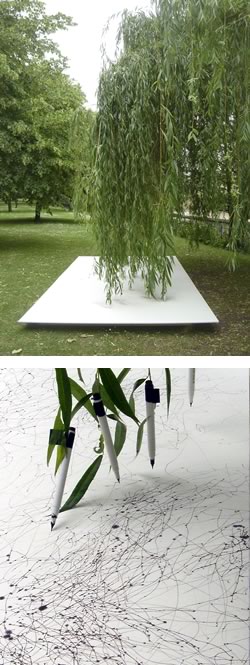 This is about trees drawing.
No, that’s not a typo for “tree drawings” or “drawing trees”, I mean “trees drawing”.
I’m always fascinated with notions of what drawing is or can be. Tim Knowles has been working on a series of tree drawings that are actually drawings made by trees.
Knowles sets up the conditions for the drawings, attaching markers to the branches of trees and allowing the wind to move the tree’s “drawing hand”. The fascinating thing about the result is that human beings can find meaning and visual pleasure in the seemingly random marks.
Knowles work is on exhibit at the Rokeby Gallery in London, UK until August 1, 2006 in a joint show with Catherine Morland. The online gallery is split between both artists, so flip through the numberd links at the top of the image to see more of Knowles’ tree drawings, as well as his drawings created by placing a plotter in the back of a moving sports car and photographs snapped by a camera on a timer peeking out of a package over the course of being delivered.
There is something primal about drawing, particularly in its most rudimentary form of lines on a surface. The Dadaists experimented with the deliberate cultivation of chance and randomness the creation of art, later exemplified by Jackson Pollock’s drip paintings and drawings, and the Surrealists were enamored of “automatic drawing”, trying to coax drawings directly out of the subconscious without conscious intervention. All of these approaches require the artist to give up control and accept elements of chance into the work.
One of the games we used to play in school was for one person to draw a line or stroke and hand it to the other to make an image from it. Sometimes we would spatter ink on the paper and then go in and work with that as a starting point for a drawing.
Knowles leaves (if you’ll excuse the the expression) his final drawings to the trees, but the whole process is a fun invitation to think about drawing in different ways and maybe loosen up a bit in our frantic desire to control our work too much.
Link via Layers of Meaning
Categories:
-
Karl Kofoed
So you’re in a friend’s house and you notice this book on the coffee table.More like a magazine, really, with a thick spine and somewhat oversize pages, but there’s this amazing image on the cover of two spacecraft and what appear to be human and non-human figures spacewalking, drifting out toward a meeting over a great swirling vortex of red.
You look at the title, “Galactic Geographic Annual 3003” it says, and below that is apparently a list of articles to be found inside: “The Passing of the Airwhales”, Diving In Methane”, “Music of Other Worlds”… and at the top you notice is says “Earth Edition”.
Wha???
Opening the covers you do indeed find the articles listed, accompanied by stunning images, along with other topics like “The Rope Makers of Betel 2B”, “Harvest on Insandor”, and “At Home With the Tsailerol”, as well as advertisements for off-world tours, extraterrestrial zoos and “Temporal Modules”.
Suddenly it dawns on you that what you have picked up off your friend’s coffee table is an artifact from the future, a copy of the Galactic Geographic Magazine annual from the year 3003, complete with in-depth articles on alien life forms, first contact, missions to save planets and rescue explorers from black holes.
Through it all is page after page of fantastically imaginative and beautifully realized images of bizarre alien creatures, intricate otherworldly plantlife, fantastic landscapes and monumental starships set against the curves of great planets.
As you read through the pages, you begin to realize that the seemingly unrelated articles are actually telling a coherent story of space exploration, adventure and contact with three intelligent races, a story told with insight, imagination and wit.
The Galactic Geographic is the creation of veteran science fiction artist Karl Kofoed, a remarkable work that is the result of creative efforts over many years. Kofoed began the individual stories as articles for Heavy Metal Magazine in 1980, where it was a regular feature for two years. It resumed in 1998 and is running in the magazine today. The collection (the “3003 Annual”) was published in 2003.
Kofoed is also a graphic designer and does specialty photo restoration in addition to his wonderful speculations on life from other worlds.
He has just launched a new site devoted to his recent work, offering it up as clickable thumbnails or a slide show. The site also indicates that giclee prints are available.
The Galactic Geographic has its own site. Although navigation is less clear than it might be, if you follow links in the text under the images you’ll be rewarded with additional images and details.
Kofoed works both in traditional media and digitally in Photohop, often combining the two. His images range from sketchy and highly textured to sharply photorealistic, and can even be delightfully cartoony at times, always appropriate to the concept he’s illustrating. You can see some additional examples of his science fiction illustration here.
In some of his more recent work he will combine photographic elements, digitallly manipulated, with digital painting and traditional watercolor in a true mixed media aproach.
Kofoed’s wife, Janet Kofoed, creates unique and imaginative jewelry, often with sculptural components. I’ve had the pleasure of knowing Karl and Janet for a number of years and they are the kind of warm and genuine people that you hope all of your favorite artists would turn out to be.
The Galactic Geographic Annual 3003 is available from Amazon. I’m just not sure how they get them from the future.
Categories:
-
Boneville Reloaded
 Jeff Smith’s Bone is one of the best examples of an independent comic breaking out into mainstream awareness on the basis of sheer quality.
It’s a wonderfully drawn, imaginative, involving and beautifully realized comic series that has been collected in a series of books, translated into editions all over the world, printed in popular magazines, and now re-issued in a new full-color version from Scholastic Press (the originals were in splendiferous black and white).
I posted about Bone, and the Boneville website in two back-to-back posts in March, one about Smith’s post on the process of drawing Bone and one on Steve Hamaker’s post about coloring Bone. The former of my two posts has more general information about the strip and its creator, Jeff Smith.
Smith has since then revamped the Boneville web site with an entirely new design, featuring a clean, spare, blog-like interface and simplified navigation.
Most of the features are still there, like the Cover Gallery, Discussion Board, Shop (containing Amazon links to the various Bone editions) and Blog.
September of this year will also see a new pressing of the out-of-print Bone One Volume Edition, the 1300 page phone-book-thick paperback that collects the Bone stories in their original sublime black and white format (not to disparage the color editions, I just happen to think the strips in color and black and white are two different works, like a drawing and a painting of the same subject). Smith has created a new cover for the volume (large version here, Smith’s blog post here).
I’ve taken some license with my doctored “screen cap” to show both the new interface and as much art from the new color edition as I could.
Link via buffalog and Bolt City.
Categories:


Charley’s Picks
Bookshop.org
(Bookshop.org affilliate links; sales benefit independent bookshop owners; I get a small percentage to help support my work on Lines and Colors)

John Singer Sargent: Watercolors


Urban Sketching: Understanding Perspective


Charley’s Picks
Amazon
(Amazon.com affiliate links; sales go to a larger yacht for Jeff Bezos; but I get a small percentage to help support my work on Lines and Colors)
John Singer Sargent: Watercolors
Urban Sketching: Understanding Perspective