
Categories
- 3d CGI
- Amusements
- Animation
- Anime & Manga
- Art Materials
- Art Videos
- Blogroll
- Cartoons
- Color
- Comics
- Concept & Visual Dev.
- Creativity
- Digital Art
- Digital Painting
- Displaying Art on the Web
- Drawing
- Eye Candy for Today
- Gallery and Museum Art
- High-res Art Images
- Illustration
- Motion Graphics & Flash
- Museums
- Online Museums
- Outsider Art
- Painting
- Painting a Day
- Paleo Art
- Pastel, Conté & Chalk
- Pen & Ink
- Prints and Printmaking
- Reviews
- Sc-fi and Fantasy
- Sculpture & Dimensional
- Site Comments
- Sketching
- Storyboards
- Tools and Techniques
- Uncategorized
- Vector Art
- Videos & Podcasts
- Vision and Optics
- Watercolor and Gouache
- Webcomics
Archives
- May 2026
- April 2026
- March 2026
- February 2026
- January 2026
- December 2025
- November 2025
- October 2025
- September 2025
- August 2025
- July 2025
- June 2025
- May 2025
- January 2025
- December 2024
- November 2024
- October 2024
- September 2024
- August 2024
- June 2024
- April 2024
- March 2024
- February 2024
- January 2024
- December 2023
- November 2023
- October 2023
- September 2023
- August 2023
- July 2023
- May 2023
- April 2023
- March 2023
- February 2023
- January 2023
- December 2022
- November 2022
- September 2022
- August 2022
- July 2022
- June 2022
- May 2022
- April 2022
- March 2022
- February 2022
- January 2022
- December 2021
- November 2021
- October 2021
- September 2021
- August 2021
- July 2021
- June 2021
- May 2021
- April 2021
- March 2021
- February 2021
- January 2021
- December 2020
- November 2020
- October 2020
- September 2020
- August 2020
- July 2020
- June 2020
- May 2020
- April 2020
- March 2020
- February 2020
- January 2020
- December 2019
- November 2019
- October 2019
- September 2019
- August 2019
- July 2019
- June 2019
- May 2019
- April 2019
- March 2019
- February 2019
- January 2019
- December 2018
- November 2018
- October 2018
- September 2018
- August 2018
- July 2018
- June 2018
- May 2018
- April 2018
- March 2018
- February 2018
- January 2018
- December 2017
- November 2017
- October 2017
- September 2017
- August 2017
- July 2017
- June 2017
- May 2017
- April 2017
- March 2017
- February 2017
- January 2017
- December 2016
- November 2016
- October 2016
- September 2016
- August 2016
- July 2016
- June 2016
- May 2016
- April 2016
- March 2016
- February 2016
- January 2016
- December 2015
- November 2015
- October 2015
- September 2015
- August 2015
- July 2015
- June 2015
- May 2015
- April 2015
- March 2015
- February 2015
- January 2015
- December 2014
- November 2014
- October 2014
- September 2014
- August 2014
- July 2014
- June 2014
- May 2014
- April 2014
- March 2014
- February 2014
- January 2014
- December 2013
- November 2013
- October 2013
- September 2013
- August 2013
- July 2013
- June 2013
- May 2013
- April 2013
- March 2013
- February 2013
- January 2013
- December 2012
- November 2012
- October 2012
- September 2012
- August 2012
- July 2012
- June 2012
- May 2012
- April 2012
- March 2012
- February 2012
- January 2012
- December 2011
- November 2011
- October 2011
- September 2011
- August 2011
- July 2011
- June 2011
- May 2011
- April 2011
- March 2011
- February 2011
- January 2011
- December 2010
- November 2010
- October 2010
- September 2010
- August 2010
- July 2010
- June 2010
- May 2010
- April 2010
- March 2010
- February 2010
- January 2010
- December 2009
- November 2009
- October 2009
- September 2009
- August 2009
- July 2009
- June 2009
- May 2009
- April 2009
- March 2009
- February 2009
- January 2009
- December 2008
- November 2008
- October 2008
- September 2008
- August 2008
- July 2008
- June 2008
- May 2008
- April 2008
- March 2008
- February 2008
- January 2008
- December 2007
- November 2007
- October 2007
- September 2007
- August 2007
- July 2007
- June 2007
- May 2007
- April 2007
- March 2007
- February 2007
- January 2007
- December 2006
- November 2006
- October 2006
- September 2006
- August 2006
- July 2006
- June 2006
- May 2006
- April 2006
- March 2006
- February 2006
- January 2006
- December 2005
- November 2005
- October 2005
- September 2005
- August 2005
Relevant Blogs
Art, Painting & Sketch
- Gurney Journey
- Underpaintings
- Art and Influence
- Painting Perceptions
- Oil Painters of America
- Vasari Paint POV
- Flying Fox
- Urban Sketchers
- Bento (Smithsonian)
- Art Inconnu
- The Hidden Place
- Still Life
- Making a Mark
- The Art of the Landscape
- Exploring Color & Creativity
- Art Contrarian
- Artist A Day
- beinArt Surreal Art Collective
- Eye Level
- David Dunlop
- p.i.g.m.e.n.t.i.u.m
- CultureGrrl
- Joaquín Sorolla blog
- Artists in Pastel
“Painting a Day”
- A Painting a Day (Keiser)
- On Painting (Keiser)
- Julian Merrow-Smith
- Karen Jurick
- Jeffrey Hayes
- Carol Marine
- Abbey Ryan
- Daily Paintworks
Other Painting Blogs
- Virtual Gouache Land
- Neil Hollingsworth
- Marc Hanson
- Kevin Menck
- Marc Dalessio
- Larry Seiler
- Stapleton Kearns
- Colin Page
- Roos Schuring
- Hans Versfelt
- Titus Meeuws
- Régis Pettinari
- René Plein Air
- Belinda Del Pesco
- Robin Weiss
- Nathan Fowkes (Land Sketch)
- William Wray
- Frank Serrano
- Stephen Magsig
- Michael Chesley Johnson
- Twice a Week
- Sarah Wimperis
- Rob Adams
- Michael Cole Manley
- The Dirty Palette Club
- Mike Manley’s Draw!
Gallery Art & Illustration mix
Illustration
- Howard Pyle
- 100 Years of Illustration
- BibliOdyssey
- Illustration Art
- Today’s Inspiration
- Illustration Mundo
- Little Chimp Society
- Danny Gregory
- R D (John Martz
- Illustration Friday blog
- Monster Brains
- Illustrators & Illustrations (RU)
- Elwood H. Smith
- DaniDraws.com
- Designers Who Blog
- iSpot Blog
Sci-Fi & Fantasy
Illustration & Comics
Comics & Cartoons
- Comics Beat
- Robot 6
- Newsarama Blog
- Comic Vine
- Comics Alliance
- Forbidden Planet Int.
- Paolo Rivera
- Bolt City
- Flight
- Scott McCloud
- The Comics Journal
- Comixpedia
- Funnybook Babylon
- James Baker
- Middleton’s Sketchbook
- Boneville
- The Hotel Fred
- Paul Rivoche
- Daily Cartoonist
- Mad About Cartoons (William Wray)
- Digital Strips
Illustration & Concept
Animation & Concept
- Cartoon Brew
- Animation Blog
- Cold Hard Flash
- Concept Art World
- The CAB
- FY Concept Art
- Concept Ships
- Concept Robots
- John Nevarez
- Armand Serrano
- Marcos Mateu-Mestre
- all kinds of stuff (Kricfalusi)
- Yacin the faun (Man Arenas)
- Kelsey Mann
- Cre8tivemarks Blog
- Ice-Cream Monster Toon Cafe
- AAU Character & Creature Design
- AAU Animation Notes
- Articles and Texticles
Paleo & Scientific
Tools & Techniques
Other
Lists of Art Blogs
Art Image Resource Links
Historic Art Images
- Wikimedia Commons: Paintings
- Wikimedia Commons: Drawings
- The Athenaeum
- WikiArt (WikiPaintings)
- Google Art Project: Artists
- Google Art Project: Collections (Museums)
- ArtCyclopedia
- Web Gallery of Art
- Art Renewal Center
- Web Gallery of Impressionism
Auction Consolidation sites
Auction sites
- Sotheby’s
- Bonham’s
- Christies
- Heritage Auctions: Fine Art
- Heritage Auctions: Illustration
- Freeman’s Auctions
- Bukowskis
- Shannon’s
Image Search
Reverse Image Search (search by image)
- Tin Eye
- RevImg
- Google Image Search (camera icon)
- Bing Image Search (camera icon)
Promoting some friends and some clients of my website design business
- Twin Willows T’ai Chi studio in Wilmington DE. Taiji classes with Bryan Davis.
- Ray Hayward, Inspired Teacher of T’ai Chi ( Taiji ) in Minneapolis, Founder of Mindful Motion Tai Chi Academy
- OldHead Tattoo studio and Art Gallery in Wilmington DE. Tattoos and paintings by Bruce Gulick
- Sharon Domenico Art, pet portrait oil paintings
- Platinum Paperhanging, wallpaper hanging, Main Line and Philadelphia, PA
- Lisa Stone Design, interior designer, Main Line and Philadelphia, PA
- Studio12KPT, original art, prints, calendars and other custom printed items by Van Sickle & Rolleri
-
R. H. Ives Gammell
 Robert Hale Ives Gammell was an artist out of sync with his times, for which I set the fault on the times rather than the artist.
Gammell was born in 1893, when academic realism and the classical traditions to which it adhered were about to be overthrown and temporarily (thankfully) submerged beneath the turgid waves of 20th Century Modernism.
Gammell trained at the School of the Boston Museum of Fine Arts, where he was a student of Edmund Tarbell, Joseph DeCamp and Phillip Hale. In particular he came to be profoundly influenced by his study with William Paxton, who had been classically trained in Europe and had studied with Jean-Léon Gérôme at the Ecole des Beaux-Arts in Paris.
Gammell thrived on the nourishment of the classical traditions, but found himself in a century when those traditions and values were being denigrated and treated as passé. His large scale paintings of mythological and Biblical themes were not well received by an art establishment caught up in the sacred “newness” of whatever modernist “ism” was in this week, and he eventually suffered a nervous collapse. He credited his recovery partly to his study of the writings of the visionary psychologist Carl G. Jung.
As he recovered he laid the groundwork for his book Twilight of Painting (out of print, but available used), in which he laments the demise of those traditions and (wrongly, I think) lays the blame partly at the unfinished Academic training of the Impressionists; which left them unable bring a painting to a finished state, and established a permissiveness for unfinished works in the art establishment. He wrote two other books, The shop-talk of Edgar Degas and The Boston Painters 1900-1930.
He devoted the remainder of his life to teaching and perpetuating what he saw, and rightly so, as the threatened traditions of classical Western Art. A number of his students (and their students) went on to become notable realist painters.
He also started what would become his masterwork, a series of 23 related paintings (or “panels”) based on the poem Hound of Heaven by English poet Francis Thompson. You can see small reproductions of nine of the panels on Wikipedia (panel 12 shown here).
Gammell found himself at a loss for some of the imagery he needed to transform the ideas in the poem into the visual realm and found them in the writings of Jung, perhaps putting him more in touch with the times than he thought.
Categories:
-
The Animated Bayeux Tapestry

The Bayeux Tapestry is a 20 inch by 230 foot (50cm x 70m) embroidered cloth that shows the story of the Norman invasion of England in 1066, from the “portent” of Halley’s comet to the Battle of Hastings. It may have been completed within a few years of the invasion, but the earliest other record of its existence is in an inventory of the Bayeux Cathederal in 1476.Like Trajan’s column, some pre-columbian manuscripts and Eqyptian hieroglyphics, it can be thought of as a “graphic story”, a form of storytelling we know today as “comics”; i.e pictures, or words and pictures, arranged in sequence to tell a story (to borrow Scott McCloud’s succinct definition).
In a kind of odd completion of a circle, there is now a computer animated version of the tapestry.
Initiated by a school project when he was 21, in which he merely needed to demonstrate that he had a command of motion graphics software, British designer David Newton took a tracking shot (like a long pan, but along a straight axis) of the tapestry and animated it, added a bit of sound and music and come up with a short movie that probably tells the story better than Hollywood could in a typical over the top blockbuster.
The camera moves along the tapestry and the pictorial elements, kings, princes, soldiers, shipwrights, blacksmiths, ships, horses and a cast of hundreds (well, dozens, anyway) come to life along the story’s path. Delightful.
There is a semi-official site devoted to the actual tapestry, and some info on Wikipedia. The only link I have to the animated version is the YouTube link, which doesn’t have much supporting information.
[Link via Kottke.org]
Categories:
-
Zina Saunders

Zina Saunders is a writer and illustrator who in the last few years has been combining her talents as “reportage illustration” in several series of combined portraits and interviews.Starting with a website called Overlooked New York in which she has set out to interview “impassioned New Yorkers”, she began illustrating her interviews by painting portraits of the interviewees. The first of the series was an article, and multiple portraits, of the members of the Puerto Rico Schwinn Club, a group of adults with a passion for those great old Schwinns with their chrome fenders and chainguards, tricked out with mirrors and flags and decorations in the spokes. The cool bikes and the wonderful character of the member’s faces made for a terrific series of paintings, and started Saunders on the path to doing more portrait/interviews.
Overlooked New York has maybe 25 or 30 stories on it now, most of which are about groups of one kind or another (Bike Messengers, River Swimmers, Subway Musicians, Kite Flyers, etc.) and feature multiple portraits.
Of double interest to lines and colors readers is her series Both Sides of the Drawing Board in which she interviews and paints portraits of illustrators and art directors, including Tim O’Brien (image above) who I profiled last year. The series will be running in every issue of Illo magazine (which I wrote about back in May). You can find several examples from the series in the Reportage section of her web site.
Her web site has a portfolio of her more general illustration, and children’s book illustration. There is an additional portfolio of her work on the site of her rep, Morgan Gaynin, Inc.
Saunders also maintains a blog on Drawger in which you can see preliminary sketches, work in progress and much larger detail images of her work.
Zina Saunders is the daughter of Norman Sanders, who created many great pulp magazine and comic covers as well as classic trading card series like Mars Attacks (more on Norman Saunders in a future post).
Zina Saunders paints the landscape of the face and figure as a series of rough edged planes, broken up into areas of often exaggerated or expressionistic colors and held within thin outlines. She sometimes surrounds them with sketch-like renderings of their environments, often with a wiggly-line style that I seldom like, but in her case works remarkably well.
Saunders has a number of portraits of celebrities, but many of my favorites are among the “overlooked New Yorkers” and people simply going about their jobs, who she treats like celebrities.
Addendum: in response to being asked about her medium and approach, Zina replied:
I’ve been changing and developing my approach for a while, but I guess it would be best described as “mixed media”. I sketch in pencil, and sometimes paint some of it traditionally and then scan and paint digitally on top of that. Sometimes I do all the painting digitally.
Each painting is different, but that’s the gist of it.
Categories:
-
Reto Kaul

Reto Kaul is a young (20 yr old) freelance concept artist and illustrator from Switzerland. His web site lists his work experience as concept design, book illustration, covers and fashion design, but doesn’t list specific credits. His portfolio, however, has some nicely atmospheric pieces that show off his talent for dealing with muted light in particular.His imaginative landscapes and imaginary cityscapes are often cast in compositions with analogous color schemes, largely blues and greens. He likes to punctuate his thick atmospheres with sharp pinpoints of light, and loves to play with the idea of faintly visible shafts of light, fanning out at they emerge through the canopies of trees, break through layers of clouds or splash around a prominence of rock.
He has a nicely balanced command of his digital tools and his pieces have suggestions of texture and detail without being overworked.
His online gallery is a little shy on information about the pieces, but if you hover your mouse over the thumbnails you’ll get a “tool tip” style pop-up with the name of the piece.
You can also find more info about the images (and some larger images) on some of the various concept art sites where he has a presence under the handle “gizmodus”.
Mirandopolis: Museum of Modern Art (image above, with detail, bottom, larger image here) is part of a series in which the museums of the imaginary city (no relation, I assume, to the actual municipality of Mirandópolis in Brazil) are pictured as built in a gigantic cave.
He also has images of an airport and cathedral for the city, and you can see a step by step for his image of the cathedral here.
Categories:
-
Tom Hale
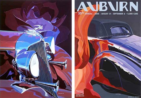 I’ve written before about concept artists and designers who create drawings and paintings of vehicles, and touched on the idea of customized car bodies as modern sculpture (in my post on “Big Daddy” Roth), but Tom Hale, who started his career as an automotive designer, has chosen cars, or more accurately, car forms, as the subject for his paintings.
Unlike many who might say they have chosen cars as the subject for paintings, Hale’s intent isn’t to illustrate the look of a particular model of automobile, though he certainly captures the flavor of individual models in terms of accuracy and detail; rather he sees the forms of vintage cars as objects of beauty.
This particularly applies to older, 30’s and 40’s cars, in which the curve of fenders, the rounded forms of headlight bezels, the dignified rise of grills and the sweeping curves of the bodies are inherently more beautiful and interesting, to my mind, than the designs of the 50’s and beyond. (Cars of the late 30’s, in particular, seem to have a kind of Art Deco grace.) Not that Hale doesn’t also see beauty in later models, particularly the chrome plated cruisers of the 50’s with the bulleted punch of enormous chrome bumpers and the cherry red gleam of the new paints.
Hale makes the forms stand out as forms, isolates them into small selected areas that make it easier to see them as something other than “a car” and renders them in sweeping graphic shapes of brilliant color.
He revels in the reflective surfaces of hand rubbed lacquer and polished chrome and his colors swirl and flow across the forms like the liquid rainbows on a film of oil. His compositions become very graphic, and work very well as posters.
His web site doesn’t mention anything about technique. The work looks like acrylic to me, though his bio mentions an award from the American Watercolor Society.
The gallery on his site kind of bypasses showing the art as art, however, and divides the work into posters and limited edition prints. You will find him portraying entire cars at times, particularly in the posters, but with the same dazzling ribbons of color playing off of reflective surfaces and curvilinear forms.
Categories:
-
Rogier van der Weyden
 Just as an individual artist struggles to learn the basics of drawing and painting, and works to progress into more sophisticated mastery of perspective, proportion, composition, and the ability to convincingly portray any desired subject, so too has Western art in general struggled to pass through those same stages.
Representational art started out as decoration and progressively moved toward less iconic and more “realistic” portrayals of people and other aspects of nature. The heights reached in Greece and Rome were lost in the “dark ages” and reclaimed or relearned in the time leading up to the Renaissance. Occasionally you see flashes of more naturalistic handling of subjects, particularly people, that presage later levels of accomplishment and understanding.
I think that Rogier van der Weyden (who changed his name from Roglet de la Pasture when he moved to Brussels) was one of those bright flashes.
Van der Weyden is presumed by scholars to have been a student of Robert Campin, and profoundly influenced by his silghtly older contemporary Jan van Eyck. Like Van Eyck he took up the new medium of oil painting and ran with it, realizing its potential to convey the world with more precision, detail and depth than the established medium of egg tempera.
He introduced some of the stylistic and compositional characteristics of Italian painting to the north and was instrumental in introducing the new technique of oil painting to the Italians (talk about picking it up and running with it).
He became, by the time of his death, the one of the most popular and influential painters in Europe, though he was afterward almost forgotten for hundreds of years, and much of what we know about him is through the research of scholars in the last century or so.
Unlike Van Eyck, Van der Weyden strayed from attempting to represent the world as accurately as possible and choose to infuse his work with more emotion, usually in the service of religious works. Occasionally he painted secular portraits, like the image shown here, usually simply called Portrait of a Young Woman or Lady wearing a Gauze Headdress. I’ve always found this painting in particular striking, standing out amid other work of the time like a red poppy in a green lawn.
It’s a beautiful face, rendered with confident draftsmanship and tonal subtlety, from the faint under-lighting of the folds of white fabric under her chin to the delicate Leonardoesque corners of her mouth. Wonderful. (And when I say “Leonardoesque”, bear in mind that Da Vinci wouldn’t be born for another 6 or 7 years.)
Here is where I may get a bit presumptuous in second guessing a great master, as something strikes me as a bit odd about her eyes. Yes, they too are beautiful, luminous green, holding our gaze with unwavering equanimity, with slight traces of lashes beneath absent brows (not uncommon in paintings of the time).
Look at her left eye, though (to our right), also delicately modeled, also beautiful; but isn’t it essentially the same beautifully modeled shape as her right eye? An eye in that position should be more rounded to reflect it’s position on the spherical axis of the head. Also the shape of the eyes seems oversimplified, almost iconic. I think you can see the artist appear to have some difficulty with the shape of eyes in other paintings and drawings as well.
Though he may have been free in his interpretation, intentionally giving the eyes in this portrait an artificial symmetry, I think Van der Weyden is painting partly what he sees and partly what he knows, struggling a bit with the accurate representation of reality as is actually is, and, in a way, representing the whole of Western art as it worked to improve its grasp of this process of capturing the world with brushes and paints.
Categories:


Charley’s Picks
Bookshop.org
(Bookshop.org affilliate links; sales benefit independent bookshop owners; I get a small percentage to help support my work on Lines and Colors)

John Singer Sargent: Watercolors


Urban Sketching: Understanding Perspective


Charley’s Picks
Amazon
(Amazon.com affiliate links; sales go to a larger yacht for Jeff Bezos; but I get a small percentage to help support my work on Lines and Colors)
John Singer Sargent: Watercolors
Urban Sketching: Understanding Perspective