
Categories
- 3d CGI
- Amusements
- Animation
- Anime & Manga
- Art Materials
- Art Videos
- Blogroll
- Cartoons
- Color
- Comics
- Concept & Visual Dev.
- Creativity
- Digital Art
- Digital Painting
- Displaying Art on the Web
- Drawing
- Eye Candy for Today
- Gallery and Museum Art
- High-res Art Images
- Illustration
- Motion Graphics & Flash
- Museums
- Online Museums
- Outsider Art
- Painting
- Painting a Day
- Paleo Art
- Pastel, Conté & Chalk
- Pen & Ink
- Prints and Printmaking
- Reviews
- Sc-fi and Fantasy
- Sculpture & Dimensional
- Site Comments
- Sketching
- Storyboards
- Tools and Techniques
- Uncategorized
- Vector Art
- Videos & Podcasts
- Vision and Optics
- Watercolor and Gouache
- Webcomics
Archives
- May 2026
- April 2026
- March 2026
- February 2026
- January 2026
- December 2025
- November 2025
- October 2025
- September 2025
- August 2025
- July 2025
- June 2025
- May 2025
- January 2025
- December 2024
- November 2024
- October 2024
- September 2024
- August 2024
- June 2024
- April 2024
- March 2024
- February 2024
- January 2024
- December 2023
- November 2023
- October 2023
- September 2023
- August 2023
- July 2023
- May 2023
- April 2023
- March 2023
- February 2023
- January 2023
- December 2022
- November 2022
- September 2022
- August 2022
- July 2022
- June 2022
- May 2022
- April 2022
- March 2022
- February 2022
- January 2022
- December 2021
- November 2021
- October 2021
- September 2021
- August 2021
- July 2021
- June 2021
- May 2021
- April 2021
- March 2021
- February 2021
- January 2021
- December 2020
- November 2020
- October 2020
- September 2020
- August 2020
- July 2020
- June 2020
- May 2020
- April 2020
- March 2020
- February 2020
- January 2020
- December 2019
- November 2019
- October 2019
- September 2019
- August 2019
- July 2019
- June 2019
- May 2019
- April 2019
- March 2019
- February 2019
- January 2019
- December 2018
- November 2018
- October 2018
- September 2018
- August 2018
- July 2018
- June 2018
- May 2018
- April 2018
- March 2018
- February 2018
- January 2018
- December 2017
- November 2017
- October 2017
- September 2017
- August 2017
- July 2017
- June 2017
- May 2017
- April 2017
- March 2017
- February 2017
- January 2017
- December 2016
- November 2016
- October 2016
- September 2016
- August 2016
- July 2016
- June 2016
- May 2016
- April 2016
- March 2016
- February 2016
- January 2016
- December 2015
- November 2015
- October 2015
- September 2015
- August 2015
- July 2015
- June 2015
- May 2015
- April 2015
- March 2015
- February 2015
- January 2015
- December 2014
- November 2014
- October 2014
- September 2014
- August 2014
- July 2014
- June 2014
- May 2014
- April 2014
- March 2014
- February 2014
- January 2014
- December 2013
- November 2013
- October 2013
- September 2013
- August 2013
- July 2013
- June 2013
- May 2013
- April 2013
- March 2013
- February 2013
- January 2013
- December 2012
- November 2012
- October 2012
- September 2012
- August 2012
- July 2012
- June 2012
- May 2012
- April 2012
- March 2012
- February 2012
- January 2012
- December 2011
- November 2011
- October 2011
- September 2011
- August 2011
- July 2011
- June 2011
- May 2011
- April 2011
- March 2011
- February 2011
- January 2011
- December 2010
- November 2010
- October 2010
- September 2010
- August 2010
- July 2010
- June 2010
- May 2010
- April 2010
- March 2010
- February 2010
- January 2010
- December 2009
- November 2009
- October 2009
- September 2009
- August 2009
- July 2009
- June 2009
- May 2009
- April 2009
- March 2009
- February 2009
- January 2009
- December 2008
- November 2008
- October 2008
- September 2008
- August 2008
- July 2008
- June 2008
- May 2008
- April 2008
- March 2008
- February 2008
- January 2008
- December 2007
- November 2007
- October 2007
- September 2007
- August 2007
- July 2007
- June 2007
- May 2007
- April 2007
- March 2007
- February 2007
- January 2007
- December 2006
- November 2006
- October 2006
- September 2006
- August 2006
- July 2006
- June 2006
- May 2006
- April 2006
- March 2006
- February 2006
- January 2006
- December 2005
- November 2005
- October 2005
- September 2005
- August 2005
Relevant Blogs
Art, Painting & Sketch
- Gurney Journey
- Underpaintings
- Art and Influence
- Painting Perceptions
- Oil Painters of America
- Vasari Paint POV
- Flying Fox
- Urban Sketchers
- Bento (Smithsonian)
- Art Inconnu
- The Hidden Place
- Still Life
- Making a Mark
- The Art of the Landscape
- Exploring Color & Creativity
- Art Contrarian
- Artist A Day
- beinArt Surreal Art Collective
- Eye Level
- David Dunlop
- p.i.g.m.e.n.t.i.u.m
- CultureGrrl
- Joaquín Sorolla blog
- Artists in Pastel
“Painting a Day”
- A Painting a Day (Keiser)
- On Painting (Keiser)
- Julian Merrow-Smith
- Karen Jurick
- Jeffrey Hayes
- Carol Marine
- Abbey Ryan
- Daily Paintworks
Other Painting Blogs
- Virtual Gouache Land
- Neil Hollingsworth
- Marc Hanson
- Kevin Menck
- Marc Dalessio
- Larry Seiler
- Stapleton Kearns
- Colin Page
- Roos Schuring
- Hans Versfelt
- Titus Meeuws
- Régis Pettinari
- René Plein Air
- Belinda Del Pesco
- Robin Weiss
- Nathan Fowkes (Land Sketch)
- William Wray
- Frank Serrano
- Stephen Magsig
- Michael Chesley Johnson
- Twice a Week
- Sarah Wimperis
- Rob Adams
- Michael Cole Manley
- The Dirty Palette Club
- Mike Manley’s Draw!
Gallery Art & Illustration mix
Illustration
- Howard Pyle
- 100 Years of Illustration
- BibliOdyssey
- Illustration Art
- Today’s Inspiration
- Illustration Mundo
- Little Chimp Society
- Danny Gregory
- R D (John Martz
- Illustration Friday blog
- Monster Brains
- Illustrators & Illustrations (RU)
- Elwood H. Smith
- DaniDraws.com
- Designers Who Blog
- iSpot Blog
Sci-Fi & Fantasy
Illustration & Comics
Comics & Cartoons
- Comics Beat
- Robot 6
- Newsarama Blog
- Comic Vine
- Comics Alliance
- Forbidden Planet Int.
- Paolo Rivera
- Bolt City
- Flight
- Scott McCloud
- The Comics Journal
- Comixpedia
- Funnybook Babylon
- James Baker
- Middleton’s Sketchbook
- Boneville
- The Hotel Fred
- Paul Rivoche
- Daily Cartoonist
- Mad About Cartoons (William Wray)
- Digital Strips
Illustration & Concept
Animation & Concept
- Cartoon Brew
- Animation Blog
- Cold Hard Flash
- Concept Art World
- The CAB
- FY Concept Art
- Concept Ships
- Concept Robots
- John Nevarez
- Armand Serrano
- Marcos Mateu-Mestre
- all kinds of stuff (Kricfalusi)
- Yacin the faun (Man Arenas)
- Kelsey Mann
- Cre8tivemarks Blog
- Ice-Cream Monster Toon Cafe
- AAU Character & Creature Design
- AAU Animation Notes
- Articles and Texticles
Paleo & Scientific
Tools & Techniques
Other
Lists of Art Blogs
Art Image Resource Links
Historic Art Images
- Wikimedia Commons: Paintings
- Wikimedia Commons: Drawings
- The Athenaeum
- WikiArt (WikiPaintings)
- Google Art Project: Artists
- Google Art Project: Collections (Museums)
- ArtCyclopedia
- Web Gallery of Art
- Art Renewal Center
- Web Gallery of Impressionism
Auction Consolidation sites
Auction sites
- Sotheby’s
- Bonham’s
- Christies
- Heritage Auctions: Fine Art
- Heritage Auctions: Illustration
- Freeman’s Auctions
- Bukowskis
- Shannon’s
Image Search
Reverse Image Search (search by image)
- Tin Eye
- RevImg
- Google Image Search (camera icon)
- Bing Image Search (camera icon)
Promoting some friends and some clients of my website design business
- Twin Willows T’ai Chi studio in Wilmington DE. Taiji classes with Bryan Davis.
- Ray Hayward, Inspired Teacher of T’ai Chi ( Taiji ) in Minneapolis, Founder of Mindful Motion Tai Chi Academy
- OldHead Tattoo studio and Art Gallery in Wilmington DE. Tattoos and paintings by Bruce Gulick
- Sharon Domenico Art, pet portrait oil paintings
- Platinum Paperhanging, wallpaper hanging, Main Line and Philadelphia, PA
- Lisa Stone Design, interior designer, Main Line and Philadelphia, PA
- Studio12KPT, original art, prints, calendars and other custom printed items by Van Sickle & Rolleri
-
Brian Despain
 I just love robots. Big, little, advanced, retro, shiny, dinged, menacing, friendly or simply wacky, ‘bots leave lots of room for artists to play with forms, textures and wild ideas.
Brian Despain paints great bots. His are of the dingy and dinged variety, and he excels at giving his metallic surfaces that battered and oxidized look that lets you know his bots have been around. He also paints highly rendered, whimsical and sometimes dark illustrations of other subjects, but it’s the robots that shine (or not, depending on how dingy he has rendered their aging metal).
Despain is a concept artist and illustrator who has done work for a number of companies in the gaming card realm, including Wizards of the Coast and TSR. He is currently working as a concept artist, designer, modeler and illustrator for the gaming company Snowblind Studios.
Unfortunately, his site doesn’t seem to have been updated for some time, but he occasionally shows up on some of the GC art sites, which makes me assume that he works primarily digitally. His site doesn’t include much about technique.
You can find Despain’s work in some of the Spectrum collections of contemporary fantastic art (including Spectrum 11 and Spectrum 12) as well as collections for gaming enthusiasts like Monstrous Compendium Annual, Vol. 4 (Advanced Dungeons & Dragons Accessory, No. 2173) and Book of the Righteous (d20 System) (Arcana).
Addendum: Brian has written to say that there may be a major site overhaul in the works in the near future, so stay tuned! He was also kind enough to supply me with a higher-res image from which I’ve pulled some larger details of his rendering of the aged metallic surfaces.
Categories:
-
Yan Nascimbene

Simplicity is an enigmatic and elusive quality. We often say we admire and desire it, but seldom feel we have reached it.French/Italian illustrator Yan Nascimbene manages to achieve that quality often in his serene and engaging illustrations that dwell on the enchantment of the ordinary.
Obviously very influenced by the simplicity and charm of Japanese woodblock prints, and probably the ligne claire style of European comics artists like Hergé and others, Nascimbene has illustrated dozens of books, as well as providing illustrations for publications like Time, Newsweek, The Wall Street Journal, Boston Globe and Atlantic Monthly, and advertising illustration for companies like IBM, Apple, Macy’s, Air France, British Airways and Bank of America.
He seems most devoted, however, to his illustrations for books by an Italian writer named Italo Calvino like Aventures, Palomar and Le baron Perché. I’m not familiar with Calvino, but after reading Nascimbene’s comments, I plan to check him out.
Nascimbene uses a deceptively simple line and beautifully controlled atmospheric color to draw us into the magic within the commonplace. He has a fascination with rays of light, dappled sun and the subtle chiariscuro of midday summer shadows that enliven his compositions with a subtle rhythm and poetic geometry.
Categories:
-
Daniel Garber
 Pennsylvania is a beautiful state. It’s lush and green in the summer, bursting with color in the fall and in winter reveals gracefully rolling hills and mountains laced with the traceries of stands of deciduous forest.
Eastern Pennsylvania in particular, in the areas along the Brandywine Creek and Delaware River, has inspired two schools of artists, both of which flowered around the turn of the 20th Century: the Brandywine School of great illustrators, including Howard Pyle and N.C. Wyeth, and the landscape painters working in Bucks County in and around a small town called New Hope, that was something of an artist’s colony.
These painters were generally called “Pennsylvania Impressionists”, a term museums and galleries like to apply to Pennsylvania artists who were influenced by the French Impressionists because the word “Impressionism” sells.
Notable among those painters is Daniel Garber. Perhaps you can call him an Impressionist, perhaps not.
The bright colors are there, as are the overt brushstrokes, the freshness and immediacy of images painted from life and the brilliant landscapes flooded with light and broken color; but like most American painters labeled “Impressionist”, I think he is… something else. I’m not sure I have a label for it, but “Impressionist” doesn’t tell the whole story.
Garber’s rolling Pennsylvania fields and verdant hills have an undercurrent of the Brandywine tradition, even if just from similarities in subject matter, but the overall effect and intent seem quite different from either that school or French Impressionism.
Occasionally his landscapes are bathed in light that seems so strong it’s as if the colors in the brightest areas were being bleached out, like an over exposed photograph. At times his canvasses seem to be broken up into planes of color, while still managing to be “realism” in some sense. Sort of like a collision between Cezanne and Alfred Sisley.
At other times, he can, indeed, look like an Impressionist, with sun dappled fields, wooded hills and reflective creeks exploded into a flurry of brilliant brushstrokes. Look again and you’ll find him painting like a realist, a very direct and painterly realist, but a realist nonetheless.
This becomes evident in Garber’s canvasses of interior scenes, in a vein somewhat similar to Edmund Tarbell, who also gets boxed and sold as an American “Impressionist”. Garber, again separating him from other painters usually placed in the same box, also established himself as a portrait artist.
Garber’s work is exceptionally beautiful, and if you live in the area, you’ll have a chance this Winter to see a major retrospective at the Pennsylvania Academy of the Fine Arts, where Garber studied and was eventually an instructor for 40 years.
The show is called Daniel Garber: Romantic Realist and runs from January 26 to April 8, 2007.
Garber’s work is often fairly large in scale, and the chance to stand in front of his canvasses and immerse yourself in his brilliant visions of Pennsylvania’s countryside is not to be missed.
Categories:
-
Herblock (Herb Block)
 Herbert Block, who signed his name Herblock, was one of the most influential and widely respected American editorial cartoonists in the 20th Century. His remarkable career, most of which was spent on the staff of the Washington Post, spanned much of the 20th Century and extended into the 21st, from 1929 to 2001.
Herblock did exactly what an editorial cartoonist should do; he pointed out corruption, graft, sleaze, stupidity, and the other dangers inherent in any political system that puts power-hungry people in power; and he did it with wit, style and a flare for holding up the truth like a flag.
He went after dangerous megalomaniacs like Senator Joseph McCarthy, and was, in fact, the one who coined the term “McCarthyism”, which we now use to identify any politician who uses scare-tactic witch-hunting to aggregate power and inflence.
He went after Nixon and his corrupt cronies in the 70’s, earning in the process his third Pulitzer Prize. He also garnered other awards in his career, including the National Cartoonist Society’s Reuben Award and Editorial Cartoon Award (twice). He was elected to the NCS Hall of Fame in 1979 and was awarded the Presidential Medal of Freedom in 1944.
Herblock’s drawing style was as straightforward as his writing, quick, to the point, and dead on target. He drew his cartoons in a combination of pencil, pen and crayon, often pasting up bits and dropping out areas with white-out. There was no pretension of the finished piece being a work of art headed for a frame, this was news commentary and was meant to be created quickly, photographed and slapped on the press.
The Library of Congress has assembled an exhibit of Herblock’s cartoons, both physical and virtual. The physical exhibit, Enduring Outrage: Editorial Cartoons by Herblock, at the LOC in Washintgon, D.C. runs from July 17 of this year to January 20, 2007. The online exhibit will probably stay up for an extended period as most of the LOC exhibits do.
The online exhibit (and I presume the physical one) features both the final cartoon as prepared for the camera, and in many cases preliminary sketches, a real treat that we don’t often get to see. There are more cartoons listed in the Checklist of Objects.
It’s worth noting how eerily relevant many of Herblock’s cartoons from the 1960’s and 70’s are to today’s news, particularly in terms of issues like deficit spending, domestic spying, the erosion of civil liberties in the name of “security”, the political influence of religious factions and ethics scandals with their attendant cover-ups. Nice to know we’re making such progress.
Categories:
-
I want YOU to get out and vote!

Hey you! Yes, you!Are you an American citizen?
Did you vote yet?
No?
Well, go ahead, I’ll wait.
…
…
…
…
…
…
…
…
Back already?
That was easy enough wasn’t it? Feels good, doesn’t it? Very important too, and not just for the obvious reasons. Things like funding for the arts, federal support for art education programs and the standards for taxes as they relate to contributions for arts related non-profit organizations; all of these things are decided at the congressional level, and are directly influenced by mid-term elections.So are issues like whether or not we’ll have to re-institute a military draft, if we can’t recruit enough to keep the military all-volunteer. But maybe we should once again call on the power of Uncle Sam to attract recruits with his famous “I want YOU for the U.S. Army!” pointed finger poster.
This image, which is the most famous and enduring image of Uncle Sam, was painted by the great illustrator James Montgomery Flagg. (Sounds too patriotic to be true, doesn’t it?)
Mostly remembered as a recruiting poster for the U.S. Army, used in both World War I and World War II, the image was originally created for a magazine cover published prior the the U.S. entry into WWI, and was accompanied by the heading “What Are YOU Doing for Preparedness?”.
The pose was based on a British Army recruitment poster for WWI (below, left), showing Lord Kitchner, then England’s Secretary of State for War. It was drawn by British illustrator Alfred Leete and was also originally created for a magazine cover.
The origin of the name of Uncle Sam is in a bit of question; suffice it to say that it works well as a name with the abbreviation “U.S.” (which is also the origin of the “$” dollar sign, by the way, an extended letter “S” overlaid with a condensed letter “U”, with the bottom of the “U” eventually removed, leaving two vertical lines).
The concept of Uncle Sam as the personification (gamers, read: “avatar”) of the United States existed for a while before he was first given representation as an image, initially drawn by cartoonist Frank Bellew in the early 1850’s.
It was famous political cartoonist Thomas Nast (who was also responsible for creating the elephant and donkey symbols to represent the Republican and Democratic parties) who gave Uncle Sam the form we now recognize, with his top hat, beard and striped pants (below, middle).

It was Flagg, however, a superb illustrator about whom I will write more in the future, who really put the image in our minds. Flagg did other illustrations of Uncle Sam (above, right), but it is the stern finger-pointing image we always remember (an image for which Flagg used his own face as the model).
It is an image so iconic and powerful that few people, if you ask, will remember that the painting has an unfinished character, leaving Sam minus his left arm. Our attention is drawn inexorably to those piercing eyes and that pointing finger.
Oh, and if you’re reading this on Election Day and you still didn’t vote yet, — go ahead. Tell ’em Sam sent you!
Categories:
-
Aly Fell
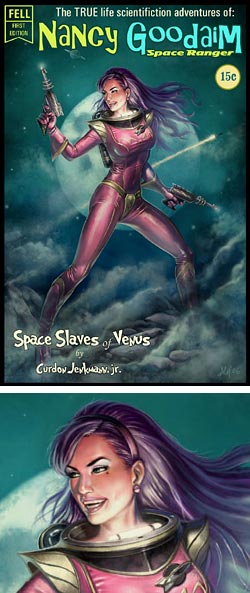 Somewhere in the base of my brain lives the 12-year-old me, still a sucker for classic pin-up art, lurid pulp and detective story covers and clichéd 50’s sci-fi ray gun and spaceship illustrations, particularly involving beautiful women. So I can’t help but love images like this mock comic cover, in all its misty-planet, skin-tight spacesuit and ring-barreled raygun glory. Space Slaves of Venus, indeed.
I suspect that digital painter Aly Fell is in pretty direct contact with the 12-year old kid in the base of his brain as well, since he apparently turns out images like this mostly for fun (and, I presume, to keep his digital painting chops up) when not doing character design and animation for gaming companies like Eurocom Entertainment, Core Design, Nu-GenerationGames and Cosgrove Hall.
Fell has little of his professional work on his site for contractual reasons, instead populating it with his digital paintings, largely of women, often with themes of horror, sci-fi or a particular fascination with “angels” and “devils”, appealing on another level to adolescent boys’ fascination with the idea of “good girls” and “bad girls”.
Fell is fond of classic pin-up artists like Gil Elvgren and illustrators like Norman Rockwell as well as the more obvious influences from sci-fi and fantasy art. He does his digital painting in Painter, Photoshop and Alias Sketchbook.
His space on CGSociety includes brief discussions of the images, his influences and working process and his regular site occasionally includes tutorials, including a brief animated step by step of the image shown here.
Staying in touch with the adolescent inside us as we grow older (as long it we don’t let him be in charge too much) is a Good Thing. It’s all too easy to let that sense of adventure, optimism and wide-eyed fascination slip away.
Note: Site contains some mildly NSFW material.
Categories:


Charley’s Picks
Bookshop.org
(Bookshop.org affilliate links; sales benefit independent bookshop owners; I get a small percentage to help support my work on Lines and Colors)

John Singer Sargent: Watercolors


Urban Sketching: Understanding Perspective


Charley’s Picks
Amazon
(Amazon.com affiliate links; sales go to a larger yacht for Jeff Bezos; but I get a small percentage to help support my work on Lines and Colors)
John Singer Sargent: Watercolors
Urban Sketching: Understanding Perspective