
Categories
- 3d CGI
- Amusements
- Animation
- Anime & Manga
- Art Materials
- Art Videos
- Blogroll
- Cartoons
- Color
- Comics
- Concept & Visual Dev.
- Creativity
- Digital Art
- Digital Painting
- Displaying Art on the Web
- Drawing
- Eye Candy for Today
- Gallery and Museum Art
- High-res Art Images
- Illustration
- Motion Graphics & Flash
- Museums
- Online Museums
- Outsider Art
- Painting
- Painting a Day
- Paleo Art
- Pastel, Conté & Chalk
- Pen & Ink
- Prints and Printmaking
- Reviews
- Sc-fi and Fantasy
- Sculpture & Dimensional
- Site Comments
- Sketching
- Storyboards
- Tools and Techniques
- Uncategorized
- Vector Art
- Videos & Podcasts
- Vision and Optics
- Watercolor and Gouache
- Webcomics
Archives
- June 2026
- May 2026
- April 2026
- March 2026
- February 2026
- January 2026
- December 2025
- November 2025
- October 2025
- September 2025
- August 2025
- July 2025
- June 2025
- May 2025
- January 2025
- December 2024
- November 2024
- October 2024
- September 2024
- August 2024
- June 2024
- April 2024
- March 2024
- February 2024
- January 2024
- December 2023
- November 2023
- October 2023
- September 2023
- August 2023
- July 2023
- May 2023
- April 2023
- March 2023
- February 2023
- January 2023
- December 2022
- November 2022
- September 2022
- August 2022
- July 2022
- June 2022
- May 2022
- April 2022
- March 2022
- February 2022
- January 2022
- December 2021
- November 2021
- October 2021
- September 2021
- August 2021
- July 2021
- June 2021
- May 2021
- April 2021
- March 2021
- February 2021
- January 2021
- December 2020
- November 2020
- October 2020
- September 2020
- August 2020
- July 2020
- June 2020
- May 2020
- April 2020
- March 2020
- February 2020
- January 2020
- December 2019
- November 2019
- October 2019
- September 2019
- August 2019
- July 2019
- June 2019
- May 2019
- April 2019
- March 2019
- February 2019
- January 2019
- December 2018
- November 2018
- October 2018
- September 2018
- August 2018
- July 2018
- June 2018
- May 2018
- April 2018
- March 2018
- February 2018
- January 2018
- December 2017
- November 2017
- October 2017
- September 2017
- August 2017
- July 2017
- June 2017
- May 2017
- April 2017
- March 2017
- February 2017
- January 2017
- December 2016
- November 2016
- October 2016
- September 2016
- August 2016
- July 2016
- June 2016
- May 2016
- April 2016
- March 2016
- February 2016
- January 2016
- December 2015
- November 2015
- October 2015
- September 2015
- August 2015
- July 2015
- June 2015
- May 2015
- April 2015
- March 2015
- February 2015
- January 2015
- December 2014
- November 2014
- October 2014
- September 2014
- August 2014
- July 2014
- June 2014
- May 2014
- April 2014
- March 2014
- February 2014
- January 2014
- December 2013
- November 2013
- October 2013
- September 2013
- August 2013
- July 2013
- June 2013
- May 2013
- April 2013
- March 2013
- February 2013
- January 2013
- December 2012
- November 2012
- October 2012
- September 2012
- August 2012
- July 2012
- June 2012
- May 2012
- April 2012
- March 2012
- February 2012
- January 2012
- December 2011
- November 2011
- October 2011
- September 2011
- August 2011
- July 2011
- June 2011
- May 2011
- April 2011
- March 2011
- February 2011
- January 2011
- December 2010
- November 2010
- October 2010
- September 2010
- August 2010
- July 2010
- June 2010
- May 2010
- April 2010
- March 2010
- February 2010
- January 2010
- December 2009
- November 2009
- October 2009
- September 2009
- August 2009
- July 2009
- June 2009
- May 2009
- April 2009
- March 2009
- February 2009
- January 2009
- December 2008
- November 2008
- October 2008
- September 2008
- August 2008
- July 2008
- June 2008
- May 2008
- April 2008
- March 2008
- February 2008
- January 2008
- December 2007
- November 2007
- October 2007
- September 2007
- August 2007
- July 2007
- June 2007
- May 2007
- April 2007
- March 2007
- February 2007
- January 2007
- December 2006
- November 2006
- October 2006
- September 2006
- August 2006
- July 2006
- June 2006
- May 2006
- April 2006
- March 2006
- February 2006
- January 2006
- December 2005
- November 2005
- October 2005
- September 2005
- August 2005
Relevant Blogs
Art, Painting & Sketch
- Gurney Journey
- Underpaintings
- Art and Influence
- Painting Perceptions
- Oil Painters of America
- Vasari Paint POV
- Flying Fox
- Urban Sketchers
- Bento (Smithsonian)
- Art Inconnu
- The Hidden Place
- Still Life
- Making a Mark
- The Art of the Landscape
- Exploring Color & Creativity
- Art Contrarian
- Artist A Day
- beinArt Surreal Art Collective
- Eye Level
- David Dunlop
- p.i.g.m.e.n.t.i.u.m
- CultureGrrl
- Joaquín Sorolla blog
- Artists in Pastel
“Painting a Day”
- A Painting a Day (Keiser)
- On Painting (Keiser)
- Julian Merrow-Smith
- Karen Jurick
- Jeffrey Hayes
- Carol Marine
- Abbey Ryan
- Daily Paintworks
Other Painting Blogs
- Virtual Gouache Land
- Neil Hollingsworth
- Marc Hanson
- Kevin Menck
- Marc Dalessio
- Larry Seiler
- Stapleton Kearns
- Colin Page
- Roos Schuring
- Hans Versfelt
- Titus Meeuws
- Régis Pettinari
- René Plein Air
- Belinda Del Pesco
- Robin Weiss
- Nathan Fowkes (Land Sketch)
- William Wray
- Frank Serrano
- Stephen Magsig
- Michael Chesley Johnson
- Twice a Week
- Sarah Wimperis
- Rob Adams
- Michael Cole Manley
- The Dirty Palette Club
- Mike Manley’s Draw!
Gallery Art & Illustration mix
Illustration
- Howard Pyle
- 100 Years of Illustration
- BibliOdyssey
- Illustration Art
- Today’s Inspiration
- Illustration Mundo
- Little Chimp Society
- Danny Gregory
- R D (John Martz
- Illustration Friday blog
- Monster Brains
- Illustrators & Illustrations (RU)
- Elwood H. Smith
- DaniDraws.com
- Designers Who Blog
- iSpot Blog
Sci-Fi & Fantasy
Illustration & Comics
Comics & Cartoons
- Comics Beat
- Robot 6
- Newsarama Blog
- Comic Vine
- Comics Alliance
- Forbidden Planet Int.
- Paolo Rivera
- Bolt City
- Flight
- Scott McCloud
- The Comics Journal
- Comixpedia
- Funnybook Babylon
- James Baker
- Middleton’s Sketchbook
- Boneville
- The Hotel Fred
- Paul Rivoche
- Daily Cartoonist
- Mad About Cartoons (William Wray)
- Digital Strips
Illustration & Concept
Animation & Concept
- Cartoon Brew
- Animation Blog
- Cold Hard Flash
- Concept Art World
- The CAB
- FY Concept Art
- Concept Ships
- Concept Robots
- John Nevarez
- Armand Serrano
- Marcos Mateu-Mestre
- all kinds of stuff (Kricfalusi)
- Yacin the faun (Man Arenas)
- Kelsey Mann
- Cre8tivemarks Blog
- Ice-Cream Monster Toon Cafe
- AAU Character & Creature Design
- AAU Animation Notes
- Articles and Texticles
Paleo & Scientific
Tools & Techniques
Other
Lists of Art Blogs
Art Image Resource Links
Historic Art Images
- Wikimedia Commons: Paintings
- Wikimedia Commons: Drawings
- The Athenaeum
- WikiArt (WikiPaintings)
- Google Art Project: Artists
- Google Art Project: Collections (Museums)
- ArtCyclopedia
- Web Gallery of Art
- Art Renewal Center
- Web Gallery of Impressionism
Auction Consolidation sites
Auction sites
- Sotheby’s
- Bonham’s
- Christies
- Heritage Auctions: Fine Art
- Heritage Auctions: Illustration
- Freeman’s Auctions
- Bukowskis
- Shannon’s
Image Search
Reverse Image Search (search by image)
- Tin Eye
- RevImg
- Google Image Search (camera icon)
- Bing Image Search (camera icon)
Promoting some friends and some clients of my website design business
- Twin Willows T’ai Chi studio in Wilmington DE. Taiji classes with Bryan Davis.
- Ray Hayward, Inspired Teacher of T’ai Chi ( Taiji ) in Minneapolis, Founder of Mindful Motion Tai Chi Academy
- OldHead Tattoo studio and Art Gallery in Wilmington DE. Tattoos and paintings by Bruce Gulick
- Sharon Domenico Art, pet portrait oil paintings
- Platinum Paperhanging, wallpaper hanging, Main Line and Philadelphia, PA
- Lisa Stone Design, interior designer, Main Line and Philadelphia, PA
- Studio12KPT, original art, prints, calendars and other custom printed items by Van Sickle & Rolleri
-
Zhaoming Wu
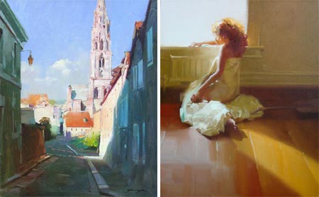
Zhaoming Wu is a Chinese painter and teacher who has been a professor of painting at the Guangzhou Academy of Fine Art in China and is currently an instructor of panting at the Academy of Art University in San Francisco.His work has garnered awards in China, Europe and the U.S. and has been featured in a number of publications including Art of the West and International Artist Magazine.
Wu paints figures, portraits and landscapes in an open, extremely painterly style, in which the character of the paint-laden brushstrokes seem as important as the forms they define. The brushstrokes, in fact, often are the forms, with deceptively simple textured strokes that make up folds of cloth or the shapes of buildings.
In his landscapes and room interiors, Wu emphasizes the geometry of the forms and sets aside areas of color as distinct shapes, deliberately blurring or obscuring detail in favor of composition and color.
Even his drawings are “painterly”. There is a nice selection of drawings on his site, in which contrast and tone take on the role color plays in his paintings, edges are often blurred or smeared, and background tones roughed out in a manner evocative of brush strokes.
[Suggestion courtesy of Evan Waldinger]
Categories:
-
Ron Mueck

I don’t often devote a lot of attention to sculpture, but, as I noted in my recent post on Claes Oldenburg, one of the things art does at its finest is to shake up our preconceptions and show us the world with fresh eyes.Ron Mueck’s astonishing sculptures of ordinary, non-heroic people do just that. Usually unclothed, his figures are strikingly realistic in terms of the physical appearance of flesh, hair, and the textures and colors of human beings; right down to finger and toenails, blemishes and moles, goosebumps, individual head and body hairs inserted one by one, and the appearance of superficial veins beneath the skin.
Life-like replicas of human beings, no matter how realistic, would not in themselves necessarily alter our perceptions. Mueck does that by ingenious manipulation of scale. His spookily human sculptures are not life size. Some are gargantuan, others slightly larger than life, like his eight foot high standing pregnant woman, some are quite small and others are about half life-size, like his startling sculpture of his dead father, which helped establish his reputation as a gallery artist.
Mueck’s sculptures are made of fiberglass and silicone and crafted with techniques Mueck acquired in his previous career as a special effects artist, working on such films as Labyrinth.
You may have seen mention on the web of his earlier, somewhat grotesque, giant babies, but I think his more recent and sophisticated work is much more interesting.
In 2006 the National Gallery in London invited Mueck to become an artist in residence and create sculptures inspired by works in the museum’s collection of old masters. There is a half-hour documentary that gives a brief overview of Mueck and his work and follows him through the extensive and painstaking process of creating his sculpture of the standing pregnant woman.
Mueck starts with the traditional sculptor’s path of sketches, preliminary clay sculptures, a small but detailed maquette and then a full size, fully realized clay sculpture. It is in the casting in fiberglass and modeling in silicone that the process diverges from the traditional methods of casting in bronze.
Even in photographs, the realism and the element of scale make Mueck’s work striking. I haven’t had the chance to see his sculptures “in the flesh”, so to speak, but the effect must be startling.
Note: Some may consider his realistic depictions of naked humans NSFW.
[Suggestion courtesy of Kevin Sparkman]
Categories:
-
Laura Wilder

I first came across Laura Wilder’s unusual “house portraits” when doing research a year or so ago for a project I was working on with FusionSpark Media called the Florida-Friendly Interactive Yard.I was looking for reference on various styles of rendering houses and I was struck by Wilder’s approach.
Though she sometimes uses watercolor or pen and ink in a more conventional way, many of her images of houses are done in gouache in a simplified, graphic style similar in appearance to woodblock prints. The ability of gouache to lay down flat tones, which has made it a favorite of illustrators over the years, is perfect for this application.
Working from photographic reference, Wilder manages to abstract (in the original sense of that word) the essential shapes in an image into areas of graphic color that are similar to the flat areas inherent in the nature of block printing.
In some of the detail images in her section of portraits, she shows the reference photos next to the finished piece.
Her approach is very influenced by the graphic style and subject matter of the Arts and Crafts movement from the turn of the last century, and she also has galleries of posters and prints in that vein.
She pays particular attention to artisans and craftspeople, and seems to feel a closer kinship with them than with the traditional art world. One of her galleries is devoted to depictions of artisans at work.
Categories:
-
Granville Redmond

Granville Redmond was born in Philadelphia in the early 1870’s. He became deaf as the result of a bout of scarlet fever when he was around three, and his family moved to California, perhaps prompted by the opportunity afforded their son at the Berkeley School for the Deaf (now the California School for the Deaf). There his artistic inclinations were encouraged and he went on to study at the California School of Design in San Francisco.He won a scholarship from the California School of the Deaf that allowed him to travel to Paris and study at the renowned Academie Julian, and had a large canvas accepted at the prestigious Paris Salon.
Though he came to California and to painting by a different route, his influences and painting excursions around California put him in the company of the other turn of the century California plein air painters, who are often referred to as “California impressionists” (see my posts on Guy Rose and Hanson Puthuff).
Like some of the other California painters, Redmond encountered the state’s amazing broad valleys carpeted with great expanses of yellow and purple California poppies.
Redmond responded with large, vibrantly intense canvasses overflowing with unusual admixtures of hues. These are contrasted with his darker, moodier paintings of overcast or misty days and subdued nocturnes.
While living in Los Angeles Redmond encountered and became friends with Charlie Chaplin, who was fascinated with the expressiveness of American Sign Language, and asked Redmond to help him develop some of his silent movie pantomime techniques. Chaplin became a patron of Redmond, provided him with a studio on the movie lot while they were collaborating, collected his paintings and featured him in small parts in his movies; notably as the sculptor in City Lights.
Redmond’s work was compared to that of Monet and Pissarro, but, like most of the American painters influenced by French Impressionism, he went his own way.
There is a fairly extensive gallery of Redmond’s work on Steven Stern’s California Paintings gallery site. Unfortunately, navigation is by way of “too clever for their own good” ASP and JavaScript tricks, so I can’t give you a direct link. Go to this page and then choose Granville Redmond from the alphabetical list.
This is a commercial gallery and some of the images are marred with an unnecessarily obnoxious little “SOLD” banner that looks like it belongs on K-mart prints (and could be below the image rather than on top of it if they wanted to show respect for their artists), but the marking isn’t large and you can still get a good feeling for Redmond’s paintings.
There is also a commercial gallery called the Granville Redmond Gallery that deals in his paintings, but while the site has some bio information, it is lacking in images.
Categories:
-
Vincent Dutrait

French illustrator Vincent Dutrait is well known in France and Asia, particularly in fantasy and role playing gaming circles, but not very familiar here in the U.S.Dutrait was born in Provence and now lives and works in Seoul, South Korea. He cites inspiration from great American illustrators of the Brandywine school like Howard Pyle and N.C. Wyeth, as well as contemporary fantasy artists like Jean-Michel Nicollet, John Howe and Angus McBride.
His web site is in French, but it’s not difficult for non-French speakers to navigate. Most of the major sections have alternate names in English and the rest isn’t difficult to figure out.
The “News” section is essentially a blog, with articles arranged by date, on which he posts and discusses some of his most recent work. You can see a sort of overview of his work in the Essential section of the Galleries.
Thought he he best known for his illustrations for role playing games and fantasy, adventure and science fiction, some of his most interesting work in in the illustrated books section; with galleries of illustrations for titles like The Knights of the Round Table, Robinson Caruso, Treasure Island, Alexander the Great, and The Count of Monte Cristo, which show his interest in classic stories, historical illustration and the traditions of the illustrators of the Brandywine school.
The info section, like most of the site’s text content, is in French, but you can try a Google Translate version.
There is also a section of wallpapers where you can find nice high-resolution images that make it easier to see the detail in his work.
I don’t know much about Dutrait’s working methods, the promised page of tutorials has some image linking problems. Addendum: Vincent has written with direct links to the tutorials and the image links have been refreshed, there are tutorials on: Scanning large illustrations, Preparing the surface and Completing the image. The tutorials are nicely done, with enlarged details.
It looks to me like he starts with a pencil drawing and then applies color in a way that leaves some of the pencil to show through as line and texture. Addendum: on viewing the tutorials, I can see that he is working, in this case, in acrylic over an ink drawing, adding some textures and details with colored pencil.
Texture plays a prominent role in his style, and is one of the most appealing aspects of his work, with a frequent use of color hatching, somewhat similar to the way color is applied in egg tempera. A lot is accomplished with suggestions of texture, a few strategically places areas of alternate color within a larger area can give your eye the feeling of a much more complete texture.
If you compare some of his drawings to his finished work, you can see where I get my impression of his working process, which leaves much of his work with an appealing feeling of being somewhere between drawing and painting.
Categories:
-
Barefoot Gen (Keiji Nakazawa)
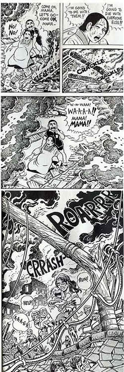 Contrary to popular belief, the horror of nuclear war is not the stuff of science fiction; humanity has already experienced a nuclear war, albeit a limited one; it was called World War II; a war in which nuclear weapons were dropped on cities full of people.
Those whose impression of the medium we call “comics” is based on American super-hero comics and the current milquetoast crop of newspaper comics may be amazed to learn of some of the topics that comics stories have dealt with. In a future post, I’ll cover Maus, Art Spiegelman’s graphic novel (fancy name for comics story) of his father’s account of imprisonment in a German concentration camp in WWII.
Spiegelman also contributed an introduction to the U.S. release of another chilling and powerful story presented in the medium of comics: the Japanese graphic novel Hadashi no Gen (Barefoot Gen, pronounced with a hard “G”), an account of the bombing of Hiroshima and its aftermath told from the point of view of a six year old boy. Though the story is fiction, it is also true to life; author/artist Keiji Nakazawa was six years old and living in Hiroshima when the bomb fell.
Tonight (Monday, August 6) at 7:30pm (ET/PT), HBO will air White Light, Black Rain: The Destruction of Hiroshima and Nagasaki, a documentary on this often ignored and swept-under-the-rug chapter from World War II. It features profiles of several survivors of the event, along with profiles of the Americans that flew the mission. One of the survivors who will be profiled is Keiji Nakazawa.
You can read an interview with the documentary’s director, Steven Okazaki, on the HBO site; and an interview with Keiji Nakazawa in The Comics Journal.
Nakazawa’s initial manga story about Hiroshima, Ore wa Mita (I Saw It) was more directly autobiographical; Gen, however, is more ambitious and more compelling as a story. At first there was resistance to the publication of these stories among the major manga publishers in Japan, who considered them too political, but a smaller publisher of “adult” (erotic) comics supported the publication of Nakazawa’s I Saw It and encouraged him to expand on the idea, which resulted in the story of Barefoot Gen.
Serialized in the manga anthology Weekly Shonen Jump in the early 1970’s, Barefoot Gen was translated into other languages in the 1980’s, and a new translation has been published in the U.S. as a four volume “graphic novel” series (with an introduction by Speigelman): Barefoot Gen Volume One: A Cartoon Story of Hiroshima, Barefoot Gen Volume Two: The Day After, Barefoot Gen Volume Three: Life After the Bomb and Barefoot Gen Volume Four: Out of the Ashes.
The Barefoot Gen manga story was made into an anime in 1983, directed by Mori Masaki, followed by Barefoot Gen 2 in 1986. (They are available on DVD as a set.)
The art for the original manga version of Barefoot Gen could be described as “cartoony” compared to what you might expect for such a theme; but the simple, spare drawings, almost iconic in their basic representation of people and environments, convey the story in a way that would actually be difficult with a more “realistic” drawing approach.
There is nothing simplistic about the story. It might have been easy to blame the “enemy”, the U.S., for the suffering imposed on their family by the war, but Gen’s father blames the greed of the ruling class and begins to resist the government’s propaganda. His pacifist beliefs brand the family as traitors. Gen is caught between the indoctrination he receives at school and his Father’s adamant anti-war stance. The already hard scrabble for food, made more imperative by his mother’s current pregnancy, becomes multiplied in the aftermath of the bomb, which leaves only Gen and his mother alive from his family. (Nakazawa himself lost his father, brother and two sisters.)
The story pulls no punches in it’s portrayal of the effect and immediate aftermath of the bomb that was dropped on Hiroshima, and the harsh realities of life for the survivors; but it is a story of personal struggle and survival in the face of the madness of war, and a story with humanity, nobility, sacrifice and compassion.
Nakazawa does not have a simplistic attitude toward the event either. Barefoot Gen is not an expression of bitterness toward the U.S. for dropping the bomb, which might be forgivable given his experience and circumstances; it rises above the kind of nationalism that permitted the events of WWII to happen in the first place; and, in its direct and honest description of the event, condems all war, and our insanity as a species in threatening ouselves with nuclear weapons, and in particular for actually using them on ourselves.
Reading Barefoot Gen should be mandatory for the presidents of the U.S. and Russia, the leaders of China, and every politician and minister in every nuclear power; as should a viewing of tonight’s HBO presentation of White Light, Black Rain.
The Web site for the documentary also includes a sldeshow of artwork created by survivors. While most of it was created by individuals without formal artistic training, the power of the images is undeniable. There are additional drawings by atomic bomb survivors on the site of the Hiroshima Peace Memorial Museum.
Categories:


Charley’s Picks
Bookshop.org
(Bookshop.org affilliate links; sales benefit independent bookshop owners; I get a small percentage to help support my work on Lines and Colors)

John Singer Sargent: Watercolors


Urban Sketching: Understanding Perspective


Charley’s Picks
Amazon
(Amazon.com affiliate links; sales go to a larger yacht for Jeff Bezos; but I get a small percentage to help support my work on Lines and Colors)
John Singer Sargent: Watercolors
Urban Sketching: Understanding Perspective