
Categories
- 3d CGI
- Amusements
- Animation
- Anime & Manga
- Art Materials
- Art Videos
- Blogroll
- Cartoons
- Color
- Comics
- Concept & Visual Dev.
- Creativity
- Digital Art
- Digital Painting
- Displaying Art on the Web
- Drawing
- Eye Candy for Today
- Gallery and Museum Art
- High-res Art Images
- Illustration
- Motion Graphics & Flash
- Museums
- Online Museums
- Outsider Art
- Painting
- Painting a Day
- Paleo Art
- Pastel, Conté & Chalk
- Pen & Ink
- Prints and Printmaking
- Reviews
- Sc-fi and Fantasy
- Sculpture & Dimensional
- Site Comments
- Sketching
- Storyboards
- Tools and Techniques
- Uncategorized
- Vector Art
- Videos & Podcasts
- Vision and Optics
- Watercolor and Gouache
- Webcomics
Archives
- May 2026
- April 2026
- March 2026
- February 2026
- January 2026
- December 2025
- November 2025
- October 2025
- September 2025
- August 2025
- July 2025
- June 2025
- May 2025
- January 2025
- December 2024
- November 2024
- October 2024
- September 2024
- August 2024
- June 2024
- April 2024
- March 2024
- February 2024
- January 2024
- December 2023
- November 2023
- October 2023
- September 2023
- August 2023
- July 2023
- May 2023
- April 2023
- March 2023
- February 2023
- January 2023
- December 2022
- November 2022
- September 2022
- August 2022
- July 2022
- June 2022
- May 2022
- April 2022
- March 2022
- February 2022
- January 2022
- December 2021
- November 2021
- October 2021
- September 2021
- August 2021
- July 2021
- June 2021
- May 2021
- April 2021
- March 2021
- February 2021
- January 2021
- December 2020
- November 2020
- October 2020
- September 2020
- August 2020
- July 2020
- June 2020
- May 2020
- April 2020
- March 2020
- February 2020
- January 2020
- December 2019
- November 2019
- October 2019
- September 2019
- August 2019
- July 2019
- June 2019
- May 2019
- April 2019
- March 2019
- February 2019
- January 2019
- December 2018
- November 2018
- October 2018
- September 2018
- August 2018
- July 2018
- June 2018
- May 2018
- April 2018
- March 2018
- February 2018
- January 2018
- December 2017
- November 2017
- October 2017
- September 2017
- August 2017
- July 2017
- June 2017
- May 2017
- April 2017
- March 2017
- February 2017
- January 2017
- December 2016
- November 2016
- October 2016
- September 2016
- August 2016
- July 2016
- June 2016
- May 2016
- April 2016
- March 2016
- February 2016
- January 2016
- December 2015
- November 2015
- October 2015
- September 2015
- August 2015
- July 2015
- June 2015
- May 2015
- April 2015
- March 2015
- February 2015
- January 2015
- December 2014
- November 2014
- October 2014
- September 2014
- August 2014
- July 2014
- June 2014
- May 2014
- April 2014
- March 2014
- February 2014
- January 2014
- December 2013
- November 2013
- October 2013
- September 2013
- August 2013
- July 2013
- June 2013
- May 2013
- April 2013
- March 2013
- February 2013
- January 2013
- December 2012
- November 2012
- October 2012
- September 2012
- August 2012
- July 2012
- June 2012
- May 2012
- April 2012
- March 2012
- February 2012
- January 2012
- December 2011
- November 2011
- October 2011
- September 2011
- August 2011
- July 2011
- June 2011
- May 2011
- April 2011
- March 2011
- February 2011
- January 2011
- December 2010
- November 2010
- October 2010
- September 2010
- August 2010
- July 2010
- June 2010
- May 2010
- April 2010
- March 2010
- February 2010
- January 2010
- December 2009
- November 2009
- October 2009
- September 2009
- August 2009
- July 2009
- June 2009
- May 2009
- April 2009
- March 2009
- February 2009
- January 2009
- December 2008
- November 2008
- October 2008
- September 2008
- August 2008
- July 2008
- June 2008
- May 2008
- April 2008
- March 2008
- February 2008
- January 2008
- December 2007
- November 2007
- October 2007
- September 2007
- August 2007
- July 2007
- June 2007
- May 2007
- April 2007
- March 2007
- February 2007
- January 2007
- December 2006
- November 2006
- October 2006
- September 2006
- August 2006
- July 2006
- June 2006
- May 2006
- April 2006
- March 2006
- February 2006
- January 2006
- December 2005
- November 2005
- October 2005
- September 2005
- August 2005
Relevant Blogs
Art, Painting & Sketch
- Gurney Journey
- Underpaintings
- Art and Influence
- Painting Perceptions
- Oil Painters of America
- Vasari Paint POV
- Flying Fox
- Urban Sketchers
- Bento (Smithsonian)
- Art Inconnu
- The Hidden Place
- Still Life
- Making a Mark
- The Art of the Landscape
- Exploring Color & Creativity
- Art Contrarian
- Artist A Day
- beinArt Surreal Art Collective
- Eye Level
- David Dunlop
- p.i.g.m.e.n.t.i.u.m
- CultureGrrl
- Joaquín Sorolla blog
- Artists in Pastel
“Painting a Day”
- A Painting a Day (Keiser)
- On Painting (Keiser)
- Julian Merrow-Smith
- Karen Jurick
- Jeffrey Hayes
- Carol Marine
- Abbey Ryan
- Daily Paintworks
Other Painting Blogs
- Virtual Gouache Land
- Neil Hollingsworth
- Marc Hanson
- Kevin Menck
- Marc Dalessio
- Larry Seiler
- Stapleton Kearns
- Colin Page
- Roos Schuring
- Hans Versfelt
- Titus Meeuws
- Régis Pettinari
- René Plein Air
- Belinda Del Pesco
- Robin Weiss
- Nathan Fowkes (Land Sketch)
- William Wray
- Frank Serrano
- Stephen Magsig
- Michael Chesley Johnson
- Twice a Week
- Sarah Wimperis
- Rob Adams
- Michael Cole Manley
- The Dirty Palette Club
- Mike Manley’s Draw!
Gallery Art & Illustration mix
Illustration
- Howard Pyle
- 100 Years of Illustration
- BibliOdyssey
- Illustration Art
- Today’s Inspiration
- Illustration Mundo
- Little Chimp Society
- Danny Gregory
- R D (John Martz
- Illustration Friday blog
- Monster Brains
- Illustrators & Illustrations (RU)
- Elwood H. Smith
- DaniDraws.com
- Designers Who Blog
- iSpot Blog
Sci-Fi & Fantasy
Illustration & Comics
Comics & Cartoons
- Comics Beat
- Robot 6
- Newsarama Blog
- Comic Vine
- Comics Alliance
- Forbidden Planet Int.
- Paolo Rivera
- Bolt City
- Flight
- Scott McCloud
- The Comics Journal
- Comixpedia
- Funnybook Babylon
- James Baker
- Middleton’s Sketchbook
- Boneville
- The Hotel Fred
- Paul Rivoche
- Daily Cartoonist
- Mad About Cartoons (William Wray)
- Digital Strips
Illustration & Concept
Animation & Concept
- Cartoon Brew
- Animation Blog
- Cold Hard Flash
- Concept Art World
- The CAB
- FY Concept Art
- Concept Ships
- Concept Robots
- John Nevarez
- Armand Serrano
- Marcos Mateu-Mestre
- all kinds of stuff (Kricfalusi)
- Yacin the faun (Man Arenas)
- Kelsey Mann
- Cre8tivemarks Blog
- Ice-Cream Monster Toon Cafe
- AAU Character & Creature Design
- AAU Animation Notes
- Articles and Texticles
Paleo & Scientific
Tools & Techniques
Other
Lists of Art Blogs
Art Image Resource Links
Historic Art Images
- Wikimedia Commons: Paintings
- Wikimedia Commons: Drawings
- The Athenaeum
- WikiArt (WikiPaintings)
- Google Art Project: Artists
- Google Art Project: Collections (Museums)
- ArtCyclopedia
- Web Gallery of Art
- Art Renewal Center
- Web Gallery of Impressionism
Auction Consolidation sites
Auction sites
- Sotheby’s
- Bonham’s
- Christies
- Heritage Auctions: Fine Art
- Heritage Auctions: Illustration
- Freeman’s Auctions
- Bukowskis
- Shannon’s
Image Search
Reverse Image Search (search by image)
- Tin Eye
- RevImg
- Google Image Search (camera icon)
- Bing Image Search (camera icon)
Promoting some friends and some clients of my website design business
- Twin Willows T’ai Chi studio in Wilmington DE. Taiji classes with Bryan Davis.
- Ray Hayward, Inspired Teacher of T’ai Chi ( Taiji ) in Minneapolis, Founder of Mindful Motion Tai Chi Academy
- OldHead Tattoo studio and Art Gallery in Wilmington DE. Tattoos and paintings by Bruce Gulick
- Sharon Domenico Art, pet portrait oil paintings
- Platinum Paperhanging, wallpaper hanging, Main Line and Philadelphia, PA
- Lisa Stone Design, interior designer, Main Line and Philadelphia, PA
- Studio12KPT, original art, prints, calendars and other custom printed items by Van Sickle & Rolleri
-
Eye Candy for Today: Sargent’s Breakfast in the Loggia

Breakfast in the Loggia, John Singer SargentLink is to zoomable version on Google Art Project. The original is in the Freer/Sackler Gallery. Though the image linked from the latter page in not high resolution, there is a nicely large image linked from this post on the Smithsonian’s Bento blog (above the image, “6301 x 4512“).
This piece used to hang near the entrance of the Freer/Sackler Gallery in D.C., and I remember being struck by it on entering the gallery for the first time many years ago.
I’m disappointed to say the museum’s website lists is as “Currently not on view” at the moment, as I was hoping to see it when I’m in the city later this month. (Oh well, I’ll just have to satisfy myself with the National Gallery of Art, the American Art Museum, The National Portrait Gallery, etc., etc.)
In what looks like a relatively finished painting from a short distance, Sargent’s casually brilliant (or brilliantly casual) brushwork is evident on closer inspection. The notation of the hands of the woman to our right is a brushy smear, the food is composed of strategically placed smudges of color, and yet all resolves to a clear, naturalistic image.
I particularly marvel at the brusque paint application in the almost pure white sprays of arch-shaped sunlight against the left wall, and the fluid shadows on the back one. The statue behind the women is of Venus, and is a little marvel of sculpturally painted shapes — each brushstroke defining a value plane.
Sargent’s rough brushwork on the vines along the columns defines their shape and texture better than if he had devoted hours to rendering them in detail.
Tell me again why Sargent is “facile” and a “19th century painter” and not considered one of history’s great painters?
Categories:
-
Joon Ahn

Joon Ahn is a concept artist based in Los Angeles. He was formerly a concept and background artist at Disney, and is currently the Senior Concept Artist at Riot Games.As far as I know, he doesn’t have a dedicated website, but does have a portfolio on ArtStation. He also has a blog, but it has not recently been updated.
His ArtStation gallery isn’t extensive, but even so is showcases are variety of approaches in terms of his approach to color, texture and degree of finish.
In many cases his use of light is dramatic and theatrical, in other cases more muted. As is often called for in concept art, his images often evoke a monumental sense of scale.
Categories:
-
Eye Candy for Today: John Hamilton Mortimer pen drawing
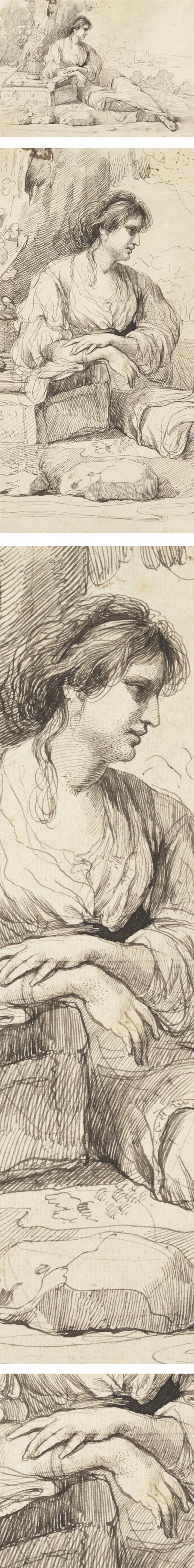
Reclining Female Figure in an Italian Landscape, John Hamilton MortimerPen and black ink on cream paper; roughly 9 x 12 inches (22 x 32 cm).
Link is to original in the Yale Center For British Art, which has both zoomable and downloadable versions on the website. There is also a zoomable version on the Google Art Project and a downloadable file of that version on Wikimedia Commons. The latter two are somewhat larger, but my instinct is that the color of the ink and paper are truer on the Yale site.
This 18th century drawing classically posed figure has some of the feeling of Renaissance figures, particularly in the elegant pose of the hands. In areas where the ink is applied more fluidly and is semi-transparent, there is an additional feeling of delicacy and softness.
I find it interesting that Mortimer has augmented the hatching lines with small areas of stipple in the modeling of the face and hands.
Categories:
-
Robert J. O’Brien

Robert J. O’Brien is a painter working in watercolor, originally from New York and now living and working in Vermont.O’Brien has a particular focus on architectural and floral subjects. The apparent perfection of flowers are contrasted with his choice of architectural subjects, which are often intimate, close-in views of buildings or other man-made objects that are apparently abandoned or dilapidated. In these he revels in their weathered textures and contrasting angles, finding beauty in rust and dry rot.
In all of his subjects there is a fascination with the play of light and shadows, the latter often marking a counterpoint to the main elements of his composition.
The galleries on his website are divided into paintings of New England, France and Flowers.
O’Brien leads workshops in the New England and New York area, as well as online courses through Artists Network University.
Categories:
-
Didier Graffet

Didier Graffet is a French illustrator, recognized in particular for his fantasy and steampunk themed work. Well known in his native France, Graffet is undeservedly less familiar here in the U.S.Graffet uses a keen sense of value relationships, a muted palette and a good amount of intricate, textural detail to create arresting images that demand the viewer slow down and linger over them, rather then scanning through them quickly. This, I think, is one of the best uses of detail in illustration — to encourage the reader to pause and reflect on the story while lingering over eye-pleasing interpretations of the text.
Though he does beautifully evocative fantasy themed work, I particularly enjoy his Victorian science fiction images, notably his illustrations for classic Jules Verne novels, and his steampunk versions of alternate times.
Unfortunately, I found the galleries in his website somewhat awkward to navigate, and not as conducive to browsing as one might hope. It’s not a language barrier, the site is nicely available in both French and English, just the arrangement.
The galleries have a drill-down structure, and the obvious path back to the top — the “Galleries” tab in the main navigation — is disabled when in the Galleries section (there is a non-obvious link on the work “Galleries” within the display area that can be used instead).
The thumbnails are small, and it’s easy to miss the links on many sets of thumbnails to subsequent pages, accessed from a small linked row of numbers at the bottom.
The effort to dig around is worthwhile, though, and you will find lots of interesting stuff tucked away. You’ll find most of the steampunk goodies in the Jules Verne section, and in the “Personal” section under “Other Worlds“.
The Fantasy section also contains some personal work and some wonderful dragons.
Most books containing Graffet’s work available in the U.S. are in French editions, a few of which are available through Amazon new, the others available used. There is also a new A Song of Ice and Fire 2017 Calendar, based on George R.R. Martin’s work, with illustrations by Graffet.
Categories:
-
Eye Candy for Today: Parmigianino’s Self-Portrait in a Convex Mirror

Self-portrait in a Convex Mirror; Francesco Mazzola, called ParmigianinoOil on curved wooden panel, roughly 9 inches (24 cm) in diameter (without frame). Link is to zoomable version on the Google Art Project; there is a downloadable file on Wikimedia Commons; the original is in the Kunsthistorisches Museum Wien, which also has both zoomable and downloadable versions.
There are plenty of precedents for the use of curved mirrors in art, as well as their use in self-portraiture, but this strikingly intimate and true to life self-portrait by the 16th century painter Parmigianino is notable for its simultaneous strength and delicacy, and for the fact that Parmigianino painted it on a convex wooden block, further adding to the illusion that the painting itself was a convex mirror.
The effect of the convex surface is difficult to see in straight-on photographs, but I found a couple of examples from the side of the painting hanging in place on Flickr, here and here. You can also see it in this video about the painting from the Khan Academy.
This was a painting that the young, 21-year-old Parmigianino intended to be an example of his skill as a painter, to be used to showcase his abilities to potential clients.
The artist presented it, along with two other small works, to Pope Clement VI in an effort to gain commissions from the Vatican. Though it didn’t accomplish that goal, it did help cement Parmigianino’s reputation in general as an exceptional painter.
The painting was mentioned in Giorgio Vasari’s seminal book of artist biographies, Lives of the Most Excellent Painters, Sculptors, and Architects. The painting was also the inspiration for a noted poem and collection by contemporary poet John Ashbery.
Many of Parmigianino’s paintings have a kind of trademark styleization, a graceful elongation of figures, but this self-portrait is directly observed with an almost hypnotic sense of accuracy, including the optical distortion of the artist’s hand due to its proximity to the mirror.
I find it interesting to compare this to another iconic portrait in a curved reflecting surface, M.C. Escher’s Hand with Reflecting Sphere.
Categories:


Charley’s Picks
Bookshop.org
(Bookshop.org affilliate links; sales benefit independent bookshop owners; I get a small percentage to help support my work on Lines and Colors)

John Singer Sargent: Watercolors


Urban Sketching: Understanding Perspective


Charley’s Picks
Amazon
(Amazon.com affiliate links; sales go to a larger yacht for Jeff Bezos; but I get a small percentage to help support my work on Lines and Colors)
John Singer Sargent: Watercolors
Urban Sketching: Understanding Perspective