
Categories
- 3d CGI
- Amusements
- Animation
- Anime & Manga
- Art Materials
- Art Videos
- Blogroll
- Cartoons
- Color
- Comics
- Concept & Visual Dev.
- Creativity
- Digital Art
- Digital Painting
- Displaying Art on the Web
- Drawing
- Eye Candy for Today
- Gallery and Museum Art
- High-res Art Images
- Illustration
- Motion Graphics & Flash
- Museums
- Online Museums
- Outsider Art
- Painting
- Painting a Day
- Paleo Art
- Pastel, Conté & Chalk
- Pen & Ink
- Prints and Printmaking
- Reviews
- Sc-fi and Fantasy
- Sculpture & Dimensional
- Site Comments
- Sketching
- Storyboards
- Tools and Techniques
- Uncategorized
- Vector Art
- Videos & Podcasts
- Vision and Optics
- Watercolor and Gouache
- Webcomics
Archives
- July 2026
- June 2026
- May 2026
- April 2026
- March 2026
- February 2026
- January 2026
- December 2025
- November 2025
- October 2025
- September 2025
- August 2025
- July 2025
- June 2025
- May 2025
- January 2025
- December 2024
- November 2024
- October 2024
- September 2024
- August 2024
- June 2024
- April 2024
- March 2024
- February 2024
- January 2024
- December 2023
- November 2023
- October 2023
- September 2023
- August 2023
- July 2023
- May 2023
- April 2023
- March 2023
- February 2023
- January 2023
- December 2022
- November 2022
- September 2022
- August 2022
- July 2022
- June 2022
- May 2022
- April 2022
- March 2022
- February 2022
- January 2022
- December 2021
- November 2021
- October 2021
- September 2021
- August 2021
- July 2021
- June 2021
- May 2021
- April 2021
- March 2021
- February 2021
- January 2021
- December 2020
- November 2020
- October 2020
- September 2020
- August 2020
- July 2020
- June 2020
- May 2020
- April 2020
- March 2020
- February 2020
- January 2020
- December 2019
- November 2019
- October 2019
- September 2019
- August 2019
- July 2019
- June 2019
- May 2019
- April 2019
- March 2019
- February 2019
- January 2019
- December 2018
- November 2018
- October 2018
- September 2018
- August 2018
- July 2018
- June 2018
- May 2018
- April 2018
- March 2018
- February 2018
- January 2018
- December 2017
- November 2017
- October 2017
- September 2017
- August 2017
- July 2017
- June 2017
- May 2017
- April 2017
- March 2017
- February 2017
- January 2017
- December 2016
- November 2016
- October 2016
- September 2016
- August 2016
- July 2016
- June 2016
- May 2016
- April 2016
- March 2016
- February 2016
- January 2016
- December 2015
- November 2015
- October 2015
- September 2015
- August 2015
- July 2015
- June 2015
- May 2015
- April 2015
- March 2015
- February 2015
- January 2015
- December 2014
- November 2014
- October 2014
- September 2014
- August 2014
- July 2014
- June 2014
- May 2014
- April 2014
- March 2014
- February 2014
- January 2014
- December 2013
- November 2013
- October 2013
- September 2013
- August 2013
- July 2013
- June 2013
- May 2013
- April 2013
- March 2013
- February 2013
- January 2013
- December 2012
- November 2012
- October 2012
- September 2012
- August 2012
- July 2012
- June 2012
- May 2012
- April 2012
- March 2012
- February 2012
- January 2012
- December 2011
- November 2011
- October 2011
- September 2011
- August 2011
- July 2011
- June 2011
- May 2011
- April 2011
- March 2011
- February 2011
- January 2011
- December 2010
- November 2010
- October 2010
- September 2010
- August 2010
- July 2010
- June 2010
- May 2010
- April 2010
- March 2010
- February 2010
- January 2010
- December 2009
- November 2009
- October 2009
- September 2009
- August 2009
- July 2009
- June 2009
- May 2009
- April 2009
- March 2009
- February 2009
- January 2009
- December 2008
- November 2008
- October 2008
- September 2008
- August 2008
- July 2008
- June 2008
- May 2008
- April 2008
- March 2008
- February 2008
- January 2008
- December 2007
- November 2007
- October 2007
- September 2007
- August 2007
- July 2007
- June 2007
- May 2007
- April 2007
- March 2007
- February 2007
- January 2007
- December 2006
- November 2006
- October 2006
- September 2006
- August 2006
- July 2006
- June 2006
- May 2006
- April 2006
- March 2006
- February 2006
- January 2006
- December 2005
- November 2005
- October 2005
- September 2005
- August 2005
Relevant Blogs
Art, Painting & Sketch
- Gurney Journey
- Underpaintings
- Art and Influence
- Painting Perceptions
- Oil Painters of America
- Vasari Paint POV
- Flying Fox
- Urban Sketchers
- Bento (Smithsonian)
- Art Inconnu
- The Hidden Place
- Still Life
- Making a Mark
- The Art of the Landscape
- Exploring Color & Creativity
- Art Contrarian
- Artist A Day
- beinArt Surreal Art Collective
- Eye Level
- David Dunlop
- p.i.g.m.e.n.t.i.u.m
- CultureGrrl
- Joaquín Sorolla blog
- Artists in Pastel
“Painting a Day”
- A Painting a Day (Keiser)
- On Painting (Keiser)
- Julian Merrow-Smith
- Karen Jurick
- Jeffrey Hayes
- Carol Marine
- Abbey Ryan
- Daily Paintworks
Other Painting Blogs
- Virtual Gouache Land
- Neil Hollingsworth
- Marc Hanson
- Kevin Menck
- Marc Dalessio
- Larry Seiler
- Stapleton Kearns
- Colin Page
- Roos Schuring
- Hans Versfelt
- Titus Meeuws
- Régis Pettinari
- René Plein Air
- Belinda Del Pesco
- Robin Weiss
- Nathan Fowkes (Land Sketch)
- William Wray
- Frank Serrano
- Stephen Magsig
- Michael Chesley Johnson
- Twice a Week
- Sarah Wimperis
- Rob Adams
- Michael Cole Manley
- The Dirty Palette Club
- Mike Manley’s Draw!
Gallery Art & Illustration mix
Illustration
- Howard Pyle
- 100 Years of Illustration
- BibliOdyssey
- Illustration Art
- Today’s Inspiration
- Illustration Mundo
- Little Chimp Society
- Danny Gregory
- R D (John Martz
- Illustration Friday blog
- Monster Brains
- Illustrators & Illustrations (RU)
- Elwood H. Smith
- DaniDraws.com
- Designers Who Blog
- iSpot Blog
Sci-Fi & Fantasy
Illustration & Comics
Comics & Cartoons
- Comics Beat
- Robot 6
- Newsarama Blog
- Comic Vine
- Comics Alliance
- Forbidden Planet Int.
- Paolo Rivera
- Bolt City
- Flight
- Scott McCloud
- The Comics Journal
- Comixpedia
- Funnybook Babylon
- James Baker
- Middleton’s Sketchbook
- Boneville
- The Hotel Fred
- Paul Rivoche
- Daily Cartoonist
- Mad About Cartoons (William Wray)
- Digital Strips
Illustration & Concept
Animation & Concept
- Cartoon Brew
- Animation Blog
- Cold Hard Flash
- Concept Art World
- The CAB
- FY Concept Art
- Concept Ships
- Concept Robots
- John Nevarez
- Armand Serrano
- Marcos Mateu-Mestre
- all kinds of stuff (Kricfalusi)
- Yacin the faun (Man Arenas)
- Kelsey Mann
- Cre8tivemarks Blog
- Ice-Cream Monster Toon Cafe
- AAU Character & Creature Design
- AAU Animation Notes
- Articles and Texticles
Paleo & Scientific
Tools & Techniques
Other
Lists of Art Blogs
Art Image Resource Links
Historic Art Images
- Wikimedia Commons: Paintings
- Wikimedia Commons: Drawings
- The Athenaeum
- WikiArt (WikiPaintings)
- Google Art Project: Artists
- Google Art Project: Collections (Museums)
- ArtCyclopedia
- Web Gallery of Art
- Art Renewal Center
- Web Gallery of Impressionism
Auction Consolidation sites
Auction sites
- Sotheby’s
- Bonham’s
- Christies
- Heritage Auctions: Fine Art
- Heritage Auctions: Illustration
- Freeman’s Auctions
- Bukowskis
- Shannon’s
Image Search
Reverse Image Search (search by image)
- Tin Eye
- RevImg
- Google Image Search (camera icon)
- Bing Image Search (camera icon)
Promoting some friends and some clients of my website design business
- Twin Willows T’ai Chi studio in Wilmington DE. Taiji classes with Bryan Davis.
- Ray Hayward, Inspired Teacher of T’ai Chi ( Taiji ) in Minneapolis, Founder of Mindful Motion Tai Chi Academy
- OldHead Tattoo studio and Art Gallery in Wilmington DE. Tattoos and paintings by Bruce Gulick
- Sharon Domenico Art, pet portrait oil paintings
- Platinum Paperhanging, wallpaper hanging, Main Line and Philadelphia, PA
- Lisa Stone Design, interior designer, Main Line and Philadelphia, PA
- Studio12KPT, original art, prints, calendars and other custom printed items by Van Sickle & Rolleri
-
Steve Hanks

Steve Hanks is a well known watercolor artist whose subject matter frequently focuses on female figures in interiors or landscapes. His subjects’ ages vary, from babies to women, as do their situations; some are nude studies, some evocative of mother and child tenderness, others children at play or women languidly posed on couches or beds.Sometimes their is an erotic component, at other times, innocence itself seems to be a theme; but Hanks’ work often carries a feeling of high-end illustration, in that there is an emotional context to the work, and with it, an implied story.
Hanks’ masterfully controlled watercolor technique manages to seem almost casual in its deft application of color, subtle textures and clear value staging. He captures the brilliant contrasts of sunlight, rich subtleties of rain and overcast and soft tones of interior light with equal aplomb.
After graduating from the California College of Arts and Crafts in Oakland, Hanks was pursuing realism in pencil drawings and impressionistic painting effects in oil, but an allergy affected his ability to work with oil and he moved to watercolor as his chosen painting medium.
SInce then he has received national recognition and numerous awards for his luminous, detailed and highly accomplished watercolors.
There is a collection of his work, Moving On: The Art of Steve Hanks. You can also find some video interviews with Hanks on YouTube, courtesy of Greenwich Workshop.
There is a good post on All Art News that gives a nice introductory overview of his work. The artwork on his official gallery is sometimes reproduced a bit smaller. I’ve listed some other resources below.
[Note: some of the work on these sites should be considered NSFW.)
Categories:
-
Compositional / Visual Clarity with Bill Perkins
 Compositional / Visual Clarity with Bill Perkins is a one day workshop scheduled for tomorrow, Sunday September 19, 2010, at Gallery Nucleus in Alhambra California.
Th workshop will focus on the role of composition in achieving visual clarity in storytelling.
That may sound dry, but the real goal is more exciting images; clarity is a big part of visual punch. If an image isn’t made clear by the arrangement of its compositional elements, it can’t communicate as well and visual power is lost. Clarity brings power.
According to Perkins: “I am going to start with an art timeline then lift the hood to reveal comparative systems of measure, visual components, and the primaries of design. Basically an intro into visual literacy to make distinctive imagery. The artists will then reconstruct the timeline without names, movements, or dates, only based on their graphic affinity to the primaries of design.”
Bill Perkins is a highly regarded plein air painter, concept artist, production designer and instructor at the Los Angeles Academy of Figurative Art. For more, see my previous posts on Perkins here and here.
The event runs from 1:00pm to 4:30pm. Seats are limited.
Categories:
-
ArtRage 3 Studio Pro
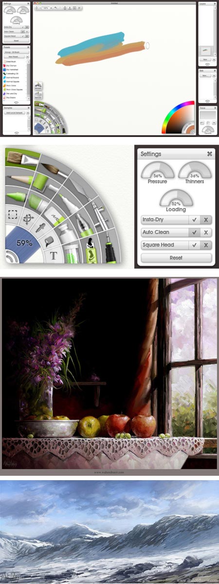
An increasing number of artists, even those firmly committed to working in traditional media, are discovering the value of adding digital painting and drawing tools to their repertoire.The transition can be daunting, though, with some artists feeling intimidated by what they perceive as complex and expensive digital art tools and the implied learning curve.
There are smaller, easier to use alternatives, however, that can make the dive into digital art simpler and require less of an up-front investment.
One of them is ArtRage, a digital painting and drawing application by Ambient Design that represents an inexpensive alternative to the industry standard digital painting and drawing applications like Corel Painter and Adobe Photoshop (I might include Manga Studio Pro as a standard at this point as well).
I received a review version of ArtRage3 Studio Pro, and as someone with both an eye to the needs of novice digital painters and a long personal history of creating digital art in both Painter and Photoshop, I put it through its paces.
Though not strictly necessary, ArtRage is meant, like those other tools, to be used with a pressure sensitive tablet and stylus when drawing and painting. (Wacom’s Bamboo Pen model [more here] allows for basic pressure sensitive pen input for about $70 U.S.)
ArtRage features digital emulations of painting and drawing tools for oils, watercolor, pencil, ink, airbrush, chalk and others. The Studio Pro version, which is what I tested, features layers and layer groups, layer blend modes, support for plug-in fliters, importing and exporting custom brush settings and a range of surprisingly sophisticated capabilities for its modest price.
The most direct competition for ArtRage might be AutoDesk’s Sketchbook Pro, though I don’t have a copy of that for comparison. Another relevant application would be Corel Painter Essentials.
Despite a vaguely toy-like interface and inclusion of craft store sillyness like a “Glitter” tool, ArtRage in actual use defies your initial impressions and becomes a surprisingly powerful tool, suitable for creating serious digital artwork.
The application’s strongest point is the drawing and painting tools themselves, particularly the default oil painting brush, which I think is among the best in the industry, and the pen and pencil tools, which are at least as good as the tools from the more expensive counterparts.
Add to that features like layers, layer transparency, layer groups, Photoshop standard blend modes, and the additional capabilities in ArtRage Studio Pro for extra painting tools, selection tools and filters, and you have a very capable digital art tool for a very reasonable price.
The downside, from my point of view, is the quirky and sometimes frustrating interface design, in which the designers have felt it necessary to be clever and original, sometimes at the expense of ease of use.
Many aspects of the interface are clear enough, like the palette of tools and the color picker, and many of the tools are actually easier to use than their counterparts in the more expensive applications, which can sometimes be bewildering to novice users.
However, there are other convention-defying interface design choices that seem different for the sake of being different rather than “different because we think we have a better way to do this”. (I happen to be a fan of the controversial interfaces Kai Krause and Phil Clevenger designed for the mid-90’s Metacreations applications like Bryce and Poser, so I don’t object to non-standard interfaces out of hand).
I initially found it maddening that I couldn’t use some simple UI conventions like “Select All” and “Delete” that are an expected function in any digital graphics application. This frustration was eventually mollified as I began to assign custom key commands (e.g. creating a custom key command for “Clear Layer” as a substitute for Select All and Delete).
The pop-up palettes for things like layers, presets, color swatches and tool settings are fine, even if they waste a bit of screen space on design elements, but I found it mildly annoying that the tool palette and color picker are part of the canvas. They can be hidden easily enough with a key command, and automatically disappear when using a tool in their corners, but cannot be moved or pulled off of the canvas as far as I can tell.
The tool and color palette arrangement is reminiscent of the old versions of Alias Sketchbook (now AutoDesk Sketchbook), but even they have moved to a more conventional tool and color palette arrangement in current versions.
The ArtRage tools themselves, however, once accessed, are a joy to use.
I found them easier to adjust and tweak (certainly for a novice) than comparable tools in Painter and Photoshop; and in general superbly implemented in terms of their action and response.
The pencil tool took much less tweaking on my part to produce a sketchy, light line for preliminary layout, easily adjusted for heavier lines (as if going from a 2h to a 2b in traditional pencil work). The pen tool (interestingly represented in the tool palette by the image of a technical pen instead of a steel quill) is smooth and fluid, with a nice response to pressure sensitivity.
The airbrush behaves well, the camel hair brush and marker tools have the necessary basic settings to make them suitable for speed painting and the creation of digital concept art.
The oil painting brush, in the way it lays down colors over other colors, blends and gives the appearance of blended brush strokes, is terrific. I like it better than any of the default oil brushes in Corel Painter (and I’m a big fan of Painter’s brushes in general), and, like many of the ArtRage tools, it’s just easier to use “out of the box”.
Those who are used to Painter and Photoshop’s more sophisticated brush engines may find some elements of the brush controls limited, but for someone who is just diving into digital art, ArtRage provides a less confusing range of options while allowing a good deal of control and flexibility.
ArtRage Studio Pro is able to import and export a variety of image formats, including (within limitations for some advanced features) layered Photoshop files.
There are a series of tutorials on the ArtRage website to get you started, and there is an ArtRage user community — the webite includes user forums and galleries.
ArtRage Studio Pro is inexpensive (as of this writing, $80 U.S.), and an excellent value given its capabilities. It can be a great place for novice digital artists to start, but is powerful enough for professionals to turn out finished work, as in the two images by Pakistani visual development artist, Waheed Nasir, above.
There are two other versions, both more limited in features, but even less expensive, as you step down: ArtRage 3 Studio (currently $40 U.S.) and Art Rage 2.6 ($20 U.S.). All are available for Mac and Windows. You can upgrade from the lesser versions to the more full featured ones.
There is a brief overview of the versions and features here, and a link at the bottom of the top section of this page to a more complete PDF listing of the differences in features between the versions.
I would certainly recommend that anyone interested in digital art give ArtRage a try, even if you are already comfortable with one of the more expensive tools.
There is a full-featured (but limited export) 30 day demo version of ArtRage 3 Studio Pro available for download.
However, I might suggest downloading their free, limited-feature but unlimited use, ArtRage 2.6 Starter Edition first (link at bottom of this page). This is much more limited than any of the other versions, but you can use it to acquaint yourself with the eccentricities of the interface, and then download and evaluate the full featured but time limited demo of ArtRage Studio Pro; so you don’t waste demo time getting used to the interface.
Even experienced Painter and Photoshop users may find, as I do, that its small memory footprint, quick launch time and sophisticated drawing and painting tools make ArtRage a valuable addition to your digital toolbox.
I continue to work extensively in Painter and Photoshop, but ArtRage has become my favored tool to open up quickly and make sketches or visual notes, and to play with casual digital paintings when I have a few minutes between deadlines.
For those who are looking to make the leap into digital painting, it can be a great place to start.
[Addendum: Cédric Trojani was kind enough to let me know that you can indeed separate the tools and colors palettes from the document area by right-clicking (Windows) or Control-clicking (Mac) on the grabber icon in each corner to access a contextual menu. For more see Cédric’s comments on this post. So the key is really just to familiarize yourself with the ArtRage interface. The more I learn about it, the more flexible and adaptable it becomes.]
Categories:
-
Themistocles von Eckenbrecher

Karl Paul Themistocles von Eckenbrecher (sometimes spelled Themistokles) was a German landscape and marine artist active in the late 19th and early 20 centuries.Born to a German Father and Italian mother while they were traveling in Athens, he he was largely schooled by private tutors as they traveled and moved often. The family eventually moved to Dussseldorf, where Von Eckenbrecher was able to study with noted professor of landscape painting Oswald Achenbach.
He became fascinated with sailing ships, which would eventually become a recurring theme in his paintings.
As an adult, he continued his family’s interest in other places, and traveled extensively throughout Europe, particularly in Norway, and the Middle East. He also visited farther destinations like Africa and the Philippines, returning with subjects for dramatic landscapes and scenes of exotic locations.
Web resources for Von Eckenbrecher are scattered; I’ve listed what I could find below.
Categories:
-
Al Williamson Archives
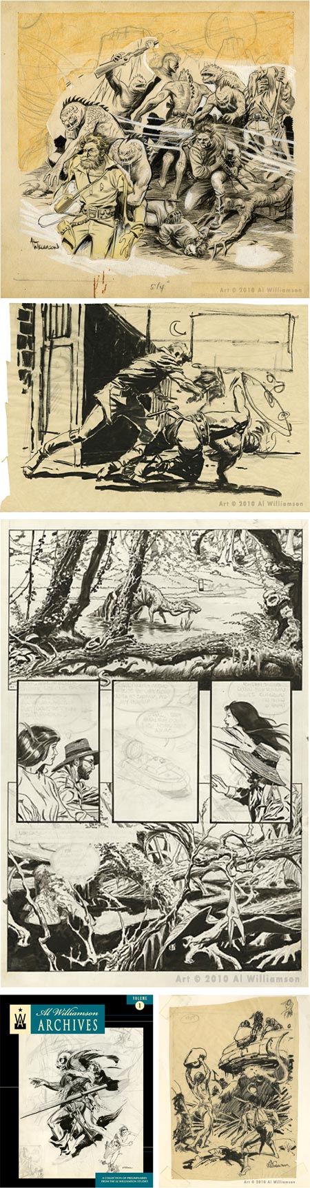
It’s a fairly common practice among comics artists to publish “sketchbooks”, sometimes literally that, sometimes collections of more finished drawings. In them we can often see the artist at play, doing preliminary sketches for art from stories with which we’re familiar, indulging in imaginative flights of fancy, doodling, practicing and learning.Rarely do we get to see this kind of work from comic art masters like Al Williamson.
Flesk Publications has come through again with a beautiful first volume in what I hope will be an extended series of books, Al Williamson Archives Volume 1. Flesk sent me a review copy, and I’m really impressed with the book.
Williamson’s approach was often very finished, with his beautiful drawing and elegant ink lines brought to a state of delicate balance between informal fluidity and refined polish; but here we get to see his drawings more as drawings, both in pencil and in ink, in various states of finish.
We get to see Williamson as draftsman, as playful inventor, as restless craftsman and as dedicated student of the art of graphic storytelling.
There are sketches and drawings from all phases of his career — science fiction heroes, dinosaurs and spooky swamps from the EC Comics days, ERB Tharks, studies of Rip Kirby, Secret Agent Corrigan and of course Flash Gordon. There are also projects I wasn’t aware of, like an unfinished page for an 8 page Xenozoic Tales story on which he and Mark Schultz were collaborating.
Sketchbooks like these are a bonanza for students of the art form, in that you get to see a master of the art as he works and learns and refines his craft. Here we see Williamson learning from Alex Raymond, who he admired greatly, and the influences from his friends and associates, Roy Krenkel, Wally Wood and Frank Frazetta, as well as sketches, both playful and businesslike, in which he works out solutions to challenges of composition, anatomy and rendering.
The book, as with all of Flesk’s books, is beautifully produced, but Flesk has gone beyond that, with an archivist’s eye and a fan’s enthusiasm, in the accurate presentation of the sketches and drawings on the original paper on which they were drawn.
Whether yellowed with age, wrinkled, cracked or touched up with white-out, Flesk has resisted the temptation to adjust levels, “clean up” the drawings and print them monochromatically on a white background; presenting them instead as full color images of the originals. It’s as if you were lovingly picking them up out of Williamson’s flat file drawer, discovering one long lost treasure after another.
You can see a preview of some of the drawings on the Flesk website, where you can also order the book directly from the new Flesk Publications online store, or by old fashioned snail mail.
Categories:
-
The Hell Creek Mural

Every field of artistic endeavor has its own limitations, but it’s often within those limitations, rather than in spite of them, that artists do their best work.In gallery art, artists who wish to survive on the sale of their art must produce work that finds an appreciative audience of buyers, and must often please gallery owners first in order to receive exposure.
Illustration has a special limitation in that the work must accompany and help express the themes, scenes or intention of a literary work, and must please editors as well as the public.
Scientific illustration brings with it the often stringent restriction that, in addition many of the challenges inherent in creating representational art, the work must adhere to scientific accuracy. This includes fields like botanical illustration, medical illustration, and that most popularly recognized branch of scientific art, paleontological illustration.
Paleo art carries even more restrictions, in that the artists are attempting to create realistic and scientifically accurate reconstructions of animals that no one has ever seen.
The importance of scientific accuracy in paleo art has led to a the creation of a special prize, awarded by the scientists themselves, for “outstanding achievement in paleontological scientific illustration and naturalistic art”. Named after, and partly supported by, noted paleo art collector John J. Lanzendorf, the Lanzendorf Paleoart Prize is awarded each year in October by the Society of Vertebrate Paleontology.
The 2-Dimensional Art category of the Lanzendorf Prize was most recently awarded to the “Hell Creek” mural at the Carnegie Museum of Natural History.
Created by Robert F. Walters, who I previously profiled here, and his partner, Tess Kissinger, with help from artist Laura Fields, the 92 ft long and 15 ft high (28 x 4.5 metre) mural depicts a scene from the end of the Cretaceous Period, just before the extinction of the non-avian dinosaurs. It is named for the Hell Creek Formation in South Dakota, where fossils of many of the species portrayed have been found.
You can read an article, Hell Creek Mural Wins Lanzendorf Prize, on Discovery News, and see the accompanying large image of the entire mural here.
You can also see images from the mural on the Walters & Kissinger DinoArt.com website.
Walters and Kissinger head one of the worlds premier dinosaur art studios, as well as the more broad-based Walters & Kissinger Museum Illustration Studio. The prize comes just two years after they were awarded the 2007 Lanzendorf prize for the Morrison Foundation mural that is part of the same exhibit, and is also, at 180 ft x 15 ft (54 x 4.5 metres) the largest dinosaur mural in the world.
I’ve known Walters and Kissinger for a number of years, so I was privy to some of the additional challenges presented by the scale and scope of the mural in much more detail than usual.
Installed in the newly redesigned Dinosaurs in their Time installation of the Carnegie Museum of Natural History, the mural was required to incorporate a number of species of animals and prehistoric plants that existed at the time in a single panoramic scene (paleo artists, in addition to the portrayal of prehistoric animals, often must serve as botanical artists as well).
The mural also had to work within the physical structure of the museum building and the layout of the exhibit design. Also, in a way perhaps analogous to the Renaissance artists who had to answer to the Church in terms of the specific and minute details of how a scene was to be portrayed, modern paleo artists answer to the rigorous analysis of the scientists who study the animals and plants to be portrayed.
The specifications of the Hell Creek mural, as outlined by the scientists working on the project, required not only specific plants and animals, but required that the animals reflect the skeleton mountings in the museum’s collection. In many cases these skeletons are mounted directly in front of the section of the mural showing that animal, and the painting must accommodate the skeleton, as well as physical models of plants, as though they were extensions of the mural, working together to create an illusionistic space for the visitor (image above, bottom).
In addition, the mural incorporates the latest scientific findings in terms of the probable physical appearance of the animals, something that is constantly changing as new discoveries are made. The triceratops (the familiar three-horned dinosaurs that are the stars of the mural) incorporate a skin texture interpreted from a fossil impression of triceratops skin discovered less than a year before. Likewise the oviraptorosaur, the animal with a beak and bony crest on it’s head in the middle image, incorporates feathers from research on an earlier oviraptorosaur find in China.
So in addition to working within the restrictions of scientific accuracy, paleo artists must also play detective, piecing together bits of knowledge from scattered sources to recreate the best possible vision of the animal.
The artists were able to incorporate some elements to surprise and delight, as well. Almost hidden in the foliage away from the more dramatic animals, are smaller creatures, like the avisaurus, a primitive bird with teeth that flies through the forest canopy just above and to the right of the triceratops, and the didelphodon, a badger-sized marsupial mammal moving through the underbrush, almost unnoticed at the right of the triceratops’ feet.
The late Cretaceous Period was a time when flowering plants came to prominence, and Walters told me that he took special delight in the portrayal of the group of edmontosaurs (the “duck-billed” dinosaurs to the left of the triceratops) in a field of flowers that resembled modern buttercups. Much of the other flora displayed is also recognizable as familiar modern plants that began to appear in that period.
Paleo artists have help, of course, in the reconstruction of extinct animals, working with the paleontologists who discover and study them, but even that has its limitations. The definition of paleontologist is one who studies ancient life, but not all paleontologists are anatomists, knowledgeable about the skeletal and muscular functioning of modern animals.
Having studied human anatomy in sessions at the medical college of Thomas Jefferson University while a student at the Pennsylvania Academy of the Fine Arts, Walters places a great deal of emphasis on accurate animal anatomy in his paleontological life reconstruction art.
The challenge, of course, was to take all of these considerations, scientific restrictions and requirements and mold them into a dynamic composition that immerses us in another time, in the orange glow of a sunset that presages the end of the reign of the dinosaurs.
So when artists think they are working within too many restrictions, they might consider the additional challenges in artistic fields where science is the salon jury.
Categories:


Charley’s Picks
Bookshop.org
(Bookshop.org affilliate links; sales benefit independent bookshop owners; I get a small percentage to help support my work on Lines and Colors)

John Singer Sargent: Watercolors


Urban Sketching: Understanding Perspective


Charley’s Picks
Amazon
(Amazon.com affiliate links; sales go to a larger yacht for Jeff Bezos; but I get a small percentage to help support my work on Lines and Colors)
John Singer Sargent: Watercolors
Urban Sketching: Understanding Perspective