
Categories
- 3d CGI
- Amusements
- Animation
- Anime & Manga
- Art Materials
- Art Videos
- Blogroll
- Cartoons
- Color
- Comics
- Concept & Visual Dev.
- Creativity
- Digital Art
- Digital Painting
- Displaying Art on the Web
- Drawing
- Eye Candy for Today
- Gallery and Museum Art
- High-res Art Images
- Illustration
- Motion Graphics & Flash
- Museums
- Online Museums
- Outsider Art
- Painting
- Painting a Day
- Paleo Art
- Pastel, Conté & Chalk
- Pen & Ink
- Prints and Printmaking
- Reviews
- Sc-fi and Fantasy
- Sculpture & Dimensional
- Site Comments
- Sketching
- Storyboards
- Tools and Techniques
- Uncategorized
- Vector Art
- Videos & Podcasts
- Vision and Optics
- Watercolor and Gouache
- Webcomics
Archives
- May 2026
- April 2026
- March 2026
- February 2026
- January 2026
- December 2025
- November 2025
- October 2025
- September 2025
- August 2025
- July 2025
- June 2025
- May 2025
- January 2025
- December 2024
- November 2024
- October 2024
- September 2024
- August 2024
- June 2024
- April 2024
- March 2024
- February 2024
- January 2024
- December 2023
- November 2023
- October 2023
- September 2023
- August 2023
- July 2023
- May 2023
- April 2023
- March 2023
- February 2023
- January 2023
- December 2022
- November 2022
- September 2022
- August 2022
- July 2022
- June 2022
- May 2022
- April 2022
- March 2022
- February 2022
- January 2022
- December 2021
- November 2021
- October 2021
- September 2021
- August 2021
- July 2021
- June 2021
- May 2021
- April 2021
- March 2021
- February 2021
- January 2021
- December 2020
- November 2020
- October 2020
- September 2020
- August 2020
- July 2020
- June 2020
- May 2020
- April 2020
- March 2020
- February 2020
- January 2020
- December 2019
- November 2019
- October 2019
- September 2019
- August 2019
- July 2019
- June 2019
- May 2019
- April 2019
- March 2019
- February 2019
- January 2019
- December 2018
- November 2018
- October 2018
- September 2018
- August 2018
- July 2018
- June 2018
- May 2018
- April 2018
- March 2018
- February 2018
- January 2018
- December 2017
- November 2017
- October 2017
- September 2017
- August 2017
- July 2017
- June 2017
- May 2017
- April 2017
- March 2017
- February 2017
- January 2017
- December 2016
- November 2016
- October 2016
- September 2016
- August 2016
- July 2016
- June 2016
- May 2016
- April 2016
- March 2016
- February 2016
- January 2016
- December 2015
- November 2015
- October 2015
- September 2015
- August 2015
- July 2015
- June 2015
- May 2015
- April 2015
- March 2015
- February 2015
- January 2015
- December 2014
- November 2014
- October 2014
- September 2014
- August 2014
- July 2014
- June 2014
- May 2014
- April 2014
- March 2014
- February 2014
- January 2014
- December 2013
- November 2013
- October 2013
- September 2013
- August 2013
- July 2013
- June 2013
- May 2013
- April 2013
- March 2013
- February 2013
- January 2013
- December 2012
- November 2012
- October 2012
- September 2012
- August 2012
- July 2012
- June 2012
- May 2012
- April 2012
- March 2012
- February 2012
- January 2012
- December 2011
- November 2011
- October 2011
- September 2011
- August 2011
- July 2011
- June 2011
- May 2011
- April 2011
- March 2011
- February 2011
- January 2011
- December 2010
- November 2010
- October 2010
- September 2010
- August 2010
- July 2010
- June 2010
- May 2010
- April 2010
- March 2010
- February 2010
- January 2010
- December 2009
- November 2009
- October 2009
- September 2009
- August 2009
- July 2009
- June 2009
- May 2009
- April 2009
- March 2009
- February 2009
- January 2009
- December 2008
- November 2008
- October 2008
- September 2008
- August 2008
- July 2008
- June 2008
- May 2008
- April 2008
- March 2008
- February 2008
- January 2008
- December 2007
- November 2007
- October 2007
- September 2007
- August 2007
- July 2007
- June 2007
- May 2007
- April 2007
- March 2007
- February 2007
- January 2007
- December 2006
- November 2006
- October 2006
- September 2006
- August 2006
- July 2006
- June 2006
- May 2006
- April 2006
- March 2006
- February 2006
- January 2006
- December 2005
- November 2005
- October 2005
- September 2005
- August 2005
Relevant Blogs
Art, Painting & Sketch
- Gurney Journey
- Underpaintings
- Art and Influence
- Painting Perceptions
- Oil Painters of America
- Vasari Paint POV
- Flying Fox
- Urban Sketchers
- Bento (Smithsonian)
- Art Inconnu
- The Hidden Place
- Still Life
- Making a Mark
- The Art of the Landscape
- Exploring Color & Creativity
- Art Contrarian
- Artist A Day
- beinArt Surreal Art Collective
- Eye Level
- David Dunlop
- p.i.g.m.e.n.t.i.u.m
- CultureGrrl
- Joaquín Sorolla blog
- Artists in Pastel
“Painting a Day”
- A Painting a Day (Keiser)
- On Painting (Keiser)
- Julian Merrow-Smith
- Karen Jurick
- Jeffrey Hayes
- Carol Marine
- Abbey Ryan
- Daily Paintworks
Other Painting Blogs
- Virtual Gouache Land
- Neil Hollingsworth
- Marc Hanson
- Kevin Menck
- Marc Dalessio
- Larry Seiler
- Stapleton Kearns
- Colin Page
- Roos Schuring
- Hans Versfelt
- Titus Meeuws
- Régis Pettinari
- René Plein Air
- Belinda Del Pesco
- Robin Weiss
- Nathan Fowkes (Land Sketch)
- William Wray
- Frank Serrano
- Stephen Magsig
- Michael Chesley Johnson
- Twice a Week
- Sarah Wimperis
- Rob Adams
- Michael Cole Manley
- The Dirty Palette Club
- Mike Manley’s Draw!
Gallery Art & Illustration mix
Illustration
- Howard Pyle
- 100 Years of Illustration
- BibliOdyssey
- Illustration Art
- Today’s Inspiration
- Illustration Mundo
- Little Chimp Society
- Danny Gregory
- R D (John Martz
- Illustration Friday blog
- Monster Brains
- Illustrators & Illustrations (RU)
- Elwood H. Smith
- DaniDraws.com
- Designers Who Blog
- iSpot Blog
Sci-Fi & Fantasy
Illustration & Comics
Comics & Cartoons
- Comics Beat
- Robot 6
- Newsarama Blog
- Comic Vine
- Comics Alliance
- Forbidden Planet Int.
- Paolo Rivera
- Bolt City
- Flight
- Scott McCloud
- The Comics Journal
- Comixpedia
- Funnybook Babylon
- James Baker
- Middleton’s Sketchbook
- Boneville
- The Hotel Fred
- Paul Rivoche
- Daily Cartoonist
- Mad About Cartoons (William Wray)
- Digital Strips
Illustration & Concept
Animation & Concept
- Cartoon Brew
- Animation Blog
- Cold Hard Flash
- Concept Art World
- The CAB
- FY Concept Art
- Concept Ships
- Concept Robots
- John Nevarez
- Armand Serrano
- Marcos Mateu-Mestre
- all kinds of stuff (Kricfalusi)
- Yacin the faun (Man Arenas)
- Kelsey Mann
- Cre8tivemarks Blog
- Ice-Cream Monster Toon Cafe
- AAU Character & Creature Design
- AAU Animation Notes
- Articles and Texticles
Paleo & Scientific
Tools & Techniques
Other
Lists of Art Blogs
Art Image Resource Links
Historic Art Images
- Wikimedia Commons: Paintings
- Wikimedia Commons: Drawings
- The Athenaeum
- WikiArt (WikiPaintings)
- Google Art Project: Artists
- Google Art Project: Collections (Museums)
- ArtCyclopedia
- Web Gallery of Art
- Art Renewal Center
- Web Gallery of Impressionism
Auction Consolidation sites
Auction sites
- Sotheby’s
- Bonham’s
- Christies
- Heritage Auctions: Fine Art
- Heritage Auctions: Illustration
- Freeman’s Auctions
- Bukowskis
- Shannon’s
Image Search
Reverse Image Search (search by image)
- Tin Eye
- RevImg
- Google Image Search (camera icon)
- Bing Image Search (camera icon)
Promoting some friends and some clients of my website design business
- Twin Willows T’ai Chi studio in Wilmington DE. Taiji classes with Bryan Davis.
- Ray Hayward, Inspired Teacher of T’ai Chi ( Taiji ) in Minneapolis, Founder of Mindful Motion Tai Chi Academy
- OldHead Tattoo studio and Art Gallery in Wilmington DE. Tattoos and paintings by Bruce Gulick
- Sharon Domenico Art, pet portrait oil paintings
- Platinum Paperhanging, wallpaper hanging, Main Line and Philadelphia, PA
- Lisa Stone Design, interior designer, Main Line and Philadelphia, PA
- Studio12KPT, original art, prints, calendars and other custom printed items by Van Sickle & Rolleri
-
William Laskin
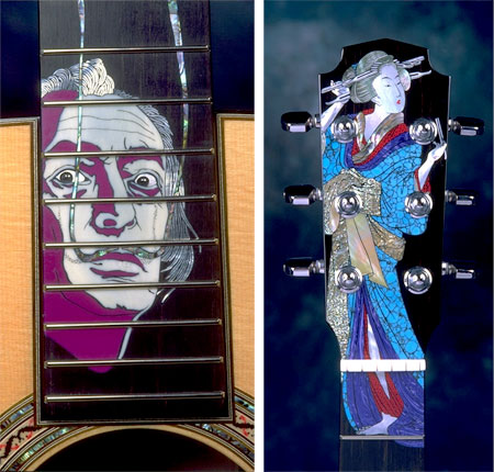
Inlay is a decorative process in which small pieces of material with differing colors are laid into carved channels in the surface of an object to create a pattern or image.Inlays are often applied to decorative boxes or other small objects using wood veneer. It is also a common practice to use other materials, notably shells, particularly when inlay is applied to wooden musical instruments.
Inlays are often applied in to small areas of the fingerboards of guitars, giving them that extra appeal of decoration and craftsmanship.
William Laskin is a Canadian luthier (maker of stringed instruments), specializing in guitars, who goes well beyond the typical small decorative patterns normally applied to guitars several ways.
One is in the composition of his materials, which range into 9 different species of shell, 15 varieties of stone, 4 kinds of ivory and bone, and 3 types of metal.
Another is the location and extent of his inlays. While it is not uncommon for inlays to appear on the rosette surrounding the sound hole, or on the headstock, the shaped block at the top of a guitar’s neck which holds the tuning nuts, those applications are normally small, with headstock decoration usually consisting of the maker’s logo.
Laskin, on the other hand frequently takes the entire headstock or large portions of the fingerboard as his canvas, and the fact that he treats it as a canvas is the most unusual and interesting aspect of his inlay work.
Using a process called engraved inlay, Laskin hand cuts shaped channels into the ebony fingerboard or ebony headstock veneer that he uses on his guitars, and applies his carefully chosen inlay materials to create what he terms “narrative” inlay, essentially realistic pictures.
The result is a series of striking images, created with the different colors and surface characteristics of the inlay materials as his palette.
Laskin often sketches his subjects from live models, and does extensive research and preliminary drawings before beginning the intense, extremely time consuming process of engraving the design and forming and setting the inlay pieces.
There is a gallery of inlays on his site (click on the thumbnails for larger images), with a description of the process. There is a video on his site called The Guitar is My Canvas, but I was unable to see it as it requires RealPlayer.
Laskin resists the temptation to repeat a successful design, and each inlay image is unique. His range of subjects includes musicians, animals, film noir scenes and artists, like the portrait of Dalí above, as well as references to art styles like the design inspired by Japanese woodblock prints, also shown above.
Makes me wish I played seriously enough to afford one.
Categories:
-
The 2009 Eustace Tilley Contest

As I promised in my post about The Many Faces of Eustace Tilley last January, I’m letting you know about the 2009 Eustace Tilley Contest in time to participate if you’re inclined.Eustace Tilley is the name given to the foppish character drawn by art director Rea Irvin for the first cover of The New Yorker in 1925 (image above, top left). The character has returned for a reprise on the anniversary issue each year and has essentially become the magazine’s mascot.
Last year The New Yorker began a contest in which entrants create their own version of an alternate or updated Eustace, and the winners are featured in a slide show on the magazine’s web site (some of last year’s entries shown above as well as in my previous post). Last year they were also featured in the print version of the magazine, but they don’t mention that on this year’s page about the contest, so I think it’s just online this time.
The contest is only open to residents of the US and Canada (with the exception of Quebec). To enter, you sign up, confirm your registration and then upload your image(s) as a jpg, png or non-animated gif file, ideally 465×633 (must be in vertical orientation).
You can submit multiple entries (up to three, I think). The entries must be received by midnight Eastern Time on January 15, 2009, and the winners will be announced on February 2, 2009.
There’s no particular prize other than inclusion in the slide show of the 12 winners, which will be chosen by the New Yorker’s art editor, François Mouly; and, of course, the fun of creating your own variation of the character.
You can see the submissions to date for the 2009 contest here, the winners of the 2008 contest here, and a Flickr gallery of all 170 entries from the 2008 contest here.
You can also see a gallery of some of the variations on Tilley that the magazine has commissioned as covers from various artists, including Art Spiegelman, Chris Ware, Charles Burns, Roz Chast, Robert Crumb, Anita Kunz, Carter Goodrich and others; and an article about the history of the character by Louis Menand, Mystery Man: The many faces of Eustace Tilley.
I’ll write another article when the contest results are posted in February and we can all see the new round of thoroughly modern Tilleys.
[Via Kottke]
Categories:
-
The Nativity by Petrus Christus

This depiction of the Nativity by Petrus Christus (large version here) strikes me as one of the more interesting and unusual interpretations of the event.We view the scene through a framing trompe l’oeil arch, likely inspired by the influence of Rogier van der Wyden’s similar compositions, such as his Miraflores Altarpiece (and interesting to compare to this “framed” walk-through composition by Antonello da Messina). The arch portrays a series of Biblical events, including stories from Genesis, and places the current event in the context of fall and redemption.
The figures, including four seemingly disinterested onlookers behind the ruined stable wall, are dressed in contemporary Flemish costume, and are viewed against a Flemish town, albeit with domed structures from Bethlehem and set amid rolling hills that might be neither location.
The event is attended by four angels, presented about one third human size, with strikingly bird-like wings, and dressed as sub-ministers of a 15th Century Northern European Mass.
The baby Jesus lies doll-like on the ground in the folds of Mary’s garments, central to everyone’s gaze, but otherwise not emphasized by the composition.
It’s interesting to compare the painting with Christus’ earlier versions of the Nativity and Annunciation here, here and here.
Petrus Christus was associated with early oil painting master Jan van Eyck, and may have succeeded him as master of his studio when he died in 1441. There is discussion, however, about whether he was actually Van Eyck’s student, as he shows as much influence from painters like Robert Campin and Rogier van der Weyden.
This painting of the Nativity is in the collection of the National Gallery in Washington.
Categories:
-
Old Kris by N.C. Wyeth

This year’s post about Santa Claus (or suitable Santa Equivalent) is Old Kris by the great American illustrator N.C. Wyeth (more on N.C. Wyeth in a future post).I had the pleasure of seeing this painting in person recently, as it is in the permanent collection of the Brandywine River Museum and currently on display as part of their Scenes of the Season exhibit (runs until January 11, 2009).
Here we have Wyeth basically doing his take, as did Norman Rockwell, Haddon Sundblom and a host of others, on a version of Santa Claus as most emphatically refined by J.C. Leyendecker; though the characterization of the Jolly One in slightly different form goes back to Thomas Nast and beyond (see my post on Illustrators’ Visions of Santa Claus.
Wyeth’s wonderfully textured characterization of Kris Kringle, with his star and moon studded sack, slightly trimmer waistline and nice details like the mouse perched on the grandfather clock, was a cover for Country Gentleman November 1, 1925 (Country Gentleman was published by Curtis Publishing, publisher of the Saturday Evening Post.)
Perhaps his slightly trimmer waistline and tighter belt makes him a Santa for our times.
Categories:
-
Jan Lievens

Our picture of art history, including the relative importance we assign to individual artists, is always changing; and a good thing too, as inaccuracies and jaded opinions often need to be corrected.This is the aim of an exhibition at the National Gallery of Art in Washington, DC, called Jan Lievens: A dutch Master Rediscovered.
Lievens was a friend, rival and studio-mate of Rembrandt, and despite acclaim and popularity in his own time, has for many years been lost in chiaroscuro darkness of that master’s considerably voluminous shadow.
The exhibition seeks to correct this and bring Lievens, whose talent in many areas rivaled or even surpassed Rembrandt’s own, into the light he so adeptly painted.
You will see in Lievens many of the same subjects, influences, techniques and approaches as Rembrandt, as in the costumed portrait above (more detail here); and scholars are in dispute about which of the artists, who shared models, materials and studio space for a time and may have even collaborated on each other’s works, originated what methods and practices.
Even their approach to graphics, and their skill with the process, were comparable.
There are differences as well, of course, and the two artists diverged in style and approach as they got older and went their separate ways.
It’s interesting to compare Leiven’s self-portrait (above, bottom left, larger version here) and his portrait of his friend Rembrandt (above, bottom-right, larger image here) with the slightly elder (by one year) artist’s own self-portrait from about a year earlier. Either Rembrandt was harsh in his own self-image, or Leivens was adept at artistic flattery; I suspect the truth is a little of both.
Jan Lievens: A dutch Master Rediscovered is on view at the National Gallery until January 11. 2009. It then moves to the Milwaukee Art Museum from February 7 to April 26, 2009, and then to the Rembrandt House Museum in Amsterdam from May 17 to August 19, 2009.
The National Gallery has an interactive feature about the exhibition. You can also download the exhibition brochure (PDF 3.2 mb), and an excerpt from the exhibition catalog (PDF 478k). The catalog itself is available from the Museum Shop or from traditional sources like Amazon.
The Wall Street Journal also has a slideshow and review of the exhibition.
The tides of art history haven’t been as kind to Leivens as to his compatriot, but perhaps this is the beginning of a resurgence of interest in an unjustly sidelined Dutch Master.
Addendum:The show will be at the Milwaukee Art Museum from February 7 to April 26, 2009.
Categories:
-
Reza Dolatabadi
 Reza Dolatabadi studied at Edinburgh College of Art and the University of Dundee, Duncan of Jordanstone College of Art and Design, from which he is graduating with a Bachelor in Animation and Media Art.
As a student project, Dolatabadi spent two years creating over 6000 individual paintings as frames for a five minute hand-painted animation called Khoda.
The film is a wordless story that is described as a psychological thriller, directed and art directed by Dolatabadi, written by Dolatabadi and Mark Szalos Farkas, with animation by Adam Thompson and music by Hamed Mafakheri.
Dolatabadi also has a web site on which you can see that film, and others, as well as his concept art and sketches.
He also maintains a blog, largely focused at the moment on the reception and accolades that Khoda is receiving, including Winner of the Best Animation Canary Wharf Film Festival (London) Aug, 2008, Award Nominee, Bacup Film Festival (Rossendale) Oct, 2008, Official selection for the “Best Short Film Program†at Waterford Film Festival (Ireland) November 2008 and selections for several other film and animation festivals.
[Via Digg]
Categories:


Charley’s Picks
Bookshop.org
(Bookshop.org affilliate links; sales benefit independent bookshop owners; I get a small percentage to help support my work on Lines and Colors)

John Singer Sargent: Watercolors


Urban Sketching: Understanding Perspective


Charley’s Picks
Amazon
(Amazon.com affiliate links; sales go to a larger yacht for Jeff Bezos; but I get a small percentage to help support my work on Lines and Colors)
John Singer Sargent: Watercolors
Urban Sketching: Understanding Perspective