
Categories
- 3d CGI
- Amusements
- Animation
- Anime & Manga
- Art Materials
- Art Videos
- Blogroll
- Cartoons
- Color
- Comics
- Concept & Visual Dev.
- Creativity
- Digital Art
- Digital Painting
- Displaying Art on the Web
- Drawing
- Eye Candy for Today
- Gallery and Museum Art
- High-res Art Images
- Illustration
- Motion Graphics & Flash
- Museums
- Online Museums
- Outsider Art
- Painting
- Painting a Day
- Paleo Art
- Pastel, Conté & Chalk
- Pen & Ink
- Prints and Printmaking
- Reviews
- Sc-fi and Fantasy
- Sculpture & Dimensional
- Site Comments
- Sketching
- Storyboards
- Tools and Techniques
- Uncategorized
- Vector Art
- Videos & Podcasts
- Vision and Optics
- Watercolor and Gouache
- Webcomics
Archives
- June 2026
- May 2026
- April 2026
- March 2026
- February 2026
- January 2026
- December 2025
- November 2025
- October 2025
- September 2025
- August 2025
- July 2025
- June 2025
- May 2025
- January 2025
- December 2024
- November 2024
- October 2024
- September 2024
- August 2024
- June 2024
- April 2024
- March 2024
- February 2024
- January 2024
- December 2023
- November 2023
- October 2023
- September 2023
- August 2023
- July 2023
- May 2023
- April 2023
- March 2023
- February 2023
- January 2023
- December 2022
- November 2022
- September 2022
- August 2022
- July 2022
- June 2022
- May 2022
- April 2022
- March 2022
- February 2022
- January 2022
- December 2021
- November 2021
- October 2021
- September 2021
- August 2021
- July 2021
- June 2021
- May 2021
- April 2021
- March 2021
- February 2021
- January 2021
- December 2020
- November 2020
- October 2020
- September 2020
- August 2020
- July 2020
- June 2020
- May 2020
- April 2020
- March 2020
- February 2020
- January 2020
- December 2019
- November 2019
- October 2019
- September 2019
- August 2019
- July 2019
- June 2019
- May 2019
- April 2019
- March 2019
- February 2019
- January 2019
- December 2018
- November 2018
- October 2018
- September 2018
- August 2018
- July 2018
- June 2018
- May 2018
- April 2018
- March 2018
- February 2018
- January 2018
- December 2017
- November 2017
- October 2017
- September 2017
- August 2017
- July 2017
- June 2017
- May 2017
- April 2017
- March 2017
- February 2017
- January 2017
- December 2016
- November 2016
- October 2016
- September 2016
- August 2016
- July 2016
- June 2016
- May 2016
- April 2016
- March 2016
- February 2016
- January 2016
- December 2015
- November 2015
- October 2015
- September 2015
- August 2015
- July 2015
- June 2015
- May 2015
- April 2015
- March 2015
- February 2015
- January 2015
- December 2014
- November 2014
- October 2014
- September 2014
- August 2014
- July 2014
- June 2014
- May 2014
- April 2014
- March 2014
- February 2014
- January 2014
- December 2013
- November 2013
- October 2013
- September 2013
- August 2013
- July 2013
- June 2013
- May 2013
- April 2013
- March 2013
- February 2013
- January 2013
- December 2012
- November 2012
- October 2012
- September 2012
- August 2012
- July 2012
- June 2012
- May 2012
- April 2012
- March 2012
- February 2012
- January 2012
- December 2011
- November 2011
- October 2011
- September 2011
- August 2011
- July 2011
- June 2011
- May 2011
- April 2011
- March 2011
- February 2011
- January 2011
- December 2010
- November 2010
- October 2010
- September 2010
- August 2010
- July 2010
- June 2010
- May 2010
- April 2010
- March 2010
- February 2010
- January 2010
- December 2009
- November 2009
- October 2009
- September 2009
- August 2009
- July 2009
- June 2009
- May 2009
- April 2009
- March 2009
- February 2009
- January 2009
- December 2008
- November 2008
- October 2008
- September 2008
- August 2008
- July 2008
- June 2008
- May 2008
- April 2008
- March 2008
- February 2008
- January 2008
- December 2007
- November 2007
- October 2007
- September 2007
- August 2007
- July 2007
- June 2007
- May 2007
- April 2007
- March 2007
- February 2007
- January 2007
- December 2006
- November 2006
- October 2006
- September 2006
- August 2006
- July 2006
- June 2006
- May 2006
- April 2006
- March 2006
- February 2006
- January 2006
- December 2005
- November 2005
- October 2005
- September 2005
- August 2005
Relevant Blogs
Art, Painting & Sketch
- Gurney Journey
- Underpaintings
- Art and Influence
- Painting Perceptions
- Oil Painters of America
- Vasari Paint POV
- Flying Fox
- Urban Sketchers
- Bento (Smithsonian)
- Art Inconnu
- The Hidden Place
- Still Life
- Making a Mark
- The Art of the Landscape
- Exploring Color & Creativity
- Art Contrarian
- Artist A Day
- beinArt Surreal Art Collective
- Eye Level
- David Dunlop
- p.i.g.m.e.n.t.i.u.m
- CultureGrrl
- Joaquín Sorolla blog
- Artists in Pastel
“Painting a Day”
- A Painting a Day (Keiser)
- On Painting (Keiser)
- Julian Merrow-Smith
- Karen Jurick
- Jeffrey Hayes
- Carol Marine
- Abbey Ryan
- Daily Paintworks
Other Painting Blogs
- Virtual Gouache Land
- Neil Hollingsworth
- Marc Hanson
- Kevin Menck
- Marc Dalessio
- Larry Seiler
- Stapleton Kearns
- Colin Page
- Roos Schuring
- Hans Versfelt
- Titus Meeuws
- Régis Pettinari
- René Plein Air
- Belinda Del Pesco
- Robin Weiss
- Nathan Fowkes (Land Sketch)
- William Wray
- Frank Serrano
- Stephen Magsig
- Michael Chesley Johnson
- Twice a Week
- Sarah Wimperis
- Rob Adams
- Michael Cole Manley
- The Dirty Palette Club
- Mike Manley’s Draw!
Gallery Art & Illustration mix
Illustration
- Howard Pyle
- 100 Years of Illustration
- BibliOdyssey
- Illustration Art
- Today’s Inspiration
- Illustration Mundo
- Little Chimp Society
- Danny Gregory
- R D (John Martz
- Illustration Friday blog
- Monster Brains
- Illustrators & Illustrations (RU)
- Elwood H. Smith
- DaniDraws.com
- Designers Who Blog
- iSpot Blog
Sci-Fi & Fantasy
Illustration & Comics
Comics & Cartoons
- Comics Beat
- Robot 6
- Newsarama Blog
- Comic Vine
- Comics Alliance
- Forbidden Planet Int.
- Paolo Rivera
- Bolt City
- Flight
- Scott McCloud
- The Comics Journal
- Comixpedia
- Funnybook Babylon
- James Baker
- Middleton’s Sketchbook
- Boneville
- The Hotel Fred
- Paul Rivoche
- Daily Cartoonist
- Mad About Cartoons (William Wray)
- Digital Strips
Illustration & Concept
Animation & Concept
- Cartoon Brew
- Animation Blog
- Cold Hard Flash
- Concept Art World
- The CAB
- FY Concept Art
- Concept Ships
- Concept Robots
- John Nevarez
- Armand Serrano
- Marcos Mateu-Mestre
- all kinds of stuff (Kricfalusi)
- Yacin the faun (Man Arenas)
- Kelsey Mann
- Cre8tivemarks Blog
- Ice-Cream Monster Toon Cafe
- AAU Character & Creature Design
- AAU Animation Notes
- Articles and Texticles
Paleo & Scientific
Tools & Techniques
Other
Lists of Art Blogs
Art Image Resource Links
Historic Art Images
- Wikimedia Commons: Paintings
- Wikimedia Commons: Drawings
- The Athenaeum
- WikiArt (WikiPaintings)
- Google Art Project: Artists
- Google Art Project: Collections (Museums)
- ArtCyclopedia
- Web Gallery of Art
- Art Renewal Center
- Web Gallery of Impressionism
Auction Consolidation sites
Auction sites
- Sotheby’s
- Bonham’s
- Christies
- Heritage Auctions: Fine Art
- Heritage Auctions: Illustration
- Freeman’s Auctions
- Bukowskis
- Shannon’s
Image Search
Reverse Image Search (search by image)
- Tin Eye
- RevImg
- Google Image Search (camera icon)
- Bing Image Search (camera icon)
Promoting some friends and some clients of my website design business
- Twin Willows T’ai Chi studio in Wilmington DE. Taiji classes with Bryan Davis.
- Ray Hayward, Inspired Teacher of T’ai Chi ( Taiji ) in Minneapolis, Founder of Mindful Motion Tai Chi Academy
- OldHead Tattoo studio and Art Gallery in Wilmington DE. Tattoos and paintings by Bruce Gulick
- Sharon Domenico Art, pet portrait oil paintings
- Platinum Paperhanging, wallpaper hanging, Main Line and Philadelphia, PA
- Lisa Stone Design, interior designer, Main Line and Philadelphia, PA
- Studio12KPT, original art, prints, calendars and other custom printed items by Van Sickle & Rolleri
-
La Gioconda (The Mona Lisa),
flipped for your viewing pleasure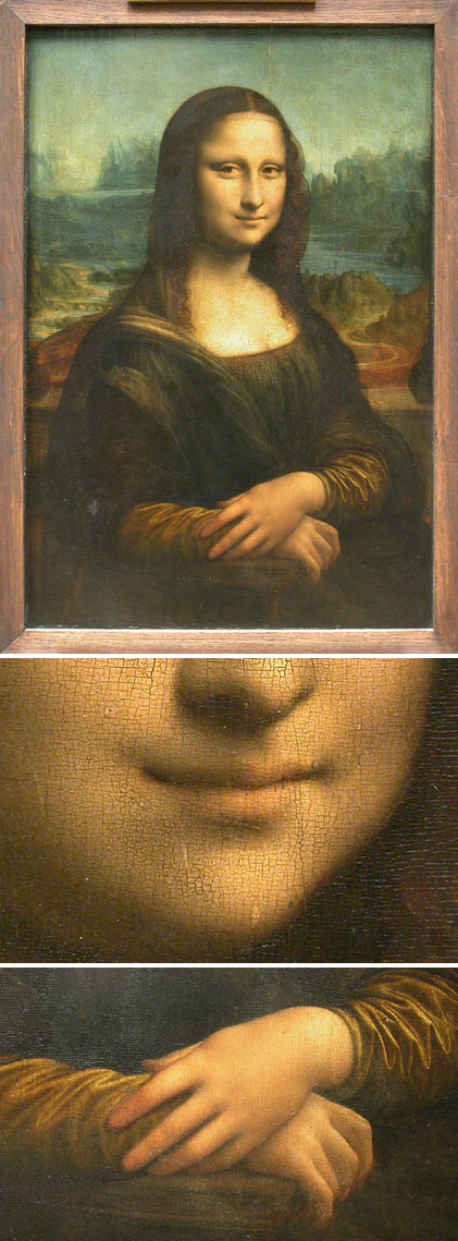
Sometimes the hardest things to see are the things that are in front of us most often. The familiar, the commonplace and the clichéd pull a veil over our eyes that dull us to their real appearance. So it is with Leonardo da Vinci’s famous portrait of a wealthy Florentine woman, most likely Lisa Gherardini, wife of silk merchant Francesco del Giocondo.Paintings from this period usually come to us named by someone other then the artist, years after they have left the artist’s studio. “La Gioconda” (or “La Joconde” in French) is a reference to the subject of the portrait as del Giocondo’s wife (and may also be wordplay meaning “light hearted”), while “Mona Lisa” simply means “Madam Lisa” or “Lady Lisa”.
The painting is almost impossible to see without peeling away layer after layer of cultural debris. The image has been reproduced, copied, morphed, written about, sung about, used in advertising and entertainment, and is generally woven into the fabric of or culture like no other work of art. There is a rather amazing site called Mona Lisa on the Web that pulls together links to over 600 Mona Lisa resources. Most of them are modifications, image mashups, animations, alternate faces, cartoons and such, and some are actually informational.
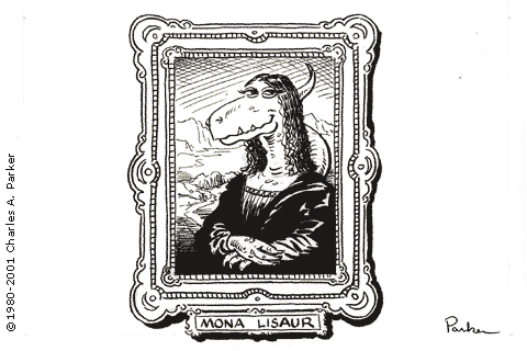
No other image has been so thoroughly modified and parodied, perhaps starting with Marcel Duchamp’s infamous mustache and goatee back in 1919. I even had my own bit of fun with her in this page from my webcomic in the mid-90’s. (Click on the image to see another bit of Mona License “underneath”.) I had my way with her again as a dinosaur cartoon.
On top of the long history of fascination with this particular painting, there is, of course, a new wave of Mona Mania sparked by all of the hype surrounding The Da Vinci Code. Even the venerable Louvre itself is bending to the winds of popular culture with Da Vinci Code Soundwalks.
Popular books and movies that bring attention and interest to great works of art are a Good Thing, and I’m glad whenever people who don’t normally pay attention to art drop by the art world for a looksee.
The challenge for those of us already here is to look at iconic images like La Gioconda and see them fresh, as paintings, the way they were meant to be seen.
One of the important tricks I learned as an illustrator and comic artist is how to see an overworked image freshly by looking at it in a mirror. This is much easier on the computer, and I have deliberately flipped the images of Dearest Mona here (or “flopped” for you graphic artists out there – OK, I admit it, I’m a flip-flopper). Anyway, I’ve reversed them left to right so you can at least get a momentary glimpse of the painting with fresh eyes.
Now look at her enigmatic smile (turned up on one end, straight on the other), her “not quite looking at you” gaze, the angelic hands, painted as if tenderly caressed by Leonardo’s brush, his wonderful sfumato blending, and his dramatic imaginary landscape with its beautiful aerial perspective, fantastic mountains, oddly snakelike winding road, arched bridge and slim hints of foreground architecture; not to mention the oddly “wrong” horizon, in which the two sides of the background do not seem to be aligned.
When you want to look at her right-way-’round again, you can see the original image on the Musée du Louvre site.
I had an extraordinary opportunity to see the actual painting under very favorable circumstances when I was in Paris a few years ago. It was the last night of our first visit to Paris and we had been to the Musée d’Orsay during our stay, but not yet to the Louvre. It was a Friday night and the museum was open late, but only particular galleries. The Italian Masters gallery was one of them, however, and we found, at the end of the gallery at the end of the night, that we had La Gioconda almost to ourselves, sharing the entire gallery with only 5 or 6 people.
I have to say that I was not expecting anything beyond Leonardo’s usual brilliance. I had seen several of his wonderfully accomplished paintings and drawings before, and was perhaps expecting something less from the “most famous painting in the world”, probably just because it was such a cliché and weighed down by so much cultural baggage.
I was surprised. I was wrong. I was astonished. Many clichés have a basis in truth and the legendary status of La Gioconda is one of them. The painting is extraordinary, captivating, mysterious, alluring, enigmatic, and, of course, painted with supreme mastery. My personal reaction to seeing Mona Lisa in person was not so much fascination with the way she smiles, but delight in the way she made me smile.
Categories:
-
Will Elder

It’s tempting to think of the comics art form as being most closely related to illustration. It is composed, after all, of drawn images. In reality it is much closer to its celluloid and electronic relatives, film and television. This is not because of the cross-over combination of animated cartoons, but because of the more direct relationship of mediums made up of images in sequence (moving or not) that tell a story.In this context, good comics artists fill multiple roles as directors, cinematographers and actors, composing a scene, framing it and then acting it out. In their role as actors, comics artists must convey in their drawings of the characters the body language, expressions, movements and gestures that live actors naturally possess.
You will even find comics artists who act out a scene before drawing it. When creating comics myself, I would often be drawing quietly only to have my wife walk into the room and burst out laughing, reacting to the fact that. without realizing it, I was grimacing wildly as I unconsciously made the facial expressions I was trying to draw.
If comics artists are the actors of this medium, Will Elder is its comic genius, the Buster Keaton and Charlie Chaplin of the comics story.
There are many comics artists who draw humorous stories or daily strips, but Will (sometimes “Bill”) Elder’s drawings can send me rolling even without words. His hilariously exaggerated drawings have most often been teamed with the brilliant comic writing of Harvey Kurtzman. Together they are a one-two knockout punch to the funny bone.
I first encountered Elder’s wonderfully twisted, and fantastically expressive comics in paperback reprints of the E.C. Mad comics from the early 1950’s. (See my post on Wally Wood, and my description of why I started lines and colors and why I started to draw comics as a kid.) Though I was more taken with Wood as an artist, it was Elder whose hilariously exaggerated character positions, wild expressions and manic actions made me laugh the most.
Kurtzman and Elder delighted in the comical destruction of classic comic strips, movies, books and cultural icons of all kinds. Along with Wally Wood, Jack Davis and John Severin, they produced some of the funniest and most brilliantly drawn humor comics ever created.
In addition to adding his outlandishly loopy drawing style and comedic “acting” talents to the work, Elder would fill the backgrounds of his panels with dozens of amazing little sight gags. If Elder’s drawings and Kurtzman’s writing weren’t enough to turn my impressionable little mind into radioactive gook, these just put me over the top.
Elder’s panels filled with sight gags also laid the groundwork for the other Mad artists to follow, and even suggesting the “stuff in as many gags as you can” approach later seen in movies like Airplane and Blazing Saddles. Note in the image above from Elder and Kurtzman’s parody of The Shadow, the items falling out of Margo’s purse, the objects lying on the stairs and the gags written on the risers of the steps, as well as the totally incidental character added to the second panel.
Elder also did commercial illustration for a number of mainstream publications like The Saturday Evening Post and more straightforward comics for E.C. titles like Front Line Combat and Two-Fisted Tales, but it was in the humor comics of Mad, Humbug, Help and Hugh Hefner’s Trump, that Elder really shined. It was Elder, in fact, who did the first rendition of Mad’s toothy idiot Alfred E. Neuman, who illustrators Kelly Freas and Norman Mingo would take and develop into the character as we know and love him.
 Kurtzman and Elder continued their comic partnership when Hefner offered them a slot for a humor comic in Playboy. They essentially took their Goodman Beaver character, a wonderfully snide take-off of the wholesome Archie comics, reworked the concept as a humorously naive, chaste but exaggeratedly sexy woman in a sex-themed parody of Little Orphan Annie and created Little Annie Fanny.
At Hefner’s urging, Elder developed a unique watercolor and tempera approach for the comic, without the traditional black outlines to hold the color, instead using fullly developed, highly rendered forms, much more like magazine illustration than comics. This, as far as I know, was the first real example of “painted” comics, a format now being successfully popularized by Alex Ross and others. Elder was occasionally assisted on the strip by veteran comics artists Russ Heath, Larry Siegel and the amazing Frank Frazetta, as well as several Mad artists including Al Jaffee and the great Jack Davis.
There are great reprints of many the Little Annie Fanny strips in two trade paperback editions from Dark Horse Comics: Little Annie Fanny, Volume 1 and Little Annie Fanny, Volume 2: 1970-1988. If you think you remember Little Annie Fanny as just a sexy Playboy comic, go back and read it again. It was a sophisticated, often hilarious and beautifully crafted series of pop culture parodies that define their era as well as anything from the time.
Elder’s official site has been pared down to just books and prints. There is an article and interview on Mad Mumblings, and an interview from The Comics Journal.
A good tribute book was recently published: Will Elder: The MAD Playboy of Art (with Daniel Clowes), and look for Chicken Fat: Drawings, Sketches, Cartoons and Doodles.
There are also reprints of some of his best Mad work in “Mad About the Fifties, and the terrific “Mad Reader” black and white paperback reprint series that originally detonated the cartooning bomb in my own adolescent brain: The Mad Reader , Mad Strikes Back, Inside Mad, Utterly Mad and Brothers Mad. There you can see Elder’s wild, brazen, hyper and sublime drawings in all of their brain-exploding glory.
If there was an Oscar for comedic acting in comics, the lifetime achievement award would go to Will Elder.
Categories:
-
Chris Moore

Clarity is something we all hope for when thinking about the future. Clarity is also an ideal that some artists, notably science fiction artists, strive for when depicting the future. Chris Moore is a British illustrator whose visions of other words and other times are focused to razor sharpness.His sci-fi work has a refined, high-tech intricacy and often depicts vistas of the future on a grand scale, utilizing a fine command of atmospheric perspective. He also has a knack for portraying robots that display both subtle and not-so-subtle human characteristics.
He works in both traditional media, usually acrylics, and digitally, though his style across the two types of media is quite consistent.
Moore has illustrated major science fiction novels by greats like Phillip K. Dick and Alfred Bester. He has also done album covers for performers like Fleetwood mac, Journey and The Allman Brothers band, as well as lesser known but terrific bands like Pentangle and Lindisfarne.
Although not a major direction in his career, Moore has done film concept work for George Lucas and Stanley Kubrick.
There is a book on his work and technique, published in 2000, Journeyman: the Art of Chris Moore. He is also featured in Fantasy Art Masters: The Best Fantasy and Science Fiction Artists Show How They Work by Dick Jude which includes a number of his preliminary sketches and the finished works they correspond to.
His online gallery also includes still lifes, portraits and landscapes. Unfortunately your enjoyment of the images will be slightly marred by the fact that Moore has felt it necessary to watermark the images. The effect is not overwhelming, however and some of the images survive better than others, depending on where the mark lies across lighter areas of the image.
On the plus side, the large images are good sized and allow you to get some idea of the wonderful detail and scale in Moore’s work. If you get the chance to see his work in books, or even better in person, as I did at an exhibit of sic-fi art at Weidner University several years ago, you will see clearly that he is one of the best in the field.
Addendum: Jane Frank’s Wow-Art.com site has Chris Moore original art for sale. Use the “Search by Artist” feature in the left column.
Categories:
-
handprint : watercolors and
watercolor painting handprint is the personal site of Bruce MacEvoy. The home page displays an unlabeled group of eight graphic symbols reflecting entry points to the sections of the site, which are a rather bizarre amalgam of his personal interests, from literary experiments to essays on Shakespeare’s Sonnets, human evolution and the philosopher Ludwig Wittgenstein.
One of the symbols is a simplified representation color wheel. Beneath this lies one of the most comprehensive and extensive painting resource sites on the web.
Starting with a guide to watercolor papers, moving on through brushes and paints. In each case the subjects are broken down into sub-sections dealing with history, manufacture, and the details of how to choose between the bewildering array of brands, styles and degrees of quality.
He then goes into selecting palettes, from simple to advanced arrays of colors, and detailed sections on color mixing, color theory and the use of various kinds of color wheels, including a nice one in which painters’ colors are arrayed on a color wheel so you can tell where, for example, venetian red sits relative to burnt sienna in terms of hue and intensity. (There is a larger, downloadable PDF version of this color wheel.)
There is even an extensive section on vision, optics and color perception. His section on techniques not only includes watercolor specific techniques like laying a wash and preparing watercolor papers, but other skills like basic perspective and modeling forms with value and color. Some sections, techniques in particular, are still under development as indicated by names of future topics that are not currently linked.
There is also a section on books, once again extensive, in which MacEvoy reviews and recommends titles on a variety of topics, from learning the basics to advanced color theory. In addition he lists and reviews major art retailers.
Ths site also contains some examples of MacEvoy’s own recent work, which is anything but showcased, you actually have to dig a bit to find it. His style seems as inquisitively eclectic as the topics on the home page of the handprint site, and features some figure painting, portraits and plein air landscapes that are very appealing.
MacEvoy has also posted a journal of thoughts and observations on painting that would make a web site in itself, as would many of the sections and sub-sections of this surprisingly deep site.
As if all of this weren’t enough, under the modest link “artists” is a wonderful section of illustrated essays on dozens of watercolor artists, from botanical and topographical illustrators to greats like Constable, Eakins, Homer and Sargent. Wow.
The site is an amazing resource, unfortunately marred by a less than ideal navigation system and his bizarre decision (what was he thinking?!) to center his columns of text, rendering them unnecessarily difficult to read. (Fortunately this practice isn’t carried to all pages, but it’s prevalent enough to be annoying.)
Don’t let that give you a moment’s pause, though. Anyone with any interest at all in watercolor, color theory, color mixing, vision, artist materials and techniques should check out the watercolors and watercolor painting section of handprint.
Categories:
-
Paul Gillon
I learned from The Comics Reporter that Paul Gillon’s 80th birthday was last Thursday (May 11, 2006). Gillon has a long and distinguished career as one of the preeminent creators of bandes desinnées – French comics (literally: “strips of drawings”). Along with Jean Giraud (Moebius), Gillon was one of the first artists I encountered when I discovered the delights of French comics.Gillon’s career was largely as a newspaper strip artist. For thirteen years he drew the daily strip 13, rue d l’Espoir (13 Hope Street), a soap opera comic, written by Jacques and François Gall and drawn by Gillon in a sophisticated realistic style in the tradition of Alex Raymond’s Rip Kirby.
Gillon is best known, however, for his landmark science fiction story Les Naufragés du Temps (Castaways in Time, sometimes translated as Lost in Time). Gillon co-created Les Naufragés du Temps with Jean-Claude Forest, who also created Barbarella, among other characters. The series, like much of Gillon’s science fiction/adventure work, has an erotic edge. (It’s a common paradigm in European comics to combine elements of eroticism with adventure, mystery and science fiction stories, since the French and Italians, in particular, don’t share America’s prudery.)
The Les Naufragés du Temps series moved to Metal Hurlant in 1977, at which point Gillon took over writing as well as drawing the strip. He also did other sci-fi stories, including La Survivante (The Survivor) a post-apocalyptic story in which we have an erotic encounter between a woman and a robot, and mystery/adventure stories like Les Léviathans (The Leviathans).
Gillon also illustrated editions of Melville’s Moby Dick and Victor Hugo’s Notre Dame de Paris, as well as Jehanne, an erotic interpretation of Joan of Arc.
Gillon sometimes puts me in mind of another soap opera newspaper strip artist who went on to comic-book stye work: Stan Drake, the under-appreciated American artist who worked for years on The Heart of Juliet Jones newspaper strip and later did the excellent graphic story albums of the Kelly Green detective series. Ah, but there’s a subject for another post.
There are English language versions of some (but not nearly enough) of Gillon’s work, notably Lost in Time: Labyrinths (with an introduction by Alex Toth, and from which the image above was taken), Lost in Time: Cannibal World and Survivor.
All of Paul Gillon’s work is distinguished by high standards of draughtsmanship, composition, characterization and comics storytelling.
Categories:
-
Worth 1000

I love living in the digital age. I truly do.Not only do I get to use the internet, paint with electrons and listen to a huge selection of music, I get to reap the benefits of other people indulging in the use of digital image editing tools.
Most often that means professionals creating digital paintings or wonderful CGI images, but occasionally it means amusing experiments by people with some degree of image editing skill, a bit of imagination and way too much time on their hands.
The bizarre fruits of these labors are often on display at Worth 1000, a “creative competition” site, the highlight of which is a showcase for outlandish image manipulation.
If you enter the home page of the site, you’ll immediately encounter the most recent Photoshop contests, a series of themed collections of manipulated images in which people attempt to illustrate a topic, like “Invisible Objects”, “Celebrity Time Tavel”, “Bizarrchitecture”, “Levitations” or “Visual Puns”, by manipulating or compositing existing images in an amusing way.
It will come as no surprise that my favorite topics are the Photoshop composite mashups of famous paintings, combined with modern elements or otherwise altered in ways that are often hilarious and occasionally very skillfully done.
There are several series built on the theme of “Counterfeit Art: Signs your fine art might be fake”, and “Modern Renaisssance”. I list some other categories below that deal with famous images from art history.
Counterfeit Art
Out of bounds art
Escher Blowout
Work-safe Art: Making Art Safe for our Children
Modern Renaisssance
Robot RenaissanceThe compositing and manipulation is sometimes overt and even clumsy, but occasionally very clever and subtle, at times requiring either an intimate familiarity with the original or a side by side comparison to pick up on the joke.
The manipulated images are usually linked to a larger version and sometimes accompanied by a link to a posting of the original, unaltered image or images.
If you want to participate, there are instructions in the beginning of the inidvidual “Active Advanced Photoshop Contests” that tell you how to submit.
While I haven’t participated in the Worth 1000 contests, I’m certainly not above the allure of manipulating favorite artworks with digital editing tools, as some pages from my webcomic back in the mid-90’s will show.
Time sink warning: if you enjoy this kind of thing, the Worth1000 site can be a time sink black hole. If you have to get something done today, you may want to postpone your visit for a rainy bored afternoon.
If you can stand the “my mother was scared by a graphic designer while carrying me” layout and the “ads in your face” arrangement of the pages, you can spend quite a bit of time flipping through the galleries.
Note: The paticipants occasionally get, um… carried away, and the site is not recommended for those who are squeamish or easily offended.
Categories:


Charley’s Picks
Bookshop.org
(Bookshop.org affilliate links; sales benefit independent bookshop owners; I get a small percentage to help support my work on Lines and Colors)

John Singer Sargent: Watercolors


Urban Sketching: Understanding Perspective


Charley’s Picks
Amazon
(Amazon.com affiliate links; sales go to a larger yacht for Jeff Bezos; but I get a small percentage to help support my work on Lines and Colors)
John Singer Sargent: Watercolors
Urban Sketching: Understanding Perspective