
Categories
- 3d CGI
- Amusements
- Animation
- Anime & Manga
- Art Materials
- Art Videos
- Blogroll
- Cartoons
- Color
- Comics
- Concept & Visual Dev.
- Creativity
- Digital Art
- Digital Painting
- Displaying Art on the Web
- Drawing
- Eye Candy for Today
- Gallery and Museum Art
- High-res Art Images
- Illustration
- Motion Graphics & Flash
- Museums
- Online Museums
- Outsider Art
- Painting
- Painting a Day
- Paleo Art
- Pastel, Conté & Chalk
- Pen & Ink
- Prints and Printmaking
- Reviews
- Sc-fi and Fantasy
- Sculpture & Dimensional
- Site Comments
- Sketching
- Storyboards
- Tools and Techniques
- Uncategorized
- Vector Art
- Videos & Podcasts
- Vision and Optics
- Watercolor and Gouache
- Webcomics
Archives
- July 2026
- June 2026
- May 2026
- April 2026
- March 2026
- February 2026
- January 2026
- December 2025
- November 2025
- October 2025
- September 2025
- August 2025
- July 2025
- June 2025
- May 2025
- January 2025
- December 2024
- November 2024
- October 2024
- September 2024
- August 2024
- June 2024
- April 2024
- March 2024
- February 2024
- January 2024
- December 2023
- November 2023
- October 2023
- September 2023
- August 2023
- July 2023
- May 2023
- April 2023
- March 2023
- February 2023
- January 2023
- December 2022
- November 2022
- September 2022
- August 2022
- July 2022
- June 2022
- May 2022
- April 2022
- March 2022
- February 2022
- January 2022
- December 2021
- November 2021
- October 2021
- September 2021
- August 2021
- July 2021
- June 2021
- May 2021
- April 2021
- March 2021
- February 2021
- January 2021
- December 2020
- November 2020
- October 2020
- September 2020
- August 2020
- July 2020
- June 2020
- May 2020
- April 2020
- March 2020
- February 2020
- January 2020
- December 2019
- November 2019
- October 2019
- September 2019
- August 2019
- July 2019
- June 2019
- May 2019
- April 2019
- March 2019
- February 2019
- January 2019
- December 2018
- November 2018
- October 2018
- September 2018
- August 2018
- July 2018
- June 2018
- May 2018
- April 2018
- March 2018
- February 2018
- January 2018
- December 2017
- November 2017
- October 2017
- September 2017
- August 2017
- July 2017
- June 2017
- May 2017
- April 2017
- March 2017
- February 2017
- January 2017
- December 2016
- November 2016
- October 2016
- September 2016
- August 2016
- July 2016
- June 2016
- May 2016
- April 2016
- March 2016
- February 2016
- January 2016
- December 2015
- November 2015
- October 2015
- September 2015
- August 2015
- July 2015
- June 2015
- May 2015
- April 2015
- March 2015
- February 2015
- January 2015
- December 2014
- November 2014
- October 2014
- September 2014
- August 2014
- July 2014
- June 2014
- May 2014
- April 2014
- March 2014
- February 2014
- January 2014
- December 2013
- November 2013
- October 2013
- September 2013
- August 2013
- July 2013
- June 2013
- May 2013
- April 2013
- March 2013
- February 2013
- January 2013
- December 2012
- November 2012
- October 2012
- September 2012
- August 2012
- July 2012
- June 2012
- May 2012
- April 2012
- March 2012
- February 2012
- January 2012
- December 2011
- November 2011
- October 2011
- September 2011
- August 2011
- July 2011
- June 2011
- May 2011
- April 2011
- March 2011
- February 2011
- January 2011
- December 2010
- November 2010
- October 2010
- September 2010
- August 2010
- July 2010
- June 2010
- May 2010
- April 2010
- March 2010
- February 2010
- January 2010
- December 2009
- November 2009
- October 2009
- September 2009
- August 2009
- July 2009
- June 2009
- May 2009
- April 2009
- March 2009
- February 2009
- January 2009
- December 2008
- November 2008
- October 2008
- September 2008
- August 2008
- July 2008
- June 2008
- May 2008
- April 2008
- March 2008
- February 2008
- January 2008
- December 2007
- November 2007
- October 2007
- September 2007
- August 2007
- July 2007
- June 2007
- May 2007
- April 2007
- March 2007
- February 2007
- January 2007
- December 2006
- November 2006
- October 2006
- September 2006
- August 2006
- July 2006
- June 2006
- May 2006
- April 2006
- March 2006
- February 2006
- January 2006
- December 2005
- November 2005
- October 2005
- September 2005
- August 2005
Relevant Blogs
Art, Painting & Sketch
- Gurney Journey
- Underpaintings
- Art and Influence
- Painting Perceptions
- Oil Painters of America
- Vasari Paint POV
- Flying Fox
- Urban Sketchers
- Bento (Smithsonian)
- Art Inconnu
- The Hidden Place
- Still Life
- Making a Mark
- The Art of the Landscape
- Exploring Color & Creativity
- Art Contrarian
- Artist A Day
- beinArt Surreal Art Collective
- Eye Level
- David Dunlop
- p.i.g.m.e.n.t.i.u.m
- CultureGrrl
- Joaquín Sorolla blog
- Artists in Pastel
“Painting a Day”
- A Painting a Day (Keiser)
- On Painting (Keiser)
- Julian Merrow-Smith
- Karen Jurick
- Jeffrey Hayes
- Carol Marine
- Abbey Ryan
- Daily Paintworks
Other Painting Blogs
- Virtual Gouache Land
- Neil Hollingsworth
- Marc Hanson
- Kevin Menck
- Marc Dalessio
- Larry Seiler
- Stapleton Kearns
- Colin Page
- Roos Schuring
- Hans Versfelt
- Titus Meeuws
- Régis Pettinari
- René Plein Air
- Belinda Del Pesco
- Robin Weiss
- Nathan Fowkes (Land Sketch)
- William Wray
- Frank Serrano
- Stephen Magsig
- Michael Chesley Johnson
- Twice a Week
- Sarah Wimperis
- Rob Adams
- Michael Cole Manley
- The Dirty Palette Club
- Mike Manley’s Draw!
Gallery Art & Illustration mix
Illustration
- Howard Pyle
- 100 Years of Illustration
- BibliOdyssey
- Illustration Art
- Today’s Inspiration
- Illustration Mundo
- Little Chimp Society
- Danny Gregory
- R D (John Martz
- Illustration Friday blog
- Monster Brains
- Illustrators & Illustrations (RU)
- Elwood H. Smith
- DaniDraws.com
- Designers Who Blog
- iSpot Blog
Sci-Fi & Fantasy
Illustration & Comics
Comics & Cartoons
- Comics Beat
- Robot 6
- Newsarama Blog
- Comic Vine
- Comics Alliance
- Forbidden Planet Int.
- Paolo Rivera
- Bolt City
- Flight
- Scott McCloud
- The Comics Journal
- Comixpedia
- Funnybook Babylon
- James Baker
- Middleton’s Sketchbook
- Boneville
- The Hotel Fred
- Paul Rivoche
- Daily Cartoonist
- Mad About Cartoons (William Wray)
- Digital Strips
Illustration & Concept
Animation & Concept
- Cartoon Brew
- Animation Blog
- Cold Hard Flash
- Concept Art World
- The CAB
- FY Concept Art
- Concept Ships
- Concept Robots
- John Nevarez
- Armand Serrano
- Marcos Mateu-Mestre
- all kinds of stuff (Kricfalusi)
- Yacin the faun (Man Arenas)
- Kelsey Mann
- Cre8tivemarks Blog
- Ice-Cream Monster Toon Cafe
- AAU Character & Creature Design
- AAU Animation Notes
- Articles and Texticles
Paleo & Scientific
Tools & Techniques
Other
Lists of Art Blogs
Art Image Resource Links
Historic Art Images
- Wikimedia Commons: Paintings
- Wikimedia Commons: Drawings
- The Athenaeum
- WikiArt (WikiPaintings)
- Google Art Project: Artists
- Google Art Project: Collections (Museums)
- ArtCyclopedia
- Web Gallery of Art
- Art Renewal Center
- Web Gallery of Impressionism
Auction Consolidation sites
Auction sites
- Sotheby’s
- Bonham’s
- Christies
- Heritage Auctions: Fine Art
- Heritage Auctions: Illustration
- Freeman’s Auctions
- Bukowskis
- Shannon’s
Image Search
Reverse Image Search (search by image)
- Tin Eye
- RevImg
- Google Image Search (camera icon)
- Bing Image Search (camera icon)
Promoting some friends and some clients of my website design business
- Twin Willows T’ai Chi studio in Wilmington DE. Taiji classes with Bryan Davis.
- Ray Hayward, Inspired Teacher of T’ai Chi ( Taiji ) in Minneapolis, Founder of Mindful Motion Tai Chi Academy
- OldHead Tattoo studio and Art Gallery in Wilmington DE. Tattoos and paintings by Bruce Gulick
- Sharon Domenico Art, pet portrait oil paintings
- Platinum Paperhanging, wallpaper hanging, Main Line and Philadelphia, PA
- Lisa Stone Design, interior designer, Main Line and Philadelphia, PA
- Studio12KPT, original art, prints, calendars and other custom printed items by Van Sickle & Rolleri
-
Charles R. Knight
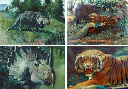
Charles R. Knight was one of the most influential and well known paleontological artists in the history of the field, and was one of the pioneers of paleontological reconstruction art, creating images of extinct animals based on their fossil remains and a knowledge of modern animal anatomy.He began his study of art at an early age, taking classes at the Metropolitan Museum of Art in spite of the fact that he had been struck in the eye with a stone at the age of six and suffered from an astigmatism that together rendered him legally blind.
He was from a family that had a passion for the outdoors and soon carried his interest in drawing to the zoo, beginning a lifetime practice of drawing animals. He started his career as an professional artist working for a firm that decorated churches and gradually moved into illustration for magazines and children’s books.
His interest in animals led him to the American Museum of natural History, where his frequent visits were noticed by the museum’s scientists, one of whom, Dr. Jacob Wortman, asked him if he could draw a reconstruction of prehistoric mammal that resembled modern pigs.
Knight used his knowledge of modern animal musculature and surface anatomy to create a successful restoration that began his career as a paleontological reconstruction artist.
Working at a time when most fossils at the AMNH were kept in drawers and there were no dinosaur skeletons in the kind of dramatic display that we now expect of natural history museums, Knight worked with Henry Farifield Osborn and William Matthew to create displays of the animals in lifelike mountings.
The scientific accuracy of his reconstructions was up-to-date with scientific findings at the time, but the past changes quickly. Paleontology has made dramatic advances in recent years and Knight’s images of tyrannosaurs and triceratops with their tails dragging on the ground and apatosaurs (at the time called brontosaurs) wading in water to support their bulk are inaccurate in light of modern knowledge.
The power of his artwork remains, however, and Knight’s drawings, watercolors, oil paintings and large scale murals are still considered classics in the field and are still influential on subsequent generations of paleo artists. Knight absorbed influences from the art world around him, including the brilliant colors of Impressionism and the elegant compositions of Japanese art and brought a feeling of light, texture and life to his work that set high standards for everyone who was to follow.
There is an excellent website devoted to Knight, maintained by his granddaughter Rhoda Knight Kalt that includes a detailed bio, gallery and Knight related news. The American Museum of Natural History has an excellent online gallery of Knight’s work, even if the images are small.
Knight was featured as a character in the IMAX film T-rex: Back to the Cretaceous, and the historical graphic novel Bone Sharps, Cowboys and Thunder Lizards (more info here).
A previously unreleased autobiography, Charles R. Knight: Autobiography of an Artist (more info here), has been published, put together by an interesting team, including a forward by Ray Bradbury and Ray Harryhausen, an introduction by William Stout and illustrations by Mark Schultz (see my previous posts on William Stout and Mark Schultz). Stout, who is himself a dinosaur artist of note, has published three volumes of Charles R. Knight Sketchbooks (toward the bottom of that page).
In addition to his ground breaking and influential work as a paleo artist, Knight also continued to pursue his interest in painting modern animals, particularly tigers and other big cats. In fact, Knight may have thought of himself as simply a nature artist, portraying animals and plants, both contemporary and extinct, with equal aplomb.
Categories:
-
René Magritte
 For some reason that I have yet to understand, when I first accidentally encountered Surrealism as a young teen ager looking through the art books in the school library, the images I saw of paintings by Salvador Dalí and Rene Magritte just hit me like a lightning bolt, flashing a giant “Whoah! What is this?!” on my cranial billboard.
That was it. I was hooked, a helpless Surrealism Junkie. How could something so utterly and amazingly cool and strange and non-school-like exist on the shelves of the school library as if it were just as innocent as all of the other stuff that school managed to make so boring? Within weeks I was haunting the school and public libraries devouring every book on Surrealism I could find, with a particular fascination for Dalí and Magritte.
I would later come to enjoy the subtle brain-vibrating pleasures of Ernst, Duchamp, Man Ray, and other less well known Surrealist and Dada artists and also come to enjoy the writings of Andre Breton, Benjamin Peret and other Surrealist writers, but it was the “big two”, with their other-worldly, dream-like, disorienting and endlessly fascinating images that really had a hold on me. (Contrary to the popular assumption, Surrealism was primarily a literary movement, not an art movement, and Breton, who wrote the Surrealist “manifestos” and was good friends with Magritte, was its center.)
Dalí, with his impressive old-master level of painting skills, propelled his fantastic images into hyper-real dream-state orbit, casting shimmering spells of wonder over my hungry teenage brain, but Magritte… ah, Magritte was more subtle. Never the accomplished painter or draughtsman that Dali was (but then, how many are?), Magritte’s ability to fascinate me lay in the psychological power of his imagery. His paintings just grab you.
His images are directly painted, with little fuss or ostentatious display of technical virtuosity. Unlike Dalí, who set out to shock, dazzle and bewilder, Magritte casts his spell more like a poet, with juxtapositions of images and scenes that don’t make sense on the surface, but do, undeniably, unfathomably, make sense unconsciously.
Magritte is about connections and disconnections. He takes a seat in the back of your brain and, like a 1940’s wire-and-plug telephone switchboard operator, begins to reroute associations between the expected and the unexpected. Suddenly your subconscious snaps its mental fingers and says “Ah-ha!”, but what the “ah-ha” actually is remains unclear.
Magritte invites you into a mystery with bizarre clues, hints of meaning and tantalizing associations and then makes a connection that turns your throbbing little brain upside-down in its brain pan and gives it a good cooking (with a dash of pepper). All the while, of course, old René is laughing up his bowler hat. Pulled another one on you. Gotcha!
In painting after painting the conventions of reality, visual perception and representational art – time, space, gravity, proportion, perspective – one by one are turned on their heads.
Some of his images have become familiar, but still have the power to give that delightful mental “twist”, and have in large part come to define what people think of when they use the word “surreal”.
The Castle of the Pyrenees sits atop a great stone mountain, except that the mountain is egg-shaped and suspended over the sea in absolute defiance of gravity; and the castle itself is made of the same stone as the mountain as if simply carved from the top of it. A man gazes into a mirror, his back turned to you, but his reflection also has its back turned to you. A large eye gazes at you from the canvas, its iris filled with sky and clouds. English businessmen with their traditional overcoats and bowler hats hang in the sky like stop-motion raindrops.
Magritte often visited the same themes many times, I think of them as series although I don’t know if he ever considered them as such. Some of them are:
– paintings in which objects and/or people turn to stone, or are filled with the sky, often in the same work
– his strange floating slotted spheres (which some designer appropriated for the Geffen Records logo)
– the series in which the well dressed businessmen with their bowler hats have objects like apples or doves suspended in front of their face, or Flora, from Botticelli’s Le Printemps hovering in mineature behind their backs
– articles of clothing sitting in closets begin to take on elements of their human owners, a chemise and a nightgown posses human breasts, boots end in toes
– paintings in which a giant apple or enormous rose takes up the entire volume of a room (or is it, in fact, the room that is miniature?)
– the series in which he copies the compositions of famous canvasses by David and Manet, not unusual except that the figures in the paintings have been replaced with coffins – in the positions of the original figures, bent in half to sit up in bed or bent twice to sit in a chair
and his beautifully poetic images of Empire of Light, not too far removed from reality, in which houses at street level are in darkness, lit by street lamps, but above the line of dark trees, the sky is midday blue.
Ah, the wonderful perfect strangeness of it all!
At the time of this post, two Magritte exhibits are running concurrently in Paris (how much is that plane fare?): Magritte and Photography, photographs of or by the Belgian artist at Maison Européenne de la Photographie from March 15 through June 11, 2006, and René Magritte Tout en papier an exhibit of Magritte’s rarely seen works on paper including drawings, collage and gouache (in which his approach and color palette are much different than in his oils) at Musée Maillol from March 8 through June 19, 2006.
There is a site at magritte.com that has some biographical information and a few images, but it seems to exist mostly to promote a CD-ROM collection. The Magritte Foundation has an interesting virtual gallery, but the images are small. I give some other resources for Magritte images on the web below.
Most fascinating of all for me of Magritte’s repeated themes is a series of paintings within paintings, in which canvases sit on easels in front of windows, inextricably seamless with the view behind them, all of which are named “The Human Condition”. There is a related series of images of windows, broken or open to show that the scene that is apparently outside the window is, in fact, painted on it, sometimes revealing an identical scene outside the window. Wonderful images that suggest the magical connection between art and reality.
No post on Magritte would be complete without mentioning the definitive Magritte image of a pipe, simply and directly rendered, on which Magritte has written in paint: “Ceci n’est pas une pipe.”, “This is not a pipe.”, and, of course,… he’s right.
Categories:
-
KAL (Kevin Kallaugher)

In a distinctive pen and ink cross hatching style that sometimes seems to carry forward the tradition of the great Thomas Nast, Kevin Kallaugher, who signs his work as KAL, has been skewering the insanities, abuses and tragedies of American politics and society at large for over 17 years from his position as editorial cartoonist for the Baltimore Sun.Although his eye for events has always been up-to-the-minute, in many ways, KAL is traditional – from his obvious affection for traditional pen and ink artists and cross hatching techniques to his staunch support of the tradition of political cartoonists doing their best to find the absurdity in government and social institutions wherever it may lie, not just in having a party line axe to grind.
His drawing style is a wonderful study in contrasts. It can be loose and sketchy, with objects and figures suggested with just a few quick lines on one part of a drawing, and rendered with fine-lined tonal detail in another part of the same drawing. His caricatures are evidence of the fun he finds in exploring the surface and geometry of a face and mapping out in detail the facial “landscape” that makes an individual’s appearance unique.
His drawing style and editorial voice are part of what makes him unique and part of what has given the Baltimore Sun (a paper I often read and enjoy) its unique character for a long time. Sadly, the paper is losing a lot of that character, and many people, myself included, feel that the once shining Baltimore Sun is beginning to dim.
I’m sorry to say KAL’s cartoons will no longer be seen in the pages of the Sun (article here). As of this January he “retired” from his position, accepting a buyout that is part of Tribune Co.’s wrong-headed attempt to cut costs by dropping editorial cartoonists from the staffs of its newspapers. Tragically, this trend is not limited to Tribune Co. papers, although they are perhaps the most aggressive of the newspaper conglomerates in devaluing the place of editorial cartooning in their papers.
Hmmm… let’s see… circulation is down, so let’s throw away the unique voices, incisive viewpoints and talented visionaries that make our papers unique and appealing, and instead make everything more bland, ordinary and homogenized; sweeten it up an dumb it down. We’ll jam our papers so full of ads, phamphlets, leaflets, flyers and other junk that you won’t even be able to find the content and we’ll shrink what little content there is down to the point where there’s nothing left to buy the paper for, and then we’ll sit around and cry about how the internet is ruining newspapers. Great idea.
But we’re actually to blame, us, all 300 million of us. America has made its choices: Wall-mart instead of community businesses, McDonald’s instead of great little diners, Thomas Kinkade instead of earnest local artists, Katie Couric instead of Bob Scheiffer and another page of supermarket ads and syndicated astrology columns in place of insightful editorial voices like Kallaugher’s. (You’ll notice I resisted the enormous temptation to include a political statement there. Really bit my tongue on that one. Yessir. No suggestions about America making bad political choices here!)
There are still some who recognize the value of a great talent like KAL, and the Walters Art Museum in Baltimore has mounted an exhibition of his work: Mightier than the Sword: The Satirical Pen of KAL, that will run from June 18 to September 3 of 2006.
There are also collections of his work; some are out of print but still available through used book services at Amazon and elsewhere: Kal Draws the Line, KAL Draws a Crowd, Kaltoons: A Collection of Political Cartoons from the Baltimore Sun, and Drawn from the Economist: A collection of caricatures.
In the meantime, here are some places on the web where you can still see the talent and vision that made Kallaugher one of the greats of American editorial cartooning.
Exhibit link via Art Knowledge News.
Categories:
-
Mark Sullivan
Concept artists provide much of the “imagination power” behind the fantastic images we see in film and games. They provide their services to the entertainment industry in a variety of ways, some work for large production or special effects firms, some for design studios, some independently and some for alliances or “studio groups” of artists and designers with related skills.Concept artist Mark Sullivan is part of the Ice Blink studio group, led by noted concept artist Doug Chiang. I’ve written posts about several of the groups members, including Doug Chiang, Marc Gabbana and Josh Viers and Bill Mather (who I didn’t even realize was a concept artist at the time of my post).
Sullivan has provided concept art for films like The Hudsucker Proxy, Pleasantville (a treat, if you haven’t seen it), Bugsy, Starship Troopers and The Polar Express. He has worked for Jim Danforth, Dreamquest Images, Industrial Light and Magic and others.
Sulivan credits his exposure at an early age to the original King Kong, and its wonderous multi-plane glass matte painting visions of Skull Island, with sparking his enthusiasm for working in the film and concept design field. His bio describes his early attempts to animate clay dinosaurs in Super-8 in front of crudely painted scenic backgrounds.
I would bet that most artists in the field have a similar story to tell, and now Mark and his fellow Ice Blink artists are fueling the imaginations of the next generation of entertainment industry artists.
Categories:
-
Dennis Wojtkiewicz
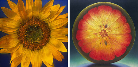
Anyone who has really studied biology and the natural world can tell you that even the simplest of organic objects can be a marvel of biological complexity. If we take the time to stop and examine them, we find that simple organic objects can be visual wonders as well.Dennis Wojtkiewicz makes that brilliantly clear for us. He paints large, luminous oil paintings of simple-but-complex objects like single flower blossoms or slices of fruit or melons. The fruit slices are often lit from behind, giving their intricate interiors the appearance of being illuminated from within, and the flowers are bathed in warm light that gives their finely textured surfaces an almost angelic quality.
I would really enjoy the opportunity to see his canvases in person because they are large in scale, many are 4ft x 4ft (121 x 121 cm), and the visual impact must be wonderful. The fruit images are more recent than the flowers. According his artist’s statement he has been working on the series for the past two years.
Wojtkiewicz is a professor at the School of Art, Bowling Greeen State University in Ohio, and his work has been in an impressive list of exhibits, collections and publications.
The links for Wojtkiewicz’s galleries below are to the J. Cacciola Gallery in New York, the Glass Garage Gallery in West Hollywood, and the Robert Kidd Gallery in Burmingmham, MI, all of which represent some other very interesting artists.
One of the things that art does best is to remind us how astonishing the “ordinary world” around us really is. I would love to gaze at Wojtkiewicz’s 4 foot high painting of a grapefruit for a while and then sit down to breakfast.
Link via Changing Places.
Categories:
-
Coloring Comics: Steve Hamaker Colors Bone

In yesterday’s post on drawing comics I pointed to some thumbnail to ink sequences Jeff Smith has posted of his working process for Bone. Thanks to some recent posts by Steve Hamaker, who is coloring the new Bone color editions for Scholastic Press, we can follow the process to its next step.Hamaker’s first blog entry on coloring Bone with Photoshop features a detailed sequence of images but not much explanation. His more recent post has more explanation and both posts have interesting comments from readers.
You can read the explanation from the second post and then go back and look at the first sequence with his process in mind. Hamaker promises to expand on his coloring how-tos in more detail in the near future, perhaps on the official Boneville site.
In addition to his work on the Bone color editions, Hamaker is the creator of Fish N Chips, a comic that features a fish whose bowl sits atop a robot body that he controls via telekenesis, and an electric cat. He also contributed coloring to a Jeff Smith story in Flight Volume 2 and is contributing a complete 16 page story to the new Flight Volume 3, which is due in June. Hamaker is also applying color for Smith’s upcoming Shazam! limited series for DC and is illustrating a series of books written by Dave Stewart, beginning with Turtletown.
In addition to steve’s blog, Hamaker has a regular web site that showcases his projects in a more general way.
Categories:


Charley’s Picks
Bookshop.org
(Bookshop.org affilliate links; sales benefit independent bookshop owners; I get a small percentage to help support my work on Lines and Colors)

John Singer Sargent: Watercolors


Urban Sketching: Understanding Perspective


Charley’s Picks
Amazon
(Amazon.com affiliate links; sales go to a larger yacht for Jeff Bezos; but I get a small percentage to help support my work on Lines and Colors)
John Singer Sargent: Watercolors
Urban Sketching: Understanding Perspective