
Categories
- 3d CGI
- Amusements
- Animation
- Anime & Manga
- Art Materials
- Art Videos
- Blogroll
- Cartoons
- Color
- Comics
- Concept & Visual Dev.
- Creativity
- Digital Art
- Digital Painting
- Displaying Art on the Web
- Drawing
- Eye Candy for Today
- Gallery and Museum Art
- High-res Art Images
- Illustration
- Motion Graphics & Flash
- Museums
- Online Museums
- Outsider Art
- Painting
- Painting a Day
- Paleo Art
- Pastel, Conté & Chalk
- Pen & Ink
- Prints and Printmaking
- Reviews
- Sc-fi and Fantasy
- Sculpture & Dimensional
- Site Comments
- Sketching
- Storyboards
- Tools and Techniques
- Uncategorized
- Vector Art
- Videos & Podcasts
- Vision and Optics
- Watercolor and Gouache
- Webcomics
Archives
- July 2026
- June 2026
- May 2026
- April 2026
- March 2026
- February 2026
- January 2026
- December 2025
- November 2025
- October 2025
- September 2025
- August 2025
- July 2025
- June 2025
- May 2025
- January 2025
- December 2024
- November 2024
- October 2024
- September 2024
- August 2024
- June 2024
- April 2024
- March 2024
- February 2024
- January 2024
- December 2023
- November 2023
- October 2023
- September 2023
- August 2023
- July 2023
- May 2023
- April 2023
- March 2023
- February 2023
- January 2023
- December 2022
- November 2022
- September 2022
- August 2022
- July 2022
- June 2022
- May 2022
- April 2022
- March 2022
- February 2022
- January 2022
- December 2021
- November 2021
- October 2021
- September 2021
- August 2021
- July 2021
- June 2021
- May 2021
- April 2021
- March 2021
- February 2021
- January 2021
- December 2020
- November 2020
- October 2020
- September 2020
- August 2020
- July 2020
- June 2020
- May 2020
- April 2020
- March 2020
- February 2020
- January 2020
- December 2019
- November 2019
- October 2019
- September 2019
- August 2019
- July 2019
- June 2019
- May 2019
- April 2019
- March 2019
- February 2019
- January 2019
- December 2018
- November 2018
- October 2018
- September 2018
- August 2018
- July 2018
- June 2018
- May 2018
- April 2018
- March 2018
- February 2018
- January 2018
- December 2017
- November 2017
- October 2017
- September 2017
- August 2017
- July 2017
- June 2017
- May 2017
- April 2017
- March 2017
- February 2017
- January 2017
- December 2016
- November 2016
- October 2016
- September 2016
- August 2016
- July 2016
- June 2016
- May 2016
- April 2016
- March 2016
- February 2016
- January 2016
- December 2015
- November 2015
- October 2015
- September 2015
- August 2015
- July 2015
- June 2015
- May 2015
- April 2015
- March 2015
- February 2015
- January 2015
- December 2014
- November 2014
- October 2014
- September 2014
- August 2014
- July 2014
- June 2014
- May 2014
- April 2014
- March 2014
- February 2014
- January 2014
- December 2013
- November 2013
- October 2013
- September 2013
- August 2013
- July 2013
- June 2013
- May 2013
- April 2013
- March 2013
- February 2013
- January 2013
- December 2012
- November 2012
- October 2012
- September 2012
- August 2012
- July 2012
- June 2012
- May 2012
- April 2012
- March 2012
- February 2012
- January 2012
- December 2011
- November 2011
- October 2011
- September 2011
- August 2011
- July 2011
- June 2011
- May 2011
- April 2011
- March 2011
- February 2011
- January 2011
- December 2010
- November 2010
- October 2010
- September 2010
- August 2010
- July 2010
- June 2010
- May 2010
- April 2010
- March 2010
- February 2010
- January 2010
- December 2009
- November 2009
- October 2009
- September 2009
- August 2009
- July 2009
- June 2009
- May 2009
- April 2009
- March 2009
- February 2009
- January 2009
- December 2008
- November 2008
- October 2008
- September 2008
- August 2008
- July 2008
- June 2008
- May 2008
- April 2008
- March 2008
- February 2008
- January 2008
- December 2007
- November 2007
- October 2007
- September 2007
- August 2007
- July 2007
- June 2007
- May 2007
- April 2007
- March 2007
- February 2007
- January 2007
- December 2006
- November 2006
- October 2006
- September 2006
- August 2006
- July 2006
- June 2006
- May 2006
- April 2006
- March 2006
- February 2006
- January 2006
- December 2005
- November 2005
- October 2005
- September 2005
- August 2005
Relevant Blogs
Art, Painting & Sketch
- Gurney Journey
- Underpaintings
- Art and Influence
- Painting Perceptions
- Oil Painters of America
- Vasari Paint POV
- Flying Fox
- Urban Sketchers
- Bento (Smithsonian)
- Art Inconnu
- The Hidden Place
- Still Life
- Making a Mark
- The Art of the Landscape
- Exploring Color & Creativity
- Art Contrarian
- Artist A Day
- beinArt Surreal Art Collective
- Eye Level
- David Dunlop
- p.i.g.m.e.n.t.i.u.m
- CultureGrrl
- Joaquín Sorolla blog
- Artists in Pastel
“Painting a Day”
- A Painting a Day (Keiser)
- On Painting (Keiser)
- Julian Merrow-Smith
- Karen Jurick
- Jeffrey Hayes
- Carol Marine
- Abbey Ryan
- Daily Paintworks
Other Painting Blogs
- Virtual Gouache Land
- Neil Hollingsworth
- Marc Hanson
- Kevin Menck
- Marc Dalessio
- Larry Seiler
- Stapleton Kearns
- Colin Page
- Roos Schuring
- Hans Versfelt
- Titus Meeuws
- Régis Pettinari
- René Plein Air
- Belinda Del Pesco
- Robin Weiss
- Nathan Fowkes (Land Sketch)
- William Wray
- Frank Serrano
- Stephen Magsig
- Michael Chesley Johnson
- Twice a Week
- Sarah Wimperis
- Rob Adams
- Michael Cole Manley
- The Dirty Palette Club
- Mike Manley’s Draw!
Gallery Art & Illustration mix
Illustration
- Howard Pyle
- 100 Years of Illustration
- BibliOdyssey
- Illustration Art
- Today’s Inspiration
- Illustration Mundo
- Little Chimp Society
- Danny Gregory
- R D (John Martz
- Illustration Friday blog
- Monster Brains
- Illustrators & Illustrations (RU)
- Elwood H. Smith
- DaniDraws.com
- Designers Who Blog
- iSpot Blog
Sci-Fi & Fantasy
Illustration & Comics
Comics & Cartoons
- Comics Beat
- Robot 6
- Newsarama Blog
- Comic Vine
- Comics Alliance
- Forbidden Planet Int.
- Paolo Rivera
- Bolt City
- Flight
- Scott McCloud
- The Comics Journal
- Comixpedia
- Funnybook Babylon
- James Baker
- Middleton’s Sketchbook
- Boneville
- The Hotel Fred
- Paul Rivoche
- Daily Cartoonist
- Mad About Cartoons (William Wray)
- Digital Strips
Illustration & Concept
Animation & Concept
- Cartoon Brew
- Animation Blog
- Cold Hard Flash
- Concept Art World
- The CAB
- FY Concept Art
- Concept Ships
- Concept Robots
- John Nevarez
- Armand Serrano
- Marcos Mateu-Mestre
- all kinds of stuff (Kricfalusi)
- Yacin the faun (Man Arenas)
- Kelsey Mann
- Cre8tivemarks Blog
- Ice-Cream Monster Toon Cafe
- AAU Character & Creature Design
- AAU Animation Notes
- Articles and Texticles
Paleo & Scientific
Tools & Techniques
Other
Lists of Art Blogs
Art Image Resource Links
Historic Art Images
- Wikimedia Commons: Paintings
- Wikimedia Commons: Drawings
- The Athenaeum
- WikiArt (WikiPaintings)
- Google Art Project: Artists
- Google Art Project: Collections (Museums)
- ArtCyclopedia
- Web Gallery of Art
- Art Renewal Center
- Web Gallery of Impressionism
Auction Consolidation sites
Auction sites
- Sotheby’s
- Bonham’s
- Christies
- Heritage Auctions: Fine Art
- Heritage Auctions: Illustration
- Freeman’s Auctions
- Bukowskis
- Shannon’s
Image Search
Reverse Image Search (search by image)
- Tin Eye
- RevImg
- Google Image Search (camera icon)
- Bing Image Search (camera icon)
Promoting some friends and some clients of my website design business
- Twin Willows T’ai Chi studio in Wilmington DE. Taiji classes with Bryan Davis.
- Ray Hayward, Inspired Teacher of T’ai Chi ( Taiji ) in Minneapolis, Founder of Mindful Motion Tai Chi Academy
- OldHead Tattoo studio and Art Gallery in Wilmington DE. Tattoos and paintings by Bruce Gulick
- Sharon Domenico Art, pet portrait oil paintings
- Platinum Paperhanging, wallpaper hanging, Main Line and Philadelphia, PA
- Lisa Stone Design, interior designer, Main Line and Philadelphia, PA
- Studio12KPT, original art, prints, calendars and other custom printed items by Van Sickle & Rolleri
-
“Painting a Day” blogs
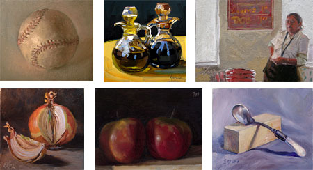
Back in December of 2004, Virginia artist and teacher Duane Keiser started the terrific practice of painting one small (usually postcard size) painting every day (as far as I know, starting with the painting of the baseball above). At the same time, he started a blog on which he would post an image of that day’s painting. See my original post about Keiser and his A Painting a Day blog from last October.Since then, a number of other artists have begun to keep this kind of routine as well (I regret to say I’m not among them). Not only is this an excellent discipline for any painter or visual artist, it may be financially beneficial as well. Keiser, and most of the other artists who have added this practice to their daily routine, usually offer their images for sale directly through their blogs. Most of Keiser’s “postcard paintings” (which he paints using a small easel made from an old cigar box) have been offered for sale (originally for $100, now for much more). Occasionally, he will do a larger scale or more complex painting within the context of the series and offer it for bid on eBay.
The other “painting a day” painters follow a similar model; small format paintings posted to a blog and offered for direct sale or bid on eBay. This not only allows the artists to leverage the fondness the web has for frequently changing content (which is one of the primary reasons for the popularity of blogs) to increase their potential audience, but also lets them connect directly with those interested in their paintings, effectively doing an end-run around galleries and their high commissions for at least some portion of their work. (A $100 postcard size painting would have to be at least 2-3 times that if sold in a gallery to accommodate the gallery’s commission as well as framing and preparation for hanging.)
The paintings all share some similarities as well. Of necessity they are small in scale and directly done, which usually translates into a fresh, painterly approach, and they are most often of individual small household objects: salt shakers, fruit, painting tubes and other studio paraphernalia, flowers, dishes, etc. Many of the sites, including Keiser’s, offer a “gallery view” of thumbnails of the paintings in addition to the chronological blog listings.
After keeping up this amazing discipline for over two years, Keiser announced on Saturday that he will be slowing down for the time being, posting a little less frequently for a bit while he focuses his energy on larger projects. My hat is off to him for making this admirable practice worthy of note and worthy of emulation.
I’ve included here a sampling (certainly not comprehensive) of some of the “painting a day” style blogs of artists I’ve come across or who have contacted me. All of them are worthy of a full post and I’ll try to revisit them in detail in the future. Clockwise from top-left: Duane Keiser, Karin Jurick, David R. Darrow, Shelly Grund, Julian Merrow-Smith, Elin Pendleton.
Categories:
-
Mort Drucker

Mort Drucker is one of the finest caricaturists and cartoonists of our age. He is often overlooked for a couple of reasons. One reason is that he is overshadowed by the attention paid to people like Al Hirschfeld and David Levine (both of whom I admire, but not as much as Drucker), along with editorial cartoonists and other caricaturists who work in more literary and cultural venues. The other is that Drucker’s main venue, aside from occasional Time and TV Guide covers, has been Mad magazine, and you don’t get much more culturally disrespected than that.Drucker has been creating splendiferous move and TV parodies in the pages of Mad since the late 50’s, for a time appearing while the great Wally Wood was still plying his visual magic at the magazine. For my money, Drucker is the only one of the post-EC Mad artists who is in the same class with Wood, Will Elder and Jack Davis (and that class is within the all time top echelon of comics artists).
Drucker is the absolute best ever at combining consistently brilliant caricatures with comics, i.e. sequential storytelling; in this he even surpasses Wood and Elder. Unlike Herschfeld and Levine, he doesn’t just create a likeness in a single image, he draws multi-page comics stories in which the caricatures are consistent, recognizable and hilariously dead-on through the course of a story, requiring a wide range of position, action and expression!
On top of all of that, Mort Drucker has one of the most wonderfully realized humorous comic drawing styles I’ve ever encountered. Every line, every figure, expression and background element is a visual treat. His lively, springy lines are full of energy and a loose, comfortable feeling that makes Drucker’s drawings just vibrate with visual fun. You get the impression that his pen just dances across the paper, leaving its marvelous marks almost as a residual effect of the joy of drawing. David Apatoff’s Illustration Art blog has a wonderful post dedicated just to the way Drucker draws hands (from which I borrowed the image above).
Angelo Torres and other Mad caricature artists have tried to do a fair job of walking in Drucker’s footsteps, basically by imitating his style, but none have ever matched him.
I link to Drucker’s official site below. You can also find his work on his rep’s sites: here and here.
There was a book published in ’98 devoted to his work, Familiar Faces: The Art of Mort Drucker by David Douglas Duncan. Unfortunately, it’s out of print and demanding high prices as a collectable. For an easier (and perhaps better) way to get a look at Drucker’s genius, pick up some of the Mad collections that feature his work. Some good ones would be Mad About the Sixties : The Best of the Decade, or Mad About the Movies: Special Warner Bros Edition and Mad About TV. Another would be Mad About the Fifties, which doesn’t contain as much Drucker, but has the bonus of including brilliant work by Wood, Elder, Davis and Harvey Kurtzman.
Categories:
-
John William Waterhouse

How better to welcome Spring than with the paintings of John William Waterhouse.Often considered a Pre-Raphaelite, Waterhouse was never actually a member of the Pre-Raphaelite Brotherhood. He was very influenced by them, however, and shared much of their subject matter.
Early in his career Waterhouse was more of a neo-classical painter, portraying Greek and Roman scenes, much like his contemporary Sir Lawrence Alma-Tadema. As time went on he came to share the Pre-Raphaelite’s passion for literary and mythological subjects, often painting many of the same subjects (in many cases in similar compositions) as Pre-Raphaelites like William Holman Hunt, Dante Gabriel Rosetti, John Everett Millais and Edward Byrne Jones. (See also the image of Waterhouse’s The Lady of Shallot, his most famous and most often reproduced painting, which I chose to accompany my first post on lines and colors, about the Art Renewal Center site.)
Waterhouse diverged from the Pre-Raphaelite painters, particularly in his approach to the handling of paint. Where the members of the brotherhood usually cultured a smooth, blended finish to their paintings, Waterhouse delighted in the sensuality of paint and his works are textured with painterly brushstrokes and obvious surface markings of discrete areas of color.
There are two excellent and comprehensive sites devoted to Waterhouse: The life and art of John William Waterhouse on www.johnwilliamwaterhouse.com and John William Waterhouse on jwwaterhouse.com. The first site (.org) has lots of drawings, preliminary sketches, alternate versions and studies for Waterhouse’s work.
Waterhouse is one of the best represented artists on the web and there are many good sources for images of his paintings, some of which are listed below. There is also a bounty of his work in print. A couple of good books at a reasonable price are J.W. Waterhouse by Peter Trippi and J W Waterhouse by Anthony Hobson.
Like the Pre-Raphaelites, Waterhouse’s images are bursting with vibrant colors, rich textures and the kind of glorious visual details that can only be drawn from an intimate study of nature and the world around us. Also like the Pre-Raphaelite artists, Waterhouse took great pleasure in the portrayal of beautiful women in detailed costumes and luxurious fabrics, as well as scenes depicting the visual bounty of the natural world and the English countryside, particularly in the Spring when that other beauty, Mother Nature, is really strutting her stuff.
Categories:
-
Daren Bader

How’s this for a transition, from yesterday’s post about eye-placement in portraits to today’s illustration of a cyclops. (What’s that saying? “In the kingdom of the blind, the one-eyed, giant-tusked, white veined, maniacal, rampaging cyclops is king.”?… or something like that…)Daren Bader is a fantasy illustrator who, among other projects, does a number of illustrations for the Magic: The Gathering card-based game. He steps outside the usual approach to that genre, though, in that he treats his Magic paintings like illustrations for the grand adventure fantasy books that were the stomping grounds of illustrators like Howard Pyle and N.C. Wyeth, who he obviously admires.
He tackles his mythological or fantasy subjects with broad strokes and painterly chunks of color, using strong value contrasts for drama and nice tonal control for atmosphere. The result makes for images full of action, adventure and lots of visual fun.
He creates interesting fantasy animals that are wierd amalgams of dinosaurs and mammals, and also paints more straightforward images of dinos. Some of his pen and ink illustrations show the influence of Franklin Booth and Roy Krenkel.
Categories:
-
Eye Placement in Portraits
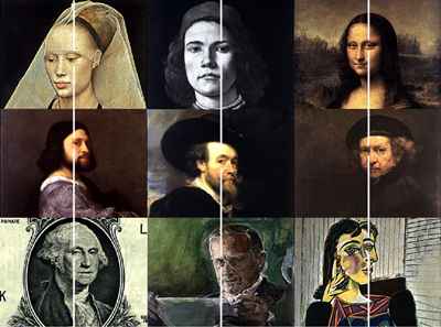
Here is an interesting bit of scientific/artistic conjecture. Christopher W. Tyler, of the Smith-Kettlewell Eye Research Institute in San Francisco suggests in this short (1 page) illustrated article that a high percentage of portrait paintings are arranged so that one eye, presumably the dominant one, falls on the horizontal center line of the image, even when the head appears to be centered in the painting. (He goes into more detail in a second article.)He cites a number of examples and invites speculation on the part of the reader as to the purposeful placement of eyes in portraits according to several artistic models. His results from a sampling of 282 different artists suggest that he is correct a large percentage of the time and my own casual observations seem to agree.
Get out your ruler and art books and see for yourself.
The site is part of the Smith-Kettlewell Brain Imaging Center, which also includes The Eye Page, with interesting tidbits about eyes, both human and those of other animals, and a series of Art Investigations, scientific inquires into various aspects of art.
Categories:
-
Tsukahara Shigeyoshi
 I hope I have the name right. I’m taking it from the copyright line. The site is iyasakado.com.
I’m a little sketchy about the details here, mainly because they’re in Japanese, and the Google translate feature, remarkable as it is, doesn’t work so well in translating from Japanese to English. (The results can be comical, in fact. Try translating a well-known phrase into Japanese with Google Translate and then translate it back. Send the phrase to your friends and see if they can guess the original. Hours of fun!)
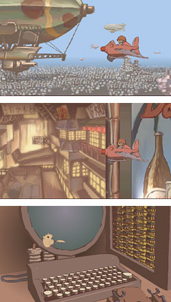
Anyway, the high point of this site is a number of nicely done and imaginative Flash animations that are part of a series entitled “Steel Fantasia”. More vignettes than parts of a coherent narrative, they are nonetheless presented in order and take place in the same setting. They are delightfully done, with simple but clever animation, artful use of multi-plane backgrounds, imaginative painted settings and nicely designed sequences.
The animations are set in an alternate time or reality, in an industrialized society at about a World War I level of technology, amid tanks with mechanical, steam-powered legs, airships, ornithopters and towering city structures. There is apparently an ongoing military conflict, against the backdrop of which small dramas play out. The overall tone is actually whimsical and the animations are charming and thought provoking.
The movies are essentially wordless, the music is excellent and the sound effects are well done, so language is no barrier to enjoyment. The supplementary comments on the pages are lost, however, in the inability of Google to return much that is intelligible. Instead of the somewhat-readable translations Google returns from related European languages, Google’s attempt to translate Japanese gives us phrases like: “…industry it sends with self-confidence cow moth!” that are amusing but not particularly informative.
The animations are linked by graphics from this page, apparently in order from the bottom up. The movies can take a while to load before playing. You might want to start with the second from the bottom (image of the toy soldier’s head) to get a better flavor for the whimsical feeling of the better sequences.
Link via Cold Hard Flash, original link via Gil Crows website.
Categories:


Charley’s Picks
Bookshop.org
(Bookshop.org affilliate links; sales benefit independent bookshop owners; I get a small percentage to help support my work on Lines and Colors)

John Singer Sargent: Watercolors


Urban Sketching: Understanding Perspective


Charley’s Picks
Amazon
(Amazon.com affiliate links; sales go to a larger yacht for Jeff Bezos; but I get a small percentage to help support my work on Lines and Colors)
John Singer Sargent: Watercolors
Urban Sketching: Understanding Perspective