
Categories
- 3d CGI
- Amusements
- Animation
- Anime & Manga
- Art Materials
- Art Videos
- Blogroll
- Cartoons
- Color
- Comics
- Concept & Visual Dev.
- Creativity
- Digital Art
- Digital Painting
- Displaying Art on the Web
- Drawing
- Eye Candy for Today
- Gallery and Museum Art
- High-res Art Images
- Illustration
- Motion Graphics & Flash
- Museums
- Online Museums
- Outsider Art
- Painting
- Painting a Day
- Paleo Art
- Pastel, Conté & Chalk
- Pen & Ink
- Prints and Printmaking
- Reviews
- Sc-fi and Fantasy
- Sculpture & Dimensional
- Site Comments
- Sketching
- Storyboards
- Tools and Techniques
- Uncategorized
- Vector Art
- Videos & Podcasts
- Vision and Optics
- Watercolor and Gouache
- Webcomics
Archives
- June 2026
- May 2026
- April 2026
- March 2026
- February 2026
- January 2026
- December 2025
- November 2025
- October 2025
- September 2025
- August 2025
- July 2025
- June 2025
- May 2025
- January 2025
- December 2024
- November 2024
- October 2024
- September 2024
- August 2024
- June 2024
- April 2024
- March 2024
- February 2024
- January 2024
- December 2023
- November 2023
- October 2023
- September 2023
- August 2023
- July 2023
- May 2023
- April 2023
- March 2023
- February 2023
- January 2023
- December 2022
- November 2022
- September 2022
- August 2022
- July 2022
- June 2022
- May 2022
- April 2022
- March 2022
- February 2022
- January 2022
- December 2021
- November 2021
- October 2021
- September 2021
- August 2021
- July 2021
- June 2021
- May 2021
- April 2021
- March 2021
- February 2021
- January 2021
- December 2020
- November 2020
- October 2020
- September 2020
- August 2020
- July 2020
- June 2020
- May 2020
- April 2020
- March 2020
- February 2020
- January 2020
- December 2019
- November 2019
- October 2019
- September 2019
- August 2019
- July 2019
- June 2019
- May 2019
- April 2019
- March 2019
- February 2019
- January 2019
- December 2018
- November 2018
- October 2018
- September 2018
- August 2018
- July 2018
- June 2018
- May 2018
- April 2018
- March 2018
- February 2018
- January 2018
- December 2017
- November 2017
- October 2017
- September 2017
- August 2017
- July 2017
- June 2017
- May 2017
- April 2017
- March 2017
- February 2017
- January 2017
- December 2016
- November 2016
- October 2016
- September 2016
- August 2016
- July 2016
- June 2016
- May 2016
- April 2016
- March 2016
- February 2016
- January 2016
- December 2015
- November 2015
- October 2015
- September 2015
- August 2015
- July 2015
- June 2015
- May 2015
- April 2015
- March 2015
- February 2015
- January 2015
- December 2014
- November 2014
- October 2014
- September 2014
- August 2014
- July 2014
- June 2014
- May 2014
- April 2014
- March 2014
- February 2014
- January 2014
- December 2013
- November 2013
- October 2013
- September 2013
- August 2013
- July 2013
- June 2013
- May 2013
- April 2013
- March 2013
- February 2013
- January 2013
- December 2012
- November 2012
- October 2012
- September 2012
- August 2012
- July 2012
- June 2012
- May 2012
- April 2012
- March 2012
- February 2012
- January 2012
- December 2011
- November 2011
- October 2011
- September 2011
- August 2011
- July 2011
- June 2011
- May 2011
- April 2011
- March 2011
- February 2011
- January 2011
- December 2010
- November 2010
- October 2010
- September 2010
- August 2010
- July 2010
- June 2010
- May 2010
- April 2010
- March 2010
- February 2010
- January 2010
- December 2009
- November 2009
- October 2009
- September 2009
- August 2009
- July 2009
- June 2009
- May 2009
- April 2009
- March 2009
- February 2009
- January 2009
- December 2008
- November 2008
- October 2008
- September 2008
- August 2008
- July 2008
- June 2008
- May 2008
- April 2008
- March 2008
- February 2008
- January 2008
- December 2007
- November 2007
- October 2007
- September 2007
- August 2007
- July 2007
- June 2007
- May 2007
- April 2007
- March 2007
- February 2007
- January 2007
- December 2006
- November 2006
- October 2006
- September 2006
- August 2006
- July 2006
- June 2006
- May 2006
- April 2006
- March 2006
- February 2006
- January 2006
- December 2005
- November 2005
- October 2005
- September 2005
- August 2005
Relevant Blogs
Art, Painting & Sketch
- Gurney Journey
- Underpaintings
- Art and Influence
- Painting Perceptions
- Oil Painters of America
- Vasari Paint POV
- Flying Fox
- Urban Sketchers
- Bento (Smithsonian)
- Art Inconnu
- The Hidden Place
- Still Life
- Making a Mark
- The Art of the Landscape
- Exploring Color & Creativity
- Art Contrarian
- Artist A Day
- beinArt Surreal Art Collective
- Eye Level
- David Dunlop
- p.i.g.m.e.n.t.i.u.m
- CultureGrrl
- Joaquín Sorolla blog
- Artists in Pastel
“Painting a Day”
- A Painting a Day (Keiser)
- On Painting (Keiser)
- Julian Merrow-Smith
- Karen Jurick
- Jeffrey Hayes
- Carol Marine
- Abbey Ryan
- Daily Paintworks
Other Painting Blogs
- Virtual Gouache Land
- Neil Hollingsworth
- Marc Hanson
- Kevin Menck
- Marc Dalessio
- Larry Seiler
- Stapleton Kearns
- Colin Page
- Roos Schuring
- Hans Versfelt
- Titus Meeuws
- Régis Pettinari
- René Plein Air
- Belinda Del Pesco
- Robin Weiss
- Nathan Fowkes (Land Sketch)
- William Wray
- Frank Serrano
- Stephen Magsig
- Michael Chesley Johnson
- Twice a Week
- Sarah Wimperis
- Rob Adams
- Michael Cole Manley
- The Dirty Palette Club
- Mike Manley’s Draw!
Gallery Art & Illustration mix
Illustration
- Howard Pyle
- 100 Years of Illustration
- BibliOdyssey
- Illustration Art
- Today’s Inspiration
- Illustration Mundo
- Little Chimp Society
- Danny Gregory
- R D (John Martz
- Illustration Friday blog
- Monster Brains
- Illustrators & Illustrations (RU)
- Elwood H. Smith
- DaniDraws.com
- Designers Who Blog
- iSpot Blog
Sci-Fi & Fantasy
Illustration & Comics
Comics & Cartoons
- Comics Beat
- Robot 6
- Newsarama Blog
- Comic Vine
- Comics Alliance
- Forbidden Planet Int.
- Paolo Rivera
- Bolt City
- Flight
- Scott McCloud
- The Comics Journal
- Comixpedia
- Funnybook Babylon
- James Baker
- Middleton’s Sketchbook
- Boneville
- The Hotel Fred
- Paul Rivoche
- Daily Cartoonist
- Mad About Cartoons (William Wray)
- Digital Strips
Illustration & Concept
Animation & Concept
- Cartoon Brew
- Animation Blog
- Cold Hard Flash
- Concept Art World
- The CAB
- FY Concept Art
- Concept Ships
- Concept Robots
- John Nevarez
- Armand Serrano
- Marcos Mateu-Mestre
- all kinds of stuff (Kricfalusi)
- Yacin the faun (Man Arenas)
- Kelsey Mann
- Cre8tivemarks Blog
- Ice-Cream Monster Toon Cafe
- AAU Character & Creature Design
- AAU Animation Notes
- Articles and Texticles
Paleo & Scientific
Tools & Techniques
Other
Lists of Art Blogs
Art Image Resource Links
Historic Art Images
- Wikimedia Commons: Paintings
- Wikimedia Commons: Drawings
- The Athenaeum
- WikiArt (WikiPaintings)
- Google Art Project: Artists
- Google Art Project: Collections (Museums)
- ArtCyclopedia
- Web Gallery of Art
- Art Renewal Center
- Web Gallery of Impressionism
Auction Consolidation sites
Auction sites
- Sotheby’s
- Bonham’s
- Christies
- Heritage Auctions: Fine Art
- Heritage Auctions: Illustration
- Freeman’s Auctions
- Bukowskis
- Shannon’s
Image Search
Reverse Image Search (search by image)
- Tin Eye
- RevImg
- Google Image Search (camera icon)
- Bing Image Search (camera icon)
Promoting some friends and some clients of my website design business
- Twin Willows T’ai Chi studio in Wilmington DE. Taiji classes with Bryan Davis.
- Ray Hayward, Inspired Teacher of T’ai Chi ( Taiji ) in Minneapolis, Founder of Mindful Motion Tai Chi Academy
- OldHead Tattoo studio and Art Gallery in Wilmington DE. Tattoos and paintings by Bruce Gulick
- Sharon Domenico Art, pet portrait oil paintings
- Platinum Paperhanging, wallpaper hanging, Main Line and Philadelphia, PA
- Lisa Stone Design, interior designer, Main Line and Philadelphia, PA
- Studio12KPT, original art, prints, calendars and other custom printed items by Van Sickle & Rolleri
-
Lucas Graciano

Southern California artist Lucas Graciano has worked in concept design and visual development for the gaming industry as well as illustration for books and games.His website and blog focus primarily on the latter, particularly showcasing his fantasy themed illustrations for “Magic: The Gathering”.
Both sources provide some reasonably large images in which you can appreciate Graciano’s nicely painterly style. Unlike many of his contemporaries in the field, Graciano works in traditional media, specifically oil on board, rather than digital painting.
I enjoy his portrayals of dragons in particular, resplendent with spines and leathery wings, and rendered, like much of Graciano’s work, with attention to textural variation that gives a feeling of physical presence.
His blog includes preliminary drawings, versions of printed work and sketches and paintings done for the classes he teaches at the Watts Atelier of the Arts.
Categories:
-
Eye Candy for Today: Whistler’s Wapping

Wapping on Thames, James McNeill WhistlerIn the national Gallery of Art, DC.
The name refers to a rough and tumble dock area of the Thames River in London, where Whistler lived and worked for a time, though I think the location is actually a nearby inn rather than the artist’s studio.
In a marked contrast to the serene simplicity of his later nocturnes, Whistler has taken on a very complex subject, one that he reworked and struggled with, dramatically changing the figures in particular.
Whistler expected the painting to be hailed as a triumph, and was embittered when it was rejected by the London art world of the time, even after a reworking. The experience helped set the course for his iconoclastic and confrontational relationship with the art establishment for most of his career.
The woman was Whistler’s companion and frequent model at the time, Jo Hiffernan, originally cast in a narrative as a prostitute being solicited by an older man. The figures were reworked, the narrative element largely removed, Jo made more presentable and the older man recast as the artist Alphonse Legros.
Perhaps it was the reworking that makes the figures, for me, the least interesting part of the painting. My eye goes immediately into the background, where it delightedly wanders amid the profusion of sails, masts and lines, the beautifully painterly wood hulls of the boats and the impressionistic swipes of muted color that make up the river’s surface.
Categories:
-
David Kassan (update)

Despite having previously written about him in 2008 and again in 2010, I still struggled a bit in trying to describe David Kassan’s approach to his portrait and figurative work.He certainly doesn’t flatter his subject, but neither does his deliberately seek out the grotesque (as, say, Lucian Freud). Words like “honest” or “direct” don’t seem to carry it. The best I could think of was “unblinking”.
It’s as though Kassan opens his eye to his subjects with the intention of taking them in in their entirety, from the minute visual details of their physical appearance to the overall effect of their personality and mood.
He paints in keenly observed notation of color, value and texture, often setting his carefully studied subjects against rough backgrounds, which are one of the few areas in which he lets the paint come forward as paint, preferring to submerge the paint into its role as a medium for the image and the artist’s vision.
In addition to the paintings on his site, there is also a selection of drawings, mostly in charcoal on toned paper.
Kassan has established the Kassan Foundation, that gives out two 5k grants each year, one in visual art and one in music.
Kassan teaches classes and workshops, and offers instructional portrait videos on painting and drawing on DVD, and one by direct streaming.
In addition, he has a number of free shorter videos on YouTube, mostly of demo sessions, and also describing his latest venture, the parallelPALETTE.
Categories:
-
Valerio Fabbretti

Originally from Italy and now living and working in San Francisco, where he studied at Academy of Art University, Valerio Fabbretti is a children’s book illustrator, concept artist and comics artist.Fabbretti brings to his work a lively, innocent style ideal for his subjects. There is little information on his website about materials, but it looks like he is using watercolor and colored pencil.
His website and portfolio on Shannon Associates contain a number of monochrome pieces and preliminary drawings as well as finished color pieces.
Categories:
-
Eugène Galien Laloue

Though others have taken on the style and subject matter over time — continuing to this day — there are four artists that I associate with a particular approach to painting the subject of Paris during the Belle Epoch (around the turn of the twentieth century): Luigi Loir, Edouard Leon Cortès; Eugène Galien Laloue and Antoine Blanchard.For lack of a better or more formal term, I’ve heard them referred to as simply “Painters of Paris”.
I might add Jean Béraud to that list, though his style wasn’t as close to the others. Neither was Loir, on the whole, but I think the origins of the style can be traced to him.
The particular style focuses on the beauty of the City of Light, and often portrays it thus — its shops, monuments, quays, boulevards, plazas and people highlighted with pools of color and light, both natural and artificial, set against lower chroma backgrounds of the city’s striking architecture.
Of the four painters, Eugène Galien Laloue (sometimes hyphenated as Eugène Galien-Laloue) is my favorite, both because I love his compositions, color choices and rendering style in general, and because he worked primarily in gouache, an often overlooked medium for which my admiration and fascination continues to grow.
Galien Laloue worked in oil as well, but reportedly preferred gouache because he could produce a salable painting in two days, rather than the week or more it took him for a oil that might sell for a comparable price.
Galien Laloue was prolfic, and while under contract to a single gallery, used several aliases, including J. Liwvin, E. Galiany and L. Dupuy, in order to continue to sell through other galleries.
Though he sketched on location, Galien Laloue preferred to paint in the controlled conditions of his studio. It looks as though he ruled out the perspective that is the basis of his architectural subjects in pencil, and often left the pencil showing as part of the finished work, even to the point that some indications of rows of window are only pencil, with little addition of linear details in paint.
This crossing of the border between painting and drawing, which gouache in particular facilitates, is one of the things I love about his work. He seems to have struck a wonderful balance between rendering and drawing, finish and sketch, detail and suggestion that I find particularly appealing.
I also enjoy his wonderful color choices, and his use of muted grays, overcast skies and the reflections of scenes in rainy pavement. In particular, Galien Laloue had a beautiful touch with portraying the city in snow, not just freshly fallen, but with the traffic of the day evident in tracks, ruts and swept away areas.
Many of his paintings of Paris are set in the late fall and winter. He also did oils of the countryside in springtime, and during World War I devoted himself to portrayals of soldiers in battle, though I find images of his work during this period are not prevalent on the web.
The best source I’ve found for high-resolution images of his work (which are particularly a treat) is to do a Google search of Bohnams.com: Eugene Galien Laloue site:bonhams.com, and then follow the links to indivudal pieces. You can do the same trick for Sotheby’s.
A great selection of medium sized images can be found in eight articles on One1more2time3’s Weblog, which is where I was introduced to Galien Laloue.
A good source for Eugene Galien Laloue biographical information and images is Rehs Galleries in NY, which frequently sells his work (and also has good info and images for Edouard Leon Cortes and Antoine Banchard). There is also a nice selection on Galerie Ary Jan.
Categories:
-
Eye Candy for Today: Théodore Chassériau pencil portrait
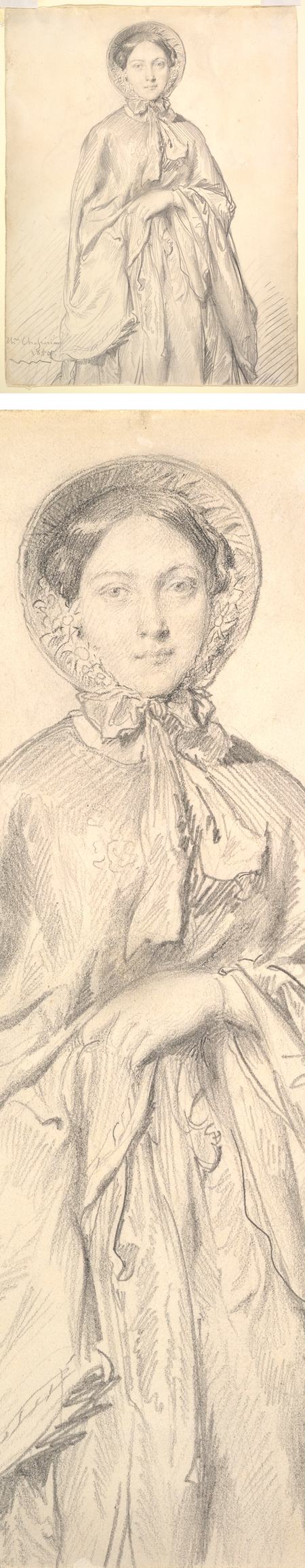
Portrait of a Young Woman Wearing a Cloak and Bonnet, Théodore ChassériauIn the Metropolitan Museum of Art; graphite on wove paper; approximately 18 x 15 in. (46 x 39 cm).
Chassériau has given us a beautifully sensitive pencil portrait. The commentary on the museum’s website suggests that Chassériau shows more interest in the subject’s garments than her face, but I have to disagree.
The face is rendered with wonderful finesse, and some of the delicacy of an etching, while the rest of the figure is more gestural and economically realized, in a manner similar to the pencil portraits of Ingres, who was Chassériau’s teacher.
Categories:


Charley’s Picks
Bookshop.org
(Bookshop.org affilliate links; sales benefit independent bookshop owners; I get a small percentage to help support my work on Lines and Colors)

John Singer Sargent: Watercolors


Urban Sketching: Understanding Perspective


Charley’s Picks
Amazon
(Amazon.com affiliate links; sales go to a larger yacht for Jeff Bezos; but I get a small percentage to help support my work on Lines and Colors)
John Singer Sargent: Watercolors
Urban Sketching: Understanding Perspective