
Categories
- 3d CGI
- Amusements
- Animation
- Anime & Manga
- Art Materials
- Art Videos
- Blogroll
- Cartoons
- Color
- Comics
- Concept & Visual Dev.
- Creativity
- Digital Art
- Digital Painting
- Displaying Art on the Web
- Drawing
- Eye Candy for Today
- Gallery and Museum Art
- High-res Art Images
- Illustration
- Motion Graphics & Flash
- Museums
- Online Museums
- Outsider Art
- Painting
- Painting a Day
- Paleo Art
- Pastel, Conté & Chalk
- Pen & Ink
- Prints and Printmaking
- Reviews
- Sc-fi and Fantasy
- Sculpture & Dimensional
- Site Comments
- Sketching
- Storyboards
- Tools and Techniques
- Uncategorized
- Vector Art
- Videos & Podcasts
- Vision and Optics
- Watercolor and Gouache
- Webcomics
Archives
- May 2026
- April 2026
- March 2026
- February 2026
- January 2026
- December 2025
- November 2025
- October 2025
- September 2025
- August 2025
- July 2025
- June 2025
- May 2025
- January 2025
- December 2024
- November 2024
- October 2024
- September 2024
- August 2024
- June 2024
- April 2024
- March 2024
- February 2024
- January 2024
- December 2023
- November 2023
- October 2023
- September 2023
- August 2023
- July 2023
- May 2023
- April 2023
- March 2023
- February 2023
- January 2023
- December 2022
- November 2022
- September 2022
- August 2022
- July 2022
- June 2022
- May 2022
- April 2022
- March 2022
- February 2022
- January 2022
- December 2021
- November 2021
- October 2021
- September 2021
- August 2021
- July 2021
- June 2021
- May 2021
- April 2021
- March 2021
- February 2021
- January 2021
- December 2020
- November 2020
- October 2020
- September 2020
- August 2020
- July 2020
- June 2020
- May 2020
- April 2020
- March 2020
- February 2020
- January 2020
- December 2019
- November 2019
- October 2019
- September 2019
- August 2019
- July 2019
- June 2019
- May 2019
- April 2019
- March 2019
- February 2019
- January 2019
- December 2018
- November 2018
- October 2018
- September 2018
- August 2018
- July 2018
- June 2018
- May 2018
- April 2018
- March 2018
- February 2018
- January 2018
- December 2017
- November 2017
- October 2017
- September 2017
- August 2017
- July 2017
- June 2017
- May 2017
- April 2017
- March 2017
- February 2017
- January 2017
- December 2016
- November 2016
- October 2016
- September 2016
- August 2016
- July 2016
- June 2016
- May 2016
- April 2016
- March 2016
- February 2016
- January 2016
- December 2015
- November 2015
- October 2015
- September 2015
- August 2015
- July 2015
- June 2015
- May 2015
- April 2015
- March 2015
- February 2015
- January 2015
- December 2014
- November 2014
- October 2014
- September 2014
- August 2014
- July 2014
- June 2014
- May 2014
- April 2014
- March 2014
- February 2014
- January 2014
- December 2013
- November 2013
- October 2013
- September 2013
- August 2013
- July 2013
- June 2013
- May 2013
- April 2013
- March 2013
- February 2013
- January 2013
- December 2012
- November 2012
- October 2012
- September 2012
- August 2012
- July 2012
- June 2012
- May 2012
- April 2012
- March 2012
- February 2012
- January 2012
- December 2011
- November 2011
- October 2011
- September 2011
- August 2011
- July 2011
- June 2011
- May 2011
- April 2011
- March 2011
- February 2011
- January 2011
- December 2010
- November 2010
- October 2010
- September 2010
- August 2010
- July 2010
- June 2010
- May 2010
- April 2010
- March 2010
- February 2010
- January 2010
- December 2009
- November 2009
- October 2009
- September 2009
- August 2009
- July 2009
- June 2009
- May 2009
- April 2009
- March 2009
- February 2009
- January 2009
- December 2008
- November 2008
- October 2008
- September 2008
- August 2008
- July 2008
- June 2008
- May 2008
- April 2008
- March 2008
- February 2008
- January 2008
- December 2007
- November 2007
- October 2007
- September 2007
- August 2007
- July 2007
- June 2007
- May 2007
- April 2007
- March 2007
- February 2007
- January 2007
- December 2006
- November 2006
- October 2006
- September 2006
- August 2006
- July 2006
- June 2006
- May 2006
- April 2006
- March 2006
- February 2006
- January 2006
- December 2005
- November 2005
- October 2005
- September 2005
- August 2005
Relevant Blogs
Art, Painting & Sketch
- Gurney Journey
- Underpaintings
- Art and Influence
- Painting Perceptions
- Oil Painters of America
- Vasari Paint POV
- Flying Fox
- Urban Sketchers
- Bento (Smithsonian)
- Art Inconnu
- The Hidden Place
- Still Life
- Making a Mark
- The Art of the Landscape
- Exploring Color & Creativity
- Art Contrarian
- Artist A Day
- beinArt Surreal Art Collective
- Eye Level
- David Dunlop
- p.i.g.m.e.n.t.i.u.m
- CultureGrrl
- Joaquín Sorolla blog
- Artists in Pastel
“Painting a Day”
- A Painting a Day (Keiser)
- On Painting (Keiser)
- Julian Merrow-Smith
- Karen Jurick
- Jeffrey Hayes
- Carol Marine
- Abbey Ryan
- Daily Paintworks
Other Painting Blogs
- Virtual Gouache Land
- Neil Hollingsworth
- Marc Hanson
- Kevin Menck
- Marc Dalessio
- Larry Seiler
- Stapleton Kearns
- Colin Page
- Roos Schuring
- Hans Versfelt
- Titus Meeuws
- Régis Pettinari
- René Plein Air
- Belinda Del Pesco
- Robin Weiss
- Nathan Fowkes (Land Sketch)
- William Wray
- Frank Serrano
- Stephen Magsig
- Michael Chesley Johnson
- Twice a Week
- Sarah Wimperis
- Rob Adams
- Michael Cole Manley
- The Dirty Palette Club
- Mike Manley’s Draw!
Gallery Art & Illustration mix
Illustration
- Howard Pyle
- 100 Years of Illustration
- BibliOdyssey
- Illustration Art
- Today’s Inspiration
- Illustration Mundo
- Little Chimp Society
- Danny Gregory
- R D (John Martz
- Illustration Friday blog
- Monster Brains
- Illustrators & Illustrations (RU)
- Elwood H. Smith
- DaniDraws.com
- Designers Who Blog
- iSpot Blog
Sci-Fi & Fantasy
Illustration & Comics
Comics & Cartoons
- Comics Beat
- Robot 6
- Newsarama Blog
- Comic Vine
- Comics Alliance
- Forbidden Planet Int.
- Paolo Rivera
- Bolt City
- Flight
- Scott McCloud
- The Comics Journal
- Comixpedia
- Funnybook Babylon
- James Baker
- Middleton’s Sketchbook
- Boneville
- The Hotel Fred
- Paul Rivoche
- Daily Cartoonist
- Mad About Cartoons (William Wray)
- Digital Strips
Illustration & Concept
Animation & Concept
- Cartoon Brew
- Animation Blog
- Cold Hard Flash
- Concept Art World
- The CAB
- FY Concept Art
- Concept Ships
- Concept Robots
- John Nevarez
- Armand Serrano
- Marcos Mateu-Mestre
- all kinds of stuff (Kricfalusi)
- Yacin the faun (Man Arenas)
- Kelsey Mann
- Cre8tivemarks Blog
- Ice-Cream Monster Toon Cafe
- AAU Character & Creature Design
- AAU Animation Notes
- Articles and Texticles
Paleo & Scientific
Tools & Techniques
Other
Lists of Art Blogs
Art Image Resource Links
Historic Art Images
- Wikimedia Commons: Paintings
- Wikimedia Commons: Drawings
- The Athenaeum
- WikiArt (WikiPaintings)
- Google Art Project: Artists
- Google Art Project: Collections (Museums)
- ArtCyclopedia
- Web Gallery of Art
- Art Renewal Center
- Web Gallery of Impressionism
Auction Consolidation sites
Auction sites
- Sotheby’s
- Bonham’s
- Christies
- Heritage Auctions: Fine Art
- Heritage Auctions: Illustration
- Freeman’s Auctions
- Bukowskis
- Shannon’s
Image Search
Reverse Image Search (search by image)
- Tin Eye
- RevImg
- Google Image Search (camera icon)
- Bing Image Search (camera icon)
Promoting some friends and some clients of my website design business
- Twin Willows T’ai Chi studio in Wilmington DE. Taiji classes with Bryan Davis.
- Ray Hayward, Inspired Teacher of T’ai Chi ( Taiji ) in Minneapolis, Founder of Mindful Motion Tai Chi Academy
- OldHead Tattoo studio and Art Gallery in Wilmington DE. Tattoos and paintings by Bruce Gulick
- Sharon Domenico Art, pet portrait oil paintings
- Platinum Paperhanging, wallpaper hanging, Main Line and Philadelphia, PA
- Lisa Stone Design, interior designer, Main Line and Philadelphia, PA
- Studio12KPT, original art, prints, calendars and other custom printed items by Van Sickle & Rolleri
-
Illustration Mundo
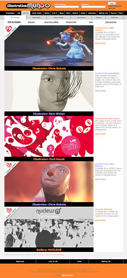 Illustration Mundo is a portal/blog (for lack of better terms) devoted to illustration. It was created by Illustrator Nate Williams because he felt the lack of a portal site specifically for illustration (as opposed to those which included design, photography, film, etc. as well as illustration).
The site has recently incorporated Erik Olsen’s illustration podcast blog Iconic, which features interviews with working illustrators with a focus on their working process. This is a fascinating angle on illustration that is seldom encountered, hearing the artists comment on their work and process in their own words.
If you find the main page a bit overwhelming in terms of selections, the site can be accessed in several ways through the navigation at the top. The Articles tab gives you the main articles arranged in reverse chronological order like most blogs (image at left), and you can sort into spotlighted articles, Iconic Audio, print Interviews and so on.
The articles are brief, but usually showcase several pieces by the illustrator and, if available, some personal photos. The podcasts that have now moved over to Illustration Mundo from the Iconic site are marked by an icon (what else?) in the upper left. There are also tabs for News and community oriented features like Polls and Forums.
On the About page, Williams and Olson invite you to become involved and encourage you to submit news, participate in the forums and place your work in the Illustrator Database. Most of the articles also allow for comments in the usual fashion for blogs.
The site also uses a “Favorites” and “User Rating” system to rate the illustrators in the database (by votes, clicks, most tagged as favorites, etc.). I’ve seen this feature on CGI portals and I’m still dubious about the value of such systems. It may help you find something others like and it may cause you to miss things.
You might actually do better with a feature like Illustration Mundo’s “100” tab, which serves up 100 random illustrators, with links to their websites, arranged simply as squares captured from their images.
Categories:
-
Art-o-mat

OK, so you’re in an art museum shop, nosing through the Impressionist calendars and Cezanne-on-a-cup bric-a-brac, and you notice what appears to be… a cigarette vending machine.Huh?
“What is this?”, you think, “a MOMA-style exhibition of industrial design?” Hmmm…, you walk closer and it becomes obvious that the machine is not vending death-sticks from the American food-tobacco-drug-&-chemical cartel; it is, in fact, vending art!
You look at the machine again. Art-o-mat, it declares in some variation of 60’s modern display script or cartoon-like banner. It’s an art vending machine! Who’d-a-thunk-it?
Art-o-mat is a project that started in 1997 with a solo art exhibit by artist Clark Whittington at a local cafe in Winston-Salem, North Carolina (ah, the poetic irony of it all). Along with 12 of his paintings, Whittington installed a cigarette machine, the actual use of which had been recently banned, in which he dispensed his black and white photographs for $1.00.
At the point that the show was to close, Cynthia Giles, the owner of the cafe, asked Whittington if the machine could remain, as it had be come a hit. She introduced Whitting to other local artists and they formed Artists in Cellophane, which went on to establish the Art-o-mat project.
The Art-o-mat vending machines dispense small original art objects that are the approximate size and shape of cigarette packages, or can be packed in a box with those dimensions. The guidleines for artists interested in participating gives the details. The wonderfully refurbished and redecorated machines are often works in themselves.
The Art-o-mat project now has over 400 participating artists vending art from 82 active Art-o-mat machines in the US (and now internationally), usually in museum stores and shops in areas where an art-oriented clientele can be found, like whole foods markets and cafes. You can find the nearest Art-o-mat to you on this list. The original machine in Winston-Salem is still there.
Art-o-mat art objects allow you to collect original art for $5.00 a pop, not much more than an actual pack of the legally addicting little cancer-tubes, and art is not only much better for you than cigarettes, it doesn’t make your clothes smell like a smoldering garbage heap (well, at least most art).
Categories:
-
Armand Serrano (update)
I posted about visual development artist Armand Serrano last month. Since then his web site has had a complete redesign with added material and a much improved interface.I mentioned in my original post that the interface of the old site was a bit frustrating and difficult to use. His new design is superb and could almost be a model for how to display a portfolio of artwork on the web.
First of all, the home page gives a succinct description of what the site is about and who the artist is (you’d be surprised how many “high-end” professionally designed sites neglect to do that). The galleries are arranged by subject and once you click on a thumbnail, it opens in the gallery space in the same window and you have a convenient “Next”, “Back” and “return to gallery” navigation; no pop-up windows, no “click to open, click to close” or “click and click back”, thank you very much. Other artists and portfolio site designers please take note.
None of this would matter, of course, if Serrano’s work wasn’t interesting enough to make it worth looking through all of the galleries, and of course, it is.
He has a rich, textured pencil style in many of his layout drawings for movies like Lilo and Stitch that makes for beautiful tone studies of interiors and landscapes. The interiors in particular have a great feeling for the textures of wood and cloth.
His monochromatic background layouts for Tarzan are soaked in rain and overflowing with moss and lush undergrowth, and background layouts for Mulan take their cues from Chinese ink painting.
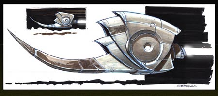
There are also galleries of concept designs and illustrations that feature more of his color work. There are designs that seem to be for fun rather than a specific project, like the wonderfully unusual design for a flying craft above.
There are also comic pages from Serrano’s participation in the El Pacifico pirate-themed collaborative comic project in which he is joined by Marcelo Vignali and Marcos Mateu.
Categories:
-
John White Alexander
 John White Alexander was an American illustrator and painter in the Victorian era. He studied in Munich and for a while joined a colony of painters Frank Duveneck had established in Bavaria. On the advice of James McNeill Whistler, he continued his studies in Florence, Amsterdam and Paris before returning to the U.S. in 1881.
I’ve been hard pressed to find many examples of his illustration on the web, but his portrait paintings are represented in several museum art collections.
In his later career, he devoted himself to portraiture and counted Oliver Wendell Holmes, R.A.L. Stevenson and Walt Whitman among his formal portrait subjects, and did a large charcoal portrait of Whistler.
The image shown here is of Isabella and the Pot of Basil, a literary theme he shared with some Pre-Raphaelite painters. It’s interesting to compare his elegant theatrical staging of the subject with William Holman Hunt’s luminous and richly detailed take on the same scene.
Alexander’s portrait paintings are most often full-length or 3/4 portraits of women, dressed in Victorian finery and occasionally languorously draped across a divan or couch with skirts flowing out in waves of shimmering fabric. You’ll also find examples of portraits of younger women or young girls, and he’ll occasionally sneak in a New Hampshire landscape.
Like Sargent, who immediately comes to mind when looking at Alexander’s portraits, Alexander has an open painterly style, at times with broad visible brushstrokes that coalesce into solid realism when viewed from the painting’s intended distance. Also like Sargent, Alexander has a great command of the texture of fabrics, hair and skin with a surprising economy of rendering.
Categories:
-
James Jean

James Jean is an illustrator who is widely recognized in the comic book community for his distinctive and beautifully done covers for DC Comics.Born in Taiwan, educated at the School of Visual Arts and currently living in LA, Jean has an impressive list of illustration clients including Time, Playboy, Wired, SPIN, The New York Times and Rolling Stone. In addition to his work for DC comics, his clients in the comic book industry include Marvel, Dark Horse and Fantagraphics.
His main site has galleries of his work arranged either by client and by project. You’ll find comic covers in the section called “Coverwork”. There are also sections for sketchbooks, paintings and “Recess”, a project about “childhood and ghosts”.
His work can be in turns elegant and beautiful or startling and disturbing. There is always a firm underpinning of solid draftsmanship and strong design.
Jean has a well regarded blog called Process Recess, that includes examples of his work, sometimes presented in several stages as in his cover for the special 5Oth issue of DC Comics’ Fables, shown above. You will also find sketches and figure drawings.
There is a book of his work, Process Recess: The Art of James Jean.
Link via Cat Morley’s Designers who blog. There is an interview with Jean in this column of Morley’s Cat’s fancy, on the same page as interviews with yours truly and John Martz of Drawn!, who has also posted about James Jean here and here.
Drawn! also points out that there is an interview with Jean on The Hundreds. Unfortunately, it’s hidden in abysmally poor navigation and is in an awkward horizontally scrolling interface. Go here and look for the James Jean link – I think it’s about the fifth or sixth thumbnail down on the left.
Categories:
-
Pablo Lobato
 I was writing about the geometry of faces in yesterday’s post about Modigliani. Well, there’s geometry of faces and then there’s geometry of faces!
Pablo Lobato is an designer, illustrator and caricaturist from Argentina who has an uncanny ability to distill the essence of a likeness out of starkly graphic geometric shapes.
The structures of his famous faces are amazingly abstract (in the true meaning of that word) and the images are wonderfully composed as graphic designs. The result is a beautiful blend and balance of design and drawing.
Caricaturists often seem to try to push the envelope to see how far they can distort a face and yet keep or reinforce the strength of the likeness. Lobato excels here as well, presenting objects that almost seem like they couldn’t even be used to represent a human face if viewed individually, that come together in an uncannily strong likeness.
Most of his portraits are of musicians and actors, and occasionally of sports or political figures or even one of his artistic heroes, Picasso.
Lobato has done work for Rolling Stone, The Chicago Tribune, The Boston Globe, Time, TV Guide and The New York Daily News, among others.
There is an article here on Illustration Mundo, and a gallery on the site of his rep, Anna Goodson.
The links page of his site includes links to other artists and caricaturists as well as related sites.
Link via Metafilter.
Categories:


Charley’s Picks
Bookshop.org
(Bookshop.org affilliate links; sales benefit independent bookshop owners; I get a small percentage to help support my work on Lines and Colors)

John Singer Sargent: Watercolors


Urban Sketching: Understanding Perspective


Charley’s Picks
Amazon
(Amazon.com affiliate links; sales go to a larger yacht for Jeff Bezos; but I get a small percentage to help support my work on Lines and Colors)
John Singer Sargent: Watercolors
Urban Sketching: Understanding Perspective