
Categories
- 3d CGI
- Amusements
- Animation
- Anime & Manga
- Art Materials
- Art Videos
- Blogroll
- Cartoons
- Color
- Comics
- Concept & Visual Dev.
- Creativity
- Digital Art
- Digital Painting
- Displaying Art on the Web
- Drawing
- Eye Candy for Today
- Gallery and Museum Art
- High-res Art Images
- Illustration
- Motion Graphics & Flash
- Museums
- Online Museums
- Outsider Art
- Painting
- Painting a Day
- Paleo Art
- Pastel, Conté & Chalk
- Pen & Ink
- Prints and Printmaking
- Reviews
- Sc-fi and Fantasy
- Sculpture & Dimensional
- Site Comments
- Sketching
- Storyboards
- Tools and Techniques
- Uncategorized
- Vector Art
- Videos & Podcasts
- Vision and Optics
- Watercolor and Gouache
- Webcomics
Archives
- June 2026
- May 2026
- April 2026
- March 2026
- February 2026
- January 2026
- December 2025
- November 2025
- October 2025
- September 2025
- August 2025
- July 2025
- June 2025
- May 2025
- January 2025
- December 2024
- November 2024
- October 2024
- September 2024
- August 2024
- June 2024
- April 2024
- March 2024
- February 2024
- January 2024
- December 2023
- November 2023
- October 2023
- September 2023
- August 2023
- July 2023
- May 2023
- April 2023
- March 2023
- February 2023
- January 2023
- December 2022
- November 2022
- September 2022
- August 2022
- July 2022
- June 2022
- May 2022
- April 2022
- March 2022
- February 2022
- January 2022
- December 2021
- November 2021
- October 2021
- September 2021
- August 2021
- July 2021
- June 2021
- May 2021
- April 2021
- March 2021
- February 2021
- January 2021
- December 2020
- November 2020
- October 2020
- September 2020
- August 2020
- July 2020
- June 2020
- May 2020
- April 2020
- March 2020
- February 2020
- January 2020
- December 2019
- November 2019
- October 2019
- September 2019
- August 2019
- July 2019
- June 2019
- May 2019
- April 2019
- March 2019
- February 2019
- January 2019
- December 2018
- November 2018
- October 2018
- September 2018
- August 2018
- July 2018
- June 2018
- May 2018
- April 2018
- March 2018
- February 2018
- January 2018
- December 2017
- November 2017
- October 2017
- September 2017
- August 2017
- July 2017
- June 2017
- May 2017
- April 2017
- March 2017
- February 2017
- January 2017
- December 2016
- November 2016
- October 2016
- September 2016
- August 2016
- July 2016
- June 2016
- May 2016
- April 2016
- March 2016
- February 2016
- January 2016
- December 2015
- November 2015
- October 2015
- September 2015
- August 2015
- July 2015
- June 2015
- May 2015
- April 2015
- March 2015
- February 2015
- January 2015
- December 2014
- November 2014
- October 2014
- September 2014
- August 2014
- July 2014
- June 2014
- May 2014
- April 2014
- March 2014
- February 2014
- January 2014
- December 2013
- November 2013
- October 2013
- September 2013
- August 2013
- July 2013
- June 2013
- May 2013
- April 2013
- March 2013
- February 2013
- January 2013
- December 2012
- November 2012
- October 2012
- September 2012
- August 2012
- July 2012
- June 2012
- May 2012
- April 2012
- March 2012
- February 2012
- January 2012
- December 2011
- November 2011
- October 2011
- September 2011
- August 2011
- July 2011
- June 2011
- May 2011
- April 2011
- March 2011
- February 2011
- January 2011
- December 2010
- November 2010
- October 2010
- September 2010
- August 2010
- July 2010
- June 2010
- May 2010
- April 2010
- March 2010
- February 2010
- January 2010
- December 2009
- November 2009
- October 2009
- September 2009
- August 2009
- July 2009
- June 2009
- May 2009
- April 2009
- March 2009
- February 2009
- January 2009
- December 2008
- November 2008
- October 2008
- September 2008
- August 2008
- July 2008
- June 2008
- May 2008
- April 2008
- March 2008
- February 2008
- January 2008
- December 2007
- November 2007
- October 2007
- September 2007
- August 2007
- July 2007
- June 2007
- May 2007
- April 2007
- March 2007
- February 2007
- January 2007
- December 2006
- November 2006
- October 2006
- September 2006
- August 2006
- July 2006
- June 2006
- May 2006
- April 2006
- March 2006
- February 2006
- January 2006
- December 2005
- November 2005
- October 2005
- September 2005
- August 2005
Relevant Blogs
Art, Painting & Sketch
- Gurney Journey
- Underpaintings
- Art and Influence
- Painting Perceptions
- Oil Painters of America
- Vasari Paint POV
- Flying Fox
- Urban Sketchers
- Bento (Smithsonian)
- Art Inconnu
- The Hidden Place
- Still Life
- Making a Mark
- The Art of the Landscape
- Exploring Color & Creativity
- Art Contrarian
- Artist A Day
- beinArt Surreal Art Collective
- Eye Level
- David Dunlop
- p.i.g.m.e.n.t.i.u.m
- CultureGrrl
- Joaquín Sorolla blog
- Artists in Pastel
“Painting a Day”
- A Painting a Day (Keiser)
- On Painting (Keiser)
- Julian Merrow-Smith
- Karen Jurick
- Jeffrey Hayes
- Carol Marine
- Abbey Ryan
- Daily Paintworks
Other Painting Blogs
- Virtual Gouache Land
- Neil Hollingsworth
- Marc Hanson
- Kevin Menck
- Marc Dalessio
- Larry Seiler
- Stapleton Kearns
- Colin Page
- Roos Schuring
- Hans Versfelt
- Titus Meeuws
- Régis Pettinari
- René Plein Air
- Belinda Del Pesco
- Robin Weiss
- Nathan Fowkes (Land Sketch)
- William Wray
- Frank Serrano
- Stephen Magsig
- Michael Chesley Johnson
- Twice a Week
- Sarah Wimperis
- Rob Adams
- Michael Cole Manley
- The Dirty Palette Club
- Mike Manley’s Draw!
Gallery Art & Illustration mix
Illustration
- Howard Pyle
- 100 Years of Illustration
- BibliOdyssey
- Illustration Art
- Today’s Inspiration
- Illustration Mundo
- Little Chimp Society
- Danny Gregory
- R D (John Martz
- Illustration Friday blog
- Monster Brains
- Illustrators & Illustrations (RU)
- Elwood H. Smith
- DaniDraws.com
- Designers Who Blog
- iSpot Blog
Sci-Fi & Fantasy
Illustration & Comics
Comics & Cartoons
- Comics Beat
- Robot 6
- Newsarama Blog
- Comic Vine
- Comics Alliance
- Forbidden Planet Int.
- Paolo Rivera
- Bolt City
- Flight
- Scott McCloud
- The Comics Journal
- Comixpedia
- Funnybook Babylon
- James Baker
- Middleton’s Sketchbook
- Boneville
- The Hotel Fred
- Paul Rivoche
- Daily Cartoonist
- Mad About Cartoons (William Wray)
- Digital Strips
Illustration & Concept
Animation & Concept
- Cartoon Brew
- Animation Blog
- Cold Hard Flash
- Concept Art World
- The CAB
- FY Concept Art
- Concept Ships
- Concept Robots
- John Nevarez
- Armand Serrano
- Marcos Mateu-Mestre
- all kinds of stuff (Kricfalusi)
- Yacin the faun (Man Arenas)
- Kelsey Mann
- Cre8tivemarks Blog
- Ice-Cream Monster Toon Cafe
- AAU Character & Creature Design
- AAU Animation Notes
- Articles and Texticles
Paleo & Scientific
Tools & Techniques
Other
Lists of Art Blogs
Art Image Resource Links
Historic Art Images
- Wikimedia Commons: Paintings
- Wikimedia Commons: Drawings
- The Athenaeum
- WikiArt (WikiPaintings)
- Google Art Project: Artists
- Google Art Project: Collections (Museums)
- ArtCyclopedia
- Web Gallery of Art
- Art Renewal Center
- Web Gallery of Impressionism
Auction Consolidation sites
Auction sites
- Sotheby’s
- Bonham’s
- Christies
- Heritage Auctions: Fine Art
- Heritage Auctions: Illustration
- Freeman’s Auctions
- Bukowskis
- Shannon’s
Image Search
Reverse Image Search (search by image)
- Tin Eye
- RevImg
- Google Image Search (camera icon)
- Bing Image Search (camera icon)
Promoting some friends and some clients of my website design business
- Twin Willows T’ai Chi studio in Wilmington DE. Taiji classes with Bryan Davis.
- Ray Hayward, Inspired Teacher of T’ai Chi ( Taiji ) in Minneapolis, Founder of Mindful Motion Tai Chi Academy
- OldHead Tattoo studio and Art Gallery in Wilmington DE. Tattoos and paintings by Bruce Gulick
- Sharon Domenico Art, pet portrait oil paintings
- Platinum Paperhanging, wallpaper hanging, Main Line and Philadelphia, PA
- Lisa Stone Design, interior designer, Main Line and Philadelphia, PA
- Studio12KPT, original art, prints, calendars and other custom printed items by Van Sickle & Rolleri
-
Robert Beverly Hale
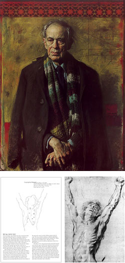 While preparing my post on Daniel E. Green I found an image of his incisive pastel portrait of Robert Beverly Hale (left).
Hale was probably the foremost teacher of figure drawing and artistic anatomy in America. He was Curator of the American Painting and Sculpture Department at the Metropolitan Museum of Art, Instructor of Drawing and Lecturer on Anatomy at The Art Students League in New York, and Lecturer on Anatomy at The Pennsylvania Academy of the Fine Arts in Philadelphia.
When I was a student at the Academy I had the privilege of attending Hale’s lectures on artistic anatomy. I was pretty young at the time and unaware of Hale’s status or reputation as a teacher. To me he was just “the anatomy lecture guy”. His lectures, however, left no doubt that you were getting the real goods from someone who knew his subject in extraordinary depth. I began to realize just how good he was when I started to pick up his books.
Hale was the author or co-author of some of the best books ever written on figure drawing and artistic anatomy: “Drawing Lessons from the Great Masters: 100 Great Drawings Analyzed, Figure Drawing Fundamentals Defined, Master Class in Figure Drawing, Artistic Anatomy (with Dr. Paul Richer), and “Anatomy Lessons from the Great Masters” (with Terence Coyle).
All of them are excellent. Anatomy Lessons from the Great Masters is my favorite book on artistic anatomy. Coyle took material from lectures by Hale, who really knew the work of the masters in addition to his knowledge of figure drawing and anatomy, included the corresponding images from Rembrandt, Rubens, Raphael, Michaelangelo, Pontormo, Leonardo, Prud’hon and others, and arranged them on opposing pages to illustrate important principles of artistic anatomy.
Hale’s quotes are accompanied by a diagram that Coyle has annotated so you know exactly what part of the master drawing Hale is referring to (image at left, below Daniel E. Green’s portrait of Hale). Wow, what a great way to learn artistic anatomy.
Categories:
-
Frezzato (Massimiliano Frezzato)
 Massimiliano Frezzato, (usually referred to, Elvis-style, as simply Frezzato) is a highly regarded Italian comics artist. Frezzato was born and lives in Torino, site of the current Winter Olympics. (how’s that for a topical tie-in?)
Although he has worked an a number of projects and short features he is best known as the artist of two major series, Margot, written by Jérôme Charyn, and in particular, Les Gardiens du Maser, written by Nikita Mandryka.
Frezzato seems to have been influenced by anime (occasionally his characters will exhibit the large doll-like eyes and head proportions seen in anime and manga), but his main influences are probably major European comics artists like Moebius and Enki Bilal.
Like Bilal, and to a lesser extent, Moebius, Frezzato’s work seems to be a mixed-media affair, combining pencils, inks, paint and colored pencils, crayons or chalks (image detail at left).
His work is at once realistic and cartoon-like, highly rendered and quickly gestured. His draughtsmanship can be restrained and straightforward and wildly exaggerated, often within the same story or even on the same page. (The image here shows him at his most restrained.)
There is a site devoted to the Maser series, with French and English versions, although the English version is offline as of this writing. It’s worth checking out, though; it contains some large (but watermarked) Frezzato images in the form of downloadable wallpapers, and the Albums section has thumbnail images that you can mouse-over to see small but beautiful previews of whole pages.
There is also a Frezzato gallery on Myrdhinn’s site, and the BDNet site (in French) includes a sample comics page linked from the detail page for most of the titles listed.
You can find the English translation versions of the Maser series in many U.S. comics shops and book stores. Here is an Amazon link to the first volume of the series: Second Moon (Keepers of the Maser Series, Volume 1).
There is also a Frezzato Sketchbook available, which I really enjoy. It contains preliminary drawings and penciled pages for his comics albums, as well as character drawings, random sketches and flights of fancy.
His work also occasionally appears in Heavy Metal, a comics magazine based on the French Metal Hurlant comics magazine.
Heavy Metal also publishes the U.S. versions of Frezzato’s comic albums.
Categories:
-
Belinda Del Pesco

Belinda Del Pesco is a watercolorist from California who has a terrific blog, Belinda Del Pesco Fine Art, in which she not only posts her work, but describes her working methods along with images of the work in progress.She has the kind of approach to watercolor that I admire: clear and fresh color built on a solid foundation of traditional draughtsmanship. She pays particular attention to contrasts of light and shadow and deals often with transparent and reflective objects, which I particularly enjoy.
The image shown above is from a post about building value in layers, which was preceded by related posts about watercolor glazing and watercolor washes. She also posted a preliminary painting of a similar composition.
Del Pesco often likes to work in monotype, prints made by painting or drawing on a non-absorbent surface (e.g. plexiglass) and transferring the unique image to paper, and monoprints, prints in traditional graphic media for which each impression is unique, (which she usually combines with watercolor). She has several instructive posts about various approaches to these processes, including this one about creating a soft-ground miniature etching with watercolor.
Here are several other informative posts about her working methods for various media: a monotype and watercolor, another monotype and watercolor, a woodcut and watercolor, a linocut, and a miniature monotype.
Del Pesco also has a web site where you can see a gallery of her work.
Categories:
-
Stephan Martiniere

Stephan Martiniere has done concept and production art for films like Star Wars, Episodes II and III, I, Robot, Red Planet, Dragonheart and others.He has also done concept design for theme parks and animation as well as doing book and magazine illustration. During his three year stint at CYAN he was visual design director for Uru “Ages Beyond Myst”.
His work is rich in detail and and sparkles with light and atmospheric effects. His science fiction illustration and space themed concept art carry delightful echoes of John Berkey’s classic illustrations, at once loose and intricate. Martiniere doesn’t shy away from tackling images of enormous scale, and he can pull it off with masterful control of atmospheric perspective and color range.
The galleries on his site contain illustration, production and concept art in pencil, marker, charcoal, paint and digital media (Photoshop). Images in the gallery can be viewed by theme (characters, environments, etc.) or by genre (feature films, theme parks, illustration etc.)
Individual images are often marked with a blinking dot, indicating a print is available, there is also a separate section of the Prints for Sale.
There are past articles about Martiniere archived on CGNetworks, Starlog, and Gamasutra.
Martiniere’s work has been featured in several Spectrum fantastic art, and Exposé digital art collections.
There is a book of Martiniere’s work called Quantum Dreams: The Art of Stephan Martiniere from Design Studio Press, (Amazon link).
Categories:
-
Chris Ware (F.C. Ware)
It’s possible that some of you have not heard of Chris Ware, particularly if you’ve been living in a refrigerator box somewhere. His books of comic art have been reviewed and written about in all levels of the press lately. It’s a little more likely, though, that you have heard of him but may not have seen good examples of his work unless you’ve actually picked up one or more of his books. (I say one or more because if you like Ware’s work, it’s hard not to want more of it.)Until recently it was easy to find reviews and articles about Ware on the web, but difficult to find much in the way of posted examples of his work, except for disjointed snippets or images that are too small to get a real flavor for why so many find it so appealing.
Just recently the New York Times began publishing comics for the first time. The first comics artist they choose to publish was Chris Ware. They are serializing his Building Stories (image above), and offering the pages online in PDF format. They’re in actual postscript PDF, which means you can zoom them large enough to read Ware’s occasionally tiny panels and get a feeling for the astonishing amount of work he invests in his comics stories. His comics pages, novelty ad parodies and book designs exhibit an attention to detail and devotion to craft for which “obsessive” is a mild word.
Like a cross between Gasoline Alley, Hergé and the flat pictographic panels of comic-style instructional pamphlets, Ware’s work is usually devoid of the hatching or rendering found in most comics (except when he’s deliberately cultivating the look of woodcuts). His drawings are mostly outline filled with color. Linear perspective is often flattened or replaced with orthographic projection; and Ware sidesteps atmospheric perspective in favor of utilizing color for design and mood.
His colors are carefully chosen, often muted and always in careful relationship not only to the other colors in the panel, but also in relation to the entire page as a work of design. Many of the elements, whether panels or actual drawn objects, are abstracted to the point of becoming elementary geometric shapes.
Sometimes his images seem not so much drawn as meticulously constructed; as if a 19th century master draughtsman had programmed a difference engine to draw comics with a series of precision pantographs.
Ware also plays with the conventions of comic art page design and storytelling, playing with panel and page layout and the normal presentation of linear time in remarkable ways. The level of design work and detail can actually be a bit overwhelming.
Despite the intricately appealing look of the art , Ware’s stories are anything but cheerful. Most of his humor is in the packaging, the parody retro graphic design and the mock ads (some of which are hilarious). The comics themselves are rarely “funny”, usually dealing with themes of loneliness, isolation, regret and the looming emptiness of modern life. But don’t let that description convince you his work is a downer. The emotional effect is balanced by the beautiful art, superb design and toy-like fun of the endlessly detailed features and comic strips. His books are more lavishly detailed artifacts then simply books of comic art. Ware’s running gag of the whole of his work being the product of “The Acme Novelty Company” is perfectly appropriate.
Ware’s own site is devoted to his interest in collecting Ragtime ephemera and doesn’t mention his own work. Here are some other links for Ware info on the web: some small reproductions of pages from Jimmy Corrigan, a small gallery of individual panels, an audio interview with Ware, a bio on NNDB, the Wikipedia entry, a review of Jimmy Corrigan, review of Acme Novelty Library 15, The Fantagraphics Books listing for many of his books, an online exhibition of black and white graphics and pages, and some wonderfully large images of pages for sale (or sold) at the Hammer Gallery.
Here is an excellent unofficial Chris Ware page with information and links to other Chris Ware pages and resources on the web. These may give you a slight taste, but you really need to pick up one of his books to get a real feeling for his work.
Though he has received acclaim for his graphic novel Jimmy Corrigan, The Smartest Kid On Earth, and there are many volumes of his work in print, I might suggest starting with his recent collection of material which offers a variety of his styles as well as being a prime example of his maniacal, designed down to the last square millimeter package:The Acme Novelty Library Final Report to Shareholders and Rainy Day Saturday Afternoon Fun Book.
Rather than try do describe this remarkable feat of comics art, design work and publishing craft, I’ll point you to Douglas Wolk’s excellent description and review on Salon.
To borrow a phrase from his own Cut Out and Fold Miniature Working Acme Novelty Library: Chris Ware’s work is “A Rewarding and Insightful Amusement for All Those who Attempt to Master its Intricacies”.
Categories:
-
Gustave Caillebotte
 Gustave Caillebotte is one of my two favorite “ignored” Impressionists. (The other being Alfred Sisley, who simply doesn’t get the respect he deserves.) Like Sisley, I find Caillebotte to be less formulaic and slavish to the “ideals” of Impressionism, and more likely to paint directly, leaning a bit more toward Courbet’s realism than the “major” Impressionist painters.
Caillebotte was a man of means and was a patron and collector of Impressionist art as well as a painter, and organized (read “financed”) many of the Impressionist exhibitions. He is also credited with introducing Impressionist art to museums by posthumously donating many of the great pieces in his collection to the French government, which accepted the controversial art very reluctantly.
He was also different from the other impressionists in his choice of subject and light conditions. Although he would occasionally paint the kind of sun-drenched countryside and riverbank scenes that were staple subjects for the “painters of light”, Caillebotte often chose a darker palette and was actually more likely to paint landscapes and city scenes in overcast conditions, or even when it was actually raining or snowing, something more common in Japanese and Chinese art at the time than European art.
He also often painted interiors in which, like Degas, he would challenge the formal compositions of the Academic painters by showing a large area of floor and a small area of the rest of the room, as in The Floor Scrapers and The Floor Strippers. Although not the draughtsman that Degas was, his figures and portraits also brought him closer to Degas than to the other Impressionists who did figurative work.
Caillebotte is responsible for some of my very favorite Impressionist images, such as Rooftops under Snow and Riverbank in the Rain (above left). His most widely recognized work depicts a Paris street in the rain; that and the rooftops are usually the only images of his you see in books on Impressionism, if he is mentioned at all.
While he was working Caillebotte was reviled by the art establishment along with the other Impressionist painters. When the art critics finally woke up and realized the power of Impressionist works, he was still dissed off as “minor” and mentioned more as a patron then a painter. Fortunately Caillebotte is receiving renewed interest in recent years from the people who actually matter (i.e. you and I) and the art establishment is sluggishly coming around to recognizing him as the major painter that he was. Who knows, maybe there’s hope for poor Alfred as well.
There is an excellent volume on his life, work and working method, Gustave Caillebotte by Kirk Varnedoe, as well as several other books out there about him. I give several links below to galleries. There are brief bios here and here.
After being dazzled by Monet’s explosions of light and color, it’s easy to miss the quiet, subtle magic that infuses Caillebotte’s paintings. Give him a chance and he’ll wow you with the haunting beauty of subdued light, mist, rain and cloudy skies.
Categories:


Charley’s Picks
Bookshop.org
(Bookshop.org affilliate links; sales benefit independent bookshop owners; I get a small percentage to help support my work on Lines and Colors)

John Singer Sargent: Watercolors


Urban Sketching: Understanding Perspective


Charley’s Picks
Amazon
(Amazon.com affiliate links; sales go to a larger yacht for Jeff Bezos; but I get a small percentage to help support my work on Lines and Colors)
John Singer Sargent: Watercolors
Urban Sketching: Understanding Perspective