
Categories
- 3d CGI
- Amusements
- Animation
- Anime & Manga
- Art Materials
- Art Videos
- Blogroll
- Cartoons
- Color
- Comics
- Concept & Visual Dev.
- Creativity
- Digital Art
- Digital Painting
- Displaying Art on the Web
- Drawing
- Eye Candy for Today
- Gallery and Museum Art
- High-res Art Images
- Illustration
- Motion Graphics & Flash
- Museums
- Online Museums
- Outsider Art
- Painting
- Painting a Day
- Paleo Art
- Pastel, Conté & Chalk
- Pen & Ink
- Prints and Printmaking
- Reviews
- Sc-fi and Fantasy
- Sculpture & Dimensional
- Site Comments
- Sketching
- Storyboards
- Tools and Techniques
- Uncategorized
- Vector Art
- Videos & Podcasts
- Vision and Optics
- Watercolor and Gouache
- Webcomics
Archives
- May 2026
- April 2026
- March 2026
- February 2026
- January 2026
- December 2025
- November 2025
- October 2025
- September 2025
- August 2025
- July 2025
- June 2025
- May 2025
- January 2025
- December 2024
- November 2024
- October 2024
- September 2024
- August 2024
- June 2024
- April 2024
- March 2024
- February 2024
- January 2024
- December 2023
- November 2023
- October 2023
- September 2023
- August 2023
- July 2023
- May 2023
- April 2023
- March 2023
- February 2023
- January 2023
- December 2022
- November 2022
- September 2022
- August 2022
- July 2022
- June 2022
- May 2022
- April 2022
- March 2022
- February 2022
- January 2022
- December 2021
- November 2021
- October 2021
- September 2021
- August 2021
- July 2021
- June 2021
- May 2021
- April 2021
- March 2021
- February 2021
- January 2021
- December 2020
- November 2020
- October 2020
- September 2020
- August 2020
- July 2020
- June 2020
- May 2020
- April 2020
- March 2020
- February 2020
- January 2020
- December 2019
- November 2019
- October 2019
- September 2019
- August 2019
- July 2019
- June 2019
- May 2019
- April 2019
- March 2019
- February 2019
- January 2019
- December 2018
- November 2018
- October 2018
- September 2018
- August 2018
- July 2018
- June 2018
- May 2018
- April 2018
- March 2018
- February 2018
- January 2018
- December 2017
- November 2017
- October 2017
- September 2017
- August 2017
- July 2017
- June 2017
- May 2017
- April 2017
- March 2017
- February 2017
- January 2017
- December 2016
- November 2016
- October 2016
- September 2016
- August 2016
- July 2016
- June 2016
- May 2016
- April 2016
- March 2016
- February 2016
- January 2016
- December 2015
- November 2015
- October 2015
- September 2015
- August 2015
- July 2015
- June 2015
- May 2015
- April 2015
- March 2015
- February 2015
- January 2015
- December 2014
- November 2014
- October 2014
- September 2014
- August 2014
- July 2014
- June 2014
- May 2014
- April 2014
- March 2014
- February 2014
- January 2014
- December 2013
- November 2013
- October 2013
- September 2013
- August 2013
- July 2013
- June 2013
- May 2013
- April 2013
- March 2013
- February 2013
- January 2013
- December 2012
- November 2012
- October 2012
- September 2012
- August 2012
- July 2012
- June 2012
- May 2012
- April 2012
- March 2012
- February 2012
- January 2012
- December 2011
- November 2011
- October 2011
- September 2011
- August 2011
- July 2011
- June 2011
- May 2011
- April 2011
- March 2011
- February 2011
- January 2011
- December 2010
- November 2010
- October 2010
- September 2010
- August 2010
- July 2010
- June 2010
- May 2010
- April 2010
- March 2010
- February 2010
- January 2010
- December 2009
- November 2009
- October 2009
- September 2009
- August 2009
- July 2009
- June 2009
- May 2009
- April 2009
- March 2009
- February 2009
- January 2009
- December 2008
- November 2008
- October 2008
- September 2008
- August 2008
- July 2008
- June 2008
- May 2008
- April 2008
- March 2008
- February 2008
- January 2008
- December 2007
- November 2007
- October 2007
- September 2007
- August 2007
- July 2007
- June 2007
- May 2007
- April 2007
- March 2007
- February 2007
- January 2007
- December 2006
- November 2006
- October 2006
- September 2006
- August 2006
- July 2006
- June 2006
- May 2006
- April 2006
- March 2006
- February 2006
- January 2006
- December 2005
- November 2005
- October 2005
- September 2005
- August 2005
Relevant Blogs
Art, Painting & Sketch
- Gurney Journey
- Underpaintings
- Art and Influence
- Painting Perceptions
- Oil Painters of America
- Vasari Paint POV
- Flying Fox
- Urban Sketchers
- Bento (Smithsonian)
- Art Inconnu
- The Hidden Place
- Still Life
- Making a Mark
- The Art of the Landscape
- Exploring Color & Creativity
- Art Contrarian
- Artist A Day
- beinArt Surreal Art Collective
- Eye Level
- David Dunlop
- p.i.g.m.e.n.t.i.u.m
- CultureGrrl
- Joaquín Sorolla blog
- Artists in Pastel
“Painting a Day”
- A Painting a Day (Keiser)
- On Painting (Keiser)
- Julian Merrow-Smith
- Karen Jurick
- Jeffrey Hayes
- Carol Marine
- Abbey Ryan
- Daily Paintworks
Other Painting Blogs
- Virtual Gouache Land
- Neil Hollingsworth
- Marc Hanson
- Kevin Menck
- Marc Dalessio
- Larry Seiler
- Stapleton Kearns
- Colin Page
- Roos Schuring
- Hans Versfelt
- Titus Meeuws
- Régis Pettinari
- René Plein Air
- Belinda Del Pesco
- Robin Weiss
- Nathan Fowkes (Land Sketch)
- William Wray
- Frank Serrano
- Stephen Magsig
- Michael Chesley Johnson
- Twice a Week
- Sarah Wimperis
- Rob Adams
- Michael Cole Manley
- The Dirty Palette Club
- Mike Manley’s Draw!
Gallery Art & Illustration mix
Illustration
- Howard Pyle
- 100 Years of Illustration
- BibliOdyssey
- Illustration Art
- Today’s Inspiration
- Illustration Mundo
- Little Chimp Society
- Danny Gregory
- R D (John Martz
- Illustration Friday blog
- Monster Brains
- Illustrators & Illustrations (RU)
- Elwood H. Smith
- DaniDraws.com
- Designers Who Blog
- iSpot Blog
Sci-Fi & Fantasy
Illustration & Comics
Comics & Cartoons
- Comics Beat
- Robot 6
- Newsarama Blog
- Comic Vine
- Comics Alliance
- Forbidden Planet Int.
- Paolo Rivera
- Bolt City
- Flight
- Scott McCloud
- The Comics Journal
- Comixpedia
- Funnybook Babylon
- James Baker
- Middleton’s Sketchbook
- Boneville
- The Hotel Fred
- Paul Rivoche
- Daily Cartoonist
- Mad About Cartoons (William Wray)
- Digital Strips
Illustration & Concept
Animation & Concept
- Cartoon Brew
- Animation Blog
- Cold Hard Flash
- Concept Art World
- The CAB
- FY Concept Art
- Concept Ships
- Concept Robots
- John Nevarez
- Armand Serrano
- Marcos Mateu-Mestre
- all kinds of stuff (Kricfalusi)
- Yacin the faun (Man Arenas)
- Kelsey Mann
- Cre8tivemarks Blog
- Ice-Cream Monster Toon Cafe
- AAU Character & Creature Design
- AAU Animation Notes
- Articles and Texticles
Paleo & Scientific
Tools & Techniques
Other
Lists of Art Blogs
Art Image Resource Links
Historic Art Images
- Wikimedia Commons: Paintings
- Wikimedia Commons: Drawings
- The Athenaeum
- WikiArt (WikiPaintings)
- Google Art Project: Artists
- Google Art Project: Collections (Museums)
- ArtCyclopedia
- Web Gallery of Art
- Art Renewal Center
- Web Gallery of Impressionism
Auction Consolidation sites
Auction sites
- Sotheby’s
- Bonham’s
- Christies
- Heritage Auctions: Fine Art
- Heritage Auctions: Illustration
- Freeman’s Auctions
- Bukowskis
- Shannon’s
Image Search
Reverse Image Search (search by image)
- Tin Eye
- RevImg
- Google Image Search (camera icon)
- Bing Image Search (camera icon)
Promoting some friends and some clients of my website design business
- Twin Willows T’ai Chi studio in Wilmington DE. Taiji classes with Bryan Davis.
- Ray Hayward, Inspired Teacher of T’ai Chi ( Taiji ) in Minneapolis, Founder of Mindful Motion Tai Chi Academy
- OldHead Tattoo studio and Art Gallery in Wilmington DE. Tattoos and paintings by Bruce Gulick
- Sharon Domenico Art, pet portrait oil paintings
- Platinum Paperhanging, wallpaper hanging, Main Line and Philadelphia, PA
- Lisa Stone Design, interior designer, Main Line and Philadelphia, PA
- Studio12KPT, original art, prints, calendars and other custom printed items by Van Sickle & Rolleri
-
The Painterly Voice, Pennsylvania Impressionism

Pennsylvania Impressionism is a term rather loosely applied to a group of late 19th and early 20th century painters who lived and worked in and around the artist colony that existed at the time in New Hope, Pennsylvania and Lambertville, New Jersey, small towns that straddle either side of the Delaware River north of Philadelphia.American Impressionism, an even more broadly applied term, refers to American painters who were influenced by the French Impressionists, but the range and variety of their styles is considerable.
New York, Boston and several spots in California were centers for these painters and their new and radical styles, Philadelphia, although a major art center at the time, was less welcoming to these styles, largely due to the strong influence of Thomas Eakins and his allies, who favored a more traditional academic approach.
So the painters in the Philadelphia area who were drawn to this new style of painting gravitated to the area of New Hope, to an art colony started by William Lathrop and drawn by the powerful influence of Edward Redfield and Daniel Garber.
Currently, the James Michener Museum, in nearby Doylestown, PA, houses one of the strongest collections of work by the Pennsylvania Impressionists. The museum recently hosted what I believe was the largest exhibition of works by these artists ever assembled.
Unfortunately the exhibition ended April 1. I have to apologize to those in the area who missed the show for my late coverage (and I regret that I only could find time for a single visit myself), but the museum continues to maintain their online exhibit for the exhibition: The Painterly Voice: Buck’s County’s Fertile Ground.
The online feature is accessed from a drop down menu in sections for artists or groups of artists. Within those sections, navigation between images is handled with arrows that are confusingly outside the apparent limits of the page, against the background on either side.
When you discover an artist you like, note the links at right of each entry to even more images by that artist to be found in the Michener Museum’s Collection Database and Bucks County Artist Database.
For those who would like to follow up with books, there are two excellent volumes that cover a broad range of these artists and their works: Pennsylvania Impressionism by Brian H. Peterson is the most scholarly and definitive and has beautiful reproductions; A New Hope for American Art by Jim Alterman (also here) is huge, stuffed with 1,000 color plates, and covers many of the less well known artists in more detail.
You can also find additional titles on individual artists in the Michener Museum’s online shop.
(Images above: William L. Lathrop, Edward Redfield, Daniel Garber, Rae Sloan Bredin, Arthur Meltzer, Charles Rosen, M. Elizabeth Price, Kenneth Nunamaker, Walter Elmer Schofield, Roy C. Nuse, Fern I. Coppedge, Robert Spencer, Roy Francis Taylor, George Sotter)
Categories:
-
Norman Rockwell Museum on Google Art Project

Wow, am I ever enjoying the recently updated Google Art Project (as I reported recently).Despite my own Time Sink Warning, I’ve been pulled back here way too often. I found this morning that among the cornucopia of art from the newly added museums is the Norman Rockwell Museum in Massachusetts.
The museum houses not only a broad collection of work from its namesake (which can be surprisingly diverse) but an excellent collection of work by other American illustrators. There is an article about the museum joining the project on New England Public Radio.
Though the number of pieces available on the GAP’s section for the museum is not extensive (presumably the number will grow), it’s a delight to be able to zoom in on classic illustrations like these. (Bear in mind that my screen captures have been greatly reduced in the images above, I’m just trying to give an idea of zooming scale.)
Now if only the Brandywine River Museum would follow suit.
(Artists above, with details: Norman Rockwell, Howard Pyle, William Smedley, Norman Rockwell, Charles Dana Gibson, Howard Pyle)
Categories:
-
Cory Godbey
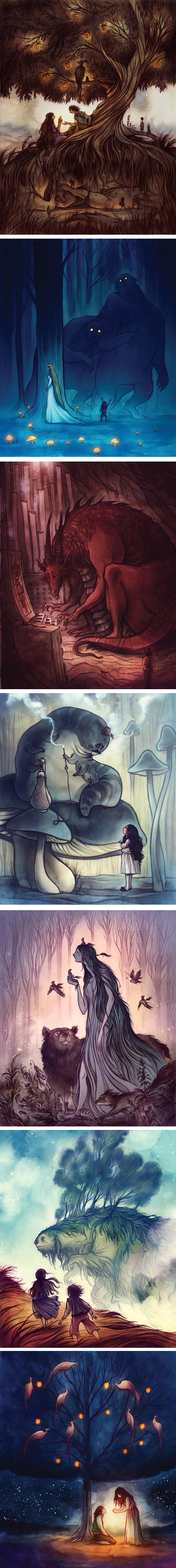
Cory Godbey is an illustrator and animator based in Greenville, South Carolina whose work utilizes elegant lines, stylized drawing and deep, carefully limited color palettes to achieve wonderful effect.He makes use of these strengths, as well as a rich imagination, in his illustrations of classic children’s stories as well as contemporary themes. I particularly enjoy his playful use of illumination and light sources.
You can see in Godbey’s work his apparent admiration for classic Golden Age illustrators like Arthur Rackham, Edmund Dulac, John Bauer and Gustav Tenggren, as well as contemporary illustrators like Maurice Sendak.
The “Gallery” portion of his website redirects to his gallery on Behance Network, where you will find sections for work in various categories. In addition Godbey maintains a blog titled late night rains.
Godbey’s clients incude Random House, HarperCollins, Marvel and The Jim Hensen Co. He has also done comics work for the Flight comics anthologies.
Categories:
-
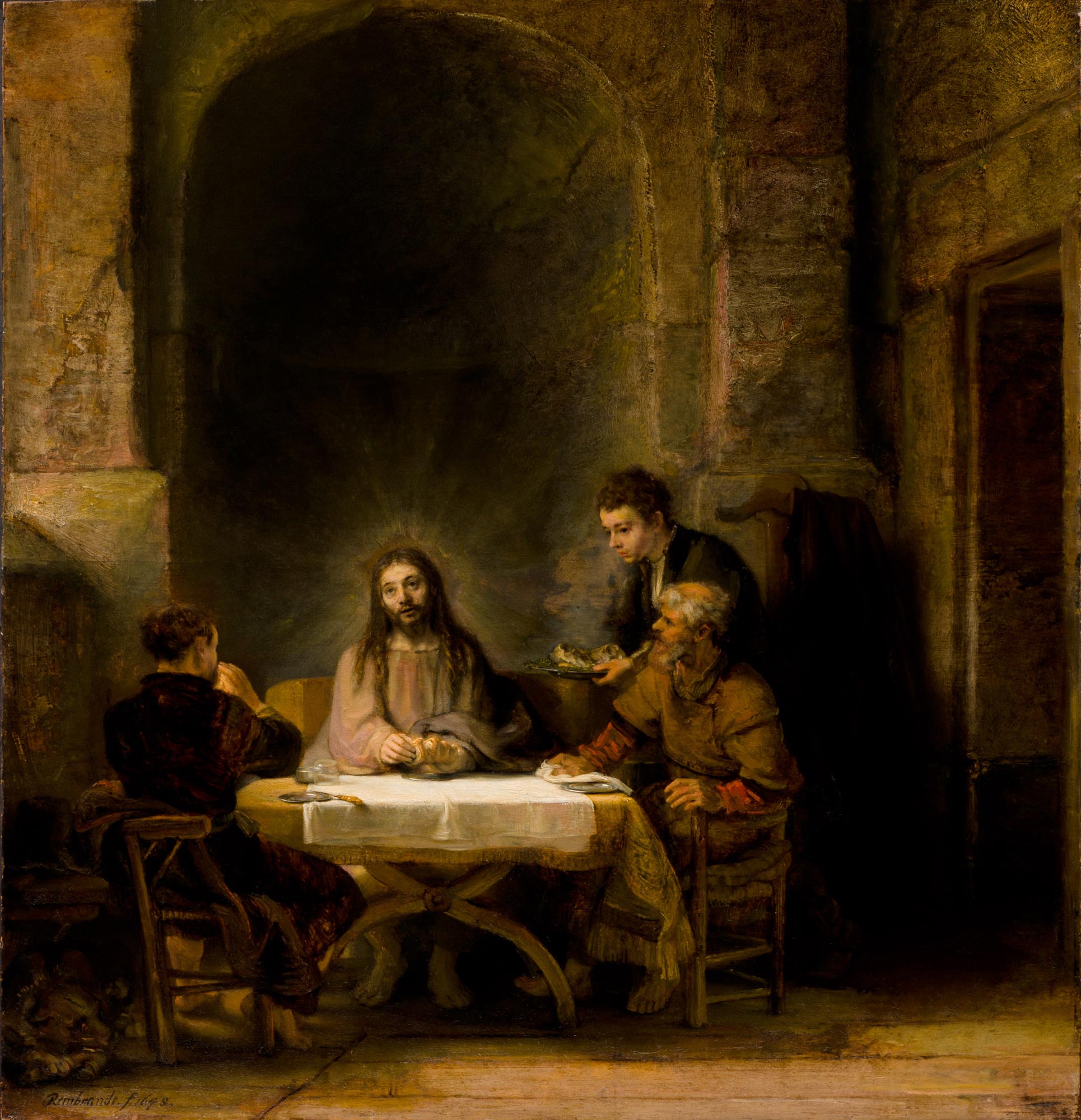
Rembrandt’s Supper at Emmaus

The Biblical story of the Supper at Emmaus, in which Jesus appears to, and later has a meal with two of his disciples after his resurrection, is a repeated theme in the history Christian art.The most famous example is the striking composition by Carravaggio.
Rembrandt’s portrayal of the scene is less familiar, and is not one of the more commonly reproduced works in his oeuvre.
However, when I had the chance to see this painting in person at the Philadelphia Museum of Art last August as part of the Rembrandt and the Face of Jesus exhibition, I was fascinated by it and returned to it several times during my visit.
With no disrespect to Rembrandt’s intentions for the focus of the painting, it was not his figures that captured my attention in this instance, but the surroundings in which he placed them, most notably the table and simple still life objects, and the cloth on which they rested.
Seen close up, these simple subjects in Rembrandt’s hands seemed to me a tour-de-force in still life painting, the background a textural masterpiece and textbook example of how to use a background and lighting to set off a scene with figures.
The figures themselves, of course, were painted with Rembrandt’s unwavering strength as a painter, but I didn’t find them among his most compelling, in contrast to the scene as a whole. The tablecloths, in particular, are a marvel of subtle color blending, rich brushwork and the play of light across a complex surface.
The painting was probably based on this earlier etching.
This is the second of two very different takes by Rembrandt on the subject, the first is more stark and dramatic, with the figure of Jesus almost in silhouette in the foreground and great areas of sharp chiaroscuro forming the composition (images above, bottom).
The later painting, though less dramatic, is richer and more involving. The original is in the Louvre, which provides a reasonably high resolution image of the painting here.
Categories:
-
Thomas Kinkade, 1958-2012

Longtime readers of Lines and Colors may be surprised to find me writing about Thomas Kinkade, as I normally only write about artists whose work I personally find appealing, and I wouldn’t be quick to put Kinkade on that list.I do find him interesting as a phenomenon, however, and his untimely death yesterday at the age of 54 prompted me to mention him in that respect.
Thomas Kinckade was an American painter noted for his extraordinarily popular paintings of deliberately charming cottages, lush gardens, idyllic landscapes and townscape Americana, rendered in wide array of high-chroma colors.
On one hand, Kinkade has been the subject of derision from critics and art lovers as a purveyor of kitschy greeting card and calendar art sentimentality; on the other hand, his work is enormously popular in the U.S., and seems to hold a strong and almost magical appeal for some.
Kinkade is noted for his aggressive merchandising, in which a chain of franchise stores, usually in shopping malls, sell prints of various kinds and levels of expense, as well as a secondary line of merchandise, perhaps making him the “Martha Stewart” of art related merchandising.
I can be critical of Kinkade’s business practices, in which “semi-original” commercial prints are touched up with oil by him or by assistants, signed by him in special ink, tagged with a special seal like a collectable coin from the Franklin Mint and sold for prices beyond what many other artists ask for originals in mall-based galleries that offer financing to purchase them.
There is also the controversial nature of his company’s gallery franchise profit percentages, coupled with the relentless marketing of his work and, most annoyingly to me, his absurd attempt to trademark the phrase “Painter of Light” (which has historically been applied to J.M.W. Turner).
However readers familiar with my taste in art may be surprised that I’m not as harshly critical of Kinkade’s actual painting style as some might expect.
I find the wide popularity of his work, and in particular the intensity of the appeal it has for many, creates a fascinating angle on the question of what is “visually appealing” in a work of art, and how artists have deliberately pursued, or eschewed, that element.
The late 20th century Modernists, of course, rejected anything with visual appeal as base and intellectually shallow — art was, after all, the provence of the intellect, and more importantly, of the intellectual few sophisticated enough to appreciate the subtleties of the theories on which modernist painting was based.
Representational art has a history of wavering between visual appeal and intellectual or emotional content, with enormous variation. There are elements, however, that can be identified as having immediate visual appeal as well as emotional resonance.
But what makes a painting visually appealing, in the combinations of subject matter, color composition, value, paint surface… all of the elements painters bring to bear in their work, and why is there such difference between the perception of those elements by different individuals?
Resisting the temptation to jump on the bandwagon and dismiss Kinkade’s work as treacle, I find it fascinating that he was a painter who evidently pursued the the question of “visual appeal” with dogged singularity.
Though I don’t respond to the particular style of visual appeal Kinkade has pursued in the way his legions of admirers do (and some respond very strongly indeed, spending quite a bit of money to purchase multiple “semi-original” prints), I can see within it many techniques that can be found in other styles and genres of art that are designed to have “Eye Candy” visual appeal.
One is the use of paired complementary colors, frequently associated with the French Impressionists, and notable in contemporary film and gaming concept art (as well as in the subsequent movies and games — as a case in point, look at something like the “robot assembly line” sequence in Star Wars: Attack of the Clones and note the colors and lighting).
You can see the combination of complementary color pairs and strong value contrasts used by painters like John Atkinson Grimshaw and the post-Impressionist “Painters of Paris” like Antoine Blanchard and Edouard-Léon Cortès repeated throughout Kinkade’s work, sometimes overtly, as in the images above, bottom two, done under the pseudonym “Robert Girrard”.
You can also see nods to the 19th century history painters like Lawrence Alma-Tadema in Kinkade’s fanciful arcadian gardens and faux classical structures, as well as a take on Maxfield Parrish’s use of similar visual props.
Similarity to Disney cartoon background painting is evident in Kinkade’s cottages and gardens, and becomes obvious in his own series of official Disney homage paintings (which look perfectly in keeping with the studio’s aesthetic).
Kinkade has extracted that aesthetic, distilled it, and applied it to his cottage scenes in heavy doses, with warm light glowing from multi-paned windows — even in daylight, and smoke wafting from idealized brick chimneys emerging from storybook roofs.
You can also see Kinkade’s adoption of the stylized fantasy shrubbery of Eyvind Earle, as well as his intense color combinations, though even more exaggerated.
I tend of think of Kinkade essentially as a fantasy painter, despite the lack of overt elves and fairies, in that he presents his viewers with an escape into an alternate world where harsh reality doesn’t intrude, and magic has more sway than physics. In the process he also borrows additional techniques from fantasy artists in terms of adding elements of fantasy landscape “eye candy”.
If I look through Kinkade’s images, I have to admit there are passages that I find visually appealing, and might admire more readily in a different context, particularly if utilized in a scene with less “visual charm density” — notably the effects of dappled light and the look of backgrounds faded into textural renderings of mist and haze.
So whatever you think of Kinkade’s work, you may find it worth putting prejudices aside and taking a closer look at individual elements in his paintings in the context of Kinkade as a “Painter of Charm”.
[Addendum: I received notice that the first scholarly analysis of Kinkade’s work, Thomas Kinkade: The Artist in the Mall, edited and with writing by Alexis L. Boylan, has been published by Duke University Press. There is an article in the premiere issue of Pacific Standard Magazine.]
Categories:
-
Kieran Yanner

Kieran Yanner is a concept artist and illustrator working for a variety of clients in publishing and the gaming industry.Originally from Darwin, Australia, Yanner now lives and works in Seattle, Washington in the U.S.
His clients include Hasbro, NCSoft, THQ, DC Comics, Marvel, Upperdeck Entertainment, Decipher, Wizards of the Coast, Wizkids, White Wolf, Vivendi Universal Games, Disney and Sony Online Entertainment.
Yanner works digitally and has a nice flair for visual drama, from the sweeping motions of dragons or sea monsters to emotional characters to dazzling special effects. He also demonstrates a flair for humorous illustration, as in his character designs for Save Dr. Lucky (above, fourth down).
His portfolio is divided into sections by project and shows the range of visual approaches and rendering styles he brings to the different kinds of projects he undertakes.
There is an interview with Yanner on 3D Total.
Categories:


Charley’s Picks
Bookshop.org
(Bookshop.org affilliate links; sales benefit independent bookshop owners; I get a small percentage to help support my work on Lines and Colors)

John Singer Sargent: Watercolors


Urban Sketching: Understanding Perspective


Charley’s Picks
Amazon
(Amazon.com affiliate links; sales go to a larger yacht for Jeff Bezos; but I get a small percentage to help support my work on Lines and Colors)
John Singer Sargent: Watercolors
Urban Sketching: Understanding Perspective