
Categories
- 3d CGI
- Amusements
- Animation
- Anime & Manga
- Art Materials
- Art Videos
- Blogroll
- Cartoons
- Color
- Comics
- Concept & Visual Dev.
- Creativity
- Digital Art
- Digital Painting
- Displaying Art on the Web
- Drawing
- Eye Candy for Today
- Gallery and Museum Art
- High-res Art Images
- Illustration
- Motion Graphics & Flash
- Museums
- Online Museums
- Outsider Art
- Painting
- Painting a Day
- Paleo Art
- Pastel, Conté & Chalk
- Pen & Ink
- Prints and Printmaking
- Reviews
- Sc-fi and Fantasy
- Sculpture & Dimensional
- Site Comments
- Sketching
- Storyboards
- Tools and Techniques
- Uncategorized
- Vector Art
- Videos & Podcasts
- Vision and Optics
- Watercolor and Gouache
- Webcomics
Archives
- May 2026
- April 2026
- March 2026
- February 2026
- January 2026
- December 2025
- November 2025
- October 2025
- September 2025
- August 2025
- July 2025
- June 2025
- May 2025
- January 2025
- December 2024
- November 2024
- October 2024
- September 2024
- August 2024
- June 2024
- April 2024
- March 2024
- February 2024
- January 2024
- December 2023
- November 2023
- October 2023
- September 2023
- August 2023
- July 2023
- May 2023
- April 2023
- March 2023
- February 2023
- January 2023
- December 2022
- November 2022
- September 2022
- August 2022
- July 2022
- June 2022
- May 2022
- April 2022
- March 2022
- February 2022
- January 2022
- December 2021
- November 2021
- October 2021
- September 2021
- August 2021
- July 2021
- June 2021
- May 2021
- April 2021
- March 2021
- February 2021
- January 2021
- December 2020
- November 2020
- October 2020
- September 2020
- August 2020
- July 2020
- June 2020
- May 2020
- April 2020
- March 2020
- February 2020
- January 2020
- December 2019
- November 2019
- October 2019
- September 2019
- August 2019
- July 2019
- June 2019
- May 2019
- April 2019
- March 2019
- February 2019
- January 2019
- December 2018
- November 2018
- October 2018
- September 2018
- August 2018
- July 2018
- June 2018
- May 2018
- April 2018
- March 2018
- February 2018
- January 2018
- December 2017
- November 2017
- October 2017
- September 2017
- August 2017
- July 2017
- June 2017
- May 2017
- April 2017
- March 2017
- February 2017
- January 2017
- December 2016
- November 2016
- October 2016
- September 2016
- August 2016
- July 2016
- June 2016
- May 2016
- April 2016
- March 2016
- February 2016
- January 2016
- December 2015
- November 2015
- October 2015
- September 2015
- August 2015
- July 2015
- June 2015
- May 2015
- April 2015
- March 2015
- February 2015
- January 2015
- December 2014
- November 2014
- October 2014
- September 2014
- August 2014
- July 2014
- June 2014
- May 2014
- April 2014
- March 2014
- February 2014
- January 2014
- December 2013
- November 2013
- October 2013
- September 2013
- August 2013
- July 2013
- June 2013
- May 2013
- April 2013
- March 2013
- February 2013
- January 2013
- December 2012
- November 2012
- October 2012
- September 2012
- August 2012
- July 2012
- June 2012
- May 2012
- April 2012
- March 2012
- February 2012
- January 2012
- December 2011
- November 2011
- October 2011
- September 2011
- August 2011
- July 2011
- June 2011
- May 2011
- April 2011
- March 2011
- February 2011
- January 2011
- December 2010
- November 2010
- October 2010
- September 2010
- August 2010
- July 2010
- June 2010
- May 2010
- April 2010
- March 2010
- February 2010
- January 2010
- December 2009
- November 2009
- October 2009
- September 2009
- August 2009
- July 2009
- June 2009
- May 2009
- April 2009
- March 2009
- February 2009
- January 2009
- December 2008
- November 2008
- October 2008
- September 2008
- August 2008
- July 2008
- June 2008
- May 2008
- April 2008
- March 2008
- February 2008
- January 2008
- December 2007
- November 2007
- October 2007
- September 2007
- August 2007
- July 2007
- June 2007
- May 2007
- April 2007
- March 2007
- February 2007
- January 2007
- December 2006
- November 2006
- October 2006
- September 2006
- August 2006
- July 2006
- June 2006
- May 2006
- April 2006
- March 2006
- February 2006
- January 2006
- December 2005
- November 2005
- October 2005
- September 2005
- August 2005
Relevant Blogs
Art, Painting & Sketch
- Gurney Journey
- Underpaintings
- Art and Influence
- Painting Perceptions
- Oil Painters of America
- Vasari Paint POV
- Flying Fox
- Urban Sketchers
- Bento (Smithsonian)
- Art Inconnu
- The Hidden Place
- Still Life
- Making a Mark
- The Art of the Landscape
- Exploring Color & Creativity
- Art Contrarian
- Artist A Day
- beinArt Surreal Art Collective
- Eye Level
- David Dunlop
- p.i.g.m.e.n.t.i.u.m
- CultureGrrl
- Joaquín Sorolla blog
- Artists in Pastel
“Painting a Day”
- A Painting a Day (Keiser)
- On Painting (Keiser)
- Julian Merrow-Smith
- Karen Jurick
- Jeffrey Hayes
- Carol Marine
- Abbey Ryan
- Daily Paintworks
Other Painting Blogs
- Virtual Gouache Land
- Neil Hollingsworth
- Marc Hanson
- Kevin Menck
- Marc Dalessio
- Larry Seiler
- Stapleton Kearns
- Colin Page
- Roos Schuring
- Hans Versfelt
- Titus Meeuws
- Régis Pettinari
- René Plein Air
- Belinda Del Pesco
- Robin Weiss
- Nathan Fowkes (Land Sketch)
- William Wray
- Frank Serrano
- Stephen Magsig
- Michael Chesley Johnson
- Twice a Week
- Sarah Wimperis
- Rob Adams
- Michael Cole Manley
- The Dirty Palette Club
- Mike Manley’s Draw!
Gallery Art & Illustration mix
Illustration
- Howard Pyle
- 100 Years of Illustration
- BibliOdyssey
- Illustration Art
- Today’s Inspiration
- Illustration Mundo
- Little Chimp Society
- Danny Gregory
- R D (John Martz
- Illustration Friday blog
- Monster Brains
- Illustrators & Illustrations (RU)
- Elwood H. Smith
- DaniDraws.com
- Designers Who Blog
- iSpot Blog
Sci-Fi & Fantasy
Illustration & Comics
Comics & Cartoons
- Comics Beat
- Robot 6
- Newsarama Blog
- Comic Vine
- Comics Alliance
- Forbidden Planet Int.
- Paolo Rivera
- Bolt City
- Flight
- Scott McCloud
- The Comics Journal
- Comixpedia
- Funnybook Babylon
- James Baker
- Middleton’s Sketchbook
- Boneville
- The Hotel Fred
- Paul Rivoche
- Daily Cartoonist
- Mad About Cartoons (William Wray)
- Digital Strips
Illustration & Concept
Animation & Concept
- Cartoon Brew
- Animation Blog
- Cold Hard Flash
- Concept Art World
- The CAB
- FY Concept Art
- Concept Ships
- Concept Robots
- John Nevarez
- Armand Serrano
- Marcos Mateu-Mestre
- all kinds of stuff (Kricfalusi)
- Yacin the faun (Man Arenas)
- Kelsey Mann
- Cre8tivemarks Blog
- Ice-Cream Monster Toon Cafe
- AAU Character & Creature Design
- AAU Animation Notes
- Articles and Texticles
Paleo & Scientific
Tools & Techniques
Other
Lists of Art Blogs
Art Image Resource Links
Historic Art Images
- Wikimedia Commons: Paintings
- Wikimedia Commons: Drawings
- The Athenaeum
- WikiArt (WikiPaintings)
- Google Art Project: Artists
- Google Art Project: Collections (Museums)
- ArtCyclopedia
- Web Gallery of Art
- Art Renewal Center
- Web Gallery of Impressionism
Auction Consolidation sites
Auction sites
- Sotheby’s
- Bonham’s
- Christies
- Heritage Auctions: Fine Art
- Heritage Auctions: Illustration
- Freeman’s Auctions
- Bukowskis
- Shannon’s
Image Search
Reverse Image Search (search by image)
- Tin Eye
- RevImg
- Google Image Search (camera icon)
- Bing Image Search (camera icon)
Promoting some friends and some clients of my website design business
- Twin Willows T’ai Chi studio in Wilmington DE. Taiji classes with Bryan Davis.
- Ray Hayward, Inspired Teacher of T’ai Chi ( Taiji ) in Minneapolis, Founder of Mindful Motion Tai Chi Academy
- OldHead Tattoo studio and Art Gallery in Wilmington DE. Tattoos and paintings by Bruce Gulick
- Sharon Domenico Art, pet portrait oil paintings
- Platinum Paperhanging, wallpaper hanging, Main Line and Philadelphia, PA
- Lisa Stone Design, interior designer, Main Line and Philadelphia, PA
- Studio12KPT, original art, prints, calendars and other custom printed items by Van Sickle & Rolleri
-
Dorothea Tanning, 1910-2012

American Surrealist painter Dorothea Tanning, who was also a printmaker, sculptor, writer and set designer, was already pursuing her own dream-like compositions when she was introduced to the work of the European Surrealists at their 1936 exhibition in New York.She then met and became lifelong companions with Max Ernst. Like Ernst, Tanning moved from the dream state explorations of the Surrealists into that shifting netherland between representational and non-representational art.
Her suggestions of recognizable forms draw you in, then drift into half-recognized shapes abstracted from something undefinable, providing fertile ground for the viewer to project their own interpreted content and meaning.
Tanning was prolific, even into her later years. She died on Wednesday, January 1, 2012, at the age of 101.
Her official website has an extensive collection of her work, though the images are unfortunately somewhat small and not of the highest quality.
I’ve listed some obits and other sources below.
Categories:
-
Lisa Nilsson
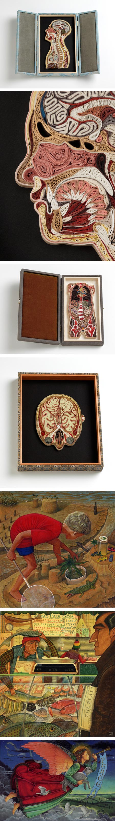
I can across Lisa Nilsson’s work in an article on Visual News about her anatomical quilling.Quilling is a practice that traces back at least to the Renaissance, in which strips of paper are rolled into shapes, usually around a quill — hence the name, and glued together to create designs, ornaments and images.
It turns out that the technique, in Nilsson’s hands, seems to be well suited for the depiction of anatomical cross-sections.
In investigating her website, I found that the Tissue Series, as she titles it, is one of several directions in which Nilsson works. Others include Boxes, assemblages in the tradition of the Dadaists, Small Paintings and Greeting Card Illustration (note that most images are linked to larger versions).
The anatomical quilling seems a natural outgrowth of her studies, which include training in illustration, medieval manuscript illumination, painting and certification as a medical assistant.
Her paintings, which are often quite small in scale — around 5×7″ (13x18cm) to 8×10 (20x25cm), are done in gouache on paper.
Categories:
-
Mona Lisa copy from Da Vinci’s workshop
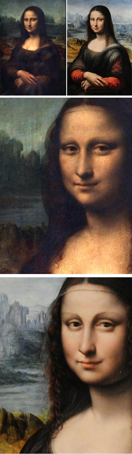
A painting in the collection of the Prado in Madrid that was long assumed to be a copy of Da Vinci’s Mona Lisa done at a later time was recently cleaned and restored, revealing a previously unseen background where there was once just dark, and on further examination is now thought to be a copy done in Leonardos’ studio by one of his pupils at the same time as the master was working on the original.If true, the painting gives us not only an insight into the master’s techniques, as it was apparently revised as Leonardo revised the original, but also reveals a clearer picture of what the original, which has not been cleaned for some time, may have looked like when originally painted.
According to The Art Newspaper, which broke the story, the scholarly paper that suggests the new placement of the painting within Leonardo’s studio at the same time as the original was presented in conjunction with the current landmark exhibition Leonardo da Vinci: painter at the Court of Milan that ends soon at the National Gallery, London.
I’ve linked to several articles below, though most source from The Art Newspaper. The LA Times has posted perhaps the best side by side image of the two paintings.
The copy by the as yet unidentified student shows us not only the brighter colors that probably lie under layers of varnish in the original, but a younger looking subject (assumed to be Lisa Gherardini).
It also makes clearer what I have long asserted to be the source of her famously “enigmatic smile” — mouth corners turned up at one end, but straight on the other [see my previous post: La Gioconda (The Mona Lisa), flipped for your viewing pleasure].
Categories:
-
1920’s Chicago promotional posters on Imprint

In a recent post to his always interesting column, J.J. Sedelmaier has written an article for Imprint on a fascinating promotional poster series in Chicago in the early 20th century: A True Visionary Gives Chicago A Landmark Branding Campaign Circa 1920-30.With the help of Dave at Poster Plus, Sedelmaier has accompanied the article with numerous examples of these beautiful posters, most of which are linked to much larger versions.
In sharp contrast to many articles you might see on the web about older posters, these are not only credited to the artists who designed them, but arranged by artist within the context of the article.
Wonderful.
Also reprinted on Salon.com as Posters that rival the London Underground.
(Images above, pairs are by the same artist: Willard Frederic Elmes, Otto Brennemann, Hazel B. Urgelles, Norman Erickson, Oscar Rabe Hanson, Robert Beebe, Arthur A. Johnson, Willard Frederic Elmes)
Categories:
-
Sean Beavers
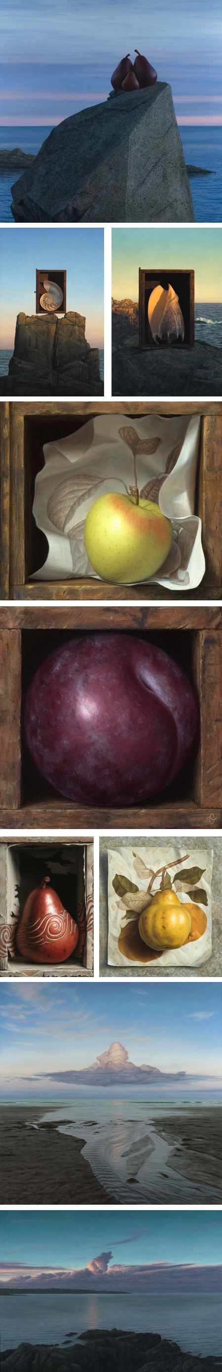
Sean Beavers is an artist who plays with context, juxtaposing his still life subjects in particular, with boxes, paintings of them resting on drawings of similar subjects, or in other backgrounds that accomplish one of the things that art does best — allowing us to see the commonplace with fresh eyes.Beavers says in his artist’s statement that he thinks of his work as symbolist, in that the subjects of his compositions represent something beyond the objects themselves, and while I don’t claim to have an understanding of the intentions behind his pieces, I do find that element of “more than meets they eye” comes through and adds to the appeal.
I particularly enjoy the series he calls “Stillscape”, in which he paints objects commonly used for still life in the context of shoreline landscapes.
Beavers also paints figurative work and landscapes. The latter tend to be spare and open, often with dramatic cloud formations as their focus.
[Via Jeffrey Hayes]
Categories:
-
Adam Hargreaves

Adam Hargreaves is an English painter whose focus is on landscape, and in particular, trees.Though not present in all of his compositions, trees are often the primary subject. Hargreaves finds special fascination in trees with gnarled, twisted trunks, roots covered in moss and wonderful textural elements that give his landscapes a great deal of presence. In a way, it almost feels as if he were doing tree portraits, so individual do some of them seem.
His work appears detailed in small reproduction, but in larger images shows as pleasingly painterly. Though his approach is never overtly impressionistic and his color palette is often muted, there are times when his compositions remind me of some of Van Gogh’s lesser known works, particularly those influenced by Japanese prints.
I personally respond strongly to visual texture in paintings, and in this characteristic, Hargreaves constantly delights. From weathered bark to soft moss to delicate patterns of leaves and branches, he seeks out the most interesting textural aspects of his scene and conveys them with tactile virtuosity.
Adam Hargreaves is the son of Roger Hargreaves, the well-known author and illustrator of the “Mr. Men” series of children’s books. Adam inherited responsibility for the line from his father, and when not painting, continues to write and illustrate books in the series.
Adam Hargreaves is represented by the Fairfax Gallery which has a selection of his work online.
On Hargreaves’ own site, there are two galleries under “Paintings”, for work from 2010, and 2009. Both come up as a slide show, but it can be stopped and thumbnails can be accessed from controls at the bottom. In the 2010 gallery, there is an additional “zoom” control. While not really a zoom feature in the usual sense, it does bring up larger versions of some of the images (as does clicking on the images themselves).
[Via ensuciando las paredes]
Categories:


Charley’s Picks
Bookshop.org
(Bookshop.org affilliate links; sales benefit independent bookshop owners; I get a small percentage to help support my work on Lines and Colors)

John Singer Sargent: Watercolors


Urban Sketching: Understanding Perspective


Charley’s Picks
Amazon
(Amazon.com affiliate links; sales go to a larger yacht for Jeff Bezos; but I get a small percentage to help support my work on Lines and Colors)
John Singer Sargent: Watercolors
Urban Sketching: Understanding Perspective