
Categories
- 3d CGI
- Amusements
- Animation
- Anime & Manga
- Art Materials
- Art Videos
- Blogroll
- Cartoons
- Color
- Comics
- Concept & Visual Dev.
- Creativity
- Digital Art
- Digital Painting
- Displaying Art on the Web
- Drawing
- Eye Candy for Today
- Gallery and Museum Art
- High-res Art Images
- Illustration
- Motion Graphics & Flash
- Museums
- Online Museums
- Outsider Art
- Painting
- Painting a Day
- Paleo Art
- Pastel, Conté & Chalk
- Pen & Ink
- Prints and Printmaking
- Reviews
- Sc-fi and Fantasy
- Sculpture & Dimensional
- Site Comments
- Sketching
- Storyboards
- Tools and Techniques
- Uncategorized
- Vector Art
- Videos & Podcasts
- Vision and Optics
- Watercolor and Gouache
- Webcomics
Archives
- May 2026
- April 2026
- March 2026
- February 2026
- January 2026
- December 2025
- November 2025
- October 2025
- September 2025
- August 2025
- July 2025
- June 2025
- May 2025
- January 2025
- December 2024
- November 2024
- October 2024
- September 2024
- August 2024
- June 2024
- April 2024
- March 2024
- February 2024
- January 2024
- December 2023
- November 2023
- October 2023
- September 2023
- August 2023
- July 2023
- May 2023
- April 2023
- March 2023
- February 2023
- January 2023
- December 2022
- November 2022
- September 2022
- August 2022
- July 2022
- June 2022
- May 2022
- April 2022
- March 2022
- February 2022
- January 2022
- December 2021
- November 2021
- October 2021
- September 2021
- August 2021
- July 2021
- June 2021
- May 2021
- April 2021
- March 2021
- February 2021
- January 2021
- December 2020
- November 2020
- October 2020
- September 2020
- August 2020
- July 2020
- June 2020
- May 2020
- April 2020
- March 2020
- February 2020
- January 2020
- December 2019
- November 2019
- October 2019
- September 2019
- August 2019
- July 2019
- June 2019
- May 2019
- April 2019
- March 2019
- February 2019
- January 2019
- December 2018
- November 2018
- October 2018
- September 2018
- August 2018
- July 2018
- June 2018
- May 2018
- April 2018
- March 2018
- February 2018
- January 2018
- December 2017
- November 2017
- October 2017
- September 2017
- August 2017
- July 2017
- June 2017
- May 2017
- April 2017
- March 2017
- February 2017
- January 2017
- December 2016
- November 2016
- October 2016
- September 2016
- August 2016
- July 2016
- June 2016
- May 2016
- April 2016
- March 2016
- February 2016
- January 2016
- December 2015
- November 2015
- October 2015
- September 2015
- August 2015
- July 2015
- June 2015
- May 2015
- April 2015
- March 2015
- February 2015
- January 2015
- December 2014
- November 2014
- October 2014
- September 2014
- August 2014
- July 2014
- June 2014
- May 2014
- April 2014
- March 2014
- February 2014
- January 2014
- December 2013
- November 2013
- October 2013
- September 2013
- August 2013
- July 2013
- June 2013
- May 2013
- April 2013
- March 2013
- February 2013
- January 2013
- December 2012
- November 2012
- October 2012
- September 2012
- August 2012
- July 2012
- June 2012
- May 2012
- April 2012
- March 2012
- February 2012
- January 2012
- December 2011
- November 2011
- October 2011
- September 2011
- August 2011
- July 2011
- June 2011
- May 2011
- April 2011
- March 2011
- February 2011
- January 2011
- December 2010
- November 2010
- October 2010
- September 2010
- August 2010
- July 2010
- June 2010
- May 2010
- April 2010
- March 2010
- February 2010
- January 2010
- December 2009
- November 2009
- October 2009
- September 2009
- August 2009
- July 2009
- June 2009
- May 2009
- April 2009
- March 2009
- February 2009
- January 2009
- December 2008
- November 2008
- October 2008
- September 2008
- August 2008
- July 2008
- June 2008
- May 2008
- April 2008
- March 2008
- February 2008
- January 2008
- December 2007
- November 2007
- October 2007
- September 2007
- August 2007
- July 2007
- June 2007
- May 2007
- April 2007
- March 2007
- February 2007
- January 2007
- December 2006
- November 2006
- October 2006
- September 2006
- August 2006
- July 2006
- June 2006
- May 2006
- April 2006
- March 2006
- February 2006
- January 2006
- December 2005
- November 2005
- October 2005
- September 2005
- August 2005
Relevant Blogs
Art, Painting & Sketch
- Gurney Journey
- Underpaintings
- Art and Influence
- Painting Perceptions
- Oil Painters of America
- Vasari Paint POV
- Flying Fox
- Urban Sketchers
- Bento (Smithsonian)
- Art Inconnu
- The Hidden Place
- Still Life
- Making a Mark
- The Art of the Landscape
- Exploring Color & Creativity
- Art Contrarian
- Artist A Day
- beinArt Surreal Art Collective
- Eye Level
- David Dunlop
- p.i.g.m.e.n.t.i.u.m
- CultureGrrl
- Joaquín Sorolla blog
- Artists in Pastel
“Painting a Day”
- A Painting a Day (Keiser)
- On Painting (Keiser)
- Julian Merrow-Smith
- Karen Jurick
- Jeffrey Hayes
- Carol Marine
- Abbey Ryan
- Daily Paintworks
Other Painting Blogs
- Virtual Gouache Land
- Neil Hollingsworth
- Marc Hanson
- Kevin Menck
- Marc Dalessio
- Larry Seiler
- Stapleton Kearns
- Colin Page
- Roos Schuring
- Hans Versfelt
- Titus Meeuws
- Régis Pettinari
- René Plein Air
- Belinda Del Pesco
- Robin Weiss
- Nathan Fowkes (Land Sketch)
- William Wray
- Frank Serrano
- Stephen Magsig
- Michael Chesley Johnson
- Twice a Week
- Sarah Wimperis
- Rob Adams
- Michael Cole Manley
- The Dirty Palette Club
- Mike Manley’s Draw!
Gallery Art & Illustration mix
Illustration
- Howard Pyle
- 100 Years of Illustration
- BibliOdyssey
- Illustration Art
- Today’s Inspiration
- Illustration Mundo
- Little Chimp Society
- Danny Gregory
- R D (John Martz
- Illustration Friday blog
- Monster Brains
- Illustrators & Illustrations (RU)
- Elwood H. Smith
- DaniDraws.com
- Designers Who Blog
- iSpot Blog
Sci-Fi & Fantasy
Illustration & Comics
Comics & Cartoons
- Comics Beat
- Robot 6
- Newsarama Blog
- Comic Vine
- Comics Alliance
- Forbidden Planet Int.
- Paolo Rivera
- Bolt City
- Flight
- Scott McCloud
- The Comics Journal
- Comixpedia
- Funnybook Babylon
- James Baker
- Middleton’s Sketchbook
- Boneville
- The Hotel Fred
- Paul Rivoche
- Daily Cartoonist
- Mad About Cartoons (William Wray)
- Digital Strips
Illustration & Concept
Animation & Concept
- Cartoon Brew
- Animation Blog
- Cold Hard Flash
- Concept Art World
- The CAB
- FY Concept Art
- Concept Ships
- Concept Robots
- John Nevarez
- Armand Serrano
- Marcos Mateu-Mestre
- all kinds of stuff (Kricfalusi)
- Yacin the faun (Man Arenas)
- Kelsey Mann
- Cre8tivemarks Blog
- Ice-Cream Monster Toon Cafe
- AAU Character & Creature Design
- AAU Animation Notes
- Articles and Texticles
Paleo & Scientific
Tools & Techniques
Other
Lists of Art Blogs
Art Image Resource Links
Historic Art Images
- Wikimedia Commons: Paintings
- Wikimedia Commons: Drawings
- The Athenaeum
- WikiArt (WikiPaintings)
- Google Art Project: Artists
- Google Art Project: Collections (Museums)
- ArtCyclopedia
- Web Gallery of Art
- Art Renewal Center
- Web Gallery of Impressionism
Auction Consolidation sites
Auction sites
- Sotheby’s
- Bonham’s
- Christies
- Heritage Auctions: Fine Art
- Heritage Auctions: Illustration
- Freeman’s Auctions
- Bukowskis
- Shannon’s
Image Search
Reverse Image Search (search by image)
- Tin Eye
- RevImg
- Google Image Search (camera icon)
- Bing Image Search (camera icon)
Promoting some friends and some clients of my website design business
- Twin Willows T’ai Chi studio in Wilmington DE. Taiji classes with Bryan Davis.
- Ray Hayward, Inspired Teacher of T’ai Chi ( Taiji ) in Minneapolis, Founder of Mindful Motion Tai Chi Academy
- OldHead Tattoo studio and Art Gallery in Wilmington DE. Tattoos and paintings by Bruce Gulick
- Sharon Domenico Art, pet portrait oil paintings
- Platinum Paperhanging, wallpaper hanging, Main Line and Philadelphia, PA
- Lisa Stone Design, interior designer, Main Line and Philadelphia, PA
- Studio12KPT, original art, prints, calendars and other custom printed items by Van Sickle & Rolleri
-
Matthias Grünewald
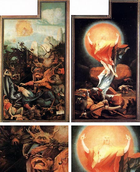
Little is known about German Renaissance painter Matthias Grünewald. Few of his paintings and drawings survive, and there is very little biographical information. His name, in fact is not even Matthias Grünewald, but Joachim von Sandrart, but his miss-identification as Grünewald by a writer in the 1600’s stuck.What is known, however, is the undeniable visual and emotional power of his work. At a time when the European artist’s role was largely in service to the church, and needed to visually impress the doctrine upon a congregation that could not read it for themselves, Grünewald’s emotionally charged images did so with a vengeance.
The images shown here are from Grünewald’s undeniable masterpiece, the Isenheim Alterpiece, originally done for the hospital chapel of Saint Anthony’s Monastery in Isenheim in the Alsace region of France, and now in the Musée d’Unterlinden in nearby Colmar near the current French German border.
The altarpiece is a multi-leveled construction, unfolding in three levels. I’ve seen it, and similar multi-leveled altarpieces, referred to as the Renaissance equivalent of hyper-media.
The top layer of 4 panels shows the crucifixion, concentrating on an agonizingly visceral portrayal of suffering. It opens into a striking series of panels portraying the nativity, some painted into a dramatically detailed trompe l’oiel architectural framework, and the stunning image of the resurrection shown above right, in which the holy aura is portrayed in almost psychedelic intensity, with the force of it hitting the soldiers in the foreground like a wave of special effects in a modern movie.
It often occurs to me that paintings like this were the equivalent of modern special effects spectacle, even more so, to a populace that often lived in harsh circumstances and would only be exposed to painted imagery in the churches.
When the second set of panels were opened, they revealed the innermost set, two panels and a sculpted relief in the center. The rightmost panel, directly under the panel of the resurrection, portrayed the temptation of St. Anthony (above, left) with an astonishing array of monstorous, demented figures that strongly recall the horrific visions of Hieronymous Bosch, another visionary artist about whom little is actually known.
Grünewald was a mystic and the symbolism and messages inherent in all of the panels are still a matter of much scholarly discussion. Ruth Mellinkoff has suggested, in fact, that Grünewald has painted Lucifer as one of the angels in attendance at the nativity. Weird and fascinating stuff.
Categories:
-
Frank Brangwyn
Frank Brangwyn was a unique and individualistic painter, water colorist, illustrator, muralist and graphic artist who is hard to categorize. Critics had difficulty classifying him while he was active and writers still have difficulty today. Unfortunately, he often unjustly winds up in the “forgotten Victorian painters” bin.From the grays of his early marine paintings, to the rich but muted colors of works inspired by his study of the Dutch masters, to the explosion of light and color that ensued when he followed the popular fascination with “Orientalism” and traveled to Turkey, Spain and Morroco, his style and palette evolved thorughout his career.
Brangwyn was extraordinarily prolific, creating some 12,000 works. In addition to paintings and watercolors, he created wonderful etchings, woodcuts and lithographs, as well as designs for architecture, interiors, ceramics, jewelry and stained glass. He did numerous book and periodical illustrations and book plates. He also designed posters and was a sought-after muralist, creating dramatic and controversial murals for notable spaces in the UK.
His murals were an inspiration to the renowned American illustrator Dean Cornwell, who took three years off to travel to England to study and work with Brangwyn before tackling his commission for the murals at the Los Angeles Public Library.
Brangwyn was also one of the artists, like Thomas Eakins, Maxfield Parrish and Elizabeth Shippen Green, to experiment early on with the use of the new medium of photography for composing studies for paintings.
His more colorful works utilized broad impressionistic brushstrokes and brilliant hues. His work was influended by, and in turn, influenced, the major art movements of his time: Victorian neo-classicism, the Pre-Raphaelites (he originally studied with William Morris), Art Nouveau and Impressionism.
He received numerous awards and prizes and was eventually knighted. When asked about his place in the art world, Brangwyn described himself simply as “a designer”.
Thanks to Carl Critchlow for the suggestion.
Categories:
-
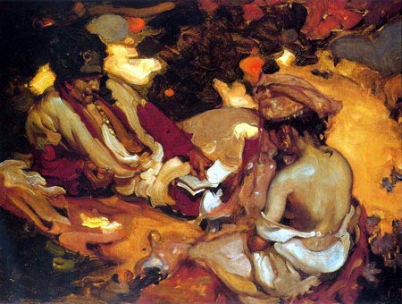
Gregory Manchess
 Gregory Manchess is one of the major illustrators in America. The fact that he is represented by Richard Solomon is a clue. His clients include Time, Newsweek, The Atlantic Monthly, Playboy, Smithsonian and The National Geographic.
He has been featured in articles in Communication Arts, Step-by-Step Graphics (now Step Into Graphics), the Artist’s Magazine and Walt Reed’s The Illustrator in America 1860-2000.
To say Manchess works in an open, painterly style may be an understatement. His broad, loaded brushstrokes define the forms with luxurious sweeping areas of color. You get the impression that he enjoys the look of the strokes themselves as design elements, the way they overlap and intersect with each other, sometimes in sharp relief.
You can see the brushstrokes and other details in the images featured on his section of the Workbook Illustration site, thanks to a Flash portfolio feature that lets you zoom way in on the images and pan around at will (image at left, bottom). For larger single images, go to his own website.
Manchess is also one of the artists featured through Solomon’s Art on a Grand Scale site which is devoted to illustrators who create work to be reproduced as digital murals.
Link and info courtesy of Jack Harris.
Categories:
-
Claude Bordeleau
 Claude Bordeleau is a Canadian illustrator, designer and cartoonist who has done work for Warner Brothers and Cartoon Networks as well as a number of other editorial and advertising clients.
Bordeleau has a springy, lively cartoon illustration style with lots of energy and color that is nicely restrained with precision linework. He uses a rich color palette and often accents his color work with touches of texture.
His site includes examples of his illustration, character design, caricature and comics work.
Note: the site contains some NSFW material.
Categories:
-
Zip and Li’l Bit (Trade Loeffler)
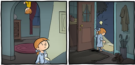
Zip and Li’l Bit is a webcomic by Trade Loeffler that is simultaneously quite modern and nicely retro. By “retro” in this case, I’m referring to newspaper comics from the early part of the 20th Century (or “Golden Age”, coinciding with the Golden Age of illustration).I say that partly because of the excellent drawing, which has echoes of classic strips, particularly in the carefully portrayed backgrounds, and partly because of the gentle, whimsical approach to characters and story. The linework on the characters, although it fits nicely with the backgrounds, is crisp and modern, owing more to Bill Watterson than McCay or McManus.
This is particularly easy to see because the strip has an absolutely wonderful feature, possible only in webcomics, that allows you to click on any panel and see it enlarged.
Loeffler also has a subtle, balanced color palette that he uses quite effectively in service of the story, always keeping the focus on the characters. The nice combination of new and traditional sensibilities, along with the artfulness and craft that goes into the strip, put me in mind of Kazu Kibuishi and Rad Sechrist.
Zip and Elizabeth (Li’l Bit) are a young brother and sister whose first adventure, The Upside-down Me features their friend Officer John and what seems to be a version of Zip who walks on the ceiling. The story takes place while everyone else is sleeping. (As an interesting side note, Zip walks around in his PJ’s, the kind with feet, that have a letter on the front; except that is seems to be a different letter in each panel.)
The project was originally planned as a printed graphic story, but Loeffler has repurposed it as a webcomic and is posting pages twice weekly, on Thursdays and Sundays.
There are only 11 pages posted as of this writing, but the strip is beginning to get some well-deserved attention, already garnering mentions on Bolt City and Drawn!.
Categories:
-
Illustration Mundo
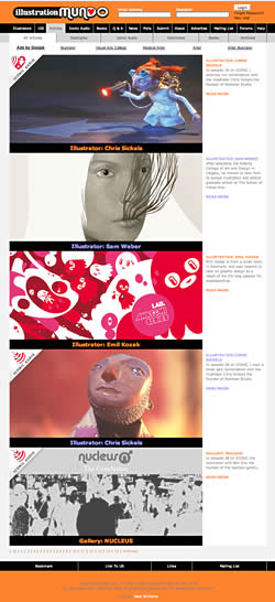 Illustration Mundo is a portal/blog (for lack of better terms) devoted to illustration. It was created by Illustrator Nate Williams because he felt the lack of a portal site specifically for illustration (as opposed to those which included design, photography, film, etc. as well as illustration).
The site has recently incorporated Erik Olsen’s illustration podcast blog Iconic, which features interviews with working illustrators with a focus on their working process. This is a fascinating angle on illustration that is seldom encountered, hearing the artists comment on their work and process in their own words.
If you find the main page a bit overwhelming in terms of selections, the site can be accessed in several ways through the navigation at the top. The Articles tab gives you the main articles arranged in reverse chronological order like most blogs (image at left), and you can sort into spotlighted articles, Iconic Audio, print Interviews and so on.
The articles are brief, but usually showcase several pieces by the illustrator and, if available, some personal photos. The podcasts that have now moved over to Illustration Mundo from the Iconic site are marked by an icon (what else?) in the upper left. There are also tabs for News and community oriented features like Polls and Forums.
On the About page, Williams and Olson invite you to become involved and encourage you to submit news, participate in the forums and place your work in the Illustrator Database. Most of the articles also allow for comments in the usual fashion for blogs.
The site also uses a “Favorites” and “User Rating” system to rate the illustrators in the database (by votes, clicks, most tagged as favorites, etc.). I’ve seen this feature on CGI portals and I’m still dubious about the value of such systems. It may help you find something others like and it may cause you to miss things.
You might actually do better with a feature like Illustration Mundo’s “100” tab, which serves up 100 random illustrators, with links to their websites, arranged simply as squares captured from their images.
Categories:


Charley’s Picks
Bookshop.org
(Bookshop.org affilliate links; sales benefit independent bookshop owners; I get a small percentage to help support my work on Lines and Colors)

John Singer Sargent: Watercolors


Urban Sketching: Understanding Perspective


Charley’s Picks
Amazon
(Amazon.com affiliate links; sales go to a larger yacht for Jeff Bezos; but I get a small percentage to help support my work on Lines and Colors)
John Singer Sargent: Watercolors
Urban Sketching: Understanding Perspective