
Categories
- 3d CGI
- Amusements
- Animation
- Anime & Manga
- Art Materials
- Art Videos
- Blogroll
- Cartoons
- Color
- Comics
- Concept & Visual Dev.
- Creativity
- Digital Art
- Digital Painting
- Displaying Art on the Web
- Drawing
- Eye Candy for Today
- Gallery and Museum Art
- High-res Art Images
- Illustration
- Motion Graphics & Flash
- Museums
- Online Museums
- Outsider Art
- Painting
- Painting a Day
- Paleo Art
- Pastel, Conté & Chalk
- Pen & Ink
- Prints and Printmaking
- Reviews
- Sc-fi and Fantasy
- Sculpture & Dimensional
- Site Comments
- Sketching
- Storyboards
- Tools and Techniques
- Uncategorized
- Vector Art
- Videos & Podcasts
- Vision and Optics
- Watercolor and Gouache
- Webcomics
Archives
- May 2026
- April 2026
- March 2026
- February 2026
- January 2026
- December 2025
- November 2025
- October 2025
- September 2025
- August 2025
- July 2025
- June 2025
- May 2025
- January 2025
- December 2024
- November 2024
- October 2024
- September 2024
- August 2024
- June 2024
- April 2024
- March 2024
- February 2024
- January 2024
- December 2023
- November 2023
- October 2023
- September 2023
- August 2023
- July 2023
- May 2023
- April 2023
- March 2023
- February 2023
- January 2023
- December 2022
- November 2022
- September 2022
- August 2022
- July 2022
- June 2022
- May 2022
- April 2022
- March 2022
- February 2022
- January 2022
- December 2021
- November 2021
- October 2021
- September 2021
- August 2021
- July 2021
- June 2021
- May 2021
- April 2021
- March 2021
- February 2021
- January 2021
- December 2020
- November 2020
- October 2020
- September 2020
- August 2020
- July 2020
- June 2020
- May 2020
- April 2020
- March 2020
- February 2020
- January 2020
- December 2019
- November 2019
- October 2019
- September 2019
- August 2019
- July 2019
- June 2019
- May 2019
- April 2019
- March 2019
- February 2019
- January 2019
- December 2018
- November 2018
- October 2018
- September 2018
- August 2018
- July 2018
- June 2018
- May 2018
- April 2018
- March 2018
- February 2018
- January 2018
- December 2017
- November 2017
- October 2017
- September 2017
- August 2017
- July 2017
- June 2017
- May 2017
- April 2017
- March 2017
- February 2017
- January 2017
- December 2016
- November 2016
- October 2016
- September 2016
- August 2016
- July 2016
- June 2016
- May 2016
- April 2016
- March 2016
- February 2016
- January 2016
- December 2015
- November 2015
- October 2015
- September 2015
- August 2015
- July 2015
- June 2015
- May 2015
- April 2015
- March 2015
- February 2015
- January 2015
- December 2014
- November 2014
- October 2014
- September 2014
- August 2014
- July 2014
- June 2014
- May 2014
- April 2014
- March 2014
- February 2014
- January 2014
- December 2013
- November 2013
- October 2013
- September 2013
- August 2013
- July 2013
- June 2013
- May 2013
- April 2013
- March 2013
- February 2013
- January 2013
- December 2012
- November 2012
- October 2012
- September 2012
- August 2012
- July 2012
- June 2012
- May 2012
- April 2012
- March 2012
- February 2012
- January 2012
- December 2011
- November 2011
- October 2011
- September 2011
- August 2011
- July 2011
- June 2011
- May 2011
- April 2011
- March 2011
- February 2011
- January 2011
- December 2010
- November 2010
- October 2010
- September 2010
- August 2010
- July 2010
- June 2010
- May 2010
- April 2010
- March 2010
- February 2010
- January 2010
- December 2009
- November 2009
- October 2009
- September 2009
- August 2009
- July 2009
- June 2009
- May 2009
- April 2009
- March 2009
- February 2009
- January 2009
- December 2008
- November 2008
- October 2008
- September 2008
- August 2008
- July 2008
- June 2008
- May 2008
- April 2008
- March 2008
- February 2008
- January 2008
- December 2007
- November 2007
- October 2007
- September 2007
- August 2007
- July 2007
- June 2007
- May 2007
- April 2007
- March 2007
- February 2007
- January 2007
- December 2006
- November 2006
- October 2006
- September 2006
- August 2006
- July 2006
- June 2006
- May 2006
- April 2006
- March 2006
- February 2006
- January 2006
- December 2005
- November 2005
- October 2005
- September 2005
- August 2005
Relevant Blogs
Art, Painting & Sketch
- Gurney Journey
- Underpaintings
- Art and Influence
- Painting Perceptions
- Oil Painters of America
- Vasari Paint POV
- Flying Fox
- Urban Sketchers
- Bento (Smithsonian)
- Art Inconnu
- The Hidden Place
- Still Life
- Making a Mark
- The Art of the Landscape
- Exploring Color & Creativity
- Art Contrarian
- Artist A Day
- beinArt Surreal Art Collective
- Eye Level
- David Dunlop
- p.i.g.m.e.n.t.i.u.m
- CultureGrrl
- Joaquín Sorolla blog
- Artists in Pastel
“Painting a Day”
- A Painting a Day (Keiser)
- On Painting (Keiser)
- Julian Merrow-Smith
- Karen Jurick
- Jeffrey Hayes
- Carol Marine
- Abbey Ryan
- Daily Paintworks
Other Painting Blogs
- Virtual Gouache Land
- Neil Hollingsworth
- Marc Hanson
- Kevin Menck
- Marc Dalessio
- Larry Seiler
- Stapleton Kearns
- Colin Page
- Roos Schuring
- Hans Versfelt
- Titus Meeuws
- Régis Pettinari
- René Plein Air
- Belinda Del Pesco
- Robin Weiss
- Nathan Fowkes (Land Sketch)
- William Wray
- Frank Serrano
- Stephen Magsig
- Michael Chesley Johnson
- Twice a Week
- Sarah Wimperis
- Rob Adams
- Michael Cole Manley
- The Dirty Palette Club
- Mike Manley’s Draw!
Gallery Art & Illustration mix
Illustration
- Howard Pyle
- 100 Years of Illustration
- BibliOdyssey
- Illustration Art
- Today’s Inspiration
- Illustration Mundo
- Little Chimp Society
- Danny Gregory
- R D (John Martz
- Illustration Friday blog
- Monster Brains
- Illustrators & Illustrations (RU)
- Elwood H. Smith
- DaniDraws.com
- Designers Who Blog
- iSpot Blog
Sci-Fi & Fantasy
Illustration & Comics
Comics & Cartoons
- Comics Beat
- Robot 6
- Newsarama Blog
- Comic Vine
- Comics Alliance
- Forbidden Planet Int.
- Paolo Rivera
- Bolt City
- Flight
- Scott McCloud
- The Comics Journal
- Comixpedia
- Funnybook Babylon
- James Baker
- Middleton’s Sketchbook
- Boneville
- The Hotel Fred
- Paul Rivoche
- Daily Cartoonist
- Mad About Cartoons (William Wray)
- Digital Strips
Illustration & Concept
Animation & Concept
- Cartoon Brew
- Animation Blog
- Cold Hard Flash
- Concept Art World
- The CAB
- FY Concept Art
- Concept Ships
- Concept Robots
- John Nevarez
- Armand Serrano
- Marcos Mateu-Mestre
- all kinds of stuff (Kricfalusi)
- Yacin the faun (Man Arenas)
- Kelsey Mann
- Cre8tivemarks Blog
- Ice-Cream Monster Toon Cafe
- AAU Character & Creature Design
- AAU Animation Notes
- Articles and Texticles
Paleo & Scientific
Tools & Techniques
Other
Lists of Art Blogs
Art Image Resource Links
Historic Art Images
- Wikimedia Commons: Paintings
- Wikimedia Commons: Drawings
- The Athenaeum
- WikiArt (WikiPaintings)
- Google Art Project: Artists
- Google Art Project: Collections (Museums)
- ArtCyclopedia
- Web Gallery of Art
- Art Renewal Center
- Web Gallery of Impressionism
Auction Consolidation sites
Auction sites
- Sotheby’s
- Bonham’s
- Christies
- Heritage Auctions: Fine Art
- Heritage Auctions: Illustration
- Freeman’s Auctions
- Bukowskis
- Shannon’s
Image Search
Reverse Image Search (search by image)
- Tin Eye
- RevImg
- Google Image Search (camera icon)
- Bing Image Search (camera icon)
Promoting some friends and some clients of my website design business
- Twin Willows T’ai Chi studio in Wilmington DE. Taiji classes with Bryan Davis.
- Ray Hayward, Inspired Teacher of T’ai Chi ( Taiji ) in Minneapolis, Founder of Mindful Motion Tai Chi Academy
- OldHead Tattoo studio and Art Gallery in Wilmington DE. Tattoos and paintings by Bruce Gulick
- Sharon Domenico Art, pet portrait oil paintings
- Platinum Paperhanging, wallpaper hanging, Main Line and Philadelphia, PA
- Lisa Stone Design, interior designer, Main Line and Philadelphia, PA
- Studio12KPT, original art, prints, calendars and other custom printed items by Van Sickle & Rolleri
-
David J. Teter
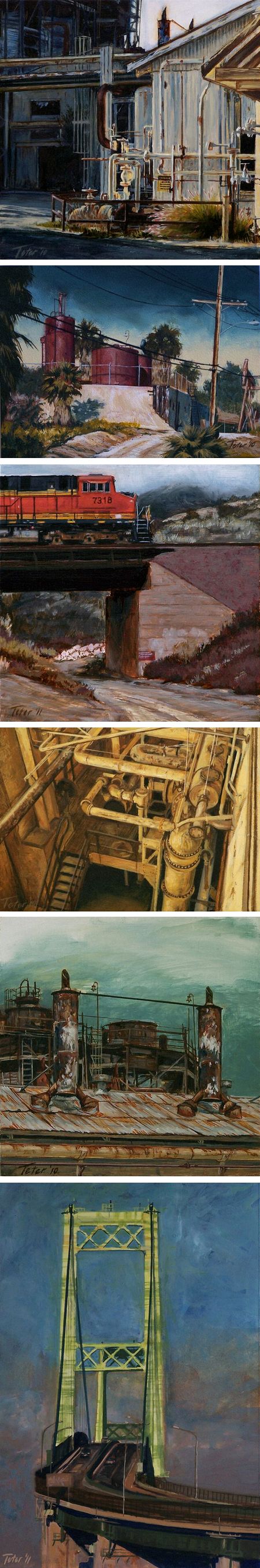
In his most recent work painter David J. Teter takes a particular interest in the rough textures and muted colors of the industrial landscape.Subjects like rusty sheet metal structures, corroded storage tanks and weathered railroad abutments give his compositions a strong geometry, and his controlled palette, often emphasized by the low value contrasts of overcast days, makes the textural aspects of his subjects more prominent.
Teter studied illustration at the Art Center College of Design in Pasedena, but has shifted his focus to gallery art. In addition to his industrial landscapes, his subjects include landscape, cityscape, seascape and figure.
Teter doesn’t have a website, but maintains an active blog titled Avid Art. You can browse through subjects for paintings within the blog posts by clicking on subject labels like “industrial painting” in the right sidebar of the blog.
In addition you can find his work on the sites of galleries in which he is represented, including Horizon Fine Art in Jackson, WY and the Randy Higbee Gallery in Costa Mesa, CA.
Teter’s work is currently the focus of a solo show at the Randy Higbee Gallery that is on view until October 14th, 2011.
Categories:
-
Sketchtravel completed

Sketchtravel is a project started by illustrators Gérald Guerlais and Daisuke (“Dice”) Tsutsumi in 2006 in which a single sketchbook has traveled around the world, being handed from artist to artist between 70 artists in 15 cities, each adding a single page to the whole.The project, which involves well known illustrators, animators and comics artists, benefits Room to Read, an international non-profit devoted to children’s literacy.
The sketchbook was completed by its final contributor, Hayao Miyazaki, in February. The first print edition has just been released in French and is now available on Amazon.fr. English and Japanese editions are planned, though there are no firm details yet.
The sketchbook itself will be auctioned off in Paris, and online, by Pierre berge & Associes on October 17, 2011. Details for the online auction, as well as other information, will be found on the new Sketchtravel website.
Designed by Seth Van Booven, the website itself it entertaining, with parts of the interface animating as you scroll down the page. There is also an impressive list of the contributors, with links to their websites or blogs.
Unfortunately the virtual version of the sketchbook that used to be available on the old site seems to be gone, but you can see more images of pages from the book on the Sketchtravel blog, along with interviews and additional features.
There is also a video trailer for a planned documentary about the project by Catherine Bonvalot available on Sketchtravel.tv.
For more, see my 2007 post on Sketchtravel.
(Images above: Greg Couch, Terada Katsuya, Sylvain Marc, Peter de Séve, Jerome Opena, Erik Tiemens)
Categories:
-
Su Blackwell

Books, we are told, are on the way out — soon to be replaced by iPads and other widgets, complete with fake page-flipping gimmicks to assure us that we are in fact, still reading a book.We’ll forget for the moment that movies were supposed to be the death of books, just as surely as TV was to be the death of movies and the internet the death of TV, and assume the pundits are correct. So what to do with the remaining dead-tree editions?
UK artist and art director Su Blackwell has one answer, in the form of beautiful cut-book sculptures.
She cuts the pages with a scalpel, forming the printed paper into various forms. Some are elaborate scenes, sitting atop the books from which they were formed, some as simple as flowers in which the ink from the printed lines is arranged to form the dark-hued edges of the blossoms. Some are arranged as dioramas in wooden and glass cases, at times theatrically lit.
In addition to her website, Blackwell also maintins a blog in which she lists upcoming exhibitions and installations.
Her themes frequently seem to be of fantasy, escape, freedom or enchantment — apt for the medium that has so long captured the ephemeral; even if the medium itself were to become ephemeral.
[Via A White Carousel by way of Sean Cowen and Eric Orchard]
Categories:
-
Oldenberg’s Paint Torch at PAFA
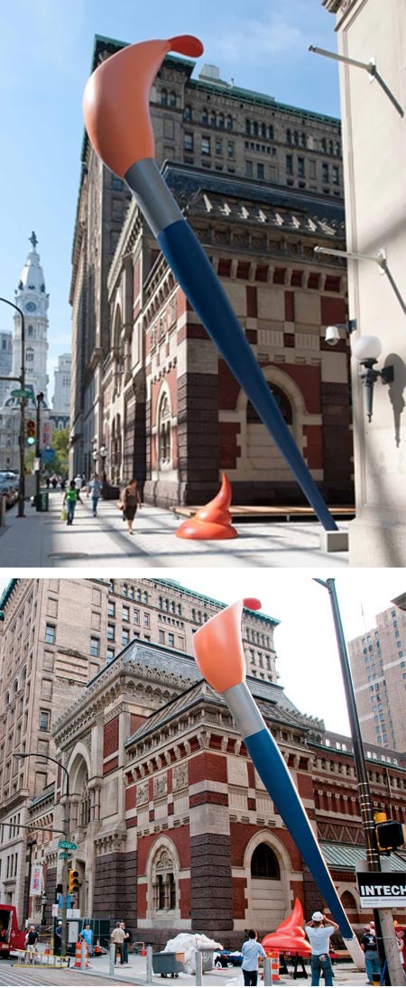
When I was a student at the Pennsylvania Academy of the Fine Arts in the 1970’s there were two factions in the school, traditionalists and modernists.Those of us, both faculty and students, who were in the traditionalist faction thought the Academy, of all places, should be bastion of academic art tradition, steeped in the teachings of Eakins and his predecessors. Those in the the modernist faction thought our values hopelessly irrelevant, just as we thought theirs spurious and insubstantial.
Times have, of course, changed somewhat; traditionalism and modernism seem to be in a kind of uneasy détente in the art world as traditional values and representational art have been reestablishing their prominence, and the Academy is perhaps a prime example of the current mix.
That mixture has become evident on the outside of the venerable school and museum as well as the inside, with the creation of the Lenfest Plaza, a reclaimed section of Cherry Street in Philadelphia, linking the Samuel M. V. Hamilton building, where most classes are now conducted, with the Academy’s Landmark building, an architectural marvel from the mind of Victorian era American architect Frank Furness that has been the Academy’s main building for most of its history.
The plaza gives the Academy a “campus” of sorts for the first time in its history (when I was there, the majority of classes were in a building called the “Peale House”, named for Charles Wilson Peale and located several blocks away form the Academy’s main building).
The centerpiece of the new plaza is the “Paint Torch”, a new large scale sculpture by modernist sculptor Claes Oldenberg.
Those who have been reading Lines and Colors for some time will know that I am generally not enthused about post-war modernism (i.e. American modernism), but there are exceptions and Oldenberg is one of them; partly because his sculptures of giant household objects are hilarious, and a breath of fresh air among modernists who take themselves way too seriously, and partly because they accomplish what I think art does for us at its best, allowing us to see the world around us, and the objects we take for granted, with fresh eyes.
Oldenberg’s Paint Torch is a 51ft (15m) high paintbrush, hanging out over the Broad Street sidewalk at a 60° angle, complete with a 6ft (2m) high dropped dollop of paint. It’s called the “Paint Torch” because the brush will light up at night, for the first time tonight, October 1, 2011.
The Academy is celebrating with a day long “Party on the Plaza” which is free and open to the public, as is the Academy’s superb museum of American art today.
As usual, Oldenberg’s work, and its placement, is stirring up a little controversy, but this is one hidebound traditionalist Academy alumni who likes it just fine.
(Photographs from PAFA)
[Addendum: photos from the event, as well as another good photo of the Paint Torch on the OLIN blog as well as extensive PAFA Flickr set.]
Categories:
-
Flesk Prime

I’ve written before about Flesk Publications, a small specialty art book publisher that concentrates on presenting illustrators and comics artists. Among the artists are many that I’ve featured here on Lines and Colors.Flesk has published a book called Flesk Prime in which five artists are highlighted in the same volume. Four are artists who have been featured in previous dedicated books: William Stout, Petar Meseldžija, Mark Schultz and Gary Gianni (links to my posts); one, Craig Elliott, is the subject of an upcoming title.
The book serves both as an introduction to those artists and as a kind of sampler and introduction to the Flesk line of books — in that the artists exemplify the kind of terrific and often underappreciated talent Flesk spotlights, and the book’s beautiful production values are consistent with the publisher’s consistently high standards.
Flesk Prime also serves as an art book on its own, a beautiful selection of work from five talented illustrators and comics artists. For those like me who already have many of the books in the Flesk line, the features and images are not redundant, each showcasing work that has not appeared in the publisher’s other volumes on these artists.
Unfortunately, the previews of the book on the Flesk site, while they do give you an idea of the book’s appearance, don’t show the artwork itself to best advantage and don’t do the book justice (though the images certainly look better there than in the limited space I have to show them above). If you’re not familiar with these artists, you would do better to look through the site for the individual volumes on them for better examples of their work.
Flesk Prime is available through the Flesk Publications store.
Categories:
-
Régis Loisel
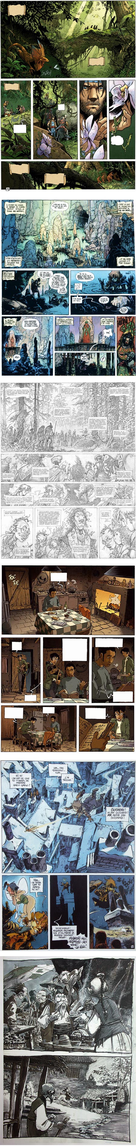
One of the most renowned and influential French comics artists, Régis Loisel is known in particular for his work in the fantasy genre. Along with Jean Giraud (“Moebius”) and several other pioneers, he helped set the stylistic standards that became the foundation of Franco-Belgian comics (“bandes desinees”) from the mid 20th century to today.Most comics readers here in the US, despite the fascination with Japanese manga in some circles, aren’t aware of how vibrant (and different) the comics scene is in other parts of the world, like France, Belgium, the UK, Italy and South America.
Loisel is perhaps best known for his work on La Quete de l’Oiseau du Temps (“The Quest for the Time Bird”, published at one point in English as Roxanna and The Quest for the Time Bird), a multi-volume fantasy epic written by Serge Le Tendre.
Loisel worked on numerous short projects, as well as the multi-volume series Le Grand Mort and a striking adaptation of Peter Pan (images above, second from bottom). He also did visual development art for the Disney animated features Mulan (above, bottom) and Atlantis.
His comics pages manage to feel detailed and open at the same time, with passages of intense detail balanced by well spotted blacks and flat areas of color, all used to dramatic effect. He has a wonderful command of the environments in which he places his characters, both natural and architectural.
He uses visual texture to great advantage in creating atmosphere, mood and a sense of scale and distance, as well as controlling how long the reader’s eye lingers on a given panel,
Loisel’s website, though in French, is easy enough for non-French speakers to navigate. The major comics series, Peter Pan, La Quete de l’Oiseau du Temps and Le Grand Mort, each have a drop down menu to pages about each volume in the series. These are usually accompanied by a few sample pages that open in pop-ups.
Some of the volumes, in particular La Quete de l’Oiseau du Temps volumes 7 and 5 have more extensive previews. Volume 5 is supplemented with images of pages in their penciled or inked states in addition to finished art.
I find Loisel’s pencil drawings for comics pages particularly appealing; even though they are intended to be finished in ink and printed in color, they have a wonderful quality just as pencil drawings.
You can sometimes find Loisel’s comics albums on Amazon.com, both in English and in French, as well as through importers like Stuart Ng Books.
You can find larger images of some of Loisel’s pages from Peter Pan, along with samples of his visual development drawings for Mulan on Animation Treasures: One1More2time3’s Weblog, the superb blog of Hans Bacher.
Bacher is the production designer who, while working on Mulan, suggested to producer Pam Coats that he bring Loisel in on the project. Bacher has an excellent series of posts on Loisel and his work.
You can also find some larger images of pages from Le Grand Mort on Vincent Mallié’s site (also here, here, here and here)
Categories:


Charley’s Picks
Bookshop.org
(Bookshop.org affilliate links; sales benefit independent bookshop owners; I get a small percentage to help support my work on Lines and Colors)

John Singer Sargent: Watercolors


Urban Sketching: Understanding Perspective


.jpg)
Charley’s Picks
Amazon
(Amazon.com affiliate links; sales go to a larger yacht for Jeff Bezos; but I get a small percentage to help support my work on Lines and Colors)
John Singer Sargent: Watercolors
Urban Sketching: Understanding Perspective