
Categories
- 3d CGI
- Amusements
- Animation
- Anime & Manga
- Art Materials
- Art Videos
- Blogroll
- Cartoons
- Color
- Comics
- Concept & Visual Dev.
- Creativity
- Digital Art
- Digital Painting
- Displaying Art on the Web
- Drawing
- Eye Candy for Today
- Gallery and Museum Art
- High-res Art Images
- Illustration
- Motion Graphics & Flash
- Museums
- Online Museums
- Outsider Art
- Painting
- Painting a Day
- Paleo Art
- Pastel, Conté & Chalk
- Pen & Ink
- Prints and Printmaking
- Reviews
- Sc-fi and Fantasy
- Sculpture & Dimensional
- Site Comments
- Sketching
- Storyboards
- Tools and Techniques
- Uncategorized
- Vector Art
- Videos & Podcasts
- Vision and Optics
- Watercolor and Gouache
- Webcomics
Archives
- May 2026
- April 2026
- March 2026
- February 2026
- January 2026
- December 2025
- November 2025
- October 2025
- September 2025
- August 2025
- July 2025
- June 2025
- May 2025
- January 2025
- December 2024
- November 2024
- October 2024
- September 2024
- August 2024
- June 2024
- April 2024
- March 2024
- February 2024
- January 2024
- December 2023
- November 2023
- October 2023
- September 2023
- August 2023
- July 2023
- May 2023
- April 2023
- March 2023
- February 2023
- January 2023
- December 2022
- November 2022
- September 2022
- August 2022
- July 2022
- June 2022
- May 2022
- April 2022
- March 2022
- February 2022
- January 2022
- December 2021
- November 2021
- October 2021
- September 2021
- August 2021
- July 2021
- June 2021
- May 2021
- April 2021
- March 2021
- February 2021
- January 2021
- December 2020
- November 2020
- October 2020
- September 2020
- August 2020
- July 2020
- June 2020
- May 2020
- April 2020
- March 2020
- February 2020
- January 2020
- December 2019
- November 2019
- October 2019
- September 2019
- August 2019
- July 2019
- June 2019
- May 2019
- April 2019
- March 2019
- February 2019
- January 2019
- December 2018
- November 2018
- October 2018
- September 2018
- August 2018
- July 2018
- June 2018
- May 2018
- April 2018
- March 2018
- February 2018
- January 2018
- December 2017
- November 2017
- October 2017
- September 2017
- August 2017
- July 2017
- June 2017
- May 2017
- April 2017
- March 2017
- February 2017
- January 2017
- December 2016
- November 2016
- October 2016
- September 2016
- August 2016
- July 2016
- June 2016
- May 2016
- April 2016
- March 2016
- February 2016
- January 2016
- December 2015
- November 2015
- October 2015
- September 2015
- August 2015
- July 2015
- June 2015
- May 2015
- April 2015
- March 2015
- February 2015
- January 2015
- December 2014
- November 2014
- October 2014
- September 2014
- August 2014
- July 2014
- June 2014
- May 2014
- April 2014
- March 2014
- February 2014
- January 2014
- December 2013
- November 2013
- October 2013
- September 2013
- August 2013
- July 2013
- June 2013
- May 2013
- April 2013
- March 2013
- February 2013
- January 2013
- December 2012
- November 2012
- October 2012
- September 2012
- August 2012
- July 2012
- June 2012
- May 2012
- April 2012
- March 2012
- February 2012
- January 2012
- December 2011
- November 2011
- October 2011
- September 2011
- August 2011
- July 2011
- June 2011
- May 2011
- April 2011
- March 2011
- February 2011
- January 2011
- December 2010
- November 2010
- October 2010
- September 2010
- August 2010
- July 2010
- June 2010
- May 2010
- April 2010
- March 2010
- February 2010
- January 2010
- December 2009
- November 2009
- October 2009
- September 2009
- August 2009
- July 2009
- June 2009
- May 2009
- April 2009
- March 2009
- February 2009
- January 2009
- December 2008
- November 2008
- October 2008
- September 2008
- August 2008
- July 2008
- June 2008
- May 2008
- April 2008
- March 2008
- February 2008
- January 2008
- December 2007
- November 2007
- October 2007
- September 2007
- August 2007
- July 2007
- June 2007
- May 2007
- April 2007
- March 2007
- February 2007
- January 2007
- December 2006
- November 2006
- October 2006
- September 2006
- August 2006
- July 2006
- June 2006
- May 2006
- April 2006
- March 2006
- February 2006
- January 2006
- December 2005
- November 2005
- October 2005
- September 2005
- August 2005
Relevant Blogs
Art, Painting & Sketch
- Gurney Journey
- Underpaintings
- Art and Influence
- Painting Perceptions
- Oil Painters of America
- Vasari Paint POV
- Flying Fox
- Urban Sketchers
- Bento (Smithsonian)
- Art Inconnu
- The Hidden Place
- Still Life
- Making a Mark
- The Art of the Landscape
- Exploring Color & Creativity
- Art Contrarian
- Artist A Day
- beinArt Surreal Art Collective
- Eye Level
- David Dunlop
- p.i.g.m.e.n.t.i.u.m
- CultureGrrl
- Joaquín Sorolla blog
- Artists in Pastel
“Painting a Day”
- A Painting a Day (Keiser)
- On Painting (Keiser)
- Julian Merrow-Smith
- Karen Jurick
- Jeffrey Hayes
- Carol Marine
- Abbey Ryan
- Daily Paintworks
Other Painting Blogs
- Virtual Gouache Land
- Neil Hollingsworth
- Marc Hanson
- Kevin Menck
- Marc Dalessio
- Larry Seiler
- Stapleton Kearns
- Colin Page
- Roos Schuring
- Hans Versfelt
- Titus Meeuws
- Régis Pettinari
- René Plein Air
- Belinda Del Pesco
- Robin Weiss
- Nathan Fowkes (Land Sketch)
- William Wray
- Frank Serrano
- Stephen Magsig
- Michael Chesley Johnson
- Twice a Week
- Sarah Wimperis
- Rob Adams
- Michael Cole Manley
- The Dirty Palette Club
- Mike Manley’s Draw!
Gallery Art & Illustration mix
Illustration
- Howard Pyle
- 100 Years of Illustration
- BibliOdyssey
- Illustration Art
- Today’s Inspiration
- Illustration Mundo
- Little Chimp Society
- Danny Gregory
- R D (John Martz
- Illustration Friday blog
- Monster Brains
- Illustrators & Illustrations (RU)
- Elwood H. Smith
- DaniDraws.com
- Designers Who Blog
- iSpot Blog
Sci-Fi & Fantasy
Illustration & Comics
Comics & Cartoons
- Comics Beat
- Robot 6
- Newsarama Blog
- Comic Vine
- Comics Alliance
- Forbidden Planet Int.
- Paolo Rivera
- Bolt City
- Flight
- Scott McCloud
- The Comics Journal
- Comixpedia
- Funnybook Babylon
- James Baker
- Middleton’s Sketchbook
- Boneville
- The Hotel Fred
- Paul Rivoche
- Daily Cartoonist
- Mad About Cartoons (William Wray)
- Digital Strips
Illustration & Concept
Animation & Concept
- Cartoon Brew
- Animation Blog
- Cold Hard Flash
- Concept Art World
- The CAB
- FY Concept Art
- Concept Ships
- Concept Robots
- John Nevarez
- Armand Serrano
- Marcos Mateu-Mestre
- all kinds of stuff (Kricfalusi)
- Yacin the faun (Man Arenas)
- Kelsey Mann
- Cre8tivemarks Blog
- Ice-Cream Monster Toon Cafe
- AAU Character & Creature Design
- AAU Animation Notes
- Articles and Texticles
Paleo & Scientific
Tools & Techniques
Other
Lists of Art Blogs
Art Image Resource Links
Historic Art Images
- Wikimedia Commons: Paintings
- Wikimedia Commons: Drawings
- The Athenaeum
- WikiArt (WikiPaintings)
- Google Art Project: Artists
- Google Art Project: Collections (Museums)
- ArtCyclopedia
- Web Gallery of Art
- Art Renewal Center
- Web Gallery of Impressionism
Auction Consolidation sites
Auction sites
- Sotheby’s
- Bonham’s
- Christies
- Heritage Auctions: Fine Art
- Heritage Auctions: Illustration
- Freeman’s Auctions
- Bukowskis
- Shannon’s
Image Search
Reverse Image Search (search by image)
- Tin Eye
- RevImg
- Google Image Search (camera icon)
- Bing Image Search (camera icon)
Promoting some friends and some clients of my website design business
- Twin Willows T’ai Chi studio in Wilmington DE. Taiji classes with Bryan Davis.
- Ray Hayward, Inspired Teacher of T’ai Chi ( Taiji ) in Minneapolis, Founder of Mindful Motion Tai Chi Academy
- OldHead Tattoo studio and Art Gallery in Wilmington DE. Tattoos and paintings by Bruce Gulick
- Sharon Domenico Art, pet portrait oil paintings
- Platinum Paperhanging, wallpaper hanging, Main Line and Philadelphia, PA
- Lisa Stone Design, interior designer, Main Line and Philadelphia, PA
- Studio12KPT, original art, prints, calendars and other custom printed items by Van Sickle & Rolleri
-
Don Kenn
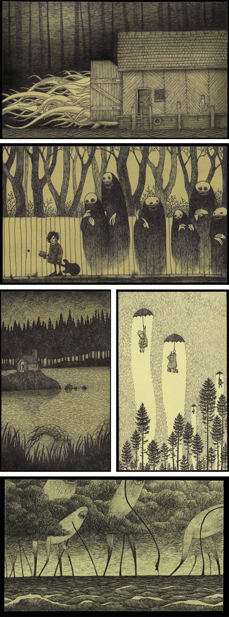
Don Kenn (whose blog also confusingly lists him as John Kenn) is a Danish writer and director of childrens’ television shows. In his limited spare time he draws “Monsterdrawings” on Post-It notes; as he describes them “…a little window into a different world, made on office supplies”.The drawings, of ghouls and ghosts, sea monsters and living islands, haunted woods and city streets, combine the imaginative ramblings of doodles with a technique of hatching tones and range of atmosphere and effect reminiscent of Edward Gorey.
Kenn often juxtaposes passages of dense hatching with areas of open space, to excellent effect.
I understand the fun of using unusual art supplies like Post-It notes, and I certainly understand the appeal of off-white drawing surfaces, because I prefer them myself; but I think Kenn’s Monsterdrawings are too good to be wasted on non-archival materials.
I would love to suggest the nicely off-white Strathmore Series #400 sketchpads and the Sakura Pigma Micron markers I described in my post on My Pocket Rembrandt.
At the very least, somebody give the man a Moleskine.
[Via Sandbox World]
Categories:
-
Mark Summers (update)
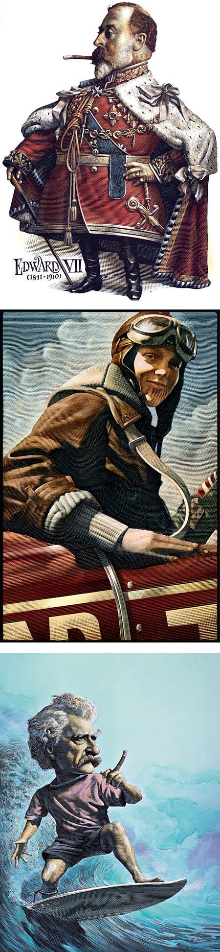
I have long been fascinated by pen and ink drawing, and its mirror world cousin, scratchboard.Both are demanding mediums, but scratchboard is additionally difficult in that the unfamiliarity of working by subtraction rather than addition takes some practice, as well a mental shift (in common with some printmaking techniques); but the rewards are a kind of textural quality and visual appeal unlike any other medium.
There are some excellent contemporary scratchboard artists carrying forward the tradition; perhaps the best known and most accomplished of which is Canadian illustrator Mark Summers.
Summers combines superb draftsmanship, a talent for whimsey and humorous exaggeration and a knack for likenesses, both contemporary and historic, with a flair that have made his unique illustrations in demand and a common sight for readers of Time, Rolling Stone, The Atlantic Monthly, Sports Illustrated, The New York Times Book Review and numerous other publications and a range of book publishers an corporate clients.
He has received awards form the Society of Illustrators and been featured in juried shows, collections and publications like Step by Step Graphics, Communication Arts, Print and Applied Arts.
If you are a book lover, you may in remember his wonderful series of literary portraits that were prominent in Barnes and Noble bookstores a few years ago (I particularly loved his portrayals of Edgar Allan Poe).
Summers was born in Ontario and studied a the Ontario College of Art. He was introduced to scratchboard by Duncan Macpherson, an editorial cartoonist who drew for the Montreal Standard and the Toronto Star.
Summers doesn’t have a dedicated website, but since I last wrote about him in 2007, a new resource for viewing his art has become available. In addition to the portfolio on the site of his artist’s representative, Richard Solomon, and his portfolio on The iSpot, he now has a presence on the relatively new Behance Network.
In the latter you will find a section of delightfully Wicked Portraits, with Summers’ portrayals of notorious heavies from history, such as Edward VII (image above, top), in the company of such cheery chums as Torquemada, Rasputin, Genghis Kahn and Atilla the Hun.
In these and many of his recent illustrations, he enlivens his scratchboard drawings with tones of watercolor and sometimes oil glazes. There is a step through and description of his working process on the Richard Solomon site, and the same process is also shown a little larger at the bottom of this page on the Behance site. In addition, Summers has left a few replies to comments on my earlier post about his work with answers to questions about his technique.
Summers’ illustrations are featured in a new book, Vanity Fair’s Presidential Profiles: Defining Portraits, Deeds, and Misdeeds of 43 Notable Americans–And What Each One Really Thought About His Predecessor.
Categories:
-
Kenn Backhaus

Kenn Backhaus is a contemporary realist painter who is a Signature Member of Oil Painters of America and past president of Plein Air Painters of America.Backhaus was one of the painters featured in the 2007 PBS series Plein Air, Painting the American Landscape, and is instrumental in the independently produced series Passport and Palette, which was recently running on the Create TV cable network.
The latter is one of the better instructional painting shows I’ve seen, and I found the episodes with Backhaus to be the most instructive.
Backhaus was born in Wisconsin and attended the Layton School of Art in Milwaukee. He pursued a successful career as an illustrator and designer, earning recognition from the Society of Illustrators in New York as well as national and local awards; but after ten years or so his passion for plein air painting took over and became his primary focus.
He paints with the crisp immediacy often associated with the best plein air painters, using textural brushstrokes and the artful simplification of forms to their essentials to capture fleeting light in the field.
Unlike a number of contemporary plein air painters who feel the need to emulate Impressionist colors, Backhaus exercises restraint in his color palette, refusing to overstate colors simply for effect. Instead he searches out the real light and color of the scene before him, finding compositional drama in value contrasts and richness of color in the carefully noted relationships of adjacent colors.
There is a gallery of work on his website (note at the top a link to a second page). Unfortunately, the images are on the small side. Somewhat larger images can be found on the websites of galleries where his work is represented (listed below).
In addition to pursuing his painting, Backhaus devotes time to a number of workshops and seminars throughout the year. You can see his current schedule here. The next workshop is a 5 day outdoor and studio class at the Hudson River Valley Art Workshops in Greenville, NY from September 26 to October 2, 2010.
He is also leading the Passport and Palette travel workshop in the South of France from October 16-25, 2010. These painting trips will be filmed as part of upcoming Passport and Palette episodes.
Categories:
-
Christopher Denise

Christopher Denise is a visual development artist who has worked with companies like Fox/Blue Sky Studios and Treanor Brothers Animation. He is also a children’s book illustrator whose clients include Candlewick Press, Penguin, Harcourt Brace McMillan and McGraw Hill.His website portfolio includes sections for character design, props design, environments and more. The work on display here owes much to his children’s book illustration style, which has a classic fairy tale and animal character feel, with delicate linework, a subdued color palette and nice attention to texture.
He also maintains a blog in which he discusses ongoing projects both in visual development and book illustration. You will also find occasional posts about plein air painting and other topics.
Denise works in both traditional and digital media, though he doesn’t always indicate which pieces are created in a particular medium.
The books section of his website portfolio doesn’t include information about the books themselves, you can find links to many of them in the right hand column of his blog.
Categories:
-
Unfinished classic Disney pencil test

A “pencil test”, as I mentioned in my recent post about Pencil Test Depot, is a hand-drawn animation sequence (or entire cartoon) in pencil, prior to the steps to final inking and painting.A rare Disney animated short that was never finished, a classic style 7 minute Mickey Mouse cartoon called Plight of the Bumble Bee, directed by Jack Kinney in 1951, has surfaced on YouTube., giving us a rare glimpse of the classic animation process.
In much the same way that hand drawn animation has a visual charm distinct from any kind of computer animation, the even more raw and immediate look of animated pencil drawings has a wonderful look all its own.
The cartoon has a full soundtrack, and can be enjoyed as a if it were a finished work, but with the x-ray view of penciled-in characters against more fully (and wonderfully) drawn backgrounds.
Harry Knowles of Ain’t It Cool News has posted the cartoon to his site along with a plea to John Lassiter to consider applying the contemporary Disney (Pixar) studio crew to finishing the unfinished work, and distributing it as an opener for a new Disney theatrical release (which was the role of the original classic cartoons in the early to mid 20th Century).
Great Idea.
[Suggestion courtesy of Gregory Frost]
[Addendum 9/2/10: This has been removed from YouTube by the Disney Copyright Hawks, but as of this writing is still viewable on Ain’t It Cool News.]
Categories:
-
More Peder Mørk Mønsted

Since I wrote about Danish landscape painter Peder Mørk Mønsted (sometimes written as Peder Mørk Mønstead) two years ago, the wonderful World Wide Web has continued to do what it does best — grow at an astonishing rate, bringing with it the joy of even more resources on Mønsted’s work.Notably, Wikimedia Commons now has a section for Monsted, including some high resolution images (look for file sizes in MB instead of KB), Hans Bacher has added a nice article on Mønstead, with lots of images, to his always terrific One1more2time3’s Weblog (see my post on One1more2time3’s Weblog), The Athenaeum now has a nice selection, and All Paintings Art Portal has added an extensive section on Mønstead’s work (click “View Larger Image” text links).
I’ve listed some more new resources below, and added to them the listings from my previous post about Mønstead.
Active in the late 19th and early 20th centuries, Mønstead was one of those painters who applied an Impressionist influenced feeling for light, atmosphere and color to a foundation of the kind traditional academic draftsmanship that Monet and many of the other Impressionists rejected, with beautiful results.
Mønstead’s sometimes dark forest glades, intimate views of creeks, ponds and reflective pools were often as much about shadow as the Impressionist’s works were about light.
Categories:


Charley’s Picks
Bookshop.org
(Bookshop.org affilliate links; sales benefit independent bookshop owners; I get a small percentage to help support my work on Lines and Colors)

John Singer Sargent: Watercolors


Urban Sketching: Understanding Perspective


Charley’s Picks
Amazon
(Amazon.com affiliate links; sales go to a larger yacht for Jeff Bezos; but I get a small percentage to help support my work on Lines and Colors)
John Singer Sargent: Watercolors
Urban Sketching: Understanding Perspective