
Categories
- 3d CGI
- Amusements
- Animation
- Anime & Manga
- Art Materials
- Art Videos
- Blogroll
- Cartoons
- Color
- Comics
- Concept & Visual Dev.
- Creativity
- Digital Art
- Digital Painting
- Displaying Art on the Web
- Drawing
- Eye Candy for Today
- Gallery and Museum Art
- High-res Art Images
- Illustration
- Motion Graphics & Flash
- Museums
- Online Museums
- Outsider Art
- Painting
- Painting a Day
- Paleo Art
- Pastel, Conté & Chalk
- Pen & Ink
- Prints and Printmaking
- Reviews
- Sc-fi and Fantasy
- Sculpture & Dimensional
- Site Comments
- Sketching
- Storyboards
- Tools and Techniques
- Uncategorized
- Vector Art
- Videos & Podcasts
- Vision and Optics
- Watercolor and Gouache
- Webcomics
Archives
- May 2026
- April 2026
- March 2026
- February 2026
- January 2026
- December 2025
- November 2025
- October 2025
- September 2025
- August 2025
- July 2025
- June 2025
- May 2025
- January 2025
- December 2024
- November 2024
- October 2024
- September 2024
- August 2024
- June 2024
- April 2024
- March 2024
- February 2024
- January 2024
- December 2023
- November 2023
- October 2023
- September 2023
- August 2023
- July 2023
- May 2023
- April 2023
- March 2023
- February 2023
- January 2023
- December 2022
- November 2022
- September 2022
- August 2022
- July 2022
- June 2022
- May 2022
- April 2022
- March 2022
- February 2022
- January 2022
- December 2021
- November 2021
- October 2021
- September 2021
- August 2021
- July 2021
- June 2021
- May 2021
- April 2021
- March 2021
- February 2021
- January 2021
- December 2020
- November 2020
- October 2020
- September 2020
- August 2020
- July 2020
- June 2020
- May 2020
- April 2020
- March 2020
- February 2020
- January 2020
- December 2019
- November 2019
- October 2019
- September 2019
- August 2019
- July 2019
- June 2019
- May 2019
- April 2019
- March 2019
- February 2019
- January 2019
- December 2018
- November 2018
- October 2018
- September 2018
- August 2018
- July 2018
- June 2018
- May 2018
- April 2018
- March 2018
- February 2018
- January 2018
- December 2017
- November 2017
- October 2017
- September 2017
- August 2017
- July 2017
- June 2017
- May 2017
- April 2017
- March 2017
- February 2017
- January 2017
- December 2016
- November 2016
- October 2016
- September 2016
- August 2016
- July 2016
- June 2016
- May 2016
- April 2016
- March 2016
- February 2016
- January 2016
- December 2015
- November 2015
- October 2015
- September 2015
- August 2015
- July 2015
- June 2015
- May 2015
- April 2015
- March 2015
- February 2015
- January 2015
- December 2014
- November 2014
- October 2014
- September 2014
- August 2014
- July 2014
- June 2014
- May 2014
- April 2014
- March 2014
- February 2014
- January 2014
- December 2013
- November 2013
- October 2013
- September 2013
- August 2013
- July 2013
- June 2013
- May 2013
- April 2013
- March 2013
- February 2013
- January 2013
- December 2012
- November 2012
- October 2012
- September 2012
- August 2012
- July 2012
- June 2012
- May 2012
- April 2012
- March 2012
- February 2012
- January 2012
- December 2011
- November 2011
- October 2011
- September 2011
- August 2011
- July 2011
- June 2011
- May 2011
- April 2011
- March 2011
- February 2011
- January 2011
- December 2010
- November 2010
- October 2010
- September 2010
- August 2010
- July 2010
- June 2010
- May 2010
- April 2010
- March 2010
- February 2010
- January 2010
- December 2009
- November 2009
- October 2009
- September 2009
- August 2009
- July 2009
- June 2009
- May 2009
- April 2009
- March 2009
- February 2009
- January 2009
- December 2008
- November 2008
- October 2008
- September 2008
- August 2008
- July 2008
- June 2008
- May 2008
- April 2008
- March 2008
- February 2008
- January 2008
- December 2007
- November 2007
- October 2007
- September 2007
- August 2007
- July 2007
- June 2007
- May 2007
- April 2007
- March 2007
- February 2007
- January 2007
- December 2006
- November 2006
- October 2006
- September 2006
- August 2006
- July 2006
- June 2006
- May 2006
- April 2006
- March 2006
- February 2006
- January 2006
- December 2005
- November 2005
- October 2005
- September 2005
- August 2005
Relevant Blogs
Art, Painting & Sketch
- Gurney Journey
- Underpaintings
- Art and Influence
- Painting Perceptions
- Oil Painters of America
- Vasari Paint POV
- Flying Fox
- Urban Sketchers
- Bento (Smithsonian)
- Art Inconnu
- The Hidden Place
- Still Life
- Making a Mark
- The Art of the Landscape
- Exploring Color & Creativity
- Art Contrarian
- Artist A Day
- beinArt Surreal Art Collective
- Eye Level
- David Dunlop
- p.i.g.m.e.n.t.i.u.m
- CultureGrrl
- Joaquín Sorolla blog
- Artists in Pastel
“Painting a Day”
- A Painting a Day (Keiser)
- On Painting (Keiser)
- Julian Merrow-Smith
- Karen Jurick
- Jeffrey Hayes
- Carol Marine
- Abbey Ryan
- Daily Paintworks
Other Painting Blogs
- Virtual Gouache Land
- Neil Hollingsworth
- Marc Hanson
- Kevin Menck
- Marc Dalessio
- Larry Seiler
- Stapleton Kearns
- Colin Page
- Roos Schuring
- Hans Versfelt
- Titus Meeuws
- Régis Pettinari
- René Plein Air
- Belinda Del Pesco
- Robin Weiss
- Nathan Fowkes (Land Sketch)
- William Wray
- Frank Serrano
- Stephen Magsig
- Michael Chesley Johnson
- Twice a Week
- Sarah Wimperis
- Rob Adams
- Michael Cole Manley
- The Dirty Palette Club
- Mike Manley’s Draw!
Gallery Art & Illustration mix
Illustration
- Howard Pyle
- 100 Years of Illustration
- BibliOdyssey
- Illustration Art
- Today’s Inspiration
- Illustration Mundo
- Little Chimp Society
- Danny Gregory
- R D (John Martz
- Illustration Friday blog
- Monster Brains
- Illustrators & Illustrations (RU)
- Elwood H. Smith
- DaniDraws.com
- Designers Who Blog
- iSpot Blog
Sci-Fi & Fantasy
Illustration & Comics
Comics & Cartoons
- Comics Beat
- Robot 6
- Newsarama Blog
- Comic Vine
- Comics Alliance
- Forbidden Planet Int.
- Paolo Rivera
- Bolt City
- Flight
- Scott McCloud
- The Comics Journal
- Comixpedia
- Funnybook Babylon
- James Baker
- Middleton’s Sketchbook
- Boneville
- The Hotel Fred
- Paul Rivoche
- Daily Cartoonist
- Mad About Cartoons (William Wray)
- Digital Strips
Illustration & Concept
Animation & Concept
- Cartoon Brew
- Animation Blog
- Cold Hard Flash
- Concept Art World
- The CAB
- FY Concept Art
- Concept Ships
- Concept Robots
- John Nevarez
- Armand Serrano
- Marcos Mateu-Mestre
- all kinds of stuff (Kricfalusi)
- Yacin the faun (Man Arenas)
- Kelsey Mann
- Cre8tivemarks Blog
- Ice-Cream Monster Toon Cafe
- AAU Character & Creature Design
- AAU Animation Notes
- Articles and Texticles
Paleo & Scientific
Tools & Techniques
Other
Lists of Art Blogs
Art Image Resource Links
Historic Art Images
- Wikimedia Commons: Paintings
- Wikimedia Commons: Drawings
- The Athenaeum
- WikiArt (WikiPaintings)
- Google Art Project: Artists
- Google Art Project: Collections (Museums)
- ArtCyclopedia
- Web Gallery of Art
- Art Renewal Center
- Web Gallery of Impressionism
Auction Consolidation sites
Auction sites
- Sotheby’s
- Bonham’s
- Christies
- Heritage Auctions: Fine Art
- Heritage Auctions: Illustration
- Freeman’s Auctions
- Bukowskis
- Shannon’s
Image Search
Reverse Image Search (search by image)
- Tin Eye
- RevImg
- Google Image Search (camera icon)
- Bing Image Search (camera icon)
Promoting some friends and some clients of my website design business
- Twin Willows T’ai Chi studio in Wilmington DE. Taiji classes with Bryan Davis.
- Ray Hayward, Inspired Teacher of T’ai Chi ( Taiji ) in Minneapolis, Founder of Mindful Motion Tai Chi Academy
- OldHead Tattoo studio and Art Gallery in Wilmington DE. Tattoos and paintings by Bruce Gulick
- Sharon Domenico Art, pet portrait oil paintings
- Platinum Paperhanging, wallpaper hanging, Main Line and Philadelphia, PA
- Lisa Stone Design, interior designer, Main Line and Philadelphia, PA
- Studio12KPT, original art, prints, calendars and other custom printed items by Van Sickle & Rolleri
-
Restoring Eakins’ The Gross Clinic

Portrait of Dr. Samuel D. Gross, more commonly referred to as The Gross Clinic, is a painting with a history.The painting is regarded as the masterpiece in the oeuvre of Thomas Eakins, who was in turn considered the greatest American painter of his time. The painting has been described as the most important American painting of the 19th Century.
It is a dramatic, large scale canvas, 8ft by 6½ft (240x200cm), showing the pioneering surgeon lecturing students as he performs an operation. Among the recognizable figures portrayed is a self-portrait of Eakins, who sits, sketching or writing, to the right of the tunnel railing (above, bottom right).
The young Eakins, who while a student at The Pennsylvania Academy of the Fine Arts had also studied anatomy at Jefferson Medical College where Dr. Gross taught, wanted to create a grand canvas, perhaps partially to cement his reputation as an artist, in what may be seen as a homage to Rembrandt’s The Anatomy Lesson of Dr. Nicolaes Tulp; but also, it has been suggested, to compare the role of an artist with that of a physician, both of which were emerging as more respected professions at the time.
Eakins spent a year on the canvas; reportedly, he badgered the retired Dr. Gross so often for additional sittings that the latter found the painter supremely annoying.
Eakins was hoping to exhibit the painting at the important Centennial Exhibition in Philadelphia in 1876, but it was rejected by the Committee of Selection. It was eventually displayed in another part of the Exposition, in Ward One of the U.S. Army Post Hospital, representatives of the Medical College having pulled strings as they felt the painting improved the image and status of the school.
General reception was the the painting was artistically strong, striking in its realism, but inappropriate and graphic in subject matter; a critic for the New York Tribune describing it as: ‘… one of the most powerful, horrible, yet fascinating pictures that has been painted anywhere in this century..”. The reaction from the public was perhaps anticipated by Eakins’ portrayal of a woman covering her face in revulsion in the painting’s left foreground.
At the end of the Centennial, in 1878, the Alumni Association of Jefferson Medical College purchased the painting for $200 (perhaps roughly $3,000 in current dollars) and donated it to Jefferson Medical College (now Thomas Jefferson University), with the intention that the portrait of their teacher and mentor would be a permanent part of the cultural legacy of the school.
In 2006, a lazy and arrogant board of directors of Thomas Jefferson University decided it was their privilege to sell off part of the cultural heritage of the school, and the city of Philadelphia, rather than sully their delicate hands with the actual work of fundraising.
To this end, they connived a secretive deal with Wal-Mart heiress Alice Walton, as part of her corporate raider style acquisition of works from financially weakened institutions from various cities to stock her ego monument, the Crystal Bridges Museum of American Art in Arkansas. (Not the most art collections didn’t start as ego monuments of rich people.) In the attempt to surreptitiously remove the Gross Clinic from Philadelphia, they were shamefully aided by the National Gallery of Art in Washington, D.C. which would have shared ownership of the work.
Fortunately, news of the board’s machinations leaked and the impending deal flared into scandal as Jefferson students and alumni, the city and its arts community mounted opposition, and eventually, though the Philadelphia Museum of Art and the Pennsylvania Academy of the Fine Arts, mounted a $68 million fundraising campaign to keep the painting in Philadelphia.
This was at the cost of the Academy having to sell off Eakins’ The Cello Player (also here) to an unidentified buyer (a painting I personally liked more than the Gross Clinic, though not considered nearly as important), and the PMA having to sell (or “deaccession”, to use the current weird euphemism for museums selling off art) Eakins’ Cowboy Singing and two Eakins sketches.
For more, see my posts from the time, Eakins’ The Gross Clinic – held for ransom? and The Continuing Saga of the Thomas Eakins Gross Clinic Art-as-Commodity Scandal.
The Gross Clinic is now part of a special exhibition at the Philadelphia Art Museum, centering on it’s recent restoration.
In addition to other indignities, The Gross Clinic has been subjected over time to several disastrous attempts at “restoration” (out of five overall). These were often performed by perhaps well intentioned individuals who lacked a knowledge of Eakins’ appraoch and technique, as well as the aesthetics of his time.
The worst was a “cleaning” sometime between 1917 and 1925, in which an attempt to “brighten” the painting removed several layers of Eakins’ glazed color, unbalancing the painting’s deep chiaroscuro and changing the overall nature of the image. In 1940 a restorer attached two pieces of plywood to the back of the canvas, ostensibly to “stabilize” it, resulting in straining of the canvas as the plywood warped.
In 2008 the Philadelphia Museum of Art and the Pennsylvania Academy of the Fine Arts undertook and assessment, and in 2009 a modern restoration project, in which the painting was in the hands of knowledgeable restorers and Eakins experts. This has led to a number of articles and reviews with headlines in which The Gross Clinic is described as being “in surgery” or “operated on”. (I have of course refrained from such silliness, mainly because they beat me to it.)
The conservators were faced with the challenge of restoring areas of paint that had been removed by previous hands, and rebalancing the color of the painting to Eakin’s original intentions. In this effort they were armed, fortunately, with a photograph of the painting prior to the first cleaning, along with a preliminary color sketch and an monochromatic version (a collotype) by the artist. The most important factor, however, is probably their deep understanding of Eakins, his works and original techniques.
The Philadelphia Museum of Art has several web pages devoted to the exhibition, An Eakins Masterpiece Restored: Seeing The Gross Clinic Anew, the conservation project and the painting itself.
The exhibition, which includes the preliminary color sketch and a later painting by Eakins of a similar subject, The Agnew Clinic (also here), to which The Gross Clinic is often compared, runs to January 9, 2011.
Hopefully this is one of the brighter chapters in the painting’s eventful history.
Categories:
-
Postcard from Provence: Paintings by Julian Merrow-Smith

Once upon a time, there was an English painter who moved to Provence, a part of southern France long associated with artists seeking the colors nature might reveal to them in the region’s legendary sunlight.This painter was not working in the time of the Barbizon School and the Impressionists, however, but in the blossoming days of the internet, as an early participant in painting/blogging and the nascent practice of “painting a day”.
Before “painting a day” acquired its current connotations of artists latching on to the term as a way to drive eyeballs, and hopefully purchasers, to their web based storefronts and auctions, the regimen of painting one small painting a day had a different purpose. It was (and still is for those who practice it in the right spirit) a form of artistic discipline, a way to focus and hone one’s painting skills and artistic vision.
Our English painter in Provence, Julian Merrow-Smith, thought of it as a project, painting a small painting every day over a period of time, and posting each day’s painting on the internet for sale and comment, a practice he admired in the hands of its originator, Duane Keiser.
Merrow-Smith’s small paintings were essentially the size of postcards, and the act of posting them on the web akin to sending them out to someone, thus his project took on the name “Postcard from Provence”.
Now, five years and over 1,300 paintings later, in a small abstract of that project, winnowing down the work of those years into 140 selections, Merrow-Smith has released a book of paintings titled, simply enough, Postcard from Provence: Paintings by Julian Merrow Smith.
The book, as one who has been following Merrow-Smith’s work for some time might expect, is beautiful, and wonderfully produced. Representative of the project as a whole, the paintings are divided more or less equally between still life subjects and landscape. The book design is elegant and simple; the printing well balanced, the colors rich and vibrant (and, for those who are into such things, the book is printed in one of those ink and paper combinations that smells wonderful).
In addition, there is a conversation with the artist in talks with Michael Gitlitz, that delves into his history, the origins of the project and his approach to painting.
The book can be ordered, signed and numbered, directly from the artist, or without signature, through Amazon in the UK and Alibris in the US. There is also a list of selected bookshops in the UK that have the book on shelf.
There is a preview widget on the book page of the Postcard From Provence blog, that allows you to step through 50 pages of the book. Be sure to choose the “full screen” option.
I have long been a bit frustrated with the reproductions of Merrow-Smith’s work on the web, in that they feel small, even though the paintings themselves are small.
Here they are displayed in the high resolution of print (much sharper than images on the web, as I frequently remind my readers). With only a few exceptions, they are also, much to my delight, presented at their actual size.
In print we can see, in a way that is not clear in the low resolution images on the web, the painterly brush strokes, sensual textures and deft painting handling that Merrow-Smith has worked so hard to acquire and now wields with apparent ease.
In selecting the paintings for the book he has not done what I might have hoped. I’ve mentioned before that I see his story as one of artistic growth and struggle, told over that five year period in the sequence of over a thousand paintings, and I might have wanted a temporal sequence showing that advancement.
In retrospect, of course, that would have been a bad and unworkable idea in the limited space of a book. (That story is there, however, on his site in the form of his archive of paintings.) Instead he has taken the much more reasonable course of selecting some of the best of those paintings, which is to say, mostly recent ones [Correction: see this post’s comments].
These are the fruits of his labors, the result and reward of the daily painting discipline, and they display the current state of his abilities, his deft draftsmanship, crisp and lively paint handling, superb sense of chiaroscuro, firm command of composition and negative space and, most dramatically, his evocation of color and light.
In a way, the book has a storybook feeling to it, as if a writer had decided to depict the life of a painter in Provence and the paintings had been chosen and arranged to communicate that perfectly; here is the painter on the edge of the vineyard, bursting with greens on the edge of shadow; here is the painter at the foot of the hill, distant mountains washed in haze; here is the painter in his house, this evening’s fish waiting to be prepared, scales glistening in the kitchen light; here is the onion, hints of transparency in its film of skin; here the garlic, rounded in deep chiaroscuro; here the simple glass of wine, reflective and refractive, the day’s fruit from the local market or the artist’s garden, ripe with color.
Here is the artist and the bits of his life he has chosen to share with us, whether in sunlight or on a kitchen counter, sparkling with the colors that Provence has revealed to him.
Categories:
-
Julie Heffernan

Garlands of fruits, rendered with softly psychedelic colors; twisted networks of wiry limbs and roots, framed by lush tropical plants, luminous in distant mist; topographical cornucopias of formal gardens, resplendent on the surface of a globe, itself set in a magical walled garden; fruit laced bowers sheltering asexual twins; glowing indoor showers of jeweled raindrops; flaming chandeliers hanging from trompe l’oeil ceilings in baroque drawing rooms, an adolescent boy lifting a folded carpet of landscape amid a netting of captured momentos; and a rope mesh dress with flowing skirts made of small game animals and fruits; these are some of the lushly painted items, signs and symbols that make up Julie Heffernan’s “Self Portraits”.The Illinois born, Brooklyn based artist names many of her works as such, “Self Portrait as Big World”, “Self Portrait as Broken Home”, “Self Portrait as Animal Bed” and “Self Portrait as Fabulous Droppings”; others are part of a sequence with more direct names, “Tender Trapper”, “Boy in Flight” and “Budding Boy”; but the sense of enigma, hidden meaning waiting to be sought out, and the elaborate Baroque meets Magic Realism detail of her compositions is common to all.
Heffernan’s paintings carry echoes of the Early Renaissance, Botecelli, Bruegel and Bosch, along with the more overt stylings of 17th Century Baroque painting and the profusion of shapes, colors and patterns with which the Baroque style gave meaning to our contemporary use of the word.
These are mixed with the dream state juxtapositions of the Surrealists, by which I don’t so much mean Dali and Magriette, as Ernst, Tanning and Tanguy; and the intensely chromatic rendering of contemporary Magic Realism. All of these affections and influences are assembled and woven into a dense and intricate tapestry of styles that becomes uniquely her expression, and by extension, her self portrait within her self portraits.
Heffernan studied at the University of California, Santa Cruz and received her MFA in painting and printmaking at the Yale School of Art and Architecture. She is an Associate Professor of Fine Arts at Montclair State University in Upper Montclair, New Jersey. She delivered this year’s commencement address at the Pennsylvania Academy of the Fine Arts.
Though the artist doesn’t appear to have a dedicated web presence, you can find her work well represented by several galleries, particularly the P-P-O-W Gallery in New York (also here). There is a post on Escape Into Life that features several works large enough to get a quick overview (more here). There is a brief interview with Heffernan on ArtSlant.
Quoted in an article on Montclair State University Insight Online, Heffernan says she seeks out her imagery in the semi-waking state on the edge of sleep in a process she calls “image streaming”. In this she shares some of the true intentions of the Surrealists, who were most interested in inspiration from dreams and the unconscious mind.
(Painting titles above: “Budding Boy”, “Self Portrait as Big World”, “Boy in Flight”, “Self Portrait as Booty”)
Categories:
-
Sketch Theatre

Sketch Theatre collects step-through demonstration videos of artists from comics, film and game design, animation and related fields.Created by Alex Alvarez, founder and director of the Gnomon School of Visual Effects and the Gnomon Workshop, and produced by Lily Feliciano, Sketch Theater allows artists in these fields to give quick instructional demonstrations that pass on some of their techniques and working methods to other interested artists.
Some are longer and more elaborate, others are short, but usually still informative. Many are extracted from longer instructional DVD’s offered commercially by Gnomon Workshop, but usually stand on their own as a demonstration piece.
The videos are all shown within the amusing conceit of a mock theater interface.
There is a list of artists, apparently arranged alphabetically by first name, many of whom have more than one video clip.
There are also video interviews with a number of the artists, news, a forum and a store.
(Images above: Travis Louie [top 2], Christian Lorenz Scheurer, Jordu Schell, David Krentz and Syd Mead; see my posts on Christian Lorenz Scheurer, Jordu Schell, David Krentz and Syd Mead.)
Categories:
-
Mary Sprague
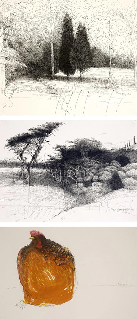
Aside from the human figure, trees are some of the natural forms artists find most interesting, and they have been drawn and painted in a myriad ways.St Louis artist Mary Sprague creates ink drawings, sometimes in colors, often monochromatic, in which delicate sprays of line and hatching coalesce to create her tree forms.
When seen at the scale at which her work is reproduced on her website, her groupings of short but flowing lines, and the way she applies them in textural passages, give her drawings some of the feeling of softness and delicacy characteristic of etchings.
I suspect, given the scale of her previous work, that these drawings are relatively large, and some of the feeling of the line comes from the relationship of the size of her drawing tools ot the size of the composition.
In her online galleries you will also find older work with different subject matter. In particular a previous series centered on large scale ink drawings of chickens. These are occasionally worked in color with brush and either watercolor or colored inks.
You will find more of her work at the Duane Reed Gallery. There is an article about her from the March/April 2007 issue of Stanford Magazine.
Categories:
-
Robert J. Barber
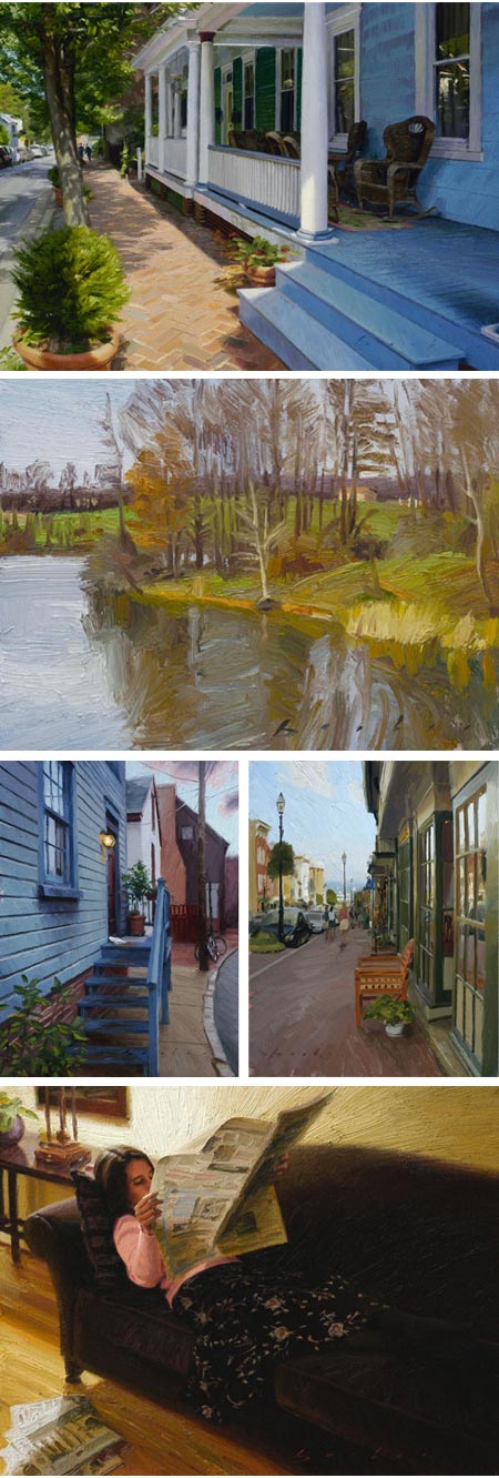
Painter Robert J. Barber lists his inspirations as including Joaquín Sorolla, John Singer Sargent and Diego Velázquez (a superb short list); and you can see the influence of the first two in particular in both his figurative and landscape paintings, which emphasize fresh, clear color choices and expressive brushwork.Personally, I also see echoes of American Impressionists like William Merritt Chase and Theodore Robinson in his direct, colorful and painterly approach.
Landscapes, and notably, townscapes, are the focus of much of Barber’s work. In the examples on his website, which are unfortunately a bit small, his landscapes seem looser and more casual, more likely done en plein air; and the townscapes seem brought to a higher degree of finish as studio paintings (it can also be a matter of scale, Barber doesn’t give dimensions in his online galleries, and I think the townscapes are larger in size).
Barber often chooses views that look down a sidewalk in his town paintings, adding challenges of dramatic perspective to his compositions. His color choices, though rich, are naturalistic; and I particularly like the way he handles the muted tones of overcast days and objects in shadow.
In his website galleries you will also find figurative work and a few still life and interior subjects.
Born in Illinois, Barber grew up in California and now lives in Pennsylvania. He studied Studio Art at the University of California at SantaBarbara and Fine Arts at the Art Center College of Design. He also pursued independent study with painters Ken Auster, Craig Nelson and Dan McCaw.
After 20 years as a freelance illustrator, working for book publishers, movie studios and natural history museums, Barber transitioned into gallery art, garnering awards in several juried shows. He also conducts painting workshops in Maryland other locations.
In addition to the work on his own website, you can find some of his paintings reproduced a bit larger on the Peter McPhee Fine Arts site. There are also works at the McBride Gallery and Susan Calloway Fine Arts.
Barber’s work will be part of a group exhibition at Peter McPhee Fine Arts in Stone Harbor, NJ from August 7 – September 1, 2010, with an opening on August 7 at 7pm.
Categories:


Charley’s Picks
Bookshop.org
(Bookshop.org affilliate links; sales benefit independent bookshop owners; I get a small percentage to help support my work on Lines and Colors)

John Singer Sargent: Watercolors


Urban Sketching: Understanding Perspective


Charley’s Picks
Amazon
(Amazon.com affiliate links; sales go to a larger yacht for Jeff Bezos; but I get a small percentage to help support my work on Lines and Colors)
John Singer Sargent: Watercolors
Urban Sketching: Understanding Perspective