
Categories
- 3d CGI
- Amusements
- Animation
- Anime & Manga
- Art Materials
- Art Videos
- Blogroll
- Cartoons
- Color
- Comics
- Concept & Visual Dev.
- Creativity
- Digital Art
- Digital Painting
- Displaying Art on the Web
- Drawing
- Eye Candy for Today
- Gallery and Museum Art
- High-res Art Images
- Illustration
- Motion Graphics & Flash
- Museums
- Online Museums
- Outsider Art
- Painting
- Painting a Day
- Paleo Art
- Pastel, Conté & Chalk
- Pen & Ink
- Prints and Printmaking
- Reviews
- Sc-fi and Fantasy
- Sculpture & Dimensional
- Site Comments
- Sketching
- Storyboards
- Tools and Techniques
- Uncategorized
- Vector Art
- Videos & Podcasts
- Vision and Optics
- Watercolor and Gouache
- Webcomics
Archives
- April 2026
- March 2026
- February 2026
- January 2026
- December 2025
- November 2025
- October 2025
- September 2025
- August 2025
- July 2025
- June 2025
- May 2025
- January 2025
- December 2024
- November 2024
- October 2024
- September 2024
- August 2024
- June 2024
- April 2024
- March 2024
- February 2024
- January 2024
- December 2023
- November 2023
- October 2023
- September 2023
- August 2023
- July 2023
- May 2023
- April 2023
- March 2023
- February 2023
- January 2023
- December 2022
- November 2022
- September 2022
- August 2022
- July 2022
- June 2022
- May 2022
- April 2022
- March 2022
- February 2022
- January 2022
- December 2021
- November 2021
- October 2021
- September 2021
- August 2021
- July 2021
- June 2021
- May 2021
- April 2021
- March 2021
- February 2021
- January 2021
- December 2020
- November 2020
- October 2020
- September 2020
- August 2020
- July 2020
- June 2020
- May 2020
- April 2020
- March 2020
- February 2020
- January 2020
- December 2019
- November 2019
- October 2019
- September 2019
- August 2019
- July 2019
- June 2019
- May 2019
- April 2019
- March 2019
- February 2019
- January 2019
- December 2018
- November 2018
- October 2018
- September 2018
- August 2018
- July 2018
- June 2018
- May 2018
- April 2018
- March 2018
- February 2018
- January 2018
- December 2017
- November 2017
- October 2017
- September 2017
- August 2017
- July 2017
- June 2017
- May 2017
- April 2017
- March 2017
- February 2017
- January 2017
- December 2016
- November 2016
- October 2016
- September 2016
- August 2016
- July 2016
- June 2016
- May 2016
- April 2016
- March 2016
- February 2016
- January 2016
- December 2015
- November 2015
- October 2015
- September 2015
- August 2015
- July 2015
- June 2015
- May 2015
- April 2015
- March 2015
- February 2015
- January 2015
- December 2014
- November 2014
- October 2014
- September 2014
- August 2014
- July 2014
- June 2014
- May 2014
- April 2014
- March 2014
- February 2014
- January 2014
- December 2013
- November 2013
- October 2013
- September 2013
- August 2013
- July 2013
- June 2013
- May 2013
- April 2013
- March 2013
- February 2013
- January 2013
- December 2012
- November 2012
- October 2012
- September 2012
- August 2012
- July 2012
- June 2012
- May 2012
- April 2012
- March 2012
- February 2012
- January 2012
- December 2011
- November 2011
- October 2011
- September 2011
- August 2011
- July 2011
- June 2011
- May 2011
- April 2011
- March 2011
- February 2011
- January 2011
- December 2010
- November 2010
- October 2010
- September 2010
- August 2010
- July 2010
- June 2010
- May 2010
- April 2010
- March 2010
- February 2010
- January 2010
- December 2009
- November 2009
- October 2009
- September 2009
- August 2009
- July 2009
- June 2009
- May 2009
- April 2009
- March 2009
- February 2009
- January 2009
- December 2008
- November 2008
- October 2008
- September 2008
- August 2008
- July 2008
- June 2008
- May 2008
- April 2008
- March 2008
- February 2008
- January 2008
- December 2007
- November 2007
- October 2007
- September 2007
- August 2007
- July 2007
- June 2007
- May 2007
- April 2007
- March 2007
- February 2007
- January 2007
- December 2006
- November 2006
- October 2006
- September 2006
- August 2006
- July 2006
- June 2006
- May 2006
- April 2006
- March 2006
- February 2006
- January 2006
- December 2005
- November 2005
- October 2005
- September 2005
- August 2005
Relevant Blogs
Art, Painting & Sketch
- Gurney Journey
- Underpaintings
- Art and Influence
- Painting Perceptions
- Oil Painters of America
- Vasari Paint POV
- Flying Fox
- Urban Sketchers
- Bento (Smithsonian)
- Art Inconnu
- The Hidden Place
- Still Life
- Making a Mark
- The Art of the Landscape
- Exploring Color & Creativity
- Art Contrarian
- Artist A Day
- beinArt Surreal Art Collective
- Eye Level
- David Dunlop
- p.i.g.m.e.n.t.i.u.m
- CultureGrrl
- Joaquín Sorolla blog
- Artists in Pastel
“Painting a Day”
- A Painting a Day (Keiser)
- On Painting (Keiser)
- Julian Merrow-Smith
- Karen Jurick
- Jeffrey Hayes
- Carol Marine
- Abbey Ryan
- Daily Paintworks
Other Painting Blogs
- Virtual Gouache Land
- Neil Hollingsworth
- Marc Hanson
- Kevin Menck
- Marc Dalessio
- Larry Seiler
- Stapleton Kearns
- Colin Page
- Roos Schuring
- Hans Versfelt
- Titus Meeuws
- Régis Pettinari
- René Plein Air
- Belinda Del Pesco
- Robin Weiss
- Nathan Fowkes (Land Sketch)
- William Wray
- Frank Serrano
- Stephen Magsig
- Michael Chesley Johnson
- Twice a Week
- Sarah Wimperis
- Rob Adams
- Michael Cole Manley
- The Dirty Palette Club
- Mike Manley’s Draw!
Gallery Art & Illustration mix
Illustration
- Howard Pyle
- 100 Years of Illustration
- BibliOdyssey
- Illustration Art
- Today’s Inspiration
- Illustration Mundo
- Little Chimp Society
- Danny Gregory
- R D (John Martz
- Illustration Friday blog
- Monster Brains
- Illustrators & Illustrations (RU)
- Elwood H. Smith
- DaniDraws.com
- Designers Who Blog
- iSpot Blog
Sci-Fi & Fantasy
Illustration & Comics
Comics & Cartoons
- Comics Beat
- Robot 6
- Newsarama Blog
- Comic Vine
- Comics Alliance
- Forbidden Planet Int.
- Paolo Rivera
- Bolt City
- Flight
- Scott McCloud
- The Comics Journal
- Comixpedia
- Funnybook Babylon
- James Baker
- Middleton’s Sketchbook
- Boneville
- The Hotel Fred
- Paul Rivoche
- Daily Cartoonist
- Mad About Cartoons (William Wray)
- Digital Strips
Illustration & Concept
Animation & Concept
- Cartoon Brew
- Animation Blog
- Cold Hard Flash
- Concept Art World
- The CAB
- FY Concept Art
- Concept Ships
- Concept Robots
- John Nevarez
- Armand Serrano
- Marcos Mateu-Mestre
- all kinds of stuff (Kricfalusi)
- Yacin the faun (Man Arenas)
- Kelsey Mann
- Cre8tivemarks Blog
- Ice-Cream Monster Toon Cafe
- AAU Character & Creature Design
- AAU Animation Notes
- Articles and Texticles
Paleo & Scientific
Tools & Techniques
Other
Lists of Art Blogs
Art Image Resource Links
Historic Art Images
- Wikimedia Commons: Paintings
- Wikimedia Commons: Drawings
- The Athenaeum
- WikiArt (WikiPaintings)
- Google Art Project: Artists
- Google Art Project: Collections (Museums)
- ArtCyclopedia
- Web Gallery of Art
- Art Renewal Center
- Web Gallery of Impressionism
Auction Consolidation sites
Auction sites
- Sotheby’s
- Bonham’s
- Christies
- Heritage Auctions: Fine Art
- Heritage Auctions: Illustration
- Freeman’s Auctions
- Bukowskis
- Shannon’s
Image Search
Reverse Image Search (search by image)
- Tin Eye
- RevImg
- Google Image Search (camera icon)
- Bing Image Search (camera icon)
Promoting some friends and some clients of my website design business
- Twin Willows T’ai Chi studio in Wilmington DE. Taiji classes with Bryan Davis.
- Ray Hayward, Inspired Teacher of T’ai Chi ( Taiji ) in Minneapolis, Founder of Mindful Motion Tai Chi Academy
- OldHead Tattoo studio and Art Gallery in Wilmington DE. Tattoos and paintings by Bruce Gulick
- Sharon Domenico Art, pet portrait oil paintings
- Platinum Paperhanging, wallpaper hanging, Main Line and Philadelphia, PA
- Lisa Stone Design, interior designer, Main Line and Philadelphia, PA
- Studio12KPT, original art, prints, calendars and other custom printed items by Van Sickle & Rolleri
-
New Hope, PA and Lambertville, NJ

My wife and I recently took a pleasant day-trip to the area of New Hope, Pennsylvania. She grew up in the area and we had a good time exploring sights both familiar and changed, and doing a little “art tourism”.New Hope is a small town in Bucks County, about 40 miles northeast of Philadelphia, that became a thriving artist’s colony around the turn of the last century (see my posts on Daniel Garber). Prior to that, it was a key point on a canal system that, at a time when “highways” were muddy ruts, helped move goods past drops in the Delaware River that weren’t navigable.
I’ve mentioned the New Hope area before in articles about Garber and Fern Coppedge, artists who, along with Edward Redfield, John Folinsbee, Walter Schofield, William Lathrop and others, have come to be called the “Pennsylvania Impressionists” (a term I always put in quotes as I doubt the artists ever referred to themselves that way).
New Hope these days is still known as a center for art and artists, but is less of a real artists’ colony and more of a tourist destination built on the remnants of that reputation. Though it certainly has some charm, the town now has a feeling of Gucci meets Jersey beach town; its main streets lined with restaurants and shops that the barge and and canal workers of the past, or the artists of Garber’s day, would not have imagined; and it’s becoming weighted down with the mall and condo barnacles that always seem to crust themselves onto any place with a hint of artsy bohemian appeal these days.
There are a number of galleries, though actually not as many as I might have expected. Unfortunately the Gratz Gallery, which deals in 19th Century art from the New Hope school, the Philadelphia 10 (see my post on Fern Coppedge) and artists from The Pennsylvania Academy of the Fine Arts, had closed for the day by the time we got to it.
Also disappointingly, the small New Hope branch of the James Michener Museum didn’t have any of that museum’s collection of New Hope artists on display.
At the foot of Bridge Street, however, a steel girder bridge lets you drive or stroll over the Delaware river, not far from where George Washington and his army made their famous crossing, to the larger, less famous, but more “real” town of Lambertville, New Jersey, which, I think is more interesting in terms of art galleries and currently working artists; even though it’s also obviously a tourist town.
There we found a number of galleries and a thriving arts scene, supported by the area’s reputation as an art center and its location within an easy drive of both Philadelphia and New York, and I was pleased to find an abundance of artists working in the kind of painterly realism that fits into the traditions of the New Hope school.
New Hope and Lambertville have Second Saturday gallery walks, and the 2007 Annual New Hope Outdoor Arts and Crafts Festival is this weekend Sept 29th & 30th.
[Image above, left to right: Gordon Haas, Dot Bunn, Robert Beck, Sandy Askey]
Categories:
-
Journey to Chandara
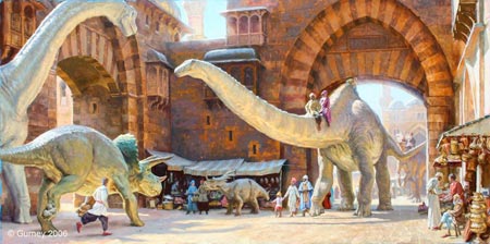
I recently did an update on James Gurney, and I don’t normally do two posts about the same artist in such quick succession, but I finally had a chance to spend some time enjoying my new copy of his latest book, Journey to Chandara, and I was just knocked out.Journey to Chandara (more detail here) is another in his series of Dinotopia books, fantasy adventure stories set in a “land apart from time”. All of these books, and particularly the new one, are the kind of books for which even that wonderful term “lavishly illustrated” is inadequate. To say these books are fantasy adventure stories is insufficient as well; they are excursions into the science, history and, in particular, art of previous centuries.
In a way somewhat more subtle than William Stout’s playful series of dinosaur images that make reference to various painters and Golden Age illustrators, Gurney likes to combine his fanciful images with his fascination for the styles and techniques of great artists, particularly those of the 19th Century, from Charles R. Knight to Daniel Ridgeway Knight.
In the new volume, this phenomenon is even more pronounced than before. This is a quest adventure to a distant part of Dinotopia. From Waterfall City, which is an idealized European city (think Rome + Venice + Mongo, which Lucas & Co. “borrowed” uncredited as the inspiration for Naboo in Star Wars Episode I), Gurney’s dinosaur and human characters “journey to the east” on their way to Chandara, the Dinotopian equivalent of China. On the way, they visit an ever widening variety of places with their attendant variety of landscapes.
In the process, we see Gurney observing, absorbing and playing with the techniques and subject matter of a host of great landscape painters (which I have to think is the real inspiration for the story). In particular he shows his affection for painters like Caspar David Frederich, John Constable, J.M.W. Turner (particularly his early work), and a number of the “Orientalist” painters (like Jean-Léon Gérôme), who took their own journeys of exploration.
Gurney also continues his obvious display of affection for 19th Century Academic painters, the Pre-Raphaelites, great illustrators like Maxfield Parrish and N.C. Wyeth, and even M.C. Escher.
Somehow, he manages to mix in his knowing winks and thank-yous to these artists with dazzling lighting and dramatic compositions that will enthrall modern adventure fans, as well as inventive designs for places, characters and props that would be the envy of many accomplished production designers and concept artists, and make it all feel like part of a whole. Remarkable.
There is another aspect to this book that makes it my favorite of his published works to date. The reproductions seem even better than in the previous volumes, even though they were excellent. You can see more of the artist’s brushstrokes and the surface quality of the paint. This may be due to the quality of the reproduction, or the way in which the works were photographed, or it may be that Gurney himself is getting more painterly and confident as he continues his restless exploration of the art of painting. I suspect it’s a combination of those factors. The paintings are in oil but Gurney occasionally achieves watercolor-like effects where the paint is thin enough to let the white of the support, and at times hints of the underlying drawing, come through.
Beyond the subtle details for art lovers, and the illustrated adventure itself, Gurney adds, as he often does, features like imaginative cut-aways of the interiors of structures and devices that appeal to the 12-year old inveterate Popular Science reader in many of us. This includes inventive conceits like the use of a brachiosaurus as a fire truck, with an escape ladder on the back of its neck.
The level of detail extends to invented alphabets based on dinosaur tracks and and a separate, beautifully done, National Geographic style Traveler’s Map of Dinotopia. The attention to detail in this volume rivals that of Chris Ware’s amazing book/artifacts.
Gurney also continues to mix real science and history in with his fantasy. He goes on to explore Escher-like surface tessellations (made, of course, of dinosaur tracks) and the presence of the Fibonacci series (the “golden section”) in the surface patterns of seeds and flowers. He shows real designs for astrolabes, demonstrates how an abacus functions; and illustrates, in a detailed, David McCauley-like cutaway, an explanation of how a windmill works.
Of course, on top of that we get image after image of Gurney’s beautiful renderings of dinosaurs; all manner of dinosaurs — large, small and in between. Again, he is including real science. In spite of the fanciful setting, Gurney strives to keep his renderings paleontologically accurate, and the book’s dust-jacket features, amid raves from Ray Harryhausen and Walt Reed, notices from renowned paleontologists like Michael Brett-Surman and Mark Norell. In some cases the relation of the dinosaur images to the story is subtle enough that that the fantasy element is subdued and the images just look like particularly beautiful straightforward paleo illustrations, making me hope that Gurney has plans for such a book up his sleeve.
All of this plus the way that Gurney has allowed us to look over his shoulder as he explores the work of great artists from the past, adds up to a package that is an absolute treat.
Gurney continues to cover his own journey, as he travels in support of the book, on his blog, Gurney Journey. The blog is increasingly fascinating and features posts on his process and technique for the book, on the practice of studying and borrowing from the masters, and the subject of painting in general (see his recent post on his favorite How-To books). It also features larger reproductions of some of the paintings than those on the Journey to Chandara section of the Dinotopia site, along with preliminary studies and sketches, and even some of Gurney’s recent landscape paintings.
Original paintings from Journey to Chandara and his other books are currently on display in exhibitions in Los Angeles and Oshkosh, Wisconsin. See my previous post and Gurney’s Dinotopia Exhibitions page for more links and details.
Categories:Concept & Visual Dev., Gallery and Museum Art, Illustration, Painting, Paleo Art, Reviews, Sc-fi and Fantasy
-
W. Heath Robinson

William Heath Robinson wanted to be a landscape painter. Even after his study at the Islington Art School and later at the Royal Academy, he came to the realization that he could support himself better by following his brothers Charles and Thomas into the burgeoning field of illustration. (See my post on Charles Robinson.)The Robinsons were part of the generation of artists that flourished in the Golden Age of illustration, along with artists like Franklin Booth, Maxfield Parrish, Arthur Rackham, Edmund Dulac, J.C. Leyendecker and Elizabeth Shippen Green.
Though he created beautiful illustrations for classics like Beauty and the Beast, Bluebeard, Little Red Riding Hood, The Red Shoes, and Sleeping Beauty (image above, right), he achieved widest notice for his humorous drawings and cartoons.
Robinson created cartoons of life prior to, during and after the First World War. He drew numerous cartoons depicting the follies of golfers; like the one above, left, in which the protagonist is trying to “play it as it lies” with a contraption of strapped together clubs, demonstrating the kind of visual invention for which Robinson became a household word.
Robinson drew countless “inventions” in which overly complex gadgets and bizarre devices were employed to accomplish otherwise simple tasks. Here in the U.S. this kind of inventive visual absurdity is associated with later drawings by Rube Goldberg, but in the U.K. they were simply called “Heath Robinsons”.
Categories:
-
R. H. Ives Gammell
 Robert Hale Ives Gammell was an artist out of sync with his times, for which I set the fault on the times rather than the artist.
Gammell was born in 1893, when academic realism and the classical traditions to which it adhered were about to be overthrown and temporarily (thankfully) submerged beneath the turgid waves of 20th Century Modernism.
Gammell trained at the School of the Boston Museum of Fine Arts, where he was a student of Edmund Tarbell, Joseph DeCamp and Phillip Hale. In particular he came to be profoundly influenced by his study with William Paxton, who had been classically trained in Europe and had studied with Jean-Léon Gérôme at the Ecole des Beaux-Arts in Paris.
Gammell thrived on the nourishment of the classical traditions, but found himself in a century when those traditions and values were being denigrated and treated as passé. His large scale paintings of mythological and Biblical themes were not well received by an art establishment caught up in the sacred “newness” of whatever modernist “ism” was in this week, and he eventually suffered a nervous collapse. He credited his recovery partly to his study of the writings of the visionary psychologist Carl G. Jung.
As he recovered he laid the groundwork for his book Twilight of Painting (out of print, but available used), in which he laments the demise of those traditions and (wrongly, I think) lays the blame partly at the unfinished Academic training of the Impressionists; which left them unable bring a painting to a finished state, and established a permissiveness for unfinished works in the art establishment. He wrote two other books, The shop-talk of Edgar Degas and The Boston Painters 1900-1930.
He devoted the remainder of his life to teaching and perpetuating what he saw, and rightly so, as the threatened traditions of classical Western Art. A number of his students (and their students) went on to become notable realist painters.
He also started what would become his masterwork, a series of 23 related paintings (or “panels”) based on the poem Hound of Heaven by English poet Francis Thompson. You can see small reproductions of nine of the panels on Wikipedia (panel 12 shown here).
Gammell found himself at a loss for some of the imagery he needed to transform the ideas in the poem into the visual realm and found them in the writings of Jung, perhaps putting him more in touch with the times than he thought.
Categories:
-
The Animated Bayeux Tapestry

The Bayeux Tapestry is a 20 inch by 230 foot (50cm x 70m) embroidered cloth that shows the story of the Norman invasion of England in 1066, from the “portent” of Halley’s comet to the Battle of Hastings. It may have been completed within a few years of the invasion, but the earliest other record of its existence is in an inventory of the Bayeux Cathederal in 1476.Like Trajan’s column, some pre-columbian manuscripts and Eqyptian hieroglyphics, it can be thought of as a “graphic story”, a form of storytelling we know today as “comics”; i.e pictures, or words and pictures, arranged in sequence to tell a story (to borrow Scott McCloud’s succinct definition).
In a kind of odd completion of a circle, there is now a computer animated version of the tapestry.
Initiated by a school project when he was 21, in which he merely needed to demonstrate that he had a command of motion graphics software, British designer David Newton took a tracking shot (like a long pan, but along a straight axis) of the tapestry and animated it, added a bit of sound and music and come up with a short movie that probably tells the story better than Hollywood could in a typical over the top blockbuster.
The camera moves along the tapestry and the pictorial elements, kings, princes, soldiers, shipwrights, blacksmiths, ships, horses and a cast of hundreds (well, dozens, anyway) come to life along the story’s path. Delightful.
There is a semi-official site devoted to the actual tapestry, and some info on Wikipedia. The only link I have to the animated version is the YouTube link, which doesn’t have much supporting information.
[Link via Kottke.org]
Categories:
-
Zina Saunders

Zina Saunders is a writer and illustrator who in the last few years has been combining her talents as “reportage illustration” in several series of combined portraits and interviews.Starting with a website called Overlooked New York in which she has set out to interview “impassioned New Yorkers”, she began illustrating her interviews by painting portraits of the interviewees. The first of the series was an article, and multiple portraits, of the members of the Puerto Rico Schwinn Club, a group of adults with a passion for those great old Schwinns with their chrome fenders and chainguards, tricked out with mirrors and flags and decorations in the spokes. The cool bikes and the wonderful character of the member’s faces made for a terrific series of paintings, and started Saunders on the path to doing more portrait/interviews.
Overlooked New York has maybe 25 or 30 stories on it now, most of which are about groups of one kind or another (Bike Messengers, River Swimmers, Subway Musicians, Kite Flyers, etc.) and feature multiple portraits.
Of double interest to lines and colors readers is her series Both Sides of the Drawing Board in which she interviews and paints portraits of illustrators and art directors, including Tim O’Brien (image above) who I profiled last year. The series will be running in every issue of Illo magazine (which I wrote about back in May). You can find several examples from the series in the Reportage section of her web site.
Her web site has a portfolio of her more general illustration, and children’s book illustration. There is an additional portfolio of her work on the site of her rep, Morgan Gaynin, Inc.
Saunders also maintains a blog on Drawger in which you can see preliminary sketches, work in progress and much larger detail images of her work.
Zina Saunders is the daughter of Norman Sanders, who created many great pulp magazine and comic covers as well as classic trading card series like Mars Attacks (more on Norman Saunders in a future post).
Zina Saunders paints the landscape of the face and figure as a series of rough edged planes, broken up into areas of often exaggerated or expressionistic colors and held within thin outlines. She sometimes surrounds them with sketch-like renderings of their environments, often with a wiggly-line style that I seldom like, but in her case works remarkably well.
Saunders has a number of portraits of celebrities, but many of my favorites are among the “overlooked New Yorkers” and people simply going about their jobs, who she treats like celebrities.
Addendum: in response to being asked about her medium and approach, Zina replied:
I’ve been changing and developing my approach for a while, but I guess it would be best described as “mixed media”. I sketch in pencil, and sometimes paint some of it traditionally and then scan and paint digitally on top of that. Sometimes I do all the painting digitally.
Each painting is different, but that’s the gist of it.
Categories:


Charley’s Picks
Bookshop.org
(Bookshop.org affilliate links; sales benefit independent bookshop owners; I get a small percentage to help support my work on Lines and Colors)

John Singer Sargent: Watercolors


Urban Sketching: Understanding Perspective


Charley’s Picks
Amazon
(Amazon.com affiliate links; sales go to a larger yacht for Jeff Bezos; but I get a small percentage to help support my work on Lines and Colors)
John Singer Sargent: Watercolors
Urban Sketching: Understanding Perspective