
Categories
- 3d CGI
- Amusements
- Animation
- Anime & Manga
- Art Materials
- Art Videos
- Blogroll
- Cartoons
- Color
- Comics
- Concept & Visual Dev.
- Creativity
- Digital Art
- Digital Painting
- Displaying Art on the Web
- Drawing
- Eye Candy for Today
- Gallery and Museum Art
- High-res Art Images
- Illustration
- Motion Graphics & Flash
- Museums
- Online Museums
- Outsider Art
- Painting
- Painting a Day
- Paleo Art
- Pastel, Conté & Chalk
- Pen & Ink
- Prints and Printmaking
- Reviews
- Sc-fi and Fantasy
- Sculpture & Dimensional
- Site Comments
- Sketching
- Storyboards
- Tools and Techniques
- Uncategorized
- Vector Art
- Videos & Podcasts
- Vision and Optics
- Watercolor and Gouache
- Webcomics
Archives
- April 2026
- March 2026
- February 2026
- January 2026
- December 2025
- November 2025
- October 2025
- September 2025
- August 2025
- July 2025
- June 2025
- May 2025
- January 2025
- December 2024
- November 2024
- October 2024
- September 2024
- August 2024
- June 2024
- April 2024
- March 2024
- February 2024
- January 2024
- December 2023
- November 2023
- October 2023
- September 2023
- August 2023
- July 2023
- May 2023
- April 2023
- March 2023
- February 2023
- January 2023
- December 2022
- November 2022
- September 2022
- August 2022
- July 2022
- June 2022
- May 2022
- April 2022
- March 2022
- February 2022
- January 2022
- December 2021
- November 2021
- October 2021
- September 2021
- August 2021
- July 2021
- June 2021
- May 2021
- April 2021
- March 2021
- February 2021
- January 2021
- December 2020
- November 2020
- October 2020
- September 2020
- August 2020
- July 2020
- June 2020
- May 2020
- April 2020
- March 2020
- February 2020
- January 2020
- December 2019
- November 2019
- October 2019
- September 2019
- August 2019
- July 2019
- June 2019
- May 2019
- April 2019
- March 2019
- February 2019
- January 2019
- December 2018
- November 2018
- October 2018
- September 2018
- August 2018
- July 2018
- June 2018
- May 2018
- April 2018
- March 2018
- February 2018
- January 2018
- December 2017
- November 2017
- October 2017
- September 2017
- August 2017
- July 2017
- June 2017
- May 2017
- April 2017
- March 2017
- February 2017
- January 2017
- December 2016
- November 2016
- October 2016
- September 2016
- August 2016
- July 2016
- June 2016
- May 2016
- April 2016
- March 2016
- February 2016
- January 2016
- December 2015
- November 2015
- October 2015
- September 2015
- August 2015
- July 2015
- June 2015
- May 2015
- April 2015
- March 2015
- February 2015
- January 2015
- December 2014
- November 2014
- October 2014
- September 2014
- August 2014
- July 2014
- June 2014
- May 2014
- April 2014
- March 2014
- February 2014
- January 2014
- December 2013
- November 2013
- October 2013
- September 2013
- August 2013
- July 2013
- June 2013
- May 2013
- April 2013
- March 2013
- February 2013
- January 2013
- December 2012
- November 2012
- October 2012
- September 2012
- August 2012
- July 2012
- June 2012
- May 2012
- April 2012
- March 2012
- February 2012
- January 2012
- December 2011
- November 2011
- October 2011
- September 2011
- August 2011
- July 2011
- June 2011
- May 2011
- April 2011
- March 2011
- February 2011
- January 2011
- December 2010
- November 2010
- October 2010
- September 2010
- August 2010
- July 2010
- June 2010
- May 2010
- April 2010
- March 2010
- February 2010
- January 2010
- December 2009
- November 2009
- October 2009
- September 2009
- August 2009
- July 2009
- June 2009
- May 2009
- April 2009
- March 2009
- February 2009
- January 2009
- December 2008
- November 2008
- October 2008
- September 2008
- August 2008
- July 2008
- June 2008
- May 2008
- April 2008
- March 2008
- February 2008
- January 2008
- December 2007
- November 2007
- October 2007
- September 2007
- August 2007
- July 2007
- June 2007
- May 2007
- April 2007
- March 2007
- February 2007
- January 2007
- December 2006
- November 2006
- October 2006
- September 2006
- August 2006
- July 2006
- June 2006
- May 2006
- April 2006
- March 2006
- February 2006
- January 2006
- December 2005
- November 2005
- October 2005
- September 2005
- August 2005
Relevant Blogs
Art, Painting & Sketch
- Gurney Journey
- Underpaintings
- Art and Influence
- Painting Perceptions
- Oil Painters of America
- Vasari Paint POV
- Flying Fox
- Urban Sketchers
- Bento (Smithsonian)
- Art Inconnu
- The Hidden Place
- Still Life
- Making a Mark
- The Art of the Landscape
- Exploring Color & Creativity
- Art Contrarian
- Artist A Day
- beinArt Surreal Art Collective
- Eye Level
- David Dunlop
- p.i.g.m.e.n.t.i.u.m
- CultureGrrl
- Joaquín Sorolla blog
- Artists in Pastel
“Painting a Day”
- A Painting a Day (Keiser)
- On Painting (Keiser)
- Julian Merrow-Smith
- Karen Jurick
- Jeffrey Hayes
- Carol Marine
- Abbey Ryan
- Daily Paintworks
Other Painting Blogs
- Virtual Gouache Land
- Neil Hollingsworth
- Marc Hanson
- Kevin Menck
- Marc Dalessio
- Larry Seiler
- Stapleton Kearns
- Colin Page
- Roos Schuring
- Hans Versfelt
- Titus Meeuws
- Régis Pettinari
- René Plein Air
- Belinda Del Pesco
- Robin Weiss
- Nathan Fowkes (Land Sketch)
- William Wray
- Frank Serrano
- Stephen Magsig
- Michael Chesley Johnson
- Twice a Week
- Sarah Wimperis
- Rob Adams
- Michael Cole Manley
- The Dirty Palette Club
- Mike Manley’s Draw!
Gallery Art & Illustration mix
Illustration
- Howard Pyle
- 100 Years of Illustration
- BibliOdyssey
- Illustration Art
- Today’s Inspiration
- Illustration Mundo
- Little Chimp Society
- Danny Gregory
- R D (John Martz
- Illustration Friday blog
- Monster Brains
- Illustrators & Illustrations (RU)
- Elwood H. Smith
- DaniDraws.com
- Designers Who Blog
- iSpot Blog
Sci-Fi & Fantasy
Illustration & Comics
Comics & Cartoons
- Comics Beat
- Robot 6
- Newsarama Blog
- Comic Vine
- Comics Alliance
- Forbidden Planet Int.
- Paolo Rivera
- Bolt City
- Flight
- Scott McCloud
- The Comics Journal
- Comixpedia
- Funnybook Babylon
- James Baker
- Middleton’s Sketchbook
- Boneville
- The Hotel Fred
- Paul Rivoche
- Daily Cartoonist
- Mad About Cartoons (William Wray)
- Digital Strips
Illustration & Concept
Animation & Concept
- Cartoon Brew
- Animation Blog
- Cold Hard Flash
- Concept Art World
- The CAB
- FY Concept Art
- Concept Ships
- Concept Robots
- John Nevarez
- Armand Serrano
- Marcos Mateu-Mestre
- all kinds of stuff (Kricfalusi)
- Yacin the faun (Man Arenas)
- Kelsey Mann
- Cre8tivemarks Blog
- Ice-Cream Monster Toon Cafe
- AAU Character & Creature Design
- AAU Animation Notes
- Articles and Texticles
Paleo & Scientific
Tools & Techniques
Other
Lists of Art Blogs
Art Image Resource Links
Historic Art Images
- Wikimedia Commons: Paintings
- Wikimedia Commons: Drawings
- The Athenaeum
- WikiArt (WikiPaintings)
- Google Art Project: Artists
- Google Art Project: Collections (Museums)
- ArtCyclopedia
- Web Gallery of Art
- Art Renewal Center
- Web Gallery of Impressionism
Auction Consolidation sites
Auction sites
- Sotheby’s
- Bonham’s
- Christies
- Heritage Auctions: Fine Art
- Heritage Auctions: Illustration
- Freeman’s Auctions
- Bukowskis
- Shannon’s
Image Search
Reverse Image Search (search by image)
- Tin Eye
- RevImg
- Google Image Search (camera icon)
- Bing Image Search (camera icon)
Promoting some friends and some clients of my website design business
- Twin Willows T’ai Chi studio in Wilmington DE. Taiji classes with Bryan Davis.
- Ray Hayward, Inspired Teacher of T’ai Chi ( Taiji ) in Minneapolis, Founder of Mindful Motion Tai Chi Academy
- OldHead Tattoo studio and Art Gallery in Wilmington DE. Tattoos and paintings by Bruce Gulick
- Sharon Domenico Art, pet portrait oil paintings
- Platinum Paperhanging, wallpaper hanging, Main Line and Philadelphia, PA
- Lisa Stone Design, interior designer, Main Line and Philadelphia, PA
- Studio12KPT, original art, prints, calendars and other custom printed items by Van Sickle & Rolleri
-
Paul Gillon
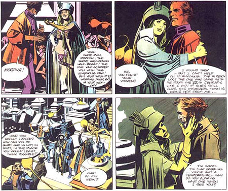
I learned from The Comics Reporter that Paul Gillon’s 80th birthday was last Thursday (May 11, 2006). Gillon has a long and distinguished career as one of the preeminent creators of bandes desinnées – French comics (literally: “strips of drawings”). Along with Jean Giraud (Moebius), Gillon was one of the first artists I encountered when I discovered the delights of French comics.Gillon’s career was largely as a newspaper strip artist. For thirteen years he drew the daily strip 13, rue d l’Espoir (13 Hope Street), a soap opera comic, written by Jacques and François Gall and drawn by Gillon in a sophisticated realistic style in the tradition of Alex Raymond’s Rip Kirby.
Gillon is best known, however, for his landmark science fiction story Les Naufragés du Temps (Castaways in Time, sometimes translated as Lost in Time). Gillon co-created Les Naufragés du Temps with Jean-Claude Forest, who also created Barbarella, among other characters. The series, like much of Gillon’s science fiction/adventure work, has an erotic edge. (It’s a common paradigm in European comics to combine elements of eroticism with adventure, mystery and science fiction stories, since the French and Italians, in particular, don’t share America’s prudery.)
The Les Naufragés du Temps series moved to Metal Hurlant in 1977, at which point Gillon took over writing as well as drawing the strip. He also did other sci-fi stories, including La Survivante (The Survivor) a post-apocalyptic story in which we have an erotic encounter between a woman and a robot, and mystery/adventure stories like Les Léviathans (The Leviathans).
Gillon also illustrated editions of Melville’s Moby Dick and Victor Hugo’s Notre Dame de Paris, as well as Jehanne, an erotic interpretation of Joan of Arc.
Gillon sometimes puts me in mind of another soap opera newspaper strip artist who went on to comic-book stye work: Stan Drake, the under-appreciated American artist who worked for years on The Heart of Juliet Jones newspaper strip and later did the excellent graphic story albums of the Kelly Green detective series. Ah, but there’s a subject for another post.
There are English language versions of some (but not nearly enough) of Gillon’s work, notably Lost in Time: Labyrinths (with an introduction by Alex Toth, and from which the image above was taken), Lost in Time: Cannibal World and Survivor.
All of Paul Gillon’s work is distinguished by high standards of draughtsmanship, composition, characterization and comics storytelling.
Categories:
-
Worth 1000

I love living in the digital age. I truly do.Not only do I get to use the internet, paint with electrons and listen to a huge selection of music, I get to reap the benefits of other people indulging in the use of digital image editing tools.
Most often that means professionals creating digital paintings or wonderful CGI images, but occasionally it means amusing experiments by people with some degree of image editing skill, a bit of imagination and way too much time on their hands.
The bizarre fruits of these labors are often on display at Worth 1000, a “creative competition” site, the highlight of which is a showcase for outlandish image manipulation.
If you enter the home page of the site, you’ll immediately encounter the most recent Photoshop contests, a series of themed collections of manipulated images in which people attempt to illustrate a topic, like “Invisible Objects”, “Celebrity Time Tavel”, “Bizarrchitecture”, “Levitations” or “Visual Puns”, by manipulating or compositing existing images in an amusing way.
It will come as no surprise that my favorite topics are the Photoshop composite mashups of famous paintings, combined with modern elements or otherwise altered in ways that are often hilarious and occasionally very skillfully done.
There are several series built on the theme of “Counterfeit Art: Signs your fine art might be fake”, and “Modern Renaisssance”. I list some other categories below that deal with famous images from art history.
Counterfeit Art
Out of bounds art
Escher Blowout
Work-safe Art: Making Art Safe for our Children
Modern Renaisssance
Robot RenaissanceThe compositing and manipulation is sometimes overt and even clumsy, but occasionally very clever and subtle, at times requiring either an intimate familiarity with the original or a side by side comparison to pick up on the joke.
The manipulated images are usually linked to a larger version and sometimes accompanied by a link to a posting of the original, unaltered image or images.
If you want to participate, there are instructions in the beginning of the inidvidual “Active Advanced Photoshop Contests” that tell you how to submit.
While I haven’t participated in the Worth 1000 contests, I’m certainly not above the allure of manipulating favorite artworks with digital editing tools, as some pages from my webcomic back in the mid-90’s will show.
Time sink warning: if you enjoy this kind of thing, the Worth1000 site can be a time sink black hole. If you have to get something done today, you may want to postpone your visit for a rainy bored afternoon.
If you can stand the “my mother was scared by a graphic designer while carrying me” layout and the “ads in your face” arrangement of the pages, you can spend quite a bit of time flipping through the galleries.
Note: The paticipants occasionally get, um… carried away, and the site is not recommended for those who are squeamish or easily offended.
Categories:
-
Edmund Blair Leighton
 There’s just something about knights in armor, fair maidens in sweeping dresses and rough castle walls draped with tapestries that makes for wonderful images; from the finely wrought paintings of the Victorian era through the dramatic illustrations of Howard Pyle and N.C. Wyeth to highly finessed digital renderings of modern fantasy illustrators.
Edmind Blair Leighton was a Victorian painter sometimes considered to be a second generation Pre-Raphaelite. It would be more accurate to simply say that he was influenced by them and displayed similarities of style and subject matter, much like his contemporary John William Waterhouse.
Leighton was known for his elegantly rendered depictions historical scenes, most often of the age of chivalry. His luxurious canvasses of valiant knights, golden tressed ladies and romanticized royalty in dramatic costume and idyllic settings made him popular in his time and account for his renewed popularity in recent years.
Leighton also painted modern (i.e. Victorian) scenes, often with themes of courtship or weddings, but is was his romanticised history painting that proved most appealing.
There seems to be little information available about Leighton, either on the web or in books. Reproductions of his work, however, are common on poster and art sites everywhere.
I should point out that Edmund Blair Leighton should be distinguished from Frederick Lord Leighton, no relation, but also a Victorian artist of note (who will be the topic of a future post).
There is a bit of biography for Edmund Blair Leighton on the ArtMagic Galleries site, and a short description on the Art Renewal site.
Even if information on Leighton himself is in short supply, we can still get lost in his wonderfully romantic visions of medieval times.
Categories:
-
Anne Sudworth

From yesterday’s post about the magic of sunlight interacting with objects, we move into a different kind of magical light, the enchanted light in the mystical paintings of British fantasy artist Ann Sudworth.Her intricately detailed pastel paintings often feature night scenes in which multiple or individual trees are sharply illuminated by a mysterious light source that is invisible to the viewer. The light is sometimes white, often green from the cast of the foliage, but rendered with naturalistic believability. The resultant effect is one of eerie realism.
Sudworth also does subjects that are almost straightforwardly realistic, often landscapes in moonlight, although the moonlight is sometimes unnaturally bright and the landscapes are occasionally of mystical places like Stonehenge. One of her pastels is of Furness Abbey, a frequent subject of etchings by J.M.W. Turner.
At times, she combines her mystically illuminated trees with her fascination for preternaturally bright moonlight, creating compositions reminiscent of Magritte’s Empire of Light paintings.
Sudworth tried several other mediums before gravitating to pastel, which fascinated her and gave her a feeling of direct contact with the work: “…you don’t need any implements to apply it, just your fingers”. She says she doesn’t visit galleries or study the work of other artists often, but is fond of the work of Arthur Rackham, among others.
She does create some images that seem more in the traditional fantasy realm of fairies, wizards or mythical animals, but the images that dwell on the border of the two realms of naturalism and fantasy seem her primary focus.
All of her works are woven together with the common thread of the mystical, ethereal qualities of light.
Categories:
-
Neil Hollingsworth
 One of the wonderful things about light, for those of us who are constantly fascinated by it, is the way it bounces around, changing and being changed by the objects it encounters.
I have to admit to a particular fascination with curved reflective surfaces and transparent objects, so Neil Hollingsworth, who paints both of these subjects with considerable finesse, had my attention as soon as I saw his work.
If you follow his eye, you can immerse yourself in a world of subtle patterns of light, shadow and contrast as sunlight, usually an angular streak slanting in through a window, cascades across, around and through the everyday objects that Hollingsworth has set up to paint. Wrapped in these soft beams, the tea kettles, coffee urns, milk bottles, glasses and cups become worlds in themselves with rooms reflected in objects and shadows revealing form as much as the light.
Hollingsworth has a quiet but intense eye for contrast and tone, and a remarkably fresh sense of composition that make his paintings more inviting and fascinating than the subjects themselves might suggest.
His still life paintings of fruit are handled with the same sensitivity for the description of form with light and shadow, usually composed with strong backlighting so that the shadows are central and the light wrapping around both edges, lending them a visual drama seldom encountered in still life.
Hollingsworth tackles other subjects, exterior scenes, architectural elements, figurative work and animals, but it is the intimate paintings of simple objects, and the not-so-simple ways that light interacts with them, that really shine.
Neil Hollingsworth is married to painter Karen Hollingsworth, who I profiled back in April. Though you can certainly see shared influences and common subjects like sunlight on draped sheets, they are both strong painters with their own sensibilities. (Their house must have great windows, though. It seems like they have “sunlight on tap”.) Both painters have a talent for transforming the mundane into the wonderful with their mastery of light and shade.
Categories:
-
Kean Soo

Jellaby is a web comics story by Kean Soo about a precocious but lonely little girl named Portia who finds a purple monster, also apparently lonely and alienated, in the woods behind her home. She befriends, and in turn is befriended by, the monster, perhaps in light of the famous quote from Shakespeares’s Portia that “the quality of mercy is not strain’d…” and “…blesseth him that gives and him that takes”.The story is in turns wistful, sad, funny and charming, drawn in a style that might be suitable for children’s book illustration. Soo doesn’t show the artistic sensiblity of someone with formal training in drawing, but demonstrates a remarkable tendency to work and experiment with the graphic and narrative form of comics. His drawings can seem in turn naive and sophisticated.
I absolutely love the fascinating bit of narrative invention in in the sequence above, where Soo has controlled the intensity of the color so that the visual focus in the three panels follows the changes in the character’s focus in over time. Wonderful! A technique that could only work in the medium of comics.
The art for Jellaby is done in a purple duotone, occasionally punctuated with elements of other colors, another way in which Soo subtly controls the visual focus of the panels.
Soo is transitioning (or has transitioned) from a career as an electrical engineer to drawing comics full time. The front of his site is essentially a blog. There is a section for illustration, which seems a byproduct of his comics work rather than an end in itself, and a comics section which is divided in to three subsections.
At the top, in a section called exitmusic, is a series of short, apparently autobiographical comics stories that are accompanied by music (and sometimes lyrics) of existing songs that are an integral part of the stories.
Below that is the journal, a series of short autobiographical, sometimes confessional, slice of life vignettes in a variety of styles. The art and writing style varies with the emotional content of the piece.
At the bottom of the page is Jellaby, the link for which takes you to the strip which is hosted on a separate site called The Secret Friend Society. Jellaby co-exists on the SFS site with comics artist Hope Larson’s creation Salamander Dream, which apparently shares a world in which Jellaby’s Portia also exists. Jellaby is Soo’s venture into long form comics.
If you go to the Jellaby archive, and start at the bottom, you can read the strip in order to its most current page. Jellaby is currently on hiatus while Soo pursues other projects, but still makes a satisfying read.
Soo has print versions of his comics available, and has been in several anthologies, including Flight Volume 1 and Volume 2.
I’m not sure is the arrangement on Soo’s comics page is chronological, or if he has arranged the features in order of importance. If the latter, I would have to disagree and suggest that his work within the more traditional format is the most successful. All of them, though are worth checking out.
Categories:


Charley’s Picks
Bookshop.org
(Bookshop.org affilliate links; sales benefit independent bookshop owners; I get a small percentage to help support my work on Lines and Colors)

John Singer Sargent: Watercolors


Urban Sketching: Understanding Perspective


Charley’s Picks
Amazon
(Amazon.com affiliate links; sales go to a larger yacht for Jeff Bezos; but I get a small percentage to help support my work on Lines and Colors)
John Singer Sargent: Watercolors
Urban Sketching: Understanding Perspective