
Categories
- 3d CGI
- Amusements
- Animation
- Anime & Manga
- Art Materials
- Art Videos
- Blogroll
- Cartoons
- Color
- Comics
- Concept & Visual Dev.
- Creativity
- Digital Art
- Digital Painting
- Displaying Art on the Web
- Drawing
- Eye Candy for Today
- Gallery and Museum Art
- High-res Art Images
- Illustration
- Motion Graphics & Flash
- Museums
- Online Museums
- Outsider Art
- Painting
- Painting a Day
- Paleo Art
- Pastel, Conté & Chalk
- Pen & Ink
- Prints and Printmaking
- Reviews
- Sc-fi and Fantasy
- Sculpture & Dimensional
- Site Comments
- Sketching
- Storyboards
- Tools and Techniques
- Uncategorized
- Vector Art
- Videos & Podcasts
- Vision and Optics
- Watercolor and Gouache
- Webcomics
Archives
- May 2026
- April 2026
- March 2026
- February 2026
- January 2026
- December 2025
- November 2025
- October 2025
- September 2025
- August 2025
- July 2025
- June 2025
- May 2025
- January 2025
- December 2024
- November 2024
- October 2024
- September 2024
- August 2024
- June 2024
- April 2024
- March 2024
- February 2024
- January 2024
- December 2023
- November 2023
- October 2023
- September 2023
- August 2023
- July 2023
- May 2023
- April 2023
- March 2023
- February 2023
- January 2023
- December 2022
- November 2022
- September 2022
- August 2022
- July 2022
- June 2022
- May 2022
- April 2022
- March 2022
- February 2022
- January 2022
- December 2021
- November 2021
- October 2021
- September 2021
- August 2021
- July 2021
- June 2021
- May 2021
- April 2021
- March 2021
- February 2021
- January 2021
- December 2020
- November 2020
- October 2020
- September 2020
- August 2020
- July 2020
- June 2020
- May 2020
- April 2020
- March 2020
- February 2020
- January 2020
- December 2019
- November 2019
- October 2019
- September 2019
- August 2019
- July 2019
- June 2019
- May 2019
- April 2019
- March 2019
- February 2019
- January 2019
- December 2018
- November 2018
- October 2018
- September 2018
- August 2018
- July 2018
- June 2018
- May 2018
- April 2018
- March 2018
- February 2018
- January 2018
- December 2017
- November 2017
- October 2017
- September 2017
- August 2017
- July 2017
- June 2017
- May 2017
- April 2017
- March 2017
- February 2017
- January 2017
- December 2016
- November 2016
- October 2016
- September 2016
- August 2016
- July 2016
- June 2016
- May 2016
- April 2016
- March 2016
- February 2016
- January 2016
- December 2015
- November 2015
- October 2015
- September 2015
- August 2015
- July 2015
- June 2015
- May 2015
- April 2015
- March 2015
- February 2015
- January 2015
- December 2014
- November 2014
- October 2014
- September 2014
- August 2014
- July 2014
- June 2014
- May 2014
- April 2014
- March 2014
- February 2014
- January 2014
- December 2013
- November 2013
- October 2013
- September 2013
- August 2013
- July 2013
- June 2013
- May 2013
- April 2013
- March 2013
- February 2013
- January 2013
- December 2012
- November 2012
- October 2012
- September 2012
- August 2012
- July 2012
- June 2012
- May 2012
- April 2012
- March 2012
- February 2012
- January 2012
- December 2011
- November 2011
- October 2011
- September 2011
- August 2011
- July 2011
- June 2011
- May 2011
- April 2011
- March 2011
- February 2011
- January 2011
- December 2010
- November 2010
- October 2010
- September 2010
- August 2010
- July 2010
- June 2010
- May 2010
- April 2010
- March 2010
- February 2010
- January 2010
- December 2009
- November 2009
- October 2009
- September 2009
- August 2009
- July 2009
- June 2009
- May 2009
- April 2009
- March 2009
- February 2009
- January 2009
- December 2008
- November 2008
- October 2008
- September 2008
- August 2008
- July 2008
- June 2008
- May 2008
- April 2008
- March 2008
- February 2008
- January 2008
- December 2007
- November 2007
- October 2007
- September 2007
- August 2007
- July 2007
- June 2007
- May 2007
- April 2007
- March 2007
- February 2007
- January 2007
- December 2006
- November 2006
- October 2006
- September 2006
- August 2006
- July 2006
- June 2006
- May 2006
- April 2006
- March 2006
- February 2006
- January 2006
- December 2005
- November 2005
- October 2005
- September 2005
- August 2005
Relevant Blogs
Art, Painting & Sketch
- Gurney Journey
- Underpaintings
- Art and Influence
- Painting Perceptions
- Oil Painters of America
- Vasari Paint POV
- Flying Fox
- Urban Sketchers
- Bento (Smithsonian)
- Art Inconnu
- The Hidden Place
- Still Life
- Making a Mark
- The Art of the Landscape
- Exploring Color & Creativity
- Art Contrarian
- Artist A Day
- beinArt Surreal Art Collective
- Eye Level
- David Dunlop
- p.i.g.m.e.n.t.i.u.m
- CultureGrrl
- Joaquín Sorolla blog
- Artists in Pastel
“Painting a Day”
- A Painting a Day (Keiser)
- On Painting (Keiser)
- Julian Merrow-Smith
- Karen Jurick
- Jeffrey Hayes
- Carol Marine
- Abbey Ryan
- Daily Paintworks
Other Painting Blogs
- Virtual Gouache Land
- Neil Hollingsworth
- Marc Hanson
- Kevin Menck
- Marc Dalessio
- Larry Seiler
- Stapleton Kearns
- Colin Page
- Roos Schuring
- Hans Versfelt
- Titus Meeuws
- Régis Pettinari
- René Plein Air
- Belinda Del Pesco
- Robin Weiss
- Nathan Fowkes (Land Sketch)
- William Wray
- Frank Serrano
- Stephen Magsig
- Michael Chesley Johnson
- Twice a Week
- Sarah Wimperis
- Rob Adams
- Michael Cole Manley
- The Dirty Palette Club
- Mike Manley’s Draw!
Gallery Art & Illustration mix
Illustration
- Howard Pyle
- 100 Years of Illustration
- BibliOdyssey
- Illustration Art
- Today’s Inspiration
- Illustration Mundo
- Little Chimp Society
- Danny Gregory
- R D (John Martz
- Illustration Friday blog
- Monster Brains
- Illustrators & Illustrations (RU)
- Elwood H. Smith
- DaniDraws.com
- Designers Who Blog
- iSpot Blog
Sci-Fi & Fantasy
Illustration & Comics
Comics & Cartoons
- Comics Beat
- Robot 6
- Newsarama Blog
- Comic Vine
- Comics Alliance
- Forbidden Planet Int.
- Paolo Rivera
- Bolt City
- Flight
- Scott McCloud
- The Comics Journal
- Comixpedia
- Funnybook Babylon
- James Baker
- Middleton’s Sketchbook
- Boneville
- The Hotel Fred
- Paul Rivoche
- Daily Cartoonist
- Mad About Cartoons (William Wray)
- Digital Strips
Illustration & Concept
Animation & Concept
- Cartoon Brew
- Animation Blog
- Cold Hard Flash
- Concept Art World
- The CAB
- FY Concept Art
- Concept Ships
- Concept Robots
- John Nevarez
- Armand Serrano
- Marcos Mateu-Mestre
- all kinds of stuff (Kricfalusi)
- Yacin the faun (Man Arenas)
- Kelsey Mann
- Cre8tivemarks Blog
- Ice-Cream Monster Toon Cafe
- AAU Character & Creature Design
- AAU Animation Notes
- Articles and Texticles
Paleo & Scientific
Tools & Techniques
Other
Lists of Art Blogs
Art Image Resource Links
Historic Art Images
- Wikimedia Commons: Paintings
- Wikimedia Commons: Drawings
- The Athenaeum
- WikiArt (WikiPaintings)
- Google Art Project: Artists
- Google Art Project: Collections (Museums)
- ArtCyclopedia
- Web Gallery of Art
- Art Renewal Center
- Web Gallery of Impressionism
Auction Consolidation sites
Auction sites
- Sotheby’s
- Bonham’s
- Christies
- Heritage Auctions: Fine Art
- Heritage Auctions: Illustration
- Freeman’s Auctions
- Bukowskis
- Shannon’s
Image Search
Reverse Image Search (search by image)
- Tin Eye
- RevImg
- Google Image Search (camera icon)
- Bing Image Search (camera icon)
Promoting some friends and some clients of my website design business
- Twin Willows T’ai Chi studio in Wilmington DE. Taiji classes with Bryan Davis.
- Ray Hayward, Inspired Teacher of T’ai Chi ( Taiji ) in Minneapolis, Founder of Mindful Motion Tai Chi Academy
- OldHead Tattoo studio and Art Gallery in Wilmington DE. Tattoos and paintings by Bruce Gulick
- Sharon Domenico Art, pet portrait oil paintings
- Platinum Paperhanging, wallpaper hanging, Main Line and Philadelphia, PA
- Lisa Stone Design, interior designer, Main Line and Philadelphia, PA
- Studio12KPT, original art, prints, calendars and other custom printed items by Van Sickle & Rolleri
-
Naoto Hattori
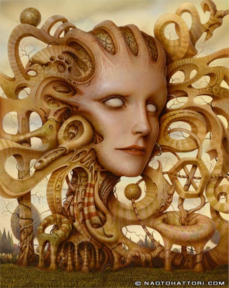
Naoto Hattori is a Japanese artist based in new York. He attended the School of Visual Arts there a well as receiving a BFA in illustration from the Tokyo Designers College.Though he lists his profession as including illustration and graphic design, most of the work that can be seen on his web site and other venues seems to be gallery art. He works in acrylic watercolor and ink, creating his dreamlike visions of imaginary worlds with rich textures and a muted color palette.
His often grotesque figures, in turn doll-like, human, alien, animalistic or plant-like in nature, grow, twist and intersect with one another, and parts of themselves, like out of control collisions of mixed DNA set on super growth mode.
Figures intertwine and morph into other shapes, hands extend, body parts distort and eyes appear everywhere as Hattori escorts you through his phantasmagoric dreamscapes.
As in the image above, Inspiration, Hattori gives us an immediate tactile sensation on which to base our perceptions, particularly in the rendering of skin and the textures of materials like wood and stone.
He playfully works in bits of pop culture in places and likes to play with historical culture, particularly the Mona Lisa, of which he has several fanciful variations (I can’t give you direct links because his site, for reasons that are lost on me, is in frames. See also my post on the Mona Lisa.)
His web site contains a small selection of available originals (though all currently sold), with larger images linked to the thumbnails. There is also a section of older sold works, that are unfortunately only shown as small thumbnails. The limited editions section contains the best images, often with nice large detail images.
I’ve listed some other places to view his work below. You might also see his list of gallery showings and check the individual galleries; there is a nice selection of large images on the Copro Nason Gallery.
There is also a selection of Hattori’s work on the beinArt Surreal Art Collective, along with an interview. Hattori is included in their collection, Metamorphosis. There is also a dedicated collection available on one of the the artist’s two web sites.
Some will, of course, find Hattori’s work more appealing than others; and its strong appeal in certain circles may be indicated by the availability in his store of specialized items like prints on perforated blotter paper.
Categories:
-
Nancy Worth

Nancy Worth is a Colorado based artist who has been artist-in-residence at Rocky Mountain National Park and still leads an annual workshop there, as well as teaching in other capacities, including classes at the Cottonwoods Artists School. She attended Trinity University in San Antonio, Texas.Despite her southwest and mountain state surroundings, the most appealing of her paintings that I have seen on the web are of Paris, particularly her paintings of the sun dappled quays of the Seine River.
Worth worked in oil originally and then moved to transparent watercolor, to which she devoted herself for a number of years.
She has recently returned to to oil painting, bringing with her the years of watercolor technique, and her oils have a fascinating quality of feeling a bit like both mediums, with some of the airy lightness of transparent watercolor next to the rough painterly textures possible only in oil.
Categories:
-
Americans Abroad: J.C. Leyendecker and the European Academic Influence on American Illustration

Joseph Christian Leyendecker and his brother Frank X. Leyendecker, both among the absolute best illustrators ever, acquired some of their marvelous technique, finesse and painting skill in the course of classical art training in Europe.It was common in the late 19th Century for American artists to make the pilgrimage to Paris, the bright jewel of culture around which the art world revolved, and study at the schools there where the traditions of western art were being handed down in an unbroken chain from the time of the Renaissance.
J.C. and Frank Leyendecker studied at the highly regarded Académie Julian at a time when William-Adophpe Bouguereau was its director. Bouguereau, whatever else you may want to say of him, was a superb painter and a master of the techniques of classical painting.
The Leyendecker brothers, as well as many other American artists, put their European training to good use, but also took their own direction, creating a unique fusion of academic skill and lively American inventiveness.
There is a terrific opportunity for those within reach of New York to see an exhibition at the Society of Illustrators titled Americans Abroad: J.C. Leyendecker and the European Academic Influence on American Illustration that focuses on that influence; and features a number of works by J.C. Leyendecker, Frank X. Leyendecker and other great illustrators who shared in that tradition like Edwin Austin Abbey, Howland Blashfield, W.T. Smedley and Everett Shinn.
The Society’s web site is kind of awkwardly arranged, but the show is mentioned on the home page and there is a more detailed PDF press release.
The exhibition runs to July 12, 2008.
The image above, the original of which is part of the show judging from the Society’s web site, is from Andrew Bosely’s blog A Little Bit of Leyendecker Greatness; which is a treasure trove of high-resolutinon scans of Leyendecker Saturday Evening Post Covers.
See the links below to my previous posts about J.C. Leyendecker for links to other Leyendecker resources around the net.
[Link the Society of Illustrators exhibit via The Art Department]
Categories:
-
William Dyce

It has long been a tradition for artists to learn by studying and copying the works of masters who came before them. In the middle of the 19th Century, it also became common practice to paint scenes from the lives of great artists, along with composers, poets, writers and other historical figures.Here we have Scottish painter William Dyce giving us his fanciful interpretation of the great Venetian painter Titian as a child, inspired by a statue of the Virgin and Child, (and perhaps contemplating the pose as a painting), and experimenting with the colored juices of crushed flowers.
Titian’s actual experimentation with color was likely in the studio of his master Giovanni Bellini, but in Titian Preparing to make his First Essay In Colouring (larger image here), Dyce has given us a wonderful vision of an artist he studied and admired deeply finding his inspiration in nature, as did Dyce himself.
Perhaps because of those sentiments, Dyce was one of the few established artists to sympathize with and champion the young Pre-Raphaelite painters when the critics were savaging them (with the notable exception of John Ruskin, who supported the Pre-Raphaelites and also praised this painting by Dyce, as well as his strikingly detailed landscape Pegwell Bay, also here).
Dyce took his influences from Renaissance masters, the Pre-Raphaelites and painters like Johann Overbeck and put them to work in religious and historically themed works; and a series of frescos, notably those in the Houses of Parliment that depicted scenes from the Authur legend.
Dyce was also a musician, scholar and essayist, winning the Blackwell prize for an essay on the now quaint topic of animal megenitism and publishing a dissertation on Gregorian music.
Dyce is sometimes listed as a Pre-Raphaelite painter, but that’s not correct. He influenced and was influenced by them, but was never an official member of their circle.
Categories:
-
Gobelins Students’ Animations at Annecy Animated Film Festival 2008
 If, like me, you have grown just a little weary of super-slick and oh-so-kinetic CGI animated movies, and long occasionally for the simpler pleasures of hand-drawn animated films, here’s a site to make your day.
Every year the graduating students at the Gobelins school in Paris, where they apparently have some incredibly effective instructors and/or amazingly talented students, form teams and create animated shorts that serve as introductions to each day’s screenings at the world renowned Festival International du Film d’Animation d’Annecy in the Rhône-Alpes region of France.
I don’t know that hand drawn animation is a requirement, but it certainly forms the majority of the student’s projects for the Annecy shorts, much to my delight.
The shorts are only 90 seconds long, but if you have ever done any hand-drawn animation, you know that even that short time involves a large amount of work. The teams work on the animations for 4 months, from January to April, and they are then shown at the festival in early June.
The films are posted to the Gobelins web site as they are introduced at the festival, one a day for the duration of the six day event.
This year’s festival is in progress as of this writing and there are five films posted, with one remaining to debut tomorrow (Saturday). You can check back to the Gobelins page that lists the animations, or you can follow along with notices, and comments, by Michael Hirsh on his ever-entertaining and informative blog, Articles and Texticles, which is where I hear about the event each year.
Here are my previous posts about Gobelins students’ Annecy animations 2007 land 2006; links for previous years are listed below.
France, in general, is a bastion of hand-drawn animation, standing with Japan as the largest remaining bulwarks against the tide of increasingly formulaic CGI from the American studios.
Don’t get me wrong, I really enjoy CGI animation when it’s done well, and The Incredibles is one of my favorite films, but there is something about the visual pleasures of moving drawings that I don’t think CGI will ever quite recapture.
Categories:
-
Keith Thompson

Keith Thompson specializes in the grotesque. Whether desiccated, corpse like figures wandering across bleak landscapes; alarmingly emaciated creatures, teeth and fangs protruding from folds of hide; strangely organic robots, scratched and worn and suggestive of some sinister purpose; or bizarrely armored warriors of some arcane and forgotten civilization; his drawings and paintings seem to find patterns and textures that suggest the creepier side of the visual world.His work often harkens to the past, rife with hints of Renaissance grotesqueries, nods to Golden Age illustrators like Arthur Rackham, and, most notably, echoes of the nightmare visions of Hieronymous Bosch.
Thompson applies his talent for the creepy and disturbing to both illustration and concept art. His site has galleries for both, and includes subsections for black and white and color illustration as well as various categories of concept art.
His work has been featured in the Spectrum collections of contemporary fantastic art and his traditional and digital processes are demonstrated in an instructional DVD from the Gnomon Workshop on Character Design Techniques. There are some images from the DVD on the DVD product page as well as an instructor gallery on the Gnomon Workshop site.
Categories:


Charley’s Picks
Bookshop.org
(Bookshop.org affilliate links; sales benefit independent bookshop owners; I get a small percentage to help support my work on Lines and Colors)

John Singer Sargent: Watercolors


Urban Sketching: Understanding Perspective


Charley’s Picks
Amazon
(Amazon.com affiliate links; sales go to a larger yacht for Jeff Bezos; but I get a small percentage to help support my work on Lines and Colors)
John Singer Sargent: Watercolors
Urban Sketching: Understanding Perspective