
Categories
- 3d CGI
- Amusements
- Animation
- Anime & Manga
- Art Materials
- Art Videos
- Blogroll
- Cartoons
- Color
- Comics
- Concept & Visual Dev.
- Creativity
- Digital Art
- Digital Painting
- Displaying Art on the Web
- Drawing
- Eye Candy for Today
- Gallery and Museum Art
- High-res Art Images
- Illustration
- Motion Graphics & Flash
- Museums
- Online Museums
- Outsider Art
- Painting
- Painting a Day
- Paleo Art
- Pastel, Conté & Chalk
- Pen & Ink
- Prints and Printmaking
- Reviews
- Sc-fi and Fantasy
- Sculpture & Dimensional
- Site Comments
- Sketching
- Storyboards
- Tools and Techniques
- Uncategorized
- Vector Art
- Videos & Podcasts
- Vision and Optics
- Watercolor and Gouache
- Webcomics
Archives
- March 2026
- February 2026
- January 2026
- December 2025
- November 2025
- October 2025
- September 2025
- August 2025
- July 2025
- June 2025
- May 2025
- January 2025
- December 2024
- November 2024
- October 2024
- September 2024
- August 2024
- June 2024
- April 2024
- March 2024
- February 2024
- January 2024
- December 2023
- November 2023
- October 2023
- September 2023
- August 2023
- July 2023
- May 2023
- April 2023
- March 2023
- February 2023
- January 2023
- December 2022
- November 2022
- September 2022
- August 2022
- July 2022
- June 2022
- May 2022
- April 2022
- March 2022
- February 2022
- January 2022
- December 2021
- November 2021
- October 2021
- September 2021
- August 2021
- July 2021
- June 2021
- May 2021
- April 2021
- March 2021
- February 2021
- January 2021
- December 2020
- November 2020
- October 2020
- September 2020
- August 2020
- July 2020
- June 2020
- May 2020
- April 2020
- March 2020
- February 2020
- January 2020
- December 2019
- November 2019
- October 2019
- September 2019
- August 2019
- July 2019
- June 2019
- May 2019
- April 2019
- March 2019
- February 2019
- January 2019
- December 2018
- November 2018
- October 2018
- September 2018
- August 2018
- July 2018
- June 2018
- May 2018
- April 2018
- March 2018
- February 2018
- January 2018
- December 2017
- November 2017
- October 2017
- September 2017
- August 2017
- July 2017
- June 2017
- May 2017
- April 2017
- March 2017
- February 2017
- January 2017
- December 2016
- November 2016
- October 2016
- September 2016
- August 2016
- July 2016
- June 2016
- May 2016
- April 2016
- March 2016
- February 2016
- January 2016
- December 2015
- November 2015
- October 2015
- September 2015
- August 2015
- July 2015
- June 2015
- May 2015
- April 2015
- March 2015
- February 2015
- January 2015
- December 2014
- November 2014
- October 2014
- September 2014
- August 2014
- July 2014
- June 2014
- May 2014
- April 2014
- March 2014
- February 2014
- January 2014
- December 2013
- November 2013
- October 2013
- September 2013
- August 2013
- July 2013
- June 2013
- May 2013
- April 2013
- March 2013
- February 2013
- January 2013
- December 2012
- November 2012
- October 2012
- September 2012
- August 2012
- July 2012
- June 2012
- May 2012
- April 2012
- March 2012
- February 2012
- January 2012
- December 2011
- November 2011
- October 2011
- September 2011
- August 2011
- July 2011
- June 2011
- May 2011
- April 2011
- March 2011
- February 2011
- January 2011
- December 2010
- November 2010
- October 2010
- September 2010
- August 2010
- July 2010
- June 2010
- May 2010
- April 2010
- March 2010
- February 2010
- January 2010
- December 2009
- November 2009
- October 2009
- September 2009
- August 2009
- July 2009
- June 2009
- May 2009
- April 2009
- March 2009
- February 2009
- January 2009
- December 2008
- November 2008
- October 2008
- September 2008
- August 2008
- July 2008
- June 2008
- May 2008
- April 2008
- March 2008
- February 2008
- January 2008
- December 2007
- November 2007
- October 2007
- September 2007
- August 2007
- July 2007
- June 2007
- May 2007
- April 2007
- March 2007
- February 2007
- January 2007
- December 2006
- November 2006
- October 2006
- September 2006
- August 2006
- July 2006
- June 2006
- May 2006
- April 2006
- March 2006
- February 2006
- January 2006
- December 2005
- November 2005
- October 2005
- September 2005
- August 2005
Relevant Blogs
Art, Painting & Sketch
- Gurney Journey
- Underpaintings
- Art and Influence
- Painting Perceptions
- Oil Painters of America
- Vasari Paint POV
- Flying Fox
- Urban Sketchers
- Bento (Smithsonian)
- Art Inconnu
- The Hidden Place
- Still Life
- Making a Mark
- The Art of the Landscape
- Exploring Color & Creativity
- Art Contrarian
- Artist A Day
- beinArt Surreal Art Collective
- Eye Level
- David Dunlop
- p.i.g.m.e.n.t.i.u.m
- CultureGrrl
- Joaquín Sorolla blog
- Artists in Pastel
“Painting a Day”
- A Painting a Day (Keiser)
- On Painting (Keiser)
- Julian Merrow-Smith
- Karen Jurick
- Jeffrey Hayes
- Carol Marine
- Abbey Ryan
- Daily Paintworks
Other Painting Blogs
- Virtual Gouache Land
- Neil Hollingsworth
- Marc Hanson
- Kevin Menck
- Marc Dalessio
- Larry Seiler
- Stapleton Kearns
- Colin Page
- Roos Schuring
- Hans Versfelt
- Titus Meeuws
- Régis Pettinari
- René Plein Air
- Belinda Del Pesco
- Robin Weiss
- Nathan Fowkes (Land Sketch)
- William Wray
- Frank Serrano
- Stephen Magsig
- Michael Chesley Johnson
- Twice a Week
- Sarah Wimperis
- Rob Adams
- Michael Cole Manley
- The Dirty Palette Club
- Mike Manley’s Draw!
Gallery Art & Illustration mix
Illustration
- Howard Pyle
- 100 Years of Illustration
- BibliOdyssey
- Illustration Art
- Today’s Inspiration
- Illustration Mundo
- Little Chimp Society
- Danny Gregory
- R D (John Martz
- Illustration Friday blog
- Monster Brains
- Illustrators & Illustrations (RU)
- Elwood H. Smith
- DaniDraws.com
- Designers Who Blog
- iSpot Blog
Sci-Fi & Fantasy
Illustration & Comics
Comics & Cartoons
- Comics Beat
- Robot 6
- Newsarama Blog
- Comic Vine
- Comics Alliance
- Forbidden Planet Int.
- Paolo Rivera
- Bolt City
- Flight
- Scott McCloud
- The Comics Journal
- Comixpedia
- Funnybook Babylon
- James Baker
- Middleton’s Sketchbook
- Boneville
- The Hotel Fred
- Paul Rivoche
- Daily Cartoonist
- Mad About Cartoons (William Wray)
- Digital Strips
Illustration & Concept
Animation & Concept
- Cartoon Brew
- Animation Blog
- Cold Hard Flash
- Concept Art World
- The CAB
- FY Concept Art
- Concept Ships
- Concept Robots
- John Nevarez
- Armand Serrano
- Marcos Mateu-Mestre
- all kinds of stuff (Kricfalusi)
- Yacin the faun (Man Arenas)
- Kelsey Mann
- Cre8tivemarks Blog
- Ice-Cream Monster Toon Cafe
- AAU Character & Creature Design
- AAU Animation Notes
- Articles and Texticles
Paleo & Scientific
Tools & Techniques
Other
Lists of Art Blogs
Art Image Resource Links
Historic Art Images
- Wikimedia Commons: Paintings
- Wikimedia Commons: Drawings
- The Athenaeum
- WikiArt (WikiPaintings)
- Google Art Project: Artists
- Google Art Project: Collections (Museums)
- ArtCyclopedia
- Web Gallery of Art
- Art Renewal Center
- Web Gallery of Impressionism
Auction Consolidation sites
Auction sites
- Sotheby’s
- Bonham’s
- Christies
- Heritage Auctions: Fine Art
- Heritage Auctions: Illustration
- Freeman’s Auctions
- Bukowskis
- Shannon’s
Image Search
Reverse Image Search (search by image)
- Tin Eye
- RevImg
- Google Image Search (camera icon)
- Bing Image Search (camera icon)
Promoting some friends and some clients of my website design business
- Twin Willows T’ai Chi studio in Wilmington DE. Taiji classes with Bryan Davis.
- OldHead Tattoo studio and Art Gallery in Wilmington DE. Tattoos and paintings by Bruce Gulick
- Sharon Domenico Art, pet portrait oil paintings
- Platinum Paperhanging, wallpaper hanging, Main Line and Philadelphia, PA
- Lisa Stone Design, interior designer, Main Line and Philadelphia, PA
- Studio12KPT, original art, prints, calendars and other custom printed items by Van Sickle & Rolleri
-
NJCox

A simultaneous fascination with detail and uncluttered open spaces led to an unusual combination of the two for Nigel (NJ) Cox, an Irish born artist now living and working in London.Cox calls his stye Photorealistic Minimalism, and gives a description here of its inception and of the original work that started him on this particular path.
The majority of his recent paintings in that style are of figures walking away from the viewer, prone and foreshortened, or otherwise positioned so that their faces are not a prominent part of the composition, forcing you to see the figure as a figure, not a portrait. This is not only an unusual compositional choice but a contrast to Cox’s other emphasis which is portraiture.
You can browse through pages of thumbnails on his site, either from the home page or the Paintings page, and can continue to click through the larger images in the pop-up window.
For even larger versions of his work, including the image above, top, “The Black Basque” (larger version here), see Cox’s blog, Paintings from the Street, which also includes work not shown in his primary site.
Cox paints in oil on linen, and works in the traditional method of layers of glazes.
Categories:
-
Jeremy Enecio
Born in the Philippines, Jeremy Enecio came to the U.S. when he was four, grew up in Maryland and studied at the Maryland Institute College of Art. He later attended the Illustration Academy program in Florida on a full scholarship from the Society of Illustrators.He currently works as a concept artist at Big Huge Games/38 Studios.
His online portfolio appears to focus mostly on illustration and personal sketches. His paintings vary from oil and acrylic works with a painterly, textural handling reminiscent of artists like Jon Foster and Gregory Manchess, to drawing-like images with rendered areas contained by outlines that are often done digitally. He doesn’t list materials for his sketches, but many look like charcoal or the digital equivalent.
Enecio also maintains a blog on which you will find preliminary versions and bigger images of many of the works in his portfolio, as well as additional images.
Categories:
-
Evgeni Gordiets

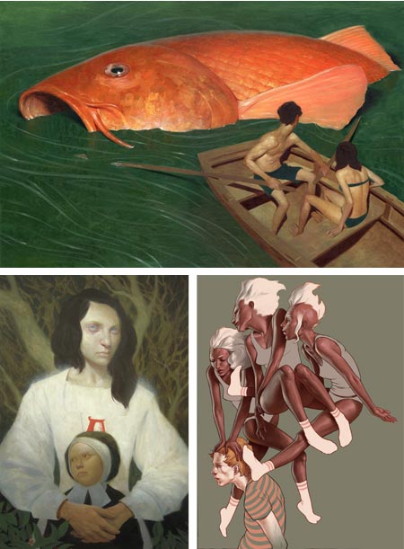
Ukrainian painter Evgeni Gordiets was trained at the National School of Fine Arts, State University of Fine Arts and the State Academy of Fine Art, all in Kiev, Ukraine.You will sometimes hear his paintings referred to as “sunny” or “serene” Surrealism. Though I doubt that Gordiets adheres to the actual tenants of the original Surrealists, his work does show their influence, but without the intention to shock or disturb. Instead, he offers a contemplative twist on reality, painted in a bright, detailed manner.
His work suggests a confluence of Magritte and Eyvind Earle, with a touch of Arnold Böcklin thrown infor good measure. You will also find brushes with pointillism and, as you go back in time, more straightforward landscapes and still life, rendered with a similar approach.
Gordiets compositions often follow similar themes, with foreground gardens or rocky outcrops set against an expanse of water and distant, sun bleached cliffs. They evoke a stillness and sense of timelessness, a feeling accentuated by a technique that carries hints of Renaissance landscape, though with a much lighter palette (see my posts on Jean Fouquet and Giovanni Bellini).
His palette is often light in value but muted in color intensity; at other times the colors are preternaturally brilliant and outside the range of nature’s normal colorations; including trees with blue or purple crowns.
I can’t find an official site for the artist, but he is represented by several galleries. [Correction: there is an official site, it just didn’t show up in my initial search. I didn’t think to simply look for the artist’s name as the domain. Here is the official site: http://evgenigordiets.com, and the gallery page: http://evgenigordiets.com/art.html]
Categories:
-
The Boing Boing Cartoon Circus
 For the past week or so, Stephen Worth, Director of the always amazing ASIFA-Hollywood Animation Archive (which I have mentioned on several occasions) has been guest blogger on Boing Boing.
During that stint he has given us a series of treats including the Boing Boing Cartoon Circus, a list of some wonderful classic cartoons.
These are almost forgotten gems from an age when cartoon characters, and the imaginations of the artists, were wildly flexible.
The list includes such bizarre and delightful wonders as Grim Natwick’s Swing You Sinners (which Worth bills as “The Weirdest Cartoon Ever”); Terry-Toons’ The Last Roundup, in which Gandy Goose faces Adolf Hitler in the form of a pig; the Fleischer brother’s Popeye in Goonland, a delightfully looney excursion into weirdness (see my previous posts on Max Fleischer and the studio’s amazing Superman and Betty Boop cartoons); Bob Clampett’s Tin Pan Alley Cats, with a parody of Fats Waller; and the beautifully realized Aladdin and the Wonderful Lamp, a masterpiece by Grim Natwick under the direction of Ub Iwerks, which has some of the character of a Winsor McCay comic strip brought to life.
All in all a treat for fans of cartoon animation, swing jazz and/or overall weirdness.
For more, see the links on the ASIFA-Hollywood Animation Archive under item #7 on The Top Ten Reasons to Contribute to A-HAA, for links to even more classic cartoons.
(Images at left: Swing You Sinners, The Last Roundup, Popeye in Goonland, Tin Pan Alley Cats, Aladdin and the Wonderful Lamp)
Categories:
-
Sergio Martinez
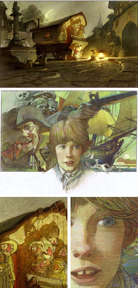
Born in Mexico, Sergio Martinez studied art at the Academie de la Gandre Chaumiere in Paris, and has had a long career in illustration for book and advertising clients in France, Switzerland, Spain, UK, Mexico, the US and other countries in Central and South America.That I haven’t encountered his work until recently just boggles my mind, because I think he’s an amazing talent.
Martinez maintains four separate blogs. Though the distinction in focus between them can be less that clear, it’s of little consequence as they all give you opportunity to view more of his wonderful artwork.
The two major blogs are Sergio Martinez Linework and Sergio’s Linework.. The others are Sergio’s Line-work Comments and Sergio Martinez Gallery. All of them seem to mix illustration with personal projects and gallery art.
Martinez has an unusual working method, involving carbon pencils, oil pastels and colored pencils on tracing vellum, worked by dissolution and blending from the back side with careful applications of turpenoid. There are also pieces in charcoal pencil, egg tempera and watercolor.
The result is a combination of line, texture and color that has some of the best characteristics of both drawing and painting, though I presume that one would call most of the works drawings.
The fluid, graceful linework, and linear applications of textural lines in colored pencil and oil pastel, give the images a loose, gestural quality; though as Walt and and Roger Reed point out in their introduction, his approach to the work is anything but casual. He often redoes images multiple times until arriving at a final he considers acceptable.
However free the application of materials may appear, it is always in service of highly accomplished draftsmanship and sophisticated compositions.
Though he doesn’t always give credits for the project associated with the images, he does give materials for each piece; a wonderful practice considering his unusual approach and variety of technique. One of his major clients appears to be BBC Radio, for whom he has provided illustrations for boxed sets of radio dramas. Other clients include Signet, New American Library, Disney Press NY, and Readers Digest.
Also a delight, is that most of the images on his blog are linked to larger images, and there are also large images linked to the cover thumbnails of his listed books for Good News and Crossway publishers (click through twice and look for text link to “High-resolution image”).
You can find a more extensive list of books he has illustrated on Amazon.com, and another on AllBookstores.com.
[Via Ericka Lugo]
Categories:
-
Bill Turner

The landscapes of Bill Turner come with invitations.Most of them follow a compositional motif of roads, often central to the image, inviting you to step onto the road and follow it into the landscape.
Turner lives and works in the Atlanta, Georgia area. His landscapes, painted in oil and acrylic, are softly rendered, at times more suggested than delineated, and frequently cloaked in soft mist or atmospheric haze.
They are usually painted with a narrow, carefully controlled palette. His compositions, however, are bold in terms of value and shapes, with large dark masses set against bright areas of hazy skies (a hazy sky is actually lighter in value than a sunny blue one).
His web site includes a multi-page gallery of paintings, as well as a selection of reproductions.
Turner started as a photographer, and continues to work in that medium, with may of his photographic compositions using the same compositional device of roads to lead your eye, and imagination, into the landscape.
I cam across Turner’s work obliquely, through an “ambient video” experiment by technology experimenter Doug Siefken and composer Tom Salvatori, in which Turner’s landscape “sewell barn” (image above, bottom) is used as the subject for a piece called The Road to Sewell’s Barn.
In it Salvatori’s painting has been digitally manipulated to an almost monochromatic state and is very gradually restored to full color (and perhaps “pushed” a bit beyond). The suggestion in this case is of dawn breaking. The changes happen so slowly as to be imperceptible, like a real dawn.
Categories:


Charley’s Picks
Bookshop.org
(Bookshop.org affilliate links; sales benefit independent bookshop owners; I get a small percentage to help support my work on Lines and Colors)

John Singer Sargent: Watercolors


Urban Sketching: Understanding Perspective


Charley’s Picks
Amazon
(Amazon.com affiliate links; sales go to a larger yacht for Jeff Bezos; but I get a small percentage to help support my work on Lines and Colors)
John Singer Sargent: Watercolors
Urban Sketching: Understanding Perspective