
Categories
- 3d CGI
- Amusements
- Animation
- Anime & Manga
- Art Materials
- Art Videos
- Blogroll
- Cartoons
- Color
- Comics
- Concept & Visual Dev.
- Creativity
- Digital Art
- Digital Painting
- Displaying Art on the Web
- Drawing
- Eye Candy for Today
- Gallery and Museum Art
- High-res Art Images
- Illustration
- Motion Graphics & Flash
- Museums
- Online Museums
- Outsider Art
- Painting
- Painting a Day
- Paleo Art
- Pastel, Conté & Chalk
- Pen & Ink
- Prints and Printmaking
- Reviews
- Sc-fi and Fantasy
- Sculpture & Dimensional
- Site Comments
- Sketching
- Storyboards
- Tools and Techniques
- Uncategorized
- Vector Art
- Videos & Podcasts
- Vision and Optics
- Watercolor and Gouache
- Webcomics
Archives
- May 2026
- April 2026
- March 2026
- February 2026
- January 2026
- December 2025
- November 2025
- October 2025
- September 2025
- August 2025
- July 2025
- June 2025
- May 2025
- January 2025
- December 2024
- November 2024
- October 2024
- September 2024
- August 2024
- June 2024
- April 2024
- March 2024
- February 2024
- January 2024
- December 2023
- November 2023
- October 2023
- September 2023
- August 2023
- July 2023
- May 2023
- April 2023
- March 2023
- February 2023
- January 2023
- December 2022
- November 2022
- September 2022
- August 2022
- July 2022
- June 2022
- May 2022
- April 2022
- March 2022
- February 2022
- January 2022
- December 2021
- November 2021
- October 2021
- September 2021
- August 2021
- July 2021
- June 2021
- May 2021
- April 2021
- March 2021
- February 2021
- January 2021
- December 2020
- November 2020
- October 2020
- September 2020
- August 2020
- July 2020
- June 2020
- May 2020
- April 2020
- March 2020
- February 2020
- January 2020
- December 2019
- November 2019
- October 2019
- September 2019
- August 2019
- July 2019
- June 2019
- May 2019
- April 2019
- March 2019
- February 2019
- January 2019
- December 2018
- November 2018
- October 2018
- September 2018
- August 2018
- July 2018
- June 2018
- May 2018
- April 2018
- March 2018
- February 2018
- January 2018
- December 2017
- November 2017
- October 2017
- September 2017
- August 2017
- July 2017
- June 2017
- May 2017
- April 2017
- March 2017
- February 2017
- January 2017
- December 2016
- November 2016
- October 2016
- September 2016
- August 2016
- July 2016
- June 2016
- May 2016
- April 2016
- March 2016
- February 2016
- January 2016
- December 2015
- November 2015
- October 2015
- September 2015
- August 2015
- July 2015
- June 2015
- May 2015
- April 2015
- March 2015
- February 2015
- January 2015
- December 2014
- November 2014
- October 2014
- September 2014
- August 2014
- July 2014
- June 2014
- May 2014
- April 2014
- March 2014
- February 2014
- January 2014
- December 2013
- November 2013
- October 2013
- September 2013
- August 2013
- July 2013
- June 2013
- May 2013
- April 2013
- March 2013
- February 2013
- January 2013
- December 2012
- November 2012
- October 2012
- September 2012
- August 2012
- July 2012
- June 2012
- May 2012
- April 2012
- March 2012
- February 2012
- January 2012
- December 2011
- November 2011
- October 2011
- September 2011
- August 2011
- July 2011
- June 2011
- May 2011
- April 2011
- March 2011
- February 2011
- January 2011
- December 2010
- November 2010
- October 2010
- September 2010
- August 2010
- July 2010
- June 2010
- May 2010
- April 2010
- March 2010
- February 2010
- January 2010
- December 2009
- November 2009
- October 2009
- September 2009
- August 2009
- July 2009
- June 2009
- May 2009
- April 2009
- March 2009
- February 2009
- January 2009
- December 2008
- November 2008
- October 2008
- September 2008
- August 2008
- July 2008
- June 2008
- May 2008
- April 2008
- March 2008
- February 2008
- January 2008
- December 2007
- November 2007
- October 2007
- September 2007
- August 2007
- July 2007
- June 2007
- May 2007
- April 2007
- March 2007
- February 2007
- January 2007
- December 2006
- November 2006
- October 2006
- September 2006
- August 2006
- July 2006
- June 2006
- May 2006
- April 2006
- March 2006
- February 2006
- January 2006
- December 2005
- November 2005
- October 2005
- September 2005
- August 2005
Relevant Blogs
Art, Painting & Sketch
- Gurney Journey
- Underpaintings
- Art and Influence
- Painting Perceptions
- Oil Painters of America
- Vasari Paint POV
- Flying Fox
- Urban Sketchers
- Bento (Smithsonian)
- Art Inconnu
- The Hidden Place
- Still Life
- Making a Mark
- The Art of the Landscape
- Exploring Color & Creativity
- Art Contrarian
- Artist A Day
- beinArt Surreal Art Collective
- Eye Level
- David Dunlop
- p.i.g.m.e.n.t.i.u.m
- CultureGrrl
- Joaquín Sorolla blog
- Artists in Pastel
“Painting a Day”
- A Painting a Day (Keiser)
- On Painting (Keiser)
- Julian Merrow-Smith
- Karen Jurick
- Jeffrey Hayes
- Carol Marine
- Abbey Ryan
- Daily Paintworks
Other Painting Blogs
- Virtual Gouache Land
- Neil Hollingsworth
- Marc Hanson
- Kevin Menck
- Marc Dalessio
- Larry Seiler
- Stapleton Kearns
- Colin Page
- Roos Schuring
- Hans Versfelt
- Titus Meeuws
- Régis Pettinari
- René Plein Air
- Belinda Del Pesco
- Robin Weiss
- Nathan Fowkes (Land Sketch)
- William Wray
- Frank Serrano
- Stephen Magsig
- Michael Chesley Johnson
- Twice a Week
- Sarah Wimperis
- Rob Adams
- Michael Cole Manley
- The Dirty Palette Club
- Mike Manley’s Draw!
Gallery Art & Illustration mix
Illustration
- Howard Pyle
- 100 Years of Illustration
- BibliOdyssey
- Illustration Art
- Today’s Inspiration
- Illustration Mundo
- Little Chimp Society
- Danny Gregory
- R D (John Martz
- Illustration Friday blog
- Monster Brains
- Illustrators & Illustrations (RU)
- Elwood H. Smith
- DaniDraws.com
- Designers Who Blog
- iSpot Blog
Sci-Fi & Fantasy
Illustration & Comics
Comics & Cartoons
- Comics Beat
- Robot 6
- Newsarama Blog
- Comic Vine
- Comics Alliance
- Forbidden Planet Int.
- Paolo Rivera
- Bolt City
- Flight
- Scott McCloud
- The Comics Journal
- Comixpedia
- Funnybook Babylon
- James Baker
- Middleton’s Sketchbook
- Boneville
- The Hotel Fred
- Paul Rivoche
- Daily Cartoonist
- Mad About Cartoons (William Wray)
- Digital Strips
Illustration & Concept
Animation & Concept
- Cartoon Brew
- Animation Blog
- Cold Hard Flash
- Concept Art World
- The CAB
- FY Concept Art
- Concept Ships
- Concept Robots
- John Nevarez
- Armand Serrano
- Marcos Mateu-Mestre
- all kinds of stuff (Kricfalusi)
- Yacin the faun (Man Arenas)
- Kelsey Mann
- Cre8tivemarks Blog
- Ice-Cream Monster Toon Cafe
- AAU Character & Creature Design
- AAU Animation Notes
- Articles and Texticles
Paleo & Scientific
Tools & Techniques
Other
Lists of Art Blogs
Art Image Resource Links
Historic Art Images
- Wikimedia Commons: Paintings
- Wikimedia Commons: Drawings
- The Athenaeum
- WikiArt (WikiPaintings)
- Google Art Project: Artists
- Google Art Project: Collections (Museums)
- ArtCyclopedia
- Web Gallery of Art
- Art Renewal Center
- Web Gallery of Impressionism
Auction Consolidation sites
Auction sites
- Sotheby’s
- Bonham’s
- Christies
- Heritage Auctions: Fine Art
- Heritage Auctions: Illustration
- Freeman’s Auctions
- Bukowskis
- Shannon’s
Image Search
Reverse Image Search (search by image)
- Tin Eye
- RevImg
- Google Image Search (camera icon)
- Bing Image Search (camera icon)
Promoting some friends and some clients of my website design business
- Twin Willows T’ai Chi studio in Wilmington DE. Taiji classes with Bryan Davis.
- Ray Hayward, Inspired Teacher of T’ai Chi ( Taiji ) in Minneapolis, Founder of Mindful Motion Tai Chi Academy
- OldHead Tattoo studio and Art Gallery in Wilmington DE. Tattoos and paintings by Bruce Gulick
- Sharon Domenico Art, pet portrait oil paintings
- Platinum Paperhanging, wallpaper hanging, Main Line and Philadelphia, PA
- Lisa Stone Design, interior designer, Main Line and Philadelphia, PA
- Studio12KPT, original art, prints, calendars and other custom printed items by Van Sickle & Rolleri
-
Color and Light: A Guide for the Realist Painter

Color. What other factor in art is so simultaneously fascinating and frustrating for artists?Numerous books have been written on the subject; some are less than worthwhile, some are good, some are excellent, and a few have become so relied on that over time they have become standards.
Each takes a certain approach to the subject, emphasizing color choices, color mixing, experimentation, analysis, etc., but of the many books on color that I’ve encountered over time, there always seemed to be key parts of the puzzle that hadn’t been addressed yet — a certain kind of book on color that was missing.
I didn’t really know what that book was until James Gurney wrote Color and Light: A Guide for the Realist Painter.
In Color and Light, which has just been released, we get the printed version of having an experienced painter leaning over our shoulder, giving us his best advice and taking us beyond the basics into the subtleties of the practical application of color in the process of creating paintings.
This is the “other” book on color, the one that takes the practice of working with color, and the understanding of color and light and how we perceive them, to the next level.
Gurney, who I have written about previously on several occasions, has culled a treasure trove of insightful observations, practical tips, experimental trials and artful technique from years of painting a wide range of subjects in a variety of visual approaches.
He has been a renowned illustrator, portraitist, landscape artist, plein air painter and scientific artist; and beyond that has for years been a restless experimenter, investigating the work of master artists, thinking about and working with color in all of its aspects as related to painting.
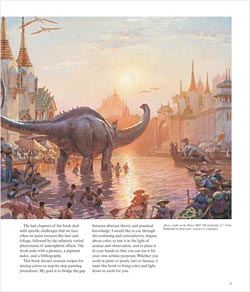
 For the past several years, Gurney, best known as the creator of the popular Dinotopia series of illustrated fantasy stories, has been writing a blog called Gurney Journey. Those of us who have been following Gurney Journey since its inception have reaped the benefit of a generous bounty of art related information, advice, observations, experiments, discoveries, and links that he has made available in his frequent posts over the past few years.
Some of this material, along with new material culled from Gurney’s expertise as an illustrator, were codified into a book in 2009 called Imaginative Realism: How to Paint What Doesn’t Exist, which I reviewed here.
In Color and Light he has also pulled from those observations and expositions (you can see some of the topics by searching for Color and Light book, or simply color on the GurneyJourney blog), but gone well beyond that into a great deal of new material written specifically for the book.
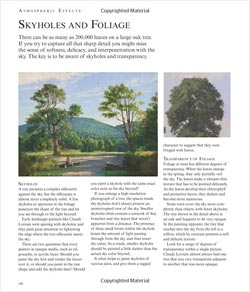
While I think of this book as advanced in many ways, Gurney does go into many of the fundamentals of color and color theory, with succinct chapters on the history of color theory, pigments, the academic tradition, plein air painting, magazine illustration, chroma and value, warm and cool, local and reflected color, atmospheric perspective, color schemes, limited palettes, reflections, highlights and shadows and many others. Beginners as well as advanced painters will find a wealth of information.
However, he goes beyond the ordinary with thoughtful excursions into topics like understanding gamuts, subsurface scattering, specular reflections, different natural and artificial light sources, and expert techniques for handling difficult problems like reflection and transparency, fog and mist, skies and foliage, nocturnes, cloud shadows, and premixing colors for a painting.
Though some of the information may be familiar, I think that most artists will find the book to be a treasure trove of small but significant revelations, as if dozens of little “Ah-ha!” lightbulbs (of varying spectrums) were appearing over your head as you read.
I consider this book, if not a “must-have”, at the very least a “must-see” for any representational painter. I urge you to pick it up and look through it in a bookstore.
 I’m a little concerned that “fine art” painters might assume from a casual leaf-through that the presence of fantasy illustrations would indicate the focus of the book is not in their direction, particularly because the fantasy illustrations often have a “jump off the page” quality to them and seem dominant. Nothing could be further off the mark, the material is exactly on target for realist painters of any background who want to get a better handle on light and color.
You can get a virtual “pick up and leaf through” from the nicely extensive preview on the Amazon.com listing (click on the “Look Inside” cover image), as well as a video flip-through from Spectrum, reposted on Gurney Journey, and another on Parka Blogs.
In addition to being available through bookstores and online booksellers, you can order directly from the the Dinotopia store and have your copy signed by the author.
Like any book from James Gurney, this one is a visual treat; in this case illustrated with works from great painters and illustrators of the past, as well as Gurney’s own illustrations, sketches, diagrams and paintings. Just like his previous instructional book, it can also be enjoyed as a coffee table art book.
Only time will tell, of course, but I think Color and Light: A Guide for the Realist Painter will take a place as a new standard text among books on color, destined to be a fixture on the bookshelves of painters and illustrators for years to come.
Categories:
-
Rockwell’s Four Freedoms

Most Americans associate Norman Rockwell’s iconic painting of the formal family meal, shown above, top, with today’s holiday of Thanksgiving, and its traditional signature main course of roast turkey.The painting, however, was painted with a different intention (even though the model for the turkey was actually the turkey from his own family Thanksgiving dinner).
Titled Freedom From Want, the painting was originally part of a series of four; I’ve pulled the top one out of it’s usual third position in the sequence here. The others were Freedom of Speech, Freedom of Worship and Freedom From Fear.
They were Rockwell’s response to a speech delivered by then President Franklin D. Roosevelt to Congress in January of 1941, in which he spoke of four essential freedoms that should be recognized and guaranteed everywhere in the world:
“In the future days, which we seek to make secure, we look forward to a world founded upon four essential human freedoms.
The first is freedom of speech and expression — everywhere in the world.
The second is freedom of every person to worship God in his own way — everywhere in the world.
The third is freedom from want — which, translated into universal terms, means economic understandings which will secure to every nation a healthy peacetime life for its inhabitants-everywhere in the world.
The fourth is freedom from fear — which, translated into world terms, means a world-wide reduction of armaments to such a point and in such a thorough fashion that no nation will be in a position to commit an act of physical aggression against any neighbor — anywhere in the world.
That is no vision of a distant millennium. It is a definite basis for a kind of world attainable in our own time and generation. That kind of world is the very antithesis of the so-called new order of tyranny which the dictators seek to create with the crash of a bomb.”
The speech was meant to prepare Congress, and the American public, for Roosevelt’s intention that the country should become directly involved in opposing Nazi Germany in its widening military domination of Western Europe, which the U.S. did, with a declaration of war (such an old fashioned notion these days) in December of that year.
Roosevelt used the image of American ideals of freedom as a symbol of the individual liberties being suppressed by the Fascist regime. (On a side note, “Fascist” has become a popular epithet with which some American political figures attempt to brand their political enemies these days. Most people who use it, or at least those who listen to them, apparently have no idea what the term actually means. Look it up.)
Rockwell, at the time the dominant star of American illustration, had a strong response to Roosevelt’s speech and two years later painted a series of four paintings depicting the four freedoms as scenes from American life.
He originally conceived the series in 1942, and attempted to volunteer his services to the government agencies responsible for war propaganda, but was met with lack on interest. (“Propaganda“, by the way, is another term whose actual meaning is often lost in its buzzword connotations and popular interpretation. Again I suggest looking it up.)
Rockwell instead submitted the paintings to the Saturday Evening Post, for which he had been regularly painting covers, and their publication was met with great popular response and millions of requests for reprints.
The government eventually recognized the power of the images and used them on posters for the efforts to support the expense of the war with the sale of War Bonds (another quaint notion these days).
Rockwell himself reportedly struggled with the paintings, never entirely happy with them and concerned that they lacked sufficient power. He worked on them over a seven month period, during which he reportedly lost several pounds from the strain of working on them so intensely.
The public, however, loved them. They were reprinted on four million posters and were displayed in a touring exhibition that drew over a million visitors. They are now considered among Rockwell’s signature works, and were the subject of a book published in 1993 on the 50th anniversary of their original publication.
The four paintings are currently in the collection of the Norman Rockwell Museum in Stockbridge, Massachusetts, the director of which recently participated in the International Four Freedoms Award ceremonies in the Netherlands.
Categories:
-
BoldBrush November competition entries

BoldBrush is a painting competition held by Canvoo, an arts newsletter produced by a company that sells hosted artist websites.Entries are not limited to customers, and they post the entries online in a large grouping that is worth looking through. There are quite a number of interesting entries, and there are links to additional images of entries, past and present, by the individual artists.
Yon can step through multiple pages of thumbnails, view all on a single page or view a selection of popular entries.
You can also just use Google to find the artist’s websites to see more of their work.
(Images above, links to BoldBrush entries: Jeffery Sparks, Margie Murray, Leah Richmond, J.M. Brodrick, Richard Christian Nelson, Alan Dingman, Tom Heflin)
Categories:
-
Past trains of the future

I just love illustrator’s visions of future transportation from the early to mid 20th Century.Popular Science has a 10 image gallery of some wonderful trains that I want to ride.
(Plus I’m still waiting for the gyrocopter in every garage and my personal jetpack.)
Isn’t it the future yet?
Categories:
-
Arthur Hughes

Though he was never a formal member of the Pre-Raphaelite Brotherhood, English painter and illustrator Arthur Hughes was part of their circle and distinctly influenced by the Pre-Raphaelite style and subject matter.Younger than the established Pre-Raphaelite painters, Hughes was first attracted to their movement by a magazine they published for short time called The Germ.
Hughes didn’t fare well with the Royal Academy, arbiter of artistic value in England at the time, but he was welcomed by the Pre-Raphaelites, attended their meetings, and became friends with several of the seminal figures, Millais in particular.
In addition to the familiar Pre-Rahaelite subjects from Shakespeare, Authurian legend, other literature and history, he painted portraits and scenes of ordinary life.
Hughes was particularly known for his paintings of lovers that were meditations on the fleeting nature of beauty, love and youth.
Categories:
-
Moebius art on Tumblr
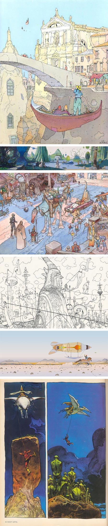
Jean Giraud, more commonly known as Moebius, and who also signs some work as “GIR”, is a French comics artist and illustrator, very well known in Europe, less so here in the U.S.Moebius is my favorite comics artist, and if you think of him as an illustrator, one of my favorites in that category as well. I haven’t had time to write a proper post on him, but I didn’t want to let this go by.
There is often, for various reasons, a dearth of Moebius art available on the web. His official site comes and goes and doesn’t show his work to best advantage.
However, someone has posted a nice variety of Moebius art on a Tumblr blog called Quenched Consciousness, and I wanted to point it out on an “enjoy it while you can” basis, as these things tend to disappear.
Though a somewhat disjointed collection — the comics aren’t in the context of the whole story and there is a glaring lack of images from his brilliant work on Lieutenant Blueberry — it’s still a nice cross section of his various styles, particularly if you’re not familiar with his work.
[Note: linked site contains images that are NSFW and not suitable for children.]
[Via Tom Gauld]
Categories:


Charley’s Picks
Bookshop.org
(Bookshop.org affilliate links; sales benefit independent bookshop owners; I get a small percentage to help support my work on Lines and Colors)

John Singer Sargent: Watercolors


Urban Sketching: Understanding Perspective


Charley’s Picks
Amazon
(Amazon.com affiliate links; sales go to a larger yacht for Jeff Bezos; but I get a small percentage to help support my work on Lines and Colors)
John Singer Sargent: Watercolors
Urban Sketching: Understanding Perspective