
It’s always a treat for me to get to meet and talk to some of the contemporary artists I write about. This past Friday, I had the opportunity to attend an opening of a new show at the Gross McCleaf Gallery here in Philadelphia of works by Western Pennsylvania artist Thomas Paquette.
I wrote about Thomas Paquette back in the Spring of 2007 on the occasion of another show at the same gallery, but I just made it to that show before it closed, and missed the opening.
At the time I was fascinated with his small works in gouache that I had seen in reproduction, and since then in a beautiful book, Thomas Paquette: Gouaches, that is available directly through the artist’s site, or though Amazon. The pieces featured in the book are also available as archival prints.
Though the gouache paintings weren’t part of the show that time (or this time), I became fascinated with some of the gouache-like characteristics of his much larger scale oils, that seem to carry some of the same feeling.
This time I had a chance to meet the artist and talk with him about his work and technique. Though still pursuing many of the same subjects and approaches that were evident in his work before, he is pushing with some of his new paintings in new directions, notably in paintings in which large color filled skies dominate the composition.
You can see some of his recent work on his own site, and a selection of additional work on the Gross McCleaf site.
In asking about his working methods, I found out that Paquette often works over his oils in layers, painting and repainting areas, partly building up texture and placing areas of color within areas of color, and partly searching out the forms and colors, almost like an additive sculptor working back and forth in clay. It reminded me that there is actually a sculptural quality to his work, in which the surface texture of his paint is one of the appealing elements of the painting; unfortunately, one that is lost in reproduction.
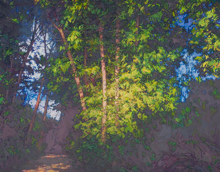
Paquette’s work strikes me as a delightful blending of seemingly contradictory elements, impressionistic in its color and open brushwork, yet academically strong in the drawing and composition. Close up, the shapes and areas of color seem abstract, in the true sense of that word, meaning to extract the essence of something, but also in the sense that you could crop out a small section of almost any area of his paintings and have a vibrant non-representaional composition, filled with lively variations in color and texture.
That texture itself, layers of richly applied paint, well raised above the surface in places, is also a contrast with the apparently flat nature some of his shapes take on from a middle distance. Step back more and that graphic quality, a sense of line and color that reminds me of colored woodblock prints, resolves into a lush naturalism.
The surface character of his paintings, and the nature of the areas of color close up, seem so different form the naturalistic appearance of the works from a distance that I asked him if he does a lot of stepping up and back as he paints; something I’ve been curious about in regard to a number of painters in who exhibit similar characteristics, like Sargent or Daniel Garber.
In Paquette’s case, the answer is no. He told me that it is more of a mental grasp of overall work, maintained while working close, than a technique of constantly viewing the work from close up and back.
Paquette is, after all is said and done, a realist; but his rendering technique pays attention to paint as paint, areas of color as individual abstract elements; and texture as an exploration in itself.
The tension between these opposites, along with his strong sense of value and color and the dynamics of his compositions, are what make his work so fascinating.
The show at the Gross McCleaf Gallery runs until September 27th, 2008.