

I was provided with a review copy of PaintWorks, a new eMagazine from Interweave, the parent company of American Artist and their corresponding website Artist Daily.
The debut issue of PaintWorks is Summer 2011 and the theme of the issue is “The Essentials of Still Life Painting”.
The eMagazine itself is an application, with a version for Mac or Windows (see the note below on compatibility). I downloaded the installer for Mac (364mb). It installs as an Adobe AIR application; I assume that users without Adobe AIR will be prompted to install that initially.
The installer can be set to open the eMagazine automatically when installation is complete. A brief introductory video drops you on the “cover” (home page?) of the issue, without a clear prompt or indication of where to go from there.
Poking around in the control/navigation bar at the top reveals a menu of contents, zoom control, help feature and forward and back arrows. (I think they are using an eMagazine package from Adobe, which has been providing them for a number of publications, and I assume any navigation issues are to be laid at the feet of Adobe, rather than being specific to PaintWorks.)
I found the eMagazine best enjoyed at full screen.

Following through in sequence, the structure is familiar and magazine-like, the initial page after the cover features an Editor’s Note, masthead, table of contents and link to a User’s Guide (which should have been provided on the cover page, but I’m being picky.)
The fact that it is an electronic magazine starts to become apparent with the Editor’s Note, which is a video. In it, editorial director Michael Gormley provides a brief introduction to the issue and its features, along with short clips of some of the featured artists giving their thoughts on the issue’s topic. The table of contents items are links to the sections, and a menu of them is always available as a pop-out from the left side of the interface. There is also a hidden pop-up navigation slider accessed by moving your cursor to the bottom of the interface.
The next page is an ad (clearly labeled as such in the table of contents) for American Artist’s print publication.
Next up is a 360° panorama of painter Nelson Shanks’ studio. There is an apparently unrelated section of “Tips on how to equip your own home studio” on the left, which is essentially an ad for Dick Blick artist materials. The pictures of particular brushes, paints, etc. are links. Clicking on them suddenly leaves the eMagazine, opens your web browser and takes you directly to the product pages on Blick’s online store.
I don’t so much object to the ad (though it should be labeled as such) as I do to the disconcerting jump from one application to another without warning. To me, this is simply poor interface design.
Next is the first actual article, and at this point the “next page/previous page” paradigm breaks down and you’re expected to scroll down to the article’s accompanying interactive features.
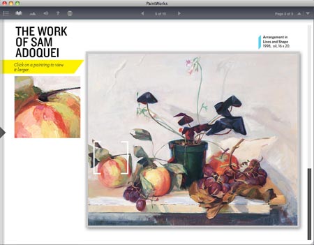
The first of these is a completely pointless bit of rollover text, a prime example of how most print publications don’t know how to use interactivity properly; but the second is a reasonably effective gallery of works from the article’s co-author, Sam Adoquei. The feature includes a “detail loupe” (my phrase, not theirs) in which you can move around the selected work to see small sections in more detail (image above).
The next article is a photographic essay on arranging and lighting a still life subject, with links to downloadable PDFs of the photos and an invitation to paint them and submit your paintings to them via Facebook.
The next section is another bit of pointless “interactivity”, with pop-up speech bubbles over photos, where simple captions would actually have been better; giving the feeling that the editors were struggling to make things “interactive” to justify the eMagazine format.

The next actual article, Draw it First, is another in which you scroll down for the article’s interactive features, in this case a nicely done step-by-step through a beautiful pencil drawing by the article’s author, Patricia Watwood. This includes the “detail loupe” feature used in the Sam Adoquei gallery (image above).
There is also a quote from another artist, Sadie Valeri (my post here), that is a link. Clicking on it again unexpectedly yanks you out of the eMagazine and into a browser, where you’re taken to an article on the Artist Daily site.
Next up is another interactive ad for one of the “Free eBooks” they’re constantly promoting with pop-ups on the Artist Daily site (they really need to get rid of those pop-ups, but I digress).
The next article, “All About Color” is another scroll-down article, thin on content and heavy on pointless rollovers.

Next is an article on Painting with Complementary Colors (image above), which consists of a series of short videos by painter Kristin Künc. These are instructive and well done, and provide more of a feeling of substance than some of the other articles.
Next is another interactive ad, this one for videos from C.W. Mundy. In this case, the video previews in the ad actually contain some useful information. The ad includes a link that again yanks you out of the eMagazine and into a browser where you are whisked to the Artist Daily online store.
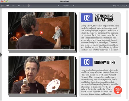
Then another article in which the actual valuable information is in the form of short videos, these from artist Martha Erlebacher. Again, the videos are instructive and well done (though supplemented with another unnecessary “interactive”, with rollovers of the names of colors on her palette where simple labels would be more helpful).
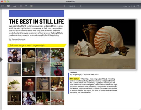
The magazine rounds out with a gallery of very nice still life paintings from 16 artists, most of whom I found worth following up on (including David Ligare, who I recently featured), though this is lacking the detail magnification feature found elsewhere.
The last page is an ad for the American Artist Weekend With the Masters workshop and conference in California in September, 2011.
I’ll give American Artist and Interweave credit for jumping into the uncharted waters of digital publishing, and try to keep in mind that this is their first effort, but they don’t quite have it yet.
This is a publishing medium with exciting potential, but the editors haven’t learned how to use it to advantage.
The most valuable information is in the familiar format of instructional videos, while the instructive potential of interactive features has gone essentially untapped. Instead we’re presented with an array of unnecessary rollover text and other unhelpful “interactivity”.
The format holds great promise, but they need to hire experienced interactive designers to take advantage of the medium.
Think of what could be done with an interactive color wheel that shows artists’ colors in different views for complements, value range, chroma or mixing gamut. How about step-through demos in which the final piece can be moused over to reveal underpainting steps, videos of process and original sketches as layers in a single image? What about interactive color charts in which sliders reveal tints, shades and complementary mixes?
You could have interactive demos of how different brush angles produce different paint strokes, or painting demos in which information about the color, brush type and mixing palette are available as pop-up extensions to the main image. You could use sliders to show a work with the hues removed as a study in values, or instructional videos with integrated links to still images of the work in various stages for closer study.
There are lots of possibilities that could make the eMagazine format shine for an instructional art magazine. Rollover speech bubbles aren’t among them.
They also need to restrain the urge to link out to the web without warning. If you want to constantly link to web resources, put the primary content on a website. If you’re making a separate downloaded application, make it self-contained. Even the advertising, if there is work put into it, could be instructive and entertaining, and actually feel like valuable content. (Advertisers would expect a link out to their website via the user’s web browser, just label it as such.)
The potential is there, the editors just need to learn to use this new publishing medium for its real strengths. Hopefully, future issues will take the strong aspects of this issue, abandon the weak ones and build from there.
That being said, the editors certainly do know how to select excellent artists with valuable painting knowledge to impart, even if it’s mostly in the videos at the moment, and there is a beautiful selection of still life painting on display in the issue.
PaintWorks eMagazine, Summer 2011: The Essentials of Still Life Painting is available from the Artist Daily shop for $9.99 USD. There is a description page with a preview of the table of contents and some introductory videos.
Requirements, from Interweave: “To view this eMag, your computer needs to have these requirements: PC with Intel Core Duo or faster processor or Mac OS X v10.5 or v10.6, plus 512MB of RAM or greater available (1GB recommended). Note: Mac computers with PowerPC processors are not supported, and this version of the eMag is not compatible with the Apple iPad (but we’re working on it!).”