
Categories
- 3d CGI
- Amusements
- Animation
- Anime & Manga
- Art Materials
- Art Videos
- Blogroll
- Cartoons
- Color
- Comics
- Concept & Visual Dev.
- Creativity
- Digital Art
- Digital Painting
- Displaying Art on the Web
- Drawing
- Eye Candy for Today
- Gallery and Museum Art
- High-res Art Images
- Illustration
- Motion Graphics & Flash
- Museums
- Online Museums
- Outsider Art
- Painting
- Painting a Day
- Paleo Art
- Pastel, Conté & Chalk
- Pen & Ink
- Prints and Printmaking
- Reviews
- Sc-fi and Fantasy
- Sculpture & Dimensional
- Site Comments
- Sketching
- Storyboards
- Tools and Techniques
- Uncategorized
- Vector Art
- Videos & Podcasts
- Vision and Optics
- Watercolor and Gouache
- Webcomics
Archives
- July 2026
- June 2026
- May 2026
- April 2026
- March 2026
- February 2026
- January 2026
- December 2025
- November 2025
- October 2025
- September 2025
- August 2025
- July 2025
- June 2025
- May 2025
- January 2025
- December 2024
- November 2024
- October 2024
- September 2024
- August 2024
- June 2024
- April 2024
- March 2024
- February 2024
- January 2024
- December 2023
- November 2023
- October 2023
- September 2023
- August 2023
- July 2023
- May 2023
- April 2023
- March 2023
- February 2023
- January 2023
- December 2022
- November 2022
- September 2022
- August 2022
- July 2022
- June 2022
- May 2022
- April 2022
- March 2022
- February 2022
- January 2022
- December 2021
- November 2021
- October 2021
- September 2021
- August 2021
- July 2021
- June 2021
- May 2021
- April 2021
- March 2021
- February 2021
- January 2021
- December 2020
- November 2020
- October 2020
- September 2020
- August 2020
- July 2020
- June 2020
- May 2020
- April 2020
- March 2020
- February 2020
- January 2020
- December 2019
- November 2019
- October 2019
- September 2019
- August 2019
- July 2019
- June 2019
- May 2019
- April 2019
- March 2019
- February 2019
- January 2019
- December 2018
- November 2018
- October 2018
- September 2018
- August 2018
- July 2018
- June 2018
- May 2018
- April 2018
- March 2018
- February 2018
- January 2018
- December 2017
- November 2017
- October 2017
- September 2017
- August 2017
- July 2017
- June 2017
- May 2017
- April 2017
- March 2017
- February 2017
- January 2017
- December 2016
- November 2016
- October 2016
- September 2016
- August 2016
- July 2016
- June 2016
- May 2016
- April 2016
- March 2016
- February 2016
- January 2016
- December 2015
- November 2015
- October 2015
- September 2015
- August 2015
- July 2015
- June 2015
- May 2015
- April 2015
- March 2015
- February 2015
- January 2015
- December 2014
- November 2014
- October 2014
- September 2014
- August 2014
- July 2014
- June 2014
- May 2014
- April 2014
- March 2014
- February 2014
- January 2014
- December 2013
- November 2013
- October 2013
- September 2013
- August 2013
- July 2013
- June 2013
- May 2013
- April 2013
- March 2013
- February 2013
- January 2013
- December 2012
- November 2012
- October 2012
- September 2012
- August 2012
- July 2012
- June 2012
- May 2012
- April 2012
- March 2012
- February 2012
- January 2012
- December 2011
- November 2011
- October 2011
- September 2011
- August 2011
- July 2011
- June 2011
- May 2011
- April 2011
- March 2011
- February 2011
- January 2011
- December 2010
- November 2010
- October 2010
- September 2010
- August 2010
- July 2010
- June 2010
- May 2010
- April 2010
- March 2010
- February 2010
- January 2010
- December 2009
- November 2009
- October 2009
- September 2009
- August 2009
- July 2009
- June 2009
- May 2009
- April 2009
- March 2009
- February 2009
- January 2009
- December 2008
- November 2008
- October 2008
- September 2008
- August 2008
- July 2008
- June 2008
- May 2008
- April 2008
- March 2008
- February 2008
- January 2008
- December 2007
- November 2007
- October 2007
- September 2007
- August 2007
- July 2007
- June 2007
- May 2007
- April 2007
- March 2007
- February 2007
- January 2007
- December 2006
- November 2006
- October 2006
- September 2006
- August 2006
- July 2006
- June 2006
- May 2006
- April 2006
- March 2006
- February 2006
- January 2006
- December 2005
- November 2005
- October 2005
- September 2005
- August 2005
Relevant Blogs
Art, Painting & Sketch
- Gurney Journey
- Underpaintings
- Art and Influence
- Painting Perceptions
- Oil Painters of America
- Vasari Paint POV
- Flying Fox
- Urban Sketchers
- Bento (Smithsonian)
- Art Inconnu
- The Hidden Place
- Still Life
- Making a Mark
- The Art of the Landscape
- Exploring Color & Creativity
- Art Contrarian
- Artist A Day
- beinArt Surreal Art Collective
- Eye Level
- David Dunlop
- p.i.g.m.e.n.t.i.u.m
- CultureGrrl
- Joaquín Sorolla blog
- Artists in Pastel
“Painting a Day”
- A Painting a Day (Keiser)
- On Painting (Keiser)
- Julian Merrow-Smith
- Karen Jurick
- Jeffrey Hayes
- Carol Marine
- Abbey Ryan
- Daily Paintworks
Other Painting Blogs
- Virtual Gouache Land
- Neil Hollingsworth
- Marc Hanson
- Kevin Menck
- Marc Dalessio
- Larry Seiler
- Stapleton Kearns
- Colin Page
- Roos Schuring
- Hans Versfelt
- Titus Meeuws
- Régis Pettinari
- René Plein Air
- Belinda Del Pesco
- Robin Weiss
- Nathan Fowkes (Land Sketch)
- William Wray
- Frank Serrano
- Stephen Magsig
- Michael Chesley Johnson
- Twice a Week
- Sarah Wimperis
- Rob Adams
- Michael Cole Manley
- The Dirty Palette Club
- Mike Manley’s Draw!
Gallery Art & Illustration mix
Illustration
- Howard Pyle
- 100 Years of Illustration
- BibliOdyssey
- Illustration Art
- Today’s Inspiration
- Illustration Mundo
- Little Chimp Society
- Danny Gregory
- R D (John Martz
- Illustration Friday blog
- Monster Brains
- Illustrators & Illustrations (RU)
- Elwood H. Smith
- DaniDraws.com
- Designers Who Blog
- iSpot Blog
Sci-Fi & Fantasy
Illustration & Comics
Comics & Cartoons
- Comics Beat
- Robot 6
- Newsarama Blog
- Comic Vine
- Comics Alliance
- Forbidden Planet Int.
- Paolo Rivera
- Bolt City
- Flight
- Scott McCloud
- The Comics Journal
- Comixpedia
- Funnybook Babylon
- James Baker
- Middleton’s Sketchbook
- Boneville
- The Hotel Fred
- Paul Rivoche
- Daily Cartoonist
- Mad About Cartoons (William Wray)
- Digital Strips
Illustration & Concept
Animation & Concept
- Cartoon Brew
- Animation Blog
- Cold Hard Flash
- Concept Art World
- The CAB
- FY Concept Art
- Concept Ships
- Concept Robots
- John Nevarez
- Armand Serrano
- Marcos Mateu-Mestre
- all kinds of stuff (Kricfalusi)
- Yacin the faun (Man Arenas)
- Kelsey Mann
- Cre8tivemarks Blog
- Ice-Cream Monster Toon Cafe
- AAU Character & Creature Design
- AAU Animation Notes
- Articles and Texticles
Paleo & Scientific
Tools & Techniques
Other
Lists of Art Blogs
Art Image Resource Links
Historic Art Images
- Wikimedia Commons: Paintings
- Wikimedia Commons: Drawings
- The Athenaeum
- WikiArt (WikiPaintings)
- Google Art Project: Artists
- Google Art Project: Collections (Museums)
- ArtCyclopedia
- Web Gallery of Art
- Art Renewal Center
- Web Gallery of Impressionism
Auction Consolidation sites
Auction sites
- Sotheby’s
- Bonham’s
- Christies
- Heritage Auctions: Fine Art
- Heritage Auctions: Illustration
- Freeman’s Auctions
- Bukowskis
- Shannon’s
Image Search
Reverse Image Search (search by image)
- Tin Eye
- RevImg
- Google Image Search (camera icon)
- Bing Image Search (camera icon)
Promoting some friends and some clients of my website design business
- Twin Willows T’ai Chi studio in Wilmington DE. Taiji classes with Bryan Davis.
- Ray Hayward, Inspired Teacher of T’ai Chi ( Taiji ) in Minneapolis, Founder of Mindful Motion Tai Chi Academy
- OldHead Tattoo studio and Art Gallery in Wilmington DE. Tattoos and paintings by Bruce Gulick
- Sharon Domenico Art, pet portrait oil paintings
- Platinum Paperhanging, wallpaper hanging, Main Line and Philadelphia, PA
- Lisa Stone Design, interior designer, Main Line and Philadelphia, PA
- Studio12KPT, original art, prints, calendars and other custom printed items by Van Sickle & Rolleri
-
Daily Painting, Carol Marine
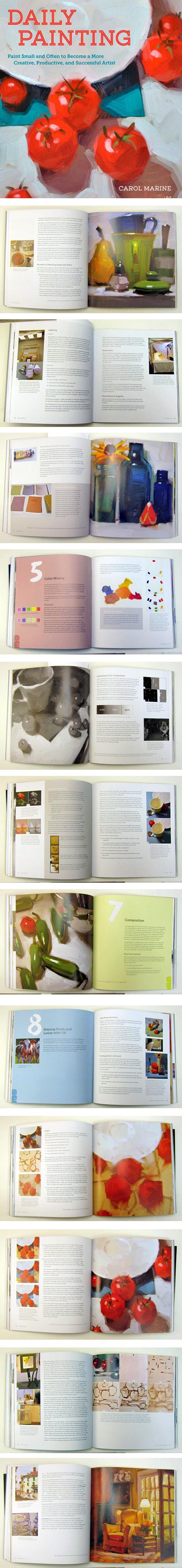
I’ve been following the “daily painting” phenomenon since 2005, when I wrote about a blog called A Painting a Day by Virginia painter Duane Keiser.Keiser had committed himself to painting one small painting each day and posting it to his blog. I commented at the time that I thought this was a terrific idea, and lamented that I didn’t have the time and discipline to follow suit.
I watched with interest as other artists took up the practice, one of whom was Texas painter Carol Marine, an early adopter who started her painting a day practice in 2006. I wrote about her in early 2007.
I continued to follow the idea, as “painting a day” grew into a genuine internet phenomenon — part of a fundamental change in the way artists world-wide interact with their audience. (And, years later than I should have, I finally joined in.)
In addition to taking note of new artists taking up the practice, for which “painting a day” became too narrow a term and “daily painting” is more widely applicable, I’ve also watched some of the earlier adopters continue to make progress (which is, after all, the primary goal of the practice).
Marine, in particular, has become noted not only for her small paintings, with their inventive compositions, geometrically strong forms and bold colors, but as one of the primary proponents of encouraging others to take up daily painting — thorough articles on her blog, a series of online tutorials and in-person workshops.
In addition, Marine and her husband, programmer David Marine, established Daily Paintworks, which has become a very popular group showcase and auction system for hundreds of daily painters.
She has also published a few books through online sources, but has recently published a book dedicated to the subject of daily painting through Random House, titled: Daily Painting: Paint Small and Often To Become a More Creative, Productive, and Successful Artist (Amazon link).
I have to admit that as much as I enjoy Marine’s work, I expected a book on this topic to be somewhat lightweight, filled with lots of her appealing paintings, and a bit of breezy commentary about the practice of daily painting.
I was wrong.
I received a review copy of Daily Painting, and I was delighted to find it extensive, well thought out, beautifully designed, and dense with information.
The book actually succeeds on three levels: as an introduction to the practice of daily painting and a detailed guide to following it; as a coach-like encouragement to follow through, keep on track and overcome problems like artist’s block; and as a basic guide to the fundamentals of oil painting.
In addition to topics related directly to daily painting, such as choosing subjects, photographing and posting your paintings to a blog, promoting your work and selling small paintings online; she also does a fine job of covering painting basics like materials, composition, proportion, value, color mixing and brush work.
Marine’s primary subject matter is still life, though she also paints landscapes and figures, and the book is rich with photos of her work; but she also draws on the work of other daily painters, such as Karin Jurick, Belinda Del Pesco, Qiang Huang, Michael Naples and a number of others, to add variety in subject matter, medium and style.
Woven throughout the instruction and information is the core message of the book — and a valid and valuable one it is — summed up in the book’s subtitle: “Paint Small and Often To Become a More Creative, Productive, and Successful Artist”.
She states in the initial chapter that painting small and often: minimizes emotional involvement in individual paintings, reduces fear, encourages experimentation, provides structure and promotes rapid growth as a painter.
I agree wholeheartedly; and for anyone interested in taking up the practice, I highly recommend Daily Painting.
Categories:
-
Eye Candy for Today: Edmund Leighton’s The Accolade

The Accolade, Edmund Blair LeightonImage file on Wikipedia, from here.
For more, see my posts on Edmund Blair Leighton, and Eye Candy: Edmund Leighton’s neighbor.
Categories:
-
Nikolai Lockertsen (Nikko)

Nikolai Lockertsen, who signs his work “Nikko”, is an art director an visual development artist for the film industry, working with Storm Studios in Norway.
His approach to digital painting is often rough-textured and gritty, in keeping with the subject matter at hand, but can also be lighter and more cartoony. He frequently casts his compositions in almost monochromatic color schemes, sometimes punctuated with high chroma spots of the complementary color for dramatic effect.
His website has examples of both his professional work in environments, character development and matte painting, as well as personal work and sketches.
Lockertsen has a number of tutorial videos available on digital painting, and in particular Procreate for the iPad. They are available through Art Study Online, and you can see short trailers for them on YouTube. There are also a couple of longer time-lapse step-throughs (and here).
[Via io9]
Categories:
-
Eye Candy for Today: John Hamilton Mortimer’s Frontispiece from Fifteen Etchings

Frontispiece (from Fifteen Etchings Dedicated to Sir Joshua Reynolds), John Hamilton MortimerIn the Metropolitan Museum of Art; image area is roughly 4 x 10 in. (35 x 25 cm).
Whenever I see etchings like this, I’m reminded how much I love the character of etched lines; though similar in many ways, so different from pen and ink, scratchboard, fine marker or technical pen.
I particularly love the loose, almost scribbled freedom with which Mortimer has rendered the trees.
I did an Eye Candy post about another etching in this series, here.
Categories:
-
Discovering Dinosaurs, Walters & Kissinger

There is something particularly fascinating about dinosaurs and dinosaur art. Here are the dragons and monsters of myth and story, but actually real — science with all the dazzle and mystery of fantasy.Those of us who remember a fascination with dinosaurs as children, whether or not we have been fortunate enough to keep it as adults, will recognize particular dinosaur books as “Wow!” books.
These are the kind of dinosaur books that are so spectacular they make kids’ eyes bug out of their heads and cause them to produce involuntary exclamations like “Woah!” and “Cool!” as they grip the book, nose to the pages, in absolute fascination.
Discovering Dinosaurs, a new dinosaur book by the highly regarded paleo art team of Bob Walters and Tess Kssinger, is one of those books — a dinosaur “Wow!” book.
The book is huge — physically big in size at over 10 x 13 inches, hugely entertaining and hugely informative. It’s loaded with information on over 160 fascinating and bizarre dinosaurs, arranged by period and family, with page after page of striking images, lots of two page spreads and three huge triple-page fold out banners.
Publisher Cider Mill Press has done an amazing job. The book design is beautiful and well thought out, and the book is rich with wonderful details, from the dinosaur-pattern end papers, to the foldouts, to the cover — which is, well, cool. The images I’ve been able to provide here don’t convey it, but the scales on the cover are actually physical bumps. Pick up the book and you can feel the scale texture on the front and back covers. In addition, the eyes and horns of the dinosaur, along with the title text, are glossy with spot-varnish, lending even more punch to the image. Somehow, they managed to price this thing, all 140+ pages of it, at $25.00.
One of the things I particularly like about Walters’ work, which I’ve written about previously, is that I know he is one of the relatively small percentage of paleo artists who makes a point of working with paleontologists who are also anatomists (which many paleontologists are not). Despite the dramatic appeal of his striking and detailed renderings, they are mercifully free of paleo-fantasy like enormous sauropods standing on their hind legs, or multi-ton tyrannosaurs running at a gallop. (These things are fine in fantasy art, but not appropriate for books that are supposed to be scientifically accurate.)
In addition to holding fast to scientific accuracy, the book is very up to date, with lots of the latest dinosaur discoveries and information. Game of Thrones author Geroge R.R. Martin gave Discovering Dinosaurs a nice plug in his blog.
The big, immersive pages and images, succinctly informative text and fun touches make Discovering Dinosaurs the kind of dinosaur book that would have had 12 year old me curled up on the couch for hours, learning my brains out and involuntarily exclaiming “Woah!” and “Cool!”
You can see more on the Discovering Dinosaurs website.
Discovering Dinosaurs can be ordered from Amazon and other online booksellers, or, if you’re fortunate enough to have one, from your local independent bookstore.
Categories:
-
Eye Candy for Today: drawing by Jean “Moebius” Giraud

Drawing by Jean “Moebius” GiraudFrom the GeekDraw article marking his passing. (See also my post: Jean Giraud (Moebius) 1938-2012).
I don’t know if this has a title, many Moebius drawings do not. I think this one is old enough that it was done with ink and watercolor, rather than digital.
One of the things that consistently amazes me about Moebius, beside his astonishingly fertile imagination, is the remarkable effects he achieves with areas of relatively flat color and subtle gradations. Yes there are hints of modeling here, but only hints — gentle suggestions that let your mind fill in the rest.
Just wonderful.
Categories:


Charley’s Picks
Bookshop.org
(Bookshop.org affilliate links; sales benefit independent bookshop owners; I get a small percentage to help support my work on Lines and Colors)

John Singer Sargent: Watercolors


Urban Sketching: Understanding Perspective


Charley’s Picks
Amazon
(Amazon.com affiliate links; sales go to a larger yacht for Jeff Bezos; but I get a small percentage to help support my work on Lines and Colors)
John Singer Sargent: Watercolors
Urban Sketching: Understanding Perspective