
Categories
- 3d CGI
- Amusements
- Animation
- Anime & Manga
- Art Materials
- Art Videos
- Blogroll
- Cartoons
- Color
- Comics
- Concept & Visual Dev.
- Creativity
- Digital Art
- Digital Painting
- Displaying Art on the Web
- Drawing
- Eye Candy for Today
- Gallery and Museum Art
- High-res Art Images
- Illustration
- Motion Graphics & Flash
- Museums
- Online Museums
- Outsider Art
- Painting
- Painting a Day
- Paleo Art
- Pastel, Conté & Chalk
- Pen & Ink
- Prints and Printmaking
- Reviews
- Sc-fi and Fantasy
- Sculpture & Dimensional
- Site Comments
- Sketching
- Storyboards
- Tools and Techniques
- Uncategorized
- Vector Art
- Videos & Podcasts
- Vision and Optics
- Watercolor and Gouache
- Webcomics
Archives
- June 2026
- May 2026
- April 2026
- March 2026
- February 2026
- January 2026
- December 2025
- November 2025
- October 2025
- September 2025
- August 2025
- July 2025
- June 2025
- May 2025
- January 2025
- December 2024
- November 2024
- October 2024
- September 2024
- August 2024
- June 2024
- April 2024
- March 2024
- February 2024
- January 2024
- December 2023
- November 2023
- October 2023
- September 2023
- August 2023
- July 2023
- May 2023
- April 2023
- March 2023
- February 2023
- January 2023
- December 2022
- November 2022
- September 2022
- August 2022
- July 2022
- June 2022
- May 2022
- April 2022
- March 2022
- February 2022
- January 2022
- December 2021
- November 2021
- October 2021
- September 2021
- August 2021
- July 2021
- June 2021
- May 2021
- April 2021
- March 2021
- February 2021
- January 2021
- December 2020
- November 2020
- October 2020
- September 2020
- August 2020
- July 2020
- June 2020
- May 2020
- April 2020
- March 2020
- February 2020
- January 2020
- December 2019
- November 2019
- October 2019
- September 2019
- August 2019
- July 2019
- June 2019
- May 2019
- April 2019
- March 2019
- February 2019
- January 2019
- December 2018
- November 2018
- October 2018
- September 2018
- August 2018
- July 2018
- June 2018
- May 2018
- April 2018
- March 2018
- February 2018
- January 2018
- December 2017
- November 2017
- October 2017
- September 2017
- August 2017
- July 2017
- June 2017
- May 2017
- April 2017
- March 2017
- February 2017
- January 2017
- December 2016
- November 2016
- October 2016
- September 2016
- August 2016
- July 2016
- June 2016
- May 2016
- April 2016
- March 2016
- February 2016
- January 2016
- December 2015
- November 2015
- October 2015
- September 2015
- August 2015
- July 2015
- June 2015
- May 2015
- April 2015
- March 2015
- February 2015
- January 2015
- December 2014
- November 2014
- October 2014
- September 2014
- August 2014
- July 2014
- June 2014
- May 2014
- April 2014
- March 2014
- February 2014
- January 2014
- December 2013
- November 2013
- October 2013
- September 2013
- August 2013
- July 2013
- June 2013
- May 2013
- April 2013
- March 2013
- February 2013
- January 2013
- December 2012
- November 2012
- October 2012
- September 2012
- August 2012
- July 2012
- June 2012
- May 2012
- April 2012
- March 2012
- February 2012
- January 2012
- December 2011
- November 2011
- October 2011
- September 2011
- August 2011
- July 2011
- June 2011
- May 2011
- April 2011
- March 2011
- February 2011
- January 2011
- December 2010
- November 2010
- October 2010
- September 2010
- August 2010
- July 2010
- June 2010
- May 2010
- April 2010
- March 2010
- February 2010
- January 2010
- December 2009
- November 2009
- October 2009
- September 2009
- August 2009
- July 2009
- June 2009
- May 2009
- April 2009
- March 2009
- February 2009
- January 2009
- December 2008
- November 2008
- October 2008
- September 2008
- August 2008
- July 2008
- June 2008
- May 2008
- April 2008
- March 2008
- February 2008
- January 2008
- December 2007
- November 2007
- October 2007
- September 2007
- August 2007
- July 2007
- June 2007
- May 2007
- April 2007
- March 2007
- February 2007
- January 2007
- December 2006
- November 2006
- October 2006
- September 2006
- August 2006
- July 2006
- June 2006
- May 2006
- April 2006
- March 2006
- February 2006
- January 2006
- December 2005
- November 2005
- October 2005
- September 2005
- August 2005
Relevant Blogs
Art, Painting & Sketch
- Gurney Journey
- Underpaintings
- Art and Influence
- Painting Perceptions
- Oil Painters of America
- Vasari Paint POV
- Flying Fox
- Urban Sketchers
- Bento (Smithsonian)
- Art Inconnu
- The Hidden Place
- Still Life
- Making a Mark
- The Art of the Landscape
- Exploring Color & Creativity
- Art Contrarian
- Artist A Day
- beinArt Surreal Art Collective
- Eye Level
- David Dunlop
- p.i.g.m.e.n.t.i.u.m
- CultureGrrl
- Joaquín Sorolla blog
- Artists in Pastel
“Painting a Day”
- A Painting a Day (Keiser)
- On Painting (Keiser)
- Julian Merrow-Smith
- Karen Jurick
- Jeffrey Hayes
- Carol Marine
- Abbey Ryan
- Daily Paintworks
Other Painting Blogs
- Virtual Gouache Land
- Neil Hollingsworth
- Marc Hanson
- Kevin Menck
- Marc Dalessio
- Larry Seiler
- Stapleton Kearns
- Colin Page
- Roos Schuring
- Hans Versfelt
- Titus Meeuws
- Régis Pettinari
- René Plein Air
- Belinda Del Pesco
- Robin Weiss
- Nathan Fowkes (Land Sketch)
- William Wray
- Frank Serrano
- Stephen Magsig
- Michael Chesley Johnson
- Twice a Week
- Sarah Wimperis
- Rob Adams
- Michael Cole Manley
- The Dirty Palette Club
- Mike Manley’s Draw!
Gallery Art & Illustration mix
Illustration
- Howard Pyle
- 100 Years of Illustration
- BibliOdyssey
- Illustration Art
- Today’s Inspiration
- Illustration Mundo
- Little Chimp Society
- Danny Gregory
- R D (John Martz
- Illustration Friday blog
- Monster Brains
- Illustrators & Illustrations (RU)
- Elwood H. Smith
- DaniDraws.com
- Designers Who Blog
- iSpot Blog
Sci-Fi & Fantasy
Illustration & Comics
Comics & Cartoons
- Comics Beat
- Robot 6
- Newsarama Blog
- Comic Vine
- Comics Alliance
- Forbidden Planet Int.
- Paolo Rivera
- Bolt City
- Flight
- Scott McCloud
- The Comics Journal
- Comixpedia
- Funnybook Babylon
- James Baker
- Middleton’s Sketchbook
- Boneville
- The Hotel Fred
- Paul Rivoche
- Daily Cartoonist
- Mad About Cartoons (William Wray)
- Digital Strips
Illustration & Concept
Animation & Concept
- Cartoon Brew
- Animation Blog
- Cold Hard Flash
- Concept Art World
- The CAB
- FY Concept Art
- Concept Ships
- Concept Robots
- John Nevarez
- Armand Serrano
- Marcos Mateu-Mestre
- all kinds of stuff (Kricfalusi)
- Yacin the faun (Man Arenas)
- Kelsey Mann
- Cre8tivemarks Blog
- Ice-Cream Monster Toon Cafe
- AAU Character & Creature Design
- AAU Animation Notes
- Articles and Texticles
Paleo & Scientific
Tools & Techniques
Other
Lists of Art Blogs
Art Image Resource Links
Historic Art Images
- Wikimedia Commons: Paintings
- Wikimedia Commons: Drawings
- The Athenaeum
- WikiArt (WikiPaintings)
- Google Art Project: Artists
- Google Art Project: Collections (Museums)
- ArtCyclopedia
- Web Gallery of Art
- Art Renewal Center
- Web Gallery of Impressionism
Auction Consolidation sites
Auction sites
- Sotheby’s
- Bonham’s
- Christies
- Heritage Auctions: Fine Art
- Heritage Auctions: Illustration
- Freeman’s Auctions
- Bukowskis
- Shannon’s
Image Search
Reverse Image Search (search by image)
- Tin Eye
- RevImg
- Google Image Search (camera icon)
- Bing Image Search (camera icon)
Promoting some friends and some clients of my website design business
- Twin Willows T’ai Chi studio in Wilmington DE. Taiji classes with Bryan Davis.
- Ray Hayward, Inspired Teacher of T’ai Chi ( Taiji ) in Minneapolis, Founder of Mindful Motion Tai Chi Academy
- OldHead Tattoo studio and Art Gallery in Wilmington DE. Tattoos and paintings by Bruce Gulick
- Sharon Domenico Art, pet portrait oil paintings
- Platinum Paperhanging, wallpaper hanging, Main Line and Philadelphia, PA
- Lisa Stone Design, interior designer, Main Line and Philadelphia, PA
- Studio12KPT, original art, prints, calendars and other custom printed items by Van Sickle & Rolleri
-
William-Adolphe Bouguereau
 The thing about opinions, as the saying goes, is that everyone has one. When it comes to William-Adolphe Bouguereau (sometimes called Adolphe-William Bouguereau), those who are have an opinion usually have a strong one.
Depending on who you ask, Bouguereau was either a purveyor of sentimental treacle, suitable only for reproductions on calendars, or one of the greatest geniuses in the history of Western art.
Fred Ross, founder of the Art Renewal Center, the impressive online museum of representational art that was the subject of my very first post on lines and colors, seems intent on elevating him to the status of a demi-god.
To say I come down somewhere in the middle of a range like that is pointless, of course; but I can narrow it to somewhere on the side of “superb painter”, with reservations on the rest of it, and a surprising lack of emphasis. Perhaps it is because I haven’t had Fred Ross’s experience, apparently life-changing, of standing in front of Bouguereau’s 1873 work Nymphs et Satyre (Nymphs and Satyr) at the Clark Art Institute (whose curators apparently come down on the other side of the fence, and denigrate a piece in their own collection by stating that it “exhibits the hackneyed mythological subject matter and glossy realistic style typical of French academic painting”).
Bouguereau was one of the most popular artists of the 19th Century, certainly the most popular French artist of his time. His popularity was with his patrons, who purchased his elaborate paintings glorifying nymphs and satyrs, and his simple but elegantly painted images of peasant girls, for huge sums, and with the general populace of art lovers who, though they couldn’t afford to buy his work, would line up to see it at the Salon. Critics, on the other hand, even in his day, disparaged him as slick and facile, pandering and irredeemably shallow.
The reaction of critics in his own day was nothing in comparison to the way he was essentially exorcised from existence by the 20th Century modernists, who reviled figurative art in general and Bouguereau in particular. The post-war modernist critics, in particular, waged a concerted campaign to denigrate representational art and elevate modernism as the pinnacle of artistic achievement to which the previous 2000 years of artistic achievement were a mere prelude. (This is where you picture me rolling my eyes and moving my hand back and forth in a rude gesture.)
Bouguereau was all but forgotten until a revival of interest in 19th Century academic art over the last 20 years or so brought him into renewed light and favor. You will find many books on 19th Century art in which the most popular painter of the time is reduced to a mere footnote, if mentioned at all. Fortunately, there are a few monographs available today, including the inexpensive and quite nice Bouguereau by Fronia E. Wissman,
It’s hard to isolate Bouguereau from the barrage of opinions for and against. On one hand, he used his influential position with the Academé des Beaux-Arts to champion the cause of allowing women to train as artists, and counted among his students Cecillia Beaux and Elizabeth Jane Gardner (who he later married). On the other hand he used that same position to help exclude the Impressionist painters, who he despised, from exhibiting at the Salon. (You can take the art out of politics, but you can’t take the politics out of art.)
If you find that you like Bouguereau, the Art Renewal Center is the place to go, it’s essentially Bouguereau Central on the web in addition to its other goals of reviving interest in 19th Century academic art in particular and representational art in general. Though I’m a strong proponent of the last two, and a definite fan of 19th Century academic art, as you may know if you’ve been reading lines and colors for any length of time, I still have trouble getting enthused, one way or the other, about Bouguereau.
I do like Bouguereau, and I will say that I think he was a superb painter with a masterful technique. I definitely admire him for that, but I’m not quite ready to park him in the Pantheon of artistic gods next to Rembrandt, Vermeer and Velazquez just yet. (This is where you picture me coughing into my hand and smirking.)
For all of Bouguereau’s dazzling technique, his subjects leave me unaffected. It’s not that they’re sentimental, it’s that there’s not enough sentiment. Even his supposedly sympathetic portrayals of peasant girls, which I prefer to his more elaborate mythological works, seem lacking in emotion or drama.
Sir Lawrence Alma-Tadema, another 19th Century academic against whom the charge of proficiency without substance is often leveled, is more to my liking. His work conveys at the very least an invitation to step into another world of visual wonders, while Bouguereau’s work feels more like a finely crafted artifact displayed in a vacuum-sealed display case, beautiful to look at, but difficult, for me at least, to enter.
It may be because the originals I have seen of his are definitely not among his most renowned works that I have not had my “life-changing experience” with Bougereau. (You may have noticed, though, that even though I profess no strong opinion about Bouguereau, I’ve wound up with a rather lengthy post on him.)
I remain distinctly impressed with his extraordinary facility as a painter, but Bougereau feels to me like an eloquent orator with a wonderful voice, who just has little to say, and no strong opinions. He is certainly worth checking out, though, even if only to see if he elicits a strong opinion from you.
Categories:
-
Don Maitz
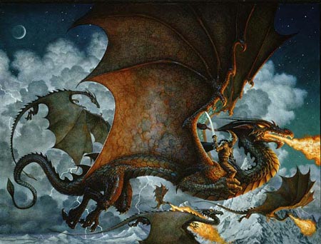
Every once in a while I just get the hankering for a good dragon painting. An artist who immediately comes to mind when I think of dragons, of course, is Don Maitz.Maitz is a well known science fiction and fantasy artist who has been awarded the Hugo for best artist twice and also taken home numerous Chesley arwards and a Sliver Medal from the Society of Illustrators. His clients include Bantam Doubleday Dell, Random House, Watson Guptill, Harper Collins, The National Geographic Society and Joseph Seagram & Sons, for whom he has been the illustrator for their highly successful Captain Morgan Spiced Rum pirate character.
Maitz has made pirate imagery one of his specialties and you will find a pirates gallery on his site alongside the fantasy and science fiction galleries.
Maitz will often paint sketches and preliminaries in acrylic, but he works in oil for his finished paintings. His richly detailed images of other worlds and times are full of texture and lively color. His fantasy heroes, damsels and dragons tread on cold stone between rough barked trees and his futuristic worlds gleam with high-tech polymers and chrome steel. Maitz makes his otherworldly images vibrant with tactile details.
In addition to his illustration work, Maitz has worked as a conceptual artist on the Jimmy Neutron: Boy Genius feature film and the recent release Ant Bully.
Maitz is married to author/illustrator Janny Wurts, There is a site devoted to their collaborative works.
There have been two collections of Maitz’s work, Dreamquests: The Art Of Don Maitz, and First Maitz, which are unfortunately out of print, but you should be able to find them from Amazon and other used book sellers. His Pirates! 2007 Calendar is easily available and chock full of his grinning, attitude-filled pirates.
Maitz is also featured in Fantasy Art Masters, an excellent book about the work and techniques of ten well-known science fiction and fantasy illustrators including John Howe, Brom, Chris Moore and others. The wonderful dragon image above is prominently featured, along with preliminary sketches and color studies for it, and it was also the work chosen for that book’s cover.
Categories:
-
Yuko Shimizu
 OK, What do you get when you combine the colorful open-lined style of Ukiyo-e woodblock prints with ink outline and color styles from comic book art, fashion drawing , movie posters, surrealist drawings, pen and ink illustrators from the 30’s, pop art from the 60’s and modern mainstream illustration, throw them in the pop-culture blender, mix well, and sprinkle with a dash of influences from Indian art and elsewhere?
You get the delightful work of New York based illustrator Yuko Shimizu (not to be confused with the Japanese designer of the same name who created the Hello Kitty character).
Shimizu’s illustrations have a fresh, casual feeling. The line work is relaxed and informal, the lines themselves are often textured. Her colors are more muted than they seem at first, it is her use of them together that creates the impression of brightness. There is a really pleasing feeling of openness and immediacy, and the way she plays with her influences makes her images feel familiar and new at the same time.
Her clients include he The New Yorker, Rolling Stone, Financial Times, Entertainment Weekly, Time, Playboy, MTV, Neiman Marcus and others.
If you enter her website and happen to click on the link for “Recent Illustrations”, you can get happily lost in her portfolio of illustrations. They are arranged by topic, so you will find some repeated in different sections, but you won’t be disappointed to encounter them a second time.
Don’t get so involved in the illustrations, though, that you forget to come back to the home page, where you will find links to her paintings and a range of special projects, like her Letters of Desire sexy alphabet book project, comic related illustrations, themed sketchbook projects and more. There are also links there to her bio and news pages.
My favorite of these projects is her fascinating “New Drawing Series“, a series of loosely themed ink drawings at times accented with understated color.
Categories:
-
Al Hirschfeld
 I promised you something lighthearted today, so how about the wonderful drawings of Al Hirschfeld?
OK, so maybe you’re familiar with Hirschfeld. Maybe you’re seen the documentary on his life and work, The Line King on PBS. Maybe you’ve seen his work in the permanent collection of the Metropolitan Museum of Art and the Museum of Modern Art in New York. Maybe you’ve seen the USPS postage stamps featuring his drawings of famous comedians, or, most likely, maybe you’ve just seen his wonderful caricatures of movie, TV and broadway stars, or rock, classical and jazz musicians in the pages of the New York Times and other publications. (Image at left, above, is Myrna Loy and William Powell, in their roles as Nora and Nick Charles, along with their dog, Asta, of course, from The Thin Man, one of my favorite movies from the 1930’s).
Maybe you’ve heard about Hirschfeld’s penchant for hiding “NINA”, his daughter’s name, in the lines of his drawings, often several times with a “hint” number penned next to his signature indicating how many times it was worked into that drawing. Maybe you’ve heard the (possibly true) rumor that the US Army would have their bomber pilots look for the hidden”NINA”s as part of their training to pick out hidden enemy targets during WW II.
OK, so maybe Hirschfeld is old hat to you, been there seen that, but my suggestion is to look again. Even though you’ve heard it before, just look at his lines.
Swooping, swirling and careening across the page like a crazed NY cabbie trying to make time through cross-town traffic, Hirschfeld’s lines look like they were drawn just to be as loopy and wild and zingy as possible, with no thought of actually doing anything. Yet, they define their targets with such succinct clarity that they could not possibly exist for any other purpose than to make those amazing faces.
And what faces they are; Hirschfeld’s caricatures stretch the limits of how exaggerated a likeness can be, but do so with an economy of line that would make a master of Chinese ink painting sit up and take notice.
Yes, notice his lines and then notice the space where the lines aren’t, the negative space defined by the lines and filled with the most eloquent and meaningful emptiness. So few lines, so much character, both in the character of the person, and the character of the line.
There is an “official” site at alhirschfield.com, managed by the gallery that represents his work in New York. The images quality is better, though on the New York Times archive. I list some other resources below. There are also a number of excellent and inexpensive collections of his work. Hirschfeld’s Hollywood: The Film Art of Al Hirschfeld, Hirschfeld’s New York and Hirschfeld , as well as Hirschfeld On Line and an interview in The Comics Journal Special Edition: Winter 2004: Four Generations of Cartoonists (along with Jules Feiffer, Art Spiegelman and Chris Ware).
OK, so you think you know Hirschfeld, but have you seen his non-caricature straightforward drawings, such as his Gibson-like portrait (image at left, bottom) of 1920’s Vaudville and film star Betty Compson? No? How about his etchings of his travels in North Africa, his watercolors of Bali, or his illustrations in watercolor and gouache? No? Didn’t think so. Neither had I until just recently.
There’s only a smattering of them around, but you can see some of them in an online exhibit on the Library of Congress site. This 2002 exhibit is based on a gift of original drawings given to the Library on its bicentennial. It shows something of Hirschfeld’s other sides as an artist, as well as some of the development of his elegant, and eloquent, lines.
Categories:
-
Dino Valls
I’ll start by suggesting that the paintings of Spanish painter Dino Valls are not for the faint of heart or easily offended; and I’ll be back tomorrow with something more lighthearted if you care to return then.Though they contain little in the way of outright violence, and may seem mild in a culture inured to slasher films and gore-soaked video games, Vall’s paintings are overflowing with disturbing suggestions of pain, isolation, physical discomfort and psychological distress (I’ve chosen one of the most innocuous to display here).
For example, in his painting Martyr, the bust of a young woman appears to be a true bust, stopping below the shoulders where it apparently sits on a red cloth surface. A pair of hands casually rest on the surface in front of her. There is no blood or indication of violence, yet the hands can only be hers if they are separate parts. She has a halo behind her head, medieval style, in the form of a circular saw blade.
I don’t profess to understand the conceptual basis for Valls’ painting, which is obviously some kind of statement about the dark side of the human condition, nor do I find his images appealing in terms of what they portray. I can’t help but respond, however, to the the extraordinary level of skill with which they are painted.
The subjects of his paintings, usually young women, occasionally young men, are portrayed with an uncanny immediacy that makes their presence in his disturbing imagery even more emotionally resounding.
Valls’ paintings are painstakingly crafted with the application of layers of tempera over which he lays transparent oil glazes. His technique is steeped in the traditions of old master Dutch and Italian painting, which he has studied extensively.
Vall’s also has a thorough knowledge of human anatomy. He trained as a medical doctor and surgeon before turning to painting full time. You can see the influence of his medical training in his subjects as well. There are often portrayals of cold, vaguely threatening medical instruments, young men and women being poked an prodded by the hands of unseen manipulators, measured with calipers, or even dissected. In his painting Noxa, a red shroud is pulled open with medical clamps, as if a surgical opening in a body, through which one of Valls’ rosy young faces peers while being lighty poked by a photograph, also held in a surgical tool.
The common theme I take away from his work is the treatment of people, and their parts, as objects. Body parts, arms, legs, hands, heads, are treated as parts, as if pieces of department store dummies or sculptural casts, but painted as very much living flesh. These suggestions are mixed with medical imagery, religious iconography, references to medieval and Renaissance painting and an undercurrent of sexuality, though the latter seems more intended to disturb than to arouse.
His young subjects are often represented as if their bodies are intersecting with objects, one another, or with stone floors. Bodies intersect with themselves in siamese twin fashion, or as in some unfortunate accident of space and time in which they are merging or being separated.
Through it all, the expressions on the beautifully, almost lovingly painted faces are not indicative of torture, but at most appear vaguely disturbed, as if recently scolded or informed that they have been assigned an onerous task. In fact, it is his faces that are sensual, where his portrayal of nude figures is actually less so and feels (to me at least) clinical.
His faces, particularly those of young women, are painted with extraordinary finesse and uncanny attention to intimate details, like small creases of skin near the eyes, delicate indications of freckles and moles, and the presence of extra blood vessels near the surface of the skin expressed as rosy cheeks and ends of noses, accented by pale skin elsewhere, as if trying to emphasize that they are very much alive in contrast to the way they are portrayed as objects and parts in the paintings.
According to some of the critical essays quoted on his site, Valls does not paint from live models or even photographs, but invents his figures; which I find remarkable because he manages to paint his figures, and particularly faces, with a kind of immediacy and tactile vibrancy that makes them emotionally visceral.
There are a few of his paintings for which I do like the subject matter as well as the technique, showing rooms in which the perspective and geometry of space are distorted, but for the most part, his images are haunting and disconcerting, but powerfully painted.
Note: the site linked here contains images of nudity, suggestions of sexuality and violence and is Not Safe For Work. Avoid it if you’re likely to be offended.
Categories:
-
Dan McCarthy
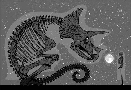
The “About Me” section of Dan McCarthy’s web site simply has three photos of him pulling screen prints, a photo of a dog (presumably his), and the unhelpful legend, “more soonish..”.Not very informative, but the prints are pretty much the story. Though there are sections of posters, paintings and even T-shirts on the site, they all seem to carry the flavor of his prints.
The prints themselves are very graphic, beautifully designed and often carry themes of trees against the night sky and, a subject I’m always keen on, dinosaurs, particularly as portrayed in the form of their skeletal remains. The one above, for example, is a 4 color screen print on 100lb Stonehenge printmaking paper (a wonderfully textured paper that I like as a drawing paper for chalk and conté). Oddly, McCarthy doesn’t indicate the size of the edition on the pages that describe the individual prints, but some of them are listed a sold out, so I presume the runs are reasonable numbers (I don’t know the limits of current screen printing materials).
Check out this fascinating print (unfortunately sold out) that is essentially a short graphic story, the biography of a carbon atom.
His posters share some of the same themes, notably skeletal winter trees and skeletal paleo images. Even his paintings are very graphic and share the same thematic direction.
His drawings are a bit different, but I’m particularly fond of them. They remind me very much of drawings I used to make when I was younger, of telephone wires, poles and transformers. (I was just fascinated with the idea of lines drawn across the sky.) Mine were just sketches, though. McCarthy’s are more fully realized silhouette drawings, carefully composed and strongly designed.
McCarthy’s “news” page does seem to have a recent update, and lists newly added prints, so maybe the “more soonish..” promise will be realized with more images and a bit of background about this fascinating artist. Until then we’ll have to extrapolate, like paleontologists, from the bones we can find.
Categories:


Charley’s Picks
Bookshop.org
(Bookshop.org affilliate links; sales benefit independent bookshop owners; I get a small percentage to help support my work on Lines and Colors)

John Singer Sargent: Watercolors


Urban Sketching: Understanding Perspective


Charley’s Picks
Amazon
(Amazon.com affiliate links; sales go to a larger yacht for Jeff Bezos; but I get a small percentage to help support my work on Lines and Colors)
John Singer Sargent: Watercolors
Urban Sketching: Understanding Perspective