
Categories
- 3d CGI
- Amusements
- Animation
- Anime & Manga
- Art Materials
- Art Videos
- Blogroll
- Cartoons
- Color
- Comics
- Concept & Visual Dev.
- Creativity
- Digital Art
- Digital Painting
- Displaying Art on the Web
- Drawing
- Eye Candy for Today
- Gallery and Museum Art
- High-res Art Images
- Illustration
- Motion Graphics & Flash
- Museums
- Online Museums
- Outsider Art
- Painting
- Painting a Day
- Paleo Art
- Pastel, Conté & Chalk
- Pen & Ink
- Prints and Printmaking
- Reviews
- Sc-fi and Fantasy
- Sculpture & Dimensional
- Site Comments
- Sketching
- Storyboards
- Tools and Techniques
- Uncategorized
- Vector Art
- Videos & Podcasts
- Vision and Optics
- Watercolor and Gouache
- Webcomics
Archives
- June 2026
- May 2026
- April 2026
- March 2026
- February 2026
- January 2026
- December 2025
- November 2025
- October 2025
- September 2025
- August 2025
- July 2025
- June 2025
- May 2025
- January 2025
- December 2024
- November 2024
- October 2024
- September 2024
- August 2024
- June 2024
- April 2024
- March 2024
- February 2024
- January 2024
- December 2023
- November 2023
- October 2023
- September 2023
- August 2023
- July 2023
- May 2023
- April 2023
- March 2023
- February 2023
- January 2023
- December 2022
- November 2022
- September 2022
- August 2022
- July 2022
- June 2022
- May 2022
- April 2022
- March 2022
- February 2022
- January 2022
- December 2021
- November 2021
- October 2021
- September 2021
- August 2021
- July 2021
- June 2021
- May 2021
- April 2021
- March 2021
- February 2021
- January 2021
- December 2020
- November 2020
- October 2020
- September 2020
- August 2020
- July 2020
- June 2020
- May 2020
- April 2020
- March 2020
- February 2020
- January 2020
- December 2019
- November 2019
- October 2019
- September 2019
- August 2019
- July 2019
- June 2019
- May 2019
- April 2019
- March 2019
- February 2019
- January 2019
- December 2018
- November 2018
- October 2018
- September 2018
- August 2018
- July 2018
- June 2018
- May 2018
- April 2018
- March 2018
- February 2018
- January 2018
- December 2017
- November 2017
- October 2017
- September 2017
- August 2017
- July 2017
- June 2017
- May 2017
- April 2017
- March 2017
- February 2017
- January 2017
- December 2016
- November 2016
- October 2016
- September 2016
- August 2016
- July 2016
- June 2016
- May 2016
- April 2016
- March 2016
- February 2016
- January 2016
- December 2015
- November 2015
- October 2015
- September 2015
- August 2015
- July 2015
- June 2015
- May 2015
- April 2015
- March 2015
- February 2015
- January 2015
- December 2014
- November 2014
- October 2014
- September 2014
- August 2014
- July 2014
- June 2014
- May 2014
- April 2014
- March 2014
- February 2014
- January 2014
- December 2013
- November 2013
- October 2013
- September 2013
- August 2013
- July 2013
- June 2013
- May 2013
- April 2013
- March 2013
- February 2013
- January 2013
- December 2012
- November 2012
- October 2012
- September 2012
- August 2012
- July 2012
- June 2012
- May 2012
- April 2012
- March 2012
- February 2012
- January 2012
- December 2011
- November 2011
- October 2011
- September 2011
- August 2011
- July 2011
- June 2011
- May 2011
- April 2011
- March 2011
- February 2011
- January 2011
- December 2010
- November 2010
- October 2010
- September 2010
- August 2010
- July 2010
- June 2010
- May 2010
- April 2010
- March 2010
- February 2010
- January 2010
- December 2009
- November 2009
- October 2009
- September 2009
- August 2009
- July 2009
- June 2009
- May 2009
- April 2009
- March 2009
- February 2009
- January 2009
- December 2008
- November 2008
- October 2008
- September 2008
- August 2008
- July 2008
- June 2008
- May 2008
- April 2008
- March 2008
- February 2008
- January 2008
- December 2007
- November 2007
- October 2007
- September 2007
- August 2007
- July 2007
- June 2007
- May 2007
- April 2007
- March 2007
- February 2007
- January 2007
- December 2006
- November 2006
- October 2006
- September 2006
- August 2006
- July 2006
- June 2006
- May 2006
- April 2006
- March 2006
- February 2006
- January 2006
- December 2005
- November 2005
- October 2005
- September 2005
- August 2005
Relevant Blogs
Art, Painting & Sketch
- Gurney Journey
- Underpaintings
- Art and Influence
- Painting Perceptions
- Oil Painters of America
- Vasari Paint POV
- Flying Fox
- Urban Sketchers
- Bento (Smithsonian)
- Art Inconnu
- The Hidden Place
- Still Life
- Making a Mark
- The Art of the Landscape
- Exploring Color & Creativity
- Art Contrarian
- Artist A Day
- beinArt Surreal Art Collective
- Eye Level
- David Dunlop
- p.i.g.m.e.n.t.i.u.m
- CultureGrrl
- Joaquín Sorolla blog
- Artists in Pastel
“Painting a Day”
- A Painting a Day (Keiser)
- On Painting (Keiser)
- Julian Merrow-Smith
- Karen Jurick
- Jeffrey Hayes
- Carol Marine
- Abbey Ryan
- Daily Paintworks
Other Painting Blogs
- Virtual Gouache Land
- Neil Hollingsworth
- Marc Hanson
- Kevin Menck
- Marc Dalessio
- Larry Seiler
- Stapleton Kearns
- Colin Page
- Roos Schuring
- Hans Versfelt
- Titus Meeuws
- Régis Pettinari
- René Plein Air
- Belinda Del Pesco
- Robin Weiss
- Nathan Fowkes (Land Sketch)
- William Wray
- Frank Serrano
- Stephen Magsig
- Michael Chesley Johnson
- Twice a Week
- Sarah Wimperis
- Rob Adams
- Michael Cole Manley
- The Dirty Palette Club
- Mike Manley’s Draw!
Gallery Art & Illustration mix
Illustration
- Howard Pyle
- 100 Years of Illustration
- BibliOdyssey
- Illustration Art
- Today’s Inspiration
- Illustration Mundo
- Little Chimp Society
- Danny Gregory
- R D (John Martz
- Illustration Friday blog
- Monster Brains
- Illustrators & Illustrations (RU)
- Elwood H. Smith
- DaniDraws.com
- Designers Who Blog
- iSpot Blog
Sci-Fi & Fantasy
Illustration & Comics
Comics & Cartoons
- Comics Beat
- Robot 6
- Newsarama Blog
- Comic Vine
- Comics Alliance
- Forbidden Planet Int.
- Paolo Rivera
- Bolt City
- Flight
- Scott McCloud
- The Comics Journal
- Comixpedia
- Funnybook Babylon
- James Baker
- Middleton’s Sketchbook
- Boneville
- The Hotel Fred
- Paul Rivoche
- Daily Cartoonist
- Mad About Cartoons (William Wray)
- Digital Strips
Illustration & Concept
Animation & Concept
- Cartoon Brew
- Animation Blog
- Cold Hard Flash
- Concept Art World
- The CAB
- FY Concept Art
- Concept Ships
- Concept Robots
- John Nevarez
- Armand Serrano
- Marcos Mateu-Mestre
- all kinds of stuff (Kricfalusi)
- Yacin the faun (Man Arenas)
- Kelsey Mann
- Cre8tivemarks Blog
- Ice-Cream Monster Toon Cafe
- AAU Character & Creature Design
- AAU Animation Notes
- Articles and Texticles
Paleo & Scientific
Tools & Techniques
Other
Lists of Art Blogs
Art Image Resource Links
Historic Art Images
- Wikimedia Commons: Paintings
- Wikimedia Commons: Drawings
- The Athenaeum
- WikiArt (WikiPaintings)
- Google Art Project: Artists
- Google Art Project: Collections (Museums)
- ArtCyclopedia
- Web Gallery of Art
- Art Renewal Center
- Web Gallery of Impressionism
Auction Consolidation sites
Auction sites
- Sotheby’s
- Bonham’s
- Christies
- Heritage Auctions: Fine Art
- Heritage Auctions: Illustration
- Freeman’s Auctions
- Bukowskis
- Shannon’s
Image Search
Reverse Image Search (search by image)
- Tin Eye
- RevImg
- Google Image Search (camera icon)
- Bing Image Search (camera icon)
Promoting some friends and some clients of my website design business
- Twin Willows T’ai Chi studio in Wilmington DE. Taiji classes with Bryan Davis.
- Ray Hayward, Inspired Teacher of T’ai Chi ( Taiji ) in Minneapolis, Founder of Mindful Motion Tai Chi Academy
- OldHead Tattoo studio and Art Gallery in Wilmington DE. Tattoos and paintings by Bruce Gulick
- Sharon Domenico Art, pet portrait oil paintings
- Platinum Paperhanging, wallpaper hanging, Main Line and Philadelphia, PA
- Lisa Stone Design, interior designer, Main Line and Philadelphia, PA
- Studio12KPT, original art, prints, calendars and other custom printed items by Van Sickle & Rolleri
-
Sita Sings the Blues (Nina Paley)
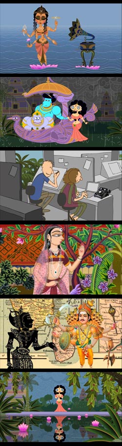 Sita Sings the Blues is an award winning independent feature length animation by Nina Paley.
The film combines an adaptation of the epic Indian story of Ramayana with a personal story from Paley herself. The film won the Best Feature award at the 32nd Annecy Animated Film Festival (see my post on student films at Annecy 2008, and Cartoon Brew on Annecy 2008), and has been receiving rave word of mouth around the net.
Sita Sings the Blues gets its TV debut tonight on WNET (Channel 13, New York), and may be on other PBS stations as well (though not here in Philadelphia).
After struggling with copyright issues which prohibited release of the film for a time, in which there was an unexpected claim to copyright on 1920’s jazz vocals by Annete Hanshaw, Paley has generously released the film through a Creative Commons Attribution-Share Alike license; so for those of us who can’t catch it on TV or in a theater, it is available in its entirety online.
You can view it on the WNET site, or on the Internet Archive, where you can also download it in a variety of formats and sizes ( and where I watched it and will eventually download a high resolution copy), or through other mirrors or BitTorrent Downloads (see the SitaSites page on the Sita Sings the Blues site).
If you like it, and want to show your support, you can donate to the artist in the kind of voluntary purchase that the internet makes possible.
The film, which Paley made primarily in Flash, with help for a specialized fight scene from Jake Friedman, is a triumph of imagination and writing over fancy technology.
It is a visual delight, with a variety of animation and drawing approaches, from direct sketchy drawing to vector patterns to shadow puppets to scanned and composited photographs, like a combination of Yellow Submarine, Terry Gilliam’s Monty Python “cartoons” and the kind of wiggly line sketchiness (“Squigglevision”) often associated with hand drawn independent animated films.
Sita Sings the Blues is awash with colors, both visual and emotional, and bursting with clever ideas and entertaining notions about how to present various subjects, but always in the service of the story, not for the gratuitous display of technique.
Unlike so many of the formulaic, manufactured CGI films that the big studios crank out to meet their accounting schedules, Paley actually has a story to tell, two of them in fact.
Categories:
-
Watchmen as a Saturday Morning Cartoon

Anyone who is familiar with Watchmen, the darkly dystopian and very adult graphic novel by Alan Moore and Dave Gibbons, or the much anticipated feature film adaptation that is being released today; and/or those familiar with 1980’s style Saturday morning superhero cartoons; will get a kick out of this perfect and spot on send-up by Harry Partridge.He’s got it all down perfect, Ozymandias and his mutant pet recast as Shaggy and Scooby-Doo, the light and happy take on Rorschach (“I’m nutty!”), the Josie and the Pussycats girl band version of Silk Spectre, and the gang sitting around eating pizza, encouraging you to say no to drugs and be in bed by 10; plus lots of “in” jokes for those familiar with the graphic novel… absolutely hilarious.
The funniest thing is that you know for certain that it could have happened. The people who made these cartoons were so monumentally clueless about their formulas that they would have cheerfully taken on the material and “cleaned it up” for the little Saturday morning cereal consumers.
Who watches the Watchmen, indeed.
[Via Geekdad/Wired]
Categories:
-
Jean-Baptiste Monge

Jean-Baptiste Monge is a French fantasy illustrator with a specialty in portraying the world of faeries, elves, goblins and related faerie folk.Monge’s detailed, beautifully rendered paintings have a textural quality and subdued color palette ideally suited to his portrayal of the denizens of the unseen world at our feet and the edges of our vision, living lives in miniature on the floor of the forest.
His images are mercifully free of the cloying cuteness sometimes associated with the subject in the hands of lesser artists, and carry a wonderful feeling of 19th century Victorian art and Golden Age illustration.
Monge is well known in France, where his books are quite popular, with titles like Halloween, Baltimore & Redingote, and In Search of Faeries, Volumes I and II (my loose translation of the titles may not be accurate), and the new Celtic Faerie. Monge also contributed heavily to The World of Dragons and has published a sketchbook (Carnet de Croquis).
Unfortunately for those of us on the other side of the Atlantic, there are no English language editions of his work yet, though you might be able to find a couple of French editions through Amazon’s extended suppliers, such as: A la recherche de féerie, volume 1: La Révélation and Baltimore & Redingote; or through importers like Stuart Ng Books.
Fortunately, however, Monge has a web site with a considerable selection of his work. Non-French speakers will be less put off by any language barrier than by a few navigation quirks. First you need to be aware that the primary navigation on the home page is hidden in a pop-out menu accessed from the little pot-O-gold at the top right of the page.
Journal de Board is the link to Monge’s Blog, Bibliographie & Galeries is where you will find a list of his books. Clicking on their covers gives you access to galleries of art from each title.
There is also a useful list of links (Liens). Interestingly, many of Monge’s links are to American fantasy artists, like James Gurney, Tony Diterlizzi and Peter de Séve (see my posts on James Gurney, Tony Diterlizzi and Peter de Séve). There is also a link to the work of Brian Froud, an artist more English speakers are likely to associate with faerie images, though I have to profess a preference for Monge’s take on the subject.
English speakers can also try a Google Translate version of Monge’s site.
Monge recently received the Spectrum Silver Award (video) for Book Illustration. (Via Tor.com)
Categories:
-
Tim Foley

I’ve mentioned before my fascination with scratchboard, that magical inverse of pen and ink, in which light areas are scratched out of a coating of ink on a clay-covered board (and sometimes a white surface is scratched away from a black-coated board), producing a line drawing with some of the characteristics of pen and ink and some of the feeling of woodcuts (see some of my posts involving scratchboard).Tm Foley is a Michigan based illustrator who worked for a long time in variations of traditional scratchboard technique, and moved over to digital illustration in the late 90’s.
Foley has found great freedom in the combination of his scratchboard style and computer color, a flexible alternative to the traditional methods of applying color to scratchboard drawings, which is usually a difficult, messy and often frustrating process because of the surface dust created by the scratchboard technique.
Foley’s color scratchboard illustrations have the visual charm of scratchboard lines with the added punch of well applied color. The other ingredients in his visual mix, a fertile imagination and strong drawing skills, have combined to garner him a roster of clients that include The Wall Street Journal, Newsday, Barrons, Highlights for Children and others.
Foley also maintains a blog, Illustratorium, where you you can find an archive of his illustrations, arranged by dated posts, or by subject categories. You can also find a few of his illustrations in other media both here and in his iSpot portfolio, as well as some of his scratchboard style work in black and white.
Categories:
-
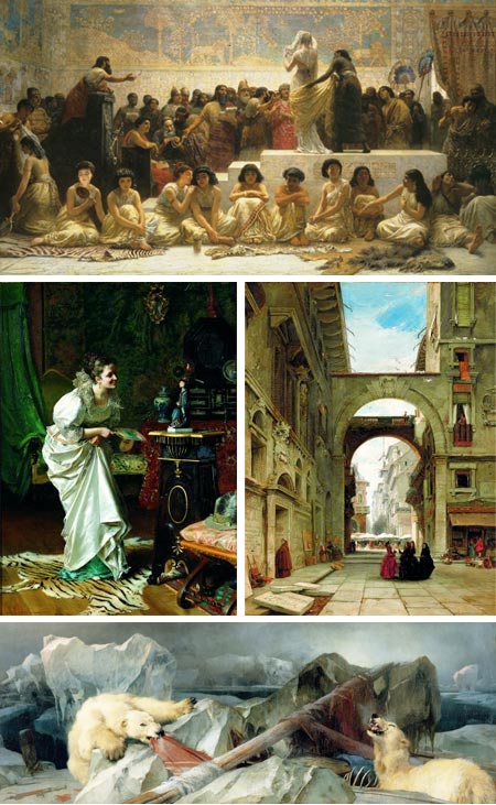
Paintings from the Reign of Victoria: The Royal Holloway Collection
Victorian art in particular, I think, suffered at the hands of the modernist art establishment of the late 20th Century, who considered it the dry and repressive standard from which modernism had “liberated” art.As a result, much of the art from the time was marginalized and trivialized for the better part of half a century, and is still denigrated in modernist circles.
In general, however, there is a revival of interest in Victorian art, with its fascinating glimpses of a complex period, historical events and engaging stories, as portrayed by some masterful painters.
The Delaware Art Museum, a bastion of Victorian art in the form its Bancroft Collection of Pre-Raphaelite Art (see my post on the Pre-Raphaelites), is currently hosting an exhibition of sixty works from the Victorian period, Paintings from the Reign of Victoria: The Royal Holloway Collection.
Many of them are dramatically large in scale (you can see some photographs of the exhibit being installed here).
Though I was a bit disappointed in my hope for more of the heavy hitters from the period, I was still delighted to see the show and to be introduced to a few artists who were unfamiliar, but terrific.
There are some real gems in the show, like Edwin Longsden Long’s The Babylonian Marriage Market (image above, top), John Evan Hodgson’s Relatives in Bondage, James Holland’s beautiful scenes of Venice and Verona (image above, middle right), Edwin Landseer’s grim Man Proposes, God Disposes (image above, bottom, larger version here – click to enlarge), and William Powell Frith’s fascinating classic The Railway Station, which tells multiple stories in a panorama of figures.
It was particularly interesting to note in Frith’s piece, that a painting of an apparent high level of finish when viewed from a few steps back reveals pencil construction and perspective lines on close inspection.
Tito Conti’s exquisite small scale paintings of women in glowing gowns, like Paying Her Respects to His Mightiness (image above, middle left), reminded me of William Holman-Hunt’s highly finessed detail painting, and John Syer surprised me with the loose, painterly handling of his Welsh Drovers. See the slideshows listed below for more images from the exhibition.
Paintings from the Reign of Victoria: The Royal Holloway Collection is on view at the Delaware Art Museum until April 12, 2009.
There is a catalog from the exhibition (link to Delaware Art Museum store, I could only find the hardback on Amazon).
Museum admission is currently free on Sundays. While there, don’t miss their collection of American illustration, an extended exhibit of which is on the second floor.
For those not within reach of the exhibition, there are an increasing number of resources on the web for Victorian art. I’ve listed a few at the bottom of the links below.
An excellent book on the subject is Victorian Painting by Lionel Lambourne.
Categories:
-
17 Digital Character Painting Tutorials

In what is probably a nod to their dominant demographic, Smashing Apps, a blog/webzine devoted to online resources for designers and web developers, named the article collecting these Photoshop tutorials “17 Mind-Blowing Digital Painting Tutorials Of Beautiful Girls“.That being said, it’s still a collection of useful Photoshop digital painting techniques of potential interest to many concept artists, illustrators and comics artists, with a variety of styles and approaches, from anime and traditional comics to more realistic and fully rendered images.
Most are brief, but they cover various stages of sketching and rendering, discuss brushes, layer compositing, brush modes and other aspects of digital rendering.
(Image above, left to right:
David Munoz Velazquez, John Kearney, Melanie Delon (see my post about Melanie Delon)
Jim Zubkavich, Marta Dahlig, Shilin Huang
Artgerm, Artgerm, Yu Cheng Hong)
Categories:


Charley’s Picks
Bookshop.org
(Bookshop.org affilliate links; sales benefit independent bookshop owners; I get a small percentage to help support my work on Lines and Colors)

John Singer Sargent: Watercolors


Urban Sketching: Understanding Perspective


Charley’s Picks
Amazon
(Amazon.com affiliate links; sales go to a larger yacht for Jeff Bezos; but I get a small percentage to help support my work on Lines and Colors)
John Singer Sargent: Watercolors
Urban Sketching: Understanding Perspective