
Categories
- 3d CGI
- Amusements
- Animation
- Anime & Manga
- Art Materials
- Art Videos
- Blogroll
- Cartoons
- Color
- Comics
- Concept & Visual Dev.
- Creativity
- Digital Art
- Digital Painting
- Displaying Art on the Web
- Drawing
- Eye Candy for Today
- Gallery and Museum Art
- High-res Art Images
- Illustration
- Motion Graphics & Flash
- Museums
- Online Museums
- Outsider Art
- Painting
- Painting a Day
- Paleo Art
- Pastel, Conté & Chalk
- Pen & Ink
- Prints and Printmaking
- Reviews
- Sc-fi and Fantasy
- Sculpture & Dimensional
- Site Comments
- Sketching
- Storyboards
- Tools and Techniques
- Uncategorized
- Vector Art
- Videos & Podcasts
- Vision and Optics
- Watercolor and Gouache
- Webcomics
Archives
- April 2026
- March 2026
- February 2026
- January 2026
- December 2025
- November 2025
- October 2025
- September 2025
- August 2025
- July 2025
- June 2025
- May 2025
- January 2025
- December 2024
- November 2024
- October 2024
- September 2024
- August 2024
- June 2024
- April 2024
- March 2024
- February 2024
- January 2024
- December 2023
- November 2023
- October 2023
- September 2023
- August 2023
- July 2023
- May 2023
- April 2023
- March 2023
- February 2023
- January 2023
- December 2022
- November 2022
- September 2022
- August 2022
- July 2022
- June 2022
- May 2022
- April 2022
- March 2022
- February 2022
- January 2022
- December 2021
- November 2021
- October 2021
- September 2021
- August 2021
- July 2021
- June 2021
- May 2021
- April 2021
- March 2021
- February 2021
- January 2021
- December 2020
- November 2020
- October 2020
- September 2020
- August 2020
- July 2020
- June 2020
- May 2020
- April 2020
- March 2020
- February 2020
- January 2020
- December 2019
- November 2019
- October 2019
- September 2019
- August 2019
- July 2019
- June 2019
- May 2019
- April 2019
- March 2019
- February 2019
- January 2019
- December 2018
- November 2018
- October 2018
- September 2018
- August 2018
- July 2018
- June 2018
- May 2018
- April 2018
- March 2018
- February 2018
- January 2018
- December 2017
- November 2017
- October 2017
- September 2017
- August 2017
- July 2017
- June 2017
- May 2017
- April 2017
- March 2017
- February 2017
- January 2017
- December 2016
- November 2016
- October 2016
- September 2016
- August 2016
- July 2016
- June 2016
- May 2016
- April 2016
- March 2016
- February 2016
- January 2016
- December 2015
- November 2015
- October 2015
- September 2015
- August 2015
- July 2015
- June 2015
- May 2015
- April 2015
- March 2015
- February 2015
- January 2015
- December 2014
- November 2014
- October 2014
- September 2014
- August 2014
- July 2014
- June 2014
- May 2014
- April 2014
- March 2014
- February 2014
- January 2014
- December 2013
- November 2013
- October 2013
- September 2013
- August 2013
- July 2013
- June 2013
- May 2013
- April 2013
- March 2013
- February 2013
- January 2013
- December 2012
- November 2012
- October 2012
- September 2012
- August 2012
- July 2012
- June 2012
- May 2012
- April 2012
- March 2012
- February 2012
- January 2012
- December 2011
- November 2011
- October 2011
- September 2011
- August 2011
- July 2011
- June 2011
- May 2011
- April 2011
- March 2011
- February 2011
- January 2011
- December 2010
- November 2010
- October 2010
- September 2010
- August 2010
- July 2010
- June 2010
- May 2010
- April 2010
- March 2010
- February 2010
- January 2010
- December 2009
- November 2009
- October 2009
- September 2009
- August 2009
- July 2009
- June 2009
- May 2009
- April 2009
- March 2009
- February 2009
- January 2009
- December 2008
- November 2008
- October 2008
- September 2008
- August 2008
- July 2008
- June 2008
- May 2008
- April 2008
- March 2008
- February 2008
- January 2008
- December 2007
- November 2007
- October 2007
- September 2007
- August 2007
- July 2007
- June 2007
- May 2007
- April 2007
- March 2007
- February 2007
- January 2007
- December 2006
- November 2006
- October 2006
- September 2006
- August 2006
- July 2006
- June 2006
- May 2006
- April 2006
- March 2006
- February 2006
- January 2006
- December 2005
- November 2005
- October 2005
- September 2005
- August 2005
Relevant Blogs
Art, Painting & Sketch
- Gurney Journey
- Underpaintings
- Art and Influence
- Painting Perceptions
- Oil Painters of America
- Vasari Paint POV
- Flying Fox
- Urban Sketchers
- Bento (Smithsonian)
- Art Inconnu
- The Hidden Place
- Still Life
- Making a Mark
- The Art of the Landscape
- Exploring Color & Creativity
- Art Contrarian
- Artist A Day
- beinArt Surreal Art Collective
- Eye Level
- David Dunlop
- p.i.g.m.e.n.t.i.u.m
- CultureGrrl
- Joaquín Sorolla blog
- Artists in Pastel
“Painting a Day”
- A Painting a Day (Keiser)
- On Painting (Keiser)
- Julian Merrow-Smith
- Karen Jurick
- Jeffrey Hayes
- Carol Marine
- Abbey Ryan
- Daily Paintworks
Other Painting Blogs
- Virtual Gouache Land
- Neil Hollingsworth
- Marc Hanson
- Kevin Menck
- Marc Dalessio
- Larry Seiler
- Stapleton Kearns
- Colin Page
- Roos Schuring
- Hans Versfelt
- Titus Meeuws
- Régis Pettinari
- René Plein Air
- Belinda Del Pesco
- Robin Weiss
- Nathan Fowkes (Land Sketch)
- William Wray
- Frank Serrano
- Stephen Magsig
- Michael Chesley Johnson
- Twice a Week
- Sarah Wimperis
- Rob Adams
- Michael Cole Manley
- The Dirty Palette Club
- Mike Manley’s Draw!
Gallery Art & Illustration mix
Illustration
- Howard Pyle
- 100 Years of Illustration
- BibliOdyssey
- Illustration Art
- Today’s Inspiration
- Illustration Mundo
- Little Chimp Society
- Danny Gregory
- R D (John Martz
- Illustration Friday blog
- Monster Brains
- Illustrators & Illustrations (RU)
- Elwood H. Smith
- DaniDraws.com
- Designers Who Blog
- iSpot Blog
Sci-Fi & Fantasy
Illustration & Comics
Comics & Cartoons
- Comics Beat
- Robot 6
- Newsarama Blog
- Comic Vine
- Comics Alliance
- Forbidden Planet Int.
- Paolo Rivera
- Bolt City
- Flight
- Scott McCloud
- The Comics Journal
- Comixpedia
- Funnybook Babylon
- James Baker
- Middleton’s Sketchbook
- Boneville
- The Hotel Fred
- Paul Rivoche
- Daily Cartoonist
- Mad About Cartoons (William Wray)
- Digital Strips
Illustration & Concept
Animation & Concept
- Cartoon Brew
- Animation Blog
- Cold Hard Flash
- Concept Art World
- The CAB
- FY Concept Art
- Concept Ships
- Concept Robots
- John Nevarez
- Armand Serrano
- Marcos Mateu-Mestre
- all kinds of stuff (Kricfalusi)
- Yacin the faun (Man Arenas)
- Kelsey Mann
- Cre8tivemarks Blog
- Ice-Cream Monster Toon Cafe
- AAU Character & Creature Design
- AAU Animation Notes
- Articles and Texticles
Paleo & Scientific
Tools & Techniques
Other
Lists of Art Blogs
Art Image Resource Links
Historic Art Images
- Wikimedia Commons: Paintings
- Wikimedia Commons: Drawings
- The Athenaeum
- WikiArt (WikiPaintings)
- Google Art Project: Artists
- Google Art Project: Collections (Museums)
- ArtCyclopedia
- Web Gallery of Art
- Art Renewal Center
- Web Gallery of Impressionism
Auction Consolidation sites
Auction sites
- Sotheby’s
- Bonham’s
- Christies
- Heritage Auctions: Fine Art
- Heritage Auctions: Illustration
- Freeman’s Auctions
- Bukowskis
- Shannon’s
Image Search
Reverse Image Search (search by image)
- Tin Eye
- RevImg
- Google Image Search (camera icon)
- Bing Image Search (camera icon)
Promoting some friends and some clients of my website design business
- Twin Willows T’ai Chi studio in Wilmington DE. Taiji classes with Bryan Davis.
- Ray Hayward, Inspired Teacher of T’ai Chi ( Taiji ) in Minneapolis, Founder of Mindful Motion Tai Chi Academy
- OldHead Tattoo studio and Art Gallery in Wilmington DE. Tattoos and paintings by Bruce Gulick
- Sharon Domenico Art, pet portrait oil paintings
- Platinum Paperhanging, wallpaper hanging, Main Line and Philadelphia, PA
- Lisa Stone Design, interior designer, Main Line and Philadelphia, PA
- Studio12KPT, original art, prints, calendars and other custom printed items by Van Sickle & Rolleri
-
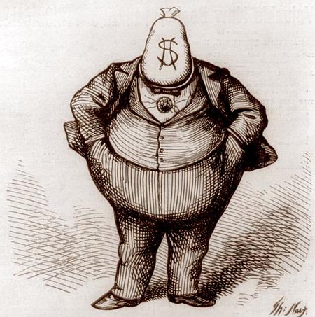
Lines and Colors has gone dark today, please read why…
——
Comments about Net Neutrality can be filed with the FCC up until July 17, 2017.When I posted this originally, I actually shut the site down and only this message was accessible against an otherwise black screen. I’ve reposted it as a regular article, both because it’s still vital, and so you can comment if you want.
Opposing viewpoints are welcome in this post’s comments if you actually have something valid to add to the discussion of Net Neutrality, but I won’t tolerate typical partisan political flaming, and off-topic comments will simply be removed.
-Charley
——This is just a hint of what can happen to “little” sites like Lines and Colors if the big telecom companies, Congress and the current administration’s FCC chairman (a former Verizon lawyer) get their way, and sell your internet to the highest bidder.
They want to gut the Net Neutrality rules that, imperfect though they may be, offer some protection for sites like mine from being squeezed out of existance by requiring that the telecoms treat data from sites like this one essentially the same as sites for the big media companies.
The telecoms want to charge the big media companies more to give their sites preference, effectively turning the internet into a toll road for the benefit of powerful corporations, and pushing “insignificant” sites like Lines and Colors — who can’t afford to pay — into the slow lane, and eventually off the net altogether.
If you want the internet to just be more like TV, a one-way stream of whatever the big media companies want to spoon feed you (that you pay more and more for), than relax and do nothing.
But if you want sites like Lines and Colors to survive, and the telecoms to be restrained from treating your internet like their personal cash cow, at your expense, then we need to take action.
Given the current political climate of “corporations get whatever they want and screw the public”, it may be difficult, but our best chance to protect Net Nutrality right now is to create such an overwhelming response to the FCC that it becomes politically embarrasing to gut the rules at this point in time.
Please consider filing a comment with the FCC in support of keeping the Net Nutrality rules in place.
Here’s an article from Ars Technica on How to write a meaningful FCC comment supporting net neutrality.
If you’re pressed for time, here is a site that can automate the process for you: https://www.battleforthenet.com/#widget-learn-more
You can also use the form on the front of the Boing Boing site today.
If you’re still uncertain about why this is important, here is some additional informaition about the principle of Net Neutrality and why it’s vital to protect it.
Lines and Colors will be back tomorrow, and hopefully, with your help, in the future as well.
Thanks!
Charley
(Image above: Thomas Nast)
Categories:
-
Zhong Biao

Zhong Biao is a concept artist and illustrator based in The Prople’s Republic of China (not to be confused in Google searches with another painter, a Chinese Neo-Surrealist gallery artist whose name also resolves to Zhong Biao in English).Zhong Biao the concept artist has very little biographical information on the web. The web presence I could find consists primarily of a Tumblr blog and a deviantArt gallery.
Zhong Biao’s digital paintings are imaginative, lively and rich with color and texture. They are best viewed in the larger versions available on the websites, and reward careful inspection with subtle details that often aren’t obvious at first glance.
Categories:
-
Eye Candy for Today: Christian Schussele illustration of sea life

Ocean Life, Christian SchusseleWatercolor and gouache, roughly 19 x 28 inches (48 x 70 cm), in the collection of the Metropolitan Museum of Art.
This illustration was painted by 19th century painter Schussele for inclusion in a scientific pamphlet, and likely under the guidance of the pamphlet’s author, James M. Sommerville, an amateur naturalist.
Sommerville was also an artist and was a trustee of the Pennsylvania Academy of the Fine Arts, where Schussele was a professor in drawing and painting.
Schussele’s sensitive but bold rendering of the strange undersea life makes for a lively tableaux of complex and colorful forms.
Categories:
-
Hector Caffieri

Hector Caffieri was a British painter active in the late 19th and early 20th centuries. Though adept at both oil and watercolor, he is known primarily as a watercolorist.His refined, academic style is sometimes tinged with hints of Impressionist color, but his approach is largely straightforward. His subjects included still life and interiors, but most frequently were of figures in landscapes.
I particularly like his handling of the textures of woodland scenes.
Categories:
-
Eye Candy for Today: Shitao (Zhu Ruoji) ink painting

Bamboo in Wind and Rain, Shitao (Zhu Ruoji)Hanging scroll, ink on paper, roughly 88 x 30 inches (223 x 76 cm). In the collection of the Metropolitan Museum of Art, NY.
Shitao, who was active in what Europeans would call the 17th century, was known for his paintings of bamboo, and his style was influential on other painters.
It is in exquisitely beautiful and deceptively simple ink paintings like this one that we can see the use of value as a kind of color. Monochromatic ink paintings of this type are sometimes referred to as having “colors”, meaning the tones of the ink.
Each leaf has been painted with exacting care and superb confidence. I love the almost drybrush effects at the base of the culms, and the wonderful shapes of the new shoots behind them.
Categories:
-
The Original Mad Man: Illustrations by Mac Conner at the Delaware Art Museum

As I mentioned in a post in 2014, I’ve long been impressed by the mid-20th century illustrations of MacCauley “Mac” Conner, an influential artist whose work was a prime example of the Madison Avenue advertising culture showcased in the Mad Men television series. This was a period that also represented last great heyday of magazine illustration in America.Rather going into more detail here, I’ll refer you to my original post on Mac Conner, and concentrate in this post on the exhibition of his work currently at the Delaware Art Museum.
My admiration for Conner’s work was based largely on seeing it in reproduction — for an illustrator, that’s how it’s actually meant to be seen — but seeing his original art in the show, in a large and very well organized retrospective, just knocked me out.
I was frankly even more impressed than I expected to be. Throughout the show, I was wowed by Conner’s masterful handling of gouache and his consistently daring and inventive compositions.
Conner (who is still with us at over 100 years old) is an artist who was clearly not content to sit within the limitations of his field, but always pushing at the borders (both literally and figuratively) of what could be done with the printed page.
He experimented with novel points of view, referential repetitions of colors and images within the theme of an image, suggestions of elements not present (like walls, floors and horizons), daring crops, simultaneous representations of multiple views of the same scene, jarring juxtapositions of size and distance and sharp projection of emotional content.
Concurrent with his explorations of composition (in which negative space played a huge role) was his experimentation with the use of his medium, usually gouache on illustration board, at times augmented with pastel, ink or pencil.
His style evolved from Norman Rockwell influenced realistic rendering to the almost flat modernist style that came to exemplify 1950s and 1960s magazine illustration, in which rendering, if present, was often confined to the edges of forms. He also experimented with both rough and fine lines, textural effects and color palettes from monochromatic to duotone to full color, often with clever use of a contrasting color within an almost monochromatic composition to both highlight important elements and tie the composition together.
Underlying all of his inventiveness and restless exploration was his keenly developed draftsmanship and an unfaltering grasp of perspective, anatomy, facial expression and spatial geometry.
The exhibition at The Delaware Art Museum was developed by the Museum of the City of New York, which apparently has a superb collection of Conner’s work, and is similar to some degree to previous exhibitions in New York in 2014 and at the Norman Rockwell Museum in 2016.
The Delaware Art Museum has a selection of images from the show on their website, but they are disappointingly small, though there is a brief video on the page that shows some of the images in more detail.
Also disappointing is the inexplicably small printed volume that accompanies the exhibition. I do have an understanding of the economics of printing, but why take illustrations often meant to be double page spreads in magazines that could be almost 11 x 14 and print them in a book less than half that size? (Sigh.) The book was prepared by the Museum of the City of New York to accompany a previous exhibition and is apparently no longer available except at the exhibition venues, so if you want it, pick it up at the museum.
The best image source for Conner’s work online is this article from 2014 in The Guardian, in which the images are large enough that you can begin to get a feeling for the character of Conner’s beautifully handled gouache paintings. There is an unofficial Tumblr blog but few other online resources for his work.
The Original Mad Man: Illustrations by Mac Conner is on view at the Delaware Art Museum until September 14, 2017.
This is a tremendous show — stunning work, beautifully presented — and fans of illustration, daring composition, gouache painting (or the Mad Men TV show, for that matter) should not miss it.
Categories:


Charley’s Picks
Bookshop.org
(Bookshop.org affilliate links; sales benefit independent bookshop owners; I get a small percentage to help support my work on Lines and Colors)

John Singer Sargent: Watercolors


Urban Sketching: Understanding Perspective


Charley’s Picks
Amazon
(Amazon.com affiliate links; sales go to a larger yacht for Jeff Bezos; but I get a small percentage to help support my work on Lines and Colors)
John Singer Sargent: Watercolors
Urban Sketching: Understanding Perspective