
Categories
- 3d CGI
- Amusements
- Animation
- Anime & Manga
- Art Materials
- Art Videos
- Blogroll
- Cartoons
- Color
- Comics
- Concept & Visual Dev.
- Creativity
- Digital Art
- Digital Painting
- Displaying Art on the Web
- Drawing
- Eye Candy for Today
- Gallery and Museum Art
- High-res Art Images
- Illustration
- Motion Graphics & Flash
- Museums
- Online Museums
- Outsider Art
- Painting
- Painting a Day
- Paleo Art
- Pastel, Conté & Chalk
- Pen & Ink
- Prints and Printmaking
- Reviews
- Sc-fi and Fantasy
- Sculpture & Dimensional
- Site Comments
- Sketching
- Storyboards
- Tools and Techniques
- Uncategorized
- Vector Art
- Videos & Podcasts
- Vision and Optics
- Watercolor and Gouache
- Webcomics
Archives
- April 2026
- March 2026
- February 2026
- January 2026
- December 2025
- November 2025
- October 2025
- September 2025
- August 2025
- July 2025
- June 2025
- May 2025
- January 2025
- December 2024
- November 2024
- October 2024
- September 2024
- August 2024
- June 2024
- April 2024
- March 2024
- February 2024
- January 2024
- December 2023
- November 2023
- October 2023
- September 2023
- August 2023
- July 2023
- May 2023
- April 2023
- March 2023
- February 2023
- January 2023
- December 2022
- November 2022
- September 2022
- August 2022
- July 2022
- June 2022
- May 2022
- April 2022
- March 2022
- February 2022
- January 2022
- December 2021
- November 2021
- October 2021
- September 2021
- August 2021
- July 2021
- June 2021
- May 2021
- April 2021
- March 2021
- February 2021
- January 2021
- December 2020
- November 2020
- October 2020
- September 2020
- August 2020
- July 2020
- June 2020
- May 2020
- April 2020
- March 2020
- February 2020
- January 2020
- December 2019
- November 2019
- October 2019
- September 2019
- August 2019
- July 2019
- June 2019
- May 2019
- April 2019
- March 2019
- February 2019
- January 2019
- December 2018
- November 2018
- October 2018
- September 2018
- August 2018
- July 2018
- June 2018
- May 2018
- April 2018
- March 2018
- February 2018
- January 2018
- December 2017
- November 2017
- October 2017
- September 2017
- August 2017
- July 2017
- June 2017
- May 2017
- April 2017
- March 2017
- February 2017
- January 2017
- December 2016
- November 2016
- October 2016
- September 2016
- August 2016
- July 2016
- June 2016
- May 2016
- April 2016
- March 2016
- February 2016
- January 2016
- December 2015
- November 2015
- October 2015
- September 2015
- August 2015
- July 2015
- June 2015
- May 2015
- April 2015
- March 2015
- February 2015
- January 2015
- December 2014
- November 2014
- October 2014
- September 2014
- August 2014
- July 2014
- June 2014
- May 2014
- April 2014
- March 2014
- February 2014
- January 2014
- December 2013
- November 2013
- October 2013
- September 2013
- August 2013
- July 2013
- June 2013
- May 2013
- April 2013
- March 2013
- February 2013
- January 2013
- December 2012
- November 2012
- October 2012
- September 2012
- August 2012
- July 2012
- June 2012
- May 2012
- April 2012
- March 2012
- February 2012
- January 2012
- December 2011
- November 2011
- October 2011
- September 2011
- August 2011
- July 2011
- June 2011
- May 2011
- April 2011
- March 2011
- February 2011
- January 2011
- December 2010
- November 2010
- October 2010
- September 2010
- August 2010
- July 2010
- June 2010
- May 2010
- April 2010
- March 2010
- February 2010
- January 2010
- December 2009
- November 2009
- October 2009
- September 2009
- August 2009
- July 2009
- June 2009
- May 2009
- April 2009
- March 2009
- February 2009
- January 2009
- December 2008
- November 2008
- October 2008
- September 2008
- August 2008
- July 2008
- June 2008
- May 2008
- April 2008
- March 2008
- February 2008
- January 2008
- December 2007
- November 2007
- October 2007
- September 2007
- August 2007
- July 2007
- June 2007
- May 2007
- April 2007
- March 2007
- February 2007
- January 2007
- December 2006
- November 2006
- October 2006
- September 2006
- August 2006
- July 2006
- June 2006
- May 2006
- April 2006
- March 2006
- February 2006
- January 2006
- December 2005
- November 2005
- October 2005
- September 2005
- August 2005
Relevant Blogs
Art, Painting & Sketch
- Gurney Journey
- Underpaintings
- Art and Influence
- Painting Perceptions
- Oil Painters of America
- Vasari Paint POV
- Flying Fox
- Urban Sketchers
- Bento (Smithsonian)
- Art Inconnu
- The Hidden Place
- Still Life
- Making a Mark
- The Art of the Landscape
- Exploring Color & Creativity
- Art Contrarian
- Artist A Day
- beinArt Surreal Art Collective
- Eye Level
- David Dunlop
- p.i.g.m.e.n.t.i.u.m
- CultureGrrl
- Joaquín Sorolla blog
- Artists in Pastel
“Painting a Day”
- A Painting a Day (Keiser)
- On Painting (Keiser)
- Julian Merrow-Smith
- Karen Jurick
- Jeffrey Hayes
- Carol Marine
- Abbey Ryan
- Daily Paintworks
Other Painting Blogs
- Virtual Gouache Land
- Neil Hollingsworth
- Marc Hanson
- Kevin Menck
- Marc Dalessio
- Larry Seiler
- Stapleton Kearns
- Colin Page
- Roos Schuring
- Hans Versfelt
- Titus Meeuws
- Régis Pettinari
- René Plein Air
- Belinda Del Pesco
- Robin Weiss
- Nathan Fowkes (Land Sketch)
- William Wray
- Frank Serrano
- Stephen Magsig
- Michael Chesley Johnson
- Twice a Week
- Sarah Wimperis
- Rob Adams
- Michael Cole Manley
- The Dirty Palette Club
- Mike Manley’s Draw!
Gallery Art & Illustration mix
Illustration
- Howard Pyle
- 100 Years of Illustration
- BibliOdyssey
- Illustration Art
- Today’s Inspiration
- Illustration Mundo
- Little Chimp Society
- Danny Gregory
- R D (John Martz
- Illustration Friday blog
- Monster Brains
- Illustrators & Illustrations (RU)
- Elwood H. Smith
- DaniDraws.com
- Designers Who Blog
- iSpot Blog
Sci-Fi & Fantasy
Illustration & Comics
Comics & Cartoons
- Comics Beat
- Robot 6
- Newsarama Blog
- Comic Vine
- Comics Alliance
- Forbidden Planet Int.
- Paolo Rivera
- Bolt City
- Flight
- Scott McCloud
- The Comics Journal
- Comixpedia
- Funnybook Babylon
- James Baker
- Middleton’s Sketchbook
- Boneville
- The Hotel Fred
- Paul Rivoche
- Daily Cartoonist
- Mad About Cartoons (William Wray)
- Digital Strips
Illustration & Concept
Animation & Concept
- Cartoon Brew
- Animation Blog
- Cold Hard Flash
- Concept Art World
- The CAB
- FY Concept Art
- Concept Ships
- Concept Robots
- John Nevarez
- Armand Serrano
- Marcos Mateu-Mestre
- all kinds of stuff (Kricfalusi)
- Yacin the faun (Man Arenas)
- Kelsey Mann
- Cre8tivemarks Blog
- Ice-Cream Monster Toon Cafe
- AAU Character & Creature Design
- AAU Animation Notes
- Articles and Texticles
Paleo & Scientific
Tools & Techniques
Other
Lists of Art Blogs
Art Image Resource Links
Historic Art Images
- Wikimedia Commons: Paintings
- Wikimedia Commons: Drawings
- The Athenaeum
- WikiArt (WikiPaintings)
- Google Art Project: Artists
- Google Art Project: Collections (Museums)
- ArtCyclopedia
- Web Gallery of Art
- Art Renewal Center
- Web Gallery of Impressionism
Auction Consolidation sites
Auction sites
- Sotheby’s
- Bonham’s
- Christies
- Heritage Auctions: Fine Art
- Heritage Auctions: Illustration
- Freeman’s Auctions
- Bukowskis
- Shannon’s
Image Search
Reverse Image Search (search by image)
- Tin Eye
- RevImg
- Google Image Search (camera icon)
- Bing Image Search (camera icon)
Promoting some friends and some clients of my website design business
- Twin Willows T’ai Chi studio in Wilmington DE. Taiji classes with Bryan Davis.
- Ray Hayward, Inspired Teacher of T’ai Chi ( Taiji ) in Minneapolis, Founder of Mindful Motion Tai Chi Academy
- OldHead Tattoo studio and Art Gallery in Wilmington DE. Tattoos and paintings by Bruce Gulick
- Sharon Domenico Art, pet portrait oil paintings
- Platinum Paperhanging, wallpaper hanging, Main Line and Philadelphia, PA
- Lisa Stone Design, interior designer, Main Line and Philadelphia, PA
- Studio12KPT, original art, prints, calendars and other custom printed items by Van Sickle & Rolleri
-
Eye Candy for Today: George Inness landscape study

Landscape Study, George innessOn Wikimedia Commons. As far as I can tell, the original is in a private collection.
In this small but strikingly beautiful study (9×13 in; 23x33m), we get an uncharacteristic glimpse of Inness wielding the brush. The brief notations of the animals and buildings are remarkable for their naturalistic appearance when viewed from a slight distance.
Categories:
-
Online art supply as a resource for pigment information

This is not a review or endorsement of any online art supplier; I think all of the well known ones are probably fine, and each has their plusses and minuses.This is about a resource that a particular art supplier, Dick Blick, offers as part of their online catalog. When browsing for paints — whether oil, acrylic, watercolor, gouache, pastels or other — the Blick site offers the ability to drill down into information about the pigments used in various paint colors.
The pigments in some paints are fairly straightforward. When you buy a tube of Chromium Oxide Green, you can reasonably expect the primary pigment to be oxide of chromium. The metal cadmium (cadmium sulfide or cadmium-zinc sulfide) is likewise the expected pigment in Cadmium Yellow.
The constitution of other paint colors is often less clear. True Naples Yellow, for example, was classically made with lead, and only a few select paint makers offer a genuine Naples Yellow (an example would be Vasari Colors). Most paint manufacturers feel at liberty to call a paint “Naples Yellow” that is made with any number of other more contemporary pigments.
By the same token, a color like “Paynes Grey”, though it has historic formulas, is a blend open to a variety of modern interpretations. So-called “Permanent Alizarin Crimson” is never actually that, but a formulation of other colors (that should more properly be called “Alizarin Crimson Hue”), the recipe for which is different from brand to brand.
So those like myself who are often curious about the constitution of various paint colors are left to wonder about what pigments are in a given paint. Sometimes the manufacturers will give that information on their websites, but it’s scattered and inconsistent.
This is where I find the resources for individual paint colors on the Blick website useful.
When you browse the Blick website for any given paint type and manufacturer — for example, Winsor and Newton Watercolors — you’re presented with a list of small color swatches and names. What’s not made obvious is that the item number in the left column (though oddly, not the paint name itself) is linked to a detail page for that particular paint color.
This is further divided by tabs into a general description with a small photographic paint swatch, a “Color Swatch” tab with a larger swatch — usually with tints or dilutions of the paint, and a “Pigment Info” tab.
In the latter, Blick has provided a list of the pigments used to make up that particular color, as well as a descriptive background on those pigments, their chemical composition, transparency, lightfastness, toxicity, history and alternate nomenclature.
Caveat: I have to assume that Blick has collected this information from the manufacturers, but I have no way to determine how accurate or consistent it may be. I offer it as something interesting and possibly useful for those who are interested to know what’s in a given paint.
Also, this only includes information on those manufacturers who deal with the large art materials suppliers, and doesn’t include independents like Vasari Colors, Robert Doak, RGH and Blue Ridge Oil Paints, but it can give you a general picture of the variety of pigments in given colors.
In the images above, I’ve used some well-known manufacturers of watercolor to provide an illustration of the variety of pigments in their formulations for the same color name.
Categories:
-
Martin Wittfooth (update)

Martin Wittfooth is a New York based painter who I first wrote about back in 2008.Wittfooth applies his lifelong fascination with classical art to paintings in which animals serve as the subject of sometimes overt, sometimes enigmatic musings on the state of the planet.
No humans appear in his paintings, but the influence of mankind’s activity is evident in his frequently dark-edged compositions. Wittfooth’s semi-mythical creatures exist in a netherworld of human creations and influence, both in the form of technological artifacts and the hybrid flowers cultured by generations of our preferences.
There seem to be touches of East-Asian thought mingled with his classical European painting approach; Many of the animals have literal or suggested “third eyes”, perhaps implying that there is more to see beyond the veil of what we are shown.
There are interviews with the artist on BeinART Collective and ClawClaw, and a video interview on YouTube, as well as a brief time-lapse of him painting.
Wittfooth’s work will be on display in New York at the Jonathan LeVine Gallery in a solo exhibition titled “Offering” that runs from October 17 to November 14, 2015, with an opening reception October 17 from 6-8pm.
Categories:
-
Eye Candy for Today: Ingres graphite portrait of Mme. Lethière
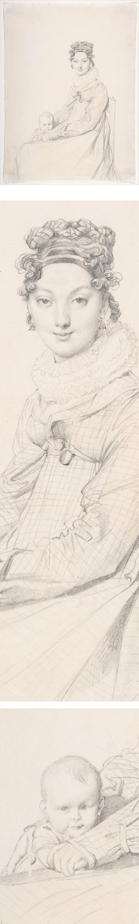
Madame Alexandre Lethière and Her Daughter Letizia, Jean Auguste Dominique IngresGraphite on paper, roughly 11×9 in (30×22 cm); in the Metropolitan Museum of Art. Use the download or zoom icons under the image.
Another of Ingres’ marvelous pencil portraits in which the delicately attentive portrait is set off by his seemingly casual sketch of the figure and drapery.
I never tire of the effect these often create of responding to the subject of the portrait as a person — and simultaneously being reminded that it’s just lines on paper!
Wonderful.
Categories:
-
Anton Batov

Anton Batov is a Russian artist and illustrator based in Moscow. He is also a senior lecturer in design and graphic design at D. Mendeleyev University Of Chemical Technology Of Russia.I particularly enjoy Batov’s landscape and cityscape watercolors, many of which are painted on location. Even in his more finished studio watercolors, he carries forward a keen awareness of the nature of light in the landscape in various weather and atmospheric conditions.
In his illustration work, he takes a variety of approaches, including watercolor and “digital watercolor”.
Non-Russian speakers may find it easiest to browse his Behance portfolio, which is extensive and divided into various categories. Many of the plein air watercolors presented there are accompanied with photos of the painting in progress on location.
If you enjoy his work as I do, you’ll find more on his website.
Though the site is in Russian, you can navigate from the list of categories; the fourth one down is paintings, the seventh is “graphics“. The latter is a selection of wonderful monochrome sketches and paintings apparently done with marker and/or brush and wash.
You can find additional work on his deviantART gallery, Flickr stream and LiveJournal blog.
Categories:
-
Gregg Kreutz

Originally from Wisconsin, Gregg Kreutz is a New York Based painter, teacher and author.His book Problem Solving for Oil Painters, originally published in 1986 and now in its fifth printing, has become something of an art instruction standard.
Kreutz graduated from N.Y.U. and continued his training at the Art Student’s League, where he studied with David Leffel, Frank Mason and Robert Beverly Hale, among others.
The influence of his prestigious teachers shows in his own keen appreciation for values, edges and nuanced color relationships in his still life, landscape and portrait paintings.
Unfortunately, Kreutz’s work is not well represented on the web. Many of the images on his own website are blurred, improperly resized or over-compressed, and those on the galleries in which he is represented are sometimes poorly reproduced as well. There are enough exceptions to get an idea of the nature of his work. The ones on the Gallery at Shoal Creek are probably of the most consistent quality.
The images in the Problem Solving for Oil Painters book, though older, are much more reliably reproduced, and are the ones that impressed me with his work. I’ve had a copy on my bookshelf since it was first published.
Kreutz currently teaches at the Art Student’s League, as well as at the Fechin Institute in New Mexico, The Scottsdale Artist’s School and The California Art Institute. His instructional videos are available from Signilar Art Video and Liliendahl.
Greg Kreutz will be teaching a three-day workshop “Painting Large Ideas in Plein Air” at the Beaufort Art Market in Beaufort, NC on October 18, 19, 20. There will also be a pleiin air paint out and competition on Saturday, October 17, for which Kreutz will serve as judge.
Categories:


Charley’s Picks
Bookshop.org
(Bookshop.org affilliate links; sales benefit independent bookshop owners; I get a small percentage to help support my work on Lines and Colors)

John Singer Sargent: Watercolors


Urban Sketching: Understanding Perspective


Charley’s Picks
Amazon
(Amazon.com affiliate links; sales go to a larger yacht for Jeff Bezos; but I get a small percentage to help support my work on Lines and Colors)
John Singer Sargent: Watercolors
Urban Sketching: Understanding Perspective