
Categories
- 3d CGI
- Amusements
- Animation
- Anime & Manga
- Art Materials
- Art Videos
- Blogroll
- Cartoons
- Color
- Comics
- Concept & Visual Dev.
- Creativity
- Digital Art
- Digital Painting
- Displaying Art on the Web
- Drawing
- Eye Candy for Today
- Gallery and Museum Art
- High-res Art Images
- Illustration
- Motion Graphics & Flash
- Museums
- Online Museums
- Outsider Art
- Painting
- Painting a Day
- Paleo Art
- Pastel, Conté & Chalk
- Pen & Ink
- Prints and Printmaking
- Reviews
- Sc-fi and Fantasy
- Sculpture & Dimensional
- Site Comments
- Sketching
- Storyboards
- Tools and Techniques
- Uncategorized
- Vector Art
- Videos & Podcasts
- Vision and Optics
- Watercolor and Gouache
- Webcomics
Archives
- April 2026
- March 2026
- February 2026
- January 2026
- December 2025
- November 2025
- October 2025
- September 2025
- August 2025
- July 2025
- June 2025
- May 2025
- January 2025
- December 2024
- November 2024
- October 2024
- September 2024
- August 2024
- June 2024
- April 2024
- March 2024
- February 2024
- January 2024
- December 2023
- November 2023
- October 2023
- September 2023
- August 2023
- July 2023
- May 2023
- April 2023
- March 2023
- February 2023
- January 2023
- December 2022
- November 2022
- September 2022
- August 2022
- July 2022
- June 2022
- May 2022
- April 2022
- March 2022
- February 2022
- January 2022
- December 2021
- November 2021
- October 2021
- September 2021
- August 2021
- July 2021
- June 2021
- May 2021
- April 2021
- March 2021
- February 2021
- January 2021
- December 2020
- November 2020
- October 2020
- September 2020
- August 2020
- July 2020
- June 2020
- May 2020
- April 2020
- March 2020
- February 2020
- January 2020
- December 2019
- November 2019
- October 2019
- September 2019
- August 2019
- July 2019
- June 2019
- May 2019
- April 2019
- March 2019
- February 2019
- January 2019
- December 2018
- November 2018
- October 2018
- September 2018
- August 2018
- July 2018
- June 2018
- May 2018
- April 2018
- March 2018
- February 2018
- January 2018
- December 2017
- November 2017
- October 2017
- September 2017
- August 2017
- July 2017
- June 2017
- May 2017
- April 2017
- March 2017
- February 2017
- January 2017
- December 2016
- November 2016
- October 2016
- September 2016
- August 2016
- July 2016
- June 2016
- May 2016
- April 2016
- March 2016
- February 2016
- January 2016
- December 2015
- November 2015
- October 2015
- September 2015
- August 2015
- July 2015
- June 2015
- May 2015
- April 2015
- March 2015
- February 2015
- January 2015
- December 2014
- November 2014
- October 2014
- September 2014
- August 2014
- July 2014
- June 2014
- May 2014
- April 2014
- March 2014
- February 2014
- January 2014
- December 2013
- November 2013
- October 2013
- September 2013
- August 2013
- July 2013
- June 2013
- May 2013
- April 2013
- March 2013
- February 2013
- January 2013
- December 2012
- November 2012
- October 2012
- September 2012
- August 2012
- July 2012
- June 2012
- May 2012
- April 2012
- March 2012
- February 2012
- January 2012
- December 2011
- November 2011
- October 2011
- September 2011
- August 2011
- July 2011
- June 2011
- May 2011
- April 2011
- March 2011
- February 2011
- January 2011
- December 2010
- November 2010
- October 2010
- September 2010
- August 2010
- July 2010
- June 2010
- May 2010
- April 2010
- March 2010
- February 2010
- January 2010
- December 2009
- November 2009
- October 2009
- September 2009
- August 2009
- July 2009
- June 2009
- May 2009
- April 2009
- March 2009
- February 2009
- January 2009
- December 2008
- November 2008
- October 2008
- September 2008
- August 2008
- July 2008
- June 2008
- May 2008
- April 2008
- March 2008
- February 2008
- January 2008
- December 2007
- November 2007
- October 2007
- September 2007
- August 2007
- July 2007
- June 2007
- May 2007
- April 2007
- March 2007
- February 2007
- January 2007
- December 2006
- November 2006
- October 2006
- September 2006
- August 2006
- July 2006
- June 2006
- May 2006
- April 2006
- March 2006
- February 2006
- January 2006
- December 2005
- November 2005
- October 2005
- September 2005
- August 2005
Relevant Blogs
Art, Painting & Sketch
- Gurney Journey
- Underpaintings
- Art and Influence
- Painting Perceptions
- Oil Painters of America
- Vasari Paint POV
- Flying Fox
- Urban Sketchers
- Bento (Smithsonian)
- Art Inconnu
- The Hidden Place
- Still Life
- Making a Mark
- The Art of the Landscape
- Exploring Color & Creativity
- Art Contrarian
- Artist A Day
- beinArt Surreal Art Collective
- Eye Level
- David Dunlop
- p.i.g.m.e.n.t.i.u.m
- CultureGrrl
- Joaquín Sorolla blog
- Artists in Pastel
“Painting a Day”
- A Painting a Day (Keiser)
- On Painting (Keiser)
- Julian Merrow-Smith
- Karen Jurick
- Jeffrey Hayes
- Carol Marine
- Abbey Ryan
- Daily Paintworks
Other Painting Blogs
- Virtual Gouache Land
- Neil Hollingsworth
- Marc Hanson
- Kevin Menck
- Marc Dalessio
- Larry Seiler
- Stapleton Kearns
- Colin Page
- Roos Schuring
- Hans Versfelt
- Titus Meeuws
- Régis Pettinari
- René Plein Air
- Belinda Del Pesco
- Robin Weiss
- Nathan Fowkes (Land Sketch)
- William Wray
- Frank Serrano
- Stephen Magsig
- Michael Chesley Johnson
- Twice a Week
- Sarah Wimperis
- Rob Adams
- Michael Cole Manley
- The Dirty Palette Club
- Mike Manley’s Draw!
Gallery Art & Illustration mix
Illustration
- Howard Pyle
- 100 Years of Illustration
- BibliOdyssey
- Illustration Art
- Today’s Inspiration
- Illustration Mundo
- Little Chimp Society
- Danny Gregory
- R D (John Martz
- Illustration Friday blog
- Monster Brains
- Illustrators & Illustrations (RU)
- Elwood H. Smith
- DaniDraws.com
- Designers Who Blog
- iSpot Blog
Sci-Fi & Fantasy
Illustration & Comics
Comics & Cartoons
- Comics Beat
- Robot 6
- Newsarama Blog
- Comic Vine
- Comics Alliance
- Forbidden Planet Int.
- Paolo Rivera
- Bolt City
- Flight
- Scott McCloud
- The Comics Journal
- Comixpedia
- Funnybook Babylon
- James Baker
- Middleton’s Sketchbook
- Boneville
- The Hotel Fred
- Paul Rivoche
- Daily Cartoonist
- Mad About Cartoons (William Wray)
- Digital Strips
Illustration & Concept
Animation & Concept
- Cartoon Brew
- Animation Blog
- Cold Hard Flash
- Concept Art World
- The CAB
- FY Concept Art
- Concept Ships
- Concept Robots
- John Nevarez
- Armand Serrano
- Marcos Mateu-Mestre
- all kinds of stuff (Kricfalusi)
- Yacin the faun (Man Arenas)
- Kelsey Mann
- Cre8tivemarks Blog
- Ice-Cream Monster Toon Cafe
- AAU Character & Creature Design
- AAU Animation Notes
- Articles and Texticles
Paleo & Scientific
Tools & Techniques
Other
Lists of Art Blogs
Art Image Resource Links
Historic Art Images
- Wikimedia Commons: Paintings
- Wikimedia Commons: Drawings
- The Athenaeum
- WikiArt (WikiPaintings)
- Google Art Project: Artists
- Google Art Project: Collections (Museums)
- ArtCyclopedia
- Web Gallery of Art
- Art Renewal Center
- Web Gallery of Impressionism
Auction Consolidation sites
Auction sites
- Sotheby’s
- Bonham’s
- Christies
- Heritage Auctions: Fine Art
- Heritage Auctions: Illustration
- Freeman’s Auctions
- Bukowskis
- Shannon’s
Image Search
Reverse Image Search (search by image)
- Tin Eye
- RevImg
- Google Image Search (camera icon)
- Bing Image Search (camera icon)
Promoting some friends and some clients of my website design business
- Twin Willows T’ai Chi studio in Wilmington DE. Taiji classes with Bryan Davis.
- Ray Hayward, Inspired Teacher of T’ai Chi ( Taiji ) in Minneapolis, Founder of Mindful Motion Tai Chi Academy
- OldHead Tattoo studio and Art Gallery in Wilmington DE. Tattoos and paintings by Bruce Gulick
- Sharon Domenico Art, pet portrait oil paintings
- Platinum Paperhanging, wallpaper hanging, Main Line and Philadelphia, PA
- Lisa Stone Design, interior designer, Main Line and Philadelphia, PA
- Studio12KPT, original art, prints, calendars and other custom printed items by Van Sickle & Rolleri
-
Randy Glass

Randy Glass is a well-known illustrator who specializes in the pen and ink technique of stipple, in which a multitude of carefully placed dots — sometimes of varying size — coalesce visually to create tone.It’s a technique adapted to the relatively low resolution of newspaper printing, in which the artist has more control over the final appearance of the illustration than a mechanically generated screen applied to a continuous tone image.
It also has the effect of being visually appealing in its own right, particularly when the dots are large enough to also provide surface texture. It’s especially pleasing to my eye when the dots are arranged in patterns of flow that help define the volume and topology of the face, as in the “hedcut” portraits Glass and a select group of other illustrators draw for the Wall Street Journal (above, middle rows).
Glass also does wonderfully expressive portraits in monochromatic watercolor (above, bottom three).
Categories:
-
Grzegorz Wróbel (update)

Grzegorz Wróbel is a Polish watercolorist who I first wrote about in 2010.Wróbel’s background in architectural design gives his cityscapes and street scenes a feeling of effortless strength that belies the complex challenge of perspective and rendering they present.
He deftly steps between detail and suggestion, giving his compositions both a tactile immediacy and and a feeling of loose, painterly handling. Particularly effective is his use of light and shadow amid the architectural forms to give them dimension and presence.
His website is in Polish, but just use the drop-down menu under “Galeria” to browse galleries. Be aware that the Exhibition 2012 gallery has sub-galleries. In addition, there is a section of tutorials.
You can also find his work on his deviantART gallery, including a number of portraits, and on the site of Galeria Sztuki Napora.
For more, see my previous post on Grzegorz Wróbel.
Categories:
-
ColourLex
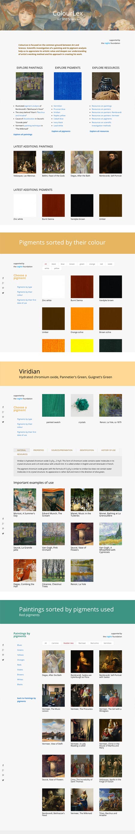
Back in 2012, I wrote about a website called Pigments through the Ages; a resource about the history and nature of artist’s pigments. That site is 10 years old now, and as far as I know, is no longer being actively developed.However, one of the original authors of that site, Juraj Lipscher, has created a new, more extensive and currently active site on the same subject, titled ColourLex.
The ColourLex site can be explored through multiple paths: by pigments, paintings, artists and periods, each with sub-paths. Pigments, for example, can be explored by type, color or first date of use.
Each pigment is then broken down by properties, sources, identification and history, and a gallery is provided of important paintings in which the pigment was prominently used.
Lipscher’s background is as a PhD in physical chemistry. He brings his experience in teaching and lecturing at the college level to the presentation of his fascination with the history of artists’ pigments.
New material is being added on an ongoing basis; the most recent additions of pigments and paintings are listed on the home page.
In addition, there are resources on paintings, painters, pigments and methods of scientific investigation of pigments used in historic paintings.
ColourLex is a fascinating resource, and a terrific crossover between art and science.
Categories:
-
Eye Candy for Today: Girolamo dai Libri’s Madonna and Child with Saints

Madonna and Child with Saints, Girolamo dai LibriTempera and oil on canvas; 16th century, in the Metropolitan Museum of Art. Use the zoom or download icons under the image.
To my mind, this could be titled “Madonna and Child with Laurel Tree“, so striking is the tree’s presence, painstakingly detailed and dominating the composition.
Along with that, the most notable features are the angelic faces of the Madonna and the other women, and the monumental geometric solidity of the Durer-inspired landscape.
The male “saints” look to me like carefully portrayed portraits of patrons or clergy, most interesting for the “painting within a painting” of their decorated robes. The angel trio — in the foreground but smaller than the other figures — seem almost like musical stage accompaniment, as if in an orchestra pit in front of an opera.
The peacock is rendered with Audubon-like accuracy and the distant mountains have the surreal feeling common in early landscapes in which the atmospheric distance is indicated with a distinct shift in color, but without the softening of detail most often present in reality and in later paintings.
Particularly impressive to me is the beatific face of the woman to our right, lovingly rendered and reminiscent of Botticelli’s mythic figures.
Categories:
-
Sung Choi

Sung Choi is a concept artist based in Seattle, working in the gaming and entertainment industry.His concept work is dramatically atmospheric, with subdued colors and muted values not only creating depth but mood.
Choi has tuned his digital painting tools to create a very brushy, painterly effect, and uses the same characteristics in what I assume are digital plein air paintings.
[Via Concept Art World]
Categories:
-
Henry John Boddington

Victorian painter Henry John Williams took his wife’s last name as Henry John Boddington to distinguish himself from the prolific Williams family of painters from which he came.Boddington, whose only formal instruction was from his father, painter Edward Williams, developed a style rich with the textures of landscape, often revealed in dramatic almost theatrical lighting. He also gave many of his paintings great depth, carrying the backgrounds into the distance with layers of atmospheric perspective.
Boddington painted his lush, detailed landscapes of the English countryside in various locations throughout England and Wales, but did not follow many of his contemporaries in traveling to the continent or to the Mediterranean basin.
Categories:


Charley’s Picks
Bookshop.org
(Bookshop.org affilliate links; sales benefit independent bookshop owners; I get a small percentage to help support my work on Lines and Colors)

John Singer Sargent: Watercolors


Urban Sketching: Understanding Perspective


Charley’s Picks
Amazon
(Amazon.com affiliate links; sales go to a larger yacht for Jeff Bezos; but I get a small percentage to help support my work on Lines and Colors)
John Singer Sargent: Watercolors
Urban Sketching: Understanding Perspective