
Categories
- 3d CGI
- Amusements
- Animation
- Anime & Manga
- Art Materials
- Art Videos
- Blogroll
- Cartoons
- Color
- Comics
- Concept & Visual Dev.
- Creativity
- Digital Art
- Digital Painting
- Displaying Art on the Web
- Drawing
- Eye Candy for Today
- Gallery and Museum Art
- High-res Art Images
- Illustration
- Motion Graphics & Flash
- Museums
- Online Museums
- Outsider Art
- Painting
- Painting a Day
- Paleo Art
- Pastel, Conté & Chalk
- Pen & Ink
- Prints and Printmaking
- Reviews
- Sc-fi and Fantasy
- Sculpture & Dimensional
- Site Comments
- Sketching
- Storyboards
- Tools and Techniques
- Uncategorized
- Vector Art
- Videos & Podcasts
- Vision and Optics
- Watercolor and Gouache
- Webcomics
Archives
- April 2026
- March 2026
- February 2026
- January 2026
- December 2025
- November 2025
- October 2025
- September 2025
- August 2025
- July 2025
- June 2025
- May 2025
- January 2025
- December 2024
- November 2024
- October 2024
- September 2024
- August 2024
- June 2024
- April 2024
- March 2024
- February 2024
- January 2024
- December 2023
- November 2023
- October 2023
- September 2023
- August 2023
- July 2023
- May 2023
- April 2023
- March 2023
- February 2023
- January 2023
- December 2022
- November 2022
- September 2022
- August 2022
- July 2022
- June 2022
- May 2022
- April 2022
- March 2022
- February 2022
- January 2022
- December 2021
- November 2021
- October 2021
- September 2021
- August 2021
- July 2021
- June 2021
- May 2021
- April 2021
- March 2021
- February 2021
- January 2021
- December 2020
- November 2020
- October 2020
- September 2020
- August 2020
- July 2020
- June 2020
- May 2020
- April 2020
- March 2020
- February 2020
- January 2020
- December 2019
- November 2019
- October 2019
- September 2019
- August 2019
- July 2019
- June 2019
- May 2019
- April 2019
- March 2019
- February 2019
- January 2019
- December 2018
- November 2018
- October 2018
- September 2018
- August 2018
- July 2018
- June 2018
- May 2018
- April 2018
- March 2018
- February 2018
- January 2018
- December 2017
- November 2017
- October 2017
- September 2017
- August 2017
- July 2017
- June 2017
- May 2017
- April 2017
- March 2017
- February 2017
- January 2017
- December 2016
- November 2016
- October 2016
- September 2016
- August 2016
- July 2016
- June 2016
- May 2016
- April 2016
- March 2016
- February 2016
- January 2016
- December 2015
- November 2015
- October 2015
- September 2015
- August 2015
- July 2015
- June 2015
- May 2015
- April 2015
- March 2015
- February 2015
- January 2015
- December 2014
- November 2014
- October 2014
- September 2014
- August 2014
- July 2014
- June 2014
- May 2014
- April 2014
- March 2014
- February 2014
- January 2014
- December 2013
- November 2013
- October 2013
- September 2013
- August 2013
- July 2013
- June 2013
- May 2013
- April 2013
- March 2013
- February 2013
- January 2013
- December 2012
- November 2012
- October 2012
- September 2012
- August 2012
- July 2012
- June 2012
- May 2012
- April 2012
- March 2012
- February 2012
- January 2012
- December 2011
- November 2011
- October 2011
- September 2011
- August 2011
- July 2011
- June 2011
- May 2011
- April 2011
- March 2011
- February 2011
- January 2011
- December 2010
- November 2010
- October 2010
- September 2010
- August 2010
- July 2010
- June 2010
- May 2010
- April 2010
- March 2010
- February 2010
- January 2010
- December 2009
- November 2009
- October 2009
- September 2009
- August 2009
- July 2009
- June 2009
- May 2009
- April 2009
- March 2009
- February 2009
- January 2009
- December 2008
- November 2008
- October 2008
- September 2008
- August 2008
- July 2008
- June 2008
- May 2008
- April 2008
- March 2008
- February 2008
- January 2008
- December 2007
- November 2007
- October 2007
- September 2007
- August 2007
- July 2007
- June 2007
- May 2007
- April 2007
- March 2007
- February 2007
- January 2007
- December 2006
- November 2006
- October 2006
- September 2006
- August 2006
- July 2006
- June 2006
- May 2006
- April 2006
- March 2006
- February 2006
- January 2006
- December 2005
- November 2005
- October 2005
- September 2005
- August 2005
Relevant Blogs
Art, Painting & Sketch
- Gurney Journey
- Underpaintings
- Art and Influence
- Painting Perceptions
- Oil Painters of America
- Vasari Paint POV
- Flying Fox
- Urban Sketchers
- Bento (Smithsonian)
- Art Inconnu
- The Hidden Place
- Still Life
- Making a Mark
- The Art of the Landscape
- Exploring Color & Creativity
- Art Contrarian
- Artist A Day
- beinArt Surreal Art Collective
- Eye Level
- David Dunlop
- p.i.g.m.e.n.t.i.u.m
- CultureGrrl
- Joaquín Sorolla blog
- Artists in Pastel
“Painting a Day”
- A Painting a Day (Keiser)
- On Painting (Keiser)
- Julian Merrow-Smith
- Karen Jurick
- Jeffrey Hayes
- Carol Marine
- Abbey Ryan
- Daily Paintworks
Other Painting Blogs
- Virtual Gouache Land
- Neil Hollingsworth
- Marc Hanson
- Kevin Menck
- Marc Dalessio
- Larry Seiler
- Stapleton Kearns
- Colin Page
- Roos Schuring
- Hans Versfelt
- Titus Meeuws
- Régis Pettinari
- René Plein Air
- Belinda Del Pesco
- Robin Weiss
- Nathan Fowkes (Land Sketch)
- William Wray
- Frank Serrano
- Stephen Magsig
- Michael Chesley Johnson
- Twice a Week
- Sarah Wimperis
- Rob Adams
- Michael Cole Manley
- The Dirty Palette Club
- Mike Manley’s Draw!
Gallery Art & Illustration mix
Illustration
- Howard Pyle
- 100 Years of Illustration
- BibliOdyssey
- Illustration Art
- Today’s Inspiration
- Illustration Mundo
- Little Chimp Society
- Danny Gregory
- R D (John Martz
- Illustration Friday blog
- Monster Brains
- Illustrators & Illustrations (RU)
- Elwood H. Smith
- DaniDraws.com
- Designers Who Blog
- iSpot Blog
Sci-Fi & Fantasy
Illustration & Comics
Comics & Cartoons
- Comics Beat
- Robot 6
- Newsarama Blog
- Comic Vine
- Comics Alliance
- Forbidden Planet Int.
- Paolo Rivera
- Bolt City
- Flight
- Scott McCloud
- The Comics Journal
- Comixpedia
- Funnybook Babylon
- James Baker
- Middleton’s Sketchbook
- Boneville
- The Hotel Fred
- Paul Rivoche
- Daily Cartoonist
- Mad About Cartoons (William Wray)
- Digital Strips
Illustration & Concept
Animation & Concept
- Cartoon Brew
- Animation Blog
- Cold Hard Flash
- Concept Art World
- The CAB
- FY Concept Art
- Concept Ships
- Concept Robots
- John Nevarez
- Armand Serrano
- Marcos Mateu-Mestre
- all kinds of stuff (Kricfalusi)
- Yacin the faun (Man Arenas)
- Kelsey Mann
- Cre8tivemarks Blog
- Ice-Cream Monster Toon Cafe
- AAU Character & Creature Design
- AAU Animation Notes
- Articles and Texticles
Paleo & Scientific
Tools & Techniques
Other
Lists of Art Blogs
Art Image Resource Links
Historic Art Images
- Wikimedia Commons: Paintings
- Wikimedia Commons: Drawings
- The Athenaeum
- WikiArt (WikiPaintings)
- Google Art Project: Artists
- Google Art Project: Collections (Museums)
- ArtCyclopedia
- Web Gallery of Art
- Art Renewal Center
- Web Gallery of Impressionism
Auction Consolidation sites
Auction sites
- Sotheby’s
- Bonham’s
- Christies
- Heritage Auctions: Fine Art
- Heritage Auctions: Illustration
- Freeman’s Auctions
- Bukowskis
- Shannon’s
Image Search
Reverse Image Search (search by image)
- Tin Eye
- RevImg
- Google Image Search (camera icon)
- Bing Image Search (camera icon)
Promoting some friends and some clients of my website design business
- Twin Willows T’ai Chi studio in Wilmington DE. Taiji classes with Bryan Davis.
- Ray Hayward, Inspired Teacher of T’ai Chi ( Taiji ) in Minneapolis, Founder of Mindful Motion Tai Chi Academy
- OldHead Tattoo studio and Art Gallery in Wilmington DE. Tattoos and paintings by Bruce Gulick
- Sharon Domenico Art, pet portrait oil paintings
- Platinum Paperhanging, wallpaper hanging, Main Line and Philadelphia, PA
- Lisa Stone Design, interior designer, Main Line and Philadelphia, PA
- Studio12KPT, original art, prints, calendars and other custom printed items by Van Sickle & Rolleri
-
Eye Candy for Today: Study of a Tree, Johann Scheuren

Study of a Tree, Johann Caspar Nepomuk ScheurenWatercolor over pencil, 124 x 200 in (316 x 512cm).
On Google art Project, downloadable file on Wikimedia Commons, original is in the Museum Kunstpalast, Düsseldorf
Categories:
-
Tadahiro Uesugi (update 2014)

I first wrote about Japanese illustrator Tadahiro Uesugi back in 2005, and again in 2010. While his awkwardly arranged website has unfortunately not been revised, his work is a fresh and wonderful as ever.Influenced by an affection for 1950s and 1960s “modern” styles of American advertising art, Uesugi brings together a strong sense of design, perspective and geometry with a brilliant use of light and color to create deceptively simple but remarkably effective images.
Many of his illustrations are set in U.S. and European cities (as presumably are some of his clients), notably San Francisco and Paris.
He uses open areas and negative space with almost equal presence to his represented objects. Often, much more is suggested than presented. He adds deft touches of texture exactly where most appropriate.
Given the amazingly strong geometric foundation of his compositions, you might be tempted to think that his images are filled with straight lines, but they’re not. His lines are curved, slanted, skewed, broken and rough edged — anything but straight.
His subtle use of value is not what you might expect from work that seems so abstracted into basic forms, but in many ways, value relationships are at the heart of his compositions.
Light shimmers, slides, peeks and bounces through his images — slipping through cracks, hiding in doorways and bounding down alleys. Light is as much a character in Uesugi’s images as his frequent subjects of fashionable young women walking through urban environments.
His website is not as easy to browse as one might like. The home page is a jumble of mentions of projects and links to places other than his portfolio, all in Japanese. Just go directly to the bottom of the page, and on the little navigation bar at the very bottom, click “Illustration”. I can’t even give you a direct link because the damn thing is in frames.
You should see a row of thumbnails in the left column (frame) and a single image in the right. As you scroll down through the thumbnails, you’ll find that the last thumbnail, or bit of text, will be a link to the next set of thumbnails. The one good thing about the site is that there are at least a two or three hundred of his images there.
There is an interview with Uesugi about his concept art for the animated film Coraline on Animation World Network (see also my posts on Coraline).
Categories:
-
Eye Candy for Today: Adélaïde Labille-Guiard’s Self-Portrait with Two Pupils

Self-Portrait with Two Pupils, Adélaïde Labille-GuiardIn the Metropolitan Museum of Art; use the zoom or download icons under the image.
Though I’m not quite as taken with her work as I am with the paintings of her contemporary, Elisabeth-Louise Vigée Le Brun, I do admire Labille-Guiard’s skill with paint, and with chalk drawing.
At the time she and Vigée Le Brun were members of the Academy, they were two of only four women admitted at any one time.
This is the kind of highly refined self-portrait that artists used as a promotion piece, demonstrating their skill as a portrait painter to prospective patrons.
In this case, however, it may have been more, a statement that women artists should have a place in the French Royal Academy that was not limited to a token representation. She certainly makes a good case for it.
Categories:
-
Ted Nasmith

Along with Alan lee, John Howe and the Hildebrant brothers, Canadian illustrator Ted Nasmith is one of the artists most associated with bringing to visual form the works of J.R.R. Tolkien.It’s difficult now to see past the look established by the extremely popular movies, but that look was largely developed from existing sources in popular illustration, one of which was Nasmith. Even though other commitments prevented him from accepting the invitation to work on the films directly, his influence on those who did work on them is evident. (There is an article here that discusses his unofficial influence on the look of the LoTR films.)
Influence and inspiration are a two way process, of course, and in Nasmith’s work I see an admiration for fantasy illustration greats from the golden age, like Arthur Rackham, John Bauer, Gustaf Tenggren and Maxfield Parrish, as well as his contemporary interpreters of Tolkein.
Nasmith has more recently been working on illustrations of the works of George R.R. Martin, including an upcoming deluxe edition of Game of Thrones.
In addition to his fantasy illustration, Nasmith has a background in architectural rendering, and a personal penchant for paintings of classic automobiles, some of which show an affection for 1960s advertising illustration. I enjoy the way he incorporates his skill with landscape and naturalistic elements into his automative renderings.
I’m particularly knocked out by Nasmith’s handling of his primary medium: gouache. I’ve frequently described gouache as an underrated and insufficiently appreciated medium, with a unique character and dramatic potential, and Nasmith’s mastery of opaque watercolor is a beautiful case in point.
With the exception of the image of Galdalf and the two hobbits at the glowing door to Moria (which was done in acrylic), all of the illustrations shown above — and with a few other exceptions, most of the pieces in his portfolio — were painted in gouache on illustration board.
Categories:
-
Eye Candy for Today: William Rickarby Miller apples
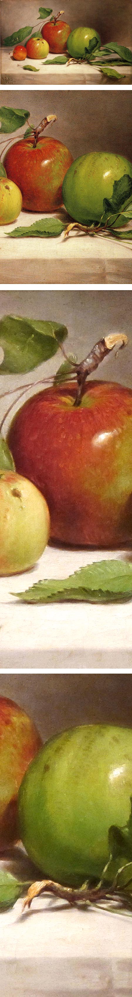
Still Life – Study of Apples, William Rickarby MillerI’ve linked here to a version of this image on The Athenaeum. The original is in the de Young museum in San Francisco. There is a high resolution version on the Google art Project, and a downloadable high resolution image on Wikimedia Commons.
The Google Art Project image, and the one on the de Young site, seem dark and over-saturated; the one on Wikimedia Commons seems too faded and desaturated. The one on The Athenaeum, which I suspect someone corrected before uploading, feels more natural to me. It is not as high in resolution, however.
I’ve used the Athenaeum version here for the top two images, and a version of the Wikimedia image that I’ve color adjusted to be closer to the Athenaeum version for the bottom two details.
I haven’t seen the original, which could well be closer in appearance to the darker versions.
Miller was a 19th century American painter, considered part of the Hudson River School. This simple, direct still life feels remarkably fresh and modern.
Categories:
-
Monet and the Seine: Impressions of a River, MFA Houston

Monet and the Seine: Impressions of a River is an exhibition currently at the Museum of Fine Arts, Houston that collects over 50 works related to the French Impressionist’s lifelong fascination with the river at the heart of Paris and, metaphorically, at the heart of France.Monet was known for his series paintings, in which he set about painting the same scene repeatedly in different light, weather and seasons — most notably his series of his garden, the water lilies, haystacks and the facade of the Rouen Cathedral.
Less well recognized are several series he painted of views from particular vantage points along the Seine, which can cumulatively be thought of as part of a much larger series of paintings of the river, encompassing a significant part of his oeuvre.
Like so many museums that seem resolutely clueless about using their website to generate interest in their exhibition by posting images of paintings in the exhibition, the MFAH serves up only a piddling slideshow and a one minute teaser video as meager clues to what pieces might await visitors.
The exhibition was organized in cooperation with the Philbrook Museum in Tulsa — where it was on display earlier this year — and their site isn’t any better at showing what to expect from the exhibit, other than a similarly stingy slideshow. Between the two sites and a review on the Houston Chronicle, I’ve put together in the images above what I could in the way of a selection of paintings that are in the exhibition.
To go on from there, for those of us who can’t visit in person, we must content ourselves with more general resources, like a Google image search for “Claude Monet” and “Seine”, and a Google Art Project search for high resolution images of the same topic (any of which may or may not be relevant to the exhibition), as well as more generalized image resources for images by Monet like Wikimedia Commons and The Athenaeum, from which we are left to our own devices to pick out views of the river.
There is a catalog accompanying the exhibition, but I have not seen it.
Categories:


Charley’s Picks
Bookshop.org
(Bookshop.org affilliate links; sales benefit independent bookshop owners; I get a small percentage to help support my work on Lines and Colors)

John Singer Sargent: Watercolors


Urban Sketching: Understanding Perspective


Charley’s Picks
Amazon
(Amazon.com affiliate links; sales go to a larger yacht for Jeff Bezos; but I get a small percentage to help support my work on Lines and Colors)
John Singer Sargent: Watercolors
Urban Sketching: Understanding Perspective