
Categories
- 3d CGI
- Amusements
- Animation
- Anime & Manga
- Art Materials
- Art Videos
- Blogroll
- Cartoons
- Color
- Comics
- Concept & Visual Dev.
- Creativity
- Digital Art
- Digital Painting
- Displaying Art on the Web
- Drawing
- Eye Candy for Today
- Gallery and Museum Art
- High-res Art Images
- Illustration
- Motion Graphics & Flash
- Museums
- Online Museums
- Outsider Art
- Painting
- Painting a Day
- Paleo Art
- Pastel, Conté & Chalk
- Pen & Ink
- Prints and Printmaking
- Reviews
- Sc-fi and Fantasy
- Sculpture & Dimensional
- Site Comments
- Sketching
- Storyboards
- Tools and Techniques
- Uncategorized
- Vector Art
- Videos & Podcasts
- Vision and Optics
- Watercolor and Gouache
- Webcomics
Archives
- May 2026
- April 2026
- March 2026
- February 2026
- January 2026
- December 2025
- November 2025
- October 2025
- September 2025
- August 2025
- July 2025
- June 2025
- May 2025
- January 2025
- December 2024
- November 2024
- October 2024
- September 2024
- August 2024
- June 2024
- April 2024
- March 2024
- February 2024
- January 2024
- December 2023
- November 2023
- October 2023
- September 2023
- August 2023
- July 2023
- May 2023
- April 2023
- March 2023
- February 2023
- January 2023
- December 2022
- November 2022
- September 2022
- August 2022
- July 2022
- June 2022
- May 2022
- April 2022
- March 2022
- February 2022
- January 2022
- December 2021
- November 2021
- October 2021
- September 2021
- August 2021
- July 2021
- June 2021
- May 2021
- April 2021
- March 2021
- February 2021
- January 2021
- December 2020
- November 2020
- October 2020
- September 2020
- August 2020
- July 2020
- June 2020
- May 2020
- April 2020
- March 2020
- February 2020
- January 2020
- December 2019
- November 2019
- October 2019
- September 2019
- August 2019
- July 2019
- June 2019
- May 2019
- April 2019
- March 2019
- February 2019
- January 2019
- December 2018
- November 2018
- October 2018
- September 2018
- August 2018
- July 2018
- June 2018
- May 2018
- April 2018
- March 2018
- February 2018
- January 2018
- December 2017
- November 2017
- October 2017
- September 2017
- August 2017
- July 2017
- June 2017
- May 2017
- April 2017
- March 2017
- February 2017
- January 2017
- December 2016
- November 2016
- October 2016
- September 2016
- August 2016
- July 2016
- June 2016
- May 2016
- April 2016
- March 2016
- February 2016
- January 2016
- December 2015
- November 2015
- October 2015
- September 2015
- August 2015
- July 2015
- June 2015
- May 2015
- April 2015
- March 2015
- February 2015
- January 2015
- December 2014
- November 2014
- October 2014
- September 2014
- August 2014
- July 2014
- June 2014
- May 2014
- April 2014
- March 2014
- February 2014
- January 2014
- December 2013
- November 2013
- October 2013
- September 2013
- August 2013
- July 2013
- June 2013
- May 2013
- April 2013
- March 2013
- February 2013
- January 2013
- December 2012
- November 2012
- October 2012
- September 2012
- August 2012
- July 2012
- June 2012
- May 2012
- April 2012
- March 2012
- February 2012
- January 2012
- December 2011
- November 2011
- October 2011
- September 2011
- August 2011
- July 2011
- June 2011
- May 2011
- April 2011
- March 2011
- February 2011
- January 2011
- December 2010
- November 2010
- October 2010
- September 2010
- August 2010
- July 2010
- June 2010
- May 2010
- April 2010
- March 2010
- February 2010
- January 2010
- December 2009
- November 2009
- October 2009
- September 2009
- August 2009
- July 2009
- June 2009
- May 2009
- April 2009
- March 2009
- February 2009
- January 2009
- December 2008
- November 2008
- October 2008
- September 2008
- August 2008
- July 2008
- June 2008
- May 2008
- April 2008
- March 2008
- February 2008
- January 2008
- December 2007
- November 2007
- October 2007
- September 2007
- August 2007
- July 2007
- June 2007
- May 2007
- April 2007
- March 2007
- February 2007
- January 2007
- December 2006
- November 2006
- October 2006
- September 2006
- August 2006
- July 2006
- June 2006
- May 2006
- April 2006
- March 2006
- February 2006
- January 2006
- December 2005
- November 2005
- October 2005
- September 2005
- August 2005
Relevant Blogs
Art, Painting & Sketch
- Gurney Journey
- Underpaintings
- Art and Influence
- Painting Perceptions
- Oil Painters of America
- Vasari Paint POV
- Flying Fox
- Urban Sketchers
- Bento (Smithsonian)
- Art Inconnu
- The Hidden Place
- Still Life
- Making a Mark
- The Art of the Landscape
- Exploring Color & Creativity
- Art Contrarian
- Artist A Day
- beinArt Surreal Art Collective
- Eye Level
- David Dunlop
- p.i.g.m.e.n.t.i.u.m
- CultureGrrl
- Joaquín Sorolla blog
- Artists in Pastel
“Painting a Day”
- A Painting a Day (Keiser)
- On Painting (Keiser)
- Julian Merrow-Smith
- Karen Jurick
- Jeffrey Hayes
- Carol Marine
- Abbey Ryan
- Daily Paintworks
Other Painting Blogs
- Virtual Gouache Land
- Neil Hollingsworth
- Marc Hanson
- Kevin Menck
- Marc Dalessio
- Larry Seiler
- Stapleton Kearns
- Colin Page
- Roos Schuring
- Hans Versfelt
- Titus Meeuws
- Régis Pettinari
- René Plein Air
- Belinda Del Pesco
- Robin Weiss
- Nathan Fowkes (Land Sketch)
- William Wray
- Frank Serrano
- Stephen Magsig
- Michael Chesley Johnson
- Twice a Week
- Sarah Wimperis
- Rob Adams
- Michael Cole Manley
- The Dirty Palette Club
- Mike Manley’s Draw!
Gallery Art & Illustration mix
Illustration
- Howard Pyle
- 100 Years of Illustration
- BibliOdyssey
- Illustration Art
- Today’s Inspiration
- Illustration Mundo
- Little Chimp Society
- Danny Gregory
- R D (John Martz
- Illustration Friday blog
- Monster Brains
- Illustrators & Illustrations (RU)
- Elwood H. Smith
- DaniDraws.com
- Designers Who Blog
- iSpot Blog
Sci-Fi & Fantasy
Illustration & Comics
Comics & Cartoons
- Comics Beat
- Robot 6
- Newsarama Blog
- Comic Vine
- Comics Alliance
- Forbidden Planet Int.
- Paolo Rivera
- Bolt City
- Flight
- Scott McCloud
- The Comics Journal
- Comixpedia
- Funnybook Babylon
- James Baker
- Middleton’s Sketchbook
- Boneville
- The Hotel Fred
- Paul Rivoche
- Daily Cartoonist
- Mad About Cartoons (William Wray)
- Digital Strips
Illustration & Concept
Animation & Concept
- Cartoon Brew
- Animation Blog
- Cold Hard Flash
- Concept Art World
- The CAB
- FY Concept Art
- Concept Ships
- Concept Robots
- John Nevarez
- Armand Serrano
- Marcos Mateu-Mestre
- all kinds of stuff (Kricfalusi)
- Yacin the faun (Man Arenas)
- Kelsey Mann
- Cre8tivemarks Blog
- Ice-Cream Monster Toon Cafe
- AAU Character & Creature Design
- AAU Animation Notes
- Articles and Texticles
Paleo & Scientific
Tools & Techniques
Other
Lists of Art Blogs
Art Image Resource Links
Historic Art Images
- Wikimedia Commons: Paintings
- Wikimedia Commons: Drawings
- The Athenaeum
- WikiArt (WikiPaintings)
- Google Art Project: Artists
- Google Art Project: Collections (Museums)
- ArtCyclopedia
- Web Gallery of Art
- Art Renewal Center
- Web Gallery of Impressionism
Auction Consolidation sites
Auction sites
- Sotheby’s
- Bonham’s
- Christies
- Heritage Auctions: Fine Art
- Heritage Auctions: Illustration
- Freeman’s Auctions
- Bukowskis
- Shannon’s
Image Search
Reverse Image Search (search by image)
- Tin Eye
- RevImg
- Google Image Search (camera icon)
- Bing Image Search (camera icon)
Promoting some friends and some clients of my website design business
- Twin Willows T’ai Chi studio in Wilmington DE. Taiji classes with Bryan Davis.
- Ray Hayward, Inspired Teacher of T’ai Chi ( Taiji ) in Minneapolis, Founder of Mindful Motion Tai Chi Academy
- OldHead Tattoo studio and Art Gallery in Wilmington DE. Tattoos and paintings by Bruce Gulick
- Sharon Domenico Art, pet portrait oil paintings
- Platinum Paperhanging, wallpaper hanging, Main Line and Philadelphia, PA
- Lisa Stone Design, interior designer, Main Line and Philadelphia, PA
- Studio12KPT, original art, prints, calendars and other custom printed items by Van Sickle & Rolleri
-
Landscape alphabet, L.E.M. Jones

This wonderful alphabet, composed of landscape images, was created in the early 19th century. If I understand correctly, it was designed and drawn by an artist named L.E.M. Jones, and then printed by Charles Joseph Hullmandel, who may have made the lithographic drawings from which the prints were pulled.Full set is in the British Museum.
I particularly love the dimensional effect of the atmospheric perspective in the “B”, and the intertwining forms of the “N”.
[Via BoingBoing and Letterology]
Categories:
-
Stefaan Eyckmans

The elegantly refined still life paintings of Belgian painter Stefaan Eyckmans resonate with the traditions of the 17th century “Golden age” Dutch and Flemish still life masters, as well as evoking the sense of stillness and the transformation of the ordinary into the extraordinary exemplified by Chardin.Taught primarily by his father, painter and commercial artist Louis Eyckmans, Stefaan Eyckmans took inspiration from his norther European predecessors as well as more contemporary artists.
Primarily, however, he takes his inspiration from life, and the clarity of presentation that comes from keenly focused observation.
His website contains three galleries of his work, and you can see more on the websites of galleries in which he is represented (linked below).
[Via Jeffrey Hayes]
Categories:
-
Tyler Jacobson (update)

When I first profiled illustrator Tyler Jacobson here on Lines and Colors in 2010, he was only about a year out of graduation from the Academy of Art University in San Francisco, but already accepting major clients, as well as representation from Richard Solomon.Since then, he has continued to develop his dramatic style and his client list, which includes Wizards of the Coast, Simon & Schuster, NBC, The Weekly Standard, Konami, The Penguin Group, Rolling Stone Magazine, Toyota, Tor Books, Scientific American, Entertainment Weekly, The New Yorker and Sports Illustrated.
In his fantasy work, in particular, Jacobson has developed a keen sense of value contrasts and theatrical lighting. These — combined with a strategic use of restricted color palettes, often rich in violets and purples — allow his renderings of fantasy scenes for projects like Magic: The Gathering and Legend of the Cryptids to deliver their subjects with force and authority.
Jacobson’s website has two galleries, one primarily of fantasy work and the other of more general illustration topics and personal work. Jacobson also maintains a blog in which you can see new work as he develops it, and sometimes works in progress.
There is also a section on Jacobson’s process, along with an additional portfolio on the site of his Artists Representative, Richard Solomon.
You can get a quick overview of some of his work on Behance and Concept Art World.
Categories:
-
Alfred Sisley snow scenes

Even though most people in North America, north of the 37th parallel or so, are pretty tired of seeing show (and wishing they could send it to Sochi, where they are apparently having trouble keeping it from melting during the Winter Olympics), there is one sub-group of people who see snow differently — painters.Some painters see in the snow covered landscape a subject as irresistible as the most brilliant colors of spring. This was particularly true among the French Impressionists, who pursued their fascination with the effects of light on the landscape avidly in the snows of winter.
Monet, Pissarro and Caillebotte are known for their landscapes in which they evoked the “effect of snow”. The fascination with snow scenes was especially strong for Alfred Sisley, who painted villages, roads and hillsides that convey not only the subtle light and color of the snowy landscape, but the sense of stillness and quiet that is part of the experience.
There is a page on the Web Gallery of Art that lists and links to larger versions of many of the paintings shown above.
Categories:
-
The Monuments Men at the Met: Treasures Saved During World War II
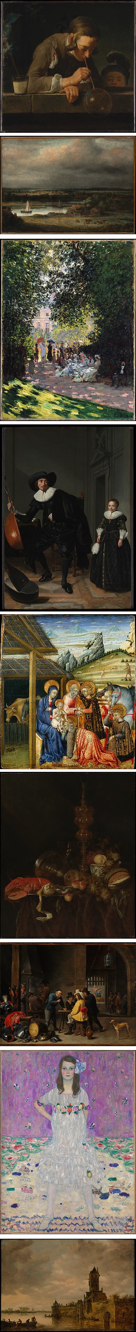
As well they should, a number of art museums are seeking to increase public interest by arranging tours, virtual or otherwise, of works in their collection relevant to the new feature film, The Monuments Men.These can be works either recovered, or preemptively protected from the Nazi’s attempt to accumulate — and potentially destroy — much of the cultural heritage of Europe during WWII.
The Metropolitan Museum of Art in New York has created a tour itinerary of relevant works in their collection. The museum’s relationship to the events in Europe is tied to James Rorimer, a member of the Monuments Men team who later became the Met’s director.
As always, for those of us who can’t conveniently stop by the Met to view the works in person, the great advantage of the Met’s website is their provision of access to high-resolution images of most of the works featured.
(Images above: Jean Siméon Chardin, Philips Konick, Claude Monet, Thomas de Keyser, Giovanni di Paolo, Abraham van Beyeren, David Teniers, Gustav Klimt, Jan van Goyen)
Categories:
-
Mark Fredrickson

Mark Fredrickson is a well-established illustrator whose clients include Time Magazine, Sports Illustrated, The Village Voice, Business Week and Mad Magazine.His range of style reaches from straightforwardly realistic to highly exaggerated caricature. At times, he walks a line between portraiture and caricature, as in his portrayal of Phillip Seymour Hoffman (above, top).
All of Fredrickson’s work is highly finessed, with great attention to the modeling of form and the drama of lighting.
My understanding is that he worked for many years in traditional airbrush before switching to digital painting.
I don’t know of a dedicated site or blog for Fredrickson, but you can see a good selection of his work on the site of his artists representatives, Gerald & Cullen Rapp.
Categories:


Charley’s Picks
Bookshop.org
(Bookshop.org affilliate links; sales benefit independent bookshop owners; I get a small percentage to help support my work on Lines and Colors)

John Singer Sargent: Watercolors


Urban Sketching: Understanding Perspective


Charley’s Picks
Amazon
(Amazon.com affiliate links; sales go to a larger yacht for Jeff Bezos; but I get a small percentage to help support my work on Lines and Colors)
John Singer Sargent: Watercolors
Urban Sketching: Understanding Perspective