
Categories
- 3d CGI
- Amusements
- Animation
- Anime & Manga
- Art Materials
- Art Videos
- Blogroll
- Cartoons
- Color
- Comics
- Concept & Visual Dev.
- Creativity
- Digital Art
- Digital Painting
- Displaying Art on the Web
- Drawing
- Eye Candy for Today
- Gallery and Museum Art
- High-res Art Images
- Illustration
- Motion Graphics & Flash
- Museums
- Online Museums
- Outsider Art
- Painting
- Painting a Day
- Paleo Art
- Pastel, Conté & Chalk
- Pen & Ink
- Prints and Printmaking
- Reviews
- Sc-fi and Fantasy
- Sculpture & Dimensional
- Site Comments
- Sketching
- Storyboards
- Tools and Techniques
- Uncategorized
- Vector Art
- Videos & Podcasts
- Vision and Optics
- Watercolor and Gouache
- Webcomics
Archives
- May 2026
- April 2026
- March 2026
- February 2026
- January 2026
- December 2025
- November 2025
- October 2025
- September 2025
- August 2025
- July 2025
- June 2025
- May 2025
- January 2025
- December 2024
- November 2024
- October 2024
- September 2024
- August 2024
- June 2024
- April 2024
- March 2024
- February 2024
- January 2024
- December 2023
- November 2023
- October 2023
- September 2023
- August 2023
- July 2023
- May 2023
- April 2023
- March 2023
- February 2023
- January 2023
- December 2022
- November 2022
- September 2022
- August 2022
- July 2022
- June 2022
- May 2022
- April 2022
- March 2022
- February 2022
- January 2022
- December 2021
- November 2021
- October 2021
- September 2021
- August 2021
- July 2021
- June 2021
- May 2021
- April 2021
- March 2021
- February 2021
- January 2021
- December 2020
- November 2020
- October 2020
- September 2020
- August 2020
- July 2020
- June 2020
- May 2020
- April 2020
- March 2020
- February 2020
- January 2020
- December 2019
- November 2019
- October 2019
- September 2019
- August 2019
- July 2019
- June 2019
- May 2019
- April 2019
- March 2019
- February 2019
- January 2019
- December 2018
- November 2018
- October 2018
- September 2018
- August 2018
- July 2018
- June 2018
- May 2018
- April 2018
- March 2018
- February 2018
- January 2018
- December 2017
- November 2017
- October 2017
- September 2017
- August 2017
- July 2017
- June 2017
- May 2017
- April 2017
- March 2017
- February 2017
- January 2017
- December 2016
- November 2016
- October 2016
- September 2016
- August 2016
- July 2016
- June 2016
- May 2016
- April 2016
- March 2016
- February 2016
- January 2016
- December 2015
- November 2015
- October 2015
- September 2015
- August 2015
- July 2015
- June 2015
- May 2015
- April 2015
- March 2015
- February 2015
- January 2015
- December 2014
- November 2014
- October 2014
- September 2014
- August 2014
- July 2014
- June 2014
- May 2014
- April 2014
- March 2014
- February 2014
- January 2014
- December 2013
- November 2013
- October 2013
- September 2013
- August 2013
- July 2013
- June 2013
- May 2013
- April 2013
- March 2013
- February 2013
- January 2013
- December 2012
- November 2012
- October 2012
- September 2012
- August 2012
- July 2012
- June 2012
- May 2012
- April 2012
- March 2012
- February 2012
- January 2012
- December 2011
- November 2011
- October 2011
- September 2011
- August 2011
- July 2011
- June 2011
- May 2011
- April 2011
- March 2011
- February 2011
- January 2011
- December 2010
- November 2010
- October 2010
- September 2010
- August 2010
- July 2010
- June 2010
- May 2010
- April 2010
- March 2010
- February 2010
- January 2010
- December 2009
- November 2009
- October 2009
- September 2009
- August 2009
- July 2009
- June 2009
- May 2009
- April 2009
- March 2009
- February 2009
- January 2009
- December 2008
- November 2008
- October 2008
- September 2008
- August 2008
- July 2008
- June 2008
- May 2008
- April 2008
- March 2008
- February 2008
- January 2008
- December 2007
- November 2007
- October 2007
- September 2007
- August 2007
- July 2007
- June 2007
- May 2007
- April 2007
- March 2007
- February 2007
- January 2007
- December 2006
- November 2006
- October 2006
- September 2006
- August 2006
- July 2006
- June 2006
- May 2006
- April 2006
- March 2006
- February 2006
- January 2006
- December 2005
- November 2005
- October 2005
- September 2005
- August 2005
Relevant Blogs
Art, Painting & Sketch
- Gurney Journey
- Underpaintings
- Art and Influence
- Painting Perceptions
- Oil Painters of America
- Vasari Paint POV
- Flying Fox
- Urban Sketchers
- Bento (Smithsonian)
- Art Inconnu
- The Hidden Place
- Still Life
- Making a Mark
- The Art of the Landscape
- Exploring Color & Creativity
- Art Contrarian
- Artist A Day
- beinArt Surreal Art Collective
- Eye Level
- David Dunlop
- p.i.g.m.e.n.t.i.u.m
- CultureGrrl
- Joaquín Sorolla blog
- Artists in Pastel
“Painting a Day”
- A Painting a Day (Keiser)
- On Painting (Keiser)
- Julian Merrow-Smith
- Karen Jurick
- Jeffrey Hayes
- Carol Marine
- Abbey Ryan
- Daily Paintworks
Other Painting Blogs
- Virtual Gouache Land
- Neil Hollingsworth
- Marc Hanson
- Kevin Menck
- Marc Dalessio
- Larry Seiler
- Stapleton Kearns
- Colin Page
- Roos Schuring
- Hans Versfelt
- Titus Meeuws
- Régis Pettinari
- René Plein Air
- Belinda Del Pesco
- Robin Weiss
- Nathan Fowkes (Land Sketch)
- William Wray
- Frank Serrano
- Stephen Magsig
- Michael Chesley Johnson
- Twice a Week
- Sarah Wimperis
- Rob Adams
- Michael Cole Manley
- The Dirty Palette Club
- Mike Manley’s Draw!
Gallery Art & Illustration mix
Illustration
- Howard Pyle
- 100 Years of Illustration
- BibliOdyssey
- Illustration Art
- Today’s Inspiration
- Illustration Mundo
- Little Chimp Society
- Danny Gregory
- R D (John Martz
- Illustration Friday blog
- Monster Brains
- Illustrators & Illustrations (RU)
- Elwood H. Smith
- DaniDraws.com
- Designers Who Blog
- iSpot Blog
Sci-Fi & Fantasy
Illustration & Comics
Comics & Cartoons
- Comics Beat
- Robot 6
- Newsarama Blog
- Comic Vine
- Comics Alliance
- Forbidden Planet Int.
- Paolo Rivera
- Bolt City
- Flight
- Scott McCloud
- The Comics Journal
- Comixpedia
- Funnybook Babylon
- James Baker
- Middleton’s Sketchbook
- Boneville
- The Hotel Fred
- Paul Rivoche
- Daily Cartoonist
- Mad About Cartoons (William Wray)
- Digital Strips
Illustration & Concept
Animation & Concept
- Cartoon Brew
- Animation Blog
- Cold Hard Flash
- Concept Art World
- The CAB
- FY Concept Art
- Concept Ships
- Concept Robots
- John Nevarez
- Armand Serrano
- Marcos Mateu-Mestre
- all kinds of stuff (Kricfalusi)
- Yacin the faun (Man Arenas)
- Kelsey Mann
- Cre8tivemarks Blog
- Ice-Cream Monster Toon Cafe
- AAU Character & Creature Design
- AAU Animation Notes
- Articles and Texticles
Paleo & Scientific
Tools & Techniques
Other
Lists of Art Blogs
Art Image Resource Links
Historic Art Images
- Wikimedia Commons: Paintings
- Wikimedia Commons: Drawings
- The Athenaeum
- WikiArt (WikiPaintings)
- Google Art Project: Artists
- Google Art Project: Collections (Museums)
- ArtCyclopedia
- Web Gallery of Art
- Art Renewal Center
- Web Gallery of Impressionism
Auction Consolidation sites
Auction sites
- Sotheby’s
- Bonham’s
- Christies
- Heritage Auctions: Fine Art
- Heritage Auctions: Illustration
- Freeman’s Auctions
- Bukowskis
- Shannon’s
Image Search
Reverse Image Search (search by image)
- Tin Eye
- RevImg
- Google Image Search (camera icon)
- Bing Image Search (camera icon)
Promoting some friends and some clients of my website design business
- Twin Willows T’ai Chi studio in Wilmington DE. Taiji classes with Bryan Davis.
- Ray Hayward, Inspired Teacher of T’ai Chi ( Taiji ) in Minneapolis, Founder of Mindful Motion Tai Chi Academy
- OldHead Tattoo studio and Art Gallery in Wilmington DE. Tattoos and paintings by Bruce Gulick
- Sharon Domenico Art, pet portrait oil paintings
- Platinum Paperhanging, wallpaper hanging, Main Line and Philadelphia, PA
- Lisa Stone Design, interior designer, Main Line and Philadelphia, PA
- Studio12KPT, original art, prints, calendars and other custom printed items by Van Sickle & Rolleri
-
Blacksad (Juanjo Guarnido)

There is a genre of comics and animated cartoons called “funny animal”, referring to animal characters that have anthropomorphic characteristics. Even if the genre name is unfamiliar, some of the characters are among the best known, e.g. Mickey mouse and Bugs Bunny.Much less familiar to the general public is a sub-genre, sometimes called “furry”, “furries” or “anthropromorphics”, in which the animal characters are anthropomorphised to a greater degree, often taking on basically a human form with an animal head, as well as human gender characteristics (the latter is sometimes emphasized, to put it politely).
I can’t say this is one of my favorite comics genres, as I often find the the concept silly to the point of detracting from the story.
However, there is a series of comics albums from Europe called Blacksad that have upended my take on the subject, simply by being so superbly done.
The creators, writer Juan Díaz Canales and artist Juanjo Guarnido are Spanish, but the books are published in French by French publisher Dargaud for the extensive comics market in France and Belgium, where they have been tremendously popular, and later released in Spanish language and other editions.
Fortunately for those of us who speak English, Dark Horse Comics has collected an published in English translations the first three volumes of the series, in a hardcover edition simply titled Blacksad (Amazon link).
The story is essentially a film noir hard-boiled detective series, John Blacksad being the lead character in that role, who just happens to be portrayed as a black cat.
Other characters are portrayed as various animals, weasels, hippos, dogs, whatever the authors saw as appropriate for their character. The stories are adult in nature, not children’s fare.
What swayed me from my usual reluctance to read comics with this kind of characterization was Guarnido’s stunning comic art, wonderfully realized characters, animal heads or no, and beautifully rendered backgrounds and settings.
Fortunately, there are a number of sources for previewing the pages, both from the Dark Horse book and the European editions, so you can see for yourself what I mean.
Linked from the Dark Horse page for the book is a 4 page preview. You can also view a preview flip book that is a bit more extensive (though smaller and hampered by one of those annoyingly stupid page flippy widgets).
There is also an 8 page preview of the Dark Horse volume on Hypergeek, and the Amazon.com listing has a 6 page preview, with covers and additional inner pages.
There is a Blacksad.com site, which may or may not be official, I don’t know, as well as fan site, Blacksadmania. Both are in French and feature sketches, preliminary art, pencilled pages and more. There is another fan site here, and some non-Blacksad work by Guarnido on The Drawing Board.
Spanish site Guía del cómic has a page about the newest Spanish language volume, Blacksad #4: El Infierno, El Silenco (French edition is titled Blacksad #4 L’enfer, le silence). They have a 9 page preview, the first three of which are posted larger than the other page previews.
Additional large pages from that volume have been posted, along with other pages and additional art, on a blog called Blacksad Gallery, another offshoot of the Character Design Blog and The Art Center that I wrote about recently.
[Suggestion courtesy of James Gurney]
Categories:
-
Sir Frank Dicksee

Sir Frank Dicksee was an English painter and illustrator active in the Victorian era.Originally taught by his father, artist Thomas Dicksee, along with his brother, Herbert, and sister, Margaret, who were also artists of note, Frank Dicksee went on to study at the Royal Academy. There he learned from renowned painters like Frederick Lord Leighton and Pre-Raphaelite master Sir John Everett Millais.
Like the Pre-Raphaelites and other Victorian painters, Dicksee took much inspiration in literary works, in particular Shakespeare, interpreting scenes like the balcony scene from Romeo and Juliet (image above, top) more than once.
Dicksee’s lushly colored, richly detailed works evoke the romance of his literary sources, as well as projecting romance into his elegant portraits.
He was a staunch believer in the traditions and beauty of Victorian High Art, and was vehemently opposed to the dissolution of those traditions at the hands of the early 20th Century Modernists.
The Google Art Project (see my post here) features a zoomable image of Dicksee’s The Two Crowns from the Tate Britain (image and detail, above, bottom). While not as high resolution as the larger images on the project, it’s probably the largest reproduction of a Frank Dicksee painting you’ll find on the web. (The reproduction is a bit murky; I’ve taken the liberty of color correcting it here.)
Categories:
-
The Art Center (blog)

The Art Center is a blog devoted to, as the tagline says, “Sharing Ideas and Tips from Artist to Artist”.An offshoot of the Character Design blog, which is devoted largely to interviews with artists working in the film, gaming and illustration fields, The Art Center features tutorials, walk-throughs, how to videos and discussions of process and technique for character design, concept art, storyboarding an other aspects of related visual art.
It also includes basic tips on painting, drawing, composition and rendering in various media, including digital painting.
You’ll find a list of the contributors, all working artists in related fields, on the left side of the blog, and a list of topic and artist tags on the right. The artists list is linked to the contributor’s blogs and websites, so you can click through to see more of their art.
You’ll have to put up with poke-your-eye-out graphic design, trying to read bright green text and bright red titles on a black background (what are they thinking?), but for those working in this vein, the tips and techniques are worth the effort.
(Images above: Florian Satzinger, Rad Sechrist, Hat Lieberman, Mark McDonnell, Louie del Carmen, Leighton Hickman, Sam Nielson)
[Via Dave Gibbons on Twitter @davegibbons90]
Categories:
-
Hi-res images on Rijksmuseum website

One thing I can never seem to get enough of is high resolution images of great art, and it seems like more and more are cropping up each day — one of the little gifts bestowed upon us by the globe spanning lattice of zooming bits we affectionately call the web.Peacay, author of the amazing blog, BibliOdyssey (see my posts here and here), was kind enough to point out recently that the Rijksmuseum in Amsterdam, one of the world’s great museums, is now posting high resolution images of almost all of the works featured in their online collections. This practice extends right down to the posters and prints in their shop.
While not as stunningly high-resolution as the images on the Google Art Project (my post here), these can be viewed whole more easily and they go way beyond the selection offered there.
You can search the collections, or, as I prefer to do, browse through their lists of artists alphabetically; find someone you’re interested in, say, Vermeer (grin), and see a selection of the works available for viewing online.
Click on a thumbnail image to access the detail page for a given work, for example, The Little Street, and click on the plus sign or link for “Extra large view of the image” below the preview image to see the larger version (images above, top, with detail crop below it).
Some enlargements are higher in resolution and have more detail than others, but all I’ve encountered have been large enough to be worthwhile.
The collection includes artists who are quite famous, like Rembrandt (images above, 3rd and 4th down), a little less famous, like Pieter de Hooch (above, 7th and 8th down), and lesser known but wonderful artists like still life painter Floris van Dijck (above, 5th and 6th down).
The museum’s online collection also contains gems you might not expect, like one of Van Gogh’s beautifully textural ink drawings, or a stunning Monet.
It’s also worth coming back through the front of the site and exploring that way, though I find the artist listings the most rewarding in terms of high resolution images. You could spend a lot of rewarding time here just checking out artists with whom you’re not familiar.
If your taste for great northern European art (and others) is anything like mine, I’ll issue my standard Major Time Sink Warning.
[Thanks also to Valentino Radman and Lok Jansen for mentions of high res images at the Rijksmuseum.]
Categories:
-
Shy the Sun (update)
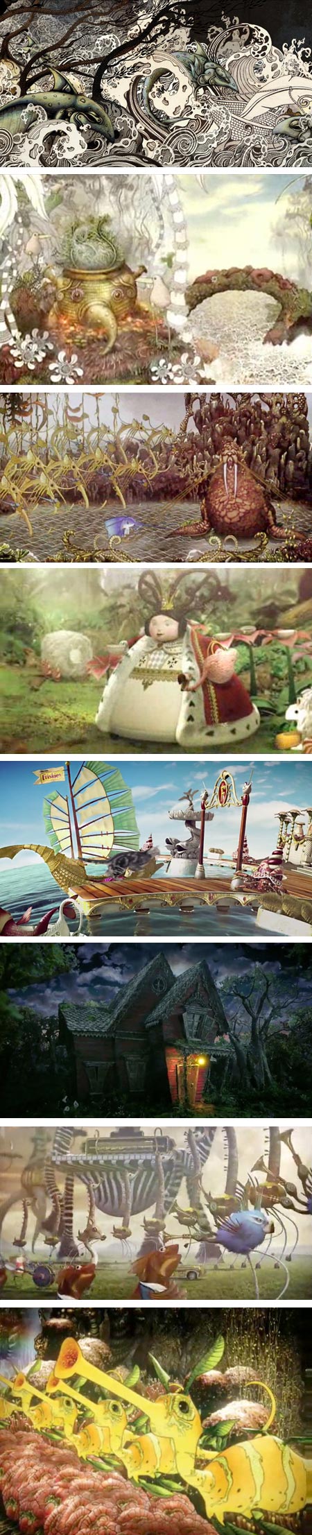
Back in 2006 I noticed the delightfully idiosyncratic work of a South African artist and illustrator named Ree Treweek (images above, top).In the time since, I have followed with fascination as Treweek and her partners Jannes Hendrikz and Marcus Smit, collectively known as The Blackheart Gang, produced a strikingly original and truly strange animation titled The Tale of How (above, 2nd down), which brought them to international attention, and leveraged that notice into a successful production company for animated commercial spots called Shy the Sun.
Shy the Sun produced a stunningly bizarre commercial called Sea Orchestra (above, 3rd down) for United Airlines (which was experimenting with exceptionally creative ad spots, like Jamie Caliri’s Dragon).
After that, I found a commercial not shown here in the U.S. that put their eccentric talents in service of selling Bakers Precious Biscuits (above, 4th down).
It was in the latter ad that I think they added to their techniques of combining hand drawings with computer coloring and compositing an additional animation style incorporating miniature models and sets. This approach has been very successful for them and they have utilized both approaches, as well as traditional CGI, in a series of terrific spots and promotions, some well known, others more obscure.
If you’ve ever wondered, as I did initially, who created the psychedelic cat food commercial, Friskies Adventureland (above, 5th down), it was Shy the Sun.
They applied their miniature set skills to ads for the South African subscription TV service Mnet in Ladybug and Firefly (above, 3rd from bottom). More traditional CGI seems to have been the choice for the darker ads for Electronic Arts’ game Alice: Madness Returns.
Treweek has been art director on most of the projects and co-director on some. She also contributed character design to the bizarre creatures seen at the end of Pete Candeland and Passion Pictures’ wild promo for Harmonix “The Beatles Rock Band” (above, 2nd from bottom).
My slightly blurry screen captures don’t begin to tell you what these animations look like in motion, particularly The Tale of How and Sea Orchestra.
There are now also videos available on The Making of The Tale of How, The Making of Sea Orchestra (above, bottom) and The Making of Bakers.
I’m looking forward to whatever projects they take on, as their work continues to be imaginative and original.
Now, if only someone would give them a big pile of money to do a feature length animation…
Categories:
-
David Gray

David Gray paints elegant, refined still life paintings and beautifully realized portraits in the classical realist tradition.In both his portraits and still life paintings, he evokes a feeling of stillness and contemplation, though in the portraits that feeling is often pierced by the quiet but intense aliveness projected by his subjects.
Similarly, Gray works with muted, limited palettes that are often punctuated by a single intense color. That kind of duality, in color, in emotional tone, in light and dark, and in the compositional contrasts of form and negative space that define his compositions, seems to pervade his work.
Many of his portraits are part of a series in which he explores a fascination with head wraps, and the contrasts of folded cloth against smooth skin. Though I was immediately drawn to a portrait of his daughter that seems very Vermeer-like, echoing the pose and colors from Girl With a Pearl Earring (images above, second down), Gray states that Vermeer was not in his mind when he composed and painted the piece; and that he takes his inspiration for figure and portrait painting most prominently from Jean-Auguste Dominique Ingres.
Gray was a finalist in the Figurative Category in the ARC 2009-2010 Salon (larger image here), and was an invited artist in the 2010 American Art Invitational.
David Gray is the subject of a featured article in the March 2011 issue of Southwest Art magazine. The online version of the article, which also includes a gallery of Gray’s work, can be read here.
Categories:


Charley’s Picks
Bookshop.org
(Bookshop.org affilliate links; sales benefit independent bookshop owners; I get a small percentage to help support my work on Lines and Colors)

John Singer Sargent: Watercolors


Urban Sketching: Understanding Perspective


Charley’s Picks
Amazon
(Amazon.com affiliate links; sales go to a larger yacht for Jeff Bezos; but I get a small percentage to help support my work on Lines and Colors)
John Singer Sargent: Watercolors
Urban Sketching: Understanding Perspective