
Categories
- 3d CGI
- Amusements
- Animation
- Anime & Manga
- Art Materials
- Art Videos
- Blogroll
- Cartoons
- Color
- Comics
- Concept & Visual Dev.
- Creativity
- Digital Art
- Digital Painting
- Displaying Art on the Web
- Drawing
- Eye Candy for Today
- Gallery and Museum Art
- High-res Art Images
- Illustration
- Motion Graphics & Flash
- Museums
- Online Museums
- Outsider Art
- Painting
- Painting a Day
- Paleo Art
- Pastel, Conté & Chalk
- Pen & Ink
- Prints and Printmaking
- Reviews
- Sc-fi and Fantasy
- Sculpture & Dimensional
- Site Comments
- Sketching
- Storyboards
- Tools and Techniques
- Uncategorized
- Vector Art
- Videos & Podcasts
- Vision and Optics
- Watercolor and Gouache
- Webcomics
Archives
- April 2026
- March 2026
- February 2026
- January 2026
- December 2025
- November 2025
- October 2025
- September 2025
- August 2025
- July 2025
- June 2025
- May 2025
- January 2025
- December 2024
- November 2024
- October 2024
- September 2024
- August 2024
- June 2024
- April 2024
- March 2024
- February 2024
- January 2024
- December 2023
- November 2023
- October 2023
- September 2023
- August 2023
- July 2023
- May 2023
- April 2023
- March 2023
- February 2023
- January 2023
- December 2022
- November 2022
- September 2022
- August 2022
- July 2022
- June 2022
- May 2022
- April 2022
- March 2022
- February 2022
- January 2022
- December 2021
- November 2021
- October 2021
- September 2021
- August 2021
- July 2021
- June 2021
- May 2021
- April 2021
- March 2021
- February 2021
- January 2021
- December 2020
- November 2020
- October 2020
- September 2020
- August 2020
- July 2020
- June 2020
- May 2020
- April 2020
- March 2020
- February 2020
- January 2020
- December 2019
- November 2019
- October 2019
- September 2019
- August 2019
- July 2019
- June 2019
- May 2019
- April 2019
- March 2019
- February 2019
- January 2019
- December 2018
- November 2018
- October 2018
- September 2018
- August 2018
- July 2018
- June 2018
- May 2018
- April 2018
- March 2018
- February 2018
- January 2018
- December 2017
- November 2017
- October 2017
- September 2017
- August 2017
- July 2017
- June 2017
- May 2017
- April 2017
- March 2017
- February 2017
- January 2017
- December 2016
- November 2016
- October 2016
- September 2016
- August 2016
- July 2016
- June 2016
- May 2016
- April 2016
- March 2016
- February 2016
- January 2016
- December 2015
- November 2015
- October 2015
- September 2015
- August 2015
- July 2015
- June 2015
- May 2015
- April 2015
- March 2015
- February 2015
- January 2015
- December 2014
- November 2014
- October 2014
- September 2014
- August 2014
- July 2014
- June 2014
- May 2014
- April 2014
- March 2014
- February 2014
- January 2014
- December 2013
- November 2013
- October 2013
- September 2013
- August 2013
- July 2013
- June 2013
- May 2013
- April 2013
- March 2013
- February 2013
- January 2013
- December 2012
- November 2012
- October 2012
- September 2012
- August 2012
- July 2012
- June 2012
- May 2012
- April 2012
- March 2012
- February 2012
- January 2012
- December 2011
- November 2011
- October 2011
- September 2011
- August 2011
- July 2011
- June 2011
- May 2011
- April 2011
- March 2011
- February 2011
- January 2011
- December 2010
- November 2010
- October 2010
- September 2010
- August 2010
- July 2010
- June 2010
- May 2010
- April 2010
- March 2010
- February 2010
- January 2010
- December 2009
- November 2009
- October 2009
- September 2009
- August 2009
- July 2009
- June 2009
- May 2009
- April 2009
- March 2009
- February 2009
- January 2009
- December 2008
- November 2008
- October 2008
- September 2008
- August 2008
- July 2008
- June 2008
- May 2008
- April 2008
- March 2008
- February 2008
- January 2008
- December 2007
- November 2007
- October 2007
- September 2007
- August 2007
- July 2007
- June 2007
- May 2007
- April 2007
- March 2007
- February 2007
- January 2007
- December 2006
- November 2006
- October 2006
- September 2006
- August 2006
- July 2006
- June 2006
- May 2006
- April 2006
- March 2006
- February 2006
- January 2006
- December 2005
- November 2005
- October 2005
- September 2005
- August 2005
Relevant Blogs
Art, Painting & Sketch
- Gurney Journey
- Underpaintings
- Art and Influence
- Painting Perceptions
- Oil Painters of America
- Vasari Paint POV
- Flying Fox
- Urban Sketchers
- Bento (Smithsonian)
- Art Inconnu
- The Hidden Place
- Still Life
- Making a Mark
- The Art of the Landscape
- Exploring Color & Creativity
- Art Contrarian
- Artist A Day
- beinArt Surreal Art Collective
- Eye Level
- David Dunlop
- p.i.g.m.e.n.t.i.u.m
- CultureGrrl
- Joaquín Sorolla blog
- Artists in Pastel
“Painting a Day”
- A Painting a Day (Keiser)
- On Painting (Keiser)
- Julian Merrow-Smith
- Karen Jurick
- Jeffrey Hayes
- Carol Marine
- Abbey Ryan
- Daily Paintworks
Other Painting Blogs
- Virtual Gouache Land
- Neil Hollingsworth
- Marc Hanson
- Kevin Menck
- Marc Dalessio
- Larry Seiler
- Stapleton Kearns
- Colin Page
- Roos Schuring
- Hans Versfelt
- Titus Meeuws
- Régis Pettinari
- René Plein Air
- Belinda Del Pesco
- Robin Weiss
- Nathan Fowkes (Land Sketch)
- William Wray
- Frank Serrano
- Stephen Magsig
- Michael Chesley Johnson
- Twice a Week
- Sarah Wimperis
- Rob Adams
- Michael Cole Manley
- The Dirty Palette Club
- Mike Manley’s Draw!
Gallery Art & Illustration mix
Illustration
- Howard Pyle
- 100 Years of Illustration
- BibliOdyssey
- Illustration Art
- Today’s Inspiration
- Illustration Mundo
- Little Chimp Society
- Danny Gregory
- R D (John Martz
- Illustration Friday blog
- Monster Brains
- Illustrators & Illustrations (RU)
- Elwood H. Smith
- DaniDraws.com
- Designers Who Blog
- iSpot Blog
Sci-Fi & Fantasy
Illustration & Comics
Comics & Cartoons
- Comics Beat
- Robot 6
- Newsarama Blog
- Comic Vine
- Comics Alliance
- Forbidden Planet Int.
- Paolo Rivera
- Bolt City
- Flight
- Scott McCloud
- The Comics Journal
- Comixpedia
- Funnybook Babylon
- James Baker
- Middleton’s Sketchbook
- Boneville
- The Hotel Fred
- Paul Rivoche
- Daily Cartoonist
- Mad About Cartoons (William Wray)
- Digital Strips
Illustration & Concept
Animation & Concept
- Cartoon Brew
- Animation Blog
- Cold Hard Flash
- Concept Art World
- The CAB
- FY Concept Art
- Concept Ships
- Concept Robots
- John Nevarez
- Armand Serrano
- Marcos Mateu-Mestre
- all kinds of stuff (Kricfalusi)
- Yacin the faun (Man Arenas)
- Kelsey Mann
- Cre8tivemarks Blog
- Ice-Cream Monster Toon Cafe
- AAU Character & Creature Design
- AAU Animation Notes
- Articles and Texticles
Paleo & Scientific
Tools & Techniques
Other
Lists of Art Blogs
Art Image Resource Links
Historic Art Images
- Wikimedia Commons: Paintings
- Wikimedia Commons: Drawings
- The Athenaeum
- WikiArt (WikiPaintings)
- Google Art Project: Artists
- Google Art Project: Collections (Museums)
- ArtCyclopedia
- Web Gallery of Art
- Art Renewal Center
- Web Gallery of Impressionism
Auction Consolidation sites
Auction sites
- Sotheby’s
- Bonham’s
- Christies
- Heritage Auctions: Fine Art
- Heritage Auctions: Illustration
- Freeman’s Auctions
- Bukowskis
- Shannon’s
Image Search
Reverse Image Search (search by image)
- Tin Eye
- RevImg
- Google Image Search (camera icon)
- Bing Image Search (camera icon)
Promoting some friends and some clients of my website design business
- Twin Willows T’ai Chi studio in Wilmington DE. Taiji classes with Bryan Davis.
- Ray Hayward, Inspired Teacher of T’ai Chi ( Taiji ) in Minneapolis, Founder of Mindful Motion Tai Chi Academy
- OldHead Tattoo studio and Art Gallery in Wilmington DE. Tattoos and paintings by Bruce Gulick
- Sharon Domenico Art, pet portrait oil paintings
- Platinum Paperhanging, wallpaper hanging, Main Line and Philadelphia, PA
- Lisa Stone Design, interior designer, Main Line and Philadelphia, PA
- Studio12KPT, original art, prints, calendars and other custom printed items by Van Sickle & Rolleri
-
Parka Blogs Art Book Reviews
 In these days of increased reliance on web-based shopping, online book merchants like Amazon, Barnes and Noble and Powells offer much wider selections than physical stores, even large ones, can provide. (Though nothing still beats the personal selections made by owners of small, independent booksellers, if you’re lucky enough to have access to one.)
The big selections of books available through the online sellers works well for finding a book that you already are familiar with and have decided to buy, but browsing, a practice of key importance to all book lovers, is hard to duplicate in the window of a web browser (despite the name).
This is particularly difficult in the case of art, illustration and design books.
The online booksellers have tried to make up for this in various ways with reviews, recommendations, ratings, and more recently, small visual excerpts form the books.
The latter, as exemplified by Amazon, is particularly bad at delivering on its premise, hampered perhaps by overzealous intellectual property lawyers and poor think-through on the part of the company. These “Look Inside” features usually disappoint, showing a table of contents, some opening pages and a bit of an index, but little (if any) of the heart of a book. I get the impression the preview pages are chosen by an algorithm or numeric formula, rather than a person.
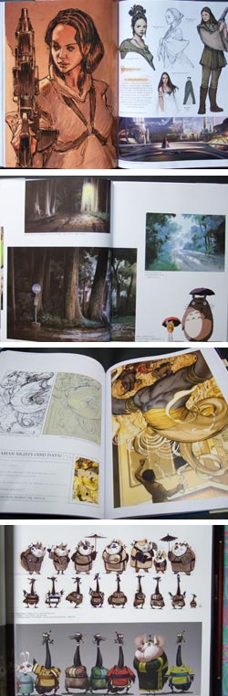
Wouldn’t it be nice if there were a site where art related books are reviewed and described, accompanied by a few carefully chosen (by a human), high-resolution images that really give you an idea of the book’s visual content?
Enter Parka Blogs, a blog by Teih Yi Chie, an illustrator and cartoonist, blogging under the alias of Parka, who makes a point of doing just that.
The Art Book List is heavy on movie and animation concept art, illustration, anime and science fiction, but within that vein does a great job on the books that are reviewed. (If anyone starts a review blog like this for gallery and museum art books, please let me know!)
The reviews themselves are succinct and give a nice overview of the book. The killer feature though, is the selection of well-chosen images from the books, images that are actually representative of the books’ content (are you listening, big-time online booksellers?), and often supplemented with video “flip-throughs”, in which the entire book is quickly flipped through, giving you on overall impression of the amount and kind of images that make up the body of the book.
The still images are linked to larger versions on Flickr, the largest of which are nicely high resolusion, giving you a browsing experience that is next-best to actually having the book in your hands when deciding what to buy.
The Art Book list is divided into types of movies, individual studios (like Pixar and Studio Ghibli), as well as collections of work by individual concept artists, illustrators and others.
There is also a shorter list of Intsructional Books.
The site provides a list of relevant links; and the blog itself can also, of course, be read like a blog, browsing back by date or searching out topics of interest. In addition to the reviews, he covers topics of interest in similar veins. I came across Parka Blogs when he was kind enough to post a brief article about Lines and Colors a few days ago.
The Parka Blogs book reviews are accompanied by links to the reviewed books on Amazon. Purchases made through his links return a small percentage to the reviewer so he can, what else?, buy more books to enjoy and review.
(Images above: from Parka’s reviews of The Art of Star Wars Episode III Revenge of the Sith, Miyazaki’s Magical World, Covers by James Jean and The Art of Kung Fu Panda. See my posts on Hayao Miyazaki and James Jean.)
Categories:
-
FM 100 Hue Test
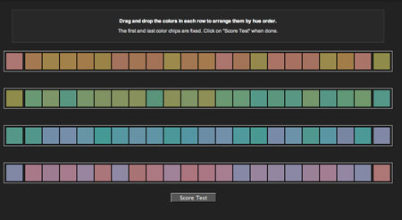
The FM 100 Hue Test is a seemingly simple test of your ability to discern close hue relationships, a sort of “color IQ test”.The interactive is provided by x-rite, a company that makes Munsell-based color measurement products.
It consists of four bands of small squares of varying colors. Each band represents a scale of colors between two specific hues, represented by fixed squares at either end.
The task is to rearrange the drag-and-drop squares within each row to set them in the appropriate order of hue.
When you get down to the fine discrimination between hues that are very close, it becomes harder than it seems at first.
You get a score at the end, “0” being perfect, and the opportunity to compare your score to others of your gender and age group. There is also a feature, that I was unable to take advantage of because I came up with a perfect score, that allows you to see the color ranges within which you had the most difficulty discerning the close hue relationships.
Scorekeeping and the game-like element aside, this is an enlightening exercise in comparing closely related hues, something of concern to anyone working in color, particularly painters looking to match the colors they see when mixing paint.
One of the keys that helped me with the exercise was not being shy about moving closely related colors side to side after they were in position, making it a bit easier to compare them briefly in a different context. Many of the color squares, arranged in their correct relationship, can appear identical until you shift them one position to the right or left. That in itself is an interesting phenomenon.
As always when viewing or judging color, whether in isolation, on a palette, in a digital color picker or in a painting, the important factor is the relationship of a color to its adjacent colors.
Have fun.
[Via Art School at Home, via Making a Mark]
Categories:
-
Coraline Mystery Box

Back in 2003, I stumbled across a promotion for the book The Da Vinci Code, little known at the time, in the form of a series of web-based clues, originating on author Dan Brown’s web site and leading through a series of automated emails and other web sites to an eventual puzzle solution that garnered the first group of participants free copies of the book. That initial Di Vinci Code “Webquest” was, I think, in no small part responsible for the web buzz that helped push the book into bestseller status.I couldn’t help but think of that again when I received a rather cryptic email from the folks at LAIKA, an animation studio in Oregon (983 miles from Hollywood, as a later missive points out), informing me that “Coraline is a fan of your work” and promising a mysterious gift, to be delivered by package carrier.
This was a promotion for the new stop-motion animated film, Coraline, due in early February, adapted from the book by Neil Gaiman, and directed by Henry Selick, director of The Nightmare Before Christmas and James and the Giant Peach.
(Stop-motion is a painstaking animation process in which small models are carefully positioned and re-positioned for each shot, one frame at a time, 24 frames per second of running film time. The models utilize hundreds of variations in faces to create mouth and eye movements and expressions. It is a filmmaking process that requires a Zen-like level of patience and an obsessive watchmaker’s devotion to detail.)
I was expecting a small package with a simple promotional object, perhaps a booklet of postcards or something similar, but received instead a sizable box, well packed for shipping, in which was an astonishingly elaborate series of objects.
The outermost was a wooden box, marked to hold seed packets, labeled “Ferry’s” and declaring that “Every Packet Dated”, “Flower Packets 10¢ (Except as Marked)” and “Vegetable Packets 5¢”.
The box was complete with an inner label informing the vendor how to set up and arrange a seed packet display, below which was loosely glued an envelope, sealed with wax into which was set a black button. The envelope contained a note from the team at LAIKA. The note let me know that this was a one-of-a-kind collection assembled for me personally, a fact reinforced by details that let me know they were indeed familiar with Lines and Colors, the small metal plate on the lid of the box stating “Handmade in Oregon, 15/50”, as well as some references I’ve since found to other unique packages in the series, that were sent to other bloggers.
Inside the box, under fancy patterned wrapping paper used as packing, was an array of objects: a large and antique-looking scrapbook, closed with cloth ribbons and a button (buttons being a key feature in the story), a heavy skeleton key attached to an old and worn looking luggage tag with a label of “Coraline dot com, Password: BUTTONEYES”, and a small ribboned gift box containing two large buttons, a needle and a spool of thread. The latter, one learns on investigating the story, is for replacing one’s eyes in order to remain in Coraline’s alternate world. Mmmmm….
The scrapbook, though, was the main attraction, and offered surprises on par with my initial shock at the extravagance of the entire package.
It opens, past patterned inside cover papers that match the wrapping paper used as packing, with a bookplate signed by director Henry Selick, declaring the volume to be Coraline – Magical Garden – Book No. 1 of 1.
Under a sheet of sewing-pattern tissue that frames the pages front and back, the introductory frontspiece tells that: “Coraline Jones moves into a house situated on large, rambling grounds. In her real world and her other world, the pleasure of exploring such uninhabited nature is hers, and now yours. In this book, you can follow the exacting replicas of flora we hand-made to make Coraline’s fantastic garden come to life.”
What follows is a beautiful series of images, with reproductions of production drawings and paintings as well as photographs of hand-made models, depicting various plants, flowers and odd flora, elaborate garden plans and related images from the film.
As I leafed through the book (sorry, couldn’t resist), I was struck not only by the painstaking work that went into the design and creation of the flora for the film, but the unbelievable level of detail and attention that had gone into this package; which was indeed, as the initial email had promised, a gift, not merely a promotional gimmick. This is like a nice book of production art that I might purchase if it were available in a commercial printing, but far more than that, a hand-made one-of-a-kind art object, an assemblage with an attention to detail bringing to mind the obsessively designed book/object creations of Chris Ware.
The images are printed on antique toned card stock, and hand-placed into traditional photo-album corners, some eighteen pages of them. They range from individual plant studies to production art for whole scenes. Many of them are exceptionally beautiful, all of them are delightful and indicative of the effort and imagination that has gone into the making of the film; visual ideas that have been carried out by a team of designers, illustrators, model makers, puppet makers and animators, evidently devoted to (obsessed with) crafting Coraline’s world with uncanny detail, visual texture and other-worldly delight.
Missing, unfortunately, are credits for the images, particularly the illustrations. I know that the superb illustrator Tadhiro Uesugi has done a number of illustrations for the production of the film, and I believe the illustration I’ve chosen above, bottom, is reliably one of his, and I recognized some as the work of Chris Turnham, the others I’m less sure of. His own web site doesn’t seem to make mention of the project. Hopefully more of the actual production art will be made available, and eventually released as a book that everyone can buy.
In the meanwhile, I’ve done something I essentially never do and posted a large number of images here from the “unboxing” of the Coraline Mystery Box, starting with the box itself and running through the pages of images. My apologies for the limited quality and lighting in my photographs, but I don’t have the facilities or time at the moment to do better, I’ll try to replace them in the future if I can.
www.linesandcolors.com/coraline-mystery-box-images
The one thing that was a bit anti-climactic after the amazing package, was the coraline.com web site, to which I (and you) now have a key (“BUTTONEYES”), that provides access to a short promo film showing the assembly of some of the models, and clips from the film, to the tune of early 1960’s “here is your modern kitchen” music.
The password key is one of several, as I’ve found on looking up references to some of the other unique Coraline Mystery Boxes that have been received by other bloggers. Each different key opens the door to a different promotional video. The films are good, and well worth watching, but leave me looking for more (which, perhaps, is the idea).
Hopefully, there is more to come as the movie release date approaches, and there is an option at the end of the clips to sign up for a mailing list.
There is a currently more filled-out site devoted to the Coraline movie on FilmInFocus, with a Flash-based puzzle interface, that rewards the finding of clues with access to additional video clips, scenes from the film and info about the characters and story.
Of course there is also the original book, and a graphic story adaptation with art by P. Craig Russell.
You can see a number of the other fascinating and wonderfully varied Coraline Mystery Boxes that various bloggers have received on the ASIFA-Hollywood Animation Archive site, with links to the individual postings by the recipients detailing the contents. As a promotional campaign, this is certainly one of the most clever, imaginative, and work intensive I’ve ever encountered or heard of.
If the Coraline film reflects the imagination, detail, artistry and obsessive effort exemplified by my encounters with the LAIKA team so far, it should be quite a treat.
AddendumThe Coraline web site has been updated with a more extensive interactive site, and no longer requires of uses the passwords. The small trailers can still be accessed by exploring various sections of the site.
Categories:
-
Lindsay Goodwin

It’s always interesting to look at the particular subject matter that artists find compelling. Some look to traditional subjects and perhaps put them into focus with their own point of view, others look for unique subjects, or variations and twists on traditional themes.Lindsay Goodwin is a young painter from California, who lived in Paris and travelled in Europe before returning to the U.S., who has a chosen to focus on restaurant interiors as subjects for her colorful, painterly images.
It makes a lot of sense in terms of a choice of subject; restaurant interiors are intentionally designed to be interesting, welcoming and often utilize carefully chosen, attractive colors. In addition, restaurant interiors are arrayed with visually appealing objects like glassware, vases and flower arrangements.
The subject also offers quite a range, from ornate and elaborate formal dining rooms to intimate bistros and informal bed and breakfast tables, as well as a range of location and nationality. (The image at top is of the restaurant in a hotel in Crillon le Brave in Provence, France; home to another artist I’ve written about on Lines and Colors, Julian Merrow-Smith).
Goodwin’s subject matter also extends to related subject matter like hotels, opera houses and classic theaters, and includes dining rooms in private homes. There are also figurative and portrait pieces, and somewhat more traditional building exteriors.
It’s easy to see influences from Sargent, Edmund Tarbell, William Merritt Chase, and other American Impressionists in her approach.
Goodwin’s work has been featured in Southwest Art Magazine and the current issue of American Art Collector.
Categories:
-
Scenes of the Season at Brandywine River Museum
There’s a tendency to think of landscape painting as primarily a summer activity, or at least one of diminished interest in the Winter, both because of the inconvenience of painting in the cold, and the expectation of less color in the winter landscape.Quite to the contrary, many painters and illustrators found great subjects in winter’s different range of colors and subjects, and some took particular delight in images of winter; and illustrators of course have a long tradition of portraying the Christmas holiday.
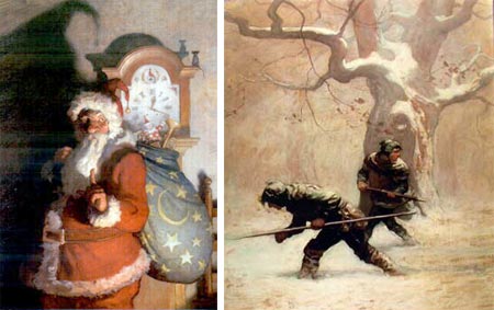
For those in the area of southeastern Pennsylvania, there is a small but delightful show at the Brandywine River Museum of works from the permanent collection showcasing winter scenes and images of Christmas, that runs until january 11, 2009.
The show includes prints by cartoonist Thomas Nast, who was in many was responsible for the image of St. Nicholas as a bearded, pipe smoking fellow with a sack of toys over his shoulder; as well as N.C. Wyeth’s colorful take on Kris Kringle (above, left) which owes more to J.C. Leyendecker’s interpretation of the Jolly One (see my post on Illustrators Visions of Santa Claus).
N.C. Wyeth is nicely represented by several of his lesser known landscape paintings, and these are complimented by large, infrequently seen works in the Brandywine’s collection by Pennsylvania Impressionists Elmer Schofield and Edward Redfield.
The show’s mix of illustration and gallery art includes prints by Winslow Homer and paintings by Ashcan School painter Everett Shinn, as well as illustrations by F.O.C. Darley, Frank X. Leyendecker (J.C. Leyendecker’s underappreciated brother), Maxfield Parrish and Jessie Wilcox Smith.
Visitors to the museum can supplement their enjoyment of the show’s theme with other relevant pieces on view in other galleries, like Howard Pyle’s wintertime historical illustrations, N.C. Wyeth’s beautiful winter-themed illustrations for The Black Arrow (above, right) and son Andrew Wyeth’s winter scenes of the Brandywine Valley.
For those not in the area, you might follow some of the links above, as well as looking into paintings by American artists who loved to paint in winter, like Edward Redfield and Fern Coppage (see my post on Fern Coppedge and George Gardner Symons, as well as my recent post on John F. Carlson).
Categories:
-
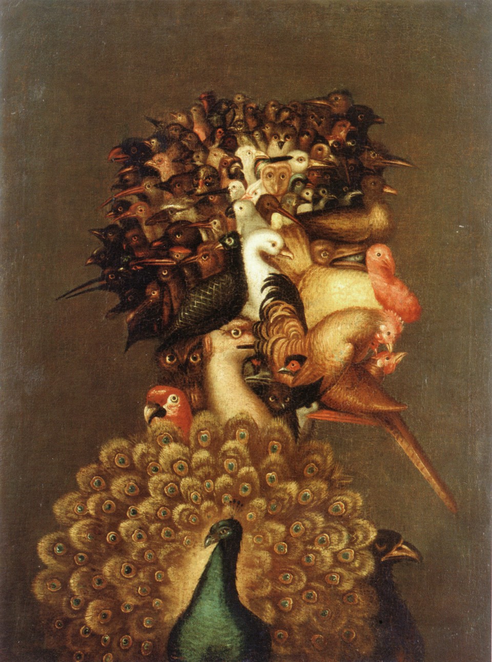
Giuseppe Arcimboldo

According to a saying that became popular in the 1960’s, you are what you eat.Perhaps not as directly as in the marvelous and bizarre portrait heads created by 16th Century painter Giuseppe Arcimboldo out of arrangements of fruit, vegetables, tree roots, fish, birds and other natural forms, but a sobering thought nonetheless as most Americans prepare today for a traditional Thanksgiving Day turkey dinner.
Born in Milan, Arcimboldo worked on frescos and tapestries in cathedrals in Italy and was also court painter to royalty in Vienna and Prague. Most of his traditional work has been lost, though a few examples survive, but his quirky and amusing portraits made from fruit, flowers and other elements of the natural world, as well as books and other man-made objects, remain, and attract attention to this day.
Some of his fruit/vegatable portraits were less obvious, disguised in what were ostensibly paintings of arrangements of vegetables in bowls, in which the face was revealed when the images was viewed upside-down, a precursor of the popular optical illusions circulated in later centuries. These upside-down portraits, when viewed in their orientation as paintings of fruit or vegetables in bowls, were, along with more straightforward images sometimes attributed to Caravaggio, among the earliest examples of still life as isolated subject matter for paintings.
The image above (large version here) is thought to be a likeness of Arcimboldo’s patron, Emperor Rudilf II, but it’s titular subject is Vertumnus, the Roman God of the seasons, whose penchant for changing his form to get what he wanted (like the favors of the goddess Pomona) personified the value of change in the practice of rotating crops to preserve the fertility of fields.
Arcimboldo’s striking visions have inspired others to follow in a similar vein, like contemporary painter Andre Martins de Barros (link contains NSFW material).
Arcimboldo’s paintings were celebrated by the Surrealists, who were always on the lookout for hallucinatory visionaries they could consider their precursors; and there has been some speculation that his inclination to see faces in arrangements of objects was the result of mental illness; a notion perhaps encouraged by his more disturbing images made of fish, birds and other animals, or the haunting images made of tree roots; but the truth is likely more prosaic. The Renaissance, a time of relative plenty and stability compared to the centuries that preceded it, not only provided the luxury of devoting more attention to art, but of indulging in puzzles, whimsies and amusement with the bizarre.
The luxury to enjoy the fruits of life beyond the necessities of survival, in particular the bounty of art, is always something for which to be thankful.
Categories:


Charley’s Picks
Bookshop.org
(Bookshop.org affilliate links; sales benefit independent bookshop owners; I get a small percentage to help support my work on Lines and Colors)

John Singer Sargent: Watercolors


Urban Sketching: Understanding Perspective


Charley’s Picks
Amazon
(Amazon.com affiliate links; sales go to a larger yacht for Jeff Bezos; but I get a small percentage to help support my work on Lines and Colors)
John Singer Sargent: Watercolors
Urban Sketching: Understanding Perspective