
Categories
- 3d CGI
- Amusements
- Animation
- Anime & Manga
- Art Materials
- Art Videos
- Blogroll
- Cartoons
- Color
- Comics
- Concept & Visual Dev.
- Creativity
- Digital Art
- Digital Painting
- Displaying Art on the Web
- Drawing
- Eye Candy for Today
- Gallery and Museum Art
- High-res Art Images
- Illustration
- Motion Graphics & Flash
- Museums
- Online Museums
- Outsider Art
- Painting
- Painting a Day
- Paleo Art
- Pastel, Conté & Chalk
- Pen & Ink
- Prints and Printmaking
- Reviews
- Sc-fi and Fantasy
- Sculpture & Dimensional
- Site Comments
- Sketching
- Storyboards
- Tools and Techniques
- Uncategorized
- Vector Art
- Videos & Podcasts
- Vision and Optics
- Watercolor and Gouache
- Webcomics
Archives
- April 2026
- March 2026
- February 2026
- January 2026
- December 2025
- November 2025
- October 2025
- September 2025
- August 2025
- July 2025
- June 2025
- May 2025
- January 2025
- December 2024
- November 2024
- October 2024
- September 2024
- August 2024
- June 2024
- April 2024
- March 2024
- February 2024
- January 2024
- December 2023
- November 2023
- October 2023
- September 2023
- August 2023
- July 2023
- May 2023
- April 2023
- March 2023
- February 2023
- January 2023
- December 2022
- November 2022
- September 2022
- August 2022
- July 2022
- June 2022
- May 2022
- April 2022
- March 2022
- February 2022
- January 2022
- December 2021
- November 2021
- October 2021
- September 2021
- August 2021
- July 2021
- June 2021
- May 2021
- April 2021
- March 2021
- February 2021
- January 2021
- December 2020
- November 2020
- October 2020
- September 2020
- August 2020
- July 2020
- June 2020
- May 2020
- April 2020
- March 2020
- February 2020
- January 2020
- December 2019
- November 2019
- October 2019
- September 2019
- August 2019
- July 2019
- June 2019
- May 2019
- April 2019
- March 2019
- February 2019
- January 2019
- December 2018
- November 2018
- October 2018
- September 2018
- August 2018
- July 2018
- June 2018
- May 2018
- April 2018
- March 2018
- February 2018
- January 2018
- December 2017
- November 2017
- October 2017
- September 2017
- August 2017
- July 2017
- June 2017
- May 2017
- April 2017
- March 2017
- February 2017
- January 2017
- December 2016
- November 2016
- October 2016
- September 2016
- August 2016
- July 2016
- June 2016
- May 2016
- April 2016
- March 2016
- February 2016
- January 2016
- December 2015
- November 2015
- October 2015
- September 2015
- August 2015
- July 2015
- June 2015
- May 2015
- April 2015
- March 2015
- February 2015
- January 2015
- December 2014
- November 2014
- October 2014
- September 2014
- August 2014
- July 2014
- June 2014
- May 2014
- April 2014
- March 2014
- February 2014
- January 2014
- December 2013
- November 2013
- October 2013
- September 2013
- August 2013
- July 2013
- June 2013
- May 2013
- April 2013
- March 2013
- February 2013
- January 2013
- December 2012
- November 2012
- October 2012
- September 2012
- August 2012
- July 2012
- June 2012
- May 2012
- April 2012
- March 2012
- February 2012
- January 2012
- December 2011
- November 2011
- October 2011
- September 2011
- August 2011
- July 2011
- June 2011
- May 2011
- April 2011
- March 2011
- February 2011
- January 2011
- December 2010
- November 2010
- October 2010
- September 2010
- August 2010
- July 2010
- June 2010
- May 2010
- April 2010
- March 2010
- February 2010
- January 2010
- December 2009
- November 2009
- October 2009
- September 2009
- August 2009
- July 2009
- June 2009
- May 2009
- April 2009
- March 2009
- February 2009
- January 2009
- December 2008
- November 2008
- October 2008
- September 2008
- August 2008
- July 2008
- June 2008
- May 2008
- April 2008
- March 2008
- February 2008
- January 2008
- December 2007
- November 2007
- October 2007
- September 2007
- August 2007
- July 2007
- June 2007
- May 2007
- April 2007
- March 2007
- February 2007
- January 2007
- December 2006
- November 2006
- October 2006
- September 2006
- August 2006
- July 2006
- June 2006
- May 2006
- April 2006
- March 2006
- February 2006
- January 2006
- December 2005
- November 2005
- October 2005
- September 2005
- August 2005
Relevant Blogs
Art, Painting & Sketch
- Gurney Journey
- Underpaintings
- Art and Influence
- Painting Perceptions
- Oil Painters of America
- Vasari Paint POV
- Flying Fox
- Urban Sketchers
- Bento (Smithsonian)
- Art Inconnu
- The Hidden Place
- Still Life
- Making a Mark
- The Art of the Landscape
- Exploring Color & Creativity
- Art Contrarian
- Artist A Day
- beinArt Surreal Art Collective
- Eye Level
- David Dunlop
- p.i.g.m.e.n.t.i.u.m
- CultureGrrl
- Joaquín Sorolla blog
- Artists in Pastel
“Painting a Day”
- A Painting a Day (Keiser)
- On Painting (Keiser)
- Julian Merrow-Smith
- Karen Jurick
- Jeffrey Hayes
- Carol Marine
- Abbey Ryan
- Daily Paintworks
Other Painting Blogs
- Virtual Gouache Land
- Neil Hollingsworth
- Marc Hanson
- Kevin Menck
- Marc Dalessio
- Larry Seiler
- Stapleton Kearns
- Colin Page
- Roos Schuring
- Hans Versfelt
- Titus Meeuws
- Régis Pettinari
- René Plein Air
- Belinda Del Pesco
- Robin Weiss
- Nathan Fowkes (Land Sketch)
- William Wray
- Frank Serrano
- Stephen Magsig
- Michael Chesley Johnson
- Twice a Week
- Sarah Wimperis
- Rob Adams
- Michael Cole Manley
- The Dirty Palette Club
- Mike Manley’s Draw!
Gallery Art & Illustration mix
Illustration
- Howard Pyle
- 100 Years of Illustration
- BibliOdyssey
- Illustration Art
- Today’s Inspiration
- Illustration Mundo
- Little Chimp Society
- Danny Gregory
- R D (John Martz
- Illustration Friday blog
- Monster Brains
- Illustrators & Illustrations (RU)
- Elwood H. Smith
- DaniDraws.com
- Designers Who Blog
- iSpot Blog
Sci-Fi & Fantasy
Illustration & Comics
Comics & Cartoons
- Comics Beat
- Robot 6
- Newsarama Blog
- Comic Vine
- Comics Alliance
- Forbidden Planet Int.
- Paolo Rivera
- Bolt City
- Flight
- Scott McCloud
- The Comics Journal
- Comixpedia
- Funnybook Babylon
- James Baker
- Middleton’s Sketchbook
- Boneville
- The Hotel Fred
- Paul Rivoche
- Daily Cartoonist
- Mad About Cartoons (William Wray)
- Digital Strips
Illustration & Concept
Animation & Concept
- Cartoon Brew
- Animation Blog
- Cold Hard Flash
- Concept Art World
- The CAB
- FY Concept Art
- Concept Ships
- Concept Robots
- John Nevarez
- Armand Serrano
- Marcos Mateu-Mestre
- all kinds of stuff (Kricfalusi)
- Yacin the faun (Man Arenas)
- Kelsey Mann
- Cre8tivemarks Blog
- Ice-Cream Monster Toon Cafe
- AAU Character & Creature Design
- AAU Animation Notes
- Articles and Texticles
Paleo & Scientific
Tools & Techniques
Other
Lists of Art Blogs
Art Image Resource Links
Historic Art Images
- Wikimedia Commons: Paintings
- Wikimedia Commons: Drawings
- The Athenaeum
- WikiArt (WikiPaintings)
- Google Art Project: Artists
- Google Art Project: Collections (Museums)
- ArtCyclopedia
- Web Gallery of Art
- Art Renewal Center
- Web Gallery of Impressionism
Auction Consolidation sites
Auction sites
- Sotheby’s
- Bonham’s
- Christies
- Heritage Auctions: Fine Art
- Heritage Auctions: Illustration
- Freeman’s Auctions
- Bukowskis
- Shannon’s
Image Search
Reverse Image Search (search by image)
- Tin Eye
- RevImg
- Google Image Search (camera icon)
- Bing Image Search (camera icon)
Promoting some friends and some clients of my website design business
- Twin Willows T’ai Chi studio in Wilmington DE. Taiji classes with Bryan Davis.
- Ray Hayward, Inspired Teacher of T’ai Chi ( Taiji ) in Minneapolis, Founder of Mindful Motion Tai Chi Academy
- OldHead Tattoo studio and Art Gallery in Wilmington DE. Tattoos and paintings by Bruce Gulick
- Sharon Domenico Art, pet portrait oil paintings
- Platinum Paperhanging, wallpaper hanging, Main Line and Philadelphia, PA
- Lisa Stone Design, interior designer, Main Line and Philadelphia, PA
- Studio12KPT, original art, prints, calendars and other custom printed items by Van Sickle & Rolleri
-
Tor Books

Tor Books is a publishing house that specializes in science fiction and fantasy titles. I should probably say outstanding science fiction and fantasy titles; Tor has won the Locus Magazine poll for best science fiction publisher every year for the last 20 years.Tor also publishes some of the very best science fiction and fantasy illustration, which is to say some of the best contemporary illustration, period. I’ve noticed in recent years, more and more mainstream illustrators moving into the this field, and more of them turning up each year in the Spectrum collections of contemporary fantastic art.
The superb choices of illustrators, and the art direction that aligns them in in fine tuned harmony with the stories they are illustrating, is the work of Tor’s insightful art director, Irene Gallo (see my previous post on Irene Gallo and her blog The Art Department). Gallo has been the art director at Tor since 1992.
Tor books has just launched a new web site at tor.com, and it has immediately become one of the best destination sites for science fiction and fantasy on the web.
In addition to the fascinating blog, and the stories you can read online (soon to include a graphic story, The Leviathan by Wesley Allsbrook), the new Tor web site includes a feature of particular interest to Lines and Colors readers, a gallery of some of their terrific illustrators.
There is a Featured Artist, currently Craig Phillips, and a roster of some of the field’s best illustrators, each with a gallery of representative work.
The list includes many illustrators I’ve featured here on Lines and Colors, including Craig Phillips, Scott Altmann, Christian Alzmann, Patrick Arrasmith, Daren Bader, Volkan Baga, David Bowers, Aleksi Briclot, Brom, Kinuko Y. Craft, Brian Despain, Bob Eggleton, Craig Elliot and Jon Foster, as well as many others that I haven’t covered who are sure to be the subject of future posts.
It’s an impressive showing and, as of this writing, they are apparently only up to the “F’s” in filling out the gallery.
Despite a few little post-launch glitches (missing thumbnails in some of the galleries) this is a fantastic collection of fantastic art, and even in its initial stages, already one of the best on the web.
The only downside I can possibly see is that that the Tor blog may distract Irene Gallo from her regular posting on The Art Department. While her posts on the Tor blog would be as interesting and informative, it’s nice to have them in one place, undiluted by other topics.
Though there may be larger repositories of science fiction and fantasy art on the web, you would be hard pressed to find a more concentrated sampling of the best the field has to offer (up to the “F’s”, that is).
(Image above, left to right: Patrick Arrasmith, Jon Foster, Christian Alzmann, Daren Bader, Brom, Brian Despain, Bob Eggleton, Aleksi Briclot, David Bowers)
Correction: Don Dos Santos was kind enough to write an let me know that there are, in fact, links to the other alphabetically arranged sections of the gallery. I specifically looked for links to additional pages at the top and bottom of the column of thumbnails, but they are off to the left in the heading area, which graphically seems to be a separate element from the thumbnail column.
Of course, that also extends the list of artists in the Tor galleries that I have previously written posts about on Lines and Colors (and I actually surprised myself on this one): Marc Gabbana, Donato Giancola, James Gurney, Stephen Hickman, James Jean, Tom Kidd, Todd Lockwood, Gregory Manchess, Daryl Mandryk, Stephen Martiniere, David Mattingly, Chris Moore, Lawrence Northey, John Jude Palencar, John Picacio, Alan Pollack, Omar Ryyan, Adam Rex, Robh Ruppel, Don Dos Santos, Sparth, Raymond Swanland, Greg Swearingen, Shaun Tan, Keith Thompson, Francis Tsai, Dice Tsutsumi, Christophe Vacher and Sam Weber.
Categories:
-
PJ Lynch

PJ Lynch is an Irish illustrator currently living in Dublin. His award winning illustrations have appeared in numerous books, illustrating both modern stories and new versions of classics.Lynch has also been commissioned to design posters for Opera Ireland and the Abbey Theatre, created murals for the Cavan County Library based on Gulliver’s Travels and designed stamps for the Irish postal service.
You can see some of the latter in a recent post on his blog, on which he also links to his 6 step by step painting videos on YouTube. You will also find some of his gallery paintings.
There is also a step by step article on the creation of his cover for The Gift of the Magi on Scamp, the Irish illustration blog.
For his illustrations, Lynch works primarily in watercolor. At times his illustrations can be evocative of classic illustrators like Arthur Rackham or Edmund Dulac, at other times they have a modern feeling; Lynch adopts his stylistic approach to the service of best illustrating the story.
Throughout, there is careful attention to the role of light, particularly the muted light of overcast days or candlelit interiors, and a masterful handling of textures and suggestions of the tactile surfaces of things.
Lynch has that quality evident in the best illustrators of understanding the theatrical application of his compositional elements; his lighting, color and textures are not just creating an image, they are also telling a story.
His gallery of book illustrations will take you through a series of covers, from which you can click to see images from the individual title. There are several pages of thumbnails, and a number of books. (Don’t miss his wonderful interpretation of Dicken’s A Christmas Carol toward the back.)
Lynch’s six (to date) step by step painting videos are short, nicely done and fascinating. They are simple, but gracefully timed and well photographed. They take you through his process from initial sketch to finished painting with just enough steps to get a good feeling for his watercolor or oil technique.
I was particularly fascinated by his video showing him painting the portrait of a young boy in a baseball cap, based on a photograph and inspired by his study of Vermeer’s Girl With a Pearl Earring (which he titles The Boy with the Blue Baseball Cap: I am not Vermeer!).
[Suggestion and links courtesy of James Gurney]
Categories:
-
The Prince Valiant Page – Gary Gianni

You will often hear the phrase “big shoes to fill” applied to the task of filling a role formerly held by someone whose accomplishments were significant and difficult to achieve.Illustrator and comics artist Gary Gianni put on some big shoes when he stepped into the role of illustrator for Hal Foster’s Prince Valiant newspaper comic strip.
Hal Foster (who will certainly be the subject of a future lines and colors post) was one of the three or four greatest newspaper comics artists in the history of the medium; and, to my mind, should be on the list of all time best pen and ink artists.
Gianni took over the illustration chores on the strip from John Cullen Murphy, who was Foster’s assistant, and had taken the reins on the strip when Foster retired in 1970.
Gianni’s previous work included illustrations for versions of classics like Moby Dick and Kidnapped, and he created graphic novel versions of Tales of O. Henry and 20,000 Leagues Under the Sea. He also worked for mainstream American comic book companies on titles like Indiana Jones and The Shrine Of The Sea Devil, Batman: Black and White (for which his story won an Eisner Award in 1997) and The Monstermen Mysteries, which ran as a backup feature for Mike Mignola’s Hellboy.
The Prince Valiant Page is a new book from Flesk Publications (see my previous posts on Flesk Publications) that showcases Gianni’s work on the strip, and also offers a glimpse into his background.
The book is written by Gianni, and offers an insightful look into his working process, and his collaboration with Mark Schultz, a terrific artist himself, who handles the writing on the current strip.
Gianni talks about his admiration for Foster, as well as other great pen and ink artists like Joseph Clement Coll and Franklin Booth, an admiration that is evident in his refined ink drawing style.
In the process of describing how a modern Prince Valiant page is created, including the use of models and reference, we get to see a number of pages of Gianni’s pencil drawings before they were inked. These, though not meant as finished art, have a wonderful tonal quality that is very different from the final ink drawings.
I have to admit that I didn’t have a proper appreciation for Gianni’s work prior to seeing this volume; partly because I had not seen much of his other illustration and comics work except in scattered examples, and partly because of the terrible job that modern newspapers do of presenting their comics.
One of the things that newspapers do to render their comic strips ineffectual, particularly those few remaining adventure strips, is to print them too small to allow for any real visual excitement. The original Prince Valiant pages, like those of Little Nemo in Slumberland and many other comic strips in the early 20th Century, were sized to full newspaper pages. (See my post on Winsor McCay.)
As time went on, and the role of newspaper comics as one of the major forms of home entertainment was superseded by movies and then television, newspaper editors (or more likely, owners and accountants) continually reduced the size of newspaper comics. In an age where home video screens and computer monitors keep getting bigger and bigger, this is a trend that, if continued, will eventually result in microscopic panels; which will undoubtedly help in the efforts of newspapers to remove all entertaining content as their circulation drops.
Prince Valiant is now down to 1/5th of a page at most in the newspapers, but several of the Gianni & Schultz strips are printed in the book as fold-out pages, doubling the book’s 9×12″ (23x30cm) size; nice and big, though still far short of a full newspaper page. It’s enough to let Gianni’s work shine, and make you wish for a volume of the strips at this size.
There is a collection of the Gianni & Schultz strips, Prince Valiant: Far From Camelot due in the (presumably near) future, but the Amazon pre-publication listing doesn’t include that book’s dimensions.
You can see a recent Prince Valiant strip on the King Features site, but you apparently can’t see the current one, or search the archives, without getting a membership of some kind, in an effort to… well, I don’t know why; I guess as part of the continuing effort on the part of newspapers and syndicates to discourage reader interest.
In the meanwhile, we have this beautiful volume to appreciate Gianni’s work. The Prince Valiant Page can be ordered directly from Flesk Publications in either hardback or limited edition signed, slipcase hardback. The book includes a foreword by Hellboy’s Mike Mignola and an introduction by Robert Wagner, who played the character in the 1954 Cinemascope movie.
Flesk has done their usual superb job of showcasing the art, jamming the book cover-to-cover with wonderful examples and using the highest production values. It certainly makes you wish newspapers would treat their comics with half as much respect.
Gianni and Schultz continue their work on the Prince Valiant weekly strip, trying to give us a taste of the former glory of newspaper adventure strips within the restricted confines of their 1/5th of a page.
It’s a valiant effort.
Categories:
-
Alfred J. Munnings

Sir Alfred James Munnings is best known as an equestrian artist. His beautifully rendered images of race horses bring high prices at auction and are the subject of popular posters and reproductions.In his early career, however, he was a plein air painter, whose subjects were as varied as the English countryside, and whose artistic sensibilities were informed by Constable, John Sell Cotman, and in particular the animal paintings of George Stubbs. He was also, evidentially, influenced by Impressionism, as his paintings are remarkably loose, filled with free brushstrokes, and a marvelous mixture of refined passages and great chunks and blobs of paint.
In 1892, at the age of 14 he apprenticed with a lithography firm, and at night attended the Norwich School of Art (you can see his painting of a class here). At the end of his apprenticeship he was offered a job with the firm, but turned it down to seek his career as a painter.
Tragically, he lost sight in his right eye as the result of an accident shortly after, but was undeterred in his pursuit of painting. The story goes that he had to stab at the canvas for a while, judging the distance to the surface by feel until he got the range.
Had I only see Munnings’ work in reproduction, I doubt that I would have paid him much attention, as images of fox hunting and horse racing are not high on my list of favorite subjects for paintings (Degas notwithstanding); but I had the opportunity today to see an exhibit of his work at the Brandywine River Museum, and came away very much impressed with Munnings as a painter.
Though he was a vocal opponent of Modernism, claiming that Piccasso, Matisse, Cezanne and their associates had ruined art; he was evidently favorably impressed by the freedom of the Impressionist painters and perhaps their American counterparts, as his own work was delightfully “modern” in that respect. Like the American Impressionists, however, he kept the firm underpinnings of academic art beneath his free brushwork.
Munnings was, in fact, a member of the Royal Academy, and for a time late in his career, served as its president.
Hi was probably one of the finest painters of horses and other animals.
In small reproductions, you would get the impression that he was painting tightly, with lots of blending, and occasionally his horses or figures are more smoothly rendered than the backgrounds he sets them in; but those backgrounds, and his landscape paintings, are full of exuberant paint handling and wonderful textures.
There are a number of books on Munnings, including an autobiography.
I’ve assembled some links below, though most reproductions are too small to really get a feel for the close-up quality of his paintings.
The exhibit at the Brandywine River Museum, which is in Chadds Ford, Pennsylvania, not far from Philadelphia and even closer to Wilmington, Delaware (see my post on Andrew Wyeth), has been assembled from local collections in the area. The Brandywine Valley has history of equestrian events and organizations, one of which, the Radnor Hunt Races, has been associated with the museum for 30 years.
Many of the paintings are on loan from private collections, and not normally on view to the public. The show is strong with his early paintings, landscapes and figurative work.
Alfred J. Munnings from Regional Collections is on view at the Brandywine River Museum until September 1, 2008.
I plan to see it again.
Addendum Katherine Tyrrell was kind enough to let us know that those in the UK can visit the Sir Alfred Munnings Museum in Dedham Vale in the heart of Constable country on the borders of Essex and Suffolk; and that there is a web site for the museum.
She also points out that Munnings was for a short while a member of the Newlyn School in Cornwall (see my post on Stanhope Forbes) and also had a studio at Lamorna.
Categories:
-
Susan Rudat
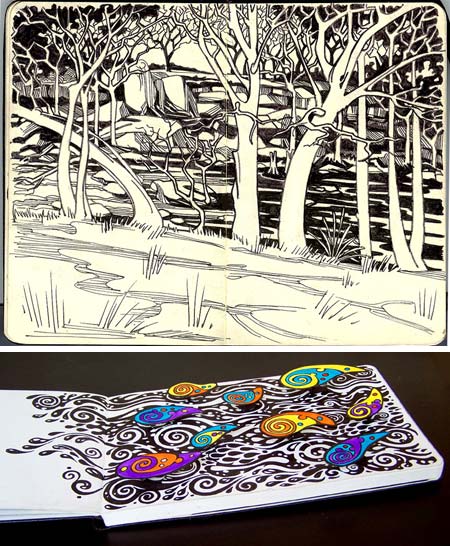
Susan Rudat is a freelance graphic designer and illustrator based in Texas.On both her blog and her Flickr gallery she often posts drawings and sketches done in Molekine sketchbooks.
Some of her drawings have a nicely graphic quality, as if designed to be woodcuts, with bold areas of black and carefully designed patterns of line weights and textures.
Others are more sketchlike and gestural, and some are in color. Many of them have a curvilinear flow and an almost art nouveau feeling.
The large images on her Flickr gallery are just about exactly the size of an actual Moleskein notebook (at least at the resolution of my screen), a nice touch.
She also posts her Moleskine drawings on DiviantART and on ‘skine.art, which featured an interview with her.
In the Flickr stream for her color drawings, you’ll find some of her experiments with “pop-up” Moleskine drawings (image above, bottom). These are in ink with color in gouache, though I don’t know how she is arranging the pop-up elements above the page.
[Link via BoingBoing and ‘skine.art]
Categories:
-
COLOURlovers

COLOURlovers is a community site devited to the exchange of colors and information about color and color trends.Aimed primarily at designers, the heart of the site is the posting of various color palettes created by members.
Of more interest to artists, however, is the COLOURlovers Color + Design Blog, which I mentioned in my post on The History of the Color Wheel.
The blog features articles on color, color trends and various potential sources of color inspiration. The latter can include images, and color palletes extracted from them, from such varied sources as plants, animals, buildings, clothing, flowers, rust, fireworks, paper, sailboats, crayons, cartoon characters, comic book costumes, anime, tattoos, graffiti, churches and temples, video games, bicycles, currency, furniture, crustaceans, insects, birds, chameleons, clouds, skies, vegetables and, presumably, the kitchen sink.
You can sort the blog posts by Articles, News, Trends, Interviews and Most Popular.
Of particular interest to me are the occasional articles they will do in which they extract simple color palettes from paintings by various artists. They’ve featured Surrealists like Yves Tanguy and Giorgio de Chirico (see my posts on Yves Tanguy and Giorgio de Chirico), modernists like Joseph Albers and Mark Rothko, old masters like Da Vinci and Impressionists like Armand Guillaumin and Claude Monet (see my post on Armand Guillaumin).
I find it particularly interesting to see the four or five dominant colors in a painting extracted and displayed as a simple palette.
Categories:


Charley’s Picks
Bookshop.org
(Bookshop.org affilliate links; sales benefit independent bookshop owners; I get a small percentage to help support my work on Lines and Colors)

John Singer Sargent: Watercolors


Urban Sketching: Understanding Perspective


Charley’s Picks
Amazon
(Amazon.com affiliate links; sales go to a larger yacht for Jeff Bezos; but I get a small percentage to help support my work on Lines and Colors)
John Singer Sargent: Watercolors
Urban Sketching: Understanding Perspective