
Categories
- 3d CGI
- Amusements
- Animation
- Anime & Manga
- Art Materials
- Art Videos
- Blogroll
- Cartoons
- Color
- Comics
- Concept & Visual Dev.
- Creativity
- Digital Art
- Digital Painting
- Displaying Art on the Web
- Drawing
- Eye Candy for Today
- Gallery and Museum Art
- High-res Art Images
- Illustration
- Motion Graphics & Flash
- Museums
- Online Museums
- Outsider Art
- Painting
- Painting a Day
- Paleo Art
- Pastel, Conté & Chalk
- Pen & Ink
- Prints and Printmaking
- Reviews
- Sc-fi and Fantasy
- Sculpture & Dimensional
- Site Comments
- Sketching
- Storyboards
- Tools and Techniques
- Uncategorized
- Vector Art
- Videos & Podcasts
- Vision and Optics
- Watercolor and Gouache
- Webcomics
Archives
- April 2026
- March 2026
- February 2026
- January 2026
- December 2025
- November 2025
- October 2025
- September 2025
- August 2025
- July 2025
- June 2025
- May 2025
- January 2025
- December 2024
- November 2024
- October 2024
- September 2024
- August 2024
- June 2024
- April 2024
- March 2024
- February 2024
- January 2024
- December 2023
- November 2023
- October 2023
- September 2023
- August 2023
- July 2023
- May 2023
- April 2023
- March 2023
- February 2023
- January 2023
- December 2022
- November 2022
- September 2022
- August 2022
- July 2022
- June 2022
- May 2022
- April 2022
- March 2022
- February 2022
- January 2022
- December 2021
- November 2021
- October 2021
- September 2021
- August 2021
- July 2021
- June 2021
- May 2021
- April 2021
- March 2021
- February 2021
- January 2021
- December 2020
- November 2020
- October 2020
- September 2020
- August 2020
- July 2020
- June 2020
- May 2020
- April 2020
- March 2020
- February 2020
- January 2020
- December 2019
- November 2019
- October 2019
- September 2019
- August 2019
- July 2019
- June 2019
- May 2019
- April 2019
- March 2019
- February 2019
- January 2019
- December 2018
- November 2018
- October 2018
- September 2018
- August 2018
- July 2018
- June 2018
- May 2018
- April 2018
- March 2018
- February 2018
- January 2018
- December 2017
- November 2017
- October 2017
- September 2017
- August 2017
- July 2017
- June 2017
- May 2017
- April 2017
- March 2017
- February 2017
- January 2017
- December 2016
- November 2016
- October 2016
- September 2016
- August 2016
- July 2016
- June 2016
- May 2016
- April 2016
- March 2016
- February 2016
- January 2016
- December 2015
- November 2015
- October 2015
- September 2015
- August 2015
- July 2015
- June 2015
- May 2015
- April 2015
- March 2015
- February 2015
- January 2015
- December 2014
- November 2014
- October 2014
- September 2014
- August 2014
- July 2014
- June 2014
- May 2014
- April 2014
- March 2014
- February 2014
- January 2014
- December 2013
- November 2013
- October 2013
- September 2013
- August 2013
- July 2013
- June 2013
- May 2013
- April 2013
- March 2013
- February 2013
- January 2013
- December 2012
- November 2012
- October 2012
- September 2012
- August 2012
- July 2012
- June 2012
- May 2012
- April 2012
- March 2012
- February 2012
- January 2012
- December 2011
- November 2011
- October 2011
- September 2011
- August 2011
- July 2011
- June 2011
- May 2011
- April 2011
- March 2011
- February 2011
- January 2011
- December 2010
- November 2010
- October 2010
- September 2010
- August 2010
- July 2010
- June 2010
- May 2010
- April 2010
- March 2010
- February 2010
- January 2010
- December 2009
- November 2009
- October 2009
- September 2009
- August 2009
- July 2009
- June 2009
- May 2009
- April 2009
- March 2009
- February 2009
- January 2009
- December 2008
- November 2008
- October 2008
- September 2008
- August 2008
- July 2008
- June 2008
- May 2008
- April 2008
- March 2008
- February 2008
- January 2008
- December 2007
- November 2007
- October 2007
- September 2007
- August 2007
- July 2007
- June 2007
- May 2007
- April 2007
- March 2007
- February 2007
- January 2007
- December 2006
- November 2006
- October 2006
- September 2006
- August 2006
- July 2006
- June 2006
- May 2006
- April 2006
- March 2006
- February 2006
- January 2006
- December 2005
- November 2005
- October 2005
- September 2005
- August 2005
Relevant Blogs
Art, Painting & Sketch
- Gurney Journey
- Underpaintings
- Art and Influence
- Painting Perceptions
- Oil Painters of America
- Vasari Paint POV
- Flying Fox
- Urban Sketchers
- Bento (Smithsonian)
- Art Inconnu
- The Hidden Place
- Still Life
- Making a Mark
- The Art of the Landscape
- Exploring Color & Creativity
- Art Contrarian
- Artist A Day
- beinArt Surreal Art Collective
- Eye Level
- David Dunlop
- p.i.g.m.e.n.t.i.u.m
- CultureGrrl
- Joaquín Sorolla blog
- Artists in Pastel
“Painting a Day”
- A Painting a Day (Keiser)
- On Painting (Keiser)
- Julian Merrow-Smith
- Karen Jurick
- Jeffrey Hayes
- Carol Marine
- Abbey Ryan
- Daily Paintworks
Other Painting Blogs
- Virtual Gouache Land
- Neil Hollingsworth
- Marc Hanson
- Kevin Menck
- Marc Dalessio
- Larry Seiler
- Stapleton Kearns
- Colin Page
- Roos Schuring
- Hans Versfelt
- Titus Meeuws
- Régis Pettinari
- René Plein Air
- Belinda Del Pesco
- Robin Weiss
- Nathan Fowkes (Land Sketch)
- William Wray
- Frank Serrano
- Stephen Magsig
- Michael Chesley Johnson
- Twice a Week
- Sarah Wimperis
- Rob Adams
- Michael Cole Manley
- The Dirty Palette Club
- Mike Manley’s Draw!
Gallery Art & Illustration mix
Illustration
- Howard Pyle
- 100 Years of Illustration
- BibliOdyssey
- Illustration Art
- Today’s Inspiration
- Illustration Mundo
- Little Chimp Society
- Danny Gregory
- R D (John Martz
- Illustration Friday blog
- Monster Brains
- Illustrators & Illustrations (RU)
- Elwood H. Smith
- DaniDraws.com
- Designers Who Blog
- iSpot Blog
Sci-Fi & Fantasy
Illustration & Comics
Comics & Cartoons
- Comics Beat
- Robot 6
- Newsarama Blog
- Comic Vine
- Comics Alliance
- Forbidden Planet Int.
- Paolo Rivera
- Bolt City
- Flight
- Scott McCloud
- The Comics Journal
- Comixpedia
- Funnybook Babylon
- James Baker
- Middleton’s Sketchbook
- Boneville
- The Hotel Fred
- Paul Rivoche
- Daily Cartoonist
- Mad About Cartoons (William Wray)
- Digital Strips
Illustration & Concept
Animation & Concept
- Cartoon Brew
- Animation Blog
- Cold Hard Flash
- Concept Art World
- The CAB
- FY Concept Art
- Concept Ships
- Concept Robots
- John Nevarez
- Armand Serrano
- Marcos Mateu-Mestre
- all kinds of stuff (Kricfalusi)
- Yacin the faun (Man Arenas)
- Kelsey Mann
- Cre8tivemarks Blog
- Ice-Cream Monster Toon Cafe
- AAU Character & Creature Design
- AAU Animation Notes
- Articles and Texticles
Paleo & Scientific
Tools & Techniques
Other
Lists of Art Blogs
Art Image Resource Links
Historic Art Images
- Wikimedia Commons: Paintings
- Wikimedia Commons: Drawings
- The Athenaeum
- WikiArt (WikiPaintings)
- Google Art Project: Artists
- Google Art Project: Collections (Museums)
- ArtCyclopedia
- Web Gallery of Art
- Art Renewal Center
- Web Gallery of Impressionism
Auction Consolidation sites
Auction sites
- Sotheby’s
- Bonham’s
- Christies
- Heritage Auctions: Fine Art
- Heritage Auctions: Illustration
- Freeman’s Auctions
- Bukowskis
- Shannon’s
Image Search
Reverse Image Search (search by image)
- Tin Eye
- RevImg
- Google Image Search (camera icon)
- Bing Image Search (camera icon)
Promoting some friends and some clients of my website design business
- Twin Willows T’ai Chi studio in Wilmington DE. Taiji classes with Bryan Davis.
- Ray Hayward, Inspired Teacher of T’ai Chi ( Taiji ) in Minneapolis, Founder of Mindful Motion Tai Chi Academy
- OldHead Tattoo studio and Art Gallery in Wilmington DE. Tattoos and paintings by Bruce Gulick
- Sharon Domenico Art, pet portrait oil paintings
- Platinum Paperhanging, wallpaper hanging, Main Line and Philadelphia, PA
- Lisa Stone Design, interior designer, Main Line and Philadelphia, PA
- Studio12KPT, original art, prints, calendars and other custom printed items by Van Sickle & Rolleri
-
Ralph McQuarrie
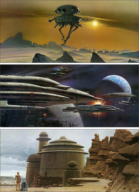
Ralph McQuarrie, although now retired, had a long and distinguished career as a pioneering and influential concept artist for the film and TV industries. He is most noted as the design consultant and conceptual artist for the original three Star Wars films.It’s hard to overstate the impact he had, not only on the look and design of those three films and all of their attendant phenomena, but on the subsequent generation of concept artists, and the style, influence and role of concept artists in the film industry in general.
McQuarrie also worked on films like Close Encounters of the Third Kind, E.T. The Extraterrestrial, Total Recall, Indiana Jones and the Raiders of the Lost Ark and Cocoon, for which he won an Academy Award.
He did not work on the last three Star Wars films. The story is that years after the original triolgy, when the new “prequels” were being discussed, McQuarrie was asked to participate, but was so impressed with the work of the team led by ILM concept artist and design director Doug Chiang, he declined, saying that he didn’t have much additional to contribute. I doubt that would have been true, but it was, of course, his decision to make.
McQuarrie is a contemporary, and school mate, of another visionary designer and futurist, Syd Mead.
Early in his career, McQuarrie created “real” space art, as a technical illustrator for The Boeing Corporation and as an illustrator for CBS News during coverage of the Apollo space missions, in some ways picking up the mantle of pioneer space artist Chesley Bonestell. You can see some of this art on his site in the “Early Days” gallery. It was this work that attracted Lucas’ attention when he was planning the first Star Wars film.
You’ll also find other Film and TV work in the galleries, including concept art for the original Battlestar Galactica TV show that looks better than the show itself ever did.
You’ll find McQuarrie’s work in numerous books associated with the Star Wars movies, including several that are essentially showcases of his art for particular movies. (Amazon link
)
His site also has extensive galleries of his work on all three of the original Star Wars films. You will be tempted to look at his vivid, beautifully realized images and say “That looks just like a scene from the movie.”, when, in fact, it was the movies that came out looking just like McQuarrie’s paintings.
Addendum: Dreams and Visions Press has sent out a pre-release announcement of a new book: The Art of Ralph McQuarrie, a 400 page retrospective of his career. The book is a limited edition (2,000 copies) set for release in May of 2007. Pre-orders will begin in January of 2007 and ship in April. See the web site for more details.
Categories:
-
Kay Nielsen
 Danish artist Kay (pronounced “Kigh”) Nielsen was one of the great illustrators of the period from the late 19th to the early 20th centuries that is usually referred to as the “Golden Age of Illustration”.
Nielsen is often mentioned in the same sentence with two other amazing illustrators, who were at the top of an impressive list of amazing illustrators from that period, Arthur Rackham and Edmund Dulac.
Like Rackham and Dulac, Nielsen was very influenced by Alphonse Mucha and Art Nouveau, the Pre-Raphaelite painters and romantic art. The terrific Swedish illustrator John Bauer was also undoubtedly influential on all three as well.
More than the others, however, Nielsen moved into the realm where representational imagery blended with design and the division of parts of the image into patterns and decorative elements. In this he took obvious inspiration from Aubrey Beardsley and Japanese woodblock prints, which were popular in Europe in Victorian times.
Nielsen, in turn, was influential on other artists at the time, including Rackham and Dulac and later illustrators such as Dorothy Lathrop. You can also see his influence in modern illustrators and even comic book artists like P. Craig Russell.
Nielsen illustrated a number of classic books of fairy tales and is perhaps most noted for his work on East of the Sun and West of the Moon: Old Tales from The North.
Late in his career, he became interested in animation and went to work for Disney, contributing designs to Fantasia (notably the Bald Mountain sequence) and its intended follow-up. His style and working methods were not a good match for the high-paced demands of the animation business, however, and his time there was brief.
There is a collection of his work, Nielsen’s Fairy Tale Illustrations in Full Color, another of work from his estate called Unknown Paintings of Kay Nielsen (David Larkin), and you may be able to find some of the fairy tale books with his illustrations, including East of The Sun and West of the Moon: Old Tales from The North.
Categories:
-
Qi Baishi (Chi Baishi, Ch’i Pai-shih)
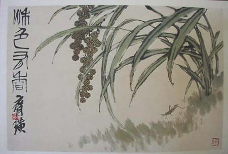
Qi Baishi was a Chinese painter whose long life and career extended from the mid 19th to mid 20th centuries.When he was young his frailty made him incapable of working the lands of his family farm and he was permitted to apprentice to a carpenter. He went on into cabinet making and carving and upon discovering The Mustard Seed Garden, the traditional manual of Chinese painting, determined to achieve a mastery of painting. He studied traditional techniques for many years and at the age of 40 began to develop the style for which he would be known in his mature career.
His early work, which I like a lot, is more like traditional Chinese landscape painting, his mature style was a turn on the schools that emphasized the portrayal of simple small bits of nature rather than grand landscapes. He combined that ink painting style with modern colors and is renowned for his deceptively simple, colorful and intimate portrayals of flowers, insects, vegetables and grass blades.
Categories:
-
Esao Andrews
 Esao Andrews’ work fits loosely into a branch of contemporary fantastic art called “pop surrealism”.
His work often involves portrait-like images of young women in conjunction with odd elements, such as objects that are combinations of plant and animal forms, apparently intended to be a bit disconcerting.
Some of his paintings are more straightforward, almost like regular portraits (left, bottom), some look a bit like deranged children’s book illustration and some are simply odd. I wouldn’t say that the images I’ve chosen here are necessarily representative of his work, I just happen to like them in particular.
His web site has a delightfully entertaining Flash interface, one of the most amusing I’ve seen, in which a young woman sits demurely in a room with a few furnishings, and her face follows your cursor as you mouse over objects that pop up or change to reveal the sites sections. The interface is done with style and cheeky wit (she looks right at you and flashes her dress up when you choose “Paintings”) and is full of nicely imaginative details.
Unfortunately, once past the amusing nature of the interface, it’s actually not easy to navigate, the galleries consist of colored dots with no indication of previews and the images open in pop-up windows. (Who ever told artists that pop-up windows are a good way to display art work?)
If you like quirky, imaginative and oddball images, though, Esao’s work is worth the trouble to look through the galleries.
There are sections of paintings, done in oil on board, drawings, illustrations and designs for skateboard decks. There is also an archive to a previous site version. His “News” section mentions an upcoming site redesign (which promises “no pop-up windows”), but I hope he archives this one.
There isn’t much background or biographical info on the site, but there is a good interview with him on Pixelsurgeon.
Categories:
-
Peter Popken

Peter Popken is a concept artist, illustrator, visual development and storyboard artist for the film industry. He has worked on films like V for Vendetta, Aeon Flux and The Bourne Supremacy.Many of the film concept images on his site are dramatic landscapes or cityscapes, painted in widescreen ratios. There are also character designs, storyboards and illustrations.
He utilizes several rendering styles, from the crosshatched linework in some of the storyboards to the direct no-nonsense approach of some of the concept paintings, which can be wonderfully graphic at times with flat areas of color crafted into three dimensional shapes.
His concept paintings are often almost monochromatic, with areas of more intense color in a different range used for emphasis and focus. Sometimes he will use a more softly rendered approach or the color-filled line style where appropriate.
Some of the movie work is labeled, but some of the storyboard work is not. I’m curious about a very cool storyboard he did for what is apparently a car ad, in which the car is injected into a patient’s bloodstream.
Categories:
-
Chet Phillips (update)

Writing about scratchboard a few days ago prompted me to check back in with illustrator Chet Phillips, who I first posted about back in October of last year.Phillips uses Corel Painter to create what he terms “Digital Scratchboard”, using the digital painting programs customizable tools to incise sharp edged linework as if scraping with a real scratchboard tool. (Painter, in fact has built in “scratchboard” tools, the most basic of which is my preferred tool for making digital “ink” drawings.)
Phillips has done both editorial and advertising illustration and his work has been featured in numerous books on digital painting. He often does wonderfully bold and graphic images of domestic animals in which the “scratchboard” effects start to lean toward a woodcut feeling.
His portfolios have been revamped and expanded since I last wrote about him. (Unfortunately, they’re still in the tedious “click and click back” arrangement found on so many artist’s sites.) It’s not always obvious that the gallery sections can be split into subsections with links under then main menu, so keep looking around. You can find additional styles of images (fun Tiki images, for example) in the “Merchandise” section.
Categories:


Charley’s Picks
Bookshop.org
(Bookshop.org affilliate links; sales benefit independent bookshop owners; I get a small percentage to help support my work on Lines and Colors)

John Singer Sargent: Watercolors


Urban Sketching: Understanding Perspective


Charley’s Picks
Amazon
(Amazon.com affiliate links; sales go to a larger yacht for Jeff Bezos; but I get a small percentage to help support my work on Lines and Colors)
John Singer Sargent: Watercolors
Urban Sketching: Understanding Perspective